To navigate the strange territory of the past year, which included learning to collaborate with team members 5,000 miles away, keeping 10,000 students safe from COVID-19, and balancing time with our families, pets, and plants, we did what we do best: we iterated.
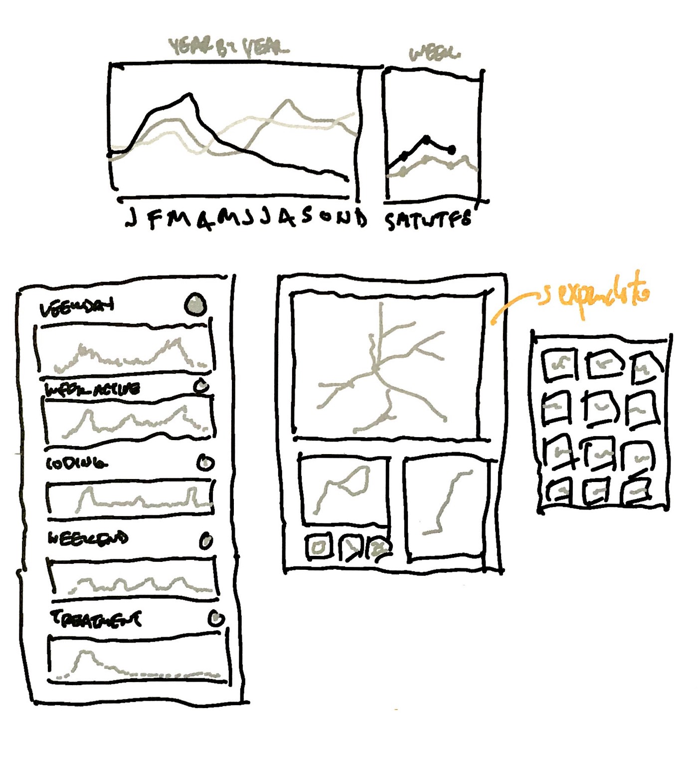
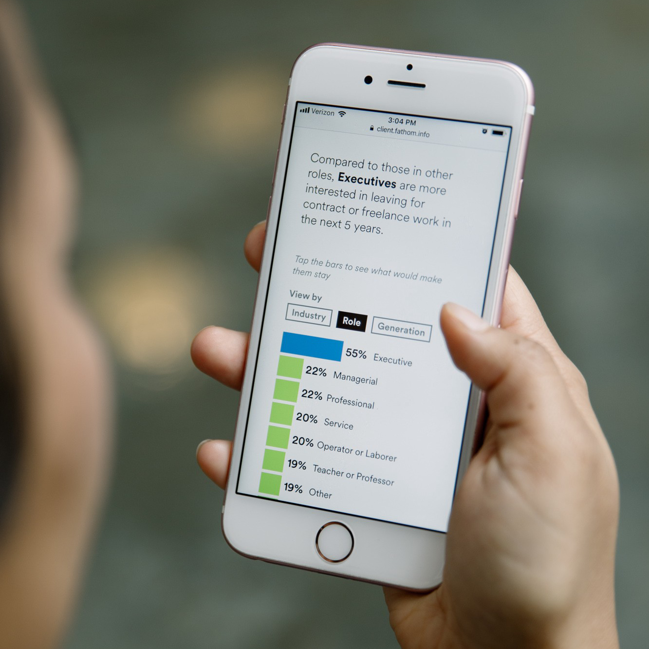
Before we went on break for the holidays in December, the office got together to brainstorm solutions to a question we’ve been thinking hard about over the past few months: what does a good health app look like? “Good,” of course, can mean countless different things. It could mean that it’s good at reminding you to exercise and eat well, good for logging personal health information, or good at predicting when a chronic condition may flare up.

At the end of the year, we like to take some time to recap what we accomplished over the past 12 months. From client work to internal projects to talks and new hires, there’s a lot to celebrate. Here’s the best of Fathom from 2019:
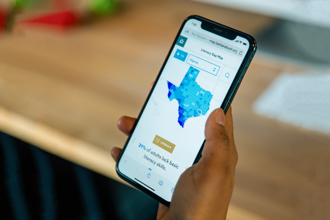
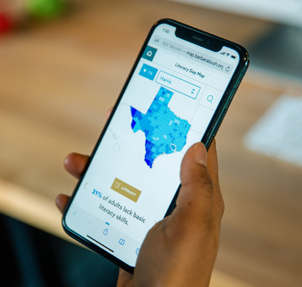
This summer, we teamed up with the Barbara Bush Foundation for Family Literacy (BBFFL) to investigate the current status of adult literacy in the United States.
It’s been well established that the U.S. is in the midst of a literacy crisis. One in five U.S. adults struggle to read basic sentences, fill out a form, or understand basic vocabulary, and limitations like these prevent people from navigating the world with dignity.
It’s been well established that the U.S. is in the midst of a literacy crisis. One in five U.S. adults struggle to read basic sentences, fill out a form, or understand basic vocabulary, and limitations like these prevent people from navigating the world with dignity.
This fall, we’ve had the opportunity to wrap up some long-running projects that we’re excited to finally share with the public. We’ve already had several occasions to do so — over the last couple months we’ve been busy presenting work at conferences, in classes, and within the office. In case you missed it, here’s what we’ve been up to…
We had a remarkably busy summer this year. With client projects to develop, workshops to teach, and a host of interns and new hires to welcome, there was never a dull moment. As we’re settling in for the fall, we’re taking some time to look back on everything we accomplished during the summer months.


Launching Myriscope, providing ConText for the Mueller Report, and visiting the Mayo Clinic
Making sense of survey data, deconstructing Mueller documents, and geeking out about Bézier curves
Our work over the past year has, as always, spanned various domains (healthcare, finance, politics, and farming) and has taken many forms: internal tools for our clients, web apps for the public, and touch screen installations.
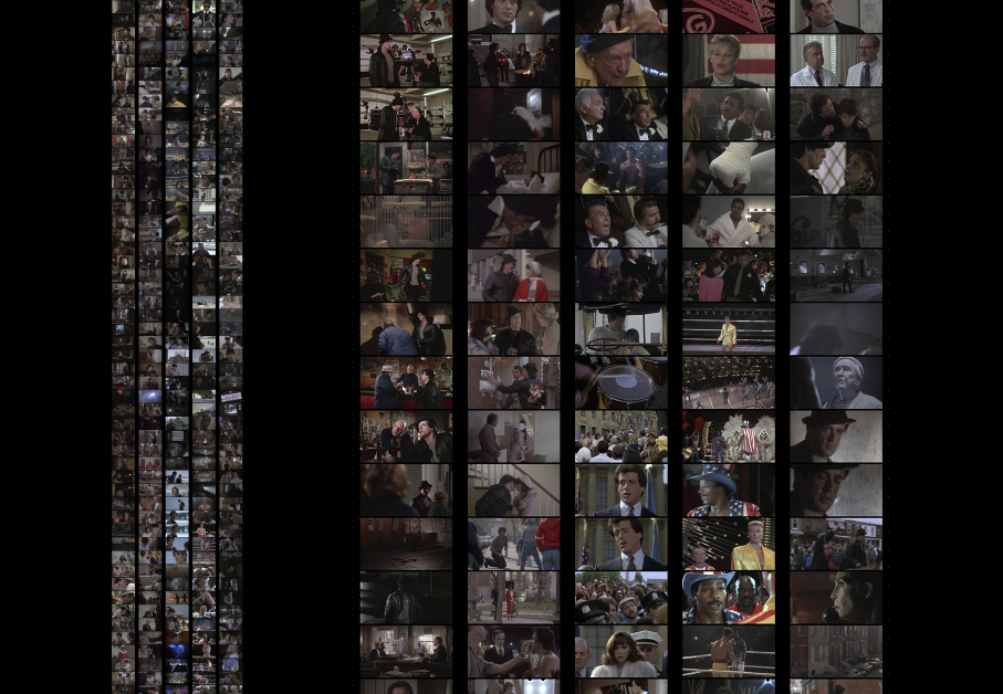
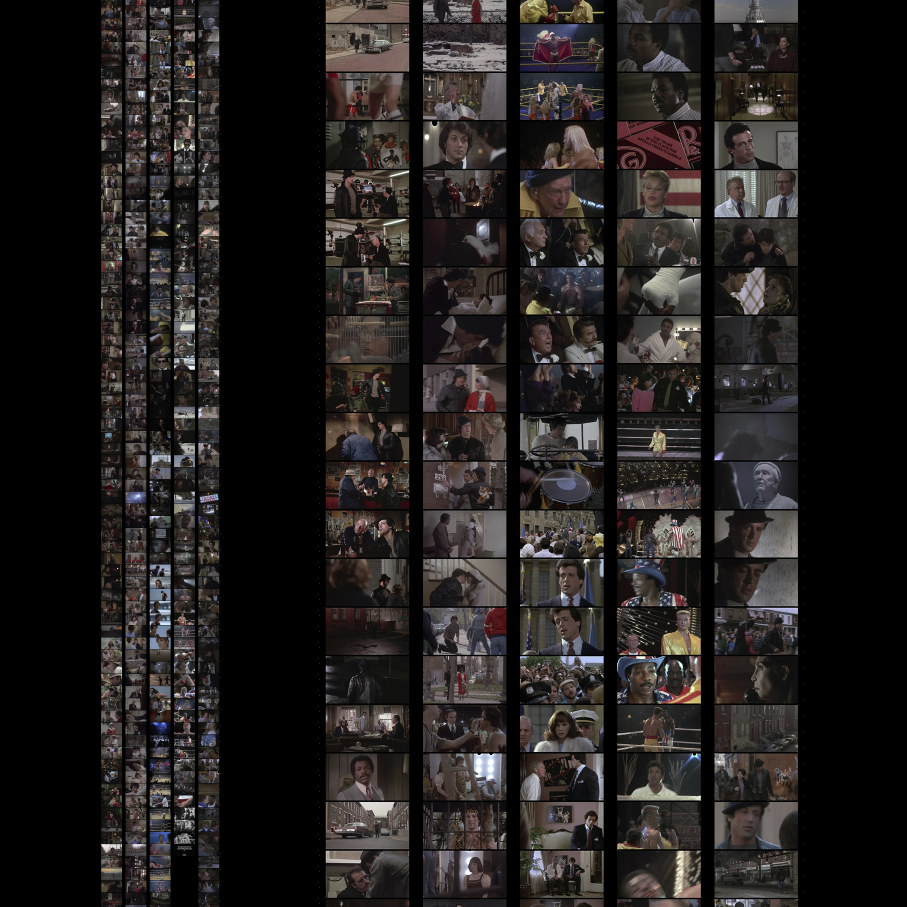
Roughly five years ago, James Grady, a designer at Fathom, settled down on his couch to watch a movie. It wasn’t just any movie, but James isn’t just any movie fan. Inspired by Morphology of the Folktale by Vladimir Propp, which lays out the patterns typical to stories that inform our culture, he wanted to see how the structure played out across all six Rocky movies. James got his spreadsheet ready, prepared snacks and drinks to see him through, and pressed Play.
It’s been a busy couple of months, and we finally found the time to write about it.
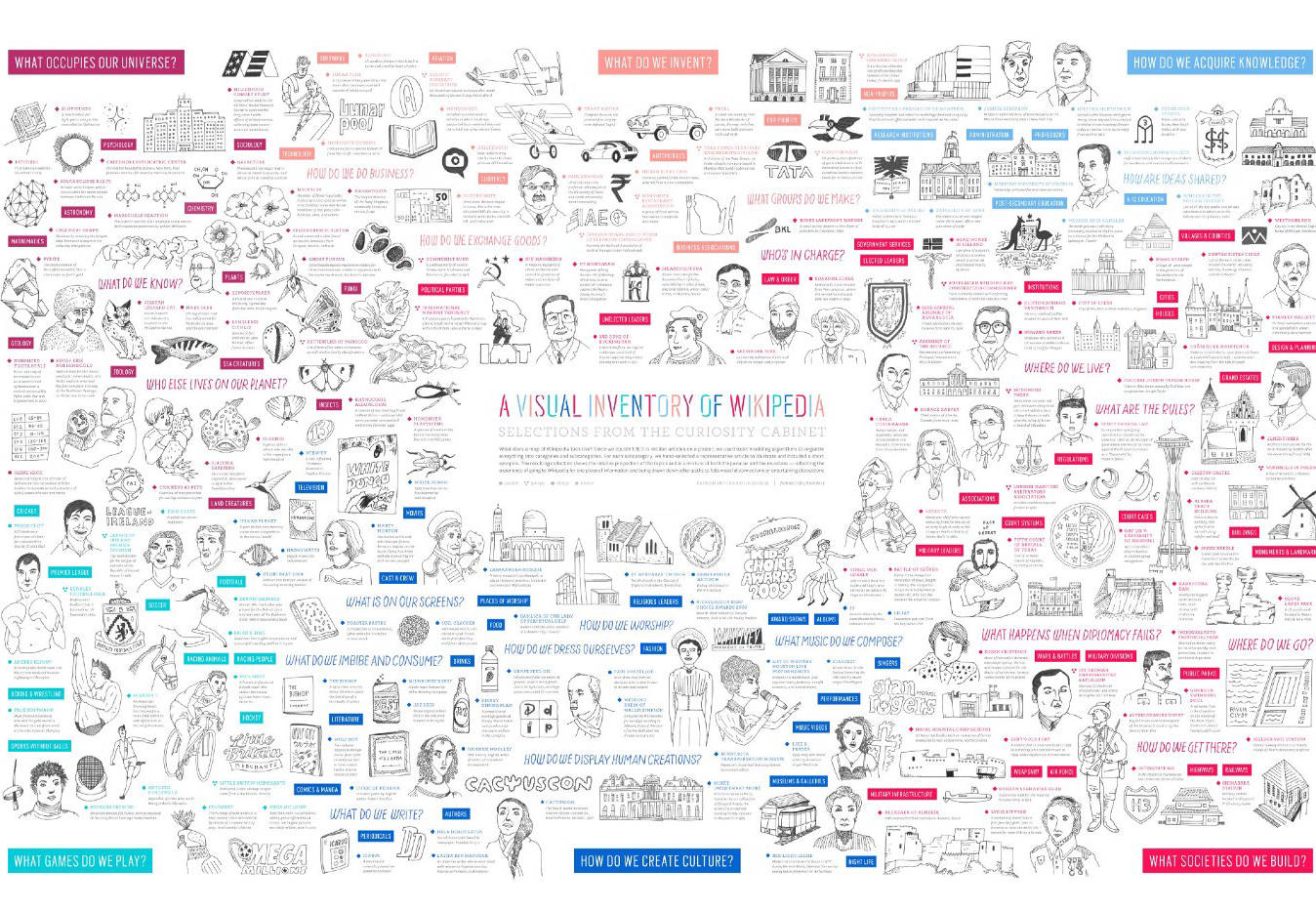
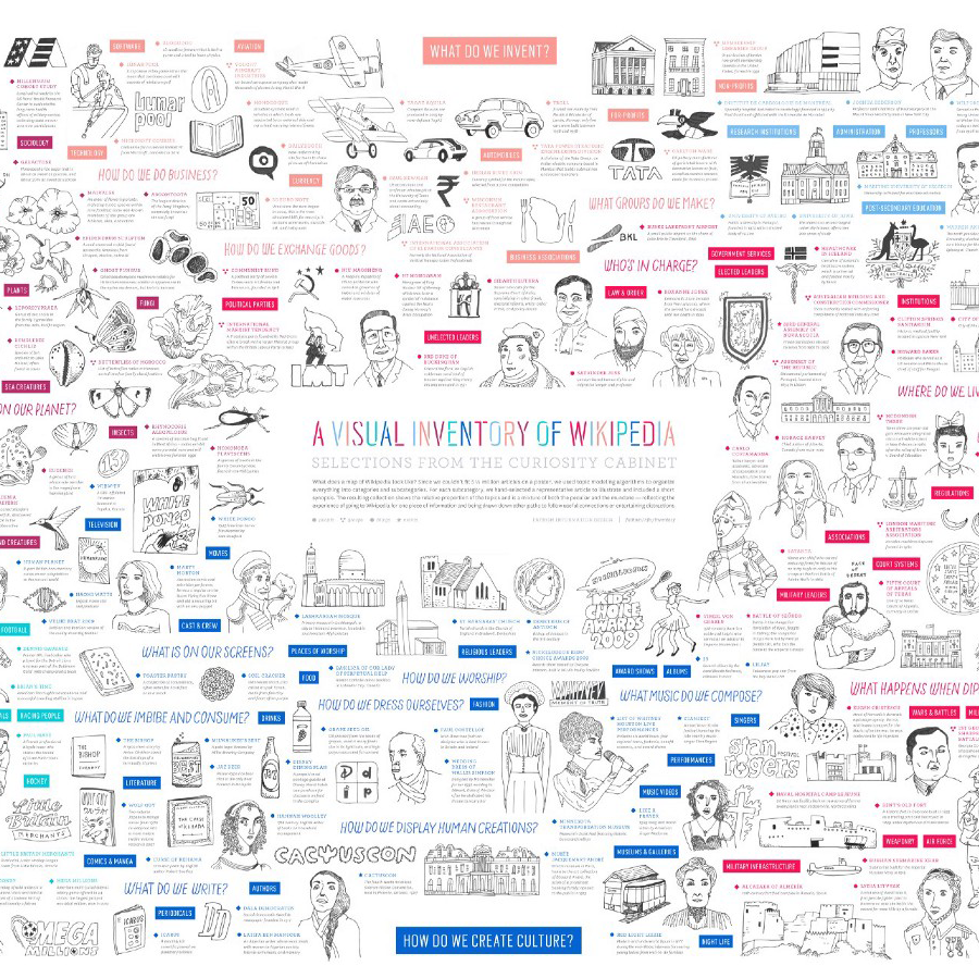
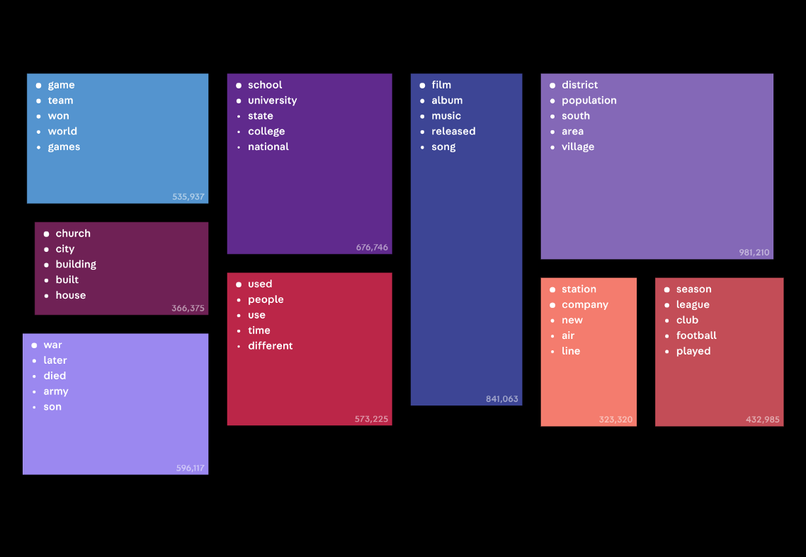
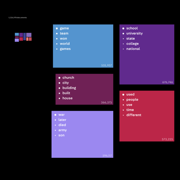
Over the last year, we’ve been working on ways to understand very large document collections—hundreds of thousands or even millions of documents. We began using Wikipedia as a source collection because it has millions of documents, but it’s also an openly available resource representing a vast range of recorded knowledge. It’s huge, it’s free, and we’ve always been curious to learn the breakdown of what’s being documented. What receives the most attention?


Anisha’s analysis of video archives, FBI documents, and Wikipedia
Visualizing 200 years of growth in finance, dissecting Russian ads in “Fakebook,” and disassembling image data
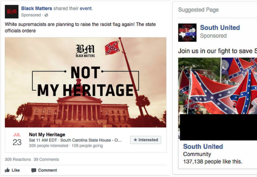
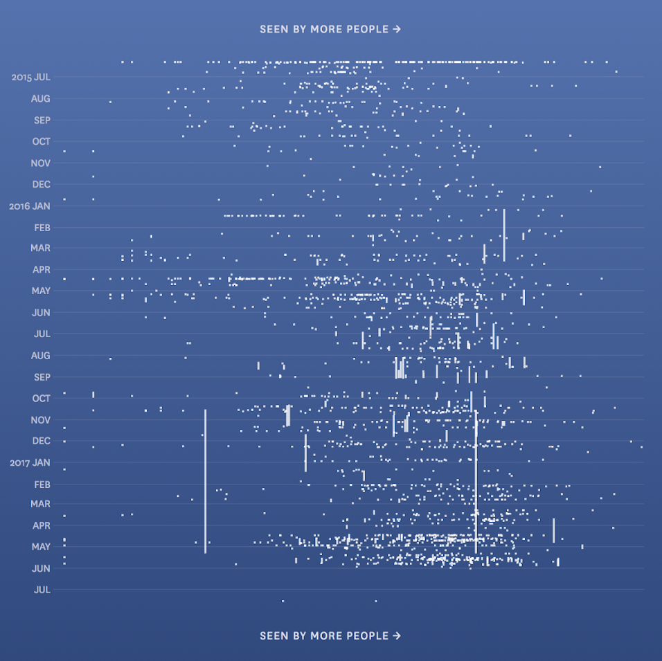
As part of our exploration of ways to understand large document sets, we took a look at the Facebook ads funded by the Russian government between 2015 and 2017. They aimed to stoke tensions by targeting polarizing messages at both sides of controversial issues.
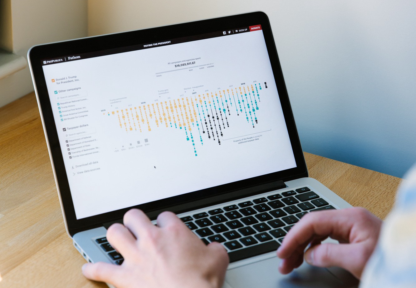
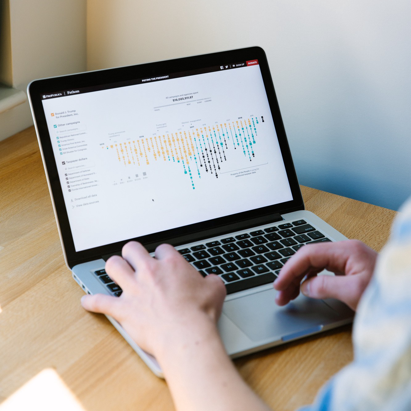
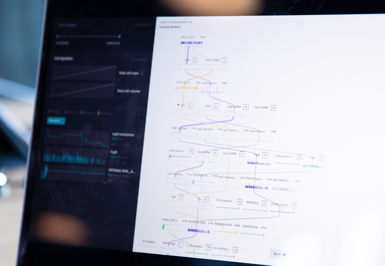
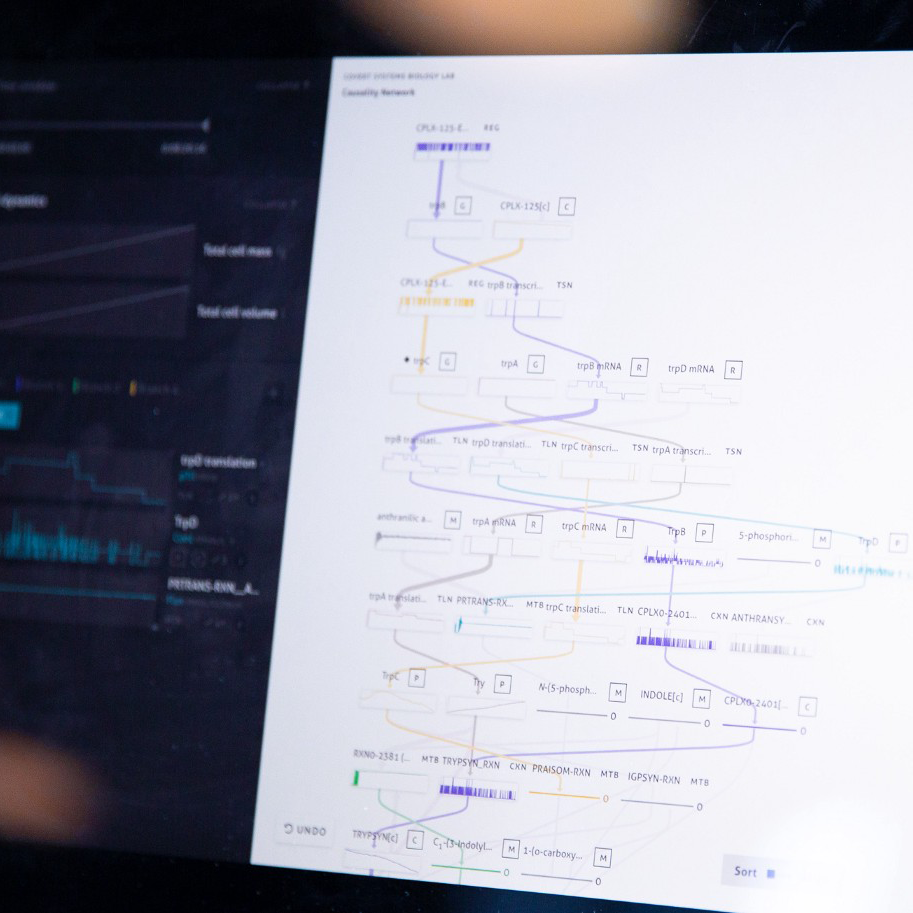
“Paying the President,” visualizing oral histories, and kicking off a summer of cell biology
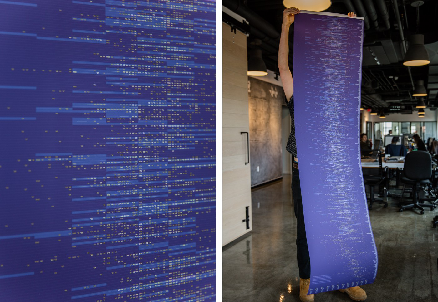
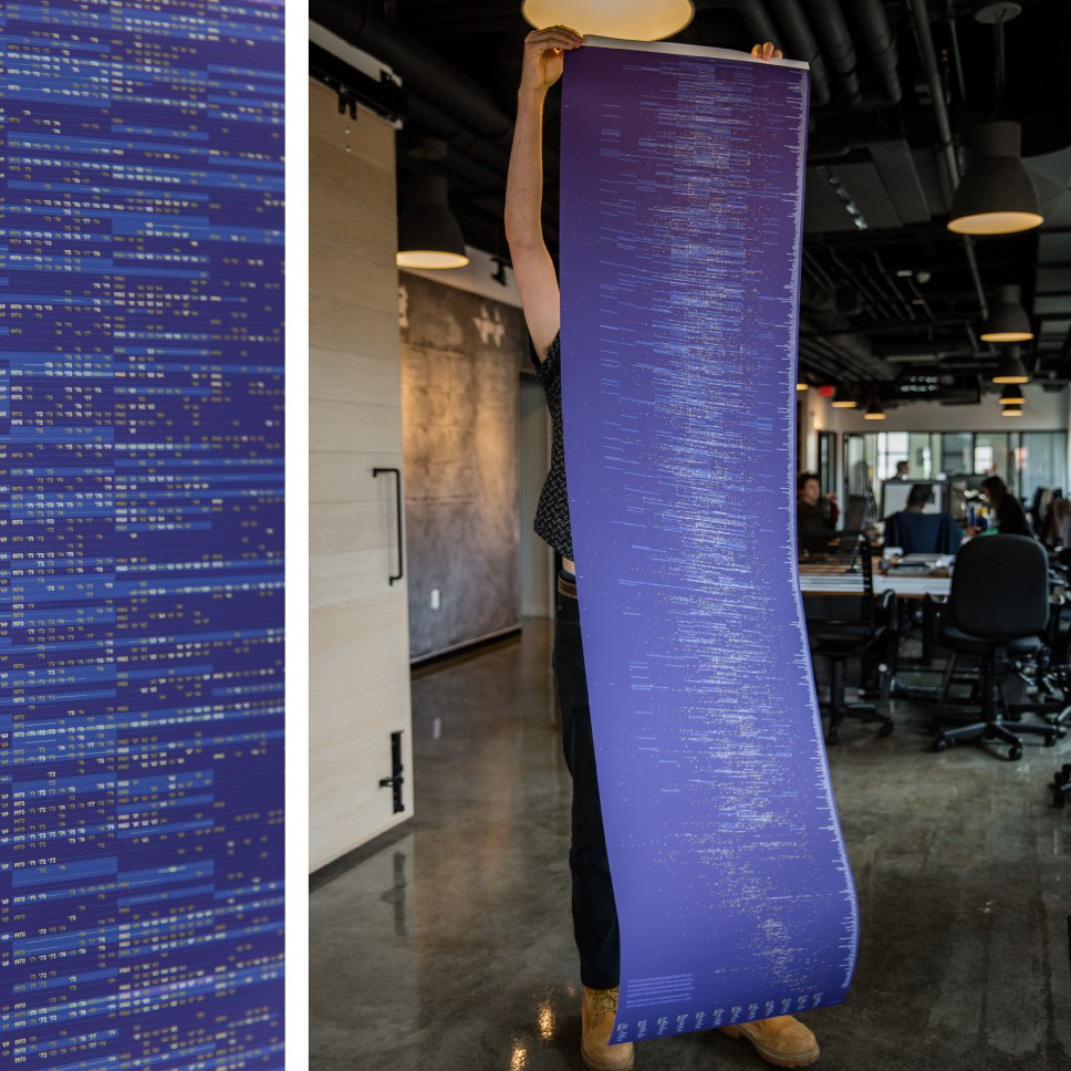
As a studio with its fair share of computer nerds, we greatly enjoyed digging into the interview archive of the Computer History Museum. Using code, we extracted dates and entities from the 800+ oral histories to create a personal timeline for each interview.
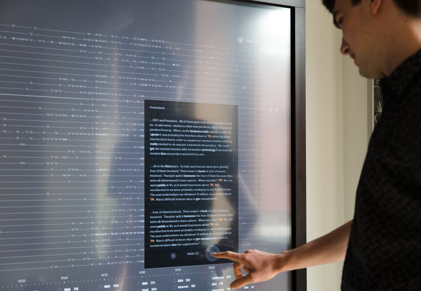
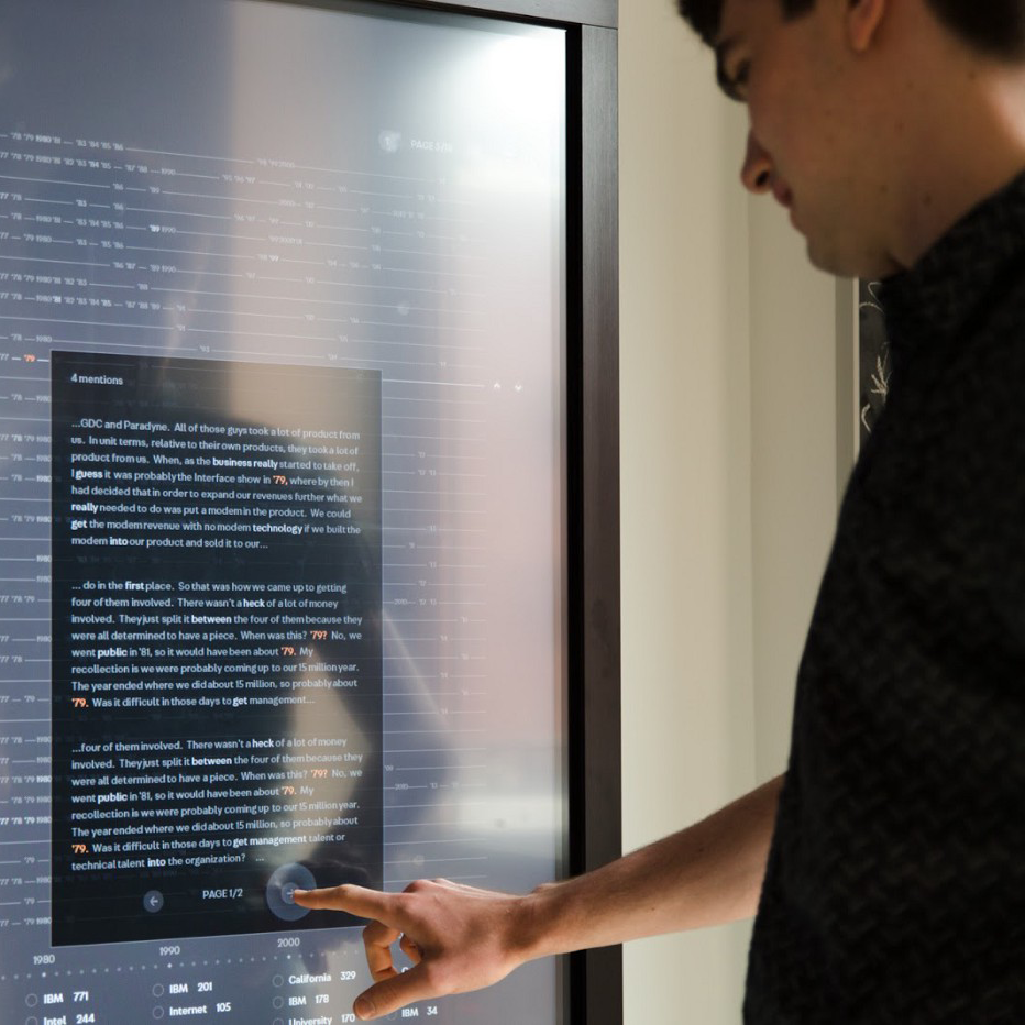
As part of our ongoing exploration into representing and understanding large document sets, we dove into the Computer History Museum’s interview archive. From the co-founders of Ethernet and Devo to professors at Carnegie Mellon, the archive includes 800+ oral histories of individuals involved in all aspects of computing over the last century.
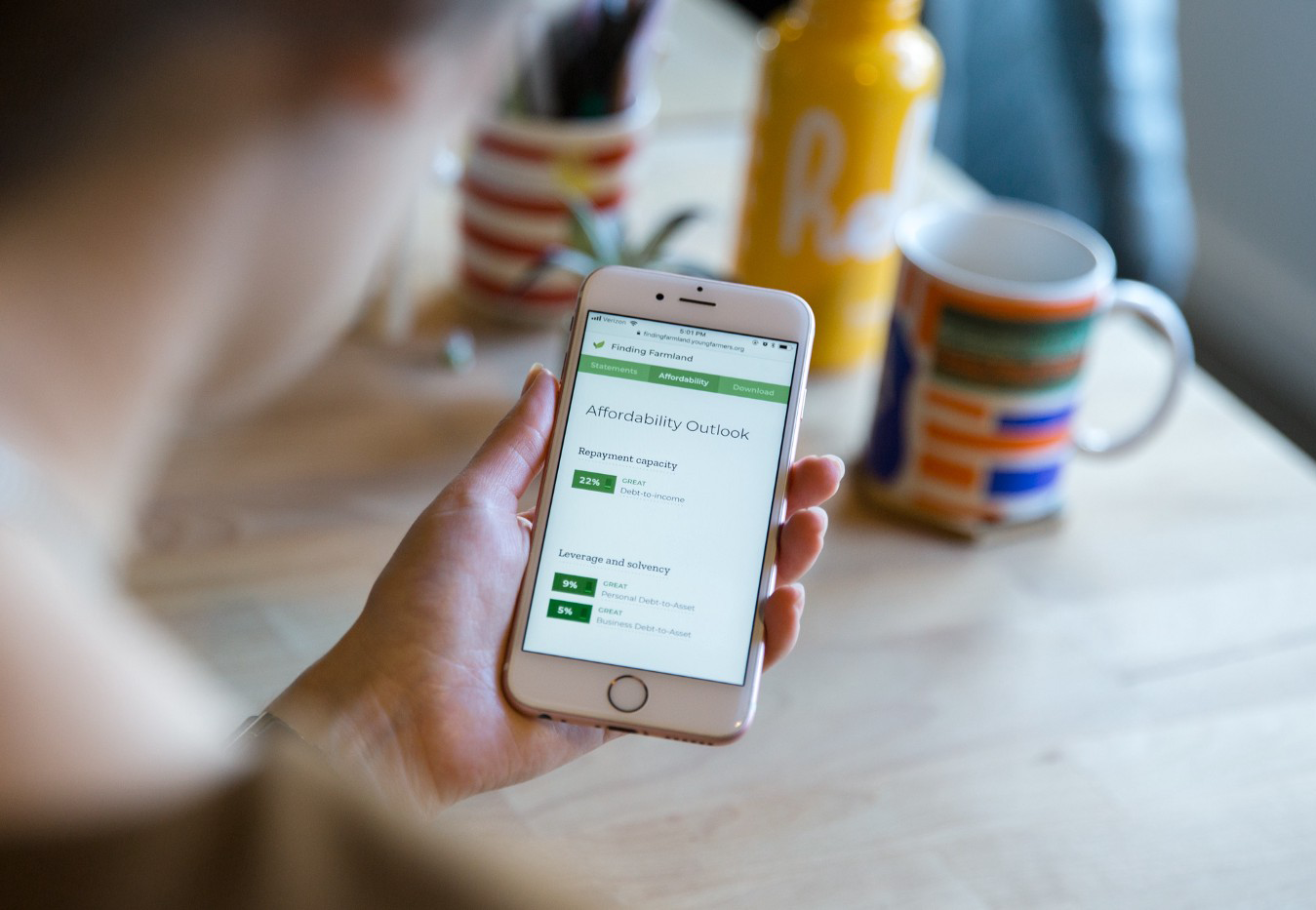
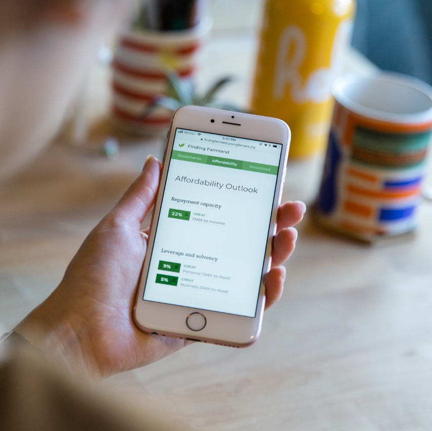
We’re pleased to announce the launch of Finding Farmland, an “affordability calculator” we built with the National Young Farmers Coalition. Since access to farmland is one of the biggest hurdles for beginning farmers, the goal of the calculator is to help farmers understand the available financing options and enable them to create land purchasing scenarios.
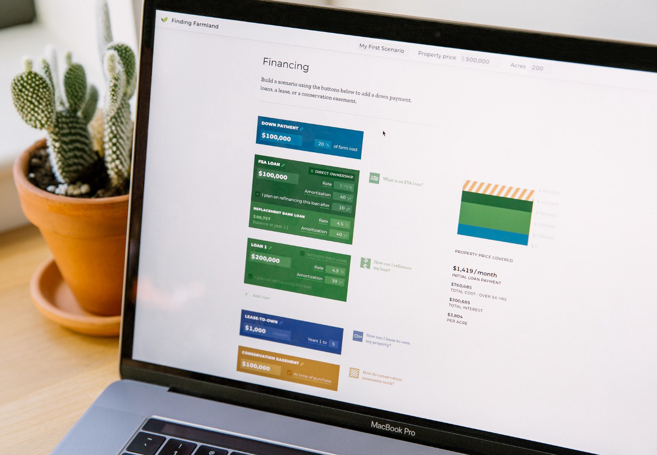
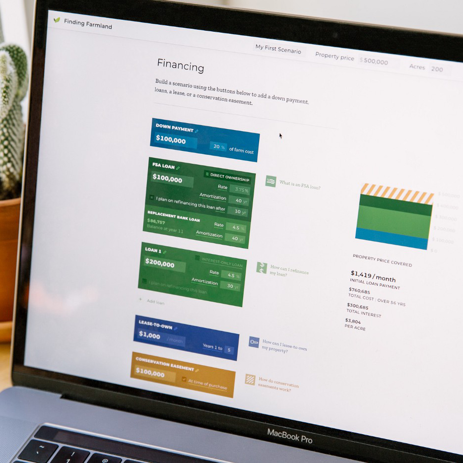
We’re excited to announce the final launch of Finding Farmland, an affordability calculator we’ve built with the National Young Farmers Coalition over the past few years. Purchasing farmland can be incredibly complex, so we partnered with NYFC to create a platform that breaks down every step of the process. Check out the calculator here.
While eagerly awaiting the Oscars, some of the movie buffs in the studio parsed through 20 years of Best Picture nominees. Rachel created a few sketches that look at the findings on movie budgets, viewer ratings, and race. For instance, this a breakdown of movies that push the 3-hour mark:

How do we quickly find what we know is there, and how do we efficiently explore what we don’t?
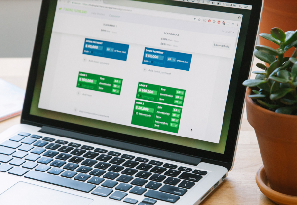
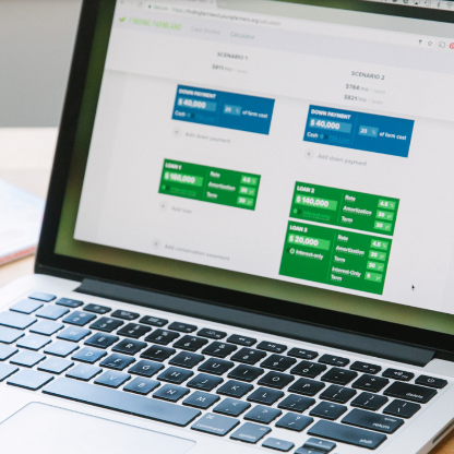
One of the biggest hurdles beginning farmers face in the US is access to land. The National Young Farmers Coalition came to us to help them build an “affordability calculator” that would let potential farmers understand funding and financing property of their own. They were looking for a partner that could build a tool from the ground up, one that went beyond a typical home mortgage calculator and took the complexity of farmland purchases into account.
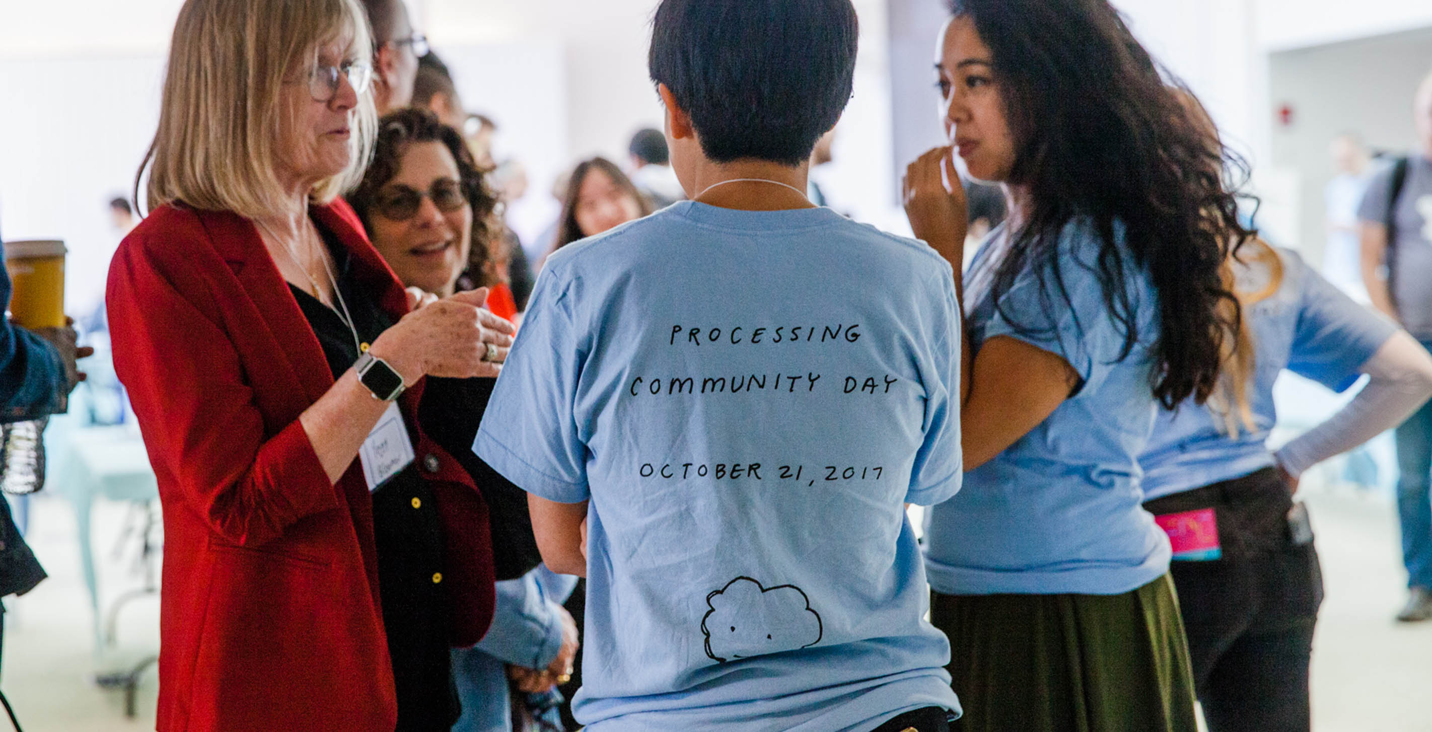
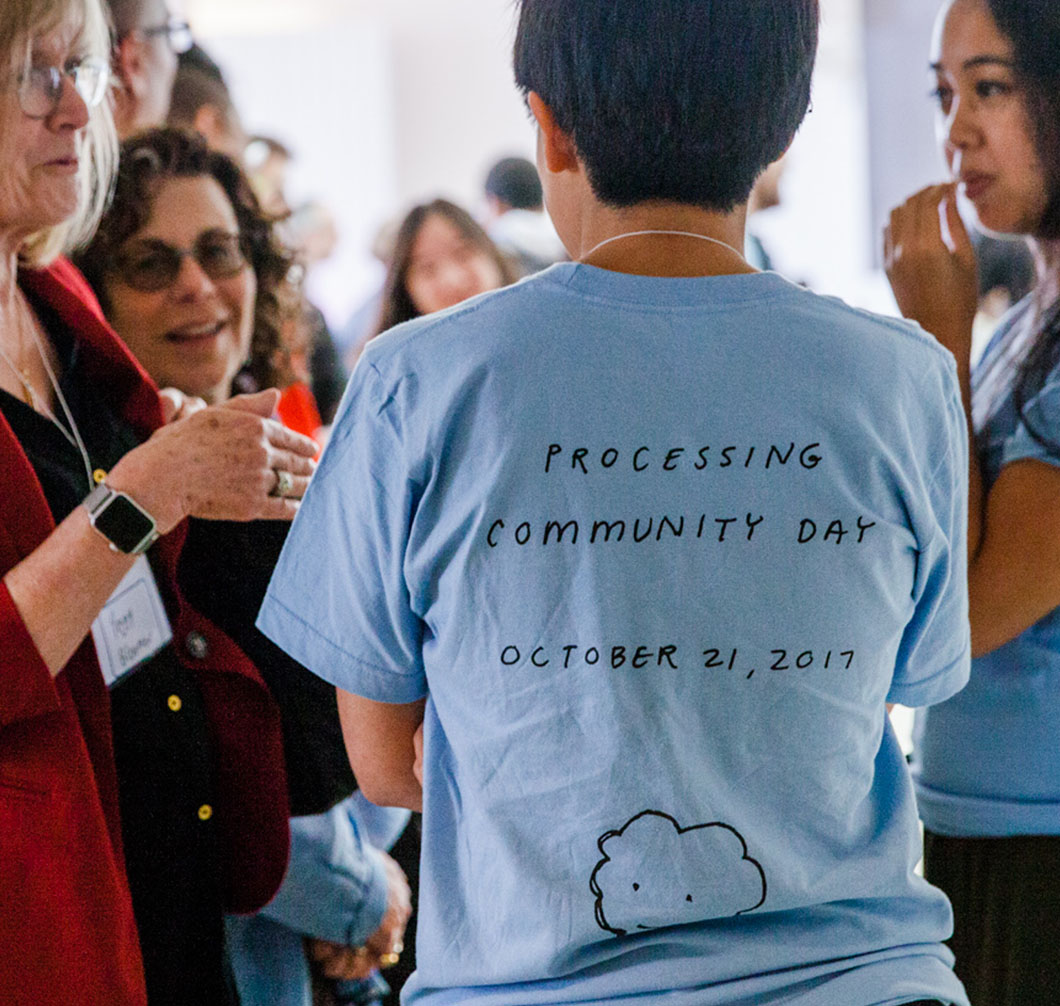
Just a few weeks ago was the first ever Processing Community Day. As volunteers and attendees, we were lucky enough to be able to watch inspiring community talks, see new and old faces, and present our own work. In this post, Danielle and Olivia reflect on their experience.
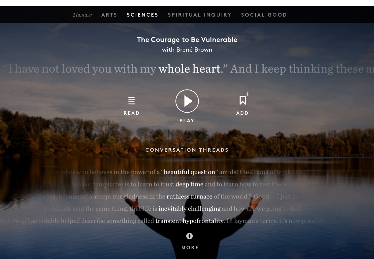
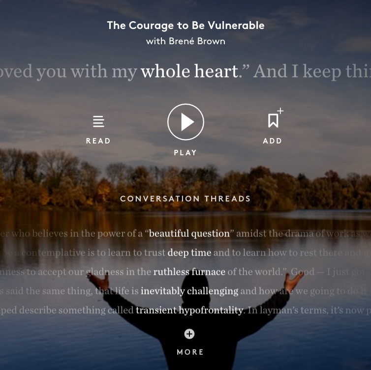
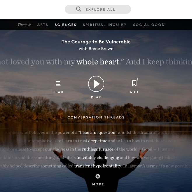
We’re thrilled to announce the release of a new project in partnership with On Being, the Peabody Award-winning podcast and public radio show that “opens up the animating questions at the center of human life: What does it mean to be human, and how do we want to live?”
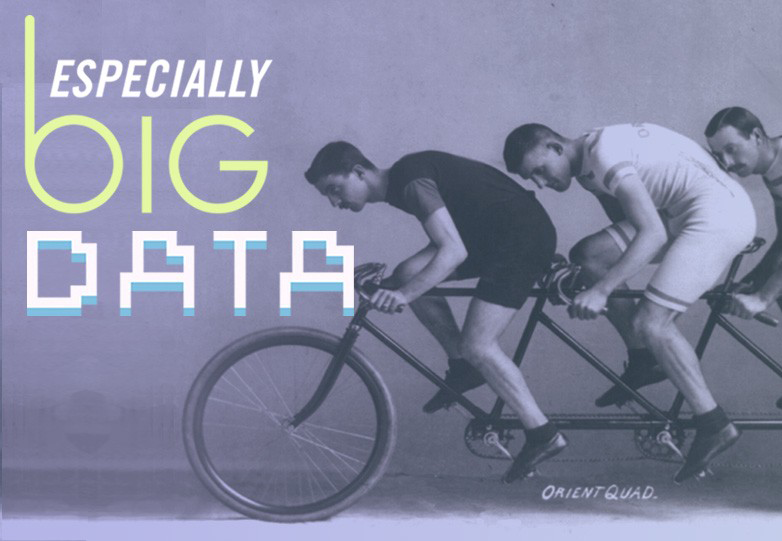
This is a transcription of the fourth episode from our Especially Big Datapodcast. You can listen to the episode here.
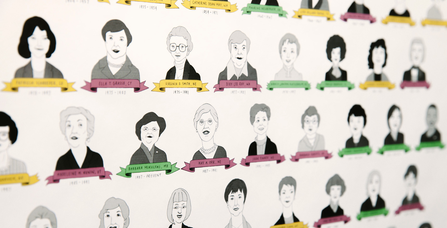
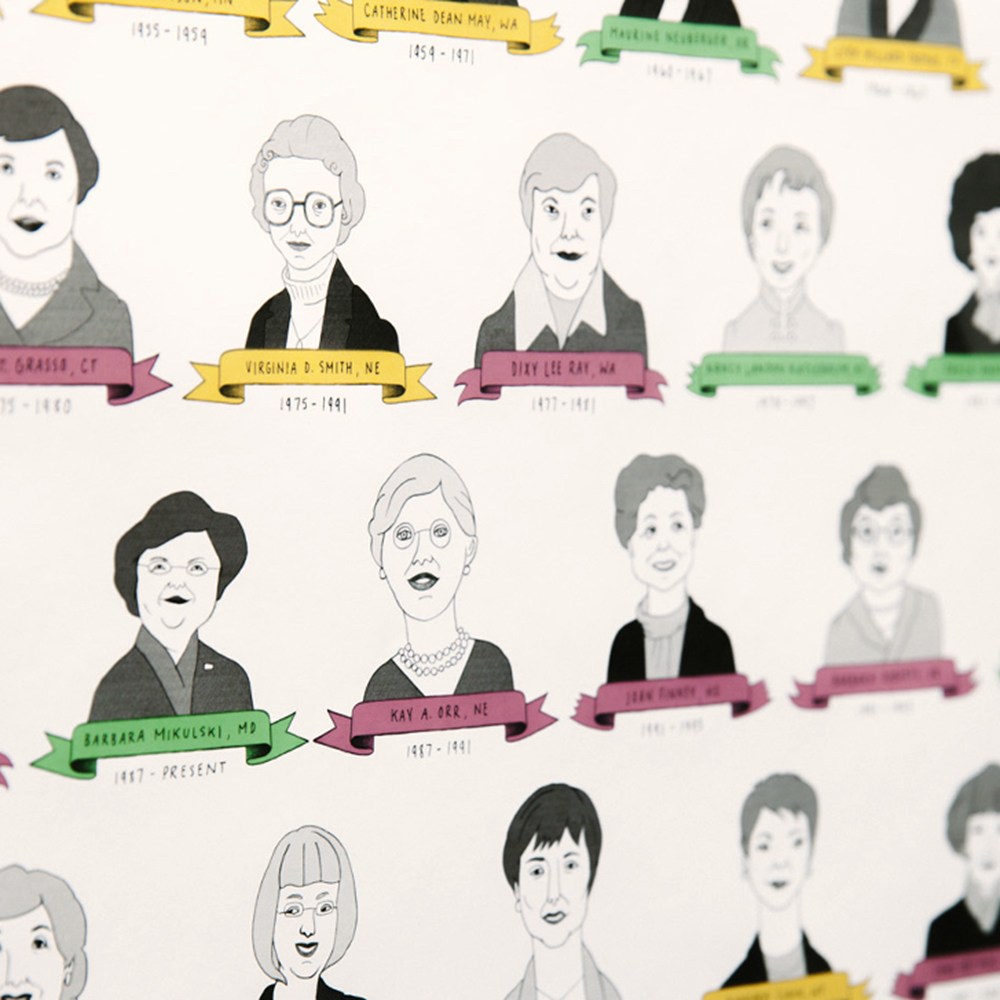
Amidst all the attention given to the 2016 presidential campaign, it was easy to miss an important date in the history of women in American government. One hundred years ago, on November 7, 1916, Jeannette Rankin of Montana became the first woman to be elected to federal office when she won a seat in the U.S. House of Representatives.


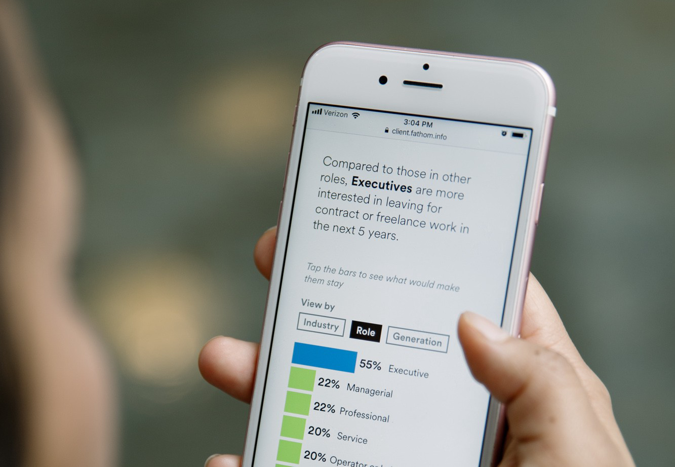
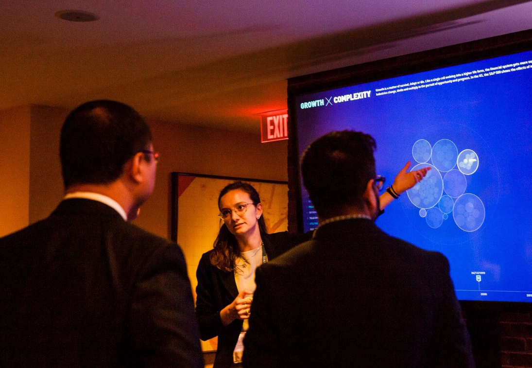
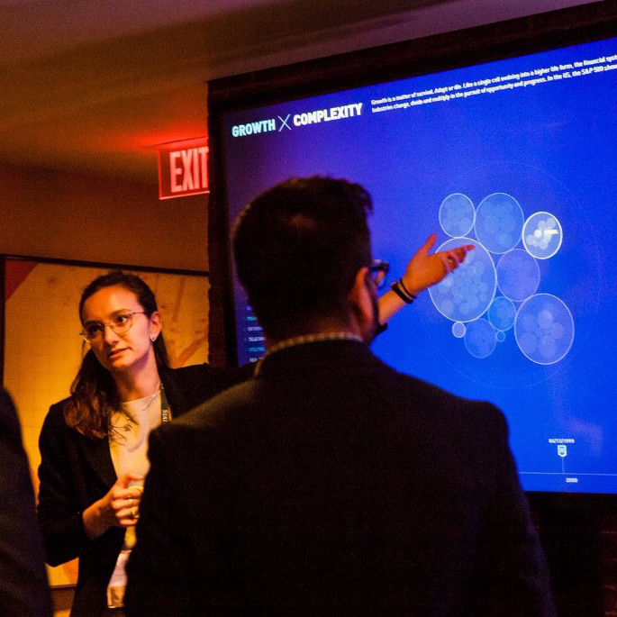
From trends in civic tech, to monitoring poverty in New York City, to understanding the future of business, we've been fielding more inquiries from organizations who want better ways to communicate the data in their research and reports.
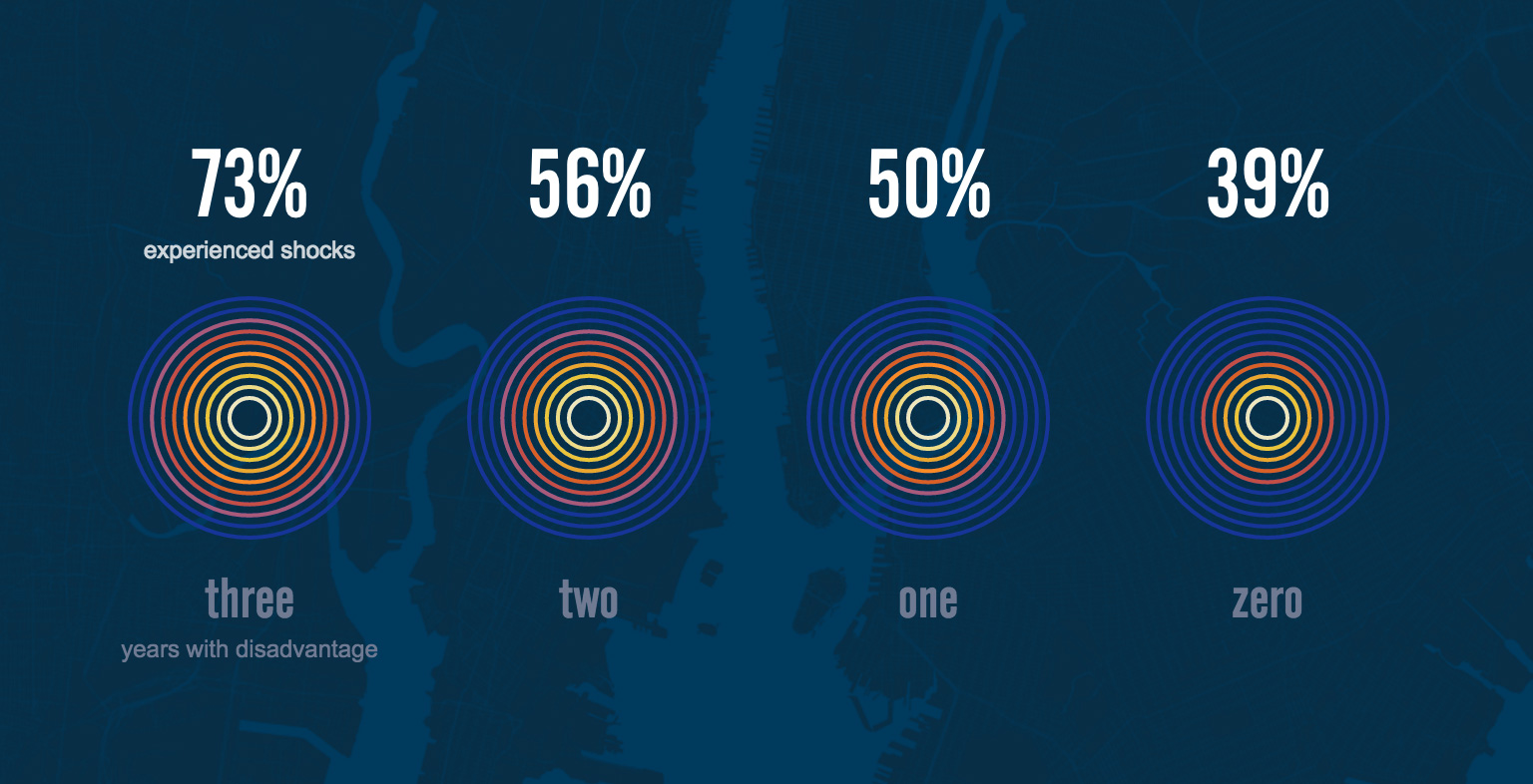
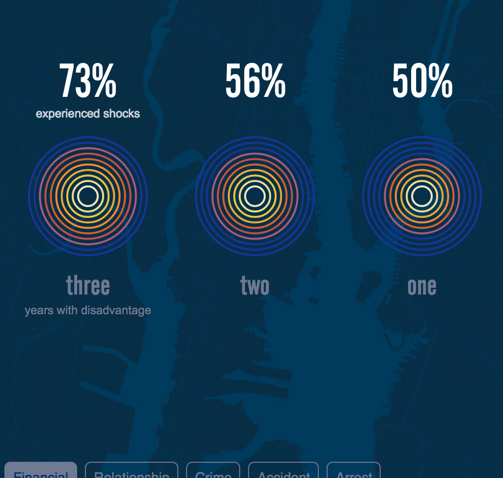
We're excited to release the latest update to the Poverty Tracker. The project is a collaboration with the Robin Hood Foundation and Columbia’s Population Research Center that has continued to look at poverty and hardship in New York City over the past three years.

A transcription of the second episode of our Especially Big Data podcast.
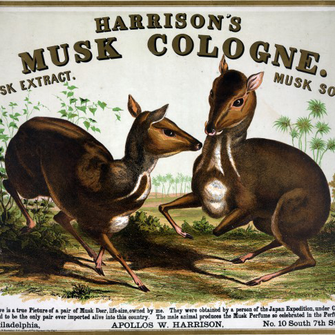
A transcription of the first episode of our Especially Big Data podcast.


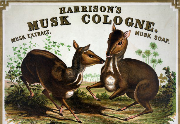
This is a transcription of an episode from our Especially Big Data podcast for those of you who prefer words on a page instead of words in your ears. Enjoy!
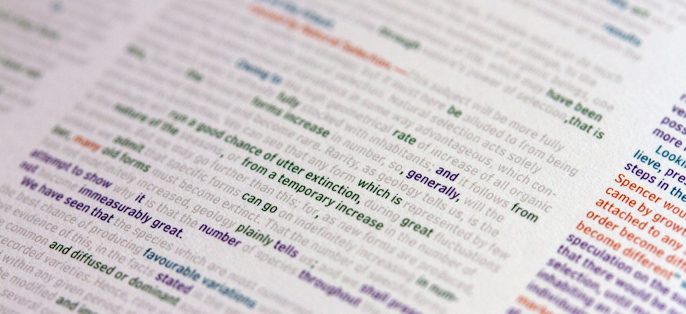
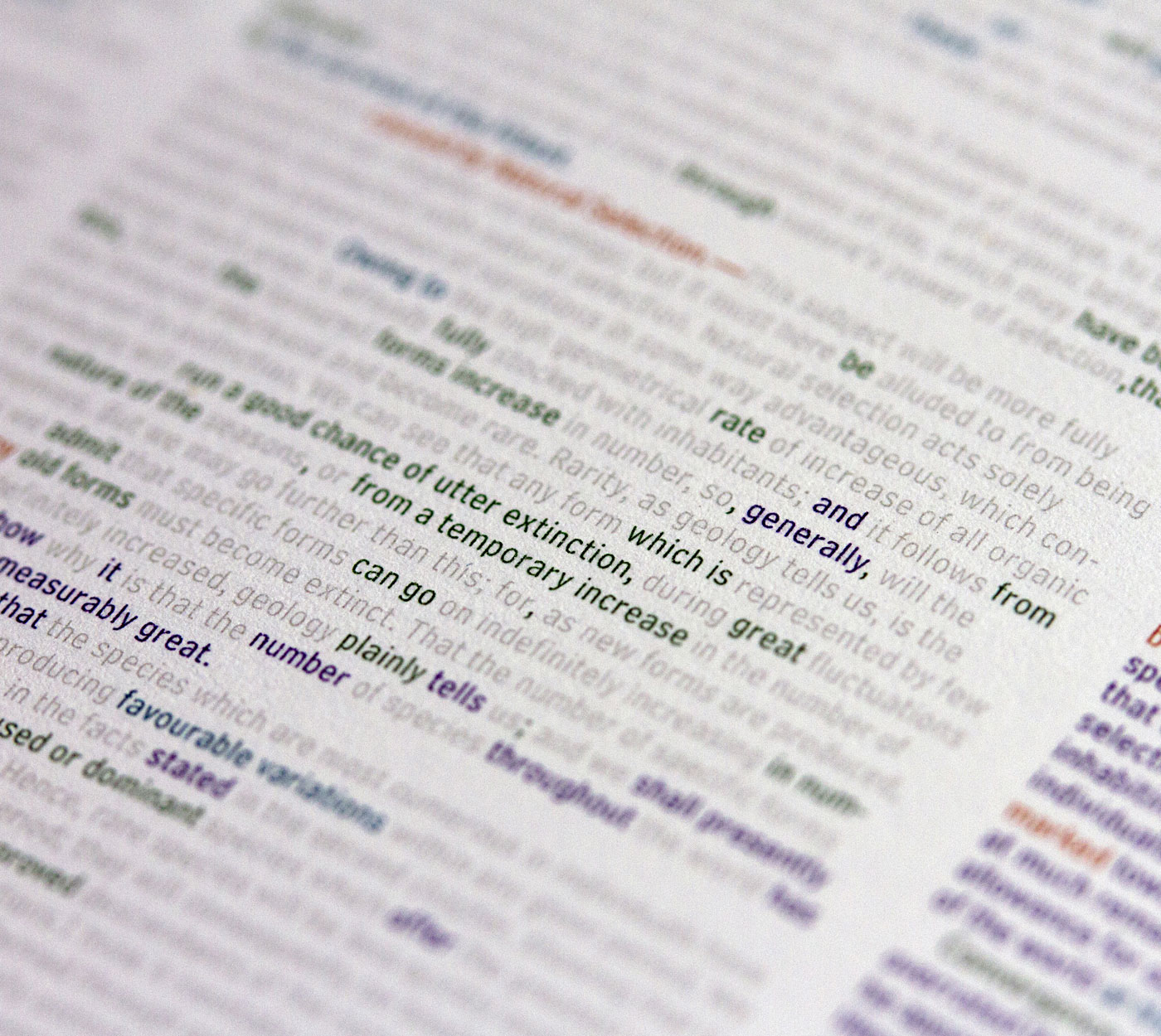
Hot off the press—and just in time for the holidays—are two print projects that look at the six editions of Charles Darwin's, On the Origin of Species. Originally developed as an interactive piece, we decided to continue our tradition of producing and selling unique printed artifacts. And as always, all of the proceeds from this work will be donated to charities focused on education, science, music, art, food, and homelessness.
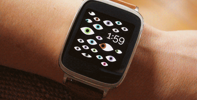
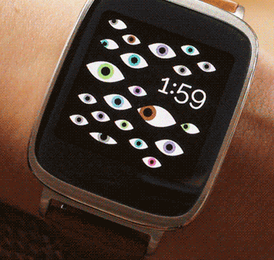
We're excited to announce the launch of the Fathom Watch Faces, a collection of interactive watch face designs for the Android Wear collection, which is part of Google's Android Experiments. The experiments are designed to bring developers together on a common platform to push the capabilities of Android tablets, phones, and watches. We focused on using the internal components of the watches, such as their accelerometers and pedometers, to create delightful user feedback at every glance, and to really explore the information people can gain from a wearable device attached to their wrist.
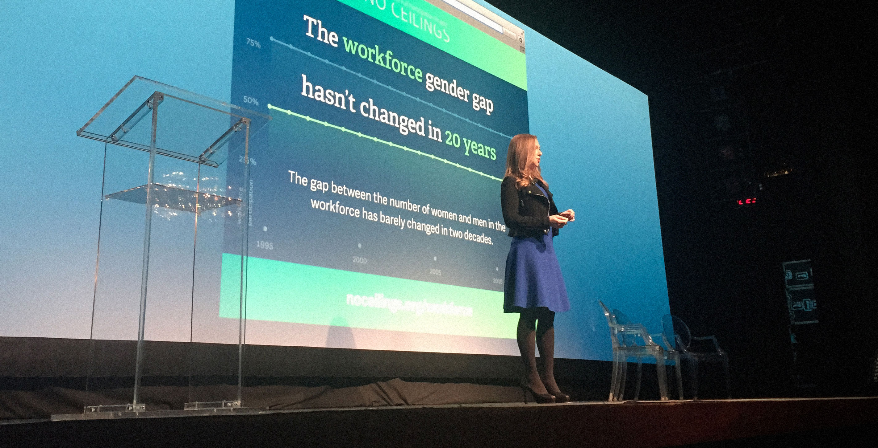
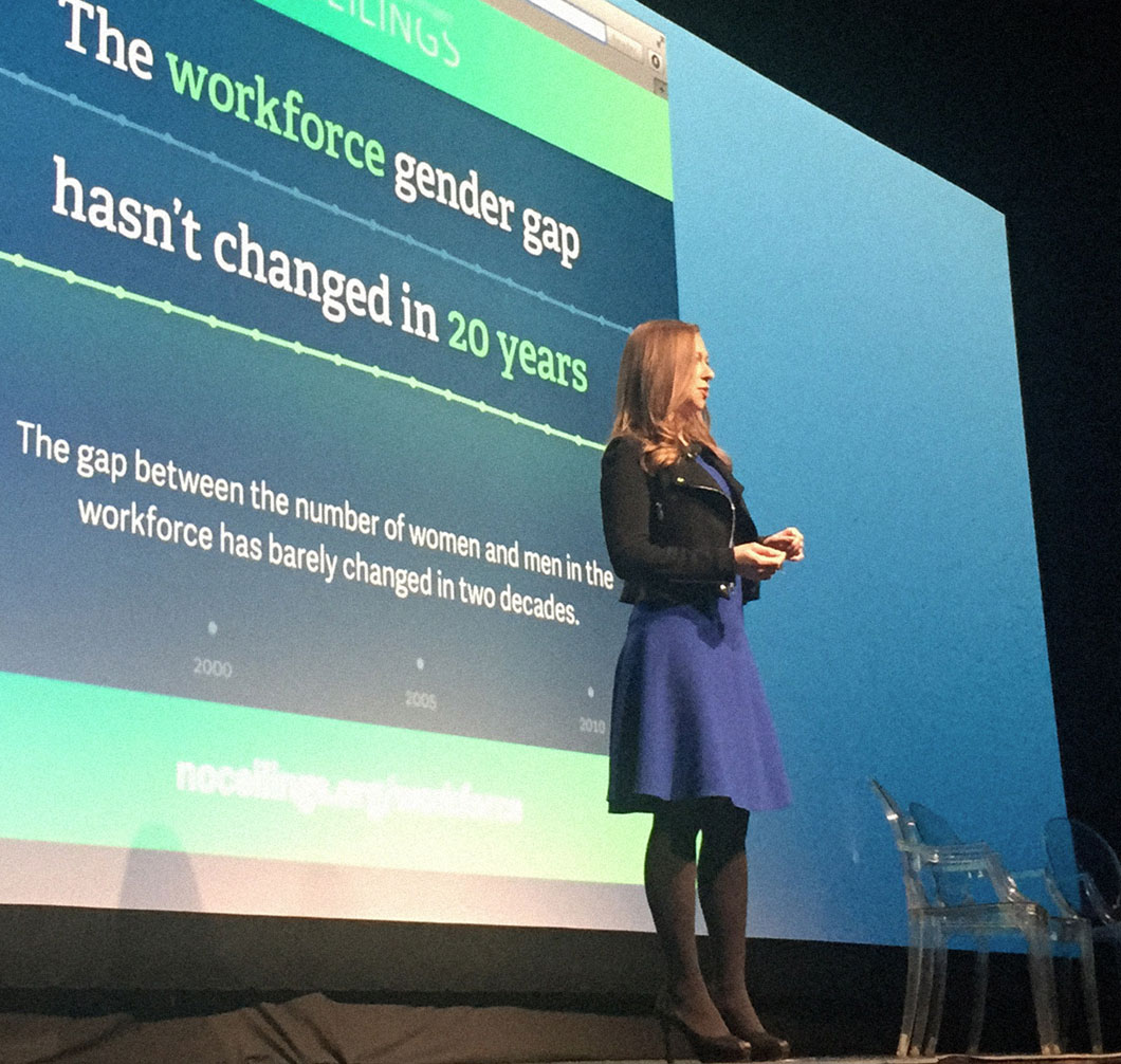
In conjunction with International Women's Day and the upcoming session of the United Nations' Commission on the Status of Women, we're thrilled about the launch of No Ceilings: The Full Participation Project. Despite gains over the last twenty years, we still haven't reached gender equality worldwide. The gap in the share of women in the workforce versus the share of men has barely changed in two decades. To make matters more grim, the United States is one of nine countries worldwide that doesn’t provide for paid maternal leave.
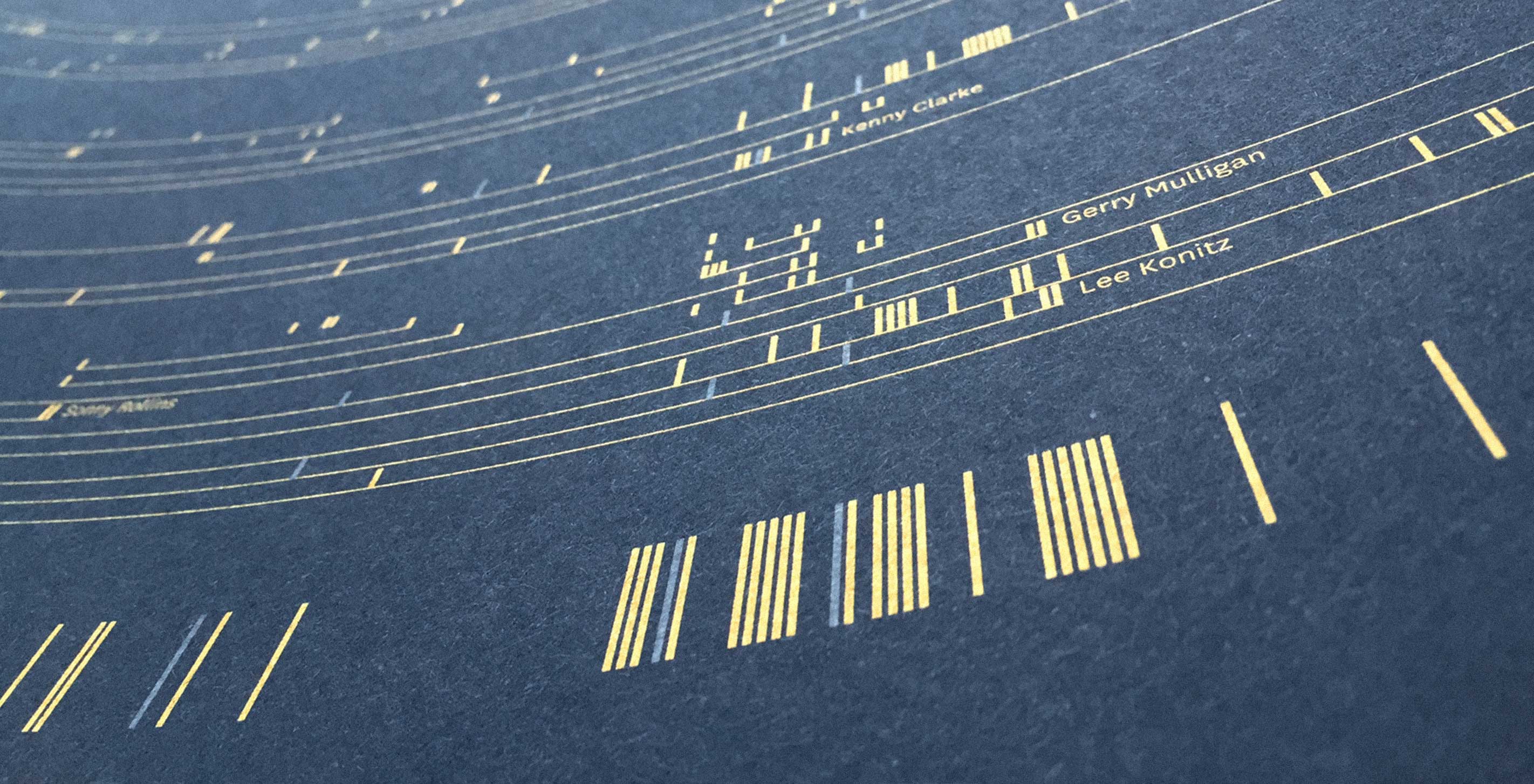
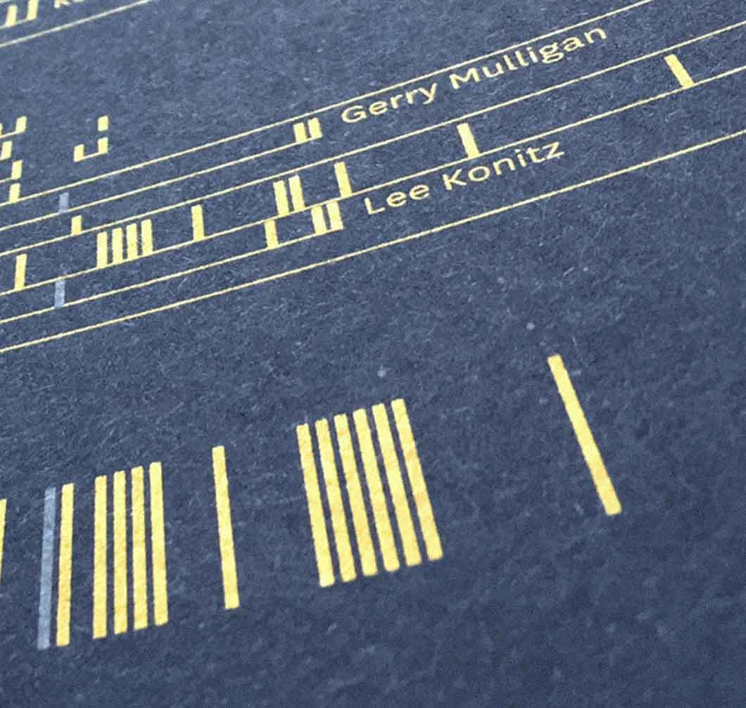
We are very excited about the release of our latest poster, Scaled in Miles. Based on one of the greatest jazz musicians of the twentieth century, Scaled in Miles looks at Miles Davis’ career through a timeline of his recording sessions and the musicians who collaborated with him.
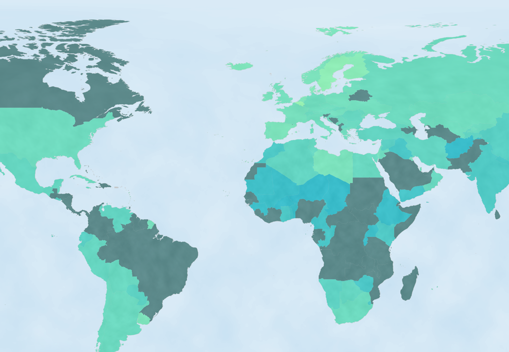
No Ceilings: The Full Participation Project is committed to using data as comprehensive evidence to measure the status of gender equality around the world. Our latest video for the Clinton Global Initiative uses data to demonstrate the progress of women and girls since the UN World Conference on Women in 1995. While the video gives a high level summary of CGI-related topic areas, we found it important to share a more granular, interactive version of the findings that fed into the piece.
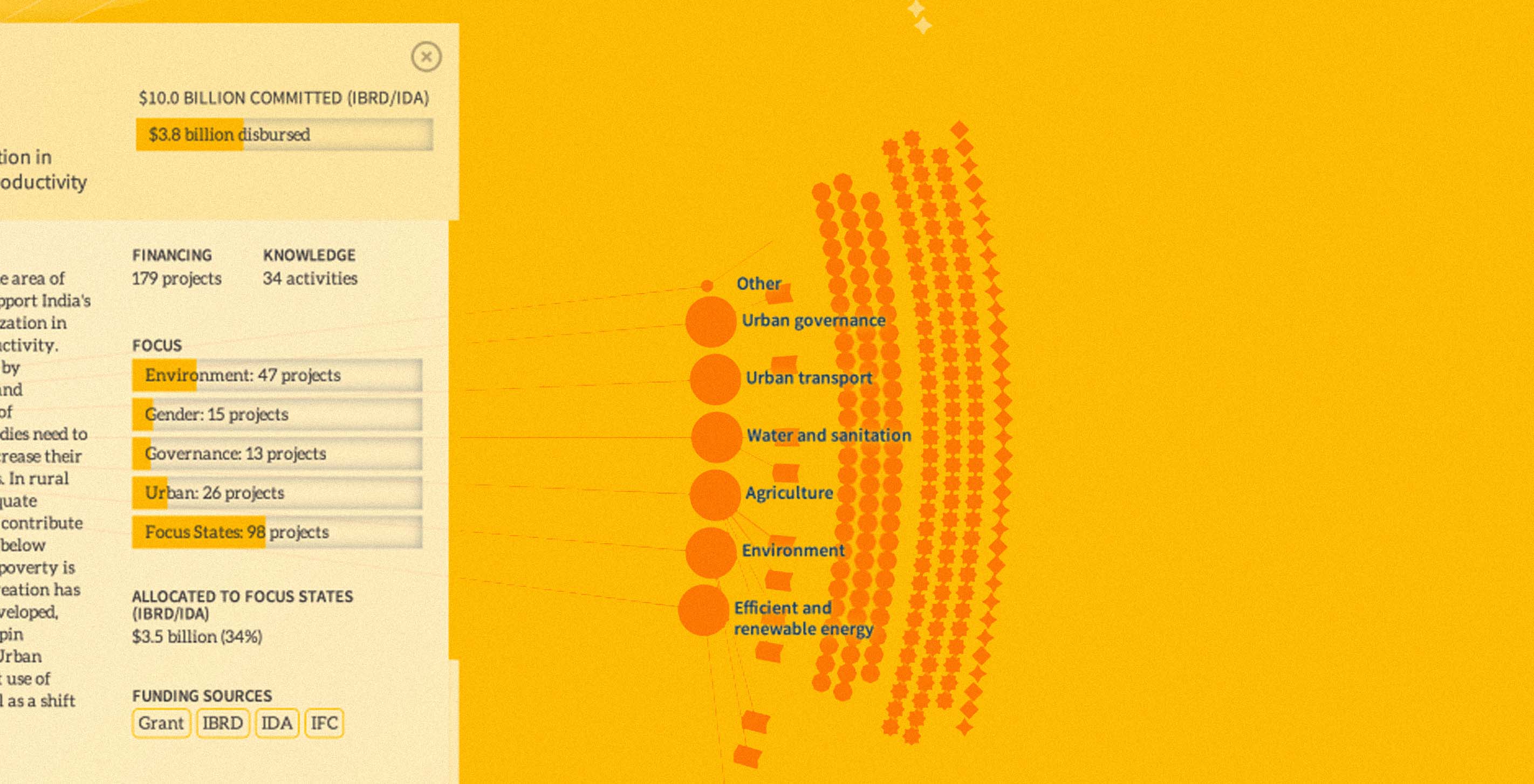
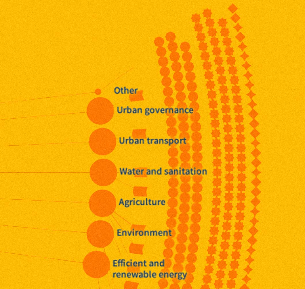
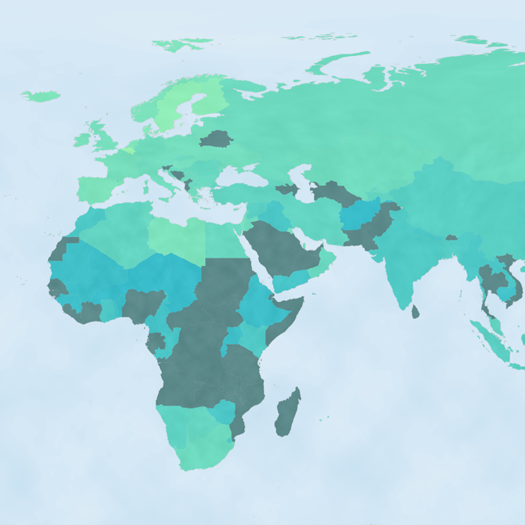
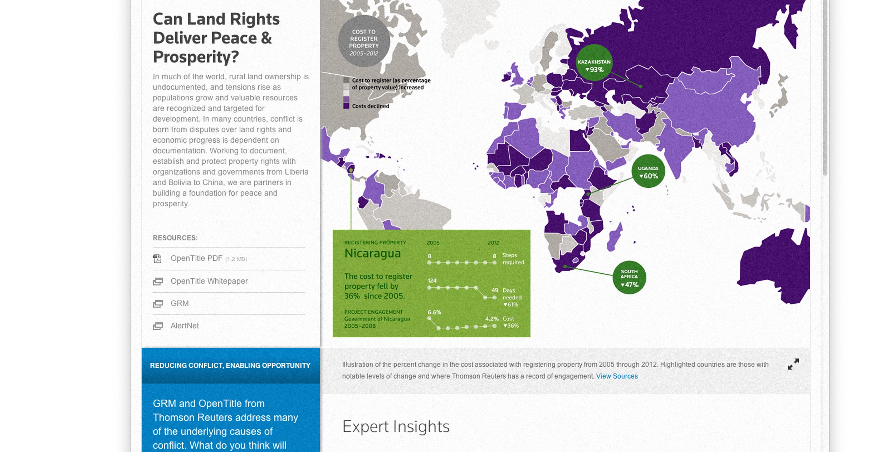
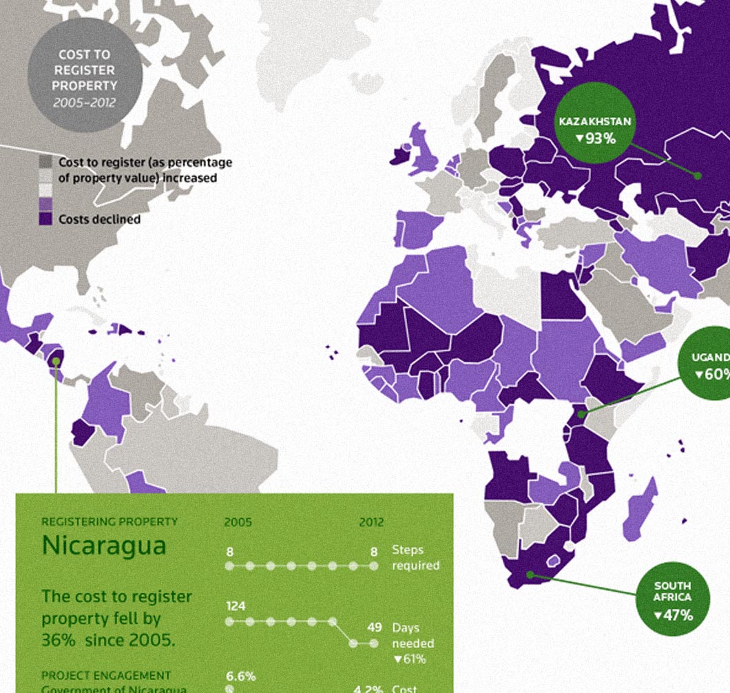
Despite unprecedented economic growth over the last fifty years, India is still home to one-third of the world's poor. Our latest project with the World Bank Group explores the Country Partnership Strategy for India (CPS) — a multi-billion dollar investment aimed at ending extreme poverty and promoting shared prosperity in one of the world's most populous countries over the next five years.
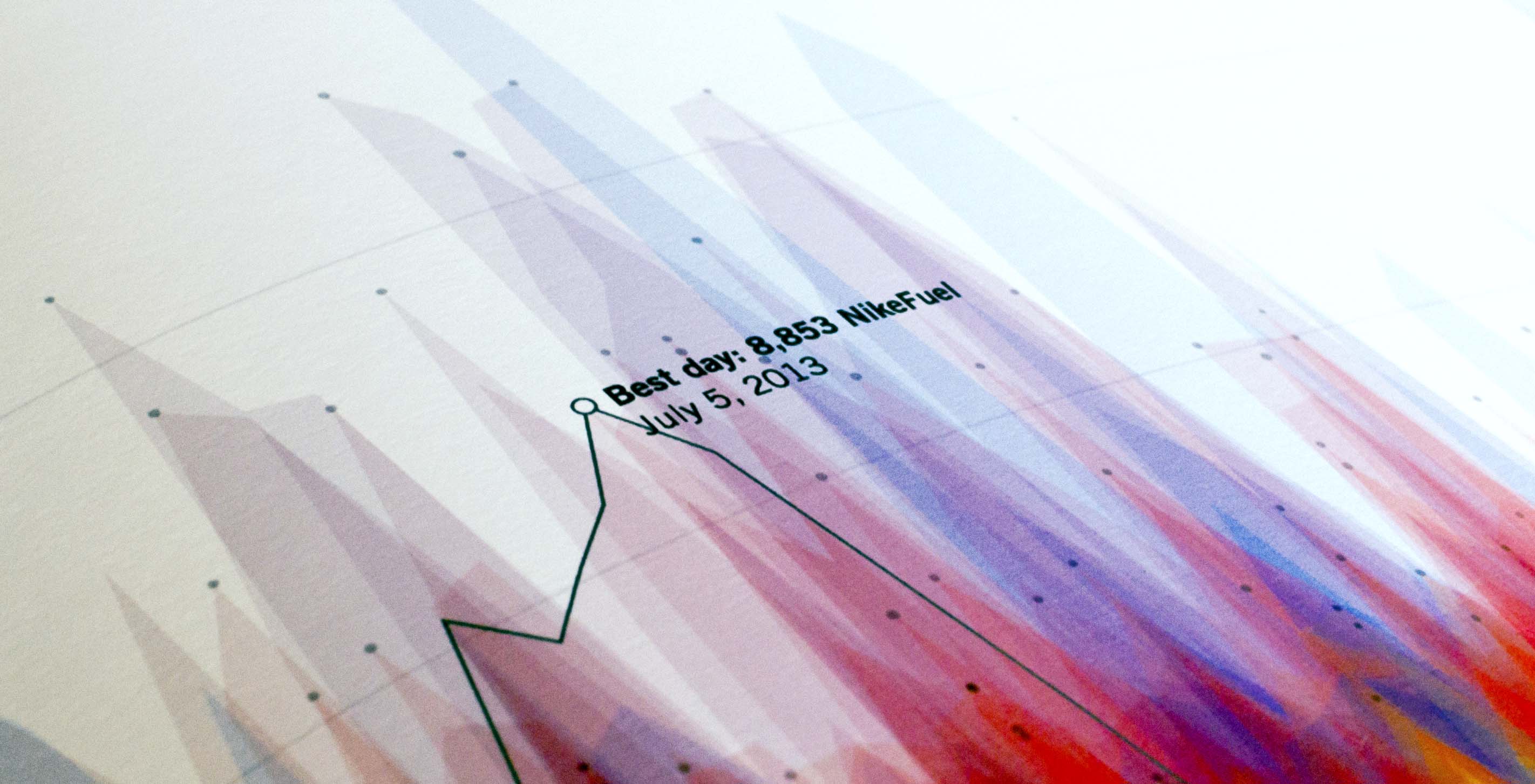
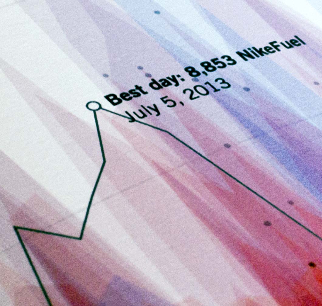
Most of our team at Fathom began wearing Nike+ FuelBands last January. By the end of the year, we had accumulated enough data to start creating interesting code-based sketches of our activity. What emerged from each person's data was a visually unique and telling story of their daily and weekly activity trends. As we fine-tuned the code to encapsulate more users’ information, it became increasingly clear that the portraits represented individualized routines, behaviors, and lifestyles. The exploration evolved into a detailed poster that depicted exercise trends, work routines, and even implications of sleep patterns. Today, those original sketches have graduated into the 2013 Year in NikeFuel, a site built for Nike that allows the entire FuelBand community to see a unique portrait of their personal activity.
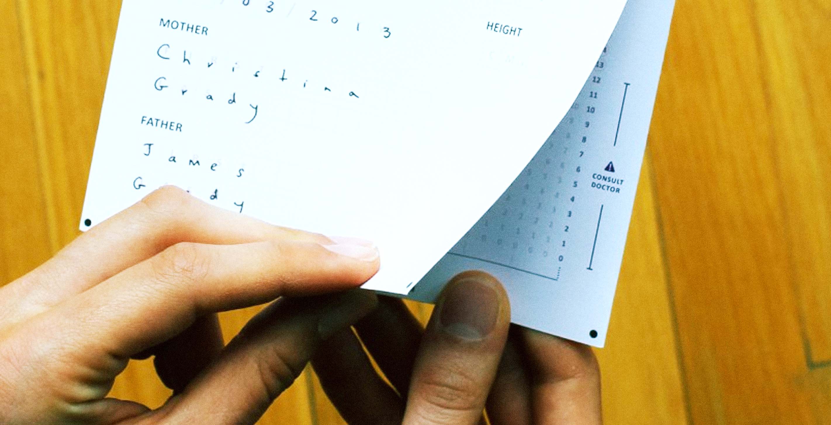

In addition to taking on new projects, interns, workshops, and leadership in the last few months, we were excited to enter Records for Life, a design challenge sponsored by the Bill & Melinda Gates Foundation. The challenge focused on reimagining the child health record — a humble document that is responsible for a tremendous amount of information exchange during the first five years of a child's life.
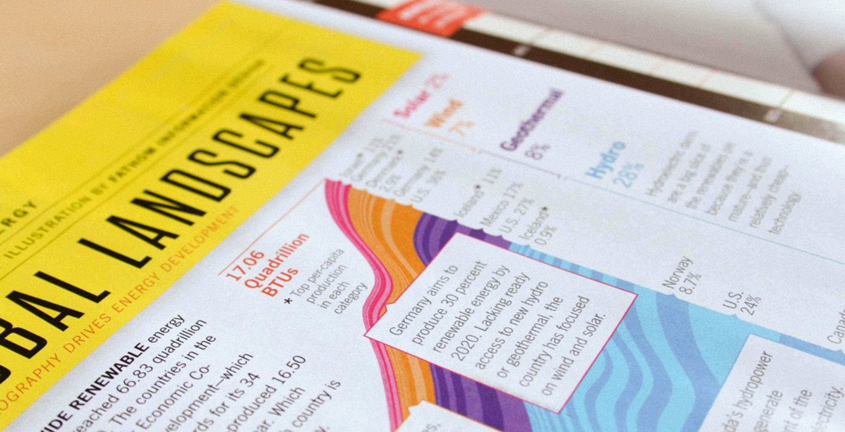
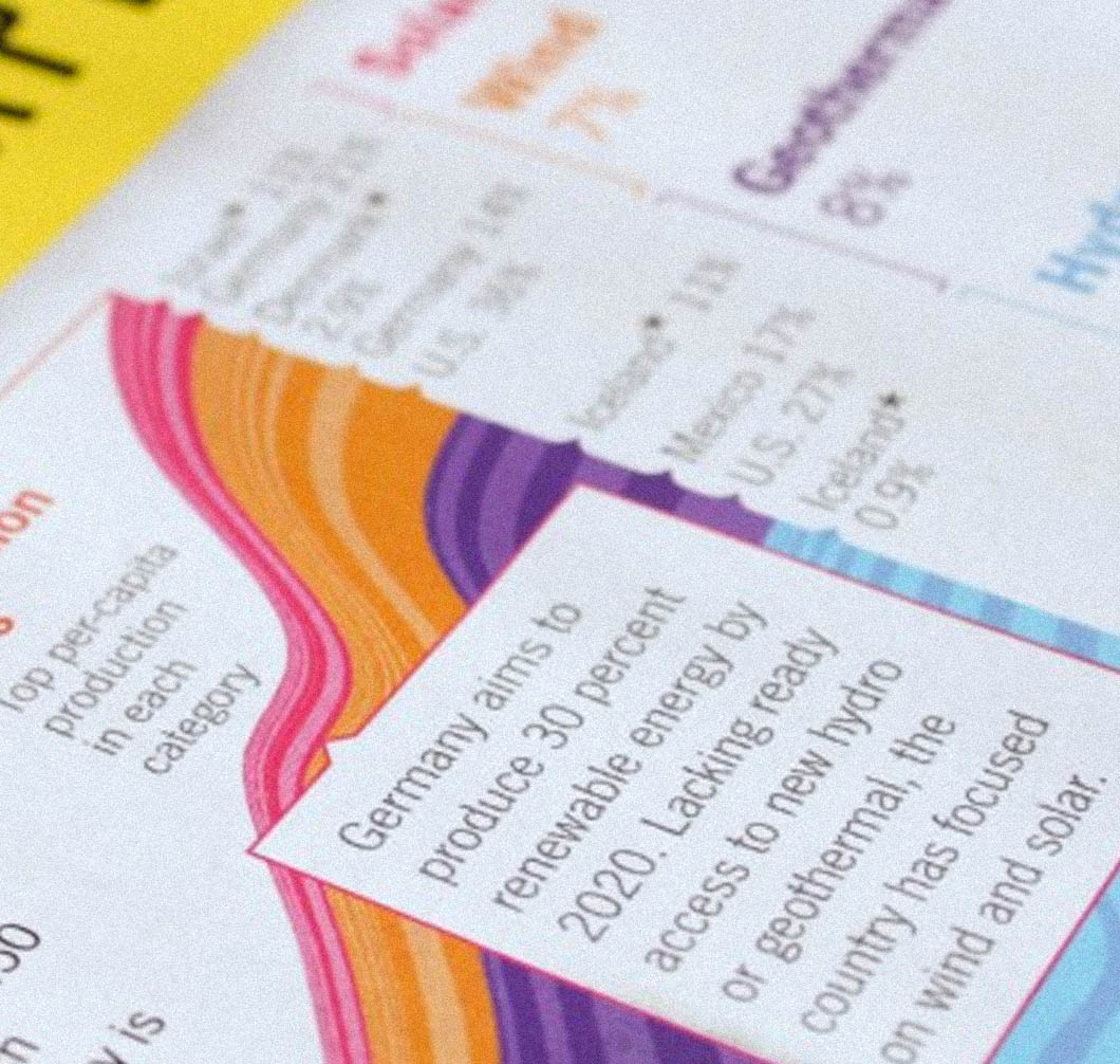
Popular Science publishes a special energy issue every two years. We designed a 2011 spread that looked at where U.S. energy comes from, where it goes, and how much is lost along the way. The biennial is upon us, so we were excited when Katie Peek got back in touch for this year's issue. She asked us to research the innovations in renewable energy production that were taking shape worldwide, and to propose a couple of stories.
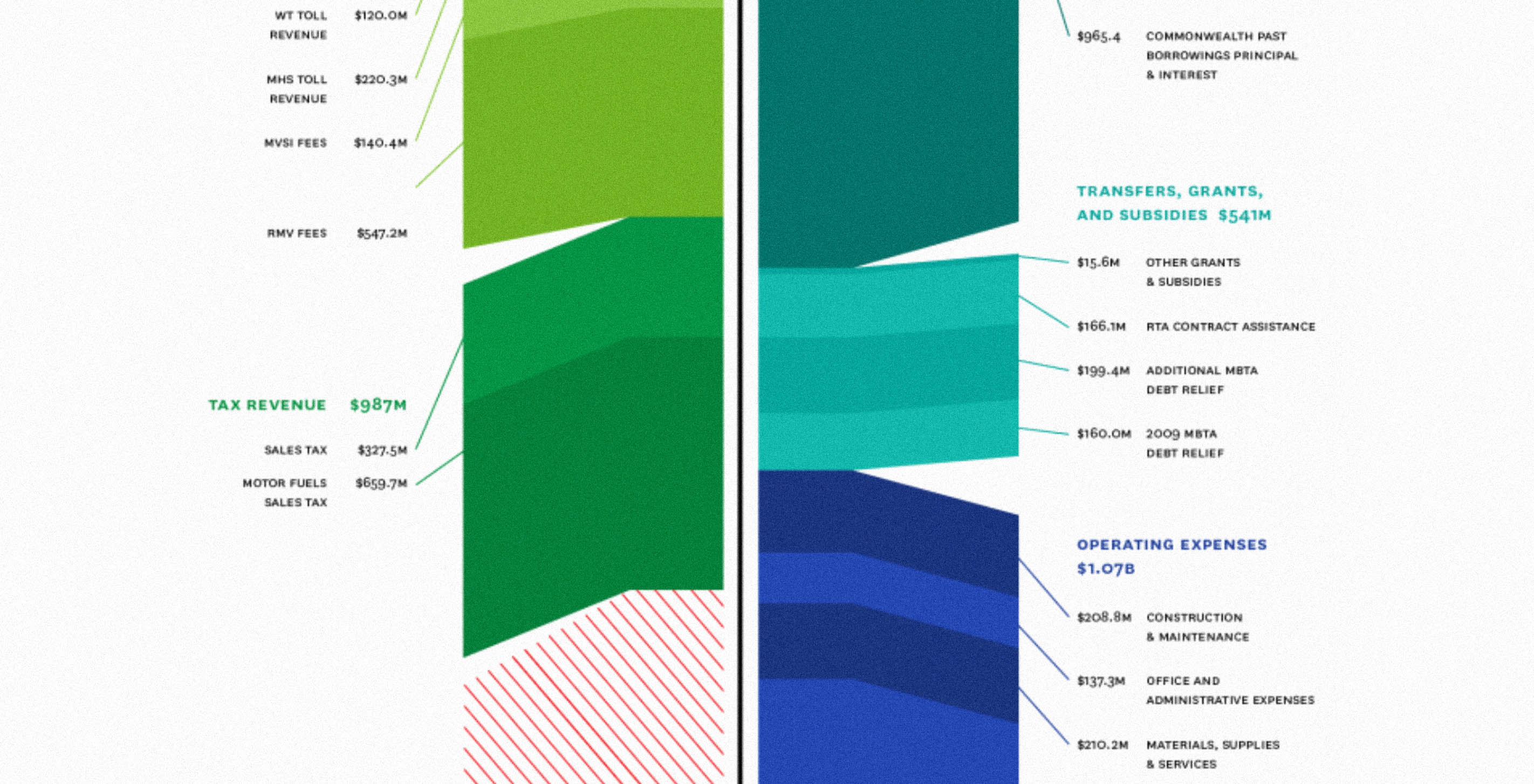
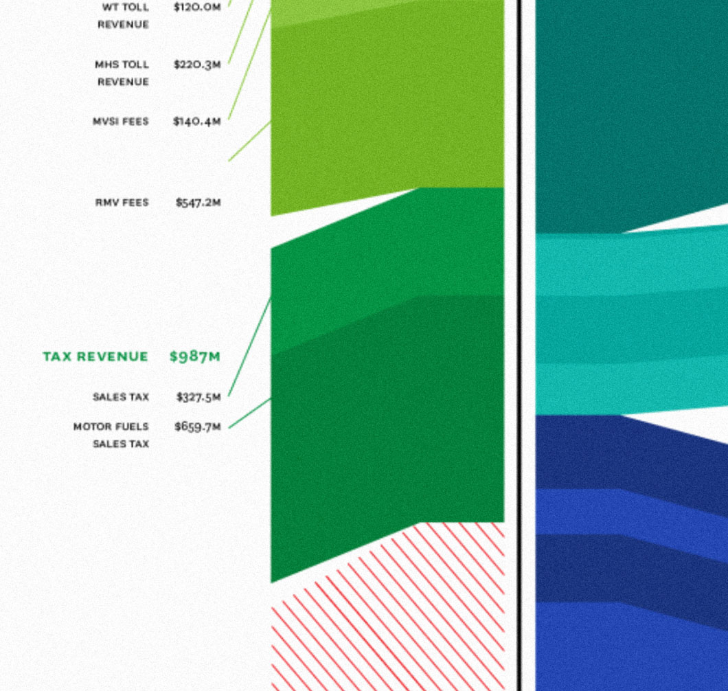
As debates around the state transportation bill heated up this month, we teamed up with the Transportation for Massachusetts Coalition (T4MA) to create a series of infographics that capture the complexity of the Bay State’s transportation network. Since most of the Fathom team commutes via public transportation (the rest bike to work), we felt strongly about contributing clear and readable graphics that could be used in the course of the T4MA advocacy campaign. We have a vested interest in seeing that network remain in good working order, accessible, and affordable.


As debates around the state transportation bill heated up this month, we teamed up with the Transportation for Massachusetts Coalition (T4MA) to create a series of infographics that capture the complexity of the Bay State's transportation network. Since most of the Fathom team commutes via public transportation (the rest bike to work), we felt strongly about contributing clear and readable graphics that could be used in the course of the T4MA advocacy campaign. We have a vested interest in seeing that network remain in good working order, accessible, and affordable.
Thomson Reuters released their 2012 Annual Report online last week. While VSA Partners designed and implemented the site, we worked on a set of five graphics that highlight a selection of Reuters’s core business units.


We are thrilled to announce the launch of Connected China, our collaborative project with Thomson Reuters. Available on the Web as an HTML5 application, and optimized for the iPad, Connected China uses a custom database to explore the cultural and political factors that shape the dynamics of power in modern China.


Our latest piece for GE (ge.com/visualization/annual) explores 120 years’ worth of their annual reports, spanning the years 1892-2011. The initial idea was to look at how words were used over time: plotting the emergence and disappearance of themes over more than a century of history.
The band is gonna take a short break, but we'll be back in 15 minutes.