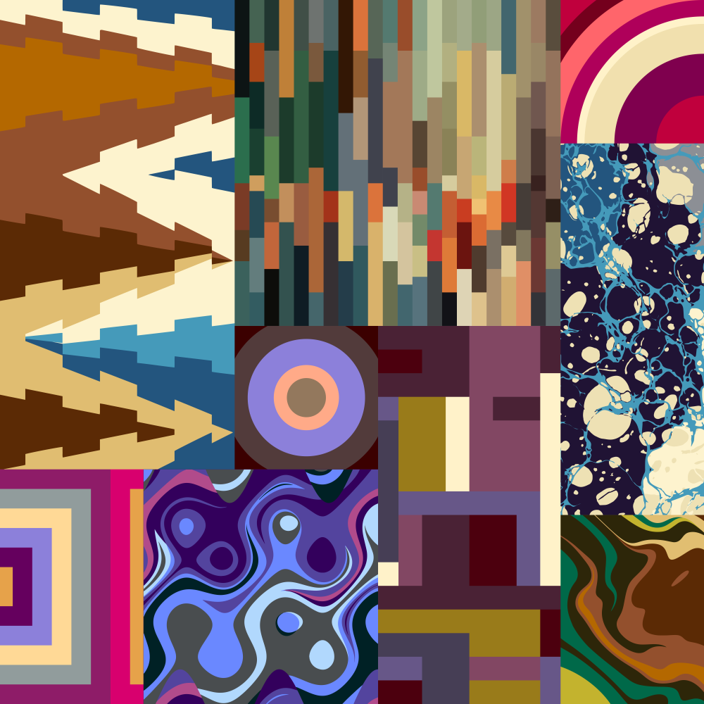
Our most recent release of the year was a short educational piece on color and how to build a simple palette.
The piece has 3 sections, Color Principles, Color Relationships, and Color Families, that teach you about hue, chroma, value, rhythm, tints, and accents. After you complete the lessons, you can do the Palette Challenge, a short exercise that helps you create a 7-color palette around a specific word or concept. Some of words you can choose are “cozy,” “expensive,” “polar,” and “medieval.” Check the piece out here.
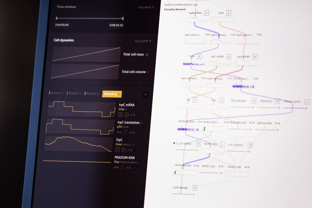
Earlier in the year, we completed the second round of a project with the Markus Covert Lab at Stanford.
Several years ago, the Covert Lab created a “whole-cell” model that allows researchers to run simulations of reactions and processes inside a single cell. The model was a breakthrough in systems biology, opening the door to a wealth of possibilities in biological research. However, they didn’t have a good interface for interacting with the data — in order to identify bugs or verify hypotheses, someone on their team would have to perform keyword searches on enormous text files or write custom Python code to make sense of the outputs.
We built a 1.0 version of an interface for their team in 2018. It focused on visualizing the complex network of molecules and processes, which both simplified the search process and enabled opportunities for discovery. After completing Phase I, we left the Covert team to test out the tool for several months and gather feedback for Phase II, the phase we completed this year. The resulting 2.0 version incorporated their feedback, adding the ability to identify and analyze multiple cell pathways throughout a network, and fine-tuning the research and discovery abilities of the tool.
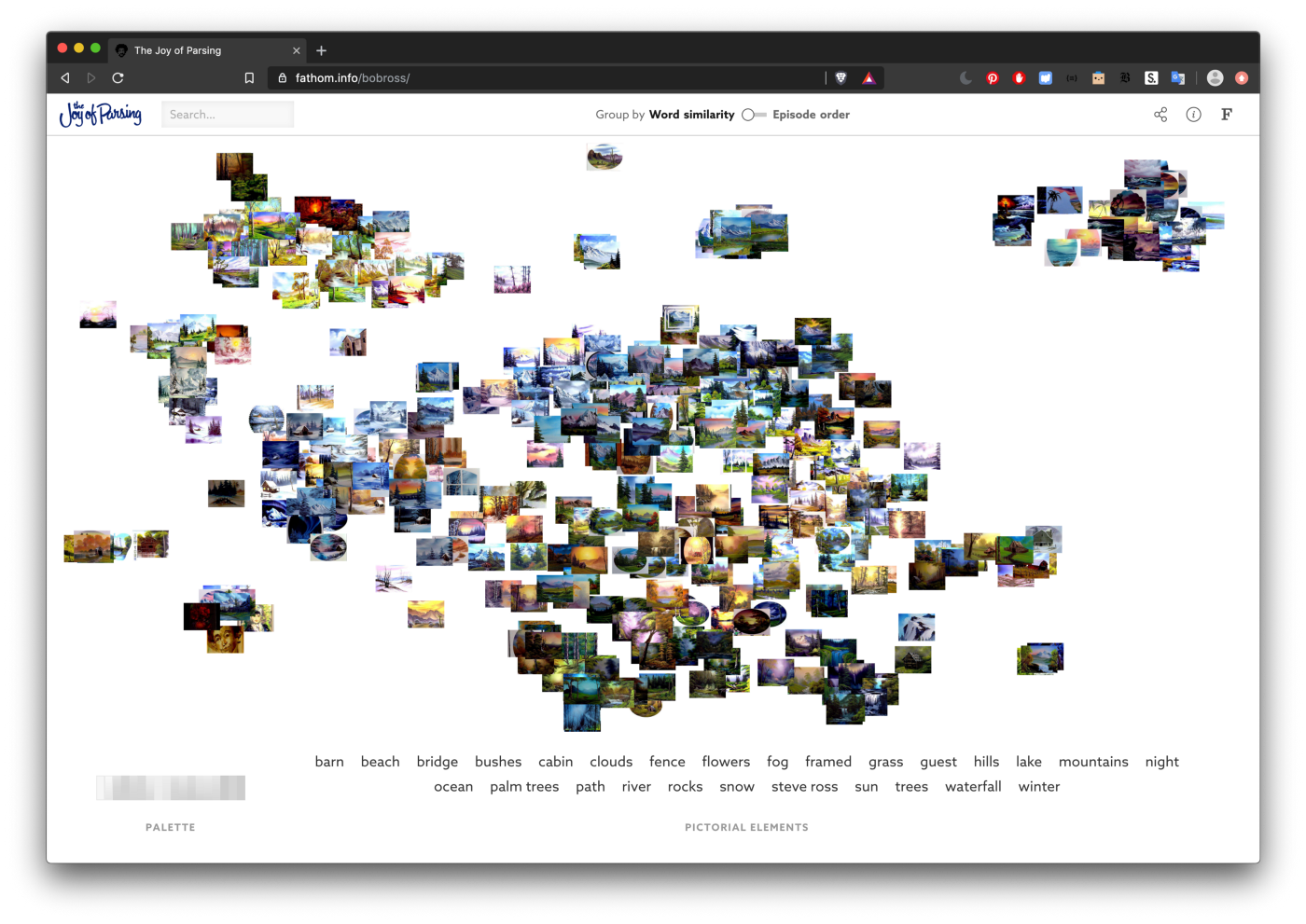
This spring, we released a small web piece called The Joy of Parsing.
In this piece, we made use of the custom text parsing and document analysis tools we’d built over the course of a 2-year grant. Using these tools, we analyzed the transcripts of all 403 episodes of Bob Ross’ “The Joy of Painting” see how his famous descriptions of painting evolved over 31 seasons. We gathered images of the painting from each episode, and mapped them out according to the similarity between their transcripts. It’s so fun to see similar paintings group together based entirely on how Bob Ross described them to his audience! You can read a full blog post about the piece here.
Over the summer, we hosted an army of interns, coming from a range of backgrounds on the designer to developer spectrum.
We wanted everyone to feel like they had the tools to do the kind of iterative design and development work that we do, so we put together a week-long version of the design class that Ben teaches at MIT in the spring semester. The workshop focused on basic coding skills, quick design iteration, and the role that data, audience, and context play in information design. You can read a longer explanation of the class here, but in short — the class was a success, and it’s inspired us to think about developing more boot camp-style workshops and bite-sized educational materials.
We’ve also been thinking about what it takes to design an inclusive hiring process. Opportunities like our summer boot camp helped to level the playing field once people make it to our office, but we’re eager to find new and improved ways of making sure a diverse and inclusive range of people are making here in the first place. Anisha collected her research on biases in hiring in this blog post.
At the end of the summer, we had the opportunity to participate in the Mayo Clinic’s annual Transform Conference.
The conference came shortly after we finished a 4-month engagement with Mayo’s Center for Innovation. We spent those 4 months rethinking the patient data pipeline and building prototypes of concepts for new ways both patients and providers to interact with data. As part of the conference, Ben gave a talk on our process and how it can be applied to healthcare.
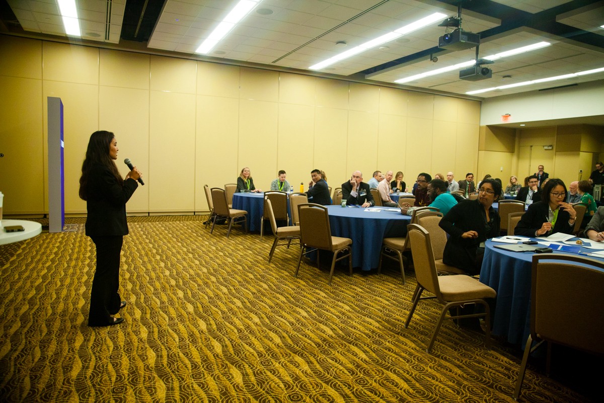
Anisha, Martha, Olivia, and Ben then led a related workshop. In the worksheet, we gave each group of participants a specific set of patient data, a common healthcare scenario (such as a GI doctor seeing a new patient for the first time), and a medium to design for (like a desktop or a piece of paper). We walked everyone through the (abbreviated) design process, helping them sketch out wireframes of interfaces for their specific scenarios. The exercise sparked a lot of discussion, and people from all over the healthcare sector had great things to say about it. You can read more about the workshop here and about Ben’s talk here. You can also see a video of the talk here.
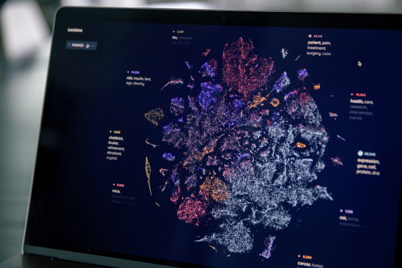
Laniakea is the final in a series of projects created for a 2-year grant we received to research, design, and develop tools that analyze large document sets. In Laniakea, thousands of documents are mapped by their content — not by spotty metadata. The tool promotes serendipitous exploration. It focuses not on the ability to search for specific, individual documents, but rather, it provides a comprehensive overview of a full document set, highlighting which topics are present throughout, and how those topics overlap and relate to each other. Currently, you can explore 3 different corpora: 100,000 PubMed articles, 37,552 Wikipedia articles, and the subset of all Wikipedia articles that mention the word ‘ghost’ or ‘ghosts.’
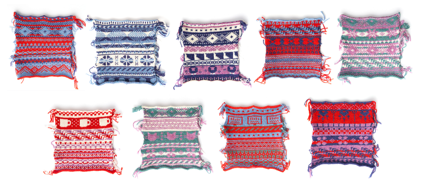
A 2019 recap wouldn’t be complete without mention of our knitting machine.
Client work typically doesn’t involve much knitting (unfortunately…) so we were excited to use our annual holiday card as an opportunity to put the knitting machine to good use. Sarah, one of our designers, knit a set of 9 holiday samplers, one for each person in the office. She generated the patterns from our answers to a series of questions about our holiday activities, and we photographed these samplers for the card. You can read more about the process of creating the samplers in Sarah’s blog post.
On January 4th, Fathom will celebrate its 10th anniversary!
We’d like to extend a warm thank you to everyone who has made these 10 years a success. From employees and interns to clients to those of you enthusiastically following along on the sidelines — thank you. Here’s to another fantastic 10 years!
We’d love to hear what you’re working on, what you’re curious about, and what messy data problems we can help you solve. Drop us a line at hello@fathom.info, or you can subscribe to our newsletter for updates.