
We began with many hours of research, prototyping, and user feedback, quickly becoming experts in mortgages, conservation easements, and the many ways in which farmers approach buying land. From there, we built a working prototype focused on comparing land purchase options. Common concerns from an NYFC feedback session led us to a two-pronged approach for the final tool. Hearing the need for more educational material, we added animated case studies to complement the calculator, each one illustrating the steps a real farmer went through to purchase land. We also built a lightweight server app to power the tool, which allowed NYFC to collect the user data and feedback they needed for a USDA grant funding the work.
Research
Everyone’s land acquisition process is different. We had to look at many different variations of how farmers have been able to access land in the past — from government grants to private investors — and decide which scenarios were the most common.
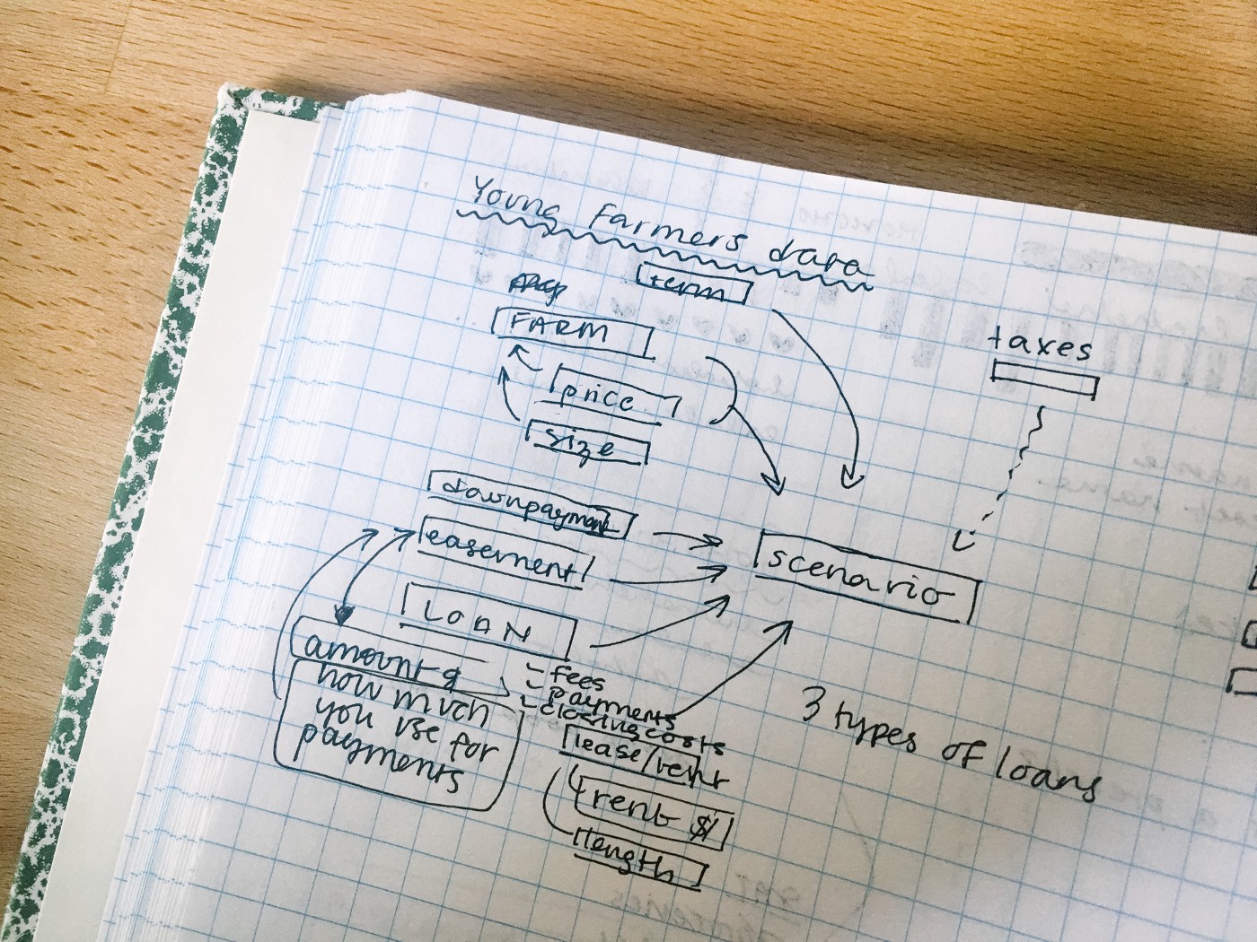
In most cases, farmers work with farm credit agencies, the Farm Service Agency (FSA), and land trusts, so we focused on those types of financial relationships.
Conservation easements are a big part of NYFC’s advocacy, so we learned a lot about the different ways in which they’re used and worked on ways that they could be incorporated into the calculator.
We also examined many of the tools we knew farmers were already using. Home mortgage calculators, like Zillow’s, were popular choices, but they didn’t allow for easy comparisons, nor did they include a lot of the other variables to consider when it comes to buying land for a farm.
Since we could assume that their target audience was serious about farming, our job was not to teach financial basics or build a business plan, but instead to help them untangle the messiness of land cost calculations, and create results that they could then plug back into their own plans.
Prototype
The first phase of this project was to develop a prototype that could be used to source feedback farmers, as well as other professionals who work with farmers to plan their finances, such as farm credit lenders.
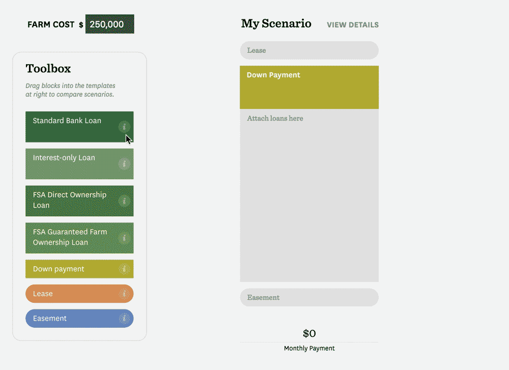
A big part of our initial design challenge was to build something that felt intuitive and friendly, but still accurate and trustworthy. The original prototype focused on a drag and drop interface, which we thought reinforced the idea of “applying” funds to different scenarios.
The prototype also contained a walkthrough to assist users with less mortgage knowledge, and a final big-picture view used to look at payments over time. We wanted to address a wide range of users in the prototype phase in order to see a) which type of user found the tool most useful, and b) if our design decisions were addressing their needs. For example, were users less familiar with mortgages able to use the tool and learn something from it? And for users who were further along in in their planning, were they able to compare scenarios in a meaningful way? Was it an obvious and significant improvement over using a custom spreadsheet?

User Feedback
A few months after releasing the prototype, we were fortunate enough to be able to meet with many of the stakeholders to review their use of the tool.
The key takeaways were that the tool needed to be simplified further, more focused on comparing the affordability of different options, help users understand their possible options, and where they have to do more of their own research.
Strategy & Design
A two-pronged approach in reviewing the feedback, we felt that the calculator alone wasn’t enough to help users understand their options. We suggested balancing the quantitative tool with more qualitative “case studies” that walked through the land access stories of real farmers.
Calculator Redesign
Based on the prototype feedback, we needed to consider a few things:
- How can we simplify the scenario building?
- How can we make the tool work for people who are still missing numbers they need, while also encouraging them to do more research?
- What are the most useful results to compare “affordability?”
Clean and direct
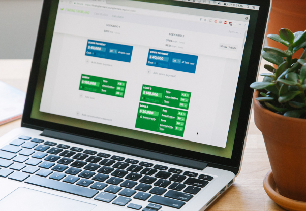
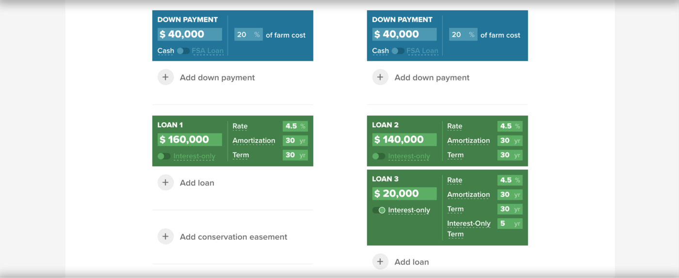
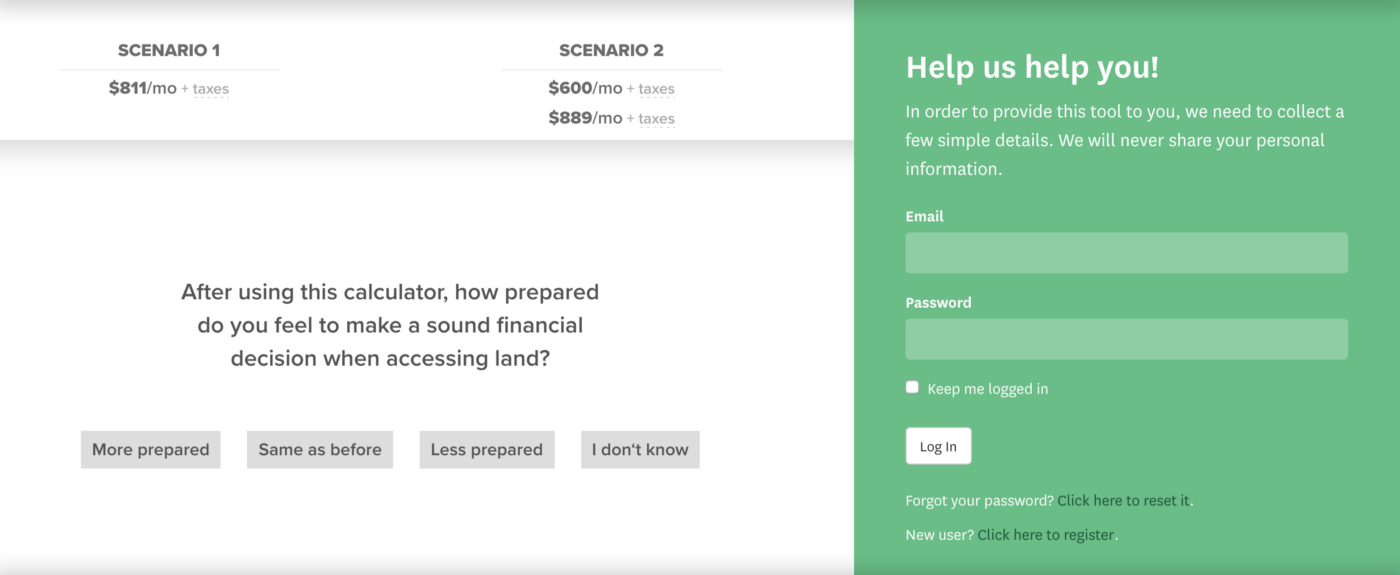
The original prototype separated the walkthrough, scenario building, and comparisons into three separate views. The redesign of the calculator showed all three on one screen, allowing users to more easily create scenarios and compare them. We also moved away from the drag and drop interface after seeing how users responded to it. In most cases, people were looking for a faster way of building so they could focus on the comparison. To address this, we reduced the number of “building block” options and switched to buttons to add or remove blocks.
In the original design, we did our best to hide any inactive numbers. However, users felt this was hiding too much. In the redesign, we kept all the numbers present, so the user can easily make changes. We also made sure that the tool would quickly and continuously provide a useful information with minimal user input. Often this is best handled by providing “default” numbers that users can change, which means that the interface is never in an “incomplete” state. But that wouldn’t work, because part of the tool’s purpose is to help inform users where they need to do more financial planning and research. However, many users may only have a vague idea of what their expenses like insurance or taxes may be. Instead, we made sure that you could get a rough picture with very few numbers.
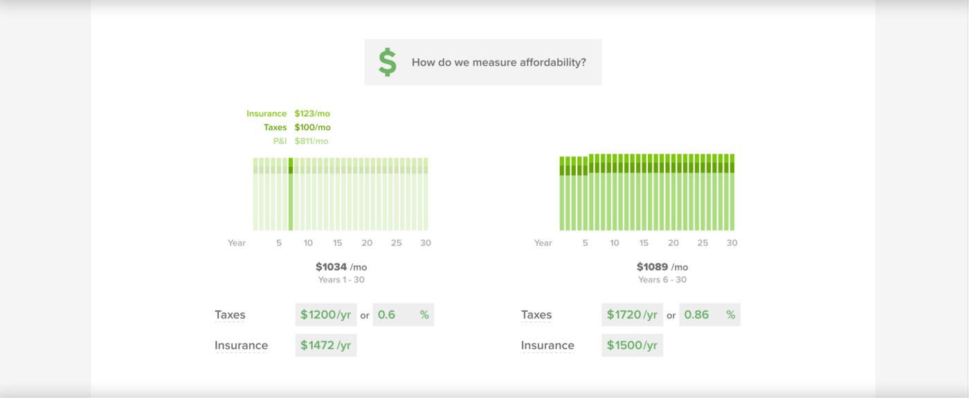
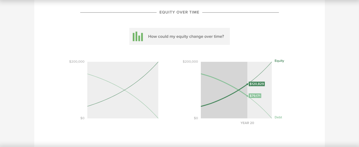
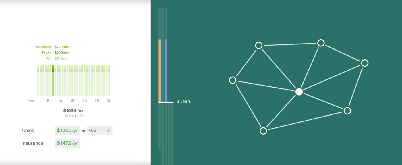
Taking an information design approach we carefully considered the interface of both what users enter and how to best depict the results. For example, the monthly payment visualization focuses on showing the breakdown of a monthly payment and how those proportions might change over time. The view also mirrors the tendency for people to budget on a monthly basis. The total costs view enables long-term planning, letting a user compare the overall cost of two scenarios — in particular, interest over time.
Case Studies
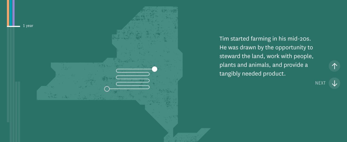
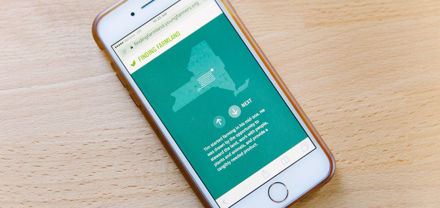
For the new case studies section, we looked at how to take complex scenarios and distill them into easy-to-understand steps. In listening to Tim’s story, we realized that a lot of time would pass between each stage of the process. We felt it was important to add a timeline to help beginning farmers understand that land acquisition can be a lengthy process, and to keep that in mind with their own planning.
Throughout the piece, we highlighted which groups Tim was working with at each step, helping introduce users to options they may not have been aware of.
Deployment
A custom server app powering the tool handled logins and collecting user feedback needed for the USDA grant. We kept this “backend” portion as simple as possible so that it was effective enough for their immediate needs, but would require as little future maintenance as possible.
Looking Forward
Working with NYFC, we were able to take lots of disparate research and materials, incorporate user feedback, and package it all into a clean and accessible tool that directly serves their audience. And the result is more than just a calculator: it’s an online resource that provides a solid foundation for NYFC’s work in promoting land accessibility.
The project is part of a grant from the USDA that is split into three phases of work — a prototype, a beta launch, and a final release. With the prototype and beta launch phases complete, we’re excited to continue working with NYFC to refining the application for its final release in the coming year.
We’d love to hear what you’re working on, what you’re curious about, and what messy data problems we can help you solve. Drop us a line at hello@fathom.info, or you can subscribe to our newsletter for updates.