Last year, we partnered with State Street to build an installation depicting the scale, growth, and complexity of 200 years of finance. Recently, we revisited the piece to build a version for the web.

Founded in 1791, State Street has been a part of the US financial system since its earliest years. This experienced viewpoint gives them an understanding of how the global financial system is growing and adapting to keep pace with technological and societal progress. While planning for an upcoming event, they reached out about building a visualization to convey these ideas to a broader audience as part of an on-site installation. With a four-week timeline, we jumped right in: sifting through possible data sets, brushing up on our financial vocabulary, and building prototypes with the selected data.
We started with almost 40,000 data sets spanning 225 years of global finance, from commodity prices to inflation rates. Despite the quantity, the data provided more breadth than depth, which meant we needed to find ways to frame and juxtapose useful data to provide more insight. For example, we looked at S&P stock indices from two different angles — the interconnected nature of industries, and the growing complexity within industries—each perspective revealing something new about the nature of the system.
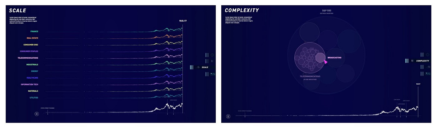
Once we identified the relevant data, we honed the story further, landing on four facets of growth: data, connectivity, complexity, and scope. In order to depict these in meaningful ways, we sketched several design iterations to find the best representations for the data. As with all of our projects, the design and development go hand-in-hand, with prototypes using real data to inform our design comps.
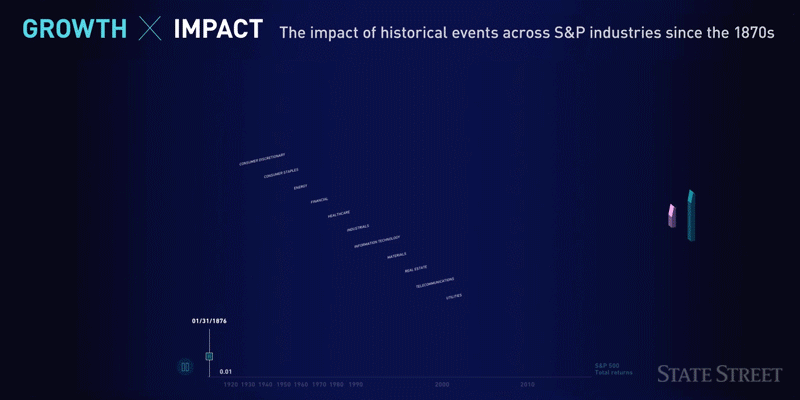
Part of designing appropriate representations was re-introducing the data through recognizable events. Instead of asking viewers to make sense of stand-alone closing price values or stock market returns, we associated these indices with relatable events such as famous market crashes, or through the stock prices of everyday items.
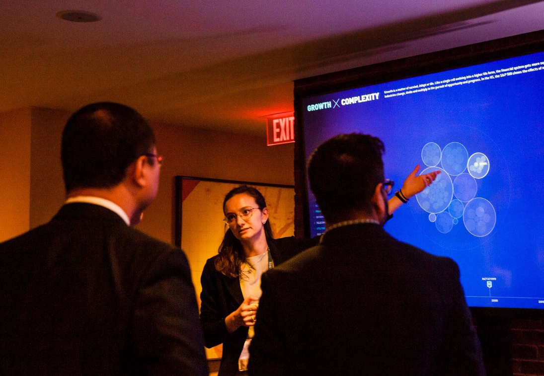
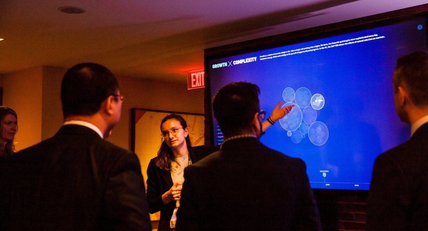
Part of our design process is considering the specific context and audience for the piece. As an installation at an event, our expectation was that most users would see it from a distance (so it needed to be visually striking from across the room), and those that used the piece would interact with it briefly, exploring it for thirty seconds or a few minutes between conference sessions.
The audience itself was very specific: event attendees who were involved in finance, ranging from field experts to emerging tech leaders. This meant that anything shown would need to be clearly articulated and relatable to experts in the field.
The result is a visualization that allows users to quickly immerse themselves in the data, comparing consumer discretionary sub-sectors across decades, or see the relative impacts of historical events across industries. The piece also reveals the exponential growth of data in finance since the 1980s, and the increasing prominence of emerging markets in global trade.
Not long after the event, State Street approached us to build a web version of the piece so that it could be shared more widely — for both internal and external audiences. Again working with a four-week scope, we rebuilt the project in JavaScript, using HTML5, Canvas, and WebGL so that it could run in a web browser.
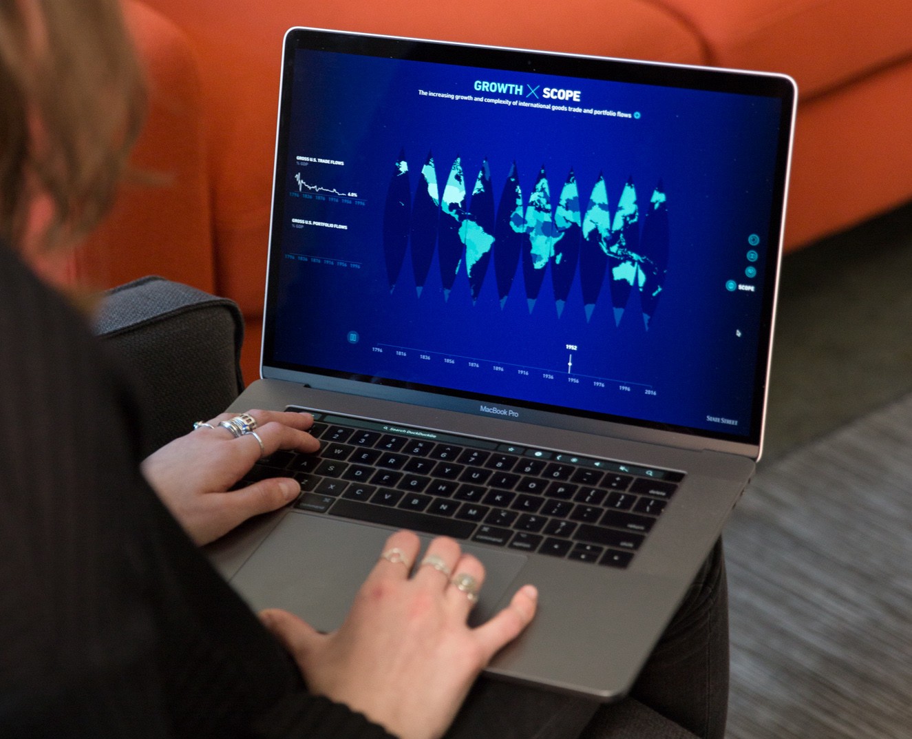
Along the way, we reworked the design to translate it from an installation-scale touchscreen to smaller laptop screens, and to handle interaction with a mouse or trackpad instead of touch. With the project now available online, a broader audience can explore the data, find stories, and ask their own questions.
We’d love to hear what you’re working on, what you’re curious about, and what messy data problems we can help you solve. Drop us a line at hello@fathom.info, or you can subscribe to our newsletter for updates.