
Recently, we wrapped up a project focused on aggregating and analyzing 16 years of survey data. The survey had over a thousand questions this year, and every year the questions vary — sometimes slightly (rewording or an additional option) and other times more dramatically (adding or removing questions). This is expected when working with survey data, but it makes analyzing any kind of longitudinal trends more challenging.
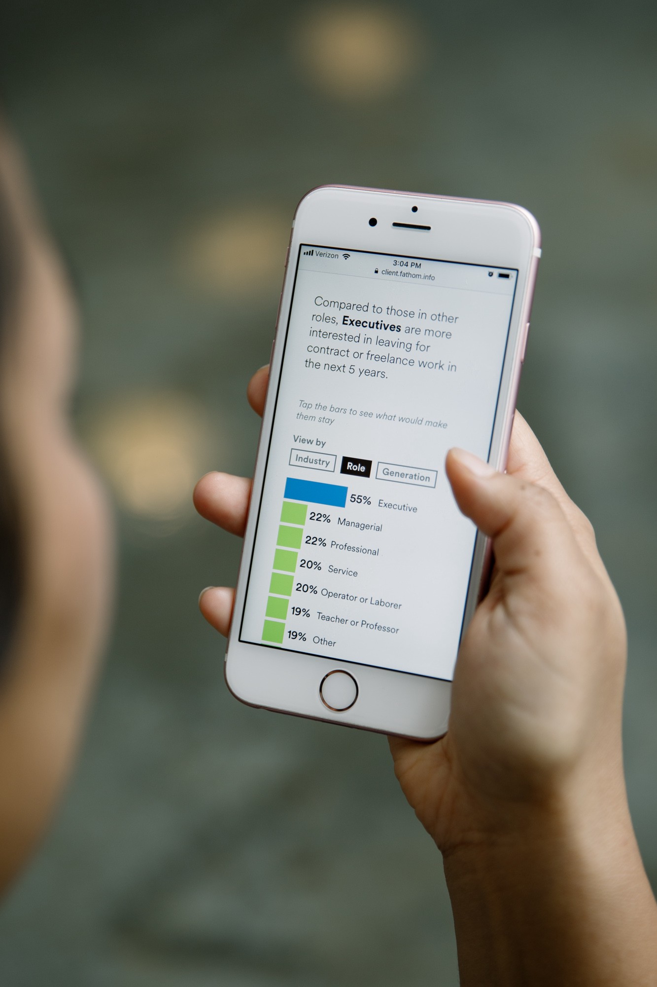
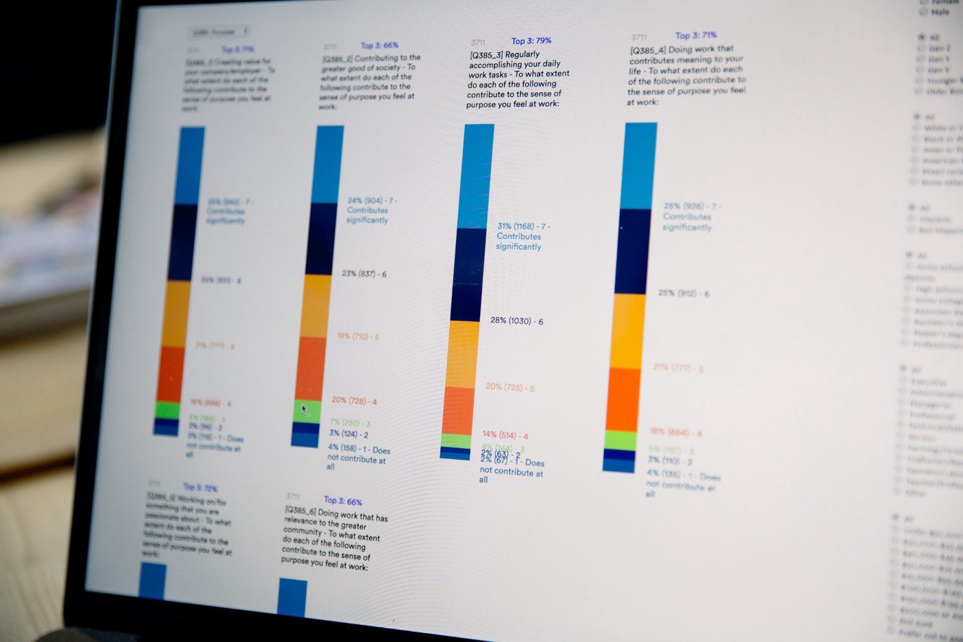
We first built a tool (seen below) to compile the data, graph the responses, and filter by demographic group. This helped us work with our partner to quickly determine trends and potential stories, as well as identify gaps in the data.
With those draft results in hand, we created a series of visualizations that can fluidly cross-cut the data by using a range of demographic filters, and explore the trends leading up to the most recent year.
Using algorithms and custom curation tools, we deconstructed court filing and news articles about the Mueller investigation.
Last year, we made a hand-illustrated poster detailing the relationships and events involving a few select players in the Trump/Russia investigation. More recently, we wanted to start making sense of the deluge of what was publicly known about the Mueller investigation—relying on court filings and news articles. We began with code to break apart the documents into individual information elements: people, dates, and co-mentions.
This kind of algorithmic approach can get you ~80% of the way there, but that the last 20% is much harder to do in code. Thankfully, humans are good at the sort of judgement calls and context-based decisions needed for that last amount, so we built curation tools that would allow us to refine the collections quickly. Is a specific reference to “Trump” referring to the President, the Tower, or one of the sons? You can spend weeks perfecting NLP/AI/ML methods for this sort of thing, or with the right tool, make the problem moot.

The result of these efforts is Porfiry, a piece in which we reconnect the individual moments into a timeline for each person and enable users to explore the connections.
Like so many of our projects, Porfiry required us to build a handful of small, custom tools along the way.
The tools we build aren’t just about enabling quick curation (merging and splitting names, correcting text selections around dates). An approach to Bézier curves later evolved into another online project: the Bézier Playground.
Mark built the initial sketch to explore flexible, elegant curves that could represent the connections between different people and mentions in Porfiry. After a bit of refinement, we launched a public version that animates the control points for a circle of Bézier curves, allowing users to tweak the parameters to affect the overall shape. Check it out! Mark also wrote about it in more detail here.
Around the studio
- We’re excited to welcome Jenny Proscia as our new studio manager!
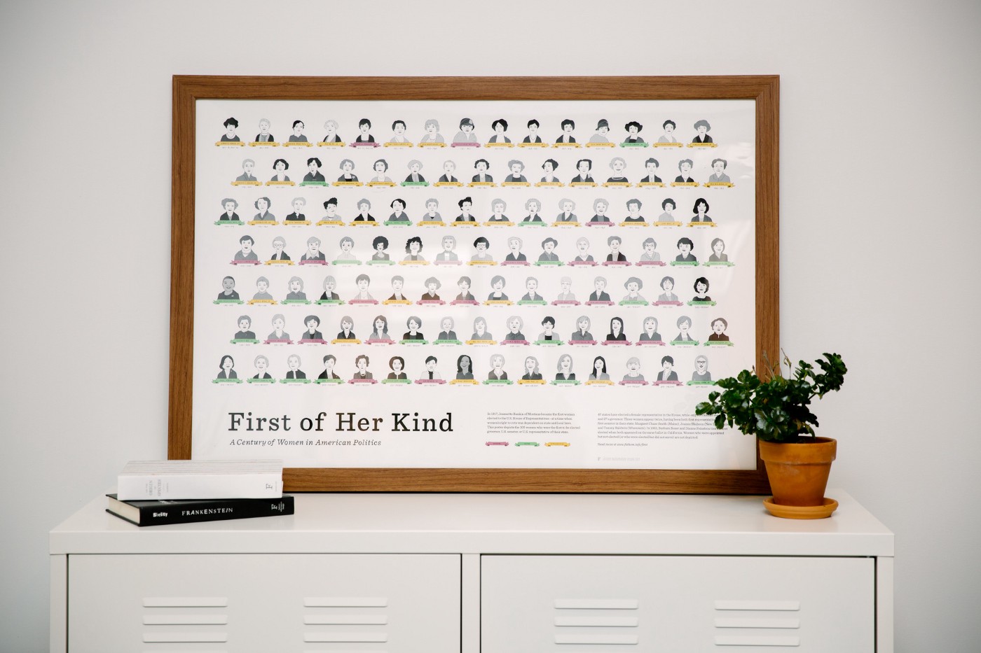
- We recently updated First of Her Kind, a poster featuring custom illustrations of the first women to serve as governor, representative, and senator in each state. This version adds several women who were elected during the 2018 midterm elections. We also rotated it to a wide format, and added a more apartment-friendly 18x12" size.
We’d love to hear what you’re working on, what you’re curious about, and what messy data problems we can help you solve. Drop us a line at hello@fathom.info, or you can subscribe to our newsletter for updates.