We’re happy to report that for another year, our curiosity and love of print have enabled us to give back to our local community and beyond. Our latest printed project—The Preservation of Favoured Traces—continues the tradition. Proceeds from all our books, offset posters and on demand posters are donated to organizations that support areas we are interested in. From supporting female entrepreneurs to encouraging more active and sustainable transportation, the diverse interests of folks in the office are reflected by our areas of donation.
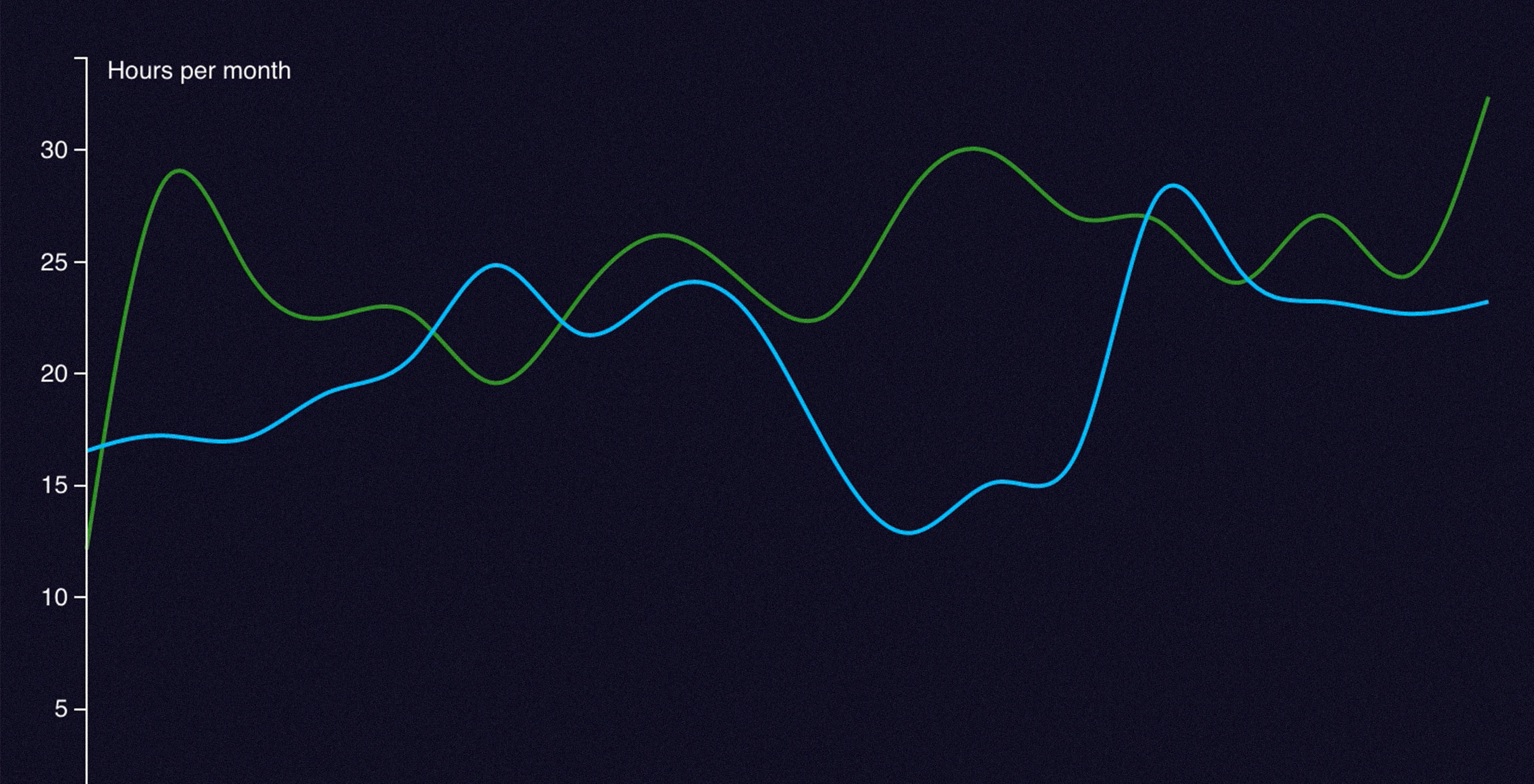
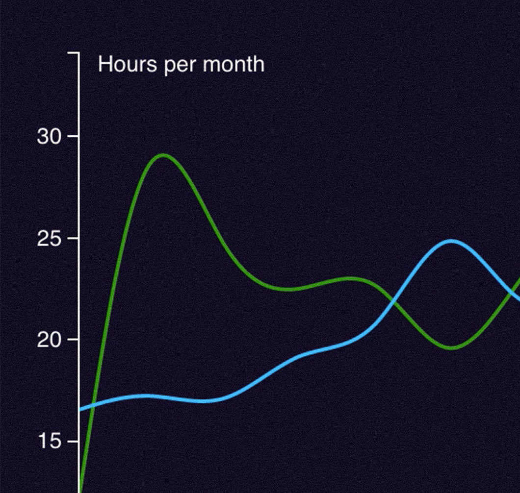
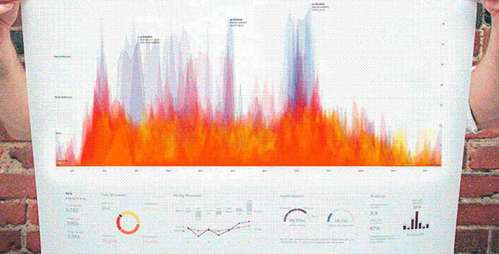
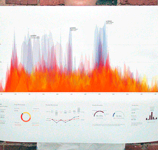
We've had an ongoing interest in activity data from projects with the Nike FuelBand (Year in NikeFuel and NikeFuel Weather Activity) to more recently with Fathom Watch Faces for Android Wear. This work has inspired me to track every place I've been and how I've moved between locations with the Moves app. With about twenty months of data on my hands I began parsing, analyzing and creating sketches.
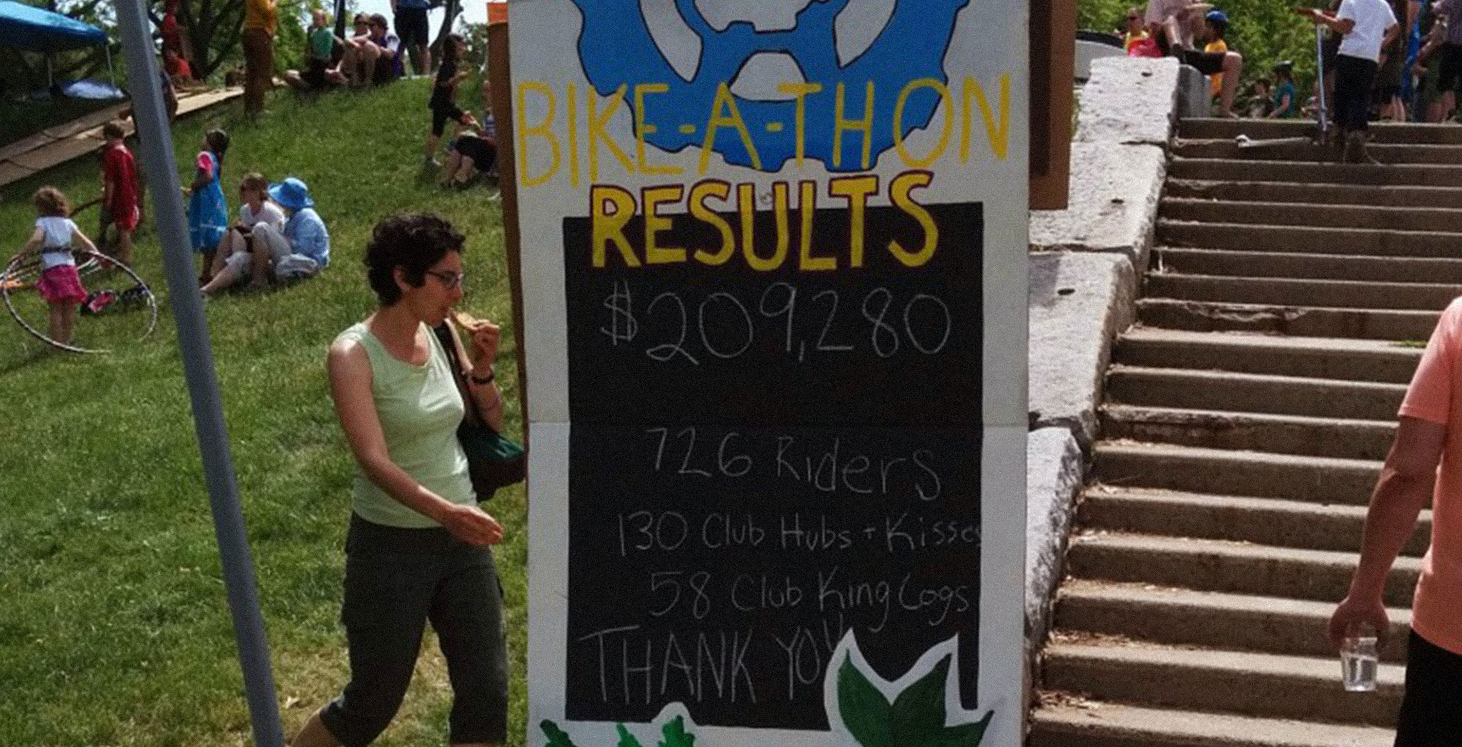
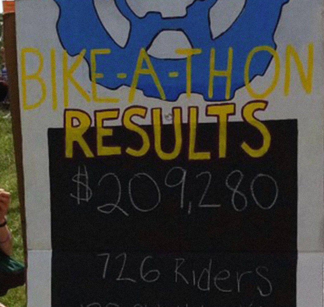
Last weekend I participated in an annual Bike-A-Thon hosted by Bikes Not Bombs, which is a non-profit that runs youth programs in the Boston area. The organization teaches kids how to build and fix bicycles, and they also run an international program that sends bikes to developing regions in Africa.
We aren't a poster company, but over the years our love of print has driven us to design a collection of printed artifacts (see Scaled in Miles, All Streets, Dencity, and Frankenfont). Our print explorations often occur alongside client work, and reflect the range of interests (and occasionally obsessions) of folks around the office. We donate all of the print-generated proceeds to charities.
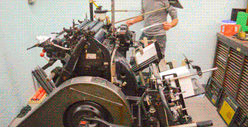
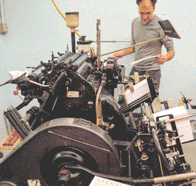
What began as a quick presscheck turned into spending the day with Elias Roustom, the Master Printer of EM Letterpress, who is making our new business cards.
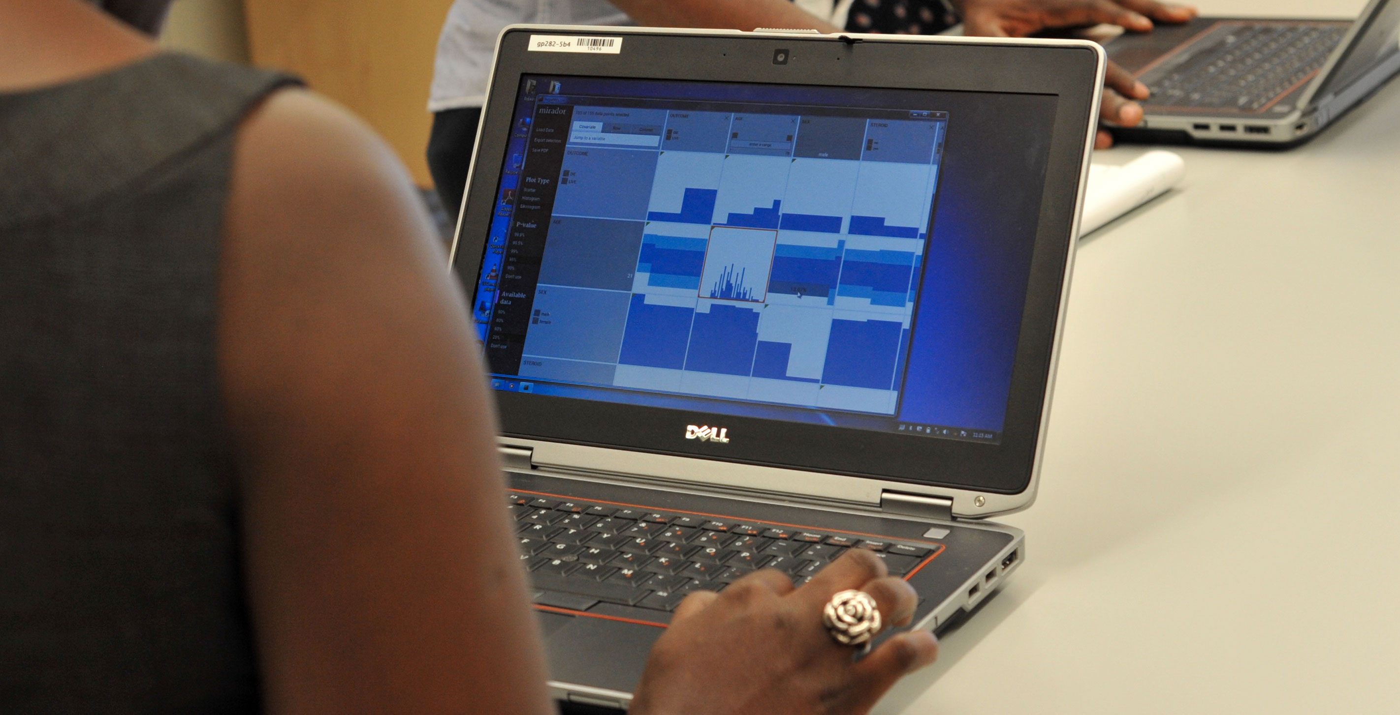
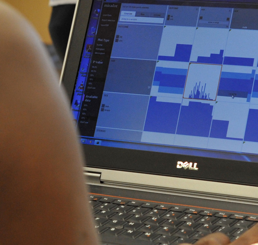
In June we released Mirador, a tool for visually exploring complex datasets, enabling users to infer new hypotheses from data and discover correlation patterns. Mirador is a collaboration between Fathom and the Sabeti Lab, which is part of the FAS Center for Systems Biology at Harvard University.
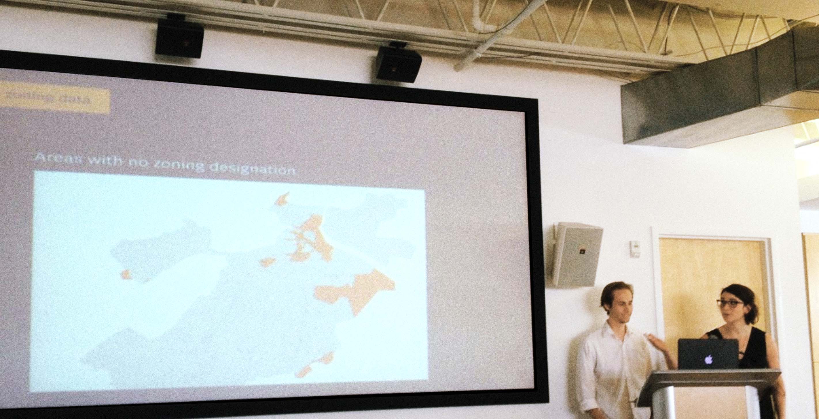
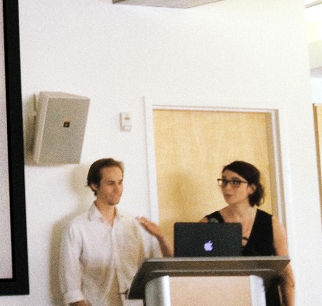
Fathom received a Knight Prototype grant which provided us the opportunity to embark on a collaborative project with the City of Boston. Last week, we traveled to Pittsburgh to present our Urban Agriculture project at Knight Demo Day.
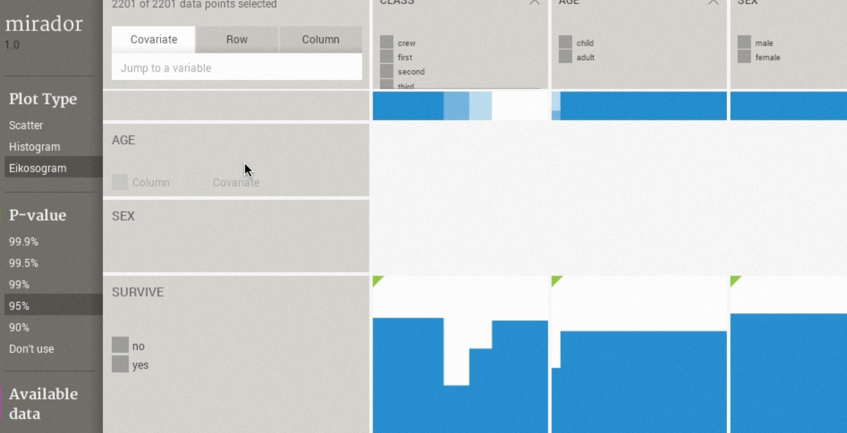
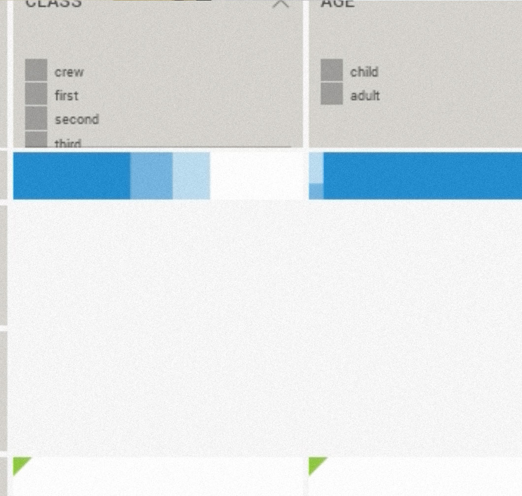
When Andrés isn’t contemplating the future of Processing or writing about OpenGL shaders, he has been leading the development of Mirador, a tool that provides an overview of large datasets, by visualizing their underlying dependency structures and identifying groups of explanatory variables.
Sina Najafi, editor-in-chief of Cabinet, contacted us about including our project Colorful Language to serve as a visual explanation of the World Color Survey data, the topic of an essay in the new issue. Cabinet is a quarterly non-profit publication about art and culture based in Brooklyn, NY.
This is a process post about 2013 Year in NikeFuel, but it also serves as an example of our collaborative process at Fathom. You can read the announcement of the project here.
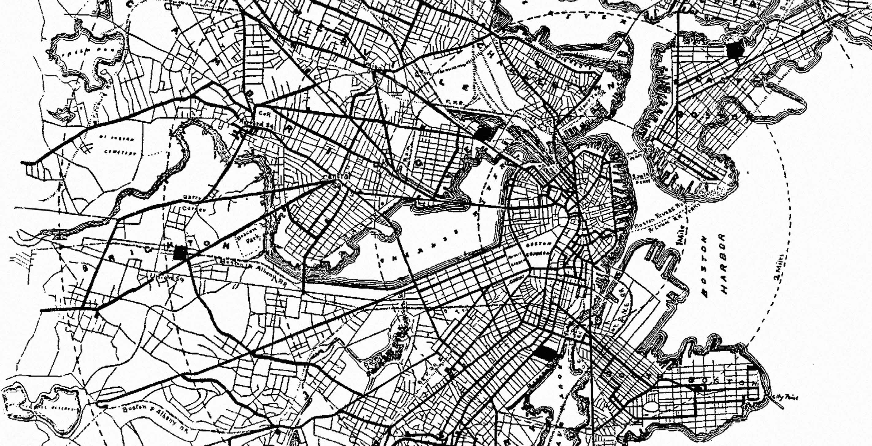
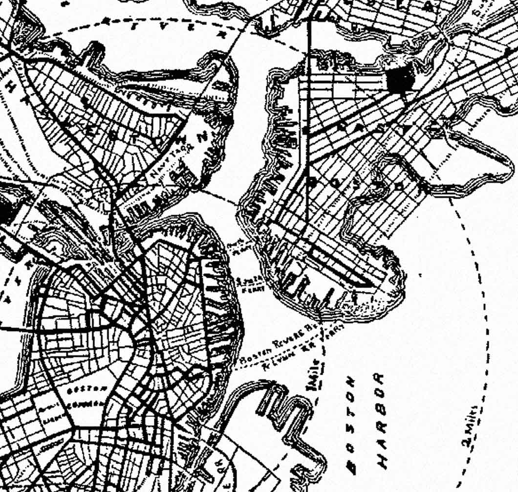
I am fascinated with metro maps. You may be more familiar with the term "metro" as the T, subway, L, Underground, Tube, Tram, BART, Muni, Subte, T-bana, U-bahn, Tren-Urbano, SkyTrain, MTR, Tren Electrico, T-bane, S-tog, Rapid, and even Clockwork Orange depending on your home city.
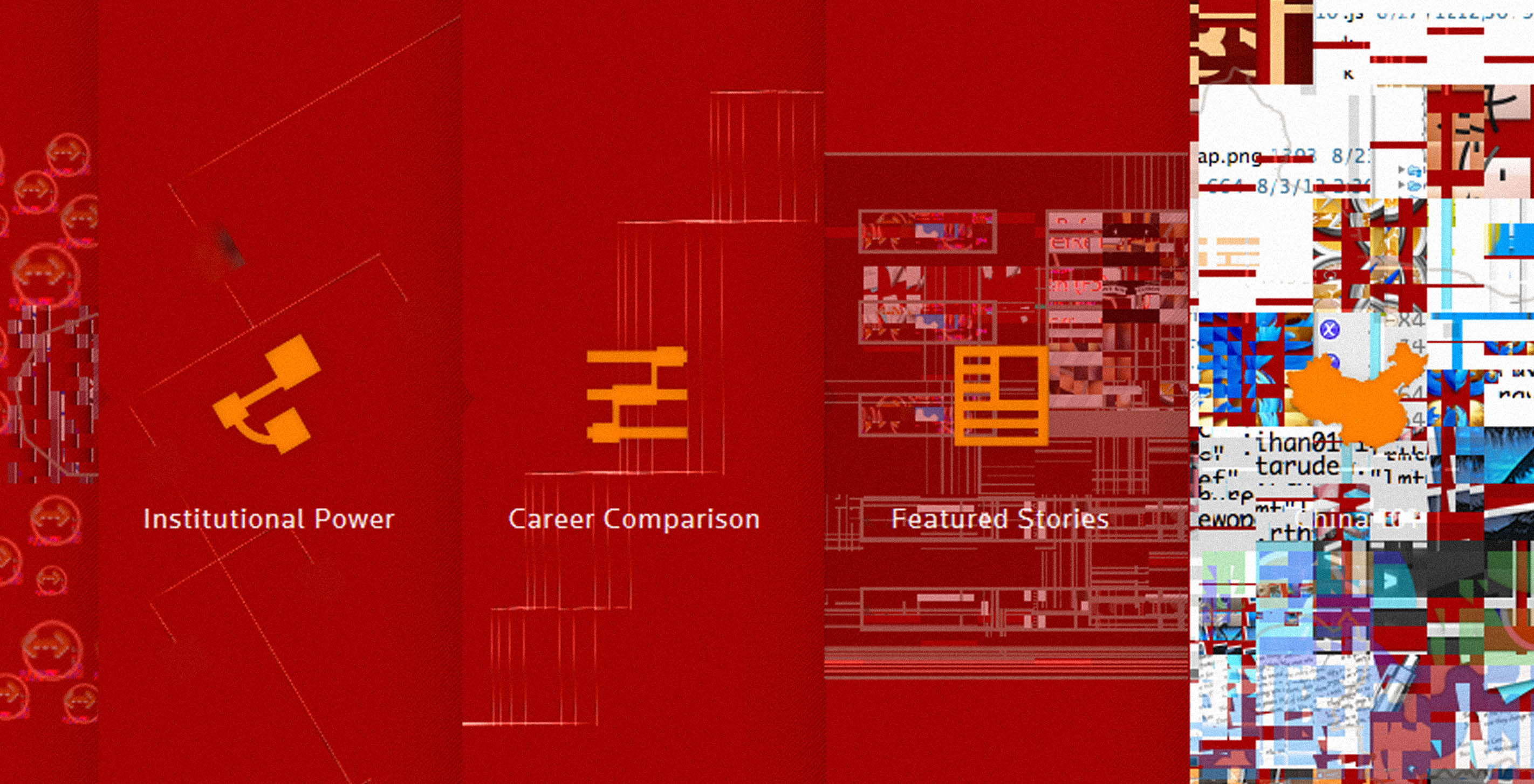
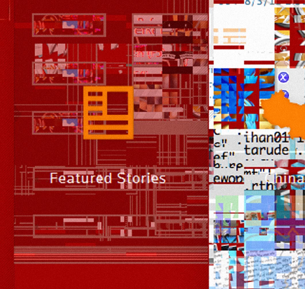
Working digitally has some similarities to the physical world. For example, when painting, brushes can break down, lighting can change, and models can shift. Often these variable forces have interesting visual results. We've collected a handful of our favorites from the Connected China project. This first image is the result of Katy testing out the homepage on Windows through VMware:
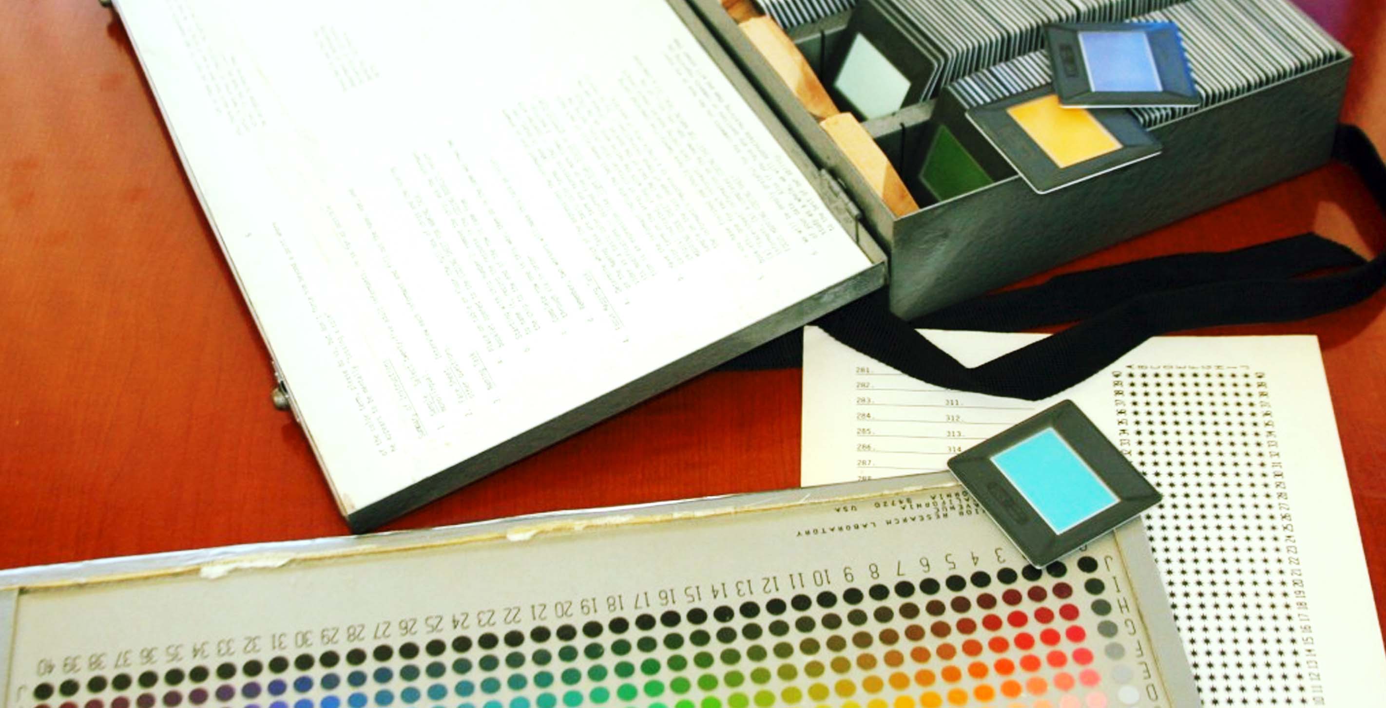
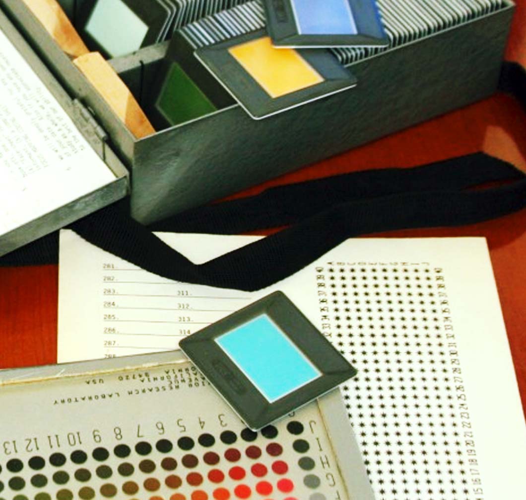
During my senior year at Savannah College of Art and Design, I took Language, Culture and Society with Désiré Houngues. Two cultural insights about language stuck with me. In some societies men and women speak with entirely different vocabularies but still communicate verbally with one another. The second was that some languages only have two words for color, white and black (light and dark); if a language includes a third color, it is always red. This led me to research by Brent Berlin, an anthropologist, and Paul Kay, a linguist. They made the first hypothesis about how color terms enter a language in a certain order. Later, I came across the World Color Survey, which was established in an effort to continue research into Berlin and Kay's hypothesis. The WCS makes their data available to the public, and I found that this was exactly what I needed to help answer my many questions. The result of the WCS data exploration is below, where about 800,000 individual color chips are grouped by the terms used to describe them.
An interview with Terrence and Andrés on their experiences at the AT&T Mobile Hackathon.