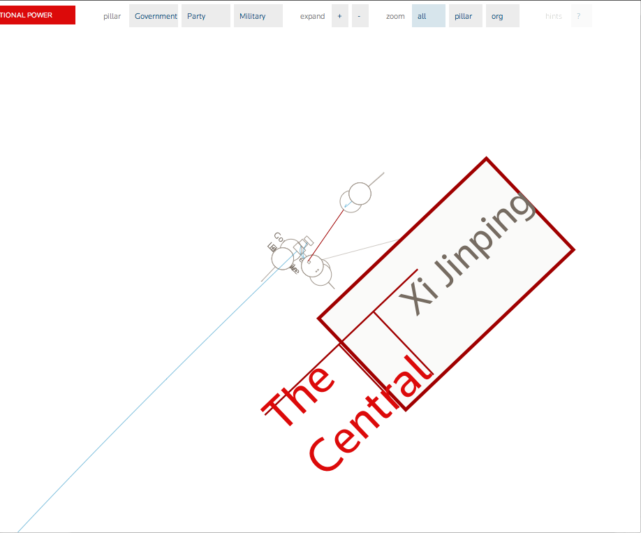
The next two bugs were caught by our own Mark Schifferli when we lost him to the cavernous org chart. Upon resurfacing, he had captured this shot of "The Central...Xi Jinping." “The Central Committee” had been shortened with some comically large text that didn't fit properly. This happened back in July 2012...a foreshadowing of Xi's election as the new top leader of China in November 2012!
Cool uninformative things get framed and sold as is:
Here's the loading nonagram (replaced by a heptagram when the number of members on the Politburo Standing Committee was reduced from nine to seven), a spiraling animated image, without the css rule [background-repeat: no-repeat;]. Especially dizzying when they are all rotating simultaneously:
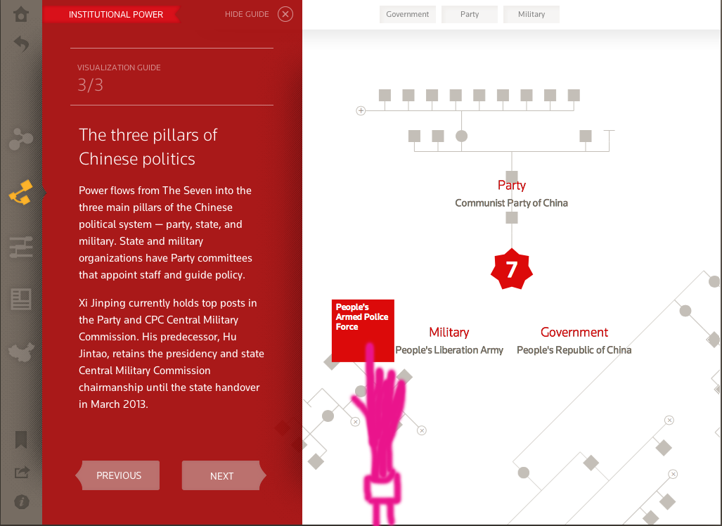
This last image isn't a bug, but it gives a glimpse of the artistry behind UI critiques we share with each other. Magenta has an important role when we are marking up comps; however, this creeping hand by Jimbo Grady was a first and favorite. We suspect this won't be the last time we see the pink arm of doom (with French cuffs) added to a mockup.
We’d love to hear what you’re working on, what you’re curious about, and what messy data problems we can help you solve. Drop us a line at hello@fathom.info, or you can subscribe to our newsletter for updates.