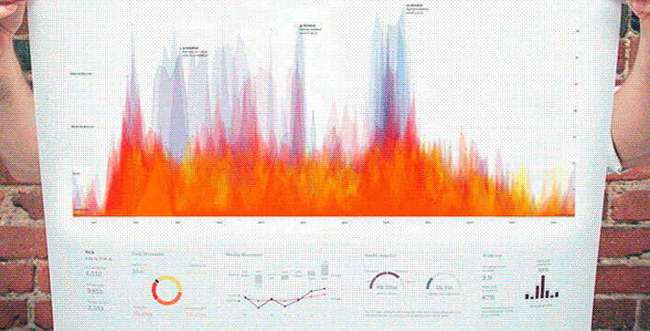
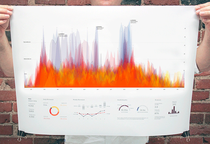
The FuelBand is one of a couple Nike+ products where NikeFuel is earned by moving---whether it be running, walking, biking or dancing. The FuelBand stores minute-to-minute data, so with 1440 minutes in a day and 365 days in a year, we had to make a number of design choices to paint a clear, unique, and beautiful picture of every user.
Before I started designing this poster, Ben had written a Processing sketch to plot his daily fuel from 12am to 12am. When Ben traveled to NYC for the announcement of the FuelBand SE, James used that sketch to create a narrative of the trip.
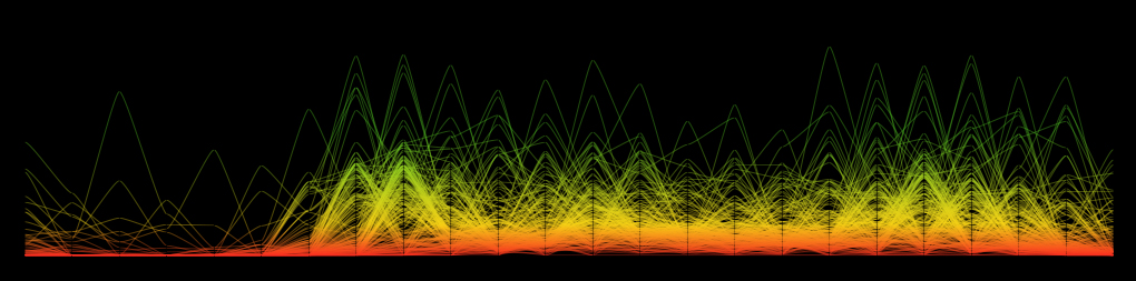
We played with the idea of using gradient to distinguish multiple layers of lines, each of which represented a single day. The Nike+ branding guide contains a gradient shift from red to yellow to green as users approach their daily goals.

Instead of adjusting the gradient from left to right, we rotated it 90 degrees to highlight the best moments---or peaks---of the day in green. This idea eventually made its way to the vertical color shift used in the final poster.
I developed the code with some help from Ben and Mark so that I could try out different ways to visualize the minute-to-minute NikeFuel data. Processing allowed me to iterate on the design more naturally while staying true to the dataset. The following snapshots capture some decisions I made throughout the design process.
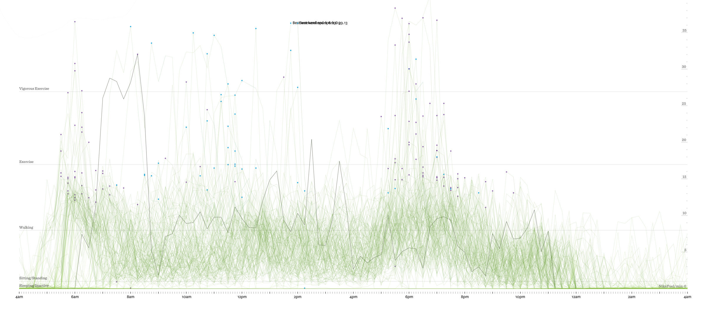
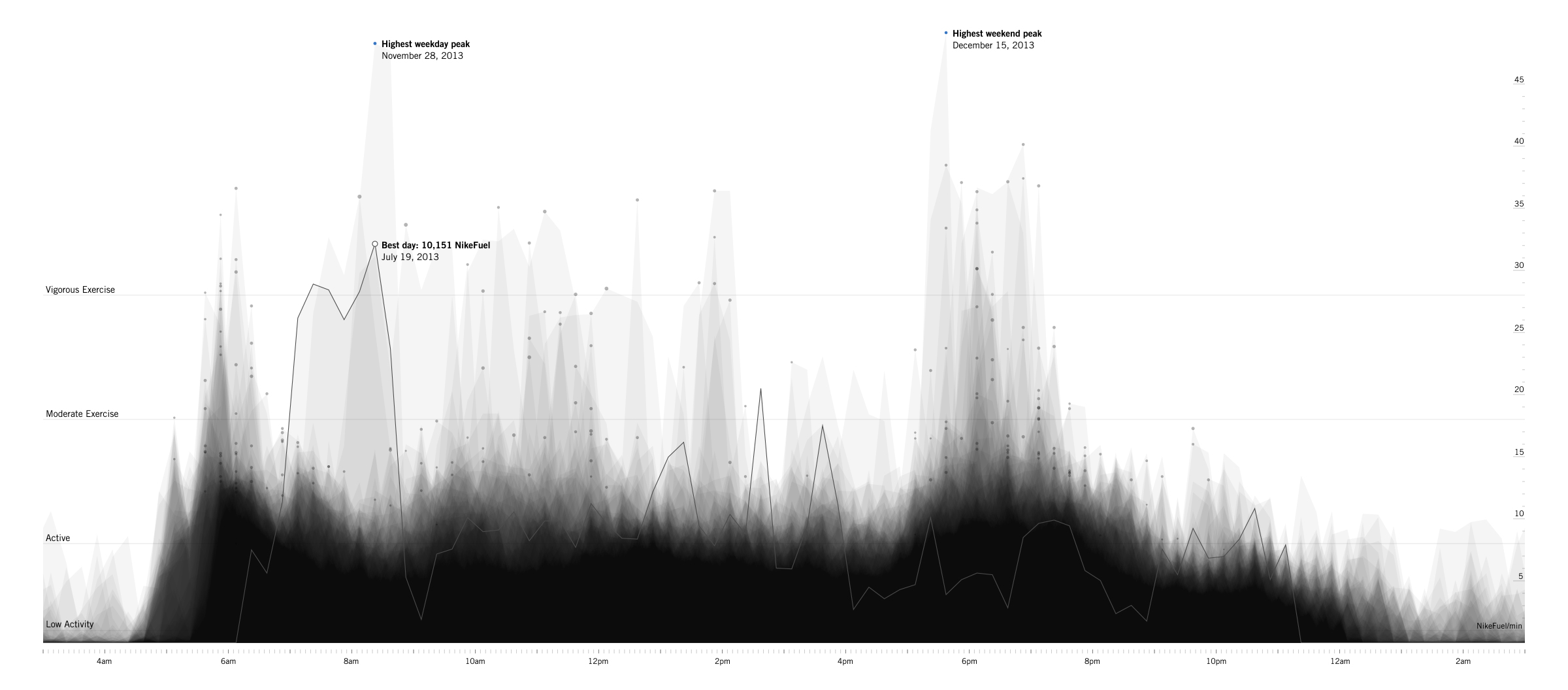
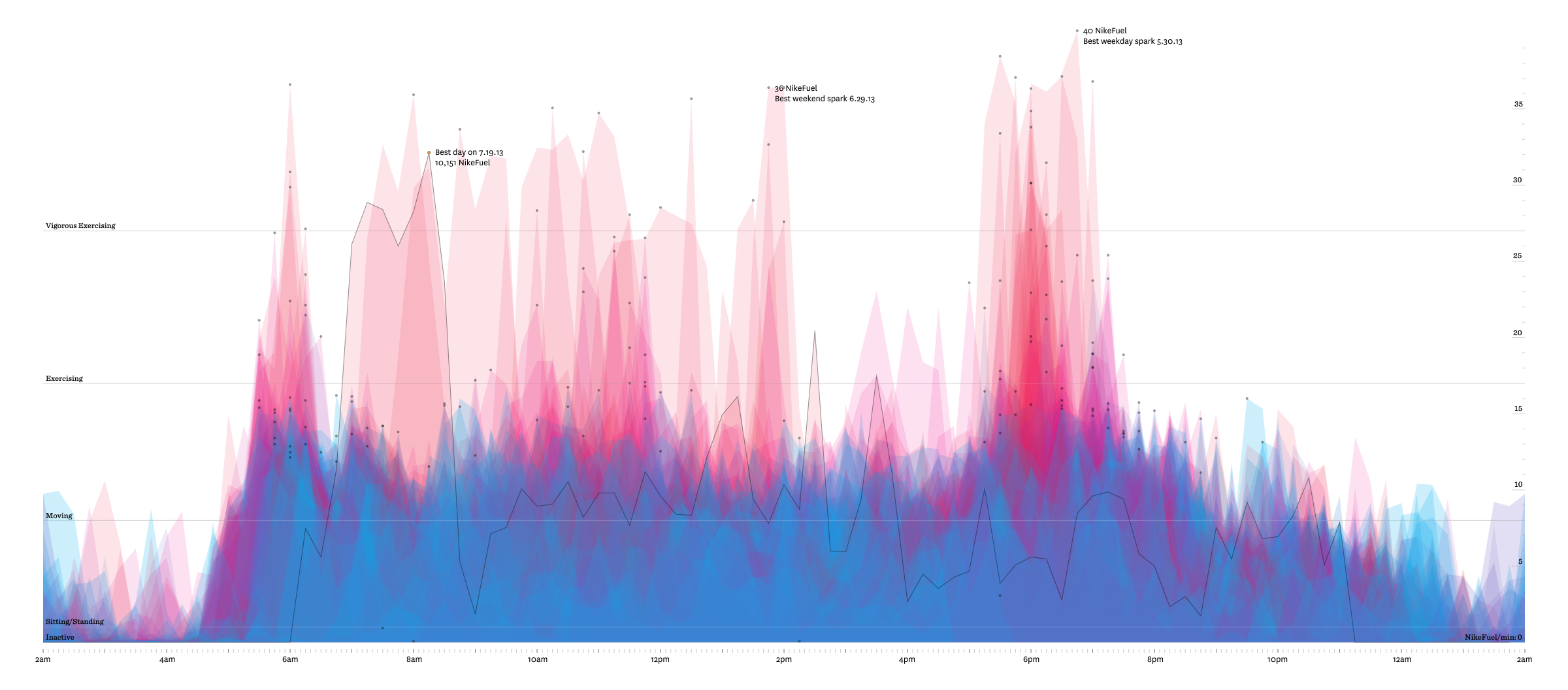
With 1440 minutes in a day, drawing a point at each minute would have been too granular a level of information. We sampled different groupings from one to 120 minutes, and eventually decided 15-minute buckets worked best. We tend to talk about and schedule our time in 15-minute increments, and the grouping allowed for a detailed representation that left out unnecessary chatter.
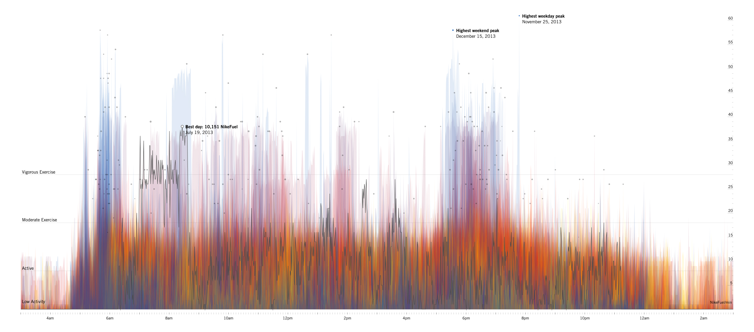
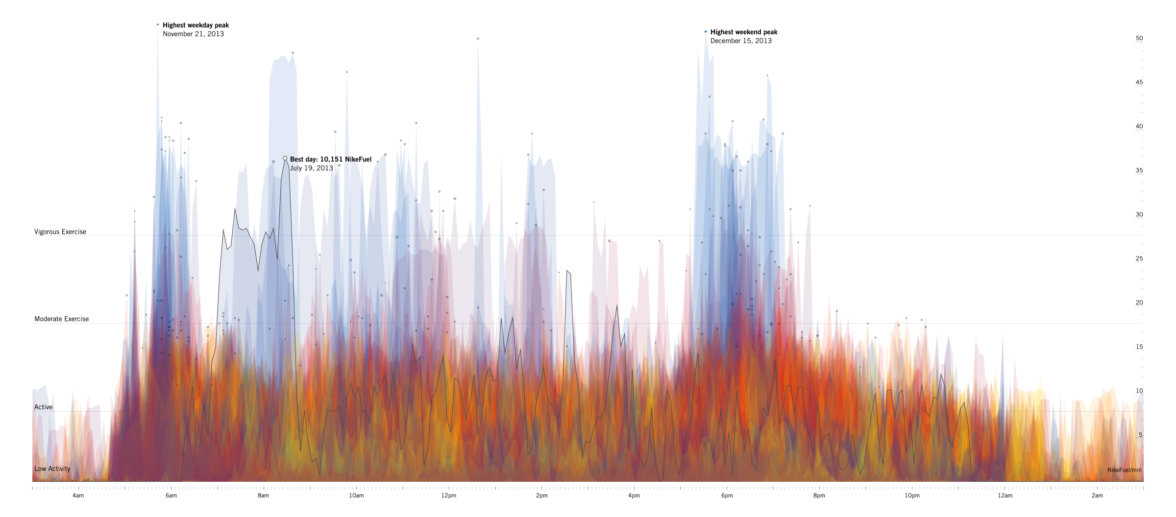
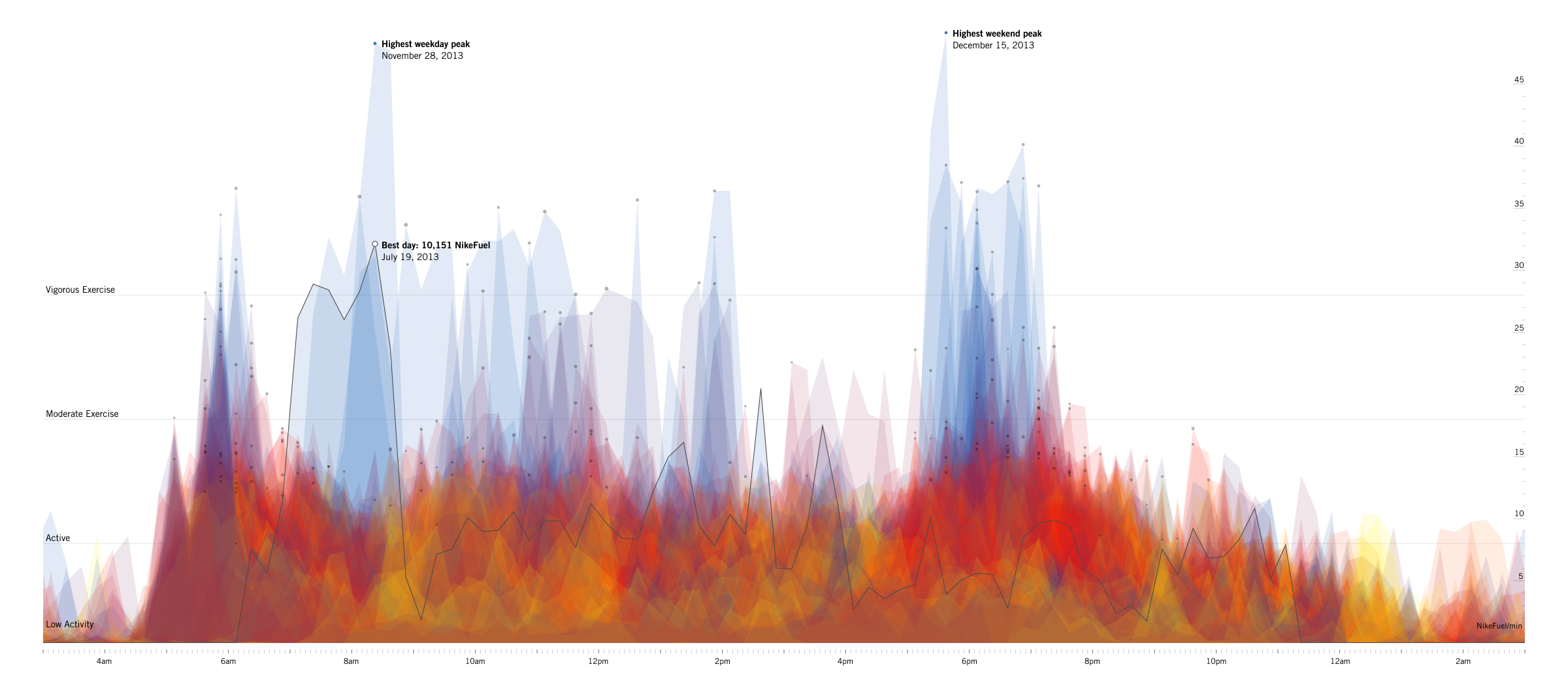
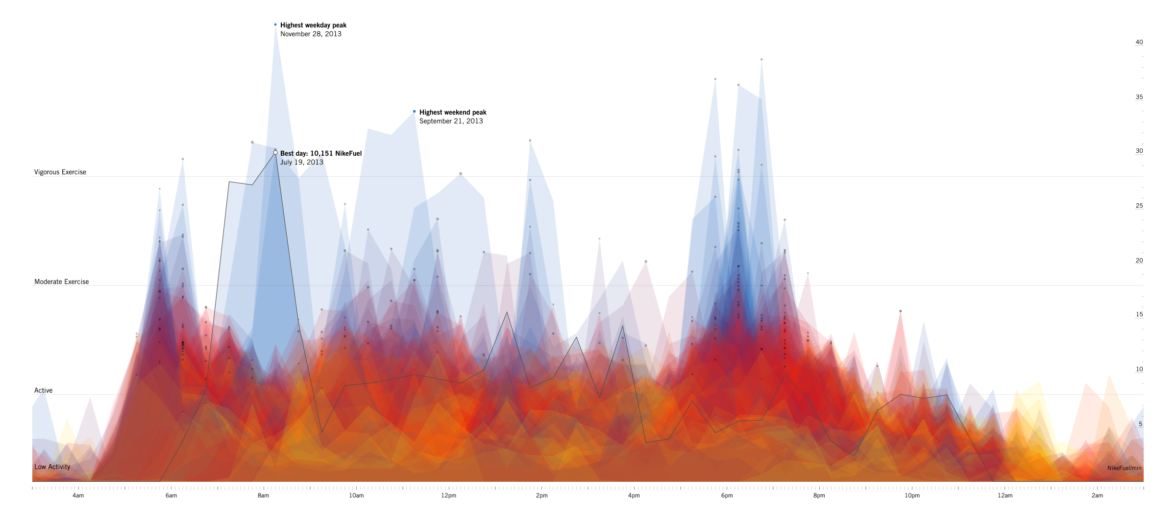
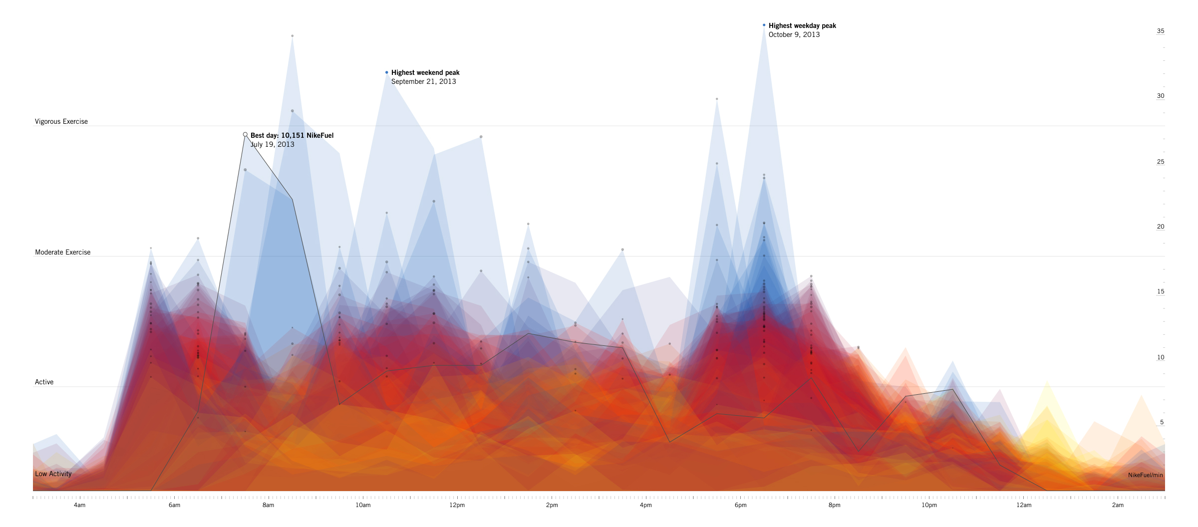
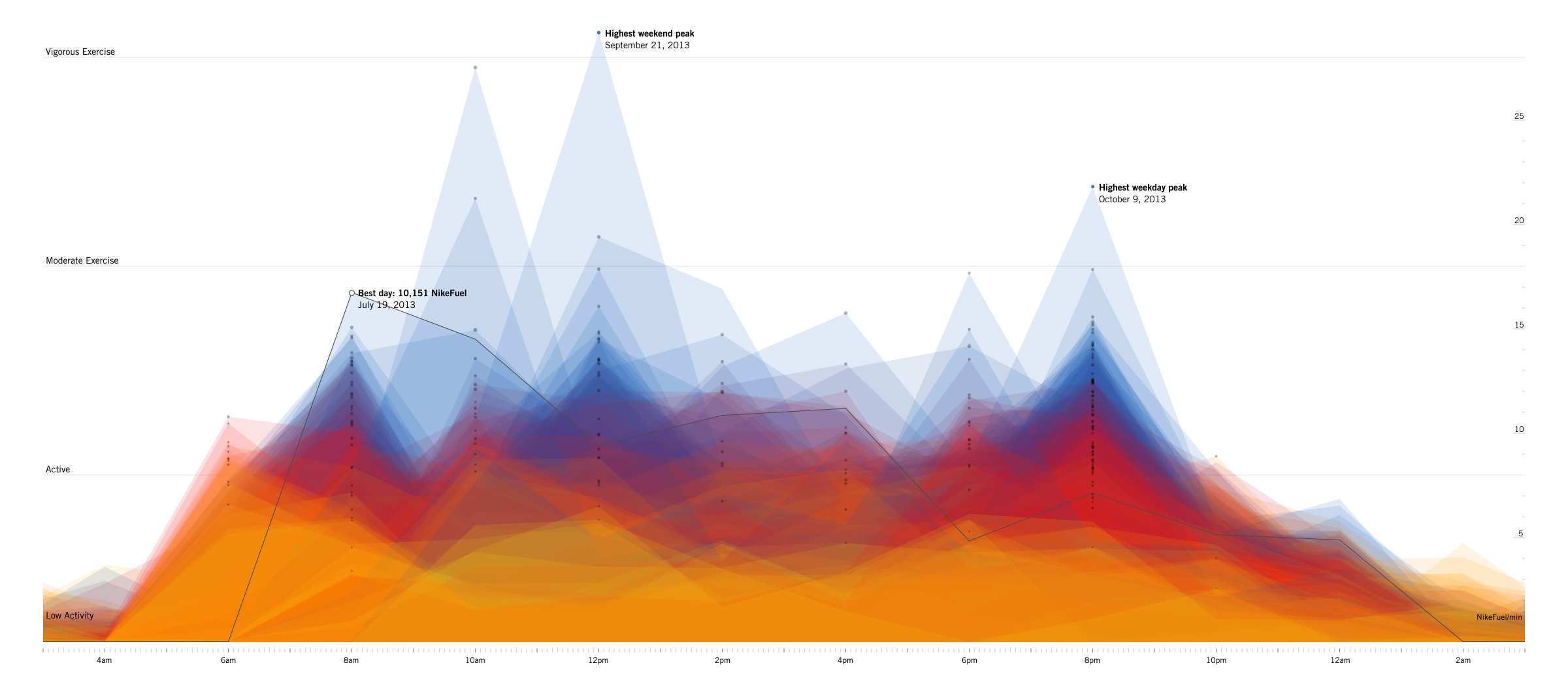
As the sketch developed, I constantly tested changes on all of our datasets in order to highlight how each user is unique. When Katy and Teri started referring to it as a #dataselfie I knew something was working.
Login to your Year in NikeFuel to see if you caught fire in 2013. Download a PDF for printing, show it off in the public gallery, and share it with your friends. You can also put it on your hearth to stay warm this winter.
And enjoy some links to our own 2013 Year in NikeFuel posters: Ben | Teri | "Randolph" | Terrence | James | Alex.
We’d love to hear what you’re working on, what you’re curious about, and what messy data problems we can help you solve. Drop us a line at hello@fathom.info, or you can subscribe to our newsletter for updates.