Notebook
Here's where we post periodic updates on what we've been up to at Fathom. Reflections on the interesting stories that emerge from our client work, side projects, after-hours rabbitholes, and other miscellaneous threads of inquiry.
You can also follow these posts as a feed in your feed reader.
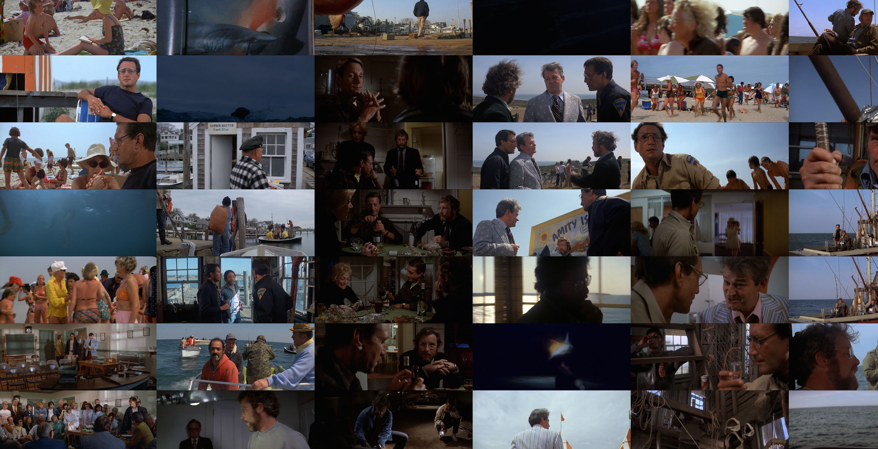
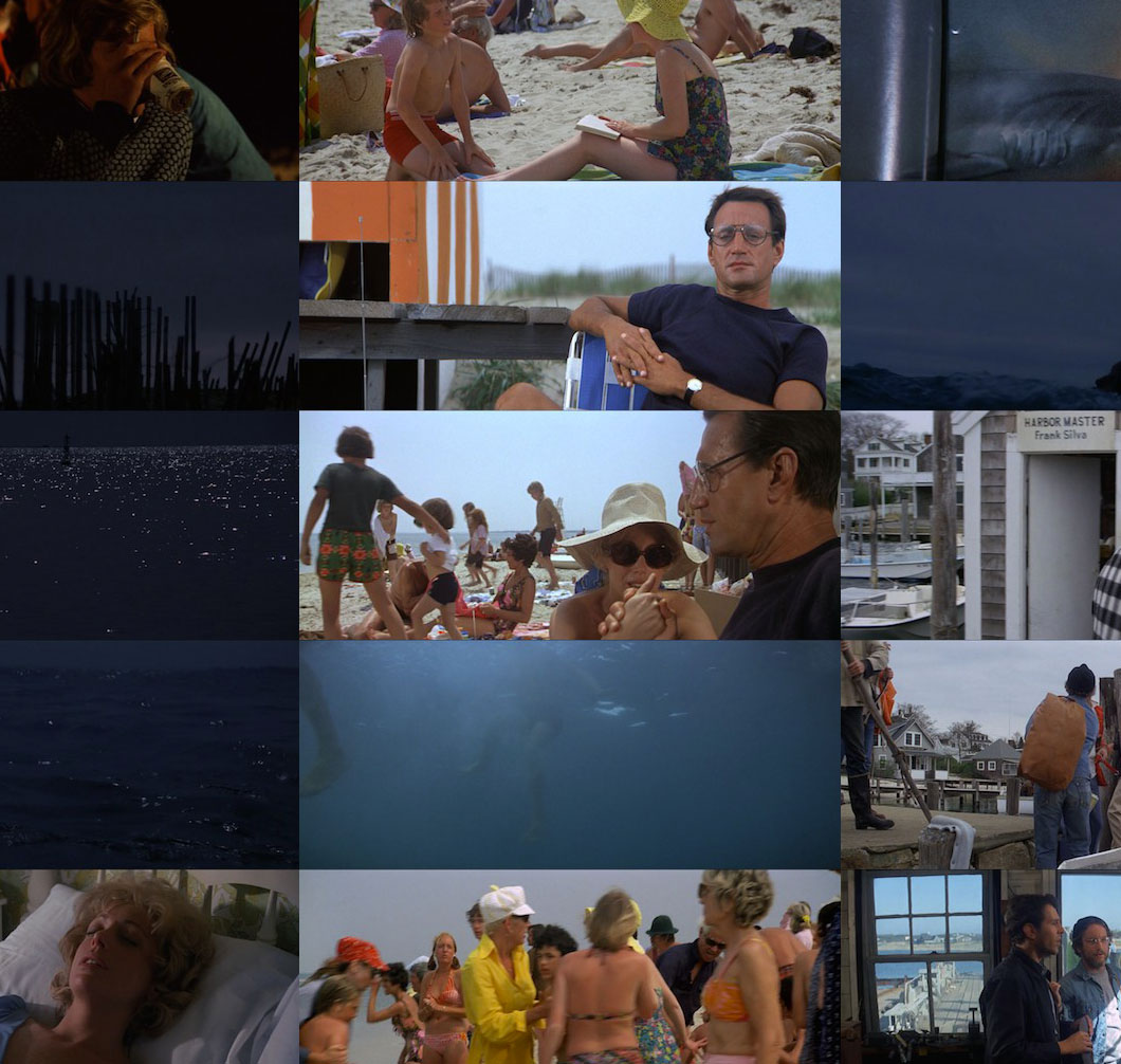
In celebration of the 40th anniversary and special re-release of the famous movie that made us afraid to swim in the ocean, we present Jawsography, an interactive app that analyzes the cinematography of the 1975 film, Jaws.
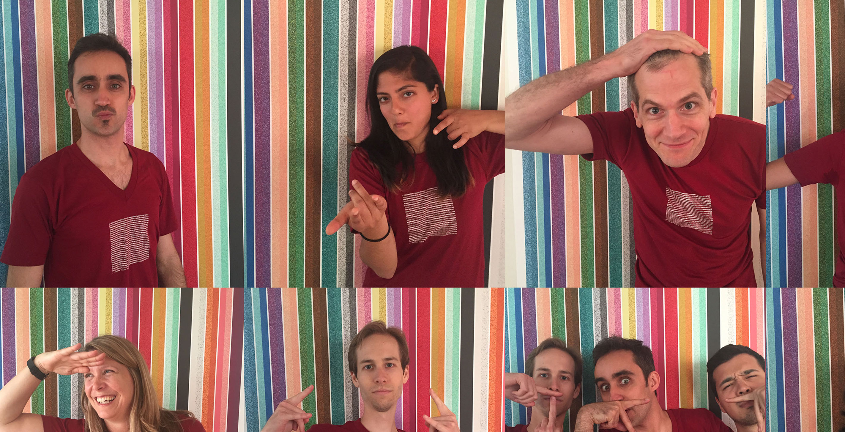
Yet another year passed, and all the studio gathered to celebrate our favorite mathematical constant in commemoration of Tau Day!
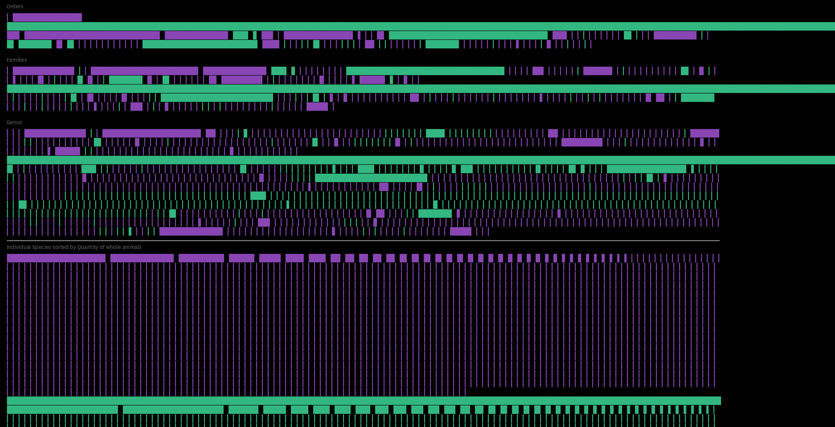

We're pleased to announce the launch of our latest project, Space Monkeys and Tiger Wine: A Look at Global Animal Trade. Built for National Geographic, the project explores the quantity, purpose, and primary locations of trade for thousands of animal species around the globe. Between the exchange of duck livers for homeopathic flu medication, ground turtle shells for anti-aging remedies, and deer glands for their fragrant musk, more than 27 million animals were traded worldwide for reasons you've possibly (and we had certainly) never imagined.
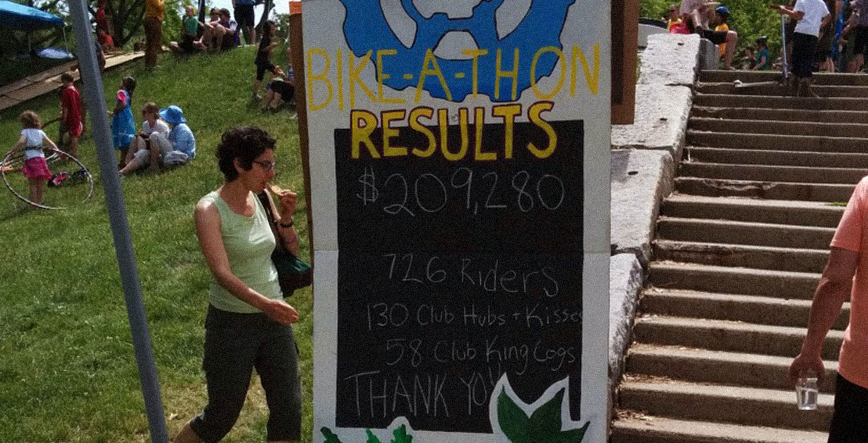
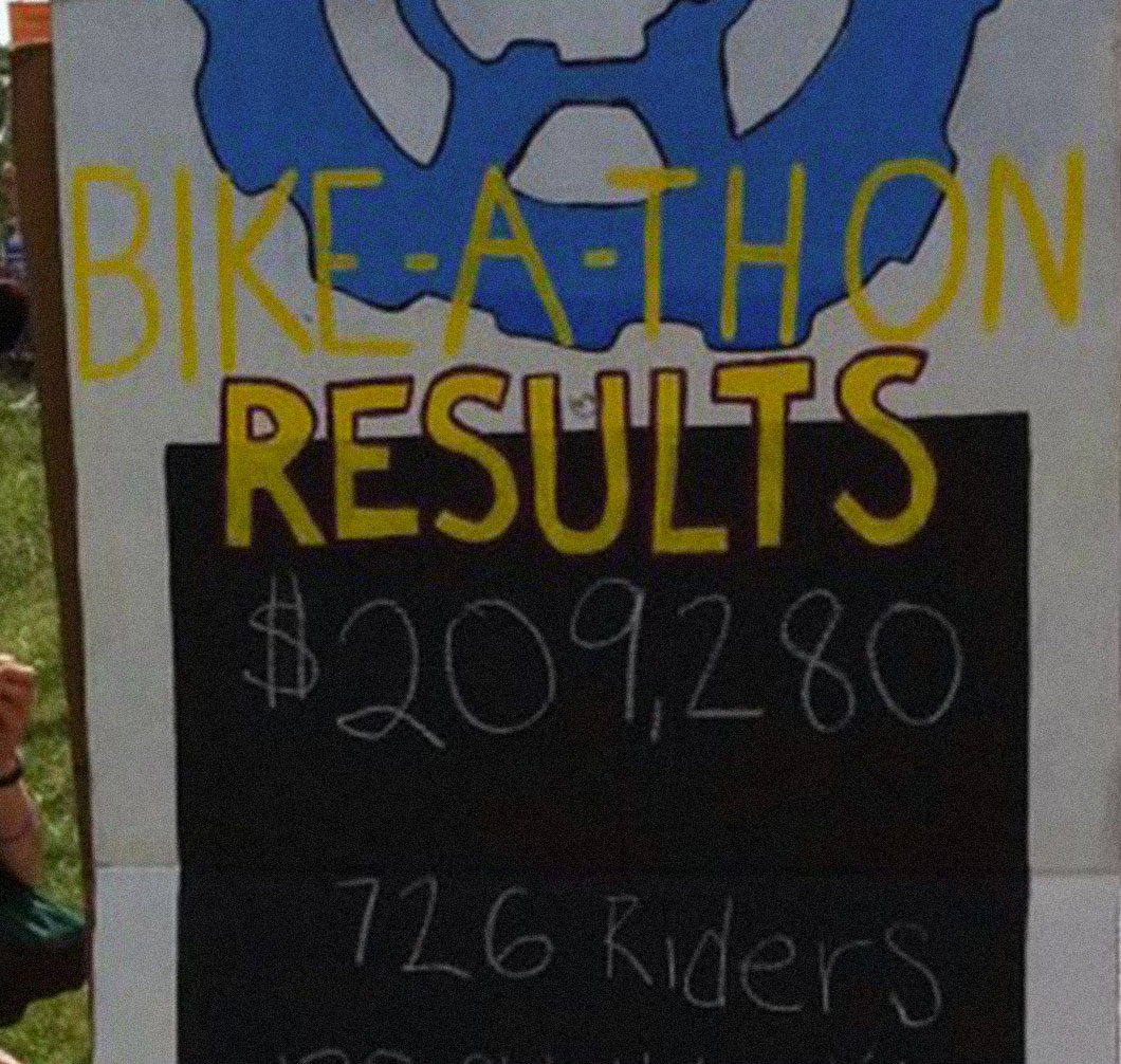
Last weekend I participated in an annual Bike-A-Thon hosted by Bikes Not Bombs, which is a non-profit that runs youth programs in the Boston area. The organization teaches kids how to build and fix bicycles, and they also run an international program that sends bikes to developing regions in Africa.
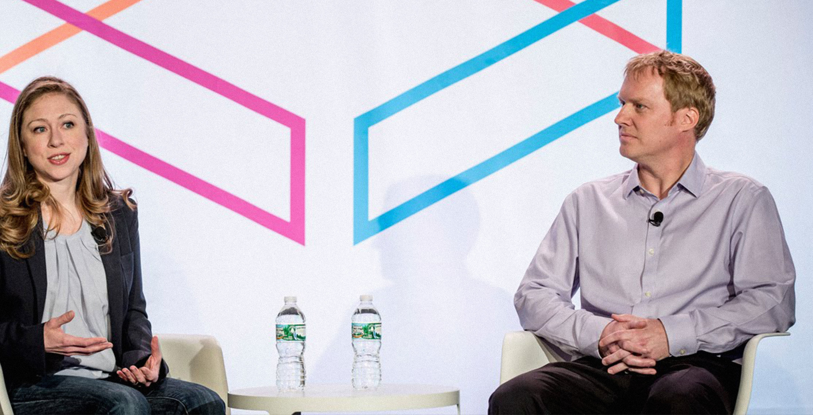
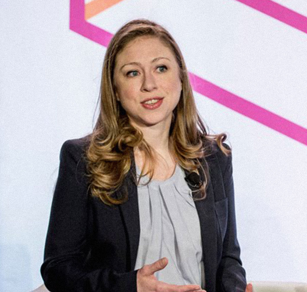
This week has been filled with some exciting travel and speaking opportunities for the Fathom team. Ben teamed up with Chelsea Clinton in NYC to give a talk at Internet week, and Teri, Alex, and I spent a day in D.C. presenting our work at the World Bank Group.
We aren't a poster company, but over the years our love of print has driven us to design a collection of printed artifacts (see Scaled in Miles, All Streets, Dencity, and Frankenfont). Our print explorations often occur alongside client work, and reflect the range of interests (and occasionally obsessions) of folks around the office. We donate all of the print-generated proceeds to charities.
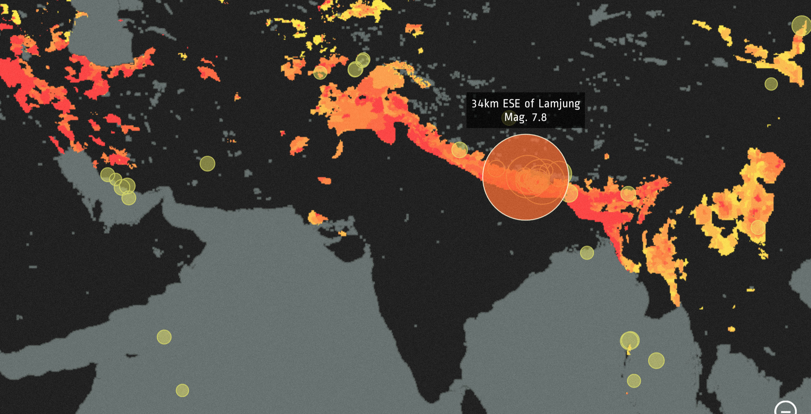
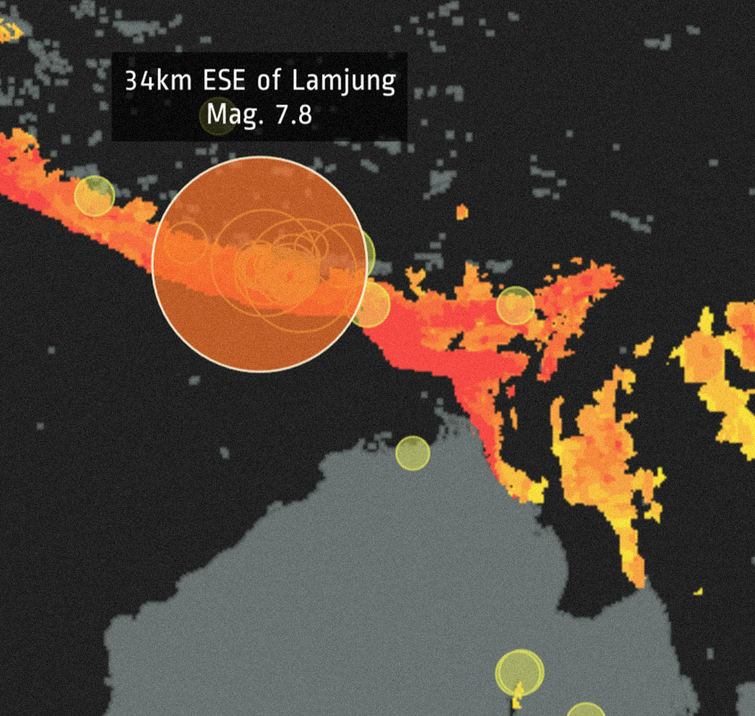
On April 25, 2015, a massive earthquake of magnitude 7.8 struck Nepal. Since then, multiple aftershock tremors of magnitude 6 and greater have caused devastating casualties and damage in Kathmandu and its neighboring areas. Papua New Guinea, too, was in close proximity to a 7.1-magnitude earthquake earlier today. As our thoughts are with the affected families and communities, we've updated our earthquakes web explorer with the most recent data to shed light on the immensity of the recent earthquakes and their aftershocks.
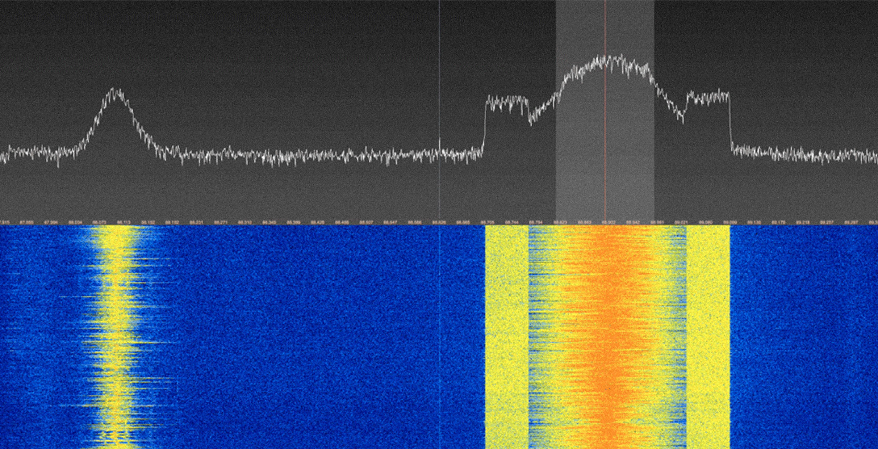
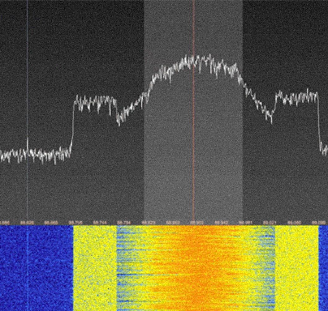
Some of us at Fathom are easily sucked into geeky hobbies. When I first came across a site dedicated to SDR, or software defined radio, I turned my desk into a makeshift communication outpost for several days to learn the basics. It turned out to be surprisingly relevant to our core interests of data visualization and programming.
The social–sharing experience is a crucial and often overlooked element of information design. In addition to updating content and the UI/UX of our latest No Ceilings site, we are constantly developing its "shareability." Between deep linking, bite-sized graphics for stories, and pre-populated social links, we have made sharing as easy and visually compelling as possible.
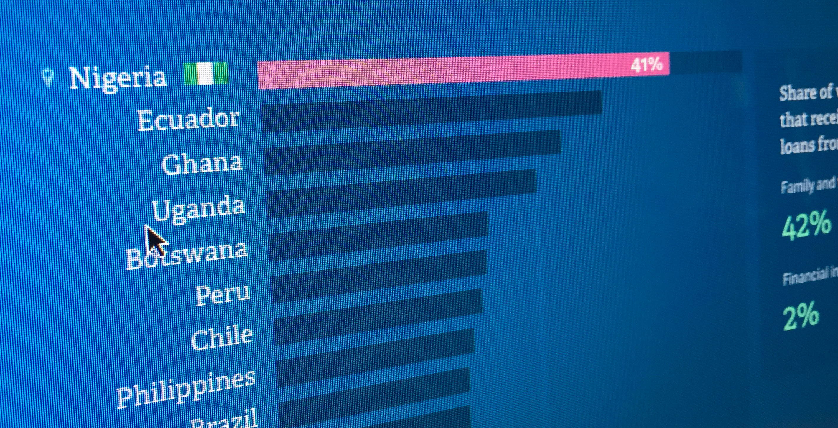
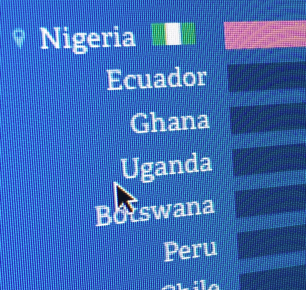
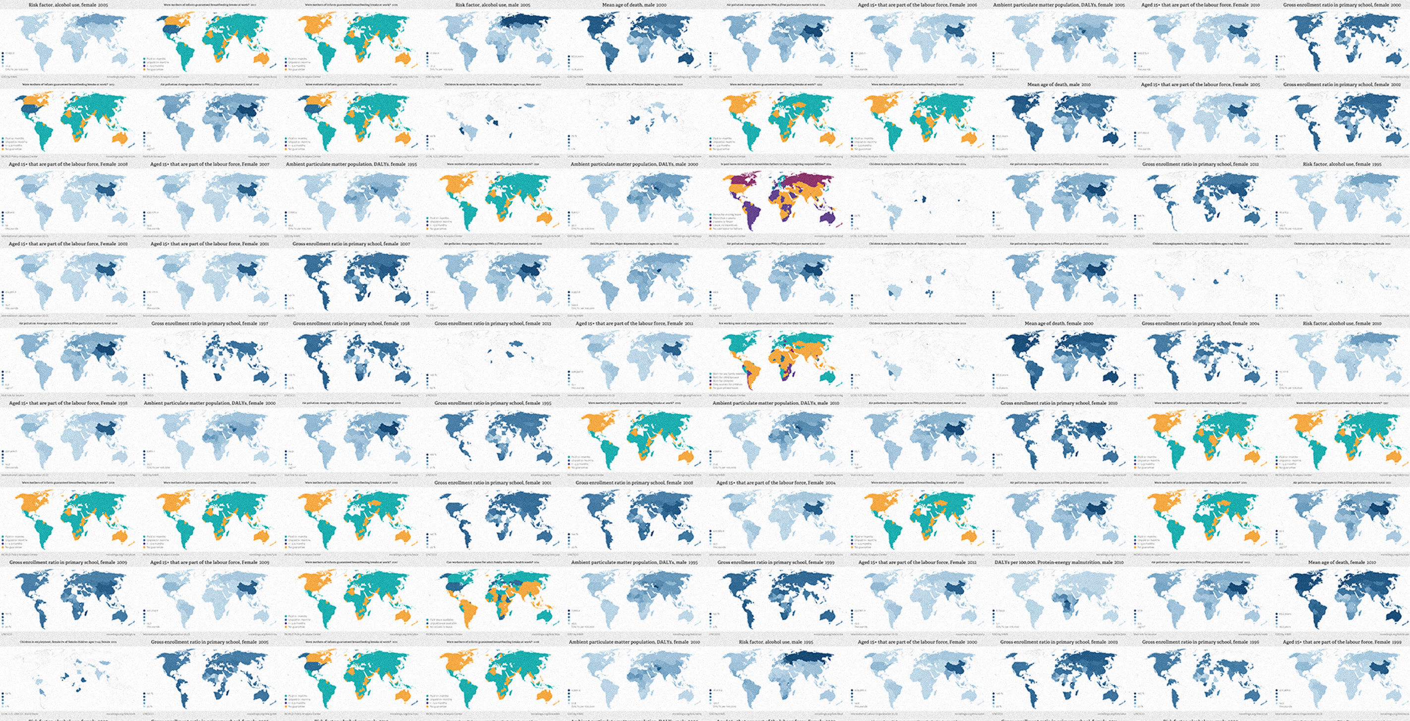
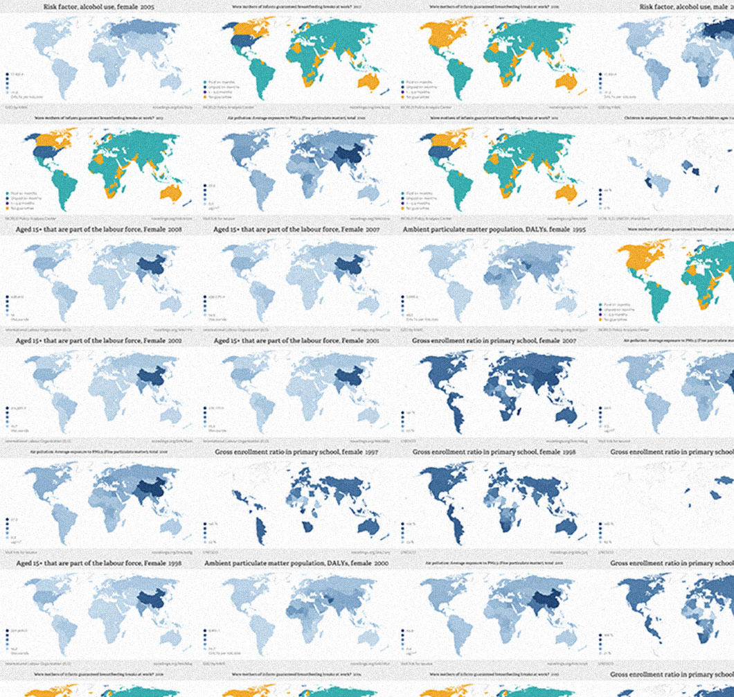
From the start of their education to the prime of their careers, women's professional paths look rather different from their male colleagues. The extent to which workplace inequity influences women's careers, though, varies by locale in a way you may not expect.