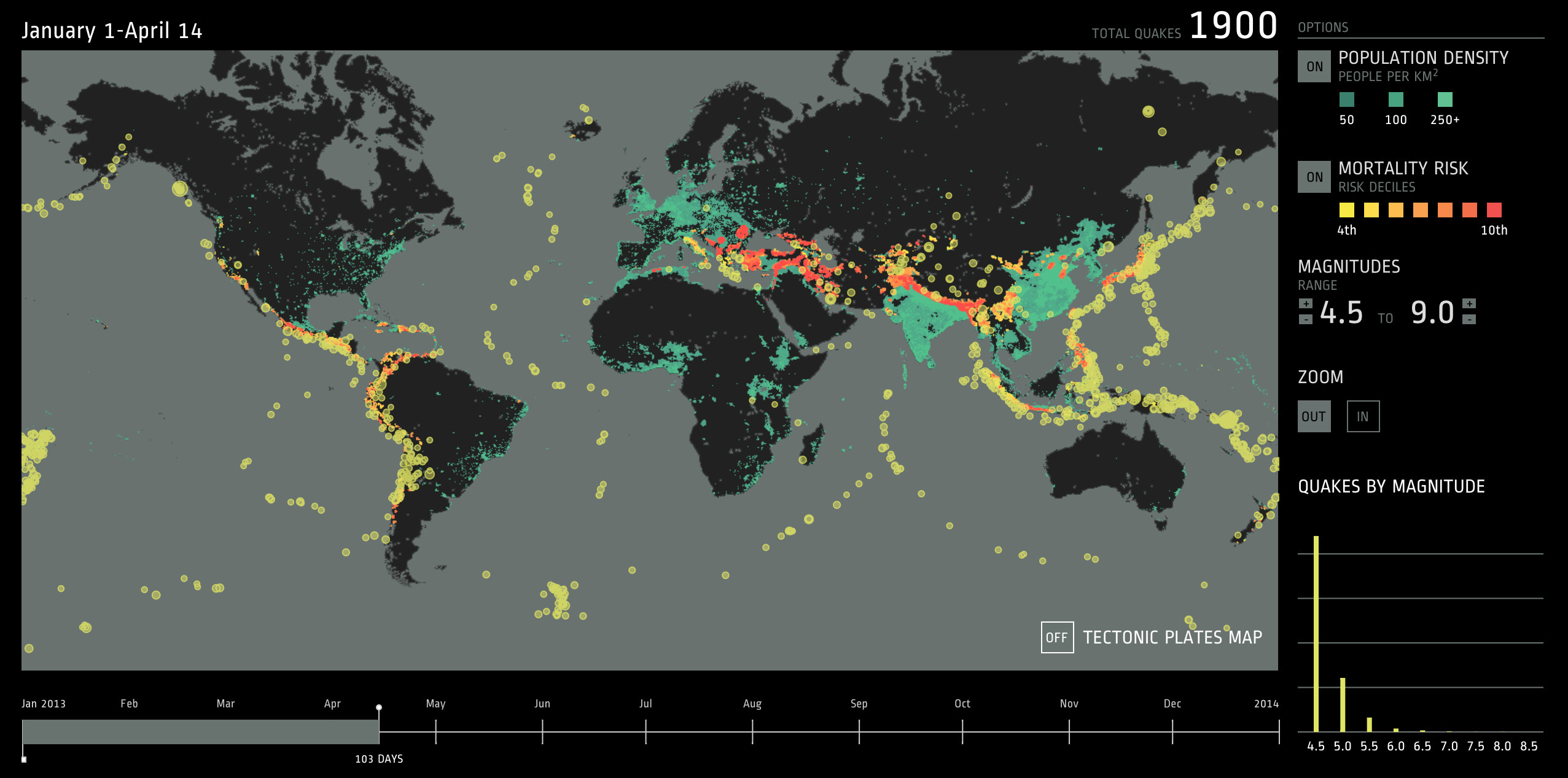
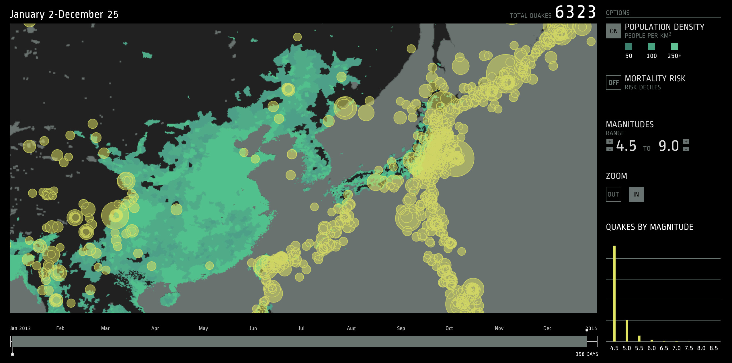
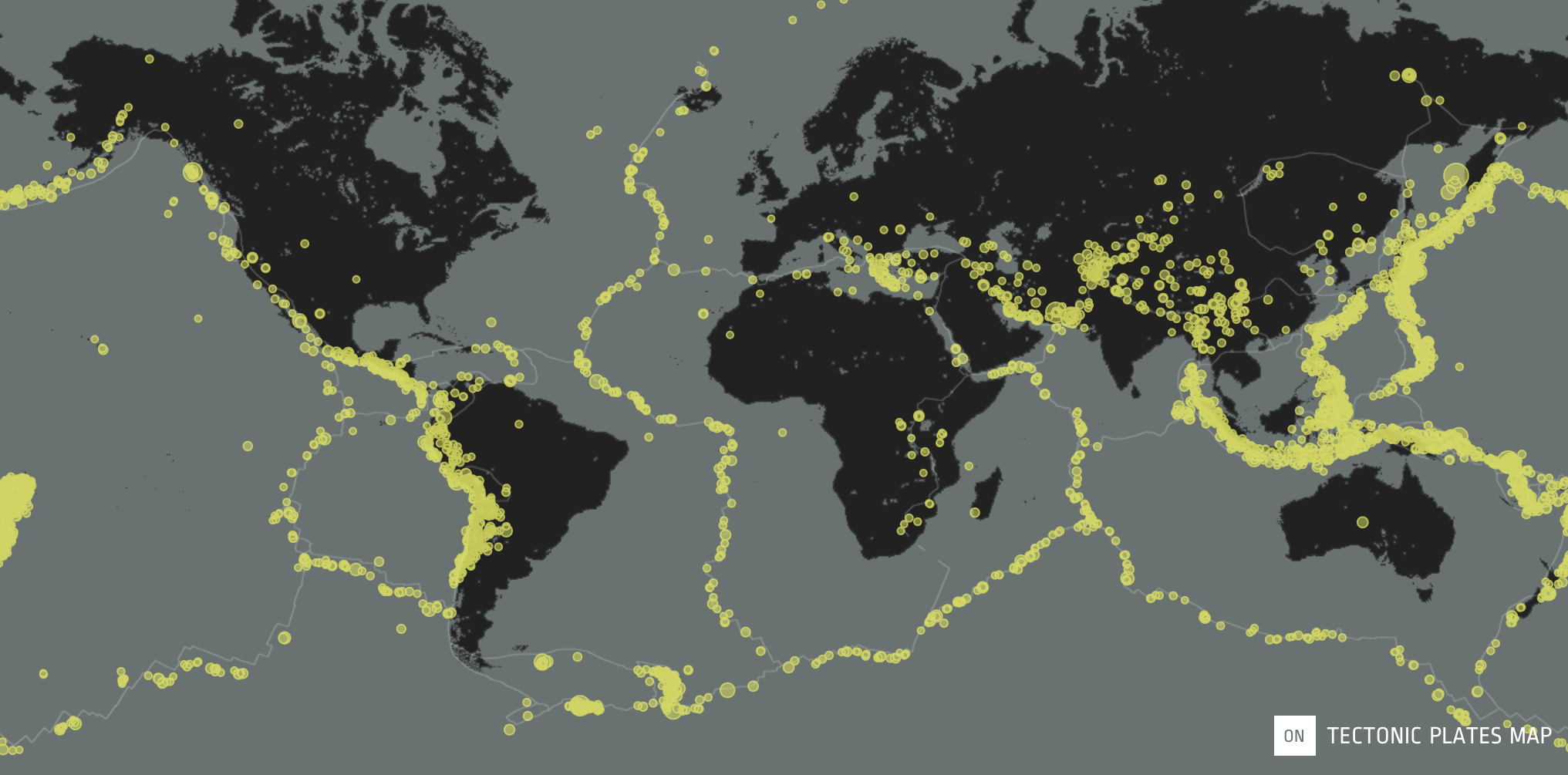
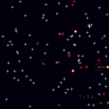
I had always thought of earthquakes as dramatic, irregular events, when in fact there are tens of thousands of earthquakes each year that people cannot even feel. Back when I was in school, I made a print piece that looked at the number and magnitude of earthquakes occurring throughout a full year. As you can see in our more recent project, there were over 6,000 earthquakes globally in 2013 (and that's only looking at those with a magnitude of 4.5+!). In fact, there are over a million earthquakes each year, but most are too small to notice.
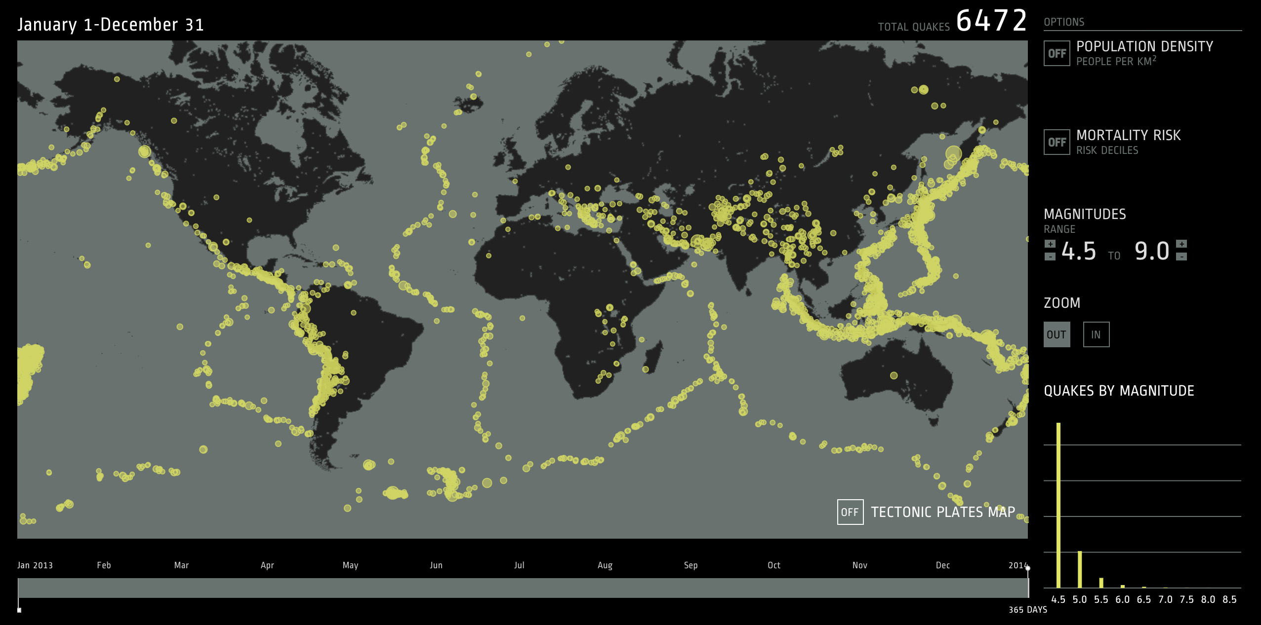
Within the dataset pulled from the U.S. Geological Survey, we focused on the earthquakes' magnitudes, locations, and dates of occurrence. The tool allows you to focus on a particular subset of earthquakes by limiting the timespan, range of magnitudes, and map extent. On the other hand, you can maximize the timeframe and magnitude range to get a picture of the whole year.
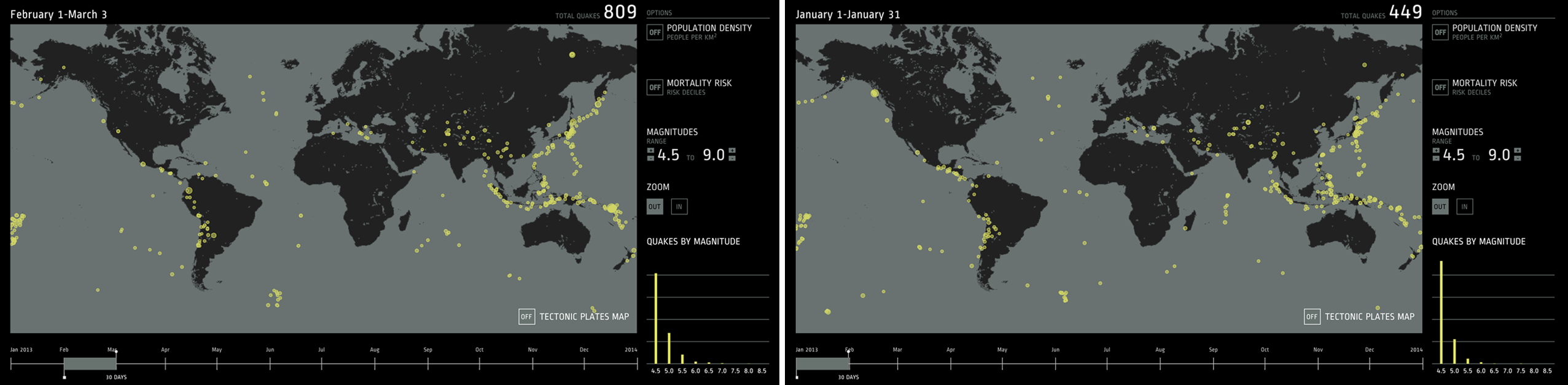
When comparing time intervals of the same length (for example 30 days), the ratio of magnitude 4.0-4.9 earthquakes to magnitude 5.5-5.9 to magnitude 6.0-6.5 earthquakes, etc. stays about the same. However, the total number of earthquakes can vary dramatically. A 31-day span starting in January had 449 earthquakes, while the 31-day span starting in February had 809.
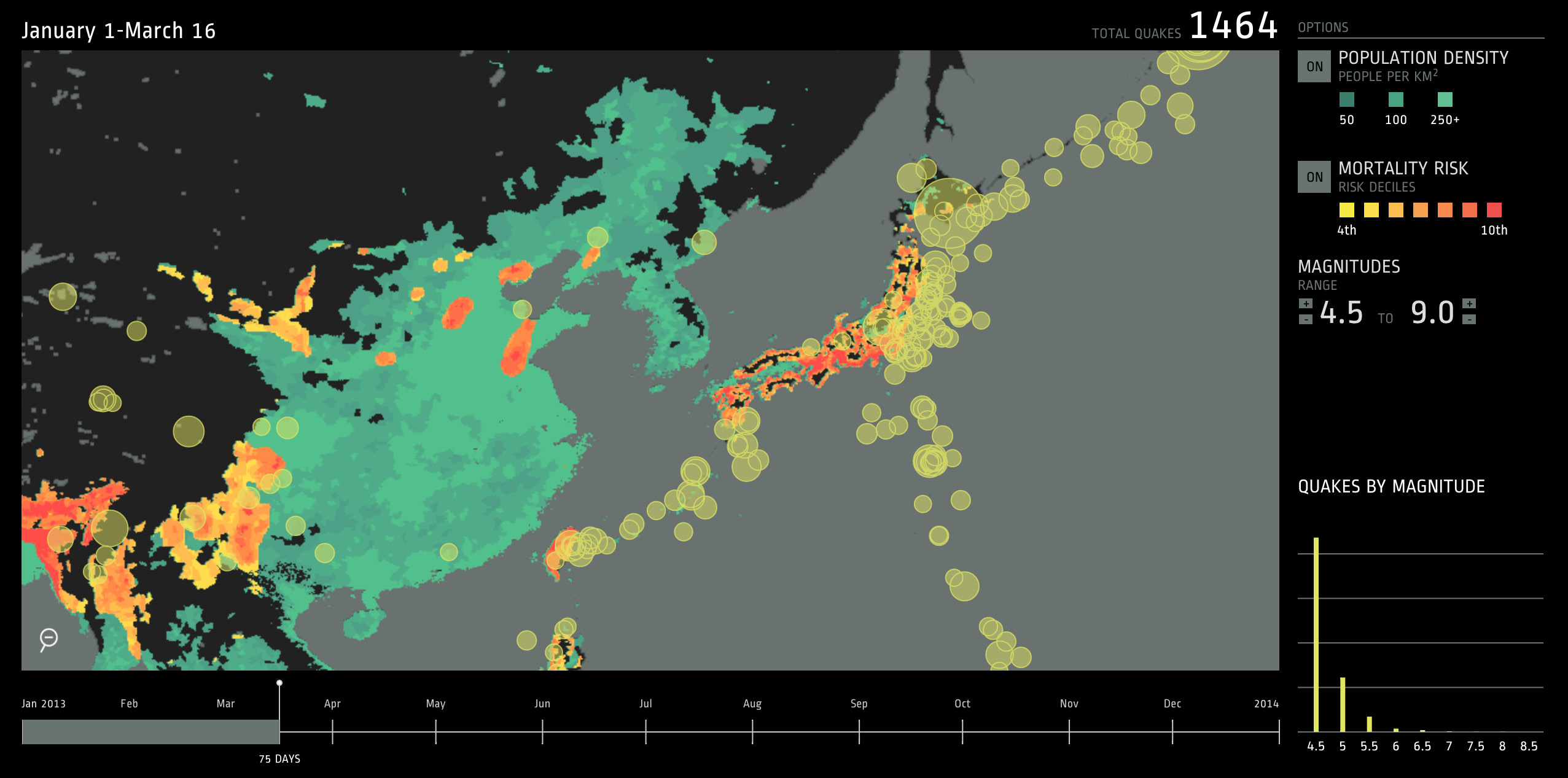
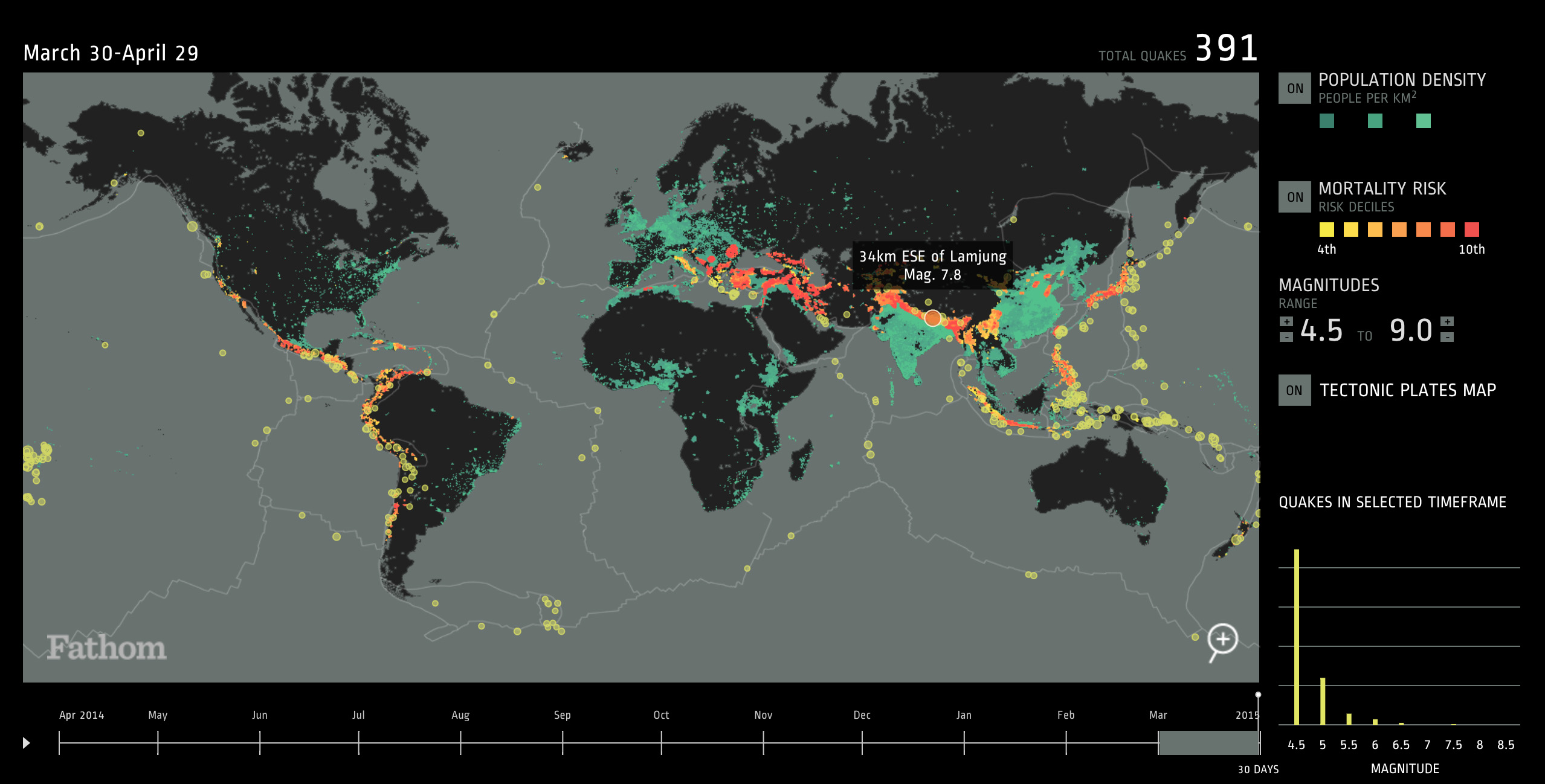
The tool revealed hot spots of seismic activity. By including population density as a layer, we could begin to see areas of high risk. For example, Japan and much of East Asia are densely populated along the coasts — an area that is also host to a large percentage of the world's earthquakes.
East Asia experiences some of the year's largest earthquakes measuring over 7.0 on the Richter scale, putting many of these areas in the top mortality risk deciles.

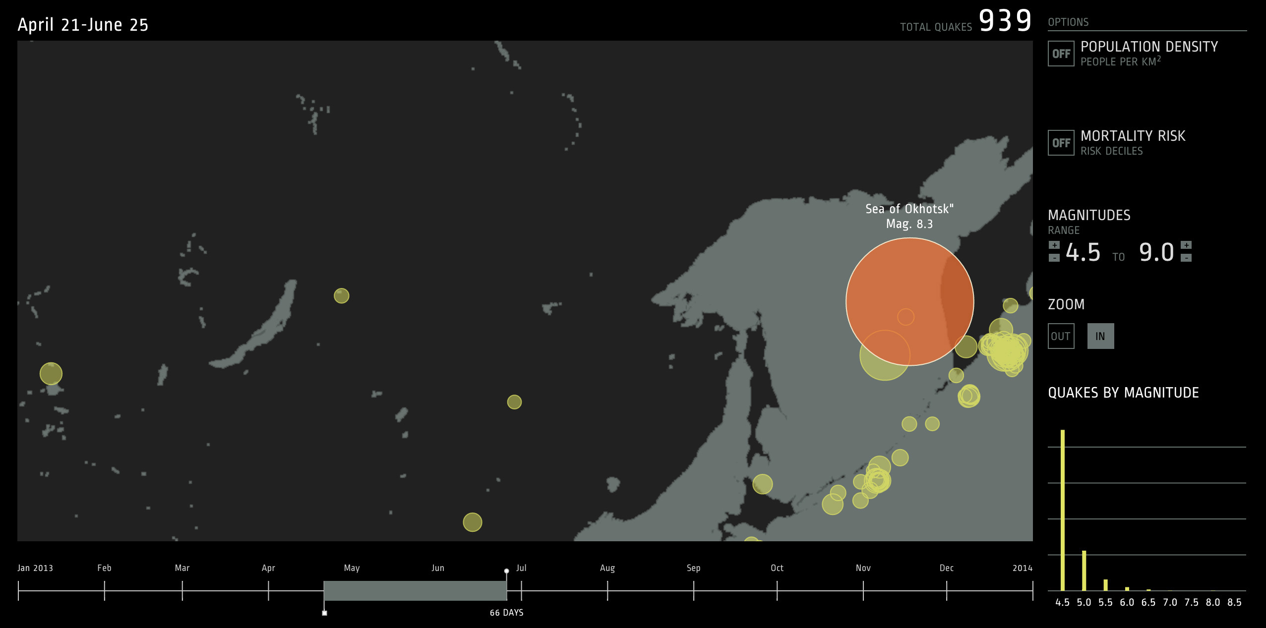
The largest earthquake in 2013 actually occurred deep in the ocean off the coast of Russia. Luckily, its depth prevented massive damage, but the tremors could be felt thousands of miles away.
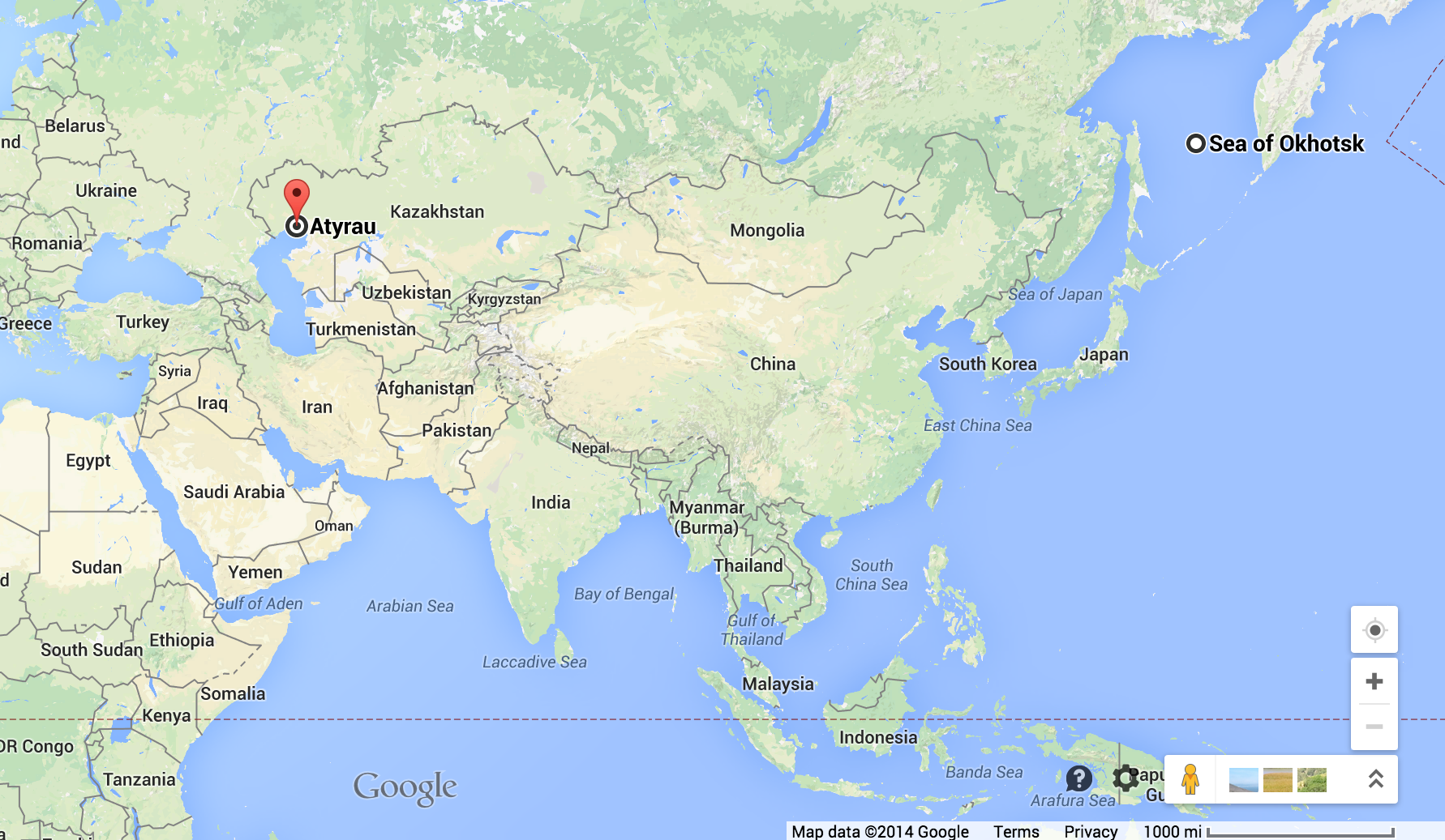
Areas like East Asia, the Himalayas and the U.S. West Coast experience a large amount of earthquakes because these areas lie directly on top of tectonic plate fault lines. On the other hand, areas like the U.S. East Coast, Australia and most of Africa experience little to no seismic activity throughout the year due to their locations in the centers of tectonic plates.
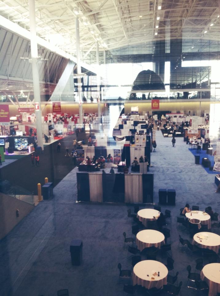
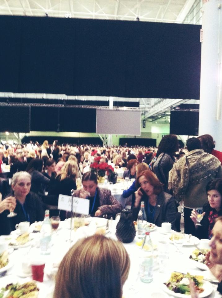
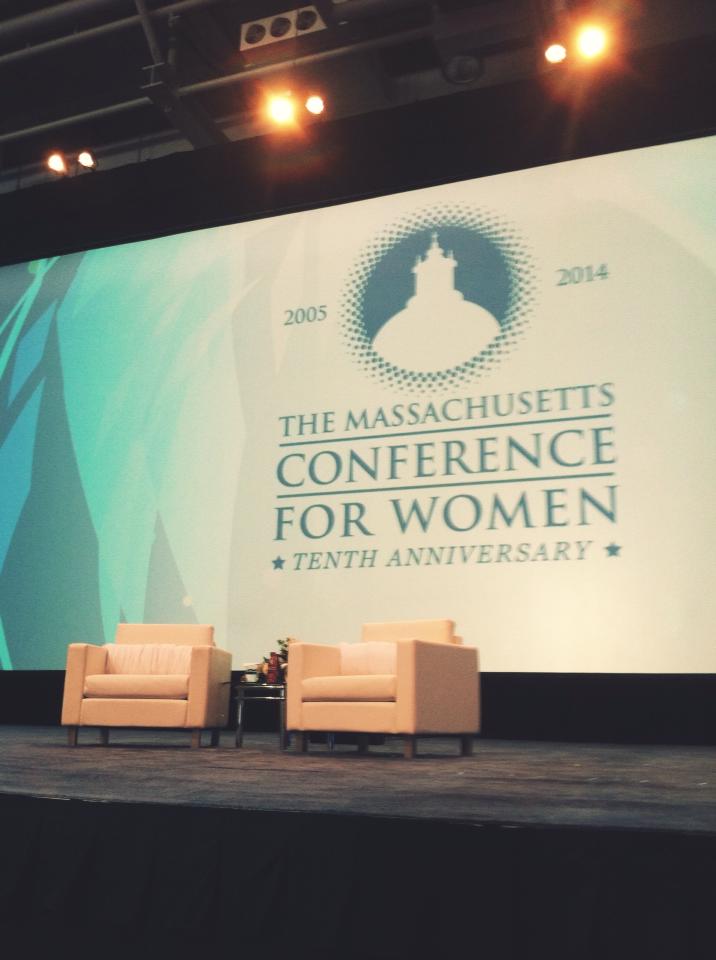
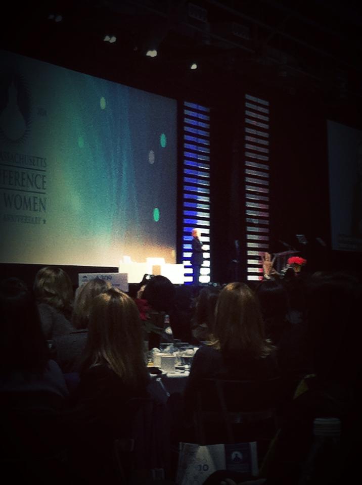
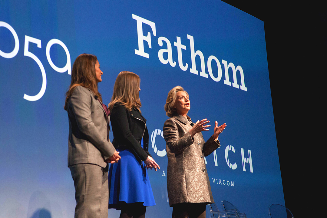
The Massachusetts Conference for Women is a yearly conference focused on bringing together the network of female community leaders, workers and entrepreneurs. The event is made up of resume building workshops, company booths, and keynote speaker presentations. This year, the keynote speakers included Lupita Nyong'o and Secretary Hillary Rodham Clinton.
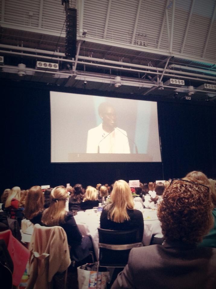
Ms. Nyong'o spoke about her journey to becoming an actor. Her talk focused on the importance of acting on your aspirations, no matter how lofty, in order to move forward.
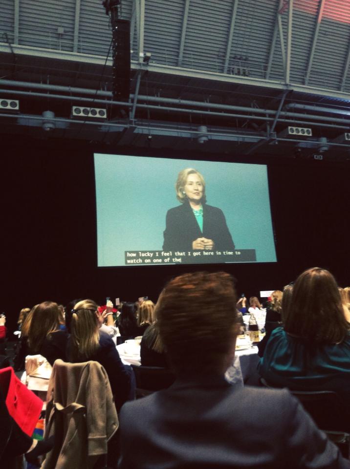
Secretary Clinton focused on Massachusetts as a place for progress and change, particularly for women. She brought up historical Massachusetts female pioneers such as Emily Dickinson and Abigail Adams, and praised Massachusetts for recently passing the law granting workers paid sick leave. She encouraged the women of Massachusetts to continue being engines of change and to "continue to crash through ceilings, and unlock the unlimited potential of every woman."
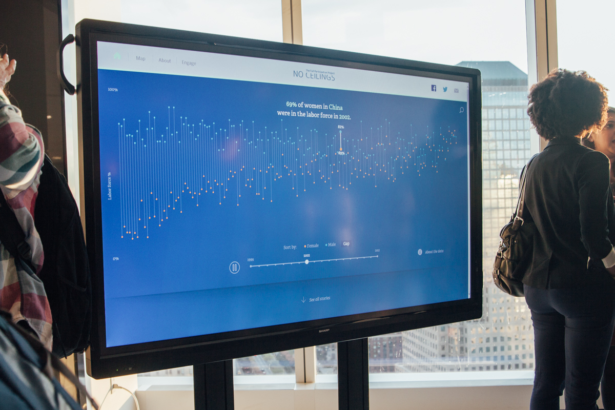
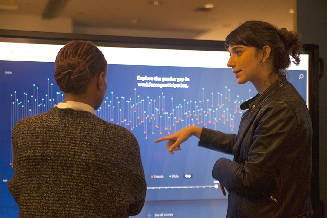
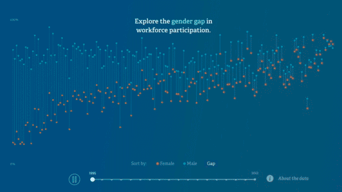
After the session, we had the pleasure of meeting Secretary Clinton and briefly discussing the data initiative we have been working on, which charts the global progress and setbacks of women and girls over the past twenty years. Stay tuned for more updates!
Please consider donating to local and international relief efforts.
Many of the world’s most densely populated areas sit along the most seismically risky locations. The Nepal earthquake was triggered by the release of escalating tension along major fault lines, where the plate containing most of Europe and Asia overrode the subducting India plate. The Nepalese capital of Kathmandu, home to more than one million people, sits just 48 miles southeast of the earthquake’s epicenter.
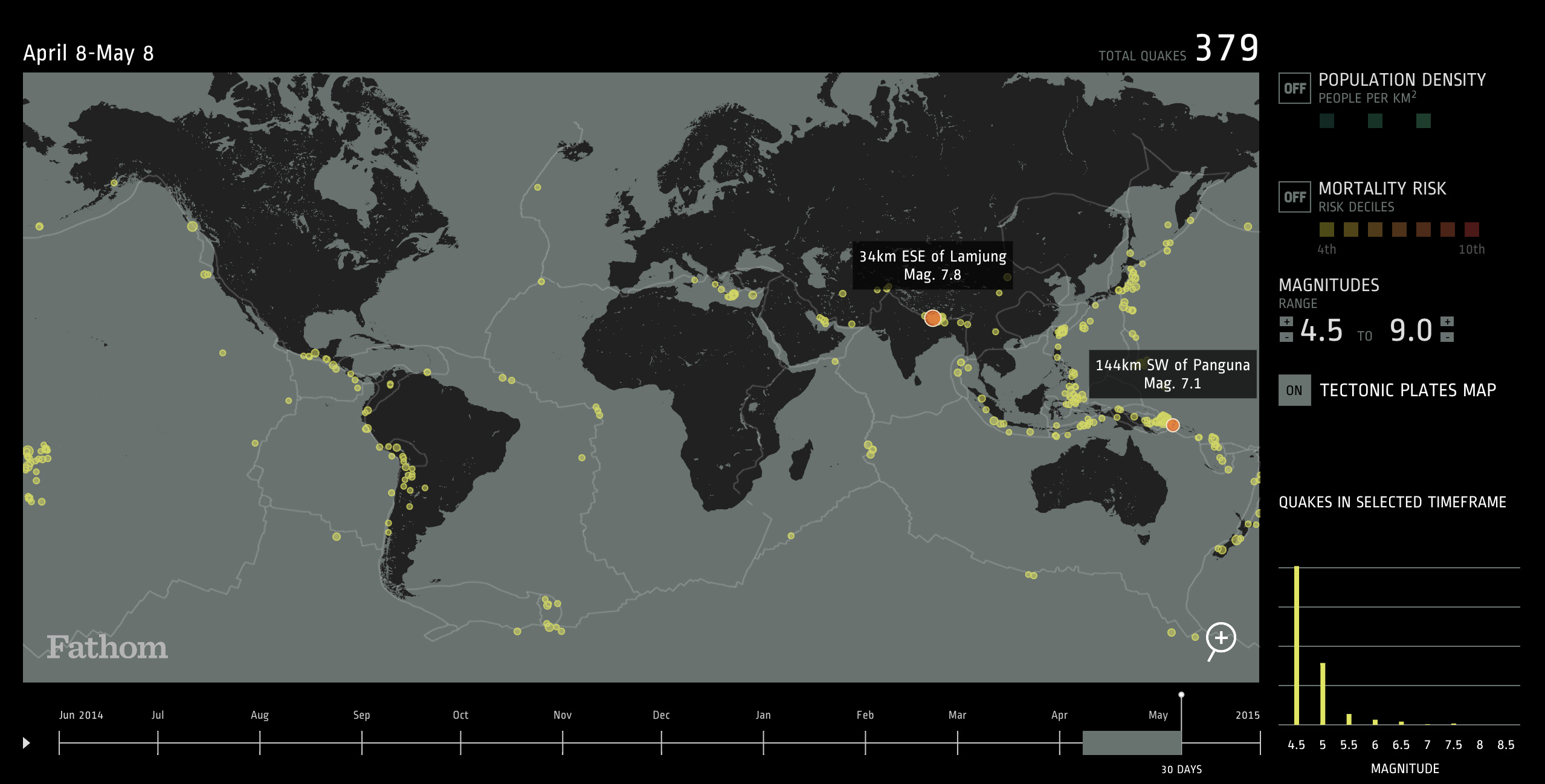
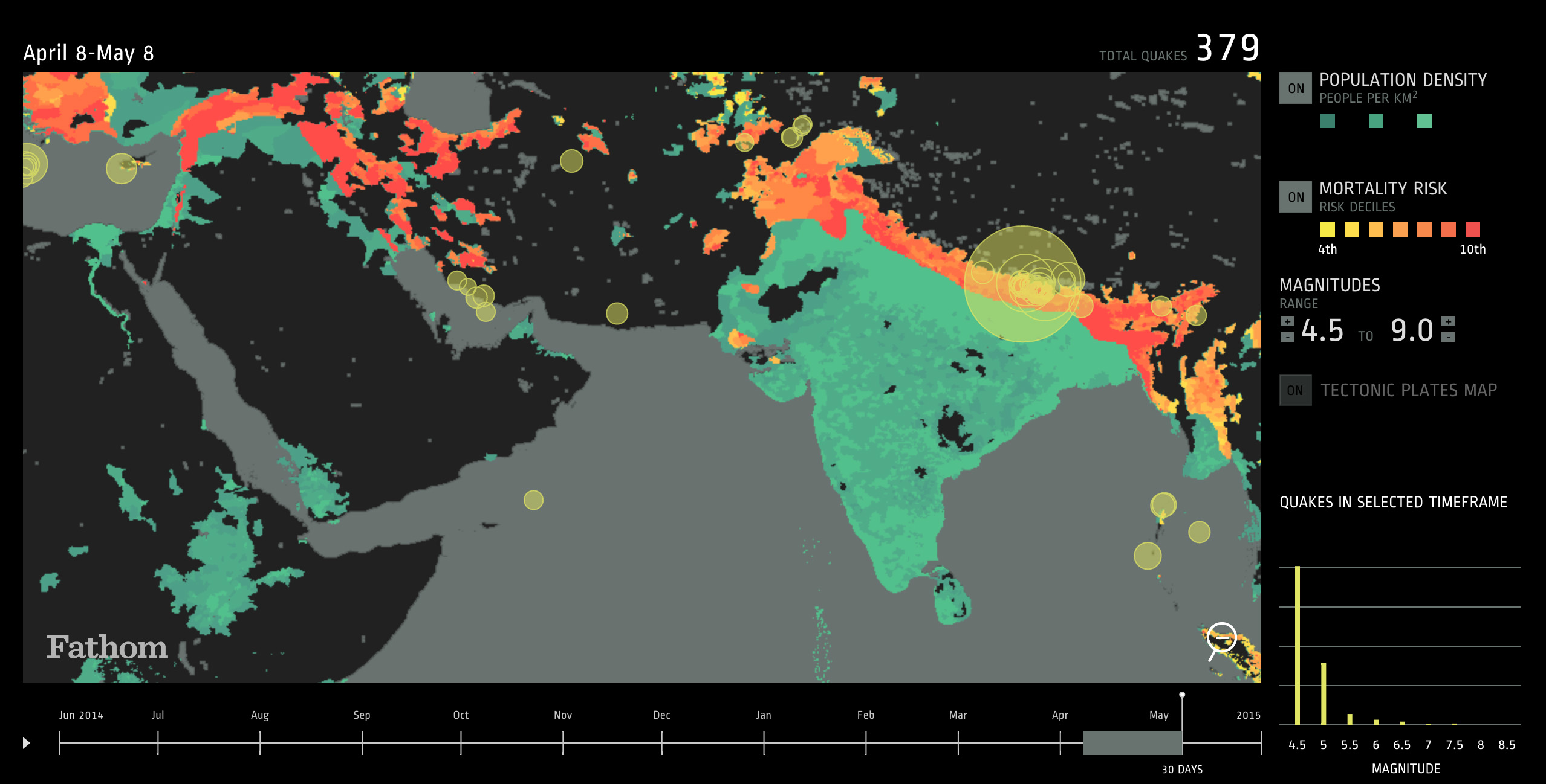
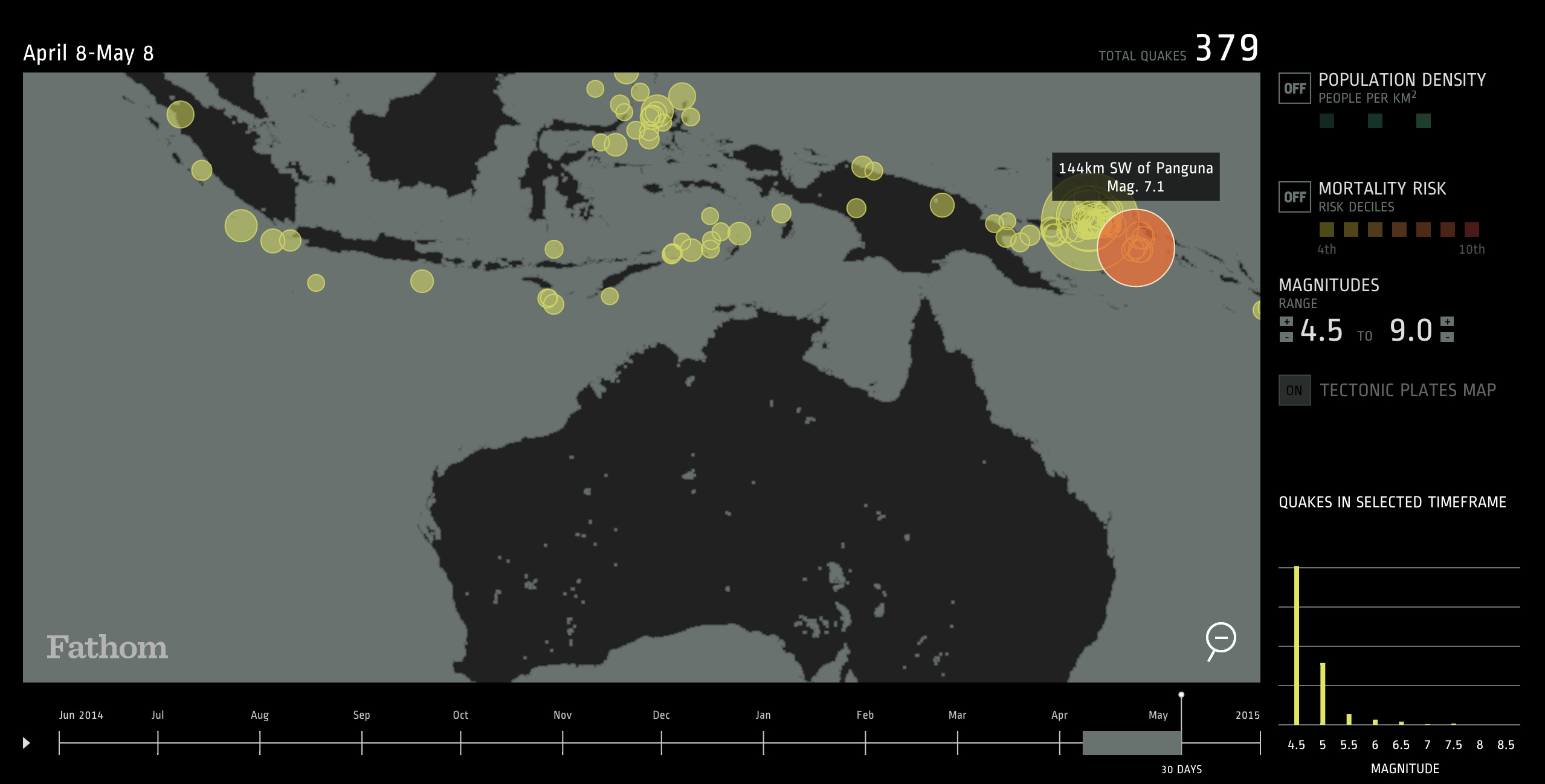
There have been four magnitude 6 earthquakes along the boundary of the India and Eurasia plates in the last century. In the last month alone, there have been 379 earthquakes between magnitude 4.5-9.0 around the world.
Our web application demonstrates that the most densely populated areas are often at the greatest risk for high magnitude earthquakes. Many of these high-risk regions require improved infrastructure that can sustain the frequenting tremors.
We hope our tool can act as a guide as to where we can focus future efforts to improve infrastructural and institutional preparedness. Please take the time to learn more, and support the international aid efforts where possible.
The researchers took every plant name in the International Plant Names Index (IPNI), and determined the gender of the original botanist who discovered and named each species. The results showed that while "approximately 20% of scholarly authors between 1900 and 2000 were female...female authors account for 5% of the new plant species names published during that time period." In total, fewer than 3% of land plant species have been named and published by women.
The gender gap in botany is particularly interesting because botany has historically been seen as a "feminine" science. As noted in the paper, women's lack -- or flat out denial-- of access to publication services and resources may have contributed to the infrequency of their new naming publications. Beatrix Potter, for example, was forbidden from presenting her paper, On the Germination of the Spores of Agaricineae, at the Linnean Society in 1897, since women could not attend Society meetings. The gender gap in botany still persists, however it has become one of the smallest gaps in the sciences, with female botanists naming about 4 species for every 5 named by their male counterparts.
It would be great to see more research published within this vein, and used as a reference point for how the gender gap persists in access to academic resources, research opportunities, and availability of publishing and distribution.
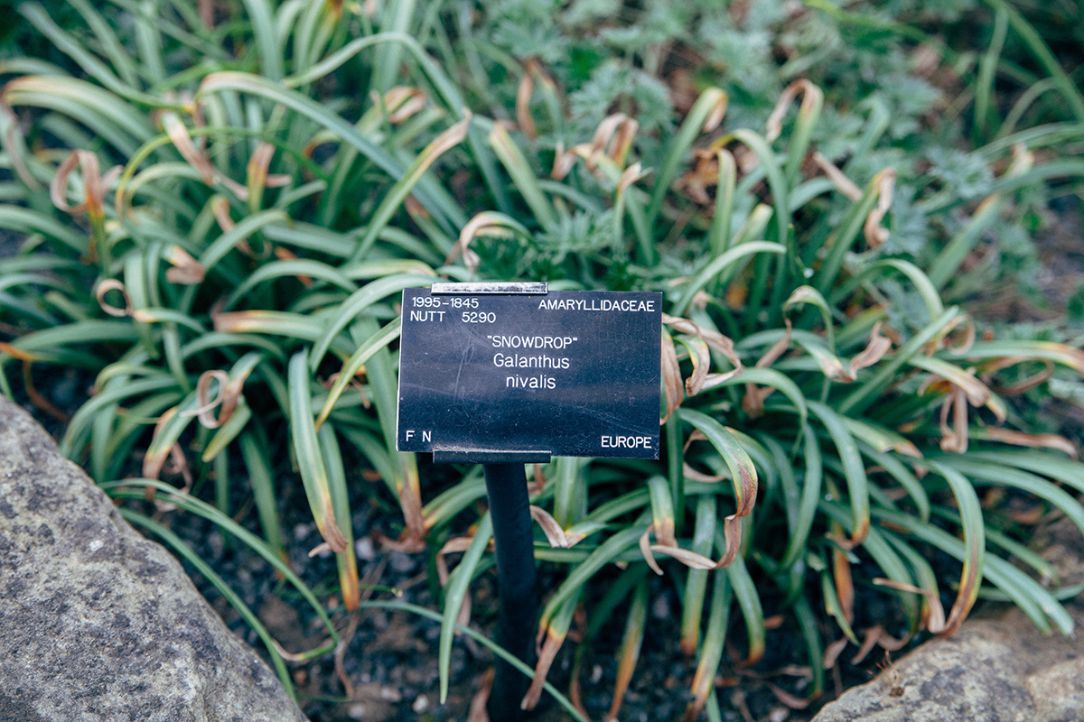
On a related note, the data source for our most recent National Geographic project keeps record of international plant trade. In our early explorations for the project, we looked at both animals and plants and found that Woronow's snowdrop (Galanthus woronowii), named in honor of Russian botanist Georg Woronow, was the most traded plant in 2013.
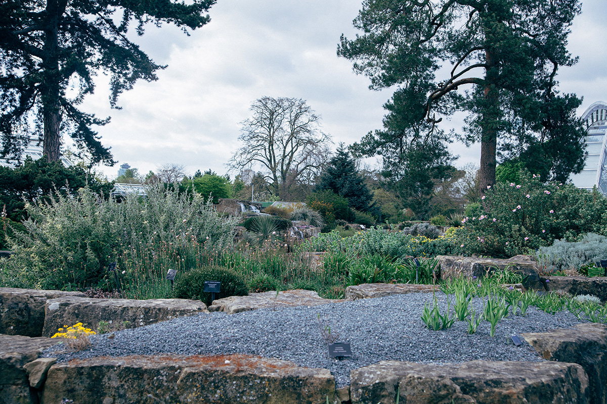
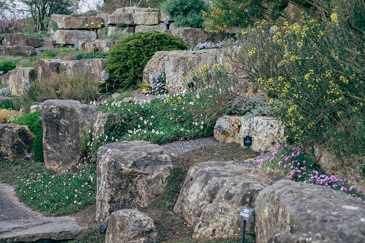
Snowdrops in general (Galanthus spp.) contain the substance galantamine, which can be used in the treatment of Alzheimer's disease. Though I missed their blooming season, I was able to find the common snowdrop (Galanthus nivalis) in the Kew Gardens Rock Garden.
A lot of our work digs deep into one area of expertise, so it's pretty amazing when we can find ways they intersect. Who knows, maybe our interest in food will combine with our love of television next...

2015 marks year six for Fathom, and it has been a big one. Over the past twelve months we've given talks at Internet Week, Eyeo, Williams College, The World Bank, Tufts, the Visualized Conference, PopTech, SATE, the MIT Media Lab, and Olin College.
Girls Who Code and Olin College came to visit and learn about Fathom, Processing, and how we work.
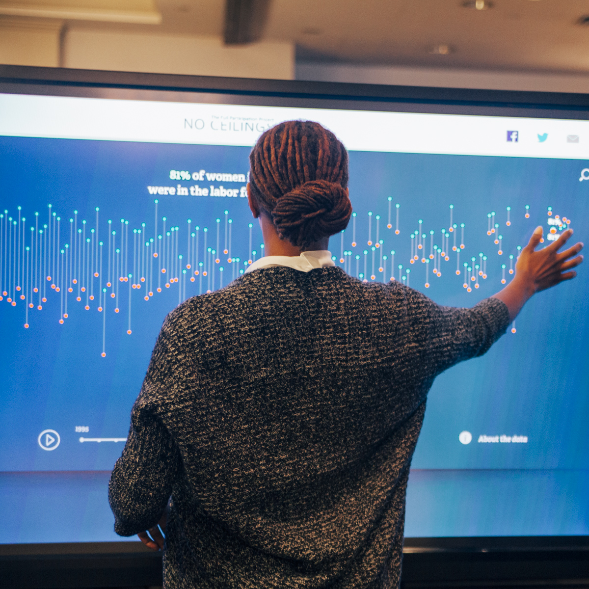
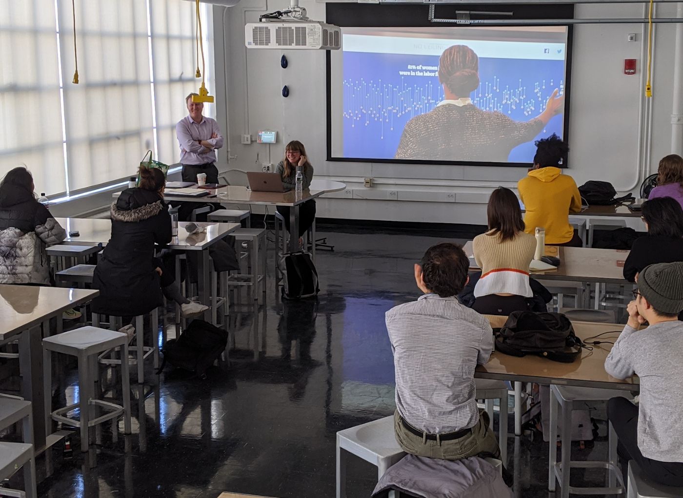
We launched one of our largest projects to date, No Ceilings, and showcased it at this year's Clinton Global Initiative as well as one of their partnered events with Self Magazine.
We also launched a piece on Animal Trade with National Geographic, a series of Watch Faces for your Android Wear, and a 2.0 version of World Bank India.

We were even able to launch a few side projects of our own that looked at the composition of Jaws, the poetic nature of U.S. city names, and we redesigned Ben's The Preservation of Favoured Traces into a set of prints.
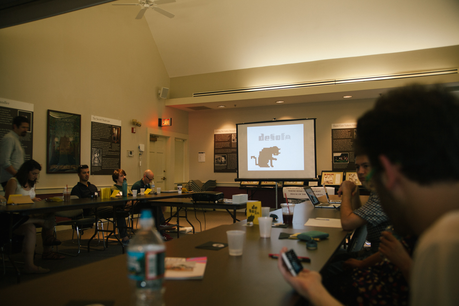
We visited Salem to talk design, technology and data at DeSoFa.


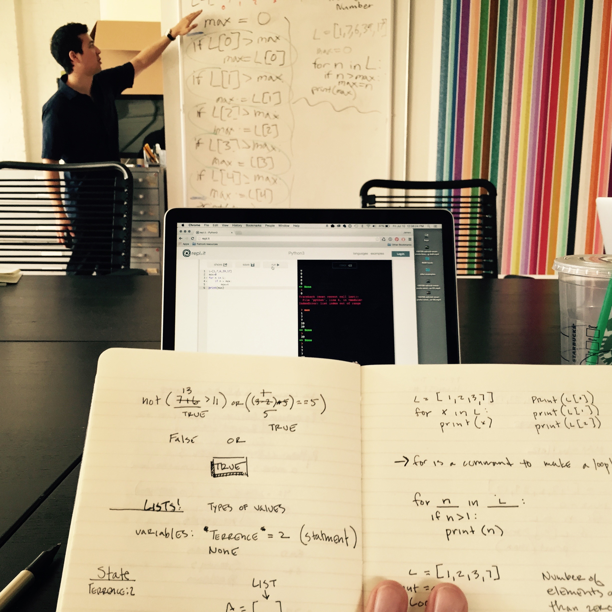
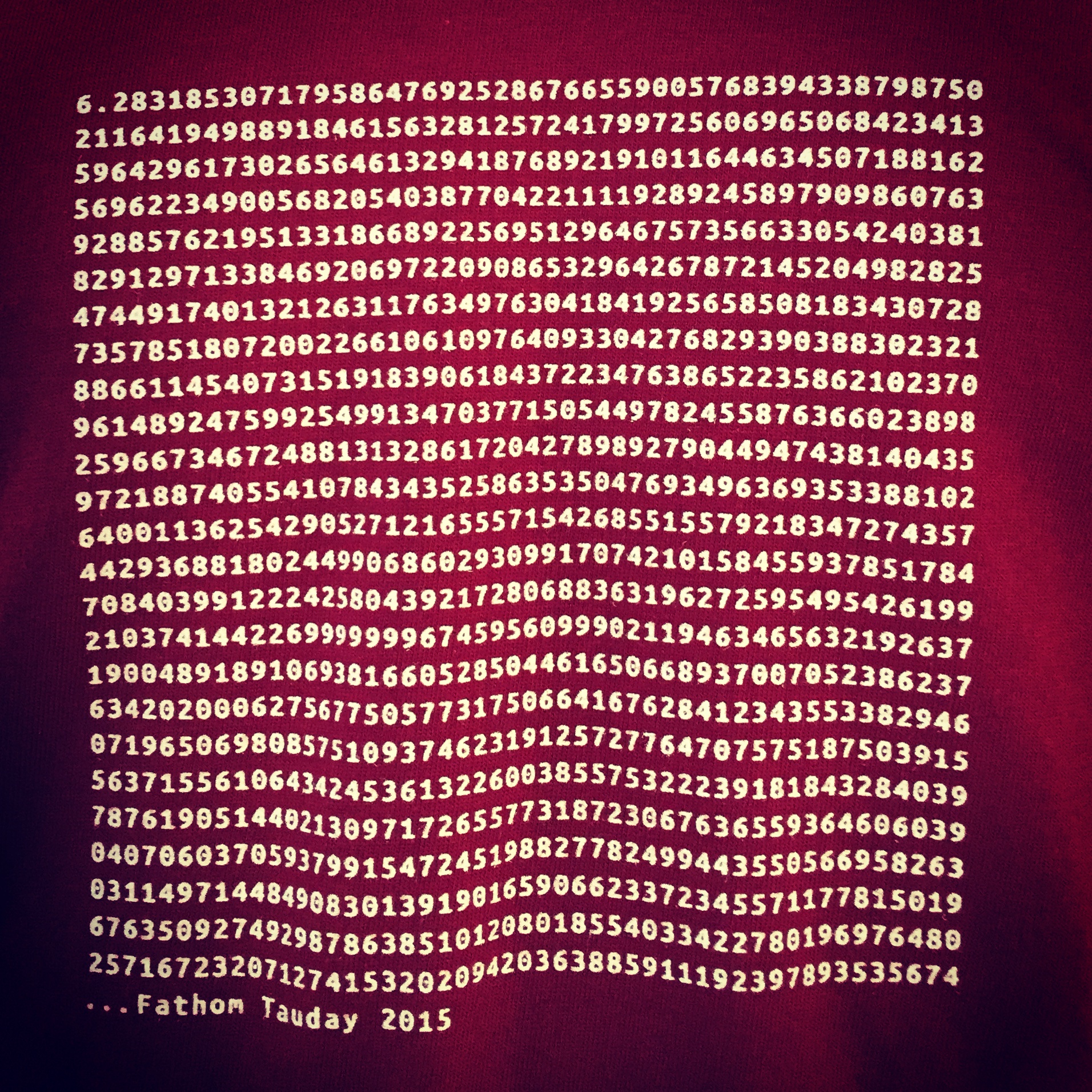
And when we were done trampling around Salem, we snuck in some time to teach Python, celebrate Tau and learn about shaders.
All in all it was a great year, and we're looking forward to the next. See you in 2016!

Fathom has done work with GE in the past, but it's been a while! Recently, we teamed up with their team and our friend, Camille of Estuary Branding, to take a fresh look at GE's historical timeline. The previous timeline was out of date in both content and structure. The goals of the new Transformation Timeline were to showcase the people, events and technology that define each of GE's businesses, and demonstrate how GE has changed over time.
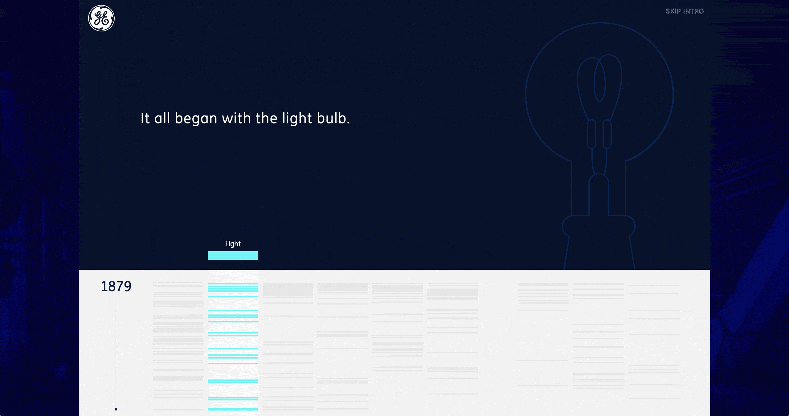
The original timeline was a series of webpages with many image carousels, and it lacked a narrative flow. For our piece, we wanted visitors to get the big picture of GE, while also having the ability to explore individual events. The landing page features an awesome animation by Rachel, which highlights the world-changing technologies GE developed over its 100+ year history. Their innovations started with the lightbulb, and have evolved to the vacuum tube, and all the way to today's wind turbines.
Below the animation there is also an overall view of the timeline. You can see how GE's earlier history spanned mostly across light, energy, and transportation, while some of the later businesses, like aviation, didn't start until almost midway through the company's history.
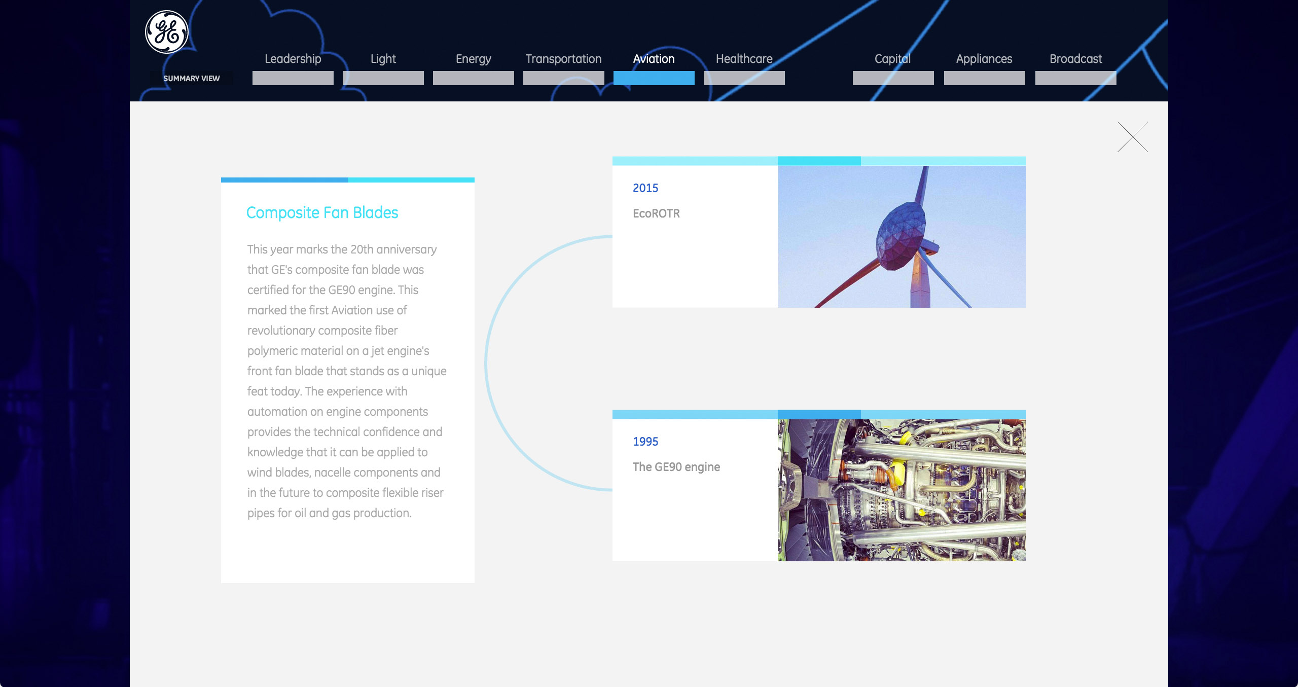
Part of what makes GE such an interesting company is that they have people working across all different technological fields, and those businesses communicate and share technology with each other. We were able to show this in the timeline through technology transfers. Throughout the timeline, there are examples of these technology transfers, and a special view showing how two or more events across businesses are connected.

There were also lots of events I didn't know GE was responsible for. For example, Thomas Edison, not only a fellow Cooper Union grad, but also the founder of GE, invented the first motion picture camera. A video on YouTube recently surfaced showing a film of cats that had been recorded with Edison's camera. That's right, GE was responsible for (probably) the first cat video ever.
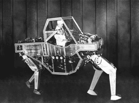
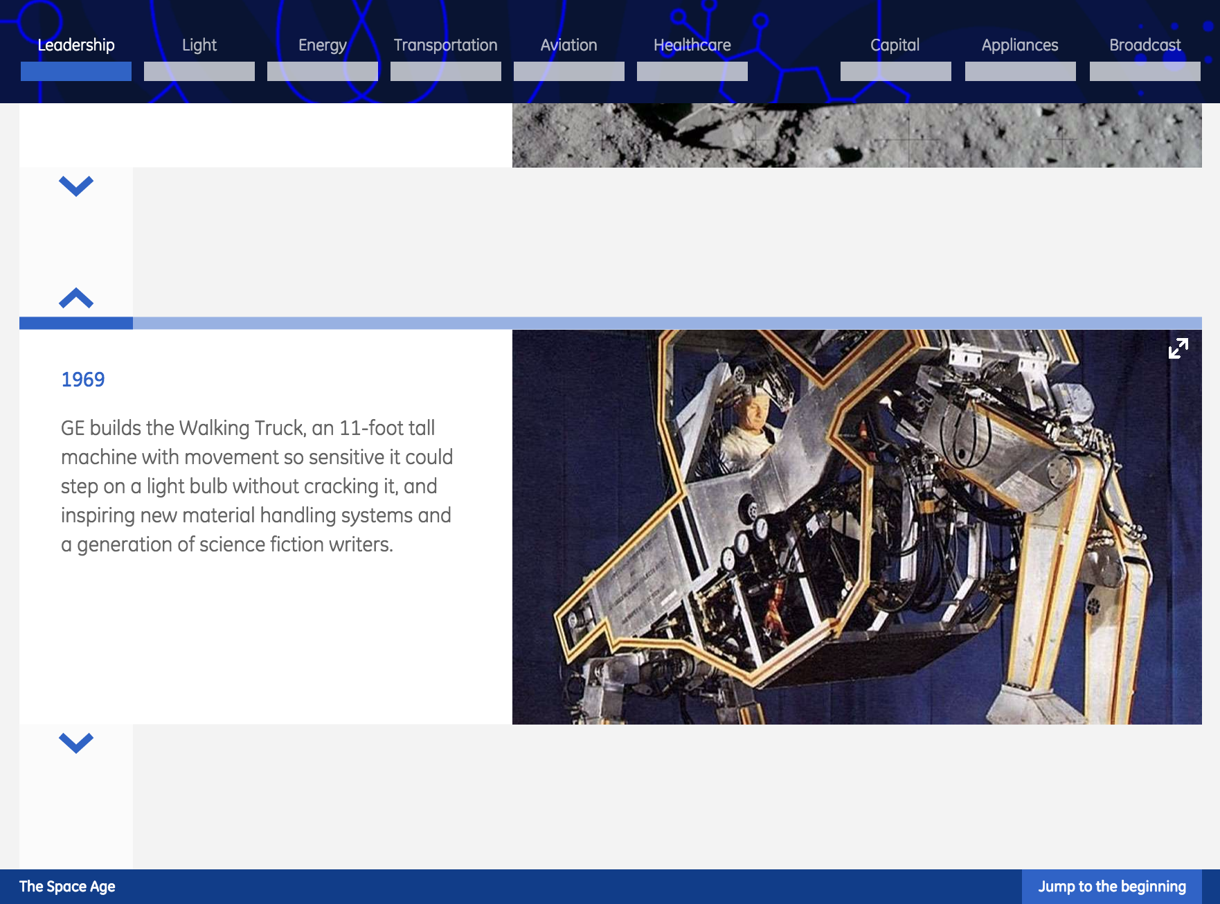
While they're most famous for their spinning things (gas turbines, wind turbines and airplane engines), they have produced a lot of strange and experimental technologies throughout their history. One example is the Walking Truck, a machine created in 1969 to facilitate navigating rough terrain. The project ultimately failed, but it has inspired countless sci-fi cousins.
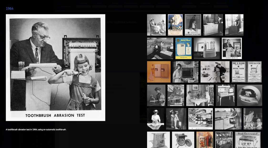
For some of the older consumer businesses, there are a lot of amazing advertisements and photography. We wanted to make sure that those materials, which GE has been known for in the past, were included in the timeline as well. For Appliances and Broadcast, we added a gallery view of historical images, which included things like ads for pink GE refrigerators and photographs of the first toaster ever!
Overall it was a pretty amazing project and there are lots of goodies hidden throughout the timeline. Check it out for yourself at ge.com/transformation!

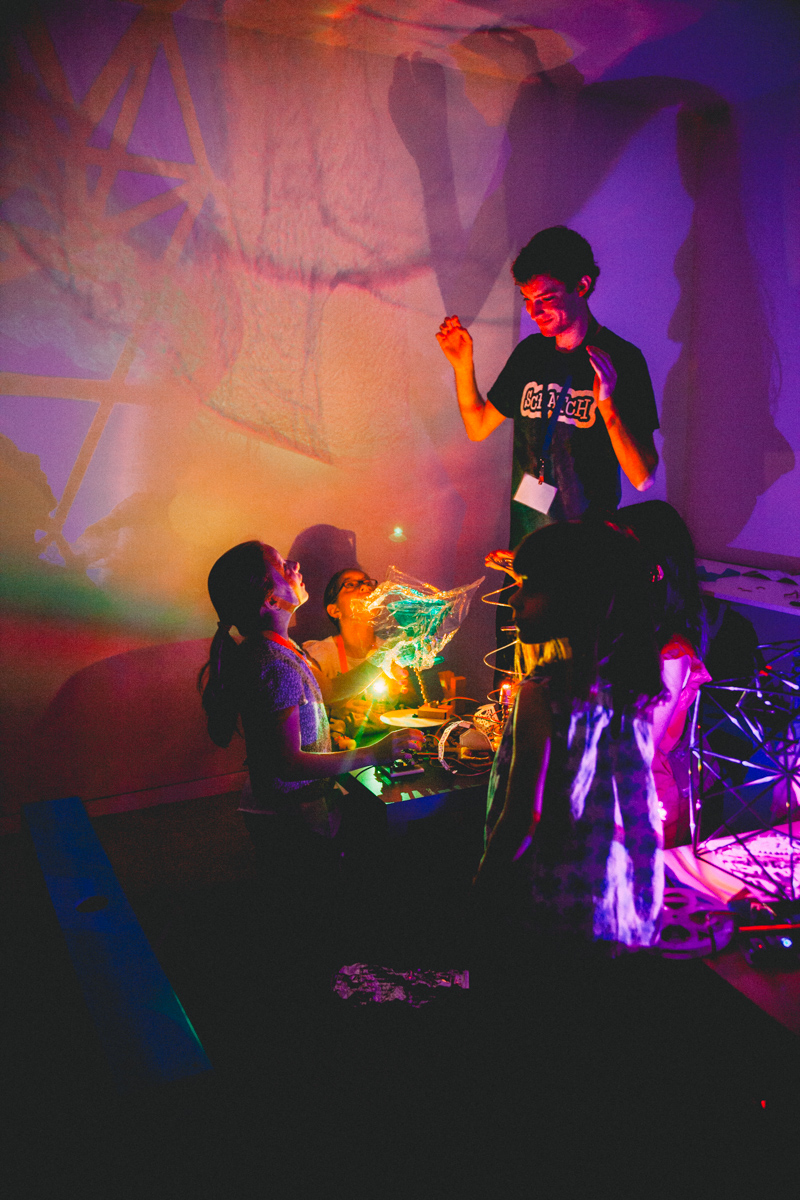
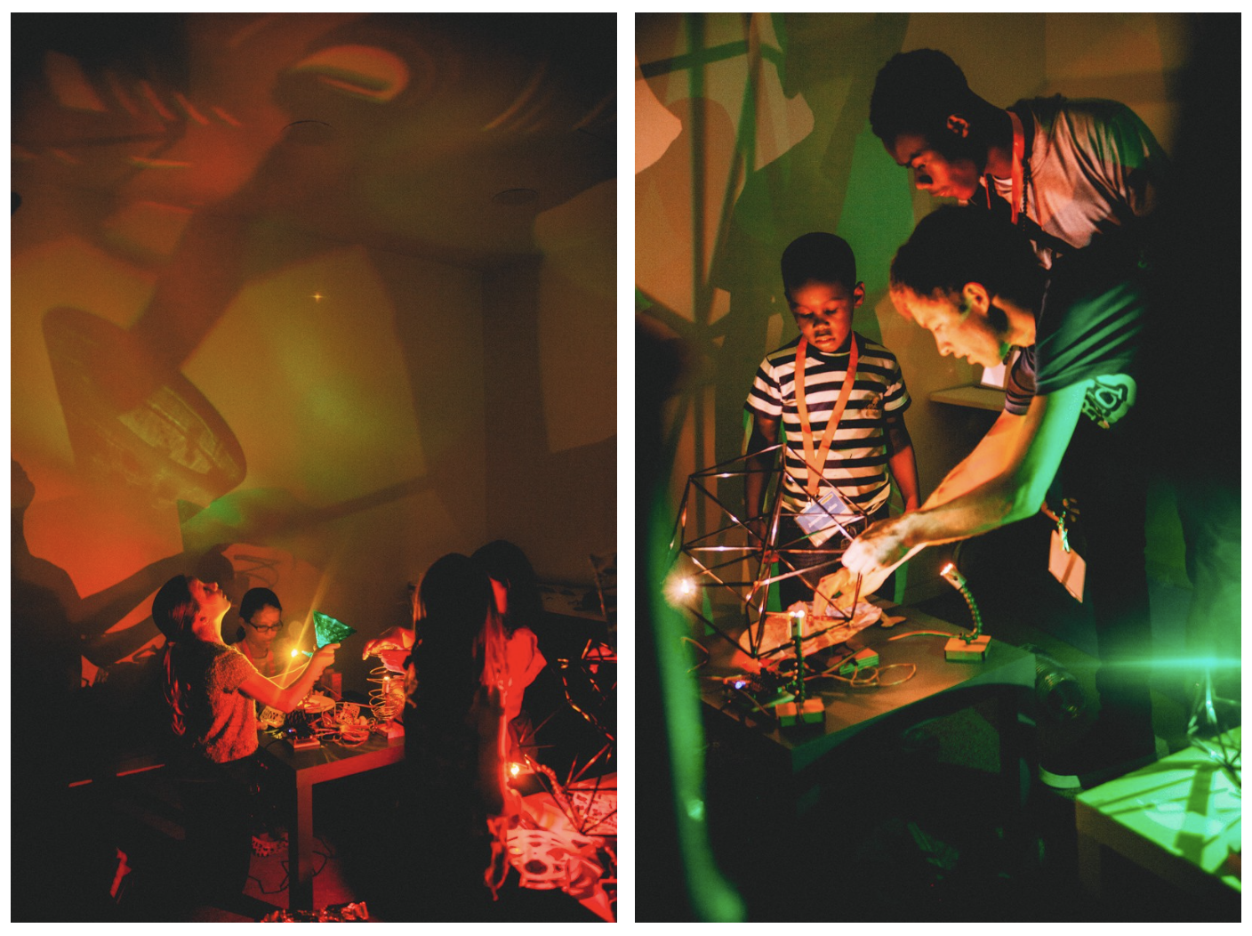
Scratch Day celebrates the anniversary of the creation of Scratch--a programming language for kids. The all-day event at the MIT Media Lab invited kids and parents to experiment with new features of the language, meet with other Scratchers, and share work. The celebration not only introduces kids of all ages to programming, but also to MIT, and the local creative coding community.
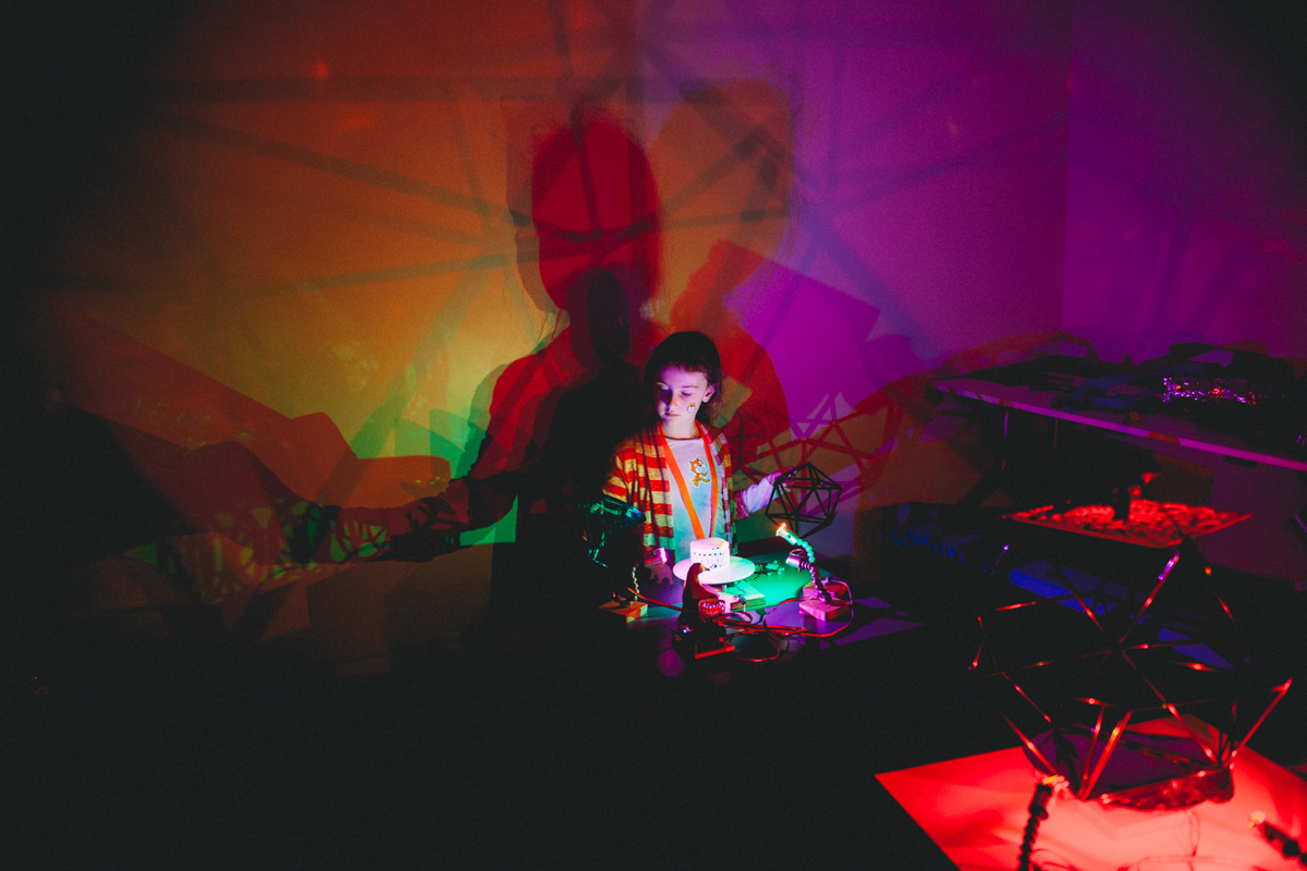
I helped with an activity that showcased how Scratch can manipulate hardware and respond to physical surroundings. The activity, called Lightplay, consisted of a set of lights and rotating platforms hooked up to Scratch through a special set of blocks (the functions and variables of the language). Using Scratch, kids could control the color and brightness of the lights, as well as the speed and direction of the rotating platforms. There were ways to set up alternating color patterns, fading between colors, and even responses to different inputs like the volume of chatter in the room. There were also different toys and reflective objects, so kids could play with making shadows and patterns in the space.
It was amazing to see how quickly kids were able to start manipulating the lights and begin to solve their own problems like “How do I make the lights fade to red in a circle?” or “What happens when I shine both red light and blue light on an object? Will I get purple?” One of the most interesting parts was the number of parents who asked “How can I buy this, or build something similar?” The experience showed how excited the kids were to mess around with the code.
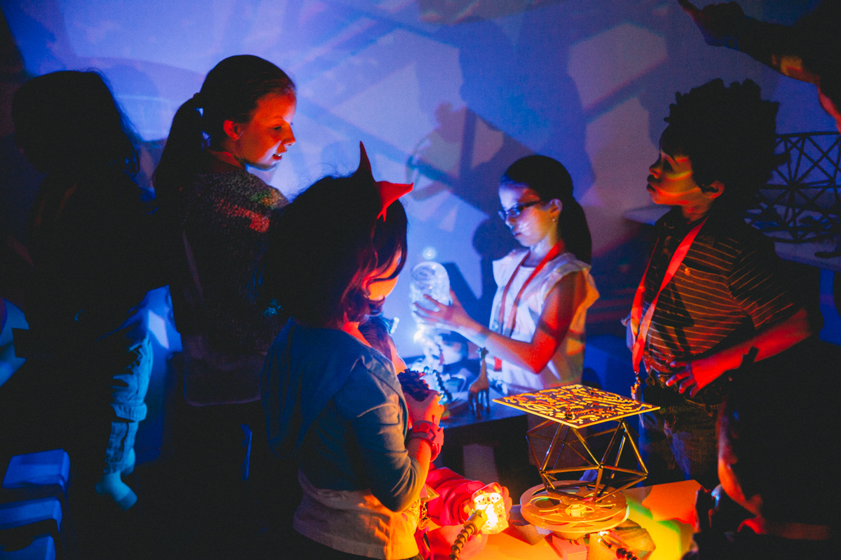
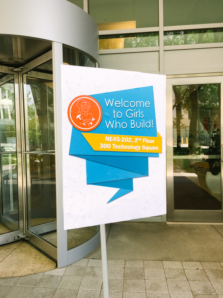
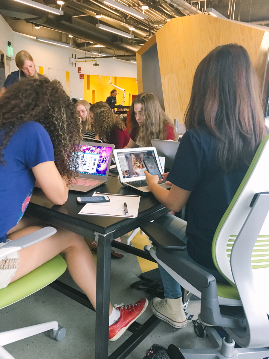
I also recently helped out at a workshop for Girls Who Build – a local group that develops open courseware and workshops on engineering for girls (our very own Leslie has developed material for it in the past!). The latest workshop focused on the intersection of computer science and photography. I gave a quick talk on image processing, and how math and computer science are combined to manipulate images for both analysis and aesthetic purposes. After the talk, the girls worked in small groups using Processing to manipulate photos they had taken.
The girls were really excited to get some insight into how some of their favorite apps, like Instagram and Snapchat, are able to produce image “filters.” A lot of the girls had never programmed before, but by the end they had all built or edited a filter in Processing. One girl even told me she was going to use her filters for all of her Instagram posts! Overall, it was incredibly satisfying to see how excited the girls were when they finally got a filter to work. The curriculum is available on MIT OpenCourseWare.
We see code as another tool for designers, artists, and engineers. We’re always interested in exploring new and engaging ways to teach programming, and in facilitating the use of code for creative endeavors. Both events were great examples of how creative coding can engage a wide variety of kids (and adults!) in programming. We're looking forward to finding more opportunities to host or participate in workshops in the future. Perhaps we need a Processing day...
This fall marked our second semester teaching a course in information design at MIT. The class breaks away from both traditional design and computer science courses by teaching design and code together as tools that support one another, as opposed to separating them into two disciplines. As a result, we get a mix of architecture, physics, engineering, you-name-it students in the class — all with various levels of code and design experience. This mirrors the fluid environment in which we work, which allows us to merge design, development, and narrative in each project. By teaching code, design, and storytelling all integrated together, we’re showing our students not only how to take their own ideas and technically build them, but create pieces that will more actively engage others, because they’ve been thinking about the work’s final context and audience all along.
The MIT course is our main teaching endeavor, but it’s important to recognize that that reaches a particular subset of potential students. So we also like to spend time with groups like Girls Who Code, who focus on bringing in voices we still hear far too little from in “tech.” And we’re excited to have the opportunity to share our take on technology with the girls. During visits to the studio, we talk about how there is more than one way to be “in tech,” from writing, research, analysis, design, and of course, code.
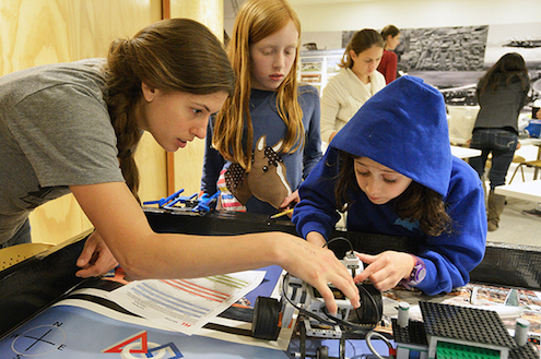
Even outside of the office, many of us volunteer our time working in various areas of design and computer science education. Leslie has been the coach of a Lego robotics team for girls for the past three years. Originally an activity she started while she was at Lincoln Lab, she continues to work with the girls to teach them the foundations of programming and mechanical design. She’s also been part of numerous hardware workshops, showing kids ways they can blend code and industrial design — all while getting to physically build something awesome with their own hands.
This past summer, Olivia volunteered at MIT’s Scratch Day, helping kids use Scratch (though they didn’t need much help!) to control a series of lights and surfaces and experiment with color, light, and shapes. She also assisted with a Girls Who Build workshop in image processing, in which girls created their own Instagram-esque photo filters in code.
In these workshops and clubs, we’ve seen kids learn not just about how to code, but how to problem solve, build, invent, iterate on their ideas, and ask themselves questions. These fundamental concepts are applicable across all fields, so even students who don’t ultimately pursue careers in programming or design can benefit from this kind of hands-on learning.
And all of this ties back to our roots with Ben being the co-creator of Processing — a programming language, development environment, and community designed to help bridge the gap between artists and engineers — which he continues to develop both in and outside of the office. Since its start, Processing has been used as a tool for teaching code in a classroom setting, and we continue to use it ourselves around the office and in the course at MIT.
At the end of the day, we’re not quite a conventional tech company, but we’re not really a typical design firm either. We are a group of dedicated individuals using code and design as tools to make work the best way we know how. By being able to share what we’ve learned about design and code, we hope to enable others — whether that’s in information design, painting, farming, or building — to further their ideas and produce work they find meaningful.
The CS171 course focuses on data visualization theory and covering a lot of ground in terms of learning to program and the basics of interactive visualization. We like being able to guest lecture for this course because we always hear from students afterwards that they enjoy being able to see how what they're learning can be used outside of the classroom. Afterwards, students still had some commonly asked questions, so we thought we could answer some of those here.
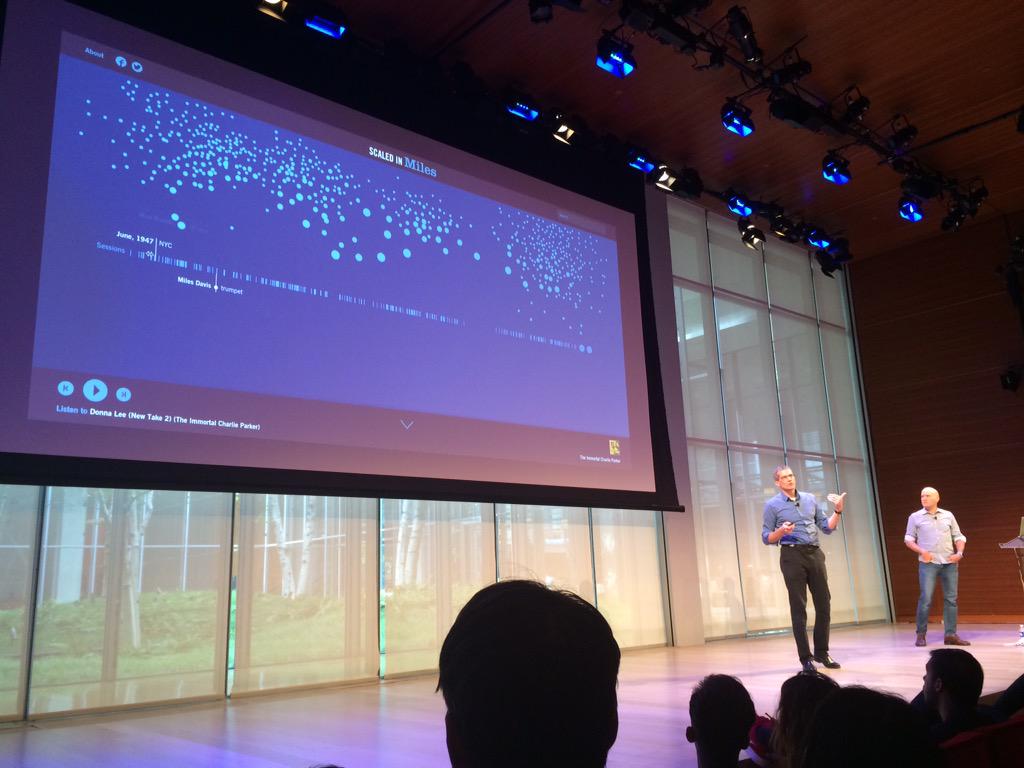
This is a question we get a lot, and unfortunately there isn't an easy answer. With our client work, they're generally the ones providing the data, but with our curiosity pieces, the data is often sourced ourselves or even self-generated. For Scaled in Miles, Mark was interested in Miles Davis' career and found a database of all of his recording sessions and collaborators, which became the main data source for that project. For Rocky Morphology, James watched all of the Rocky movies and recorded – by hand! – what type of scene was going on at every 1 minute interval. (He did this without telling us, otherwise we probably would have built a simple tool!) The USGS and NASA are great resources if you're interested in earth science data. The UN and World Bank provide lots of interesting global data (which is where most of the No Ceilings data comes from), and the U.S. Census is obviously a key resource for U.S. data. Don't be discouraged if you're having a hard time finding data you want to work with. Unless someone is providing you with data, it can take some digging to find an interesting data set to explore.
For our initial explorations and desktop applications, Processing is our go-to tool. (Ben is still its primary developer, and many of its features exist because he wanted them for his own projects.) Once we're done sketching with Processing, we might port to JavaScript (if it's a web piece) or deploy the application to another environment. For instance, we might build an installation on here using mostly Macs, and then run it on a Windows machine for the actual installation.
For the web, we stay away from visualization libraries because our job is to provide bespoke ways of looking at data, which often makes using a library more of a hindrance than helpful. (Another way of thinking about it is that visualization libraries rarely solve the things that actually take the most time for us.) Primarily, we write our projects from scratch in JavaScript and include the typical UI libraries (JQuery/JQueryUI) when useful.
For analysis and data-wrangling, we often turn to Python. We also do a fair amount of server-side work with Python, sometimes Node, and even a little Java.
We try to use whatever tool best suited to the job, and makes us most efficient, often employing many different tools at various stages. The No Ceilings project, for instance, started with a custom-built tool created with Processing. That tool helped get a sense of what was in the quarter million rows of data, and once we found something interesting, that was exported to Excel, which was used to generate charts and short write-ups that were delivered as PDF documents. The final site uses a lot of JavaScript, but also D3 for a piece or two, and even three.js for a 3D globe for mobile devices.
D3 is primarily a data visualization library. It is great for getting a quick view of your data and we've used it here for just that on many occasions.
Processing is a part language, part library, part environment, and often used for creative coding. The main version is Java-based (as a “language” it's sort of a dialect of Java), so the work you create with it is not readily usable on the web. However, it has a lot more juice than your browser, so when you're working with large datasets, it can make those initial iterations happen a lot faster. It also can export out to PDF, which makes it great for creating the data-driven pieces of any print work you may want to do.
p5.js is a project that builds on the ideas of Processing but rethinks some of its base decisions for the web. Primarily, it can help simplify the process of writing HTML5 canvas applications. It's a great starting place for learning to code in general (it's what's used by Khan Academy, for instance), but it's also helpful when you find yourself editing a D3 example so much that you're writing more code to change it than the example itself. When you get to that level of customization, p5 and the HTML5 canvas can be your friend.
Yes! We are always looking for curious, driven candidates. We are not looking for someone who can "do it all," but people who can think creatively about how to apply their skills – whether that be coding, design, writing, or managing – to the work we do. We also have internships throughout the year. If you want to learn more, check out our careers page.
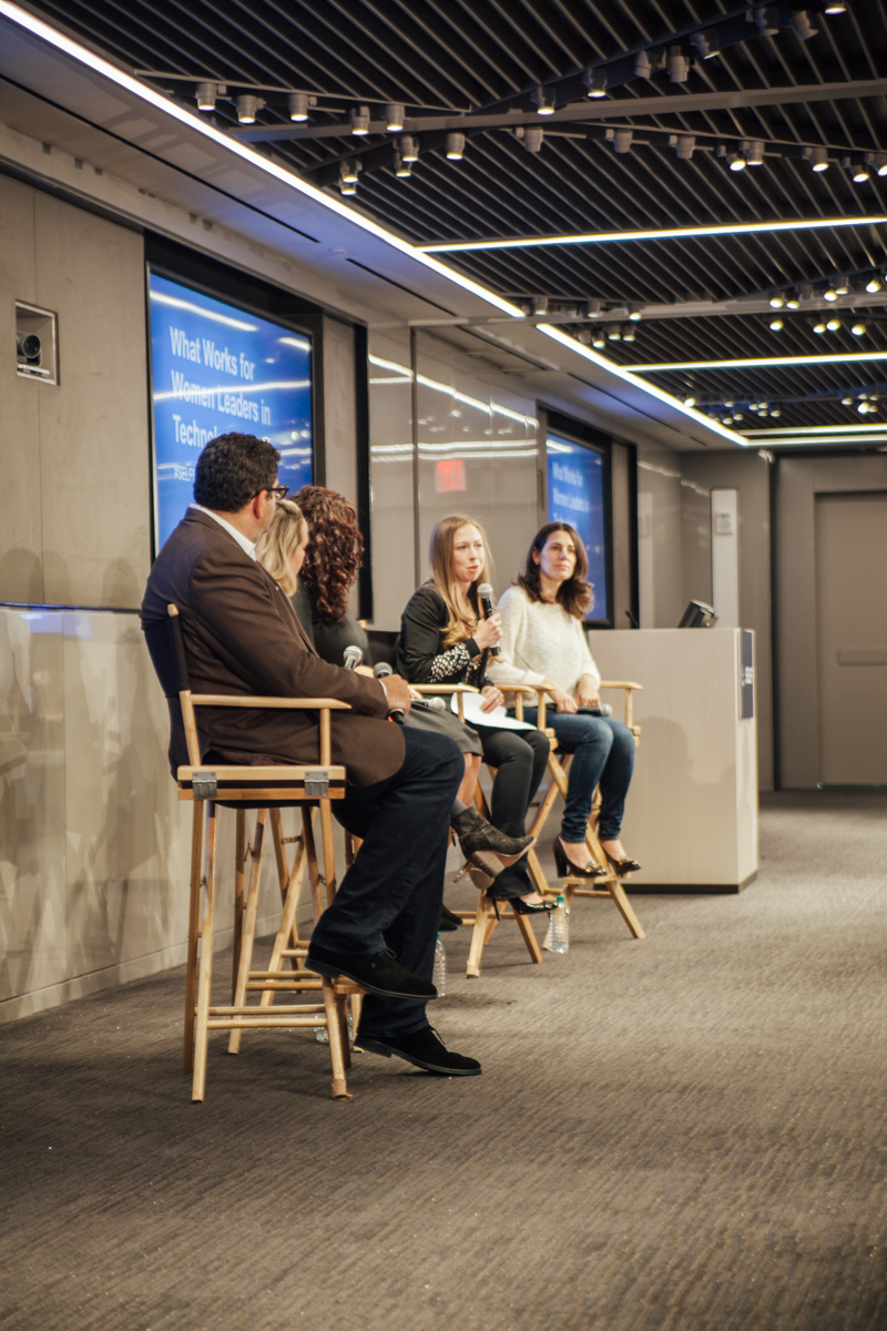
Mark and I were lucky enough to be invited as guest lecturers at Harvard’s CS171 Data Visualization course again this semester. We love being able to share our work outside of the office, especially in classrooms where students have the opportunity to ask questions. We covered some of the most frequently asked questions last year, but there were some new ones this semester.
Everyone in the office has a unique pathway as to how they got into visualization. In general, most people have a strong background in design, development, or research analysis, but specific backgrounds range anywhere from a BFA in Graphic Design to a Ph.D. in Astrophysics. At Fathom, designers can learn to code, and coders can learn about typography. You can read more about each individual on our team page.
With tools out there like Tableau and D3, we often get asked why we usually build our own for each project. Part of it is that when we started doing this, tools like Tableau weren’t viable (and D3 didn’t exist). As a result, we have a lot of reusable snippets of code for things like maps, bar charts, circle packing, etc., and it ends up being a lot faster for us to adapt that code over spinning up a new project in Tableau. The other deciding factor is that a lot of the time the data we are working with is too large for D3 to handle without getting very slow, or even for just looking at it in Excel (a worksheet can only be 1,048,576 rows?? Come on!) It also helps us really understand the gaps and nuances in the data very quickly.
Most of our projects do not come from data where individuals could personally be identified. When they do, we are especially sensitive to possible privacy concerns. For instance, when we did this project and others like it for Nike, we explicitly avoided concepts that would expose data in problematic ways. We simply treat it as another design constraint.
But generally, that kind of data is anonymized appropriately by the client, and we always make sure that our work does not do anything to weaken that anonymity.
To stay up to date with what we’re up to, you can follow us on Twitter, Instagram, and Medium, or sign up for our newsletter.
Thanks to Mark Schifferli
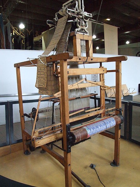
Coding and textile arts share a close bond. Some of the earliest programmable machines were Jacquard looms — weavers used a series of punch cards to make more complex patterns and produce textiles more quickly.
Since a full Jacquard loom was a little out of scope for a side project, we started looking into other machines. An embroidery machine was promising, but was unsuited for a project of a larger scale.
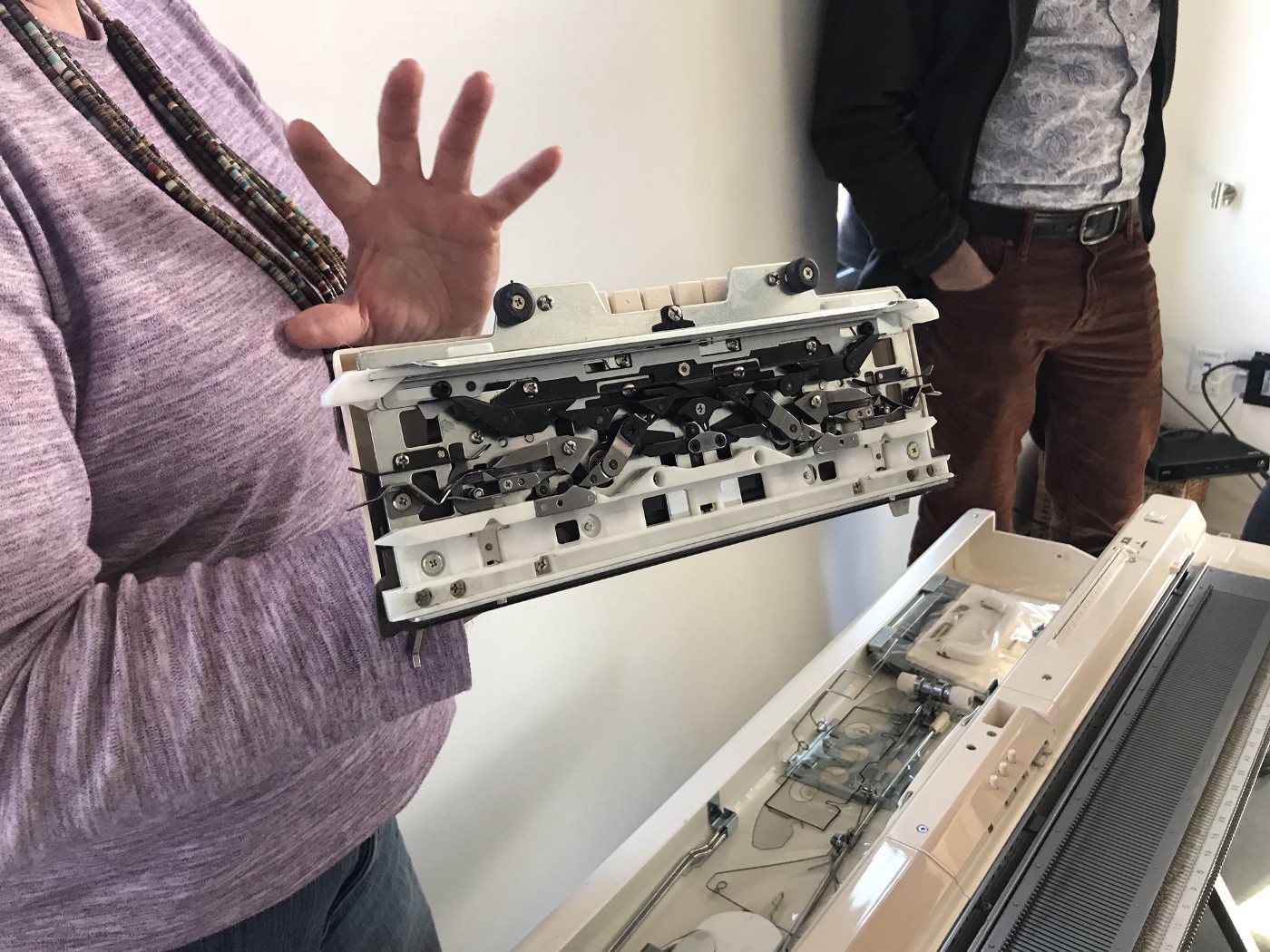
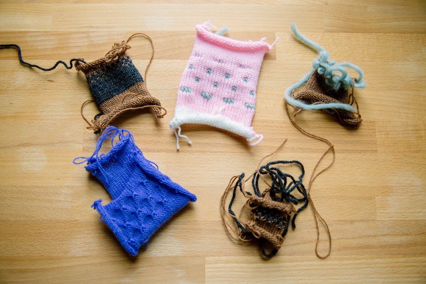
Then I stumbled upon Claire Williams‘s data knits work. I was so intrigued by the complexity of patterns she was able to knit using a hacked 90‘s electronic knitting machine that I started looking into how it was done. Turns out, she has instructions on how to get started with connecting these kinds of machines to a computer. While Anisha looked into the parts we would need for the electronics, I began my search for a knitting machine. I ended up finding a woman in western Massachusetts who works with these machines and had a nicely refurbished one that we were able to purchase. She even came to the studio and gave us a full tutorial on how to the machine works.
While we waited for the electronic interface to get up and running, Martha and I tested different techniques and patterns with the machine.
During that time, we also went to the a Bauhaus exhibit at the Harvard Art Museums, and I was completely blown away by Anni Albers’s and Gunta Stölzl’s work. That led me to pick up Albers’s book On Weaving.
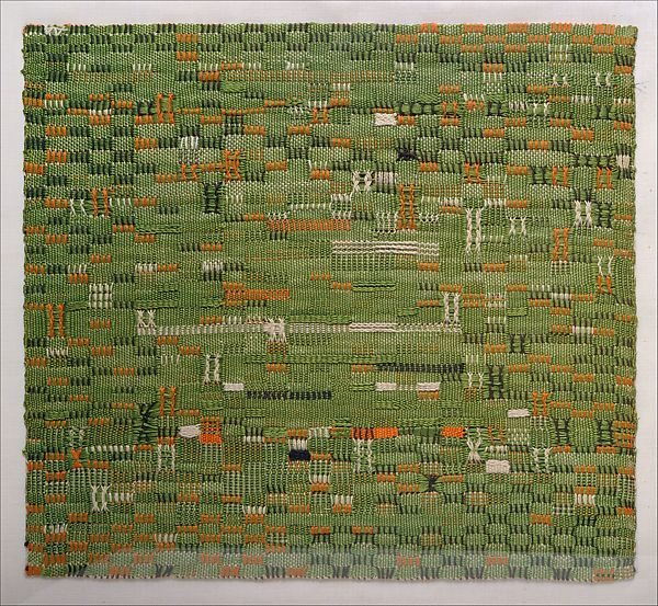
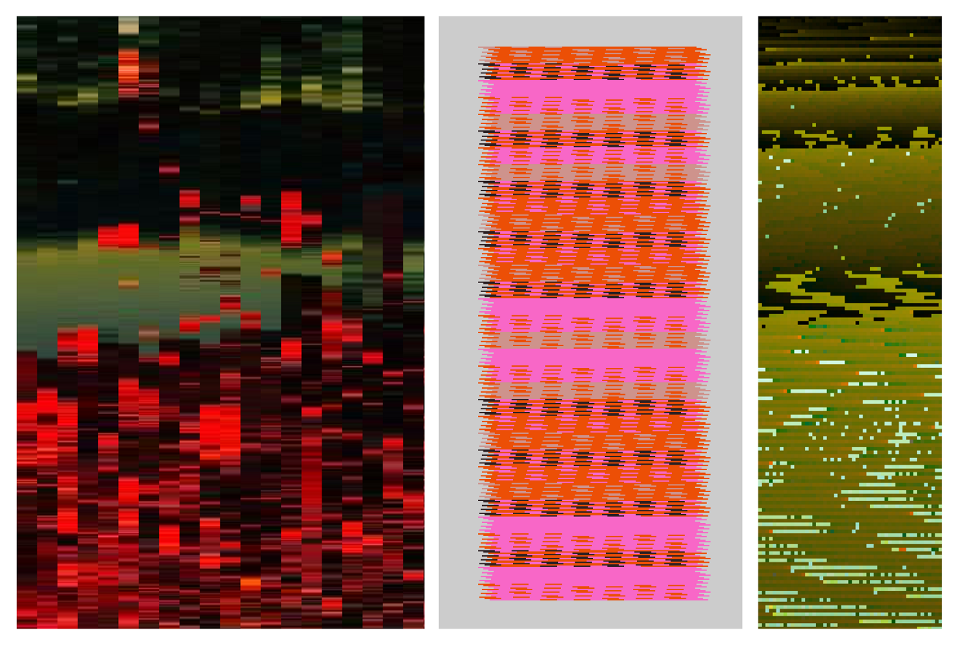
In particular, Albers’s piece “Pasture” stuck with me, and I began thinking about using photographs of places and objects to generate palettes for textiles. That led to an exploration using various software sketches to generate palettes and patterns and build assistive knitting tools.
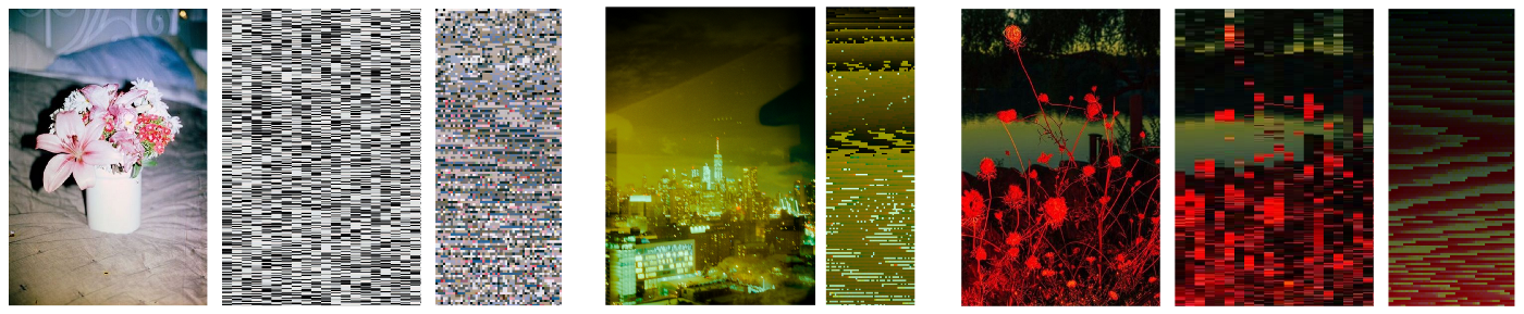
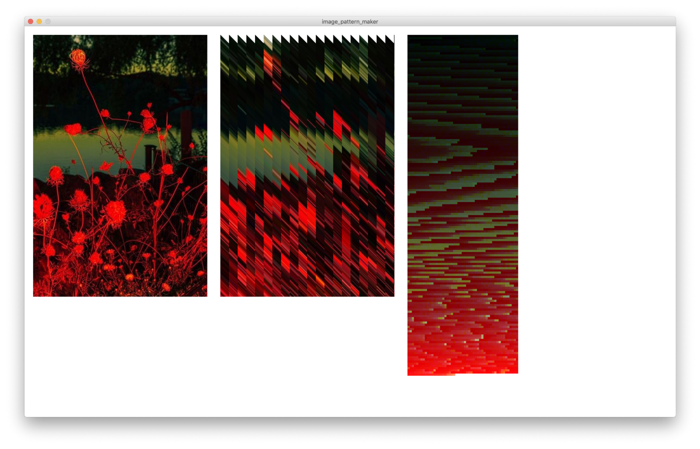
First, I was interested in seeing what you could pull from just a photo. I began with photos that had a great balance of colors, hoping that reapplying those same ratios in different orientations could create new works with a similar mood.
In making mistakes, I also got some cool results.
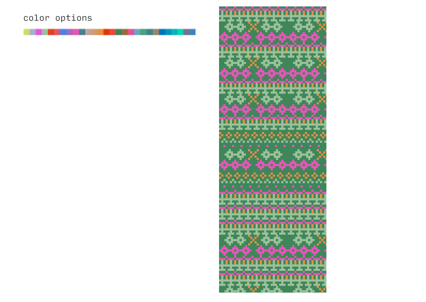
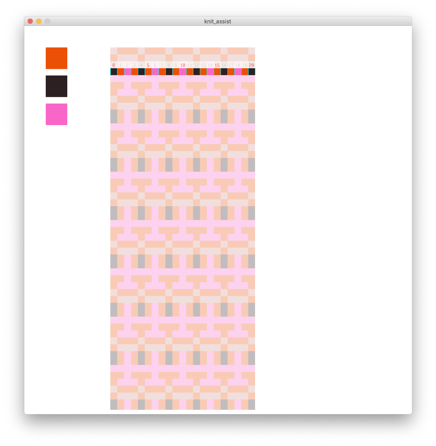
I then started to think more about the limitations of our machine (with an eye towards actually knitting something). In theory, our machine can use as many colors as you want, but only 2 can be loaded in at a time. Some accessories allow four colors at a time, so I set my sights on four-color patterns.
I didn’t have any knitting patterns handy, so I drew a few “pattern pieces” in Photoshop, and used those as the blueprints onto which I could map new colors. I wrote a few sketches in Processing to map the photo colors onto these pieces, and also generate different combinations of the pieces to create different patterns.
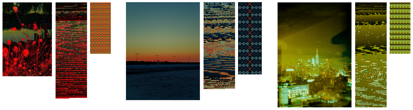
The program also worked by passing in a set palette, and having it randomly select four colors to apply to a pattern.
With those patterns in place, it was time to see if I could actually produce them with the machine.
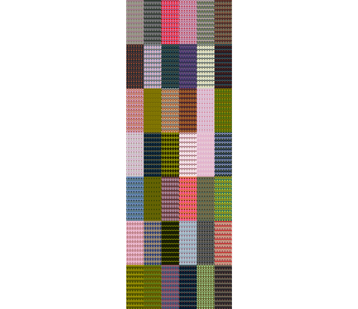
I printed out a small sample of all my generated palettes to bring to the store and see which colors were available.
It only took five hours…but I did knit one pattern I had generated, and I am really excited by the results. My knitting and finishing techniques need some work, but the colors and texture that resulted are lovely.
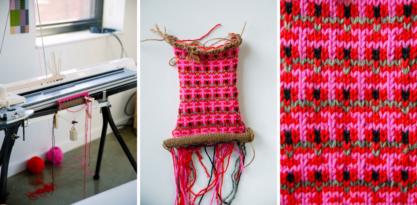
I struggle to keep track of where I’m at in a pattern, so I threw together a little Processing sketch to help me. One thing I didn’t realize while making this tool is that the machine knits patterns upside down! Oh well: I’ve been told there are no mistakes in knitting.
With more of the automation in place (and more practice!), we‘ll be able to explore the more irregular, glitchy, and tapestry-like patterns.
There’s also so much more to experiment with on the physical side that moves beyond color and its arrangement — like the different textures and sheen of the yarn (maybe we could use four different black yarns with different textures!), or different types of stitches. I’m also looking forward to exploring more meaningful data relationships between the data generating the colors and the patterns themselves.
Each project page now clearly defines the capabilities we brought to that project, alongside the challenges and outcomes that shaped the process. Potential clients often come to us with specific projects that inspired them, and we hope that by clearly defining the context around our work, we can help them understand where their unique data fits into the landscape of Fathom’s projects. The new project pages will also give prospective hires a more detailed look at how we work.
The timing for our new site release corresponds happily with Fathom’s 10-year anniversary, which we celebrated at the beginning of 2020. We’ve grown from a tiny office in the Cambridge Innovation Center to the whole beautiful 5th floor of a Beacon Hill building, and we’re thrilled to be moving into our teenage years.

One of the new additions to our website that feels particularly apt for our 10-year anniversary is a timeline of our work that includes many of our projects, posters, and tools from the last decade. We’re glad to have something that shows off our breadth of experience. And as an anniversary retrospective, it is, of course, poignant and encouraging to see how much we’ve done.
We’re also looking forward to a new addition to this timeline: an upcoming collaboration working on simulation games and tools for understanding disease outbreaks. We’re partnering with a research team that studies infectious disease, including the inevitability of global pandemic, so the project has felt more timely than we’d even anticipated. The lab developed a pandemic simulation game, which they are starting to run at schools and youth organizations across the country. The simulation takes a few hours to run. Participants download a smart phone app and some pretend to go about their regular daily activities, like work, school, and shopping, while others are tasked with being first responders, epidemiologists, or even the president. We’ll be working on an improved smart phone app that will run the simulation, as well as interfaces for setting up simulations, and performing post-simulation research. We’ve only just gotten started, but we can’t wait to see where the project goes.
Looking at current tools and games in our research has also inspired us to play around with some sci-fi interfaces and graphics…
We’re also excited to announce our first font! Paul has always had a love for mazes and typography, so his latest project is a perfect match. You can read more about his design process here or play around and download the font here.
Around the office: