Education
As the initiative is gathering data on the participation, completion, and performance of boys and girls in school, we looked at the indicator that preceded the rest of the success measures: access. In 1995, girls had less access to primary school than boys, and the disparity was most drastic in areas like Sub-Saharan Africa and South Asia. Over the last two decades though, net primary enrollment for girls has grown by 25% in both regions.
The video features net enrollment ratios rather than gross enrollment ratios so that we can understand the proportion of students who are not in school who otherwise should be. Net ratios measure the number of students who are enrolled in school within pertinent age groups, while the latter gross values measure the total children enrolled regardless of age—meaning repeaters and students entering school at an early age can distort the actual disparities that exist between genders.
Wages
Comparing income between genders is complicated because it often overlooks the larger structural factors that influence the imbalance. For instance, a disproportionately high number of women are employed in part-time labor as opposed to men, which affects the average monthly and annual salaries between genders. Women are also often employed in different occupations and sectors then men—so a gap in income may reflect the disparity of pay between jobs or economic sectors rather than a pay gap for men and women with the same position. All this being said, the contextual nuances probe a larger question: why don’t women have the same occupations as men?
Even in OECD countries (generally considered to be developed nations), we see a disparity in average annual salaries between men and women. In Ireland, the OECD country with the most “equal” median annual wages, women still earn 3.5% less than men.
Unpaid labor
Another imbalance in the workforce is reflected through the amount of time spent in unpaid labor, that being defined as the number of minutes spent on routine domestic work, care for household members, care for non household members, volunteering, and other unpaid tasks. There is data available for a smattering of the OECD countries along with a few others, and in every case, women spent significantly more time on unpaid labor than men. The trend influences the larger gender disparities that exist in the workplace.
There are very few countries worldwide that actually report this data. In fact we have record of only 29 countries in full. Data represents the efforts of governments to report on the status of its citizens. The failure to collect and share information suggests either a shortage of resources to do so, a government's lack of value for its citizens, or a hesitation to publish the reality of the results. The absence of data and transparency regarding gender disparities in the workforce points to the greater issue—why are there so few countries collecting and publishing gender disaggregated information on the labor force?
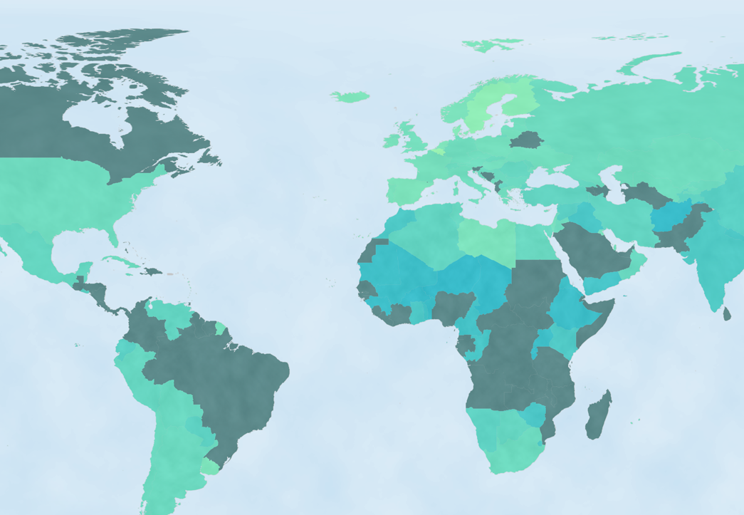
Workforce
For an accurate understanding of labor force participation rates (LFPR), it’s important to learn the context behind the numbers. The indicator below measures the share of men and women aged 15+ that are a part of the work force. Countries with the highest LFPR for women—like Afghanistan, Albania, and Algeria, where female participation rates exceed 85%— often reflect the lack of freedom and agency of women to choose an alternate path. Extraordinarily high LFPR rates suggest that women don’t have the liberty to complete secondary education, or to select a career with room for advancement.
At a global level and in the following countries, however, the longstanding gap between men and women’s participation in the workforce reflects the greater gender imbalance in economic participation.
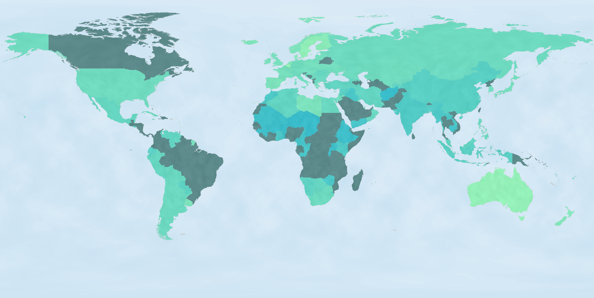
A recent study takes the gap in LFPR one step further, and measures the potential economic gains various countries would experience if they equalized employment between genders. While the available data only supports a story on national gains to GDP, the study also correlates women’s participation in the workforce to improvements in literacy rates, access to education, and infant mortality rates.
At 34%, Egypt would experience the greatest percent growth in its GDP by equalizing LFPR. Ranking second, India would increase its GDP by 27%, yet because its economy is so much larger, it would undergo the greatest monetary increase of the countries involved in the study. We measured GDP in purchasing power parity as a metric to compare and normalize economic gains across countries over a single year, 2012.
We filtered a tremendous amount of data down to a handful of high-level talking points, yet it's important to understand the context, nuances, gaps, and limitations that inform the global stories. Keep an eye out for additional insights on the data. There will be more trends, subtleties, and correlations coming your way.
We’d love to hear what you’re working on, what you’re curious about, and what messy data problems we can help you solve. Drop us a line at hello@fathom.info, or you can subscribe to our newsletter for updates.