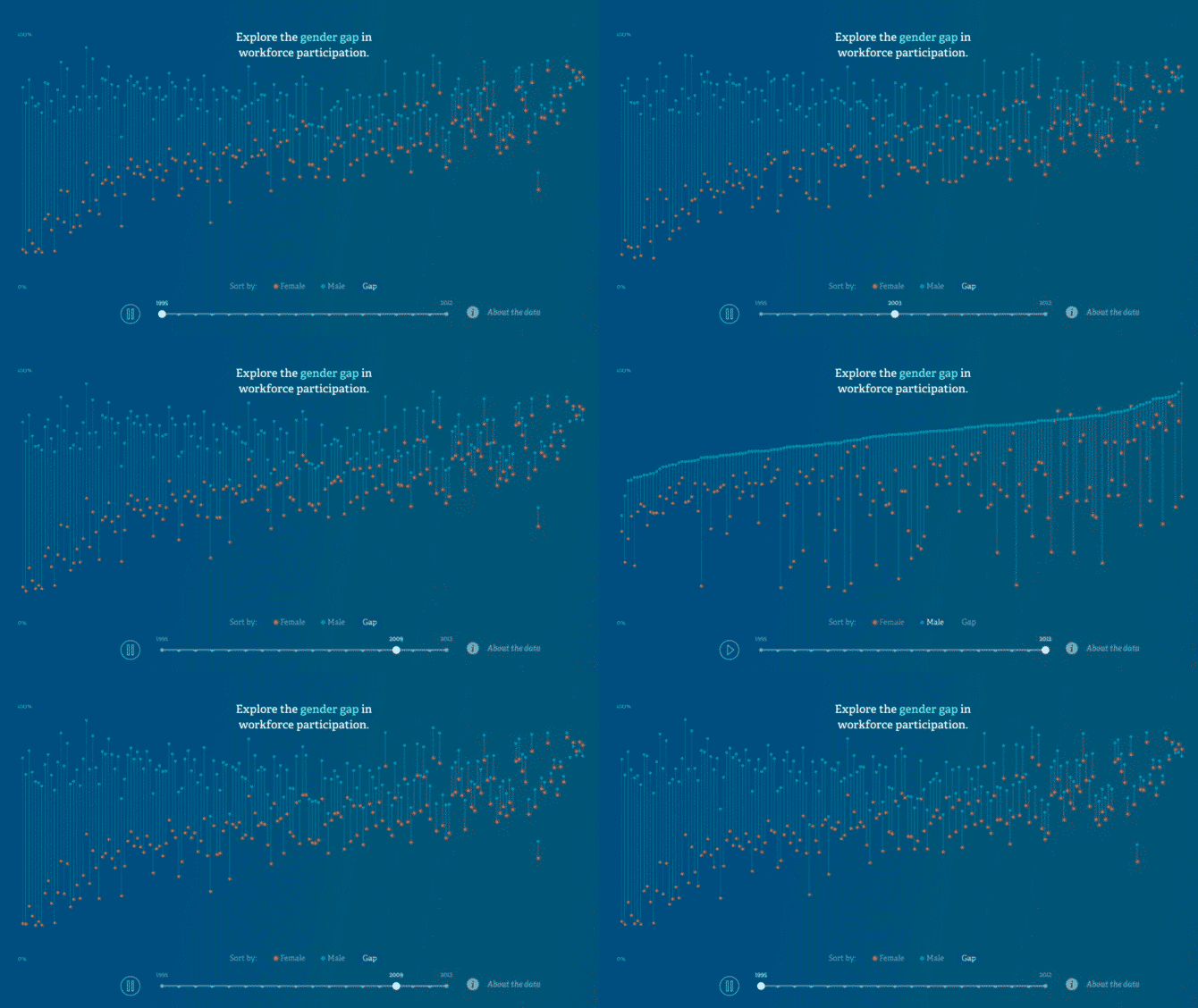

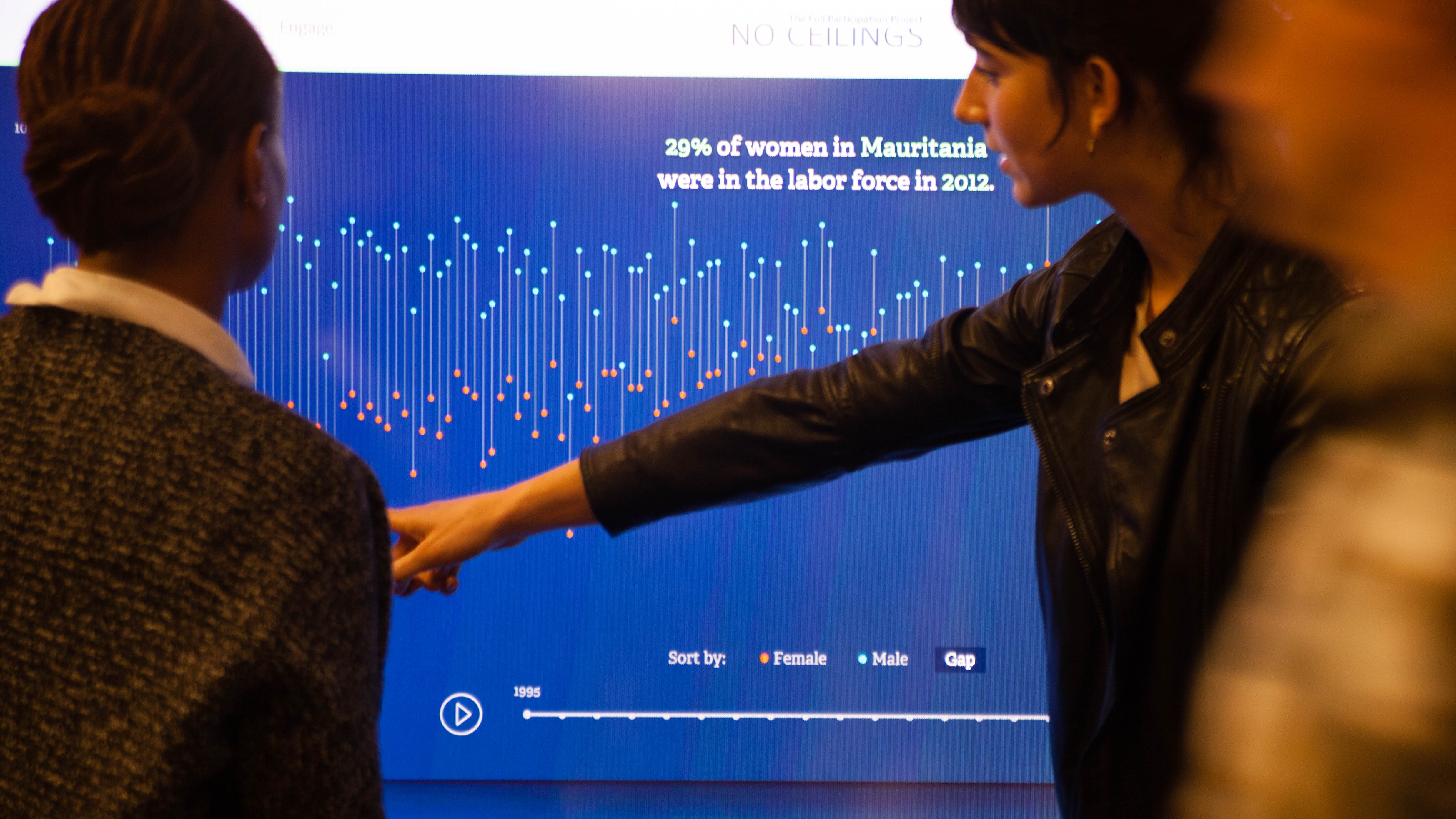
With a large installation set up, we were excited to share the latest site with meeting attendees and other passersby. The new visualization enables users to see both women's and men's labor force participation organized by the size of the gender gap, or by participation levels of either gender. Clicking play at the bottom shows how participation has changed over time. There's been notable progress in, say, the Maldives, where the gap has more than halved from 46% to 21% in the last two decades. Conversely, Afghanistan's gap has crawled from 66% to a meager 64% in the last twenty years.
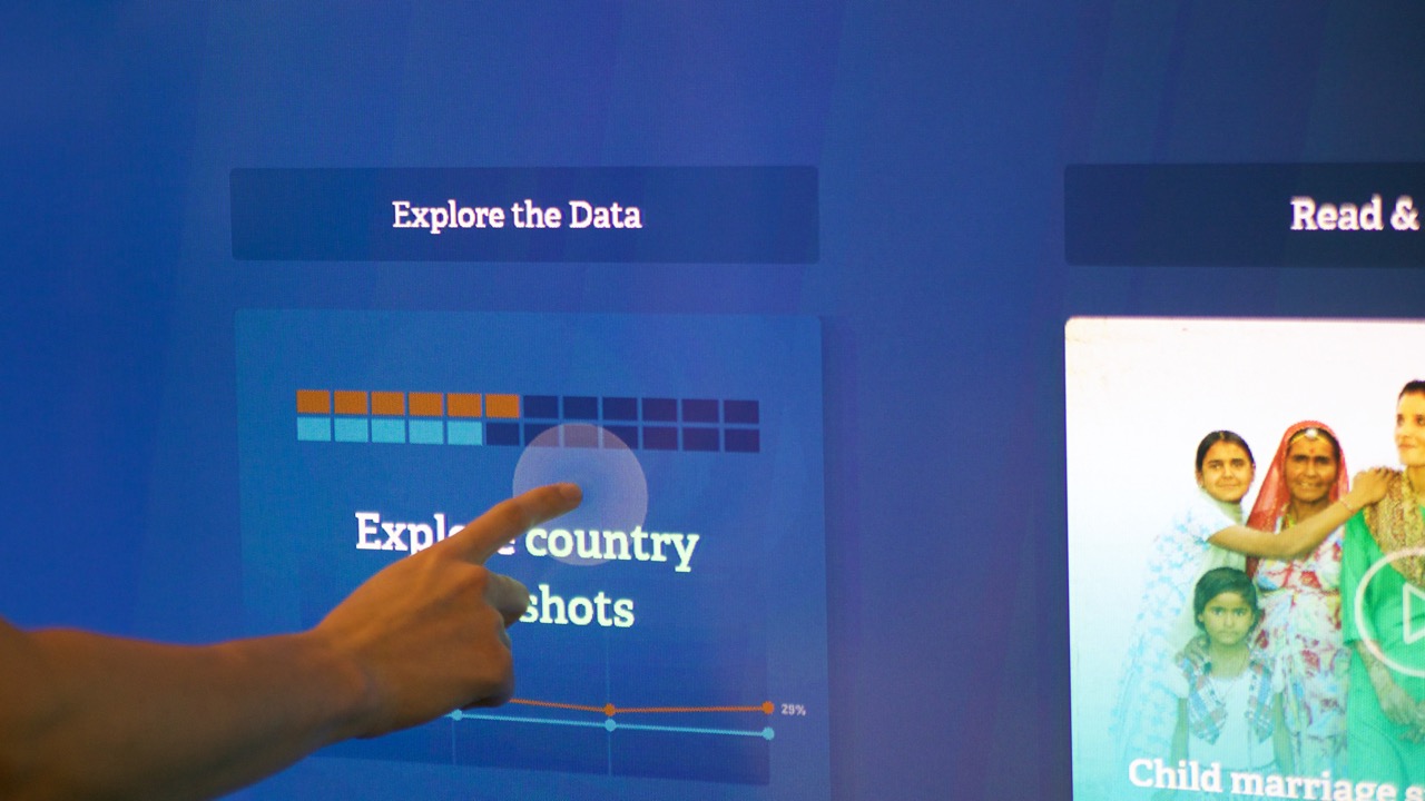
The country snapshots enable users to get a glance of the state of girls and women in areas of health, education, economic participation, security, and leadership. In addition to showing evident gains and setbacks, the snapshots also show areas where there is missing data. For the indicators surrounding women's security, only a third of countries actually have information available.
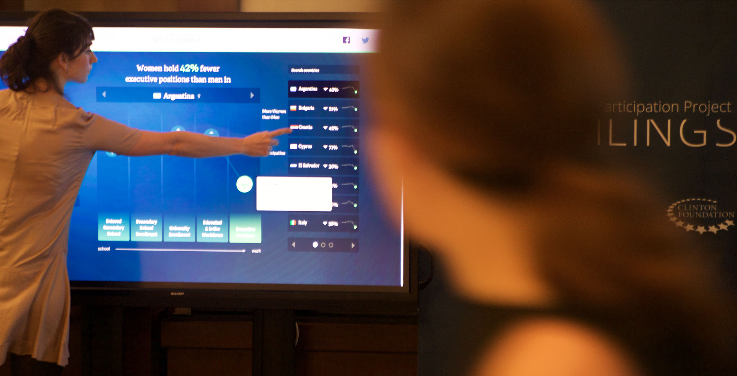
We made a number of design decisions to accommodate the site for an installation setting. Understanding how the site would scale on a 70 inch touch display, function without hover, and cater to an audience ranging from four to seven feet tall (even former NBA star Dikembe Mutombo, at 7'2", stopped by to give the site a whirl) were just a few of the many considerations we had to make when tweaking the design for the installation.
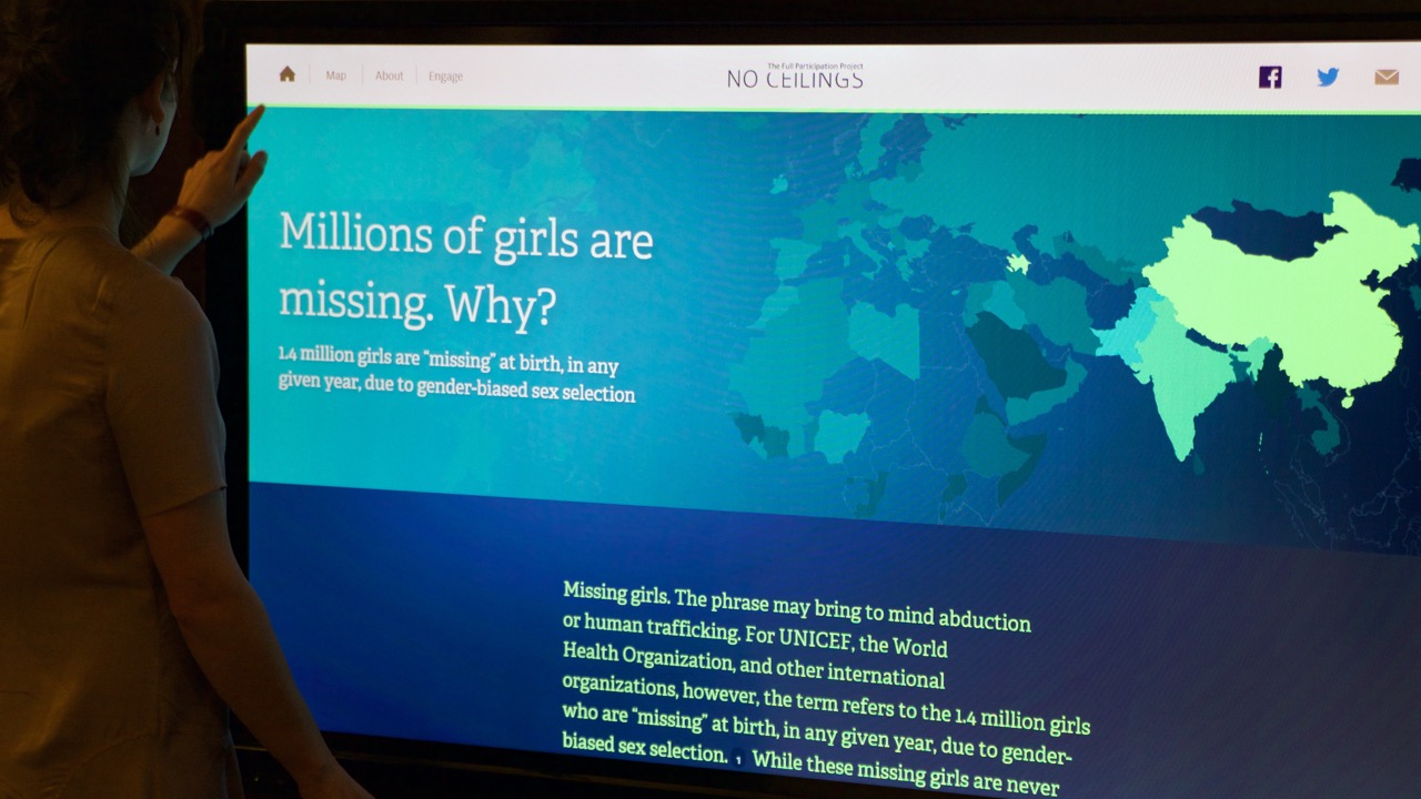
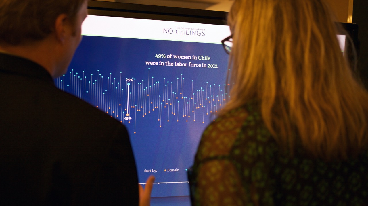
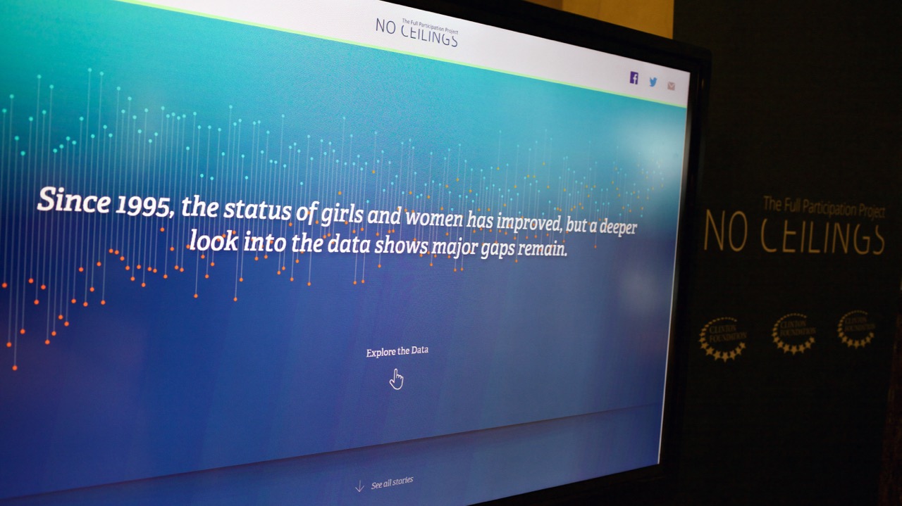
Overall CGI made for a wonderful opportunity to bring No Ceilings to a diverse audience, and a more tangible interactive setting. Stay tuned for more updates!
We’d love to hear what you’re working on, what you’re curious about, and what messy data problems we can help you solve. Drop us a line at hello@fathom.info, or you can subscribe to our newsletter for updates.
