Growing up, I spent most of my time at school embellishing notebook pages with intricate landscapes and labyrinths filled with alien characters. Actually, I still do that. To me, the open-ended nature of mazes expresses something both playful and profound. I recently dove back into mazemaking to explore its potential as a generative typographic form, creating a series of sketches that evolved into a typeface, called Mazeletter.
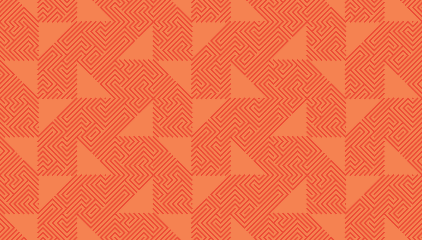
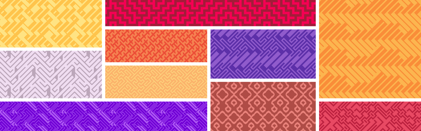
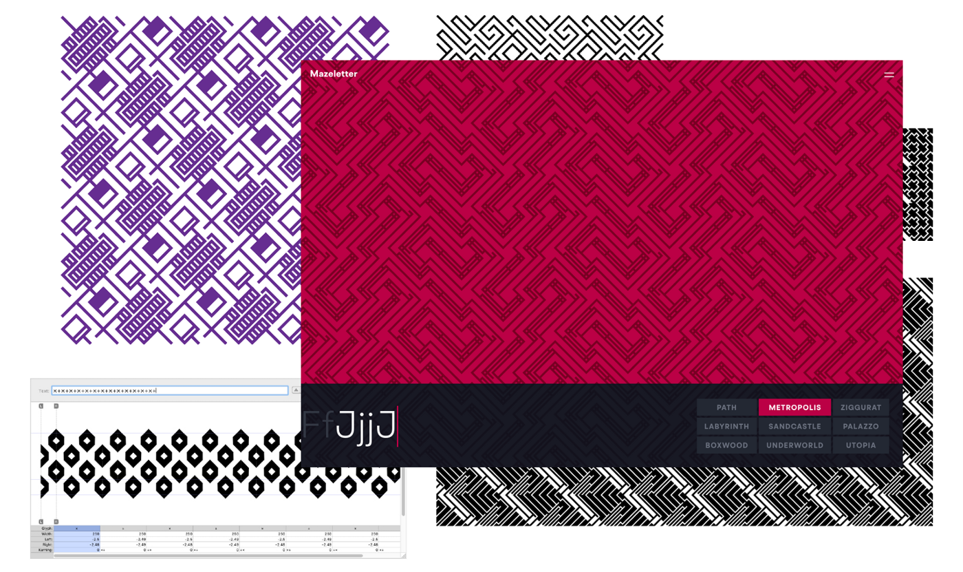
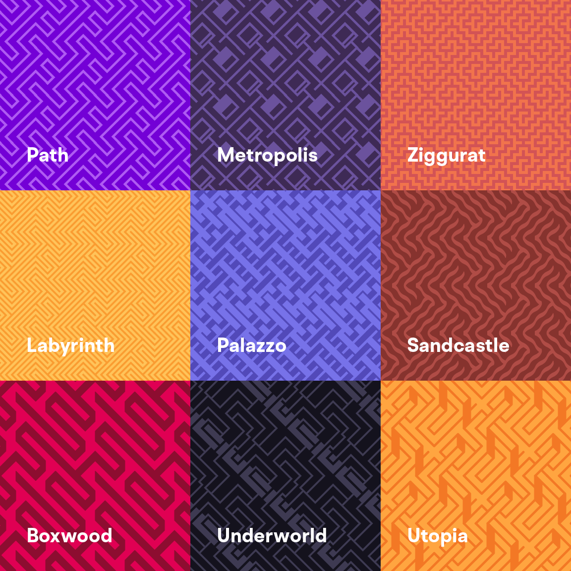
The typeface consists of nine pattern fonts that you can use to build infinite tiling maze patterns. Each style takes the same set of glyphs and translates them into a new form — zigzagging paths and hedges, calligraphic ribbons, art deco facades and impossible staircases.
At Fathom, we look for ways to navigate complexity, using design to reveal meaningful information. Frequently, we focus our work on language as a way to deepen understanding and identify patterns. At its core, Mazeletter is an exploration of pattern as language. It’s designed as an alphabet, with walls and passages combining like letters or sounds into more complex structures. And, like words, the pieces are flexible. You can set out to generate unique textures or engineer a difficult puzzle.
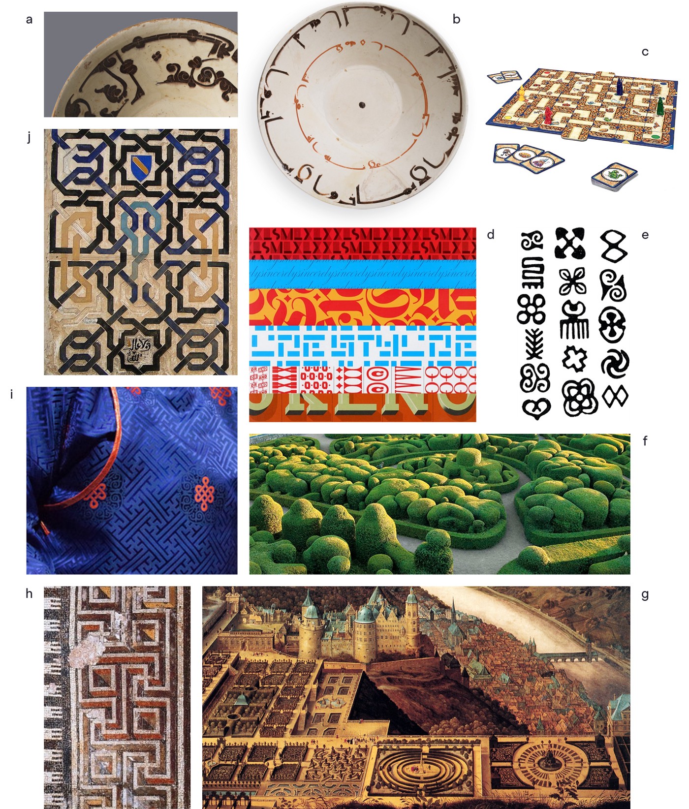
Mazes and letterforms share a human quality — both are shaped around the desire to make stories from abstraction, weaving those ideas into paths and barriers that give them meaning. As I began iterating around this relationship, visual connections emerged across materials and media. With intertwined concepts like text, texture, textile and tessera, there’s a short leap between storytelling structures and the role of pattern in mosaics, tapestries, architecture and fashion. In her post on generative knitting, Olivia touched on the shared history of these ideas, discussing the bond between coding and textile arts and writing about her experiments with data-driven patterns. There’s definitely a lot to draw on.
Excited to dig into all these ideas, I started sketching out what a maze typeface might look like.
Structure
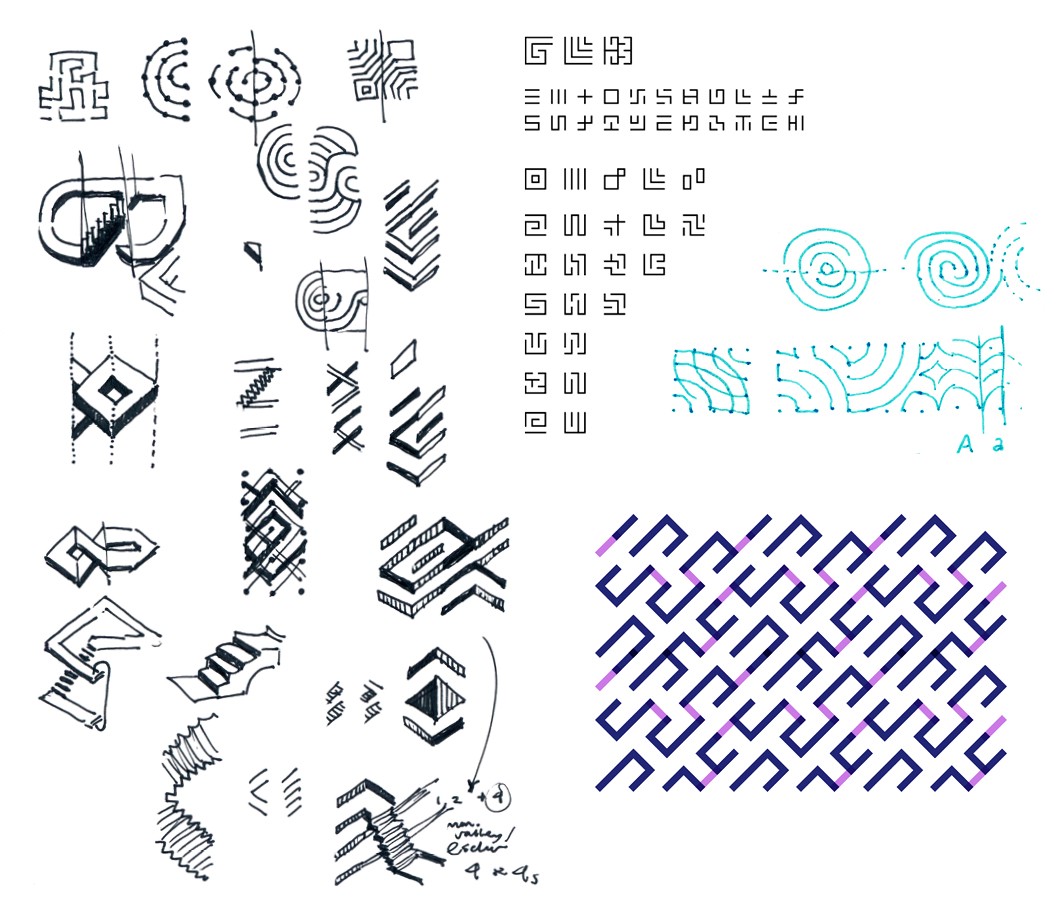
I began with open questions about the structure of the system. How might the linear qualities of reading text and perceiving letterforms translate into navigable elements of a maze? I thought about paths and bridges, entrances and exits, spirals, loops, switchbacks and courtyards. Are there ways to distill the idea of each letter into architectural elements that could create openings and obstacles?
This strategy seemed promising as a way to develop a set of distinct glyphs that could visually capture a blend of the shape, function and sound of a letter. S, for instance, might translate into a switchback curve to hint at both its snaking shape and the soft sounds it produces.
I sketched different kinds of square and circular grids to see what variations and combinations might work best for a maze. I found that by tilting square tiles 45º to create a diagonal grid, I could pack a more diverse collection of lines into each glyph and produce dynamic corners where pieces intersect. Later in the process, I learned that the Commodore 64 BASIC program 10 PRINT CHR$(205.5+RND(1)); : GOTO 10 creates a similar kind of diagonal intersection that artists have used to construct all sorts of mazes.
Early on I toyed with literal interpretations that would stick to the familiar shapes of letters in the roman alphabet, deconstructed into maze paths and walls. But sketching out that approach wasn’t as interesting, because it prioritizes the readability of the letterforms over building a good maze. Plus, flattening letters into grid cells makes it harder to tell them apart, since you lose the quirky details that give each one personality.
Rules and flexibility
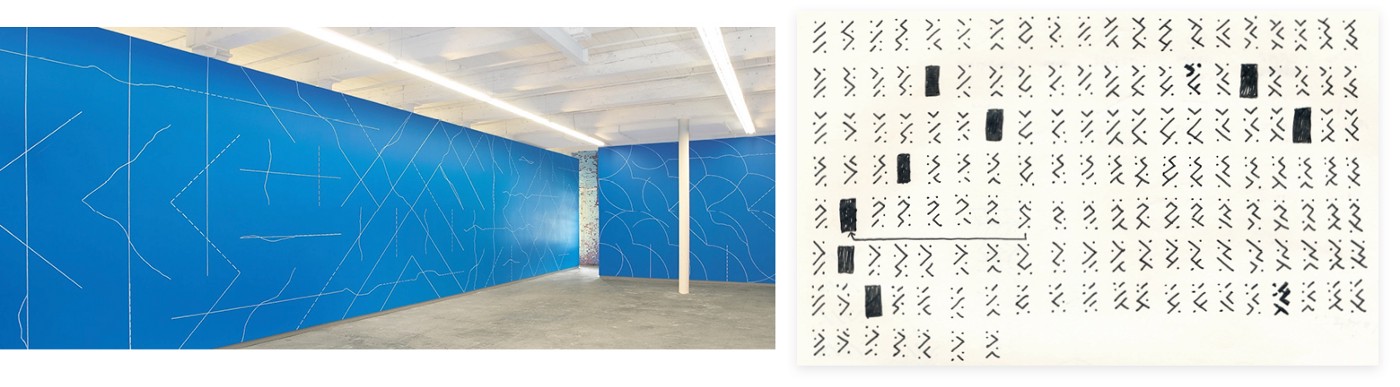
Instead, I began exploring a more generative approach. Fathom had just taken a trip out to western Massachusetts to visit MASS MoCA, and spending time with the rule-based installations of artists like Sol LeWitt left those ideas fresh in my mind.
Returning to pen and paper, I brainstormed rules that could generate a full set of modular maze pieces. If you take the same grid points and connect them in as many maze configurations as possible, are there enough useful permutations to build up an alphabet of forms?
Yeah, it turns out there are way too many options. Many of the programmatic variations were so similar that they didn’t drastically alter paths through the maze. But I was encouraged by the vast set to choose from. Pivoting in a new direction, I started drawing as many different types of maze swatches as possible, then seeing how the results might relate to the typographic geometry I sketched earlier. The only constraints I set were that all swatches should intersect seamlessly, and if a swatch was tiled independently it should make an interesting and navigable maze — not a bunch of closed shapes and dead ends.
Familiarity and context
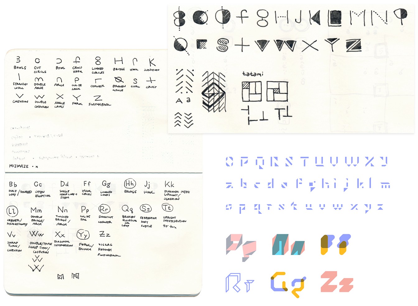
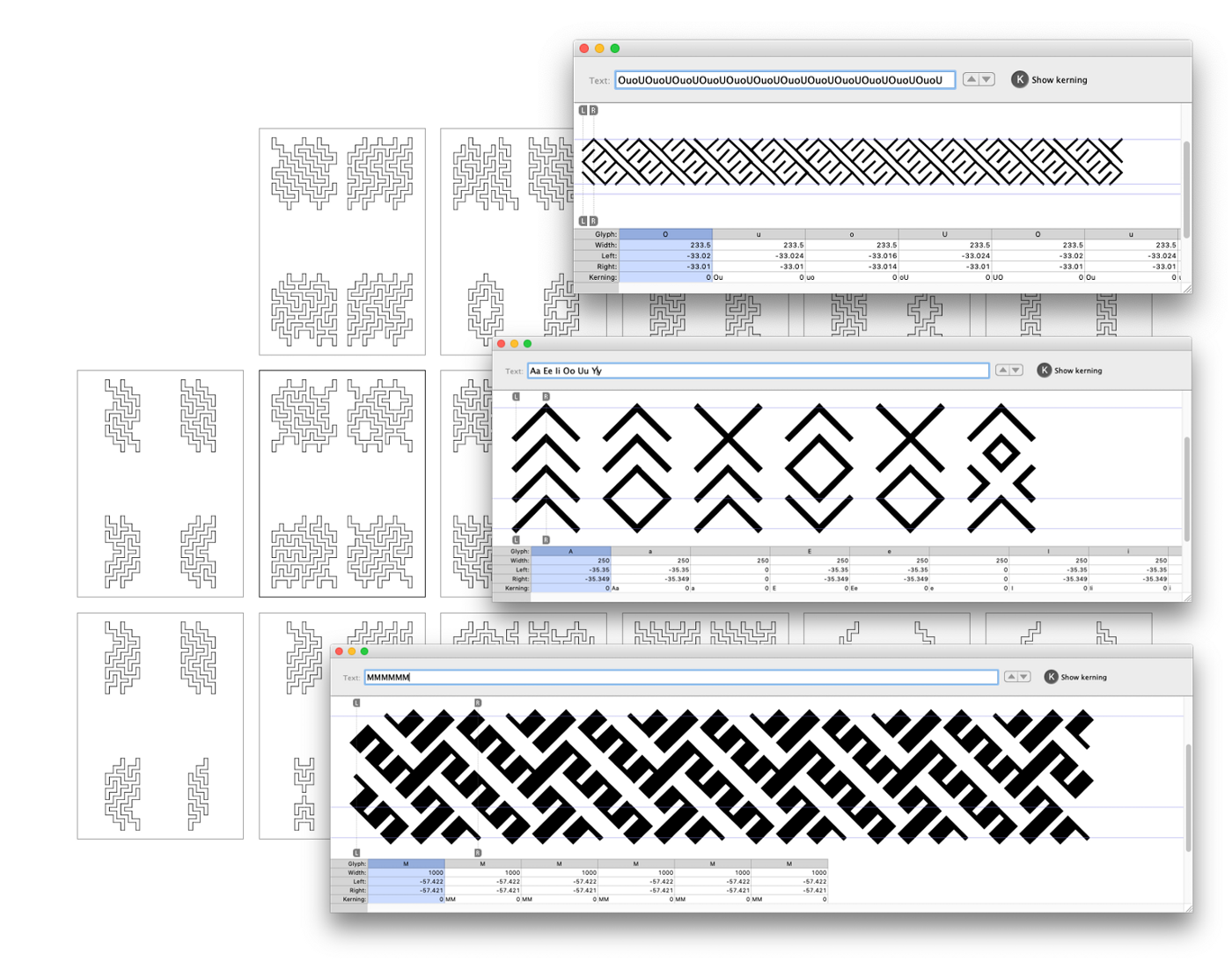
With a pattern typeface, the keyboard itself becomes a patternmaking device, and thinking about the Qwerty layout helped me shape the system. I felt it would be useful to have ways to subtly modify the pattern as you type, so I mapped out the symbols, diacritics and special characters you can access with each key, keeping an eye toward similar nuances in the texture of the maze.
Continuity
There are all sorts of visual and conceptual relationships embedded in the design of the alphabet, and I experimented with how that structure could be translated into the maze to make it striking, versatile and easy to use.
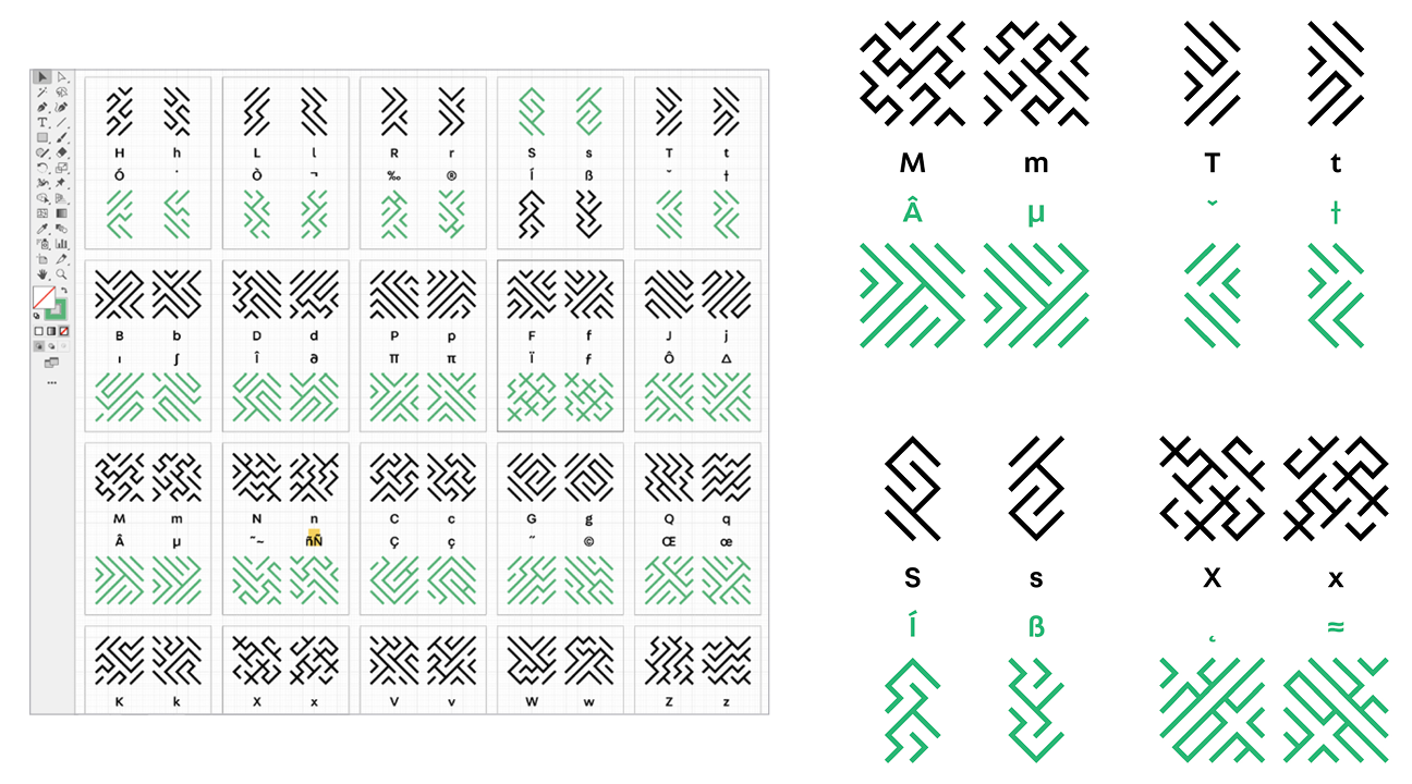
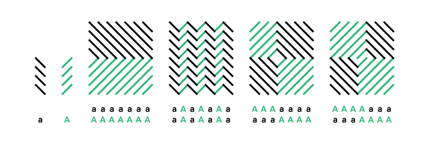
Case is one example. Upper and lowercase letters share the same keys, and many pairs evolve from the same anatomy, like J and j or F and f. Other pattern typefaces, like Zuzana Licko’s Tangly and Crackly, rotate and flip the same swatch between neighboring characters, giving the design an organic continuity when those glyphs are used together. With Mazeletter, I used similar transformations to connect upper and lowercase forms, and other pairs like ( ), { }, ‹ ›, or π and ∏. Using those combinations allows you to subtly shape the texture of the maze while pushing the paths in new, unexpected directions. It keeps the eye moving, makes the puzzle more challenging and allows you to create complex mazes using a single key. A and a illustrate this feature — they’re simple sets of parallel lines, but when combined they can produce corners, zigzags and two-way spirals.
Sound and shape
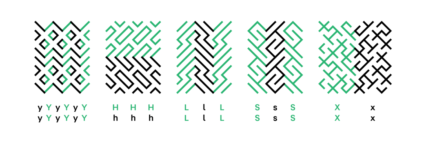
Fluidity is another key idea. How we move our teeth, tongue and lips controls the passage of air, blending or separating sounds into phonetic arrangements written as vowels and consonants. Words have movement and topography — elements that can translate naturally into passages and obstacles in a maze. I used this idea as a starting place for designing each letter, thinking about how vowels might produce more open and fluid paths, how soft consonants like h and s might redirect routes without disrupting them, and how harder sounds like x and k might be denser, containing more detours and intersections.
Visual rhythm
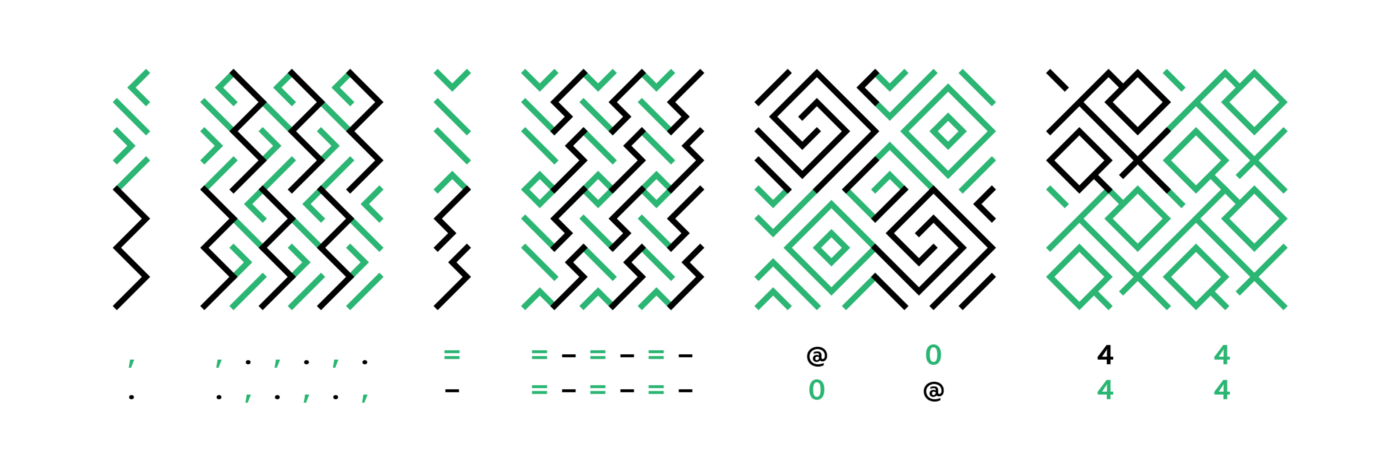
Symbols that aren’t vocal function differently from the letters. Punctuation is a good example. It organizes ideas by connecting or dividing the flow of text. I used characters like the period and colon to break up the maze with barriers, while hyphens and dashes become bridges or tunnels that can break through walls. More conceptual symbols — $, #, %, & — were fun opportunities to be inventive with form, abstractly suggesting those glyphs while adding useful twists to the maze.
Striking a balance
Another axis I considered is the balance between uniqueness and utility. There’s an exchange in using the typeface — you choose characters to type, but you get a pattern in return. If the pattern swatches are too specific, or if typing the same characters in a new order gives you the same type of maze, it doesn’t feel like your decisions matter. My goal was to build a system that’s rewarding and surprising, but without making you work too hard to get an interesting, unique result.
By sketching and iterating through different options, I found that varying the size of the glyphs gives you this sense of authorship. More common characters like vowels and punctuation are thinner. That means they have fewer lines, so they’re less detailed and less specific, letting them melt into the texture of the maze. This quality makes them the most versatile — you could build a whole maze from the vowels alone. But that would be super frustrating, because they’re small and not visually diverse. That’s where the wider characters like consonants, numerals and symbols come in, their complexity and specificity giving the pattern a voice.
Expanding the family
Style pushes that typographic voice further. Developing a suite of styles seemed like a good opportunity to hint at the wide range of maze forms I uncovered researching the idea — a way to suggest architectural and material surfaces, reference historical eras and even twist the rules of navigating the maze. I approached each style as a way to riff on one dimension of the basic concept. What happens if you make it as dense as possible? Add extreme contrast? No diagonal lines? Super decorative?
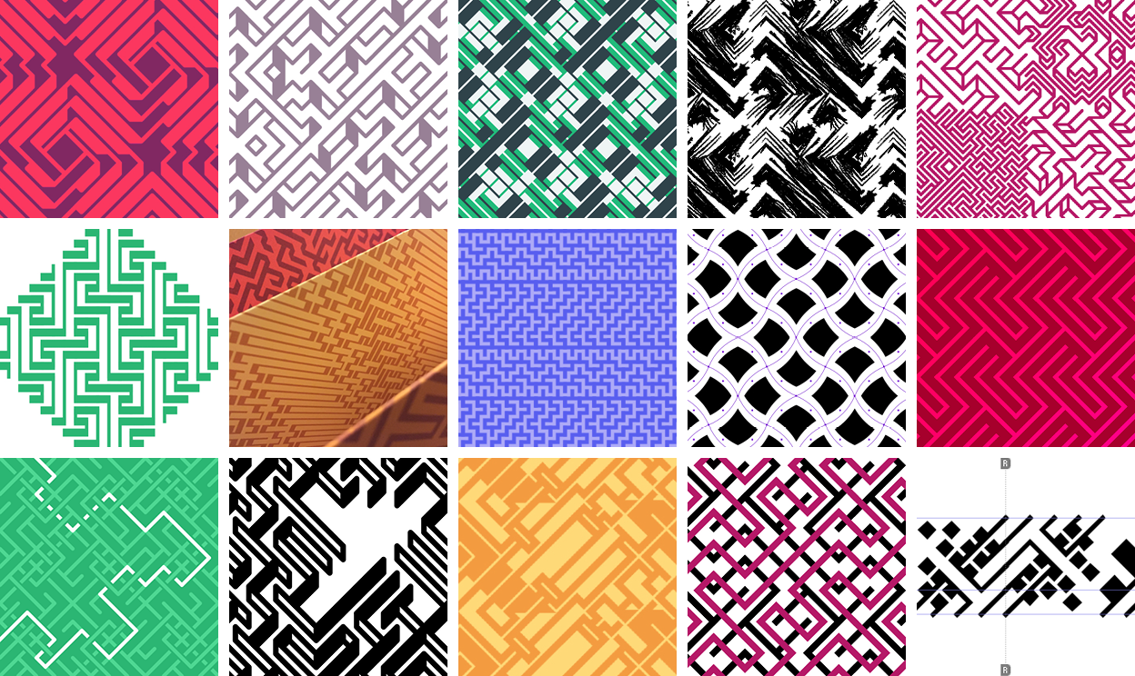
I tried a lot of options, moving on from sketches that evoked a context that was too specific. I spent a while on one variation that was a lattice of staircases and platforms. It worked well on its own, but didn’t feel quite right alongside other styles I had developed. After a while I realized that the staircases imply a human scale you couldn’t escape — seeing the steps forces you to imagine their size in relation to people walking up and down them. Instead, I worked on assembling a set of styles that share a similar level of abstraction while transforming the maze’s texture, density, depth and meaning.
Mazeletter is free to download at mazeletter.xyz. You can try it out on the site, creating your own patterns and playing with different styles. Posters made with the typeface are also available from the Fathom print shop.* Get lost in the maze… and share what you make with it!
More on type design, pattern and mazes
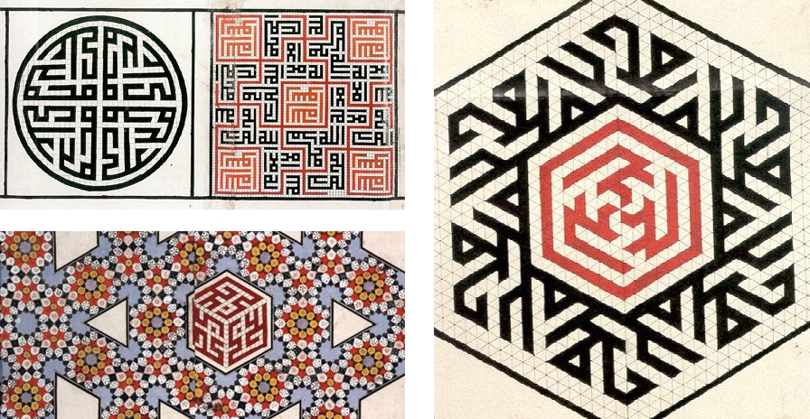
- Alphabettes | Thalia Echevarria on designing a Buginese script
- The Tokapı Scroll | Geometry and Ornament in Islamic Architecture
- 10 PRINT CHR$(205.5+RND(1)); : GOTO 10
- Anni Albers | On Weaving
- Sol LeWitt | 100 Views
- Dainippon Type Organization | Type Play
- Rijksmuseum + Irma Boom| Small Wonders: Late Gothic Boxwood Micro-carvings from the Low Countries
- Xu Bing | Book from the Ground and Book from the Sky
*As of 2022, we no longer sell our posters online, but office visitors may get a special goodie bag...
We’d love to hear what you’re working on, what you’re curious about, and what messy data problems we can help you solve. Drop us a line at hello@fathom.info, or you can subscribe to our newsletter for updates.