Notebook
Here's where we post periodic updates on what we've been up to at Fathom. Reflections on the interesting stories that emerge from our client work, side projects, after-hours rabbitholes, and other miscellaneous threads of inquiry.
You can also follow these posts as a feed in your feed reader.
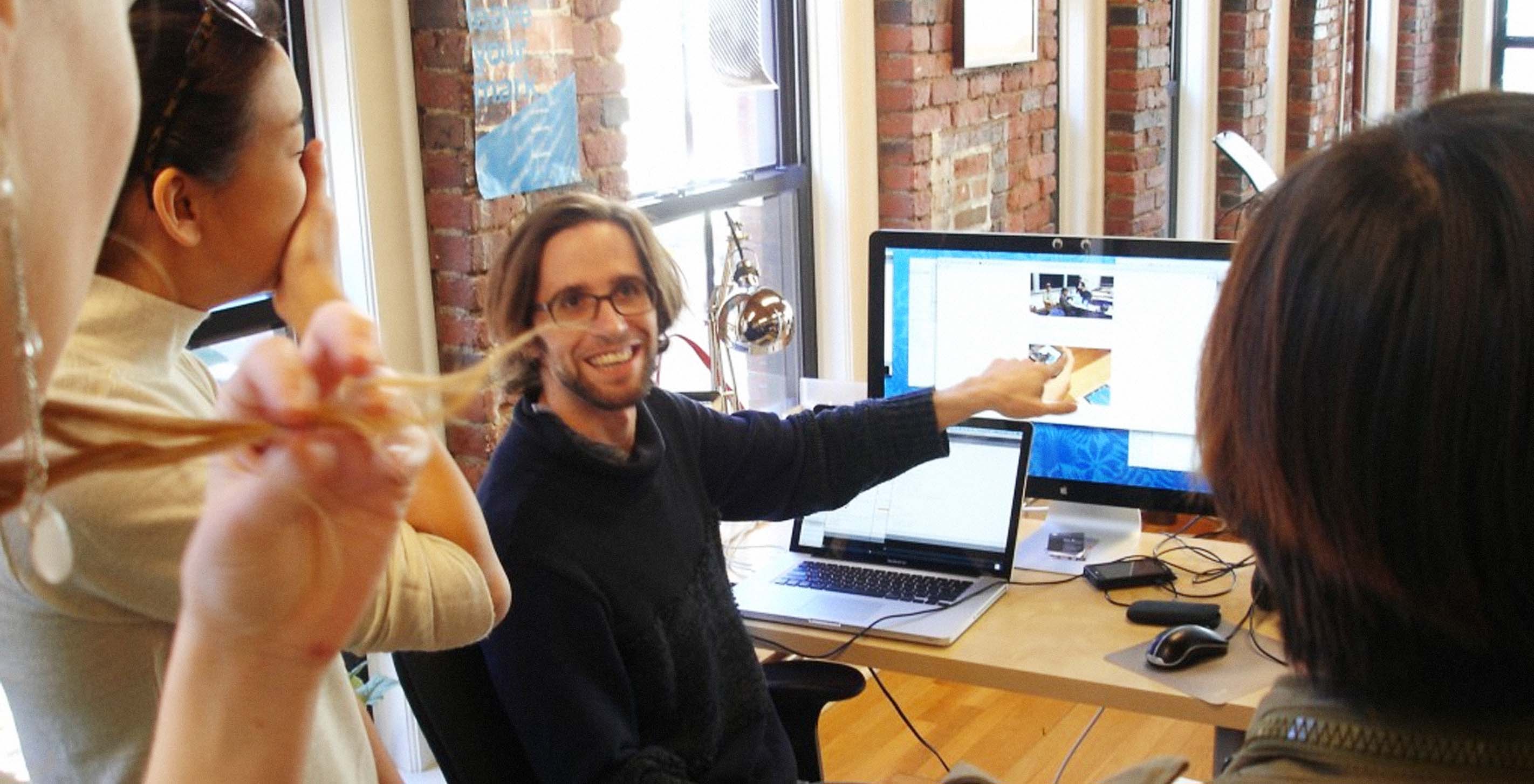
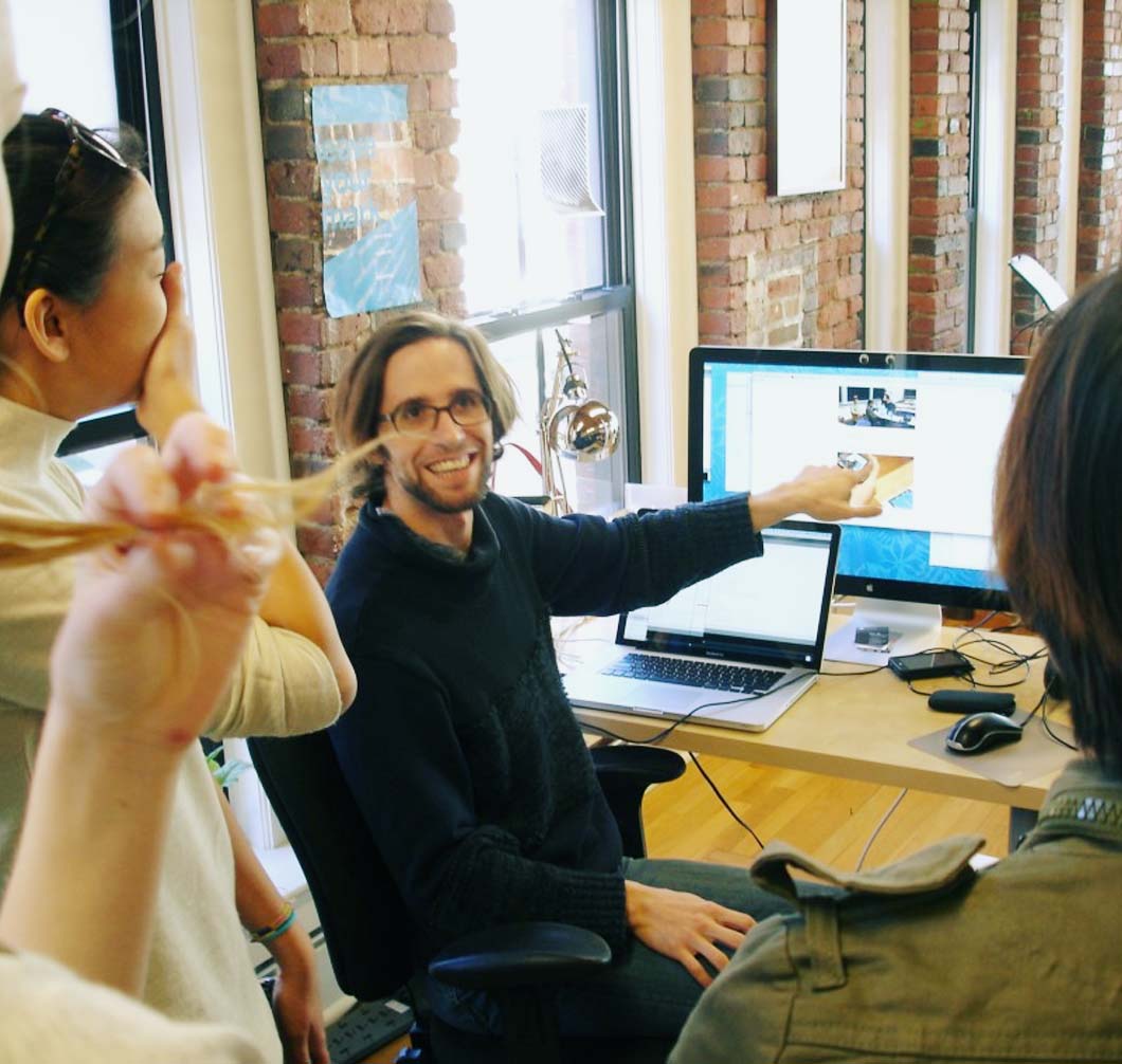
Yesterday, Kristen Coogan, Assistant Professor of Graphic Design at Boston University brought her Information Design class in for a tour of our office and some Q&A. After braving the cold and long voting lines I made it in to greet them at 10:00. Ben and I gave them a brief overview of the company and showed them some of our print work up on the 3rd floor.
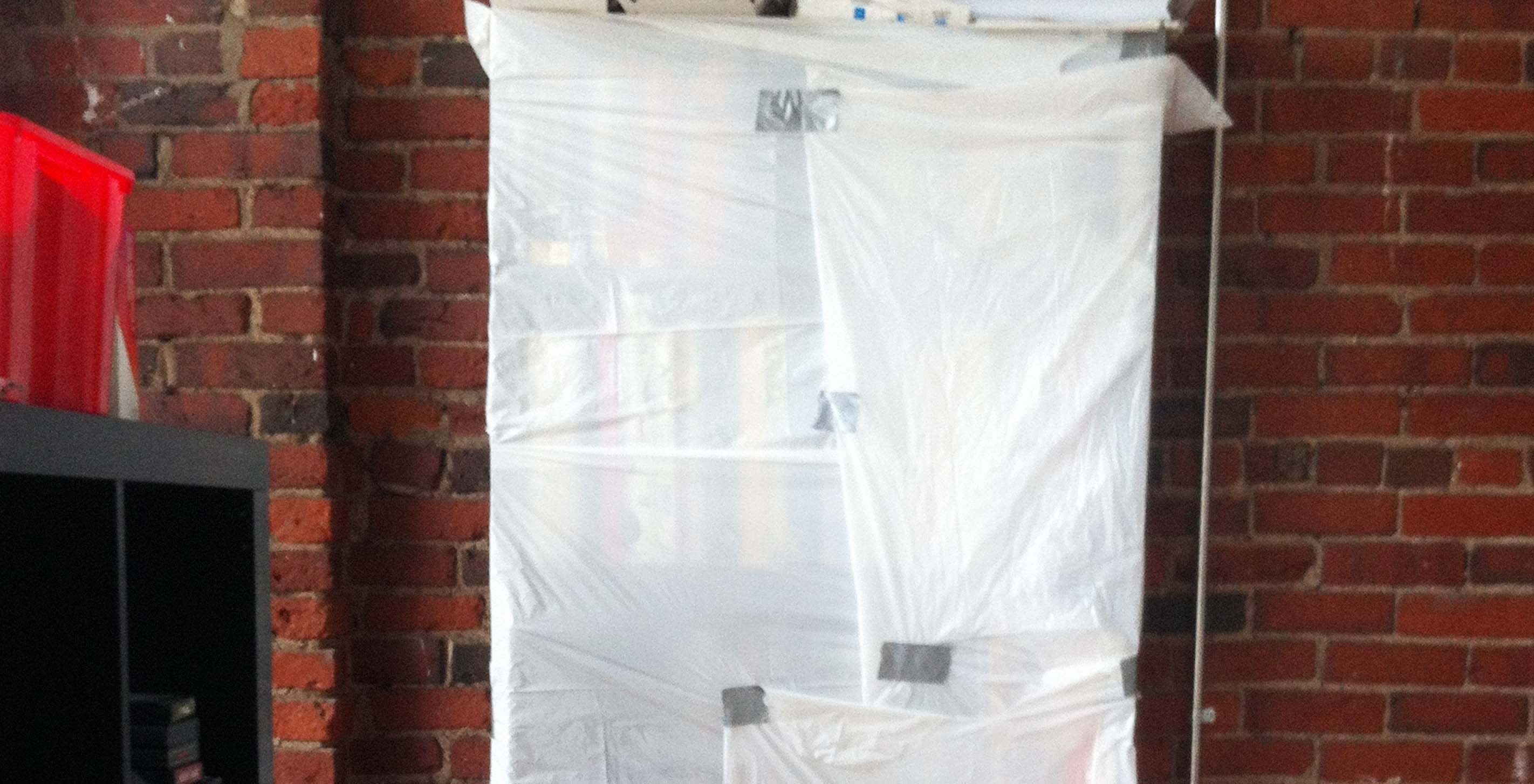
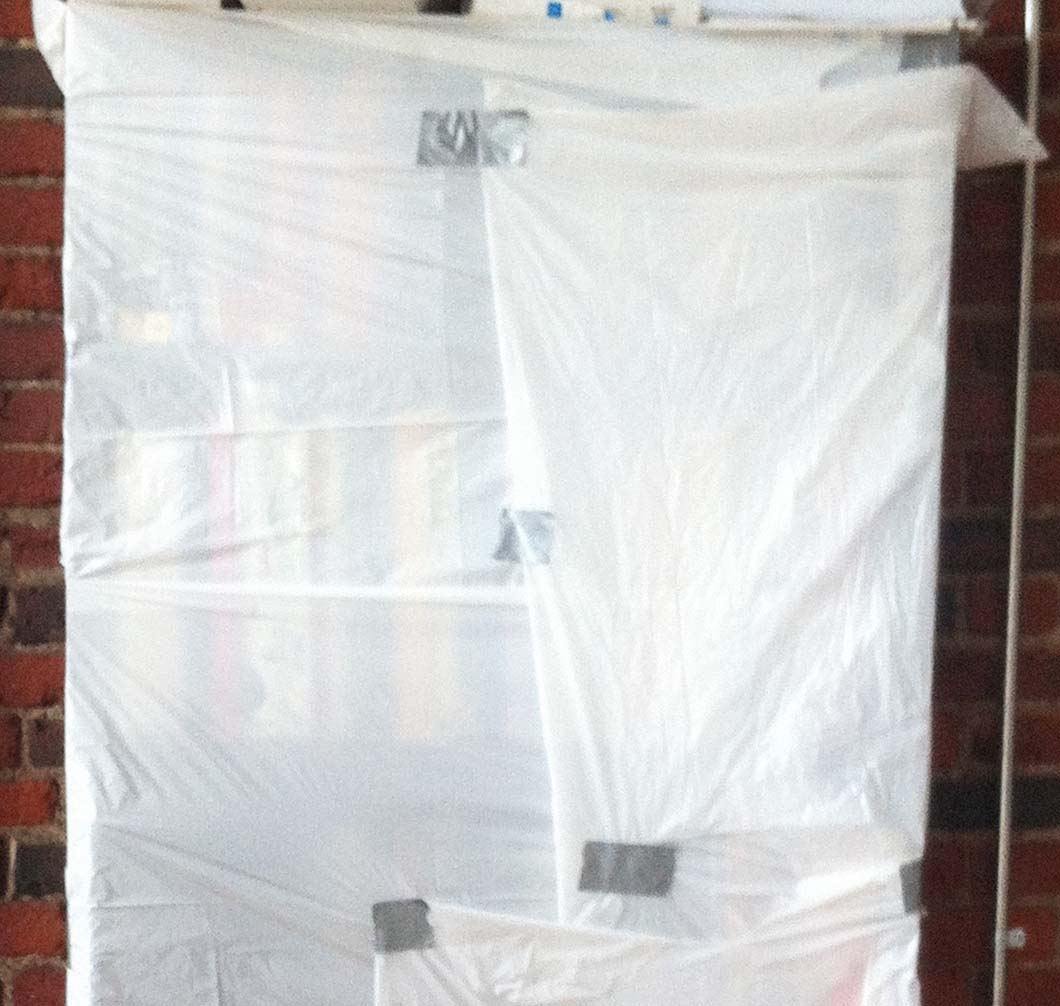
Fathom offices thankfully emerged unscathed from last night's super storm, and those regions that weathered the worst are in our thoughts today. In the event that Sandy came farther north, we took precautions over the weekend to make sure our most valuable assets were taken care of:
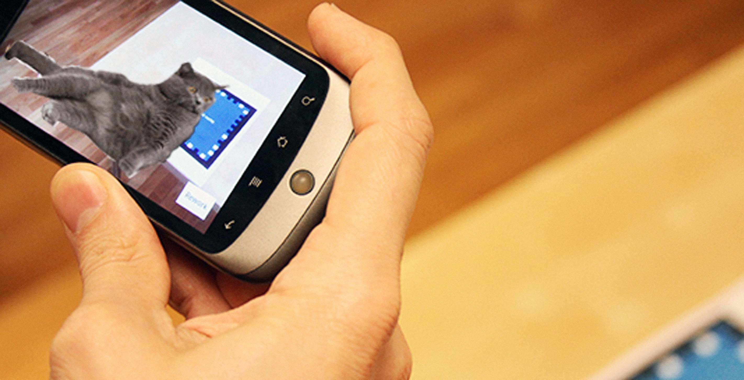
An interview with Terrence and Andrés on their experiences at the AT&T Mobile Hackathon.
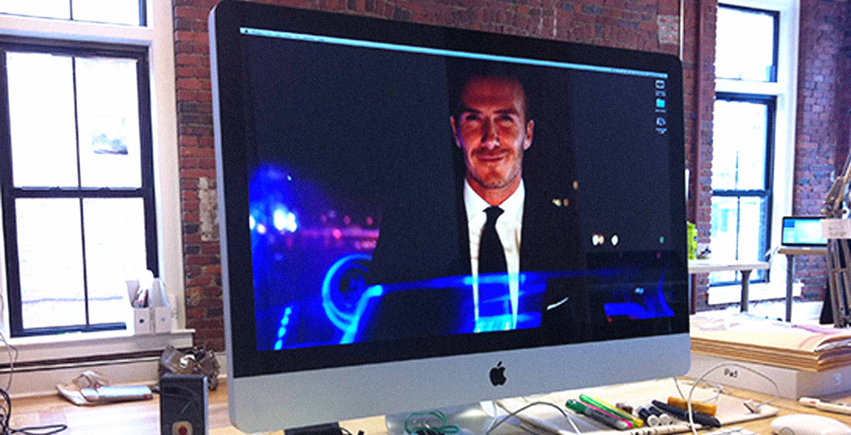
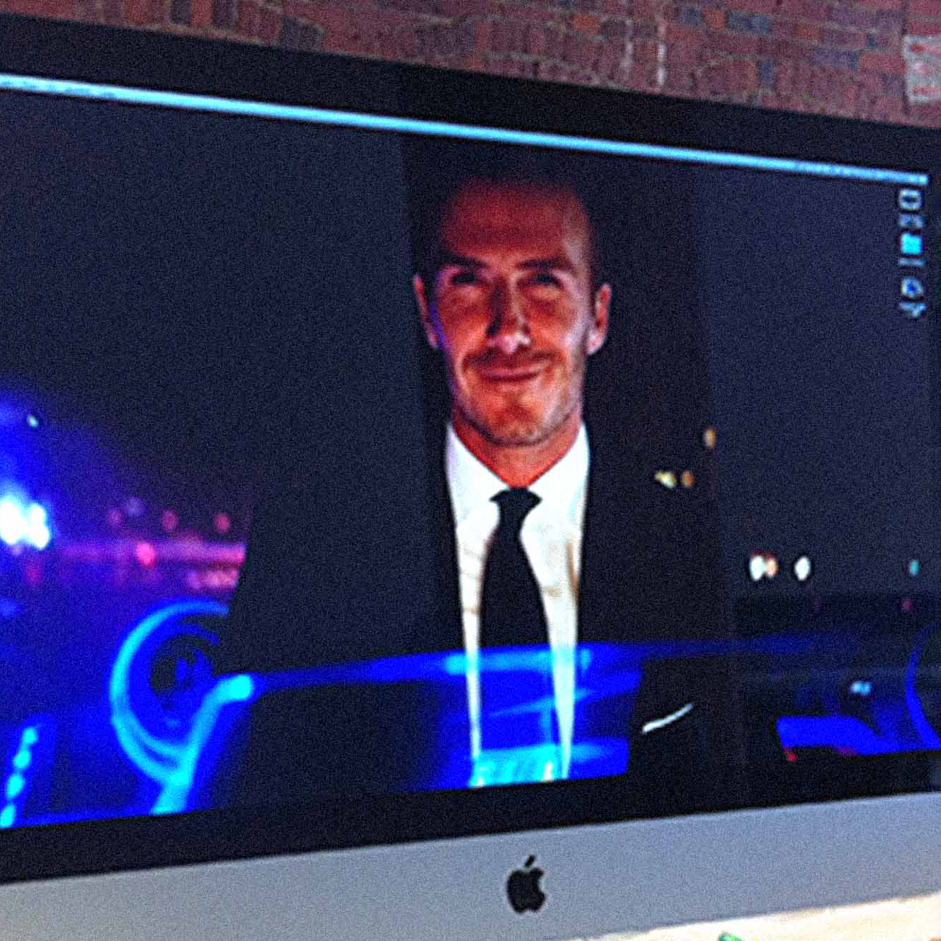
Ever since the spectacle that was the 2012 Summer Olympic opening ceremony, I’ve had an image of Sir David Beckham — captaining a jet boat down the river Thames delivering the Olympic torch while fireworks explode upon his arrival — as my desktop wallpaper. His face staring at me has been my daily dose of reality. It has challenged me to be a better person and shoot for excellence each and every day. I realize I can’t keep this inspiration all to myself, I need to share this majesty with the world, so you too can achieve more.
The good news is that our first run of All Streets posters got a ton of love this summer. The less good news is that we sold out of them, so James and Terrence ventured down to Connecticut yesterday to do press checks on the second run.
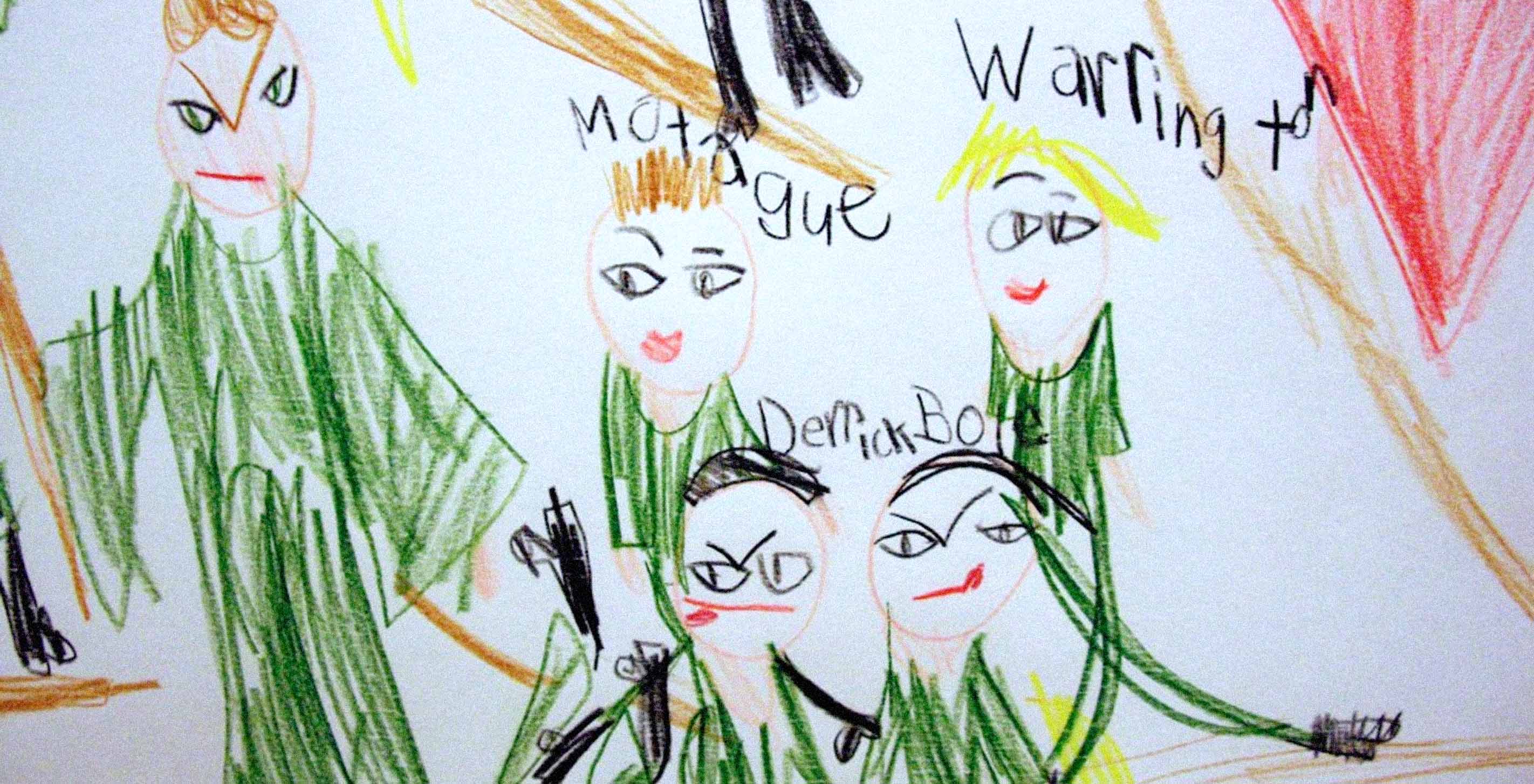
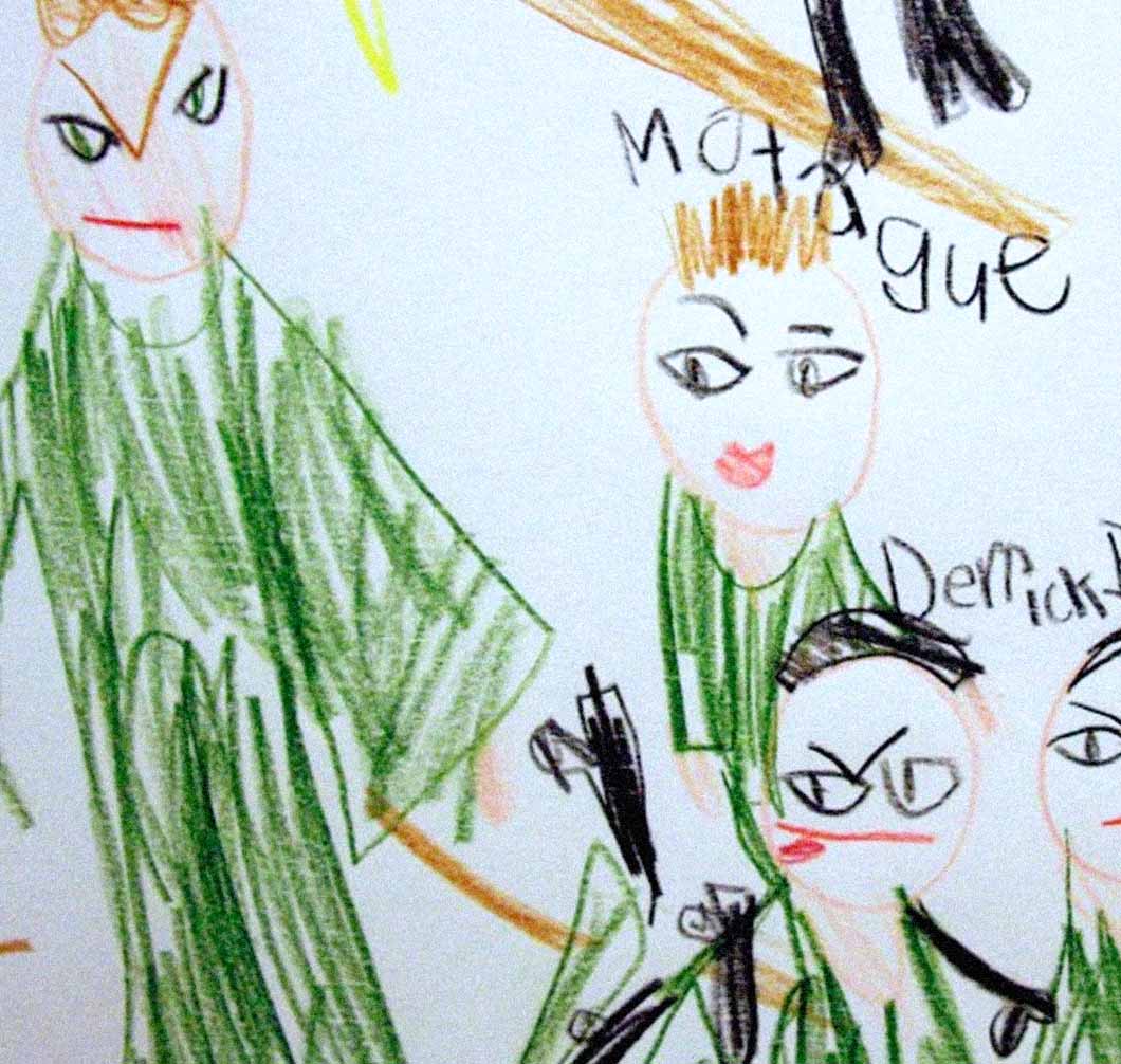
Our youngest data scientist has really evolved as an artist since we've known her, using the Fathom offices as a sometimes studio when she is not travelling. She is currently experimenting with large-scale figurative works on paper, exploring the tensions between data visualization and young adult folk iconography:
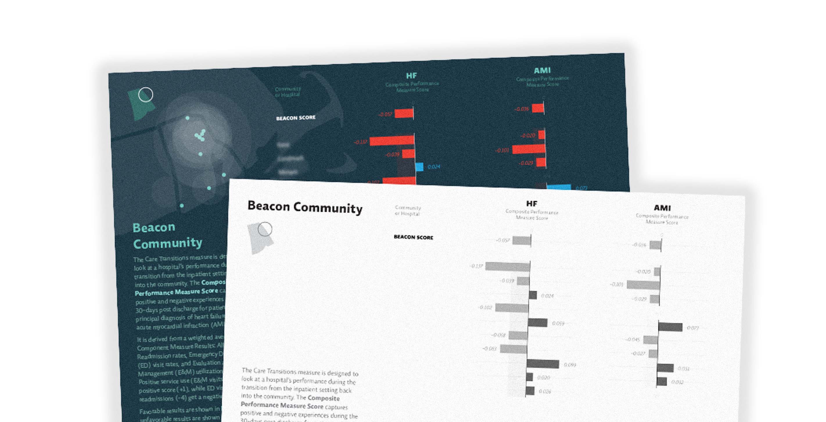
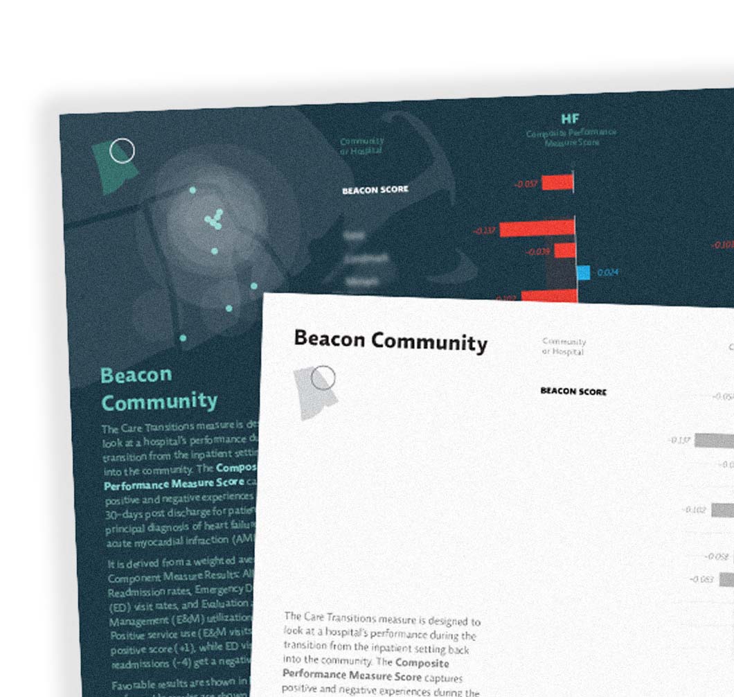
Here at Fathom we're all breathing sighs of relief, having just wrapped up a project that has been in progress for the last year or so. Sadly, you'll have to wait until January to see the fruits of that labor, but in the happy lull that comes after delivering a final product, we thought it was a good time to show off some other fun recent work!
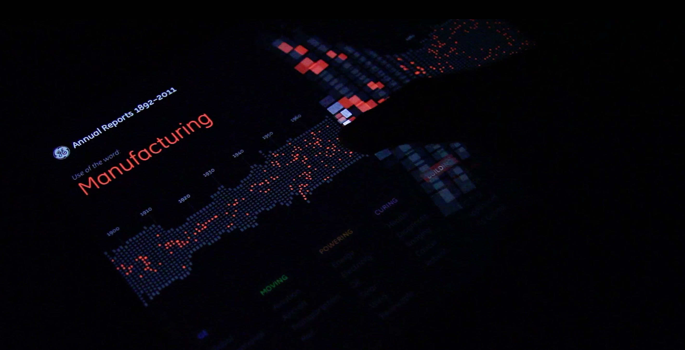
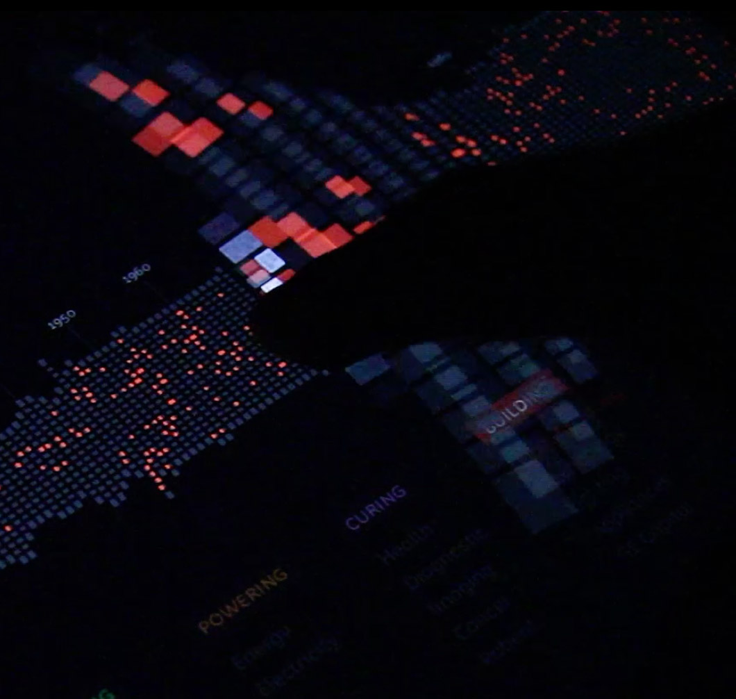
First it was an interactive touch installation. Then it was a web app. Now it's ready for the iPad! Head on over to iTunes to grab your (free!) version today.
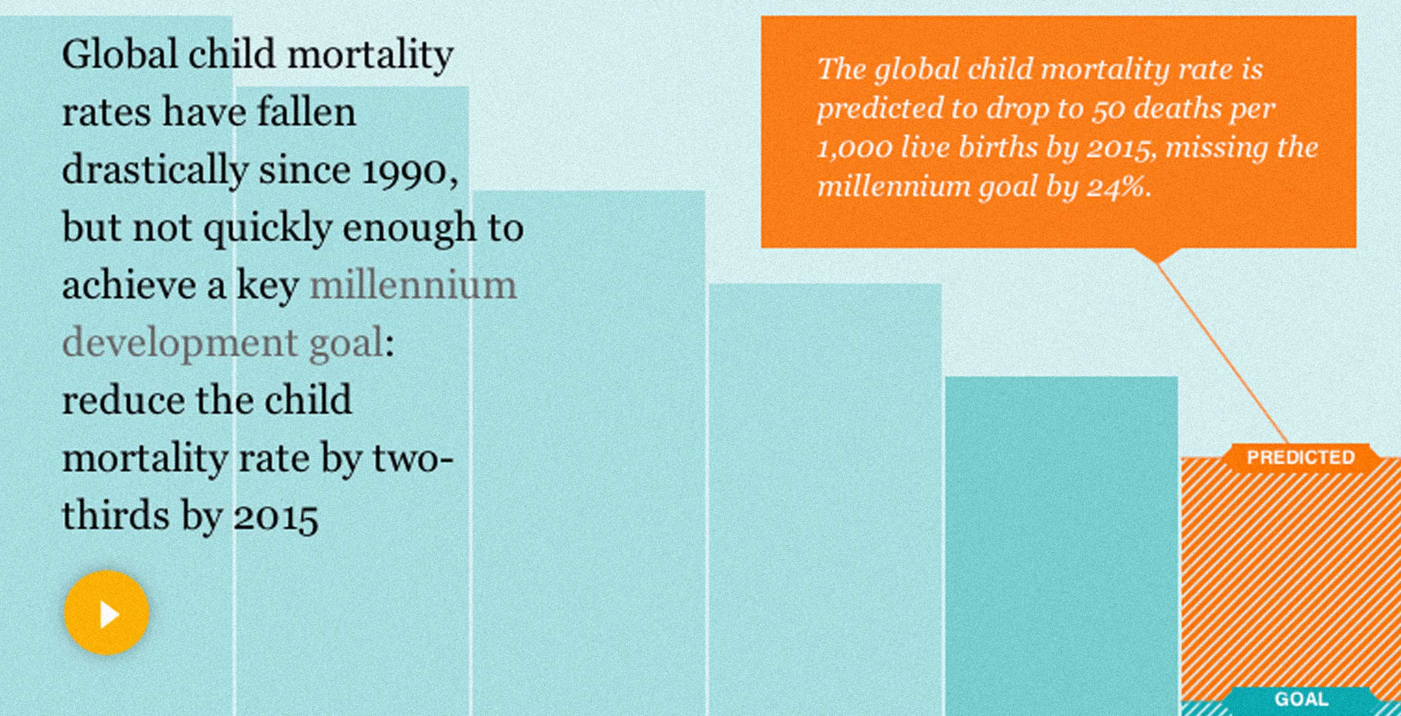
Our newest piece for the Gates Foundation — a visualization for the Guardian showing the current state of global child mortality — went live this morning!
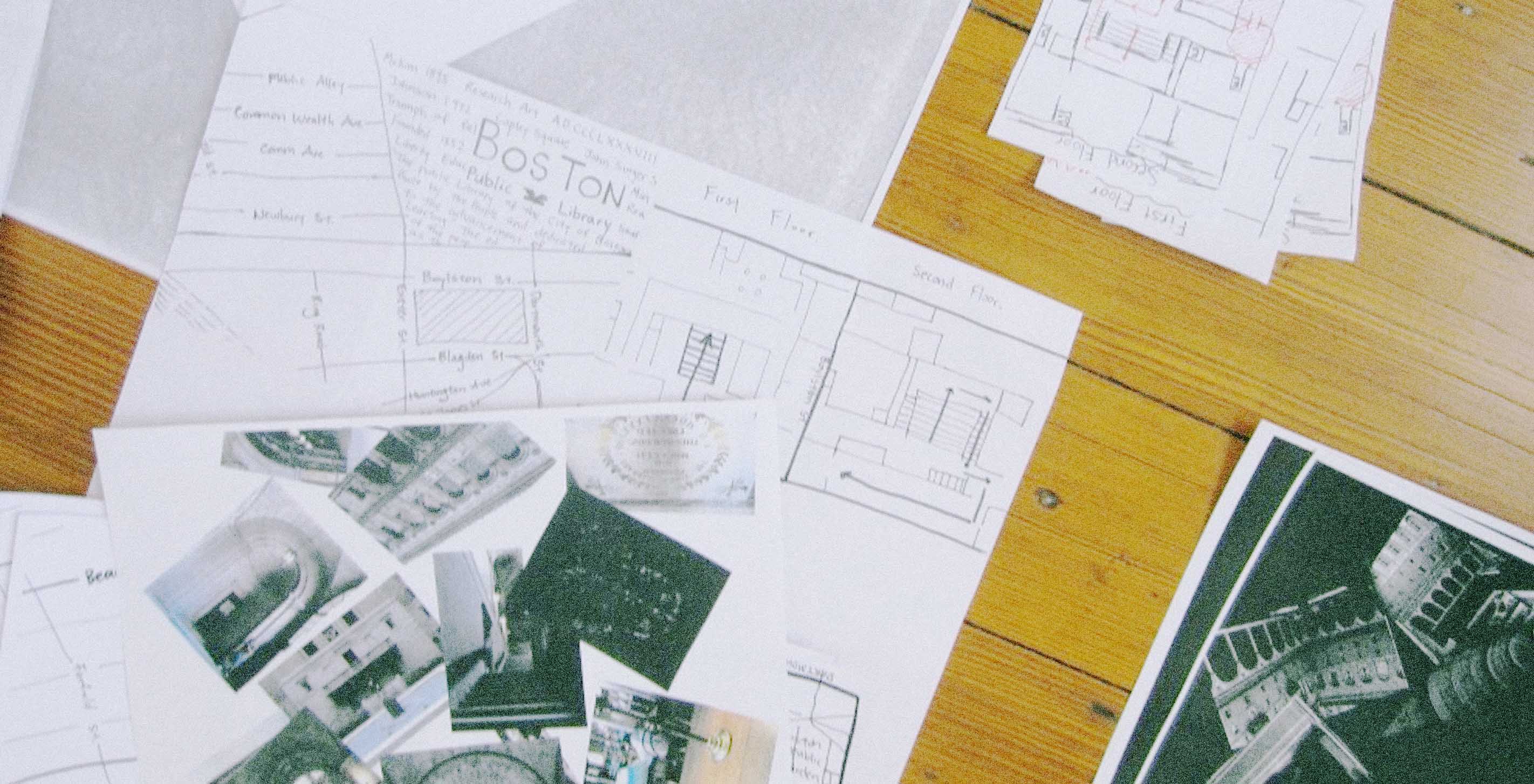
Not one to be outdone by Chris, I too welcomed an intern this summer! Dana's partner-in-crime Chensh was studying media at NYU and interested in design, and at first I wasn't sure what sort of skills we should focus on with such a short time together. Then she quoted Marshall McCluhan in our first meeting, and I knew we were in for something great.