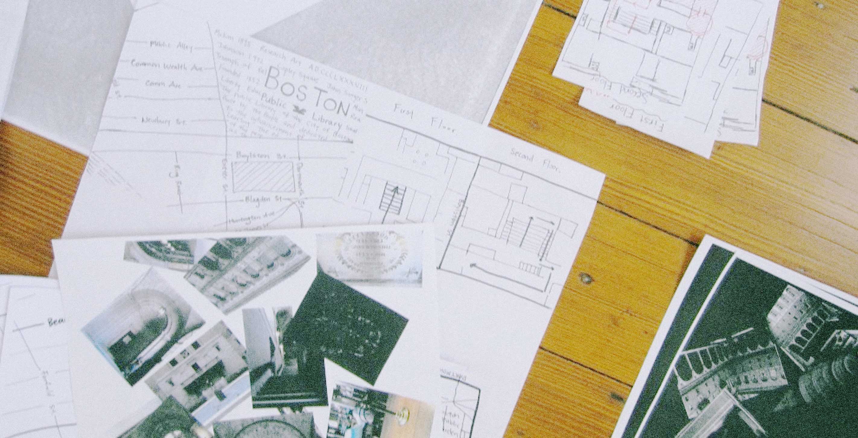
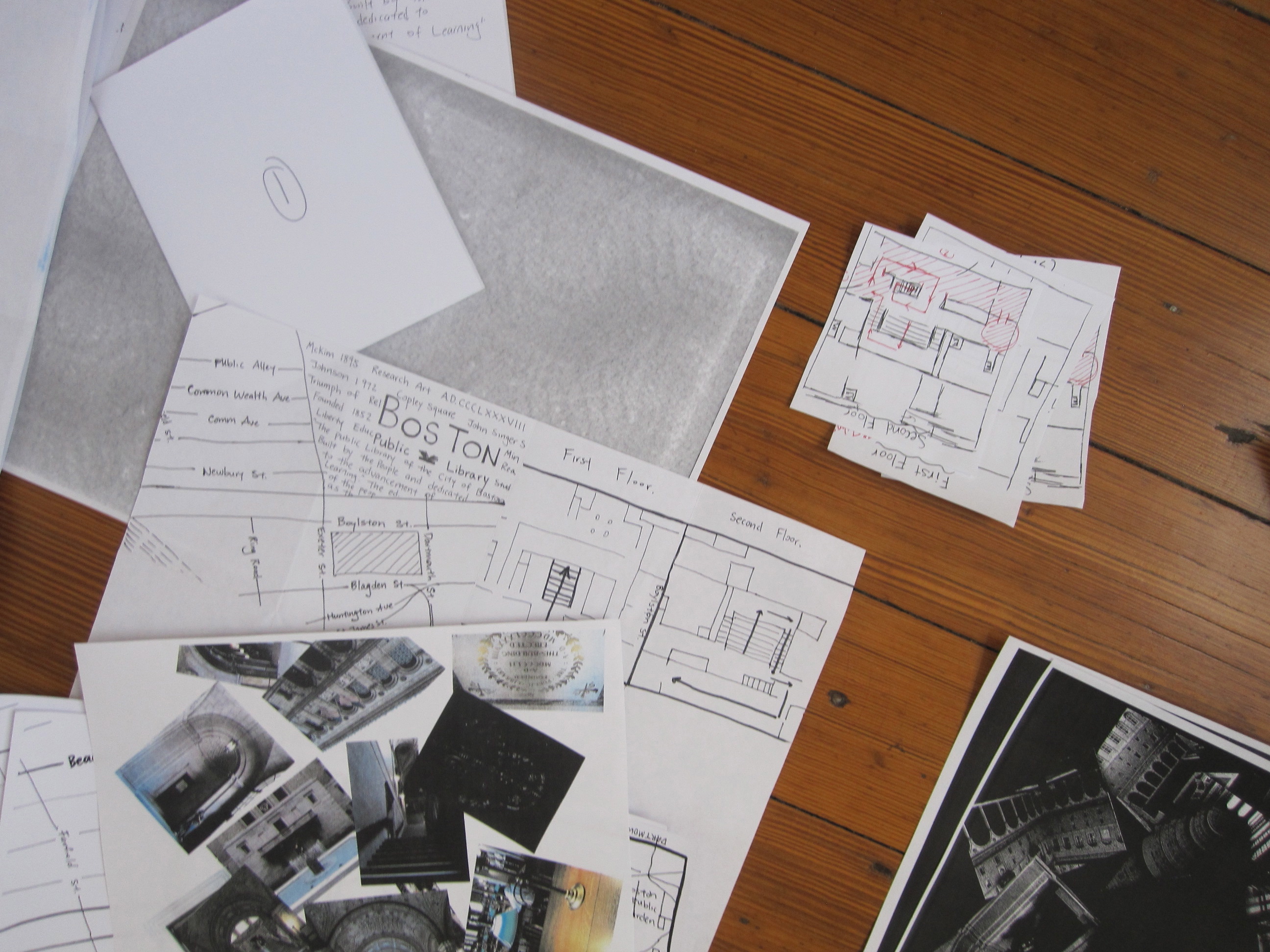
The first stage of her week with us was research: choosing the Boston Public Library as her focus, Chensh spent a day exploring the area, taking pictures and collecting observations. When she got back, we spent some time sifting through her findings to see what sorts of interesting stories she could tell.
With this archive of content built, Chensh embarked on a classic graphic design foundation project: the broster. Half brochure, half poster, this is the form we love to hate in art school, and yet it is so darned useful. (The Fathom team discovered this firsthand this past June at Eyeo, where the conference schedule was printed on—you guessed it—a broster.)
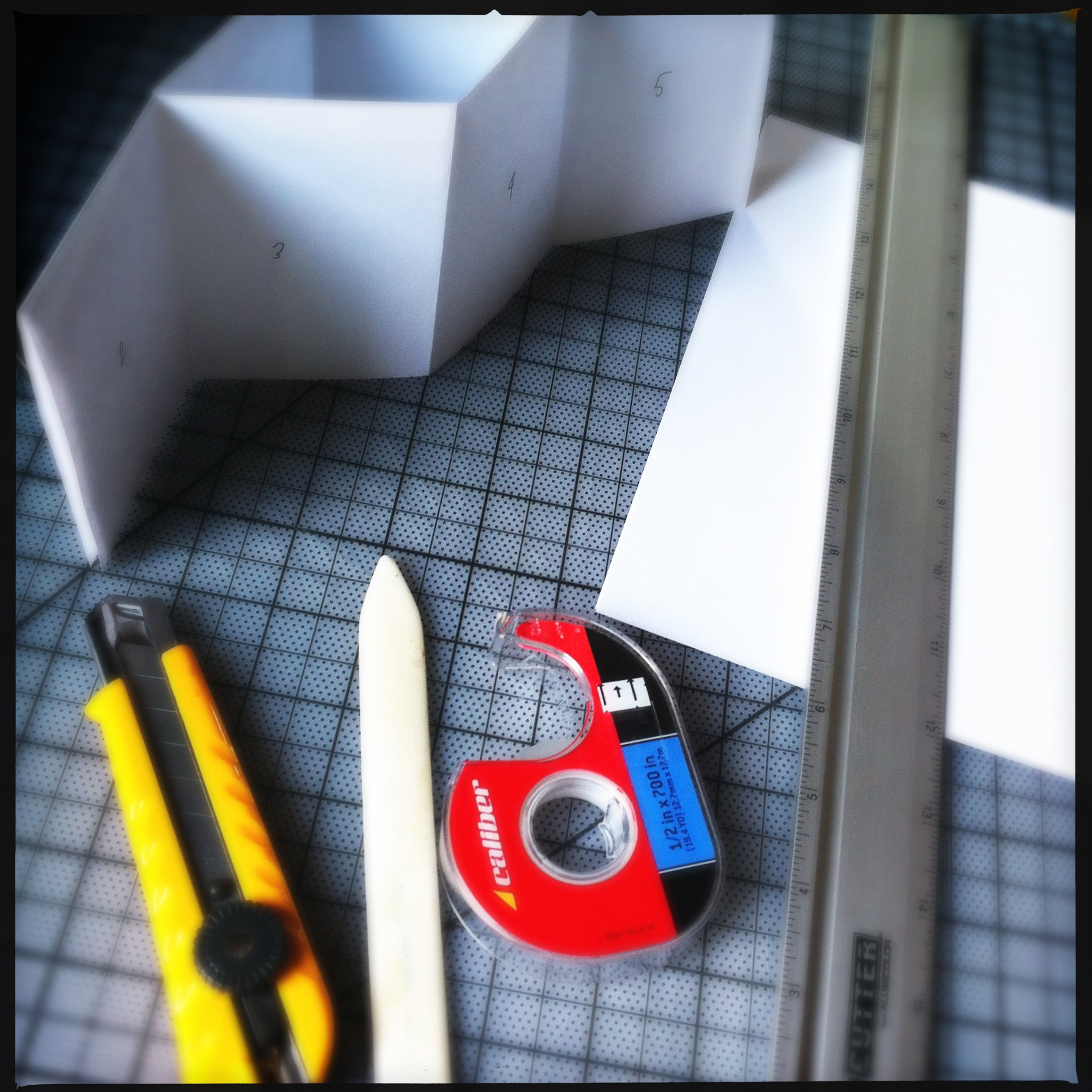
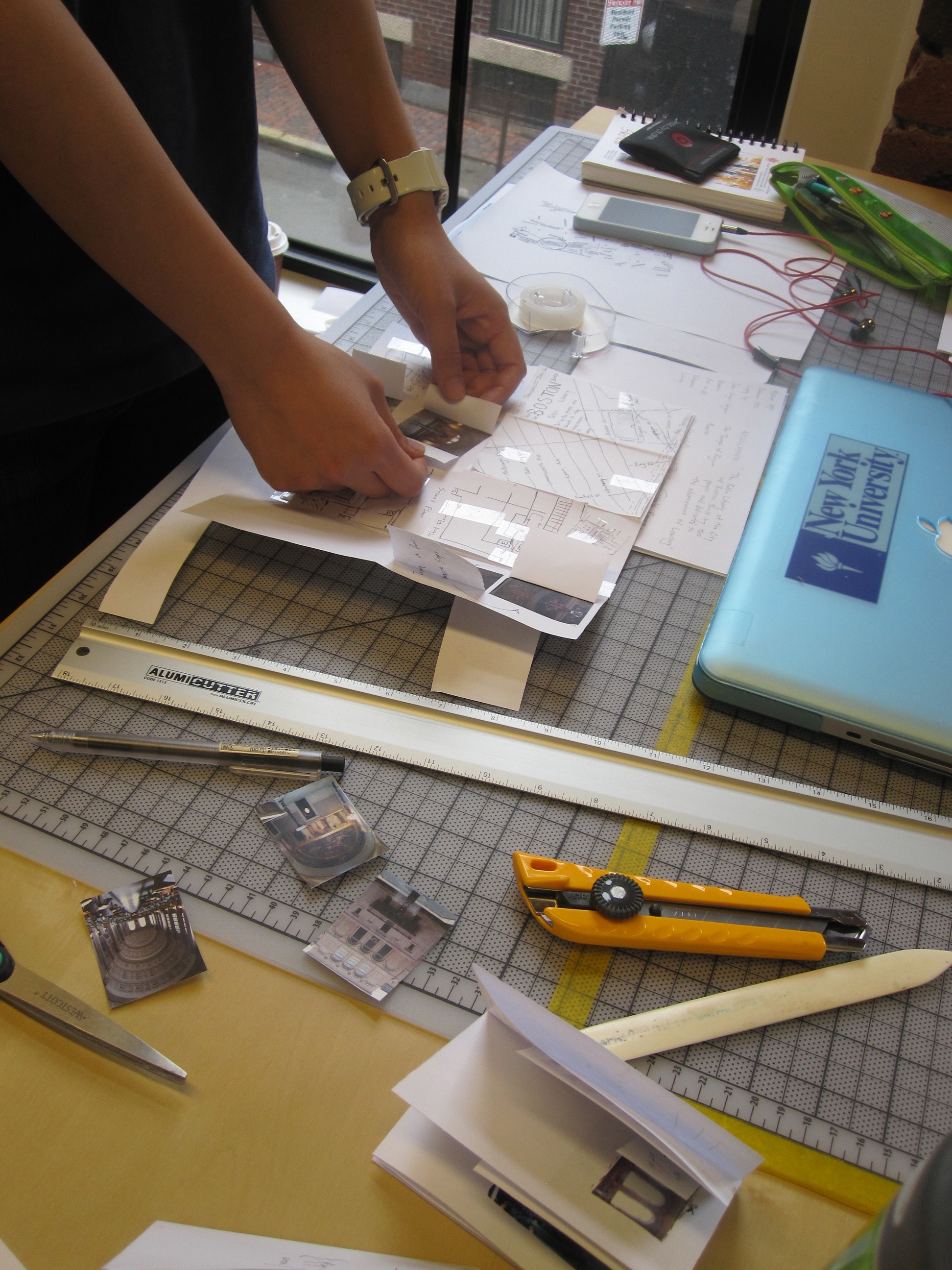
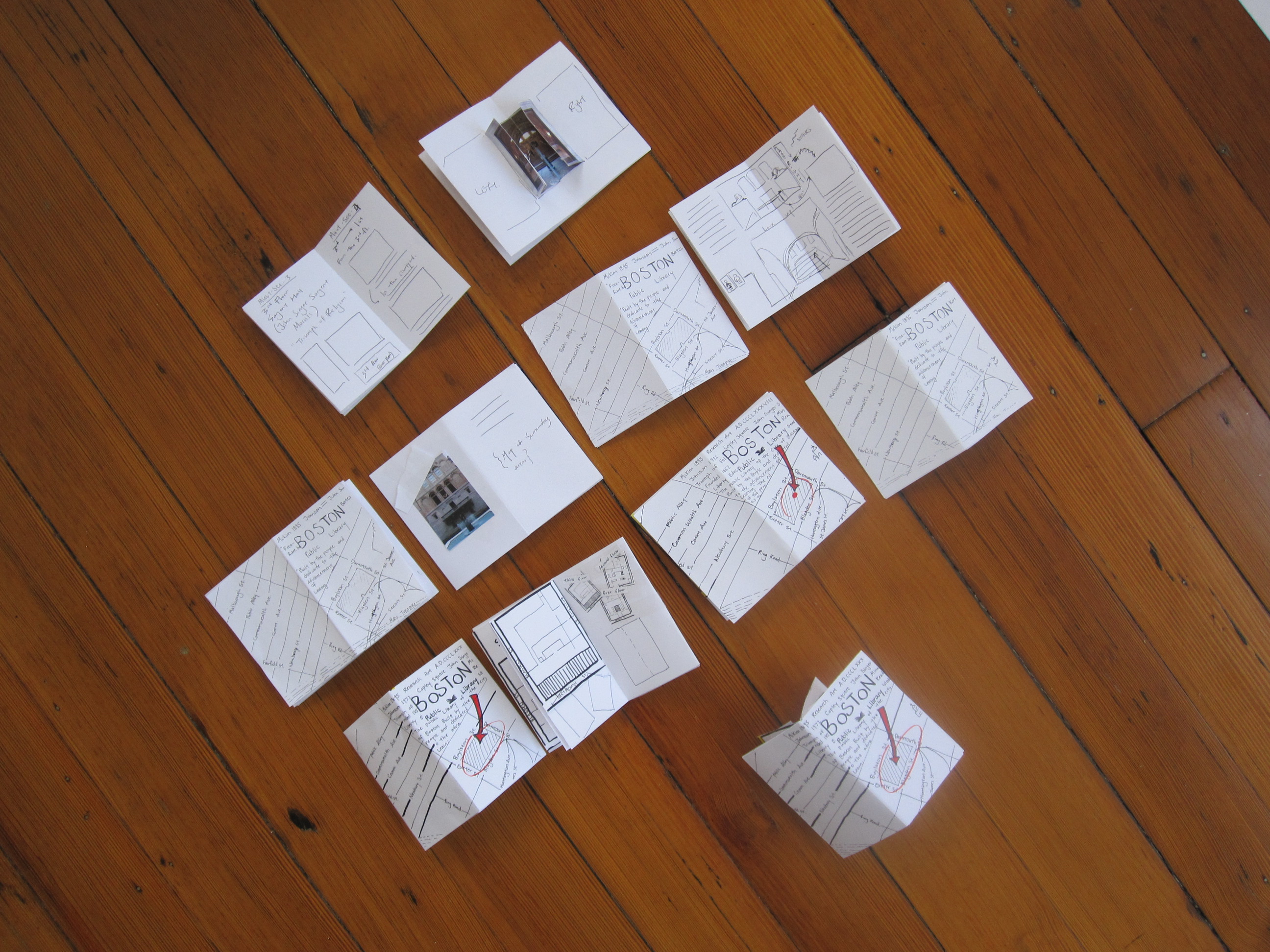
Made from a single sheet of paper with a minimum of cutting or folding, the broster folds into eighths to form a simple six page booklet, and then unfolds flat to reveal a larger composition. It turns out the interplay between these two modes of reading is a fantastic armature for teaching basic design concepts (craft, form, composition, etc) as well as more involved ones (typography, the interplay of type and image, narrative, etc). Further down the road, it can be a good introduction to some of the complexity inherent in interactive work, but that's an entirely different blog post.
Chensh's challenge was to use her collection of illustrations and photographs to design a printed map of the library. More specifically, to create a map that takes readers on a specific path through the building based on her own experiences.
Here's how the process works: start out with a single sheet of paper, fold into eighths and cut carefully along the center seam between the middle two vertices only. Starting with letter size paper nets a nice, small prototype, and from there its easy to alternate between sketching on the folded structure and running the flat version through a photocopier to build it up.
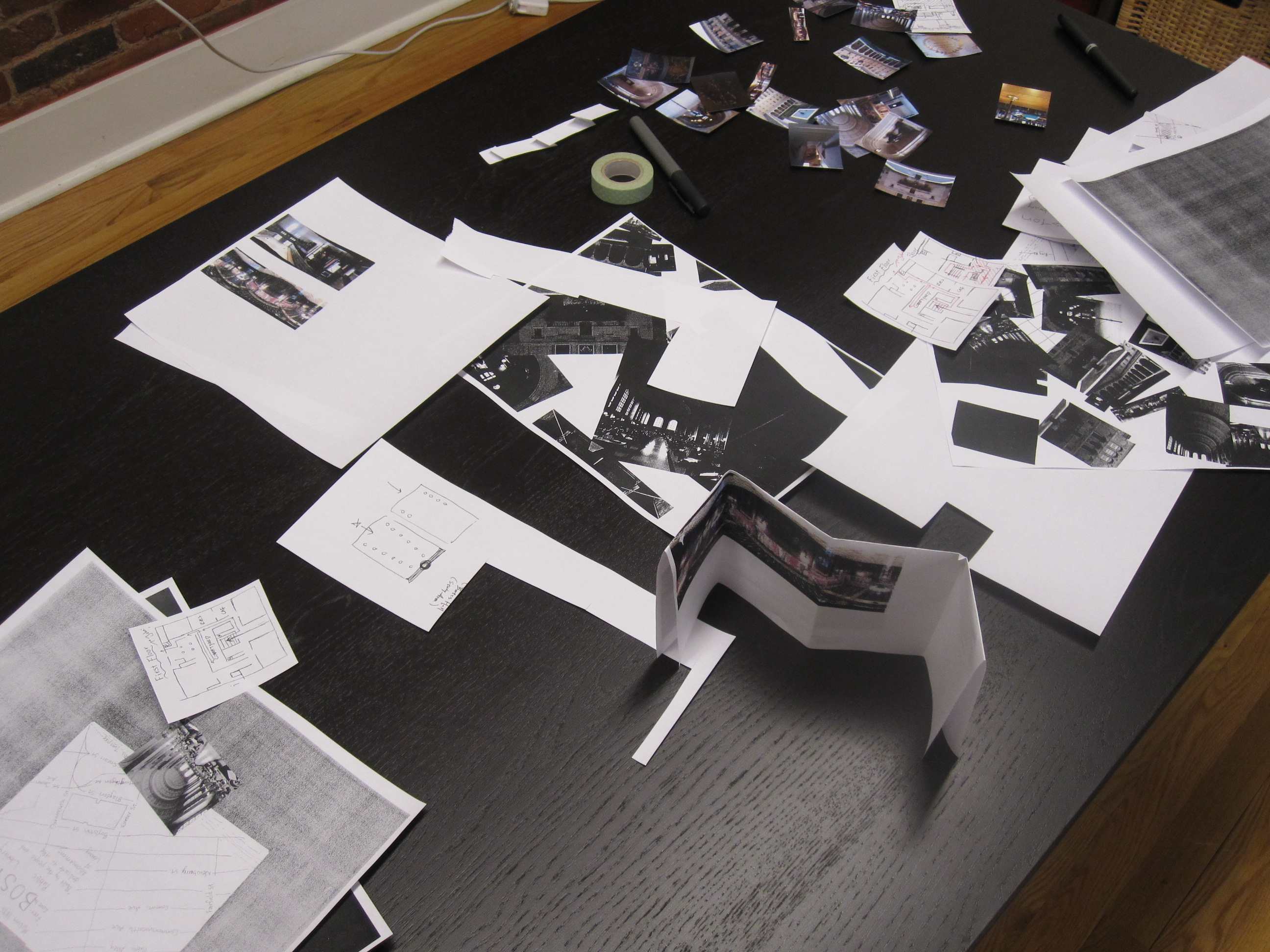
Holding things to primarily analog tools and a limited set of actions - draw, cut, invert, scale, rinse/repeat - lends itself to a fast and loose iterative process with a minimal learning curve and a maximum of experimenting, scribbling, taping, and abusing the photocopier. You know you're doing it right when you've made a mess.
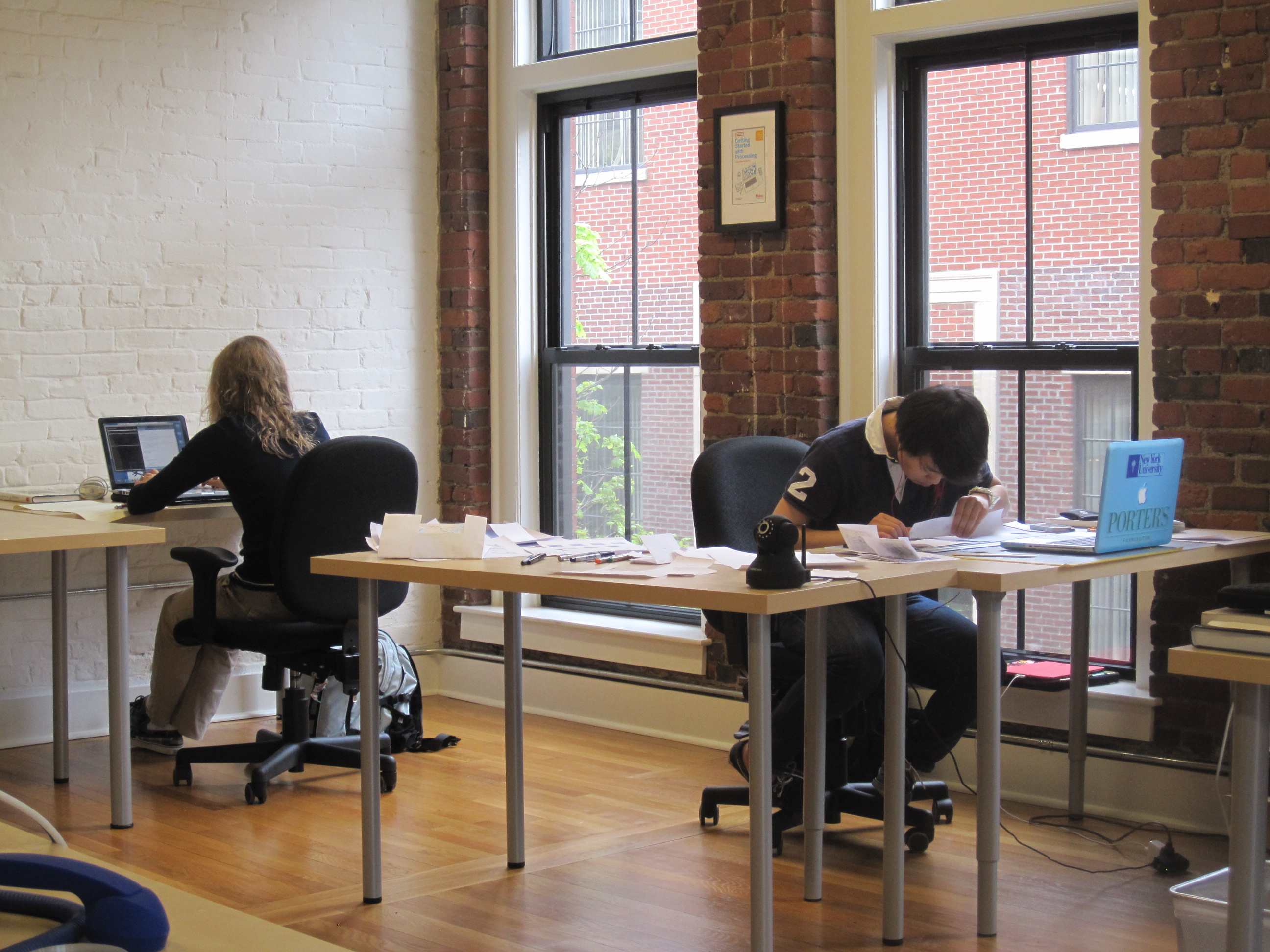
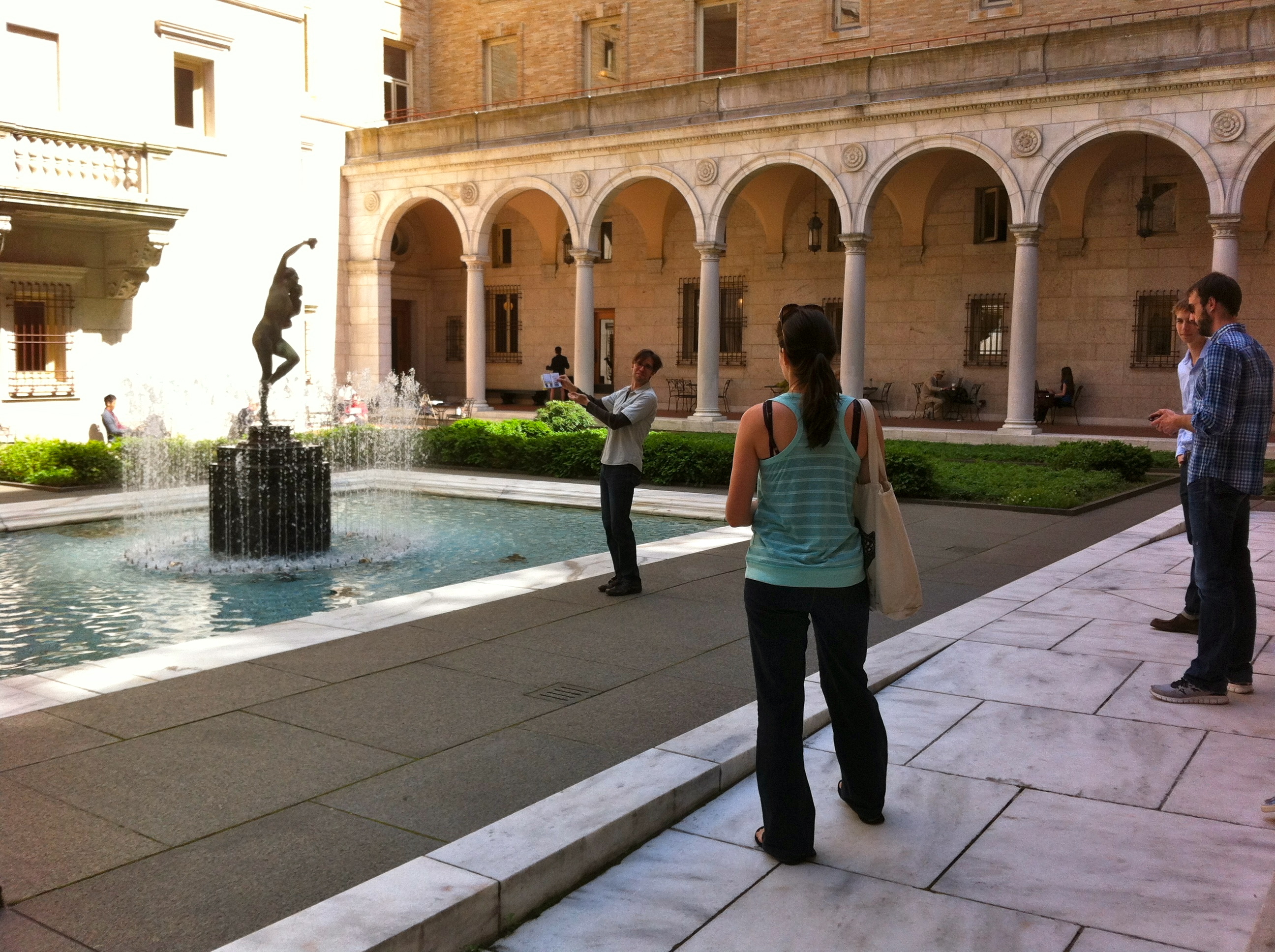
Chensh made great messes! On Friday afternoon she took a group of us on a little adventure to test out her map and get some real world feedback.
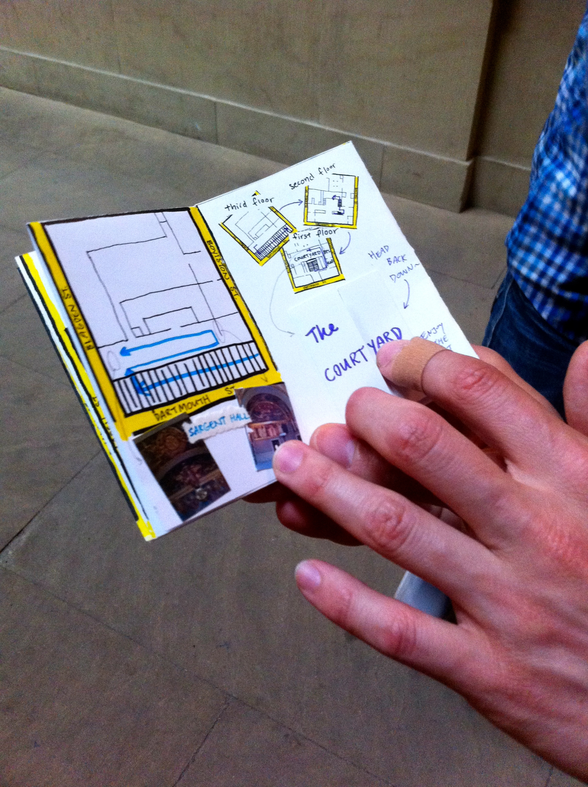
Andres generously volunteered to be the one to take Chensh's map out for a test spin, and our motley crew spent a hilarious hour following his lead.
Working through experimentations, iterations, prototypes, and discarded ideas ultimately make any kind of work better. At the end of the day the goal wasn't to have a perfectly designed object, but rather to have built up a body of work that showed an embrace of process. (If you hadn't noticed, we're big fans.) It was a pleasure to have Chensh in our offices, and to see that process in action.
We’d love to hear what you’re working on, what you’re curious about, and what messy data problems we can help you solve. Drop us a line at hello@fathom.info, or you can subscribe to our newsletter for updates.