Notebook
Here's where we post periodic updates on what we've been up to at Fathom. Reflections on the interesting stories that emerge from our client work, side projects, after-hours rabbitholes, and other miscellaneous threads of inquiry.
You can also follow these posts as a feed in your feed reader.
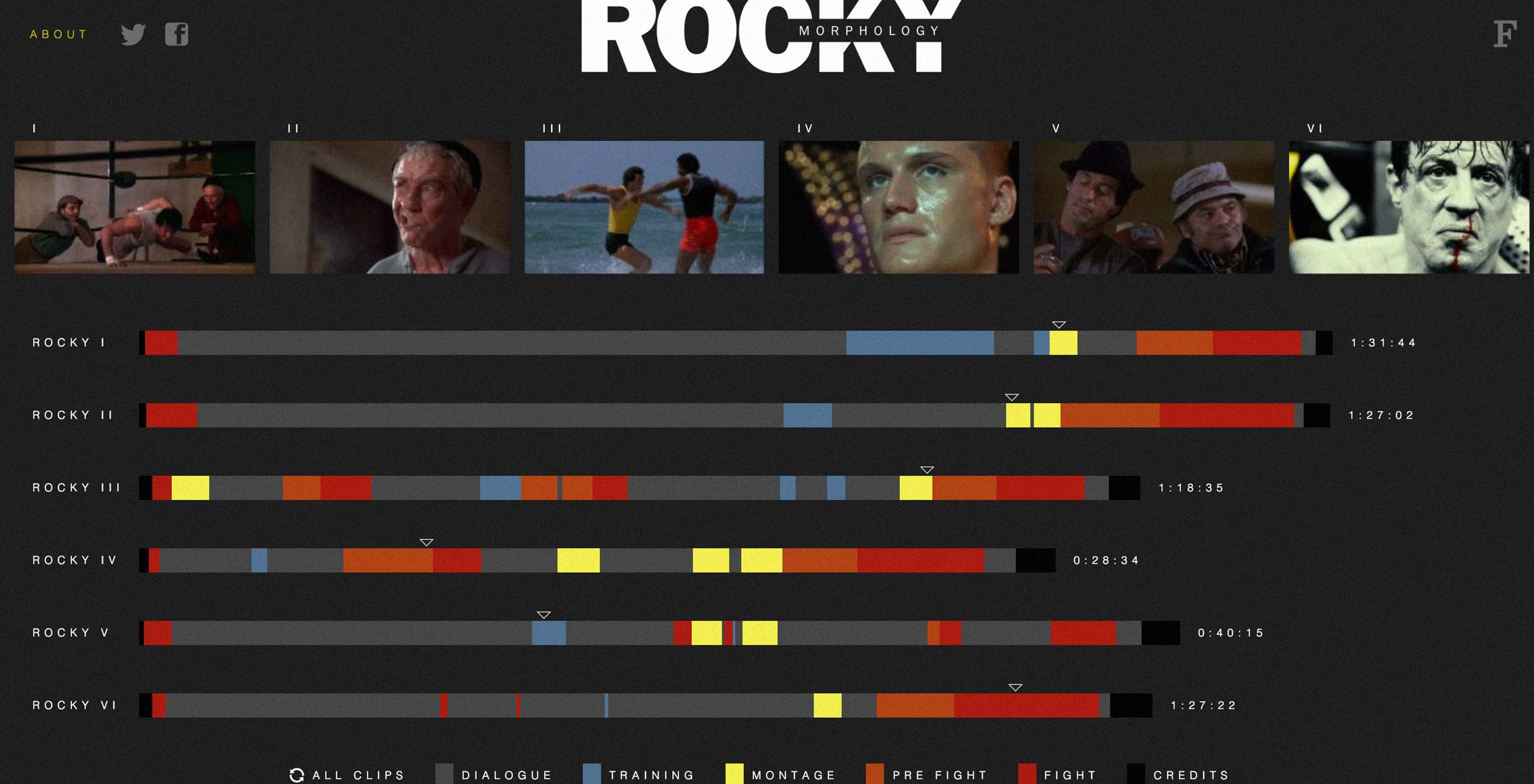
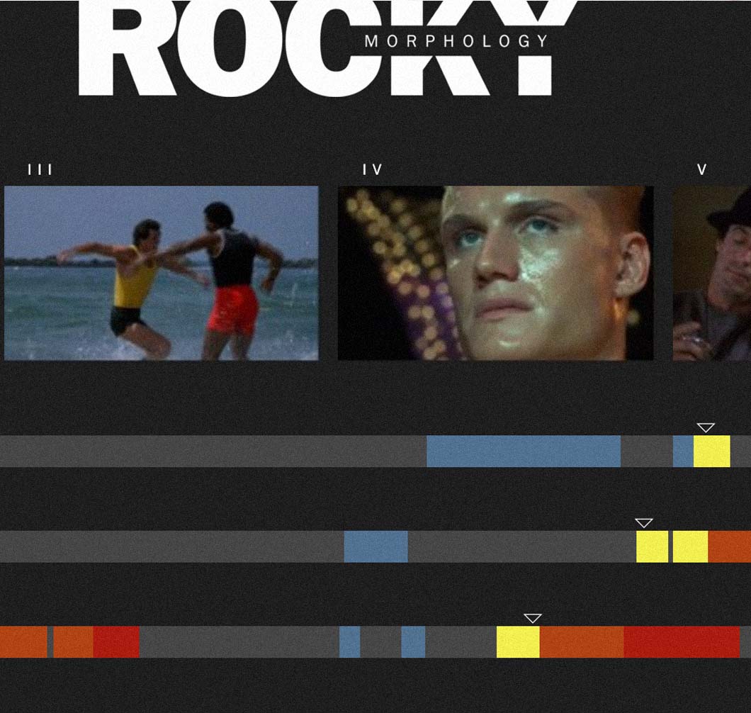
It ain’t over ’til it’s over. Latest personal project at Fathom, Rocky Morphology, analyzes the narrative structure of Rocky I-VI.
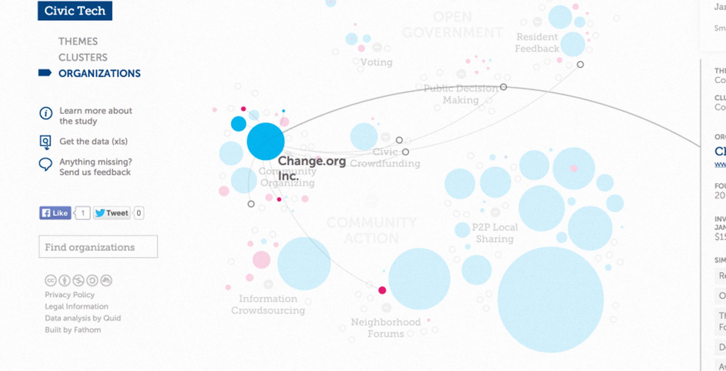
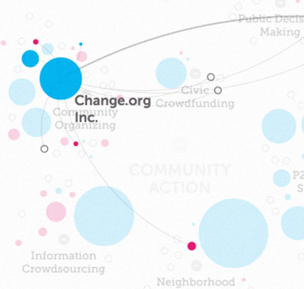
Hot off the presses! Our latest project with the Knight Foundation went live today. Trends in Civic Tech is an interactive tool for exploring the rapidly growing field of "civic tech" — organizations and companies operating at the intersection of technology, open government, and citizen engagement.

In addition to taking on new projects, interns, workshops, and leadership in the last few months, we were excited to enter Records for Life, a design challenge sponsored by the Bill & Melinda Gates Foundation. The challenge focused on reimagining the child health record — a humble document that is responsible for a tremendous amount of information exchange during the first five years of a child's life.
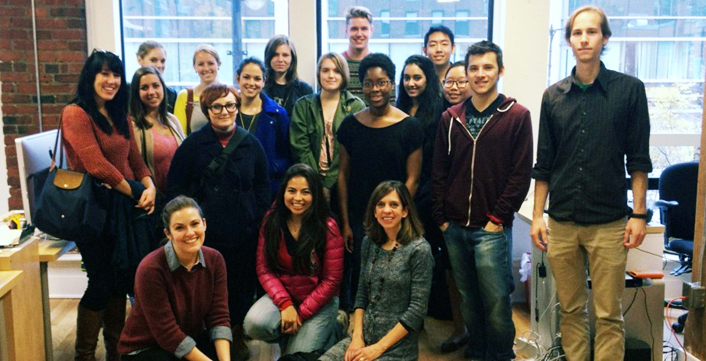
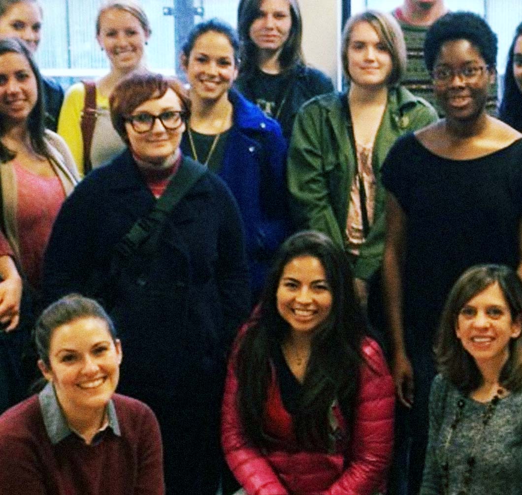
It’s been exactly a year since Professor Kristen Coogan's Information Design class from Boston University came by for a visit, so we were glad to have them back for another tour in 2013. While it was a bummer that two members of the “dad” side of our office were out sick today, their empty chairs fortunately allowed us to accommodate seating for our 16 guests. Once everyone got settled on the third floor, Katy and Terrence began an overview of some of the work we’ve been cooking up in the past year.
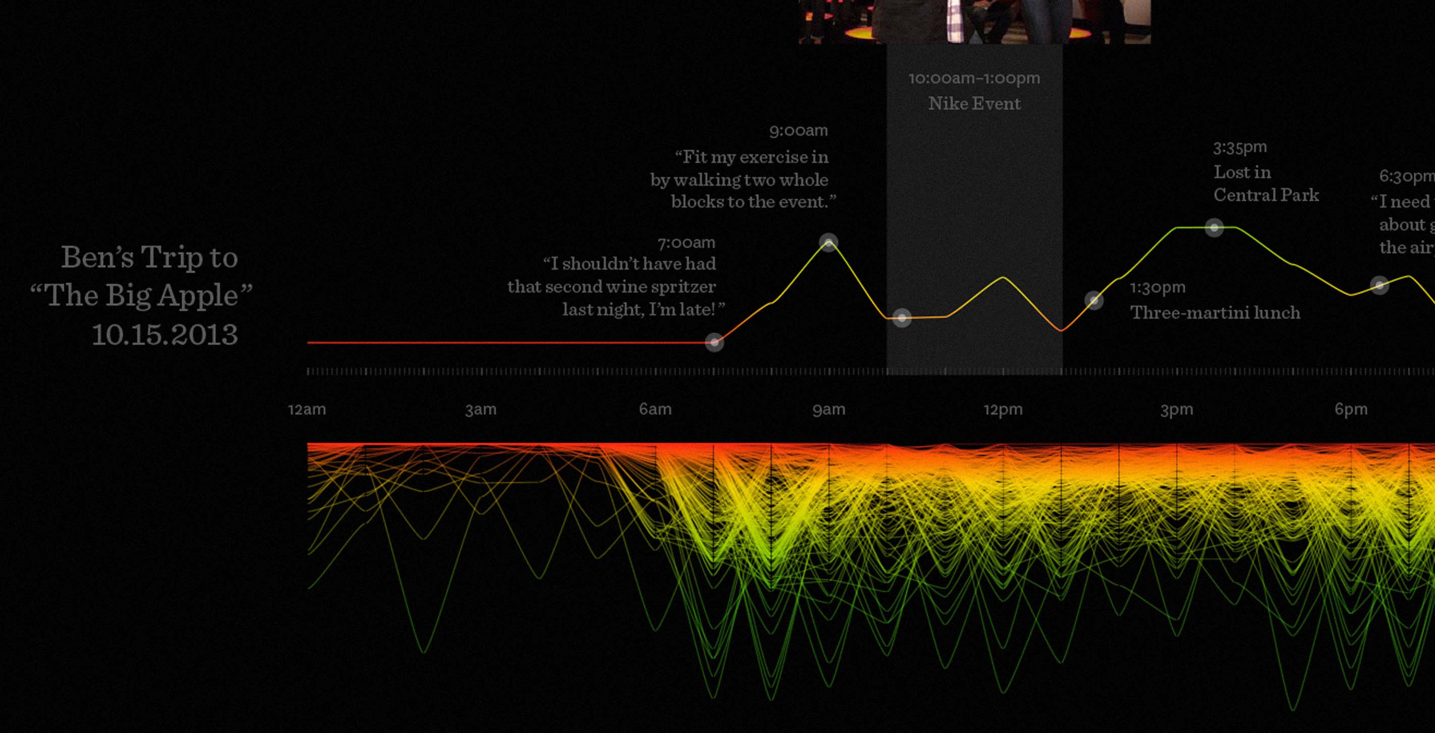
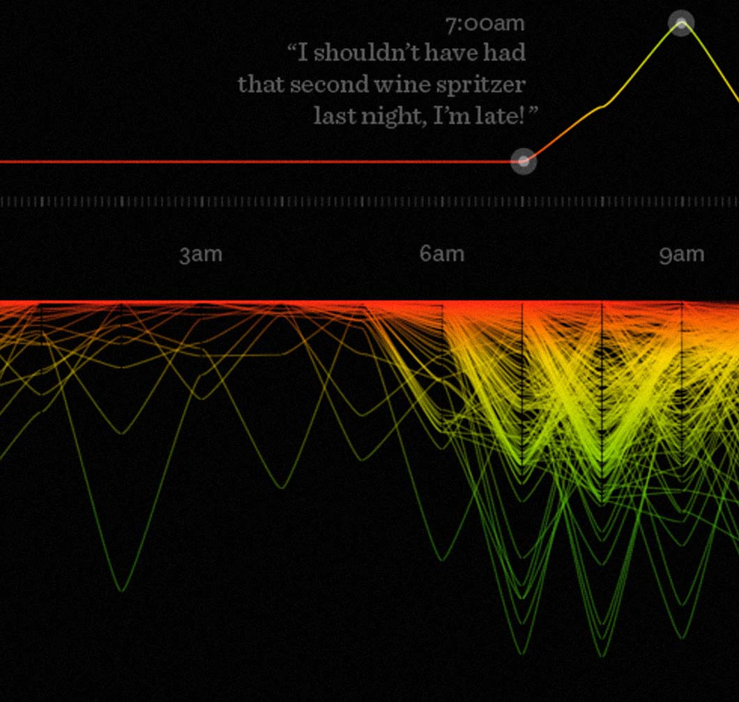
Fathom has been doing a lot of work for Nike in the past nine months, in particular with the Nike+ FuelBand and the NikeFuel* data.


In September we were honored that Connected China was named a finalist in the 2013 Fast Company Innovation by Design Awards.
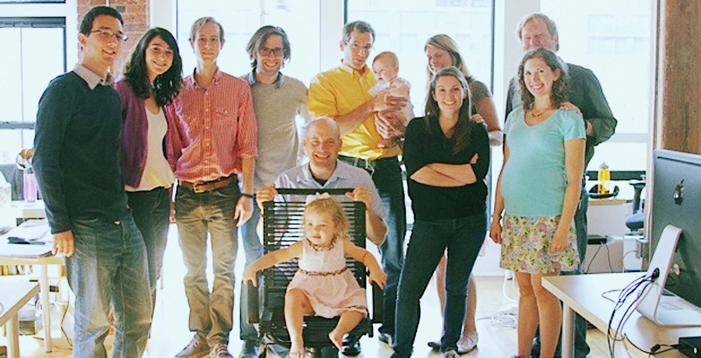
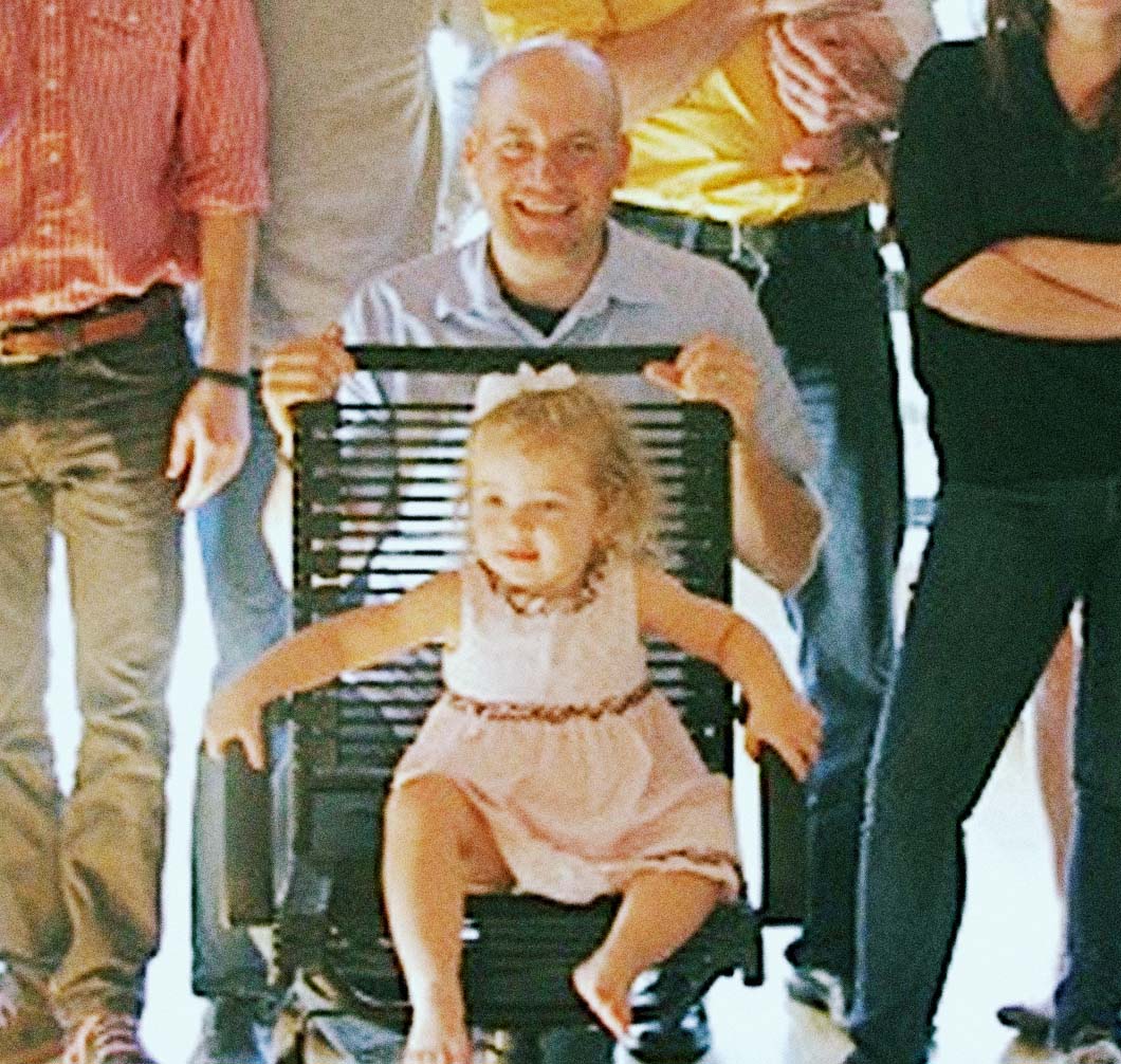
We all loved it when James brought his family to visit the office this summer — especially when his oldest daughter Joy took a particular shine to the Big Chair:
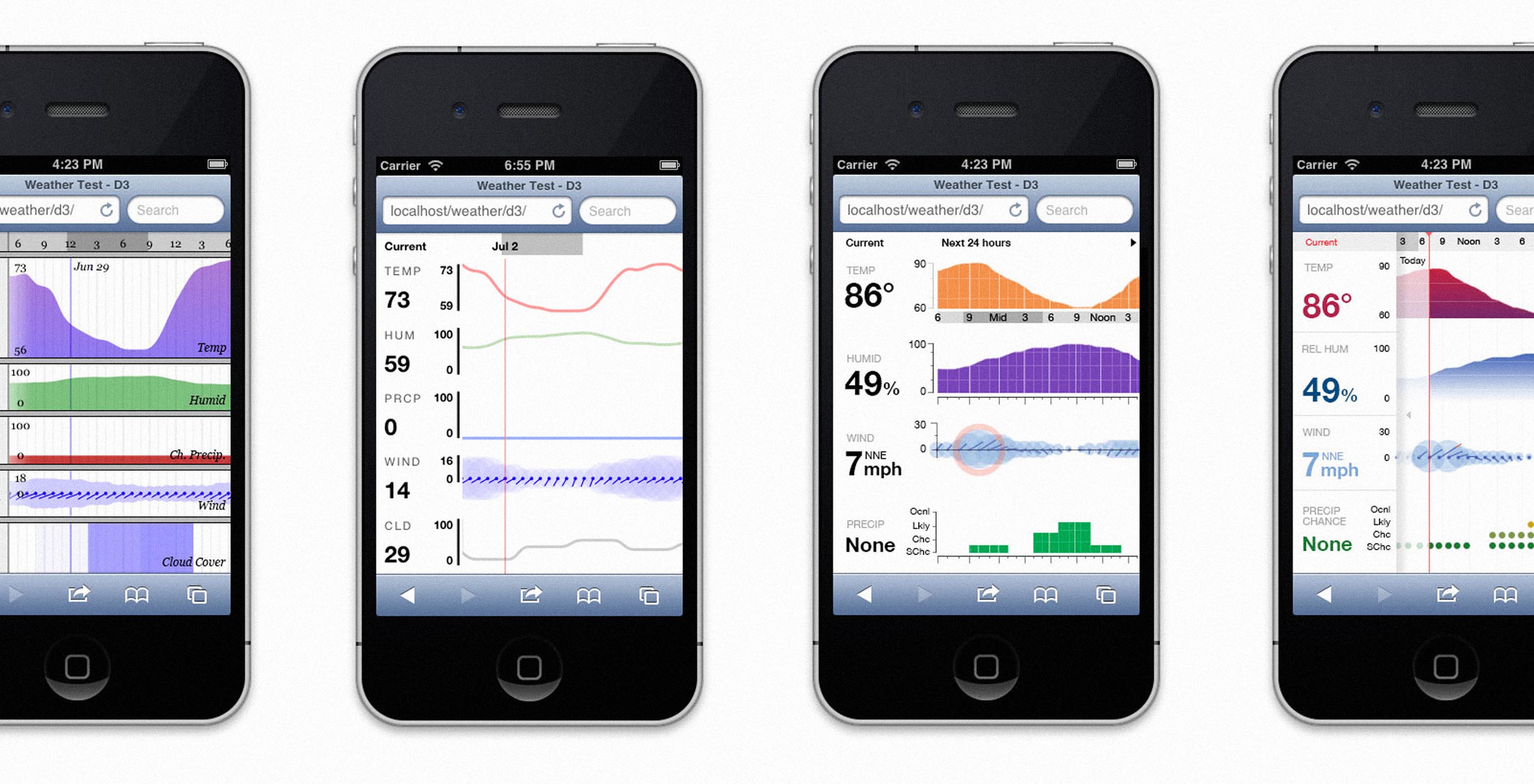

A post from Tim Ripper, who we loaned from Yale's graduate program for a summer internship. Sadly, we had to return him a couple weeks ago. Here he shares his experiences with one of the projects he worked on at Fathom these past few months. —B
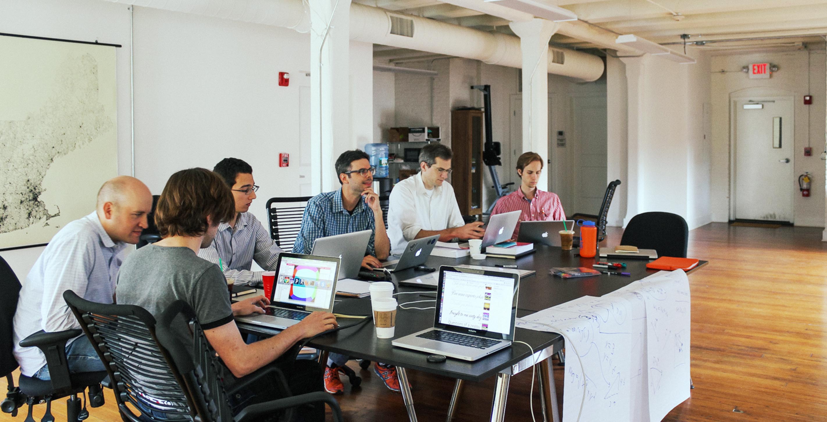
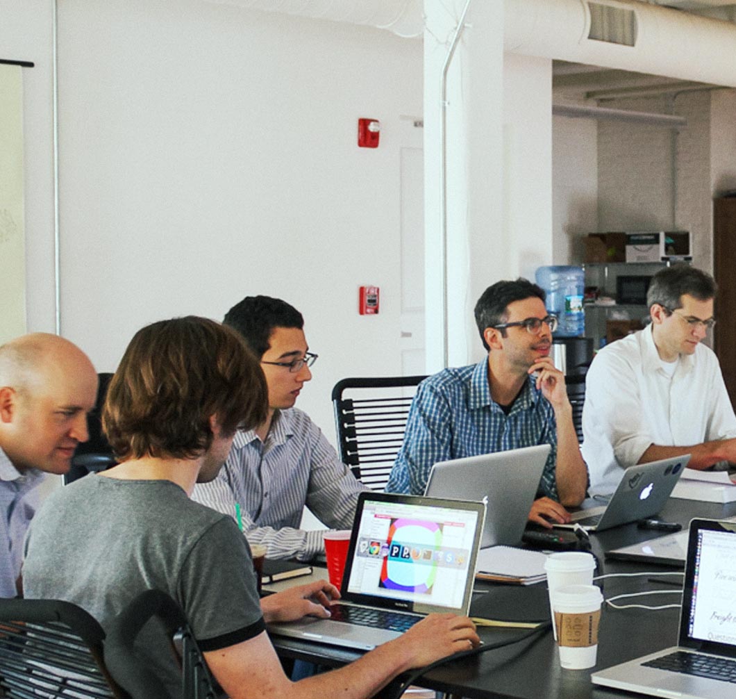
Last week we were lucky to be able to welcome Dan Shiffman to the Fathom offices for a full day of Processing workshops. Dan is a professor at the Interactive Telecommunications Program program at NYU, and is the author of Learning Processing and Nature of Code. (As far as we know, he is also our first guest to commute to the office via ferry from Maine.)


For the last couple of years we've sold posters (All Streets and Dencity) and a book (Frankenfont) as fun side projects that give us a chance to do some print work—in this graphic design-heavy office, we all still love print, and the chance to create proper physical artifacts. Since we give away the proceeds, I've been meaning to do an update on where we've sent the contributions.