Notebook
Here's where we post periodic updates on what we've been up to at Fathom. Reflections on the interesting stories that emerge from our client work, side projects, after-hours rabbitholes, and other miscellaneous threads of inquiry.
You can also follow these posts as a feed in your feed reader.
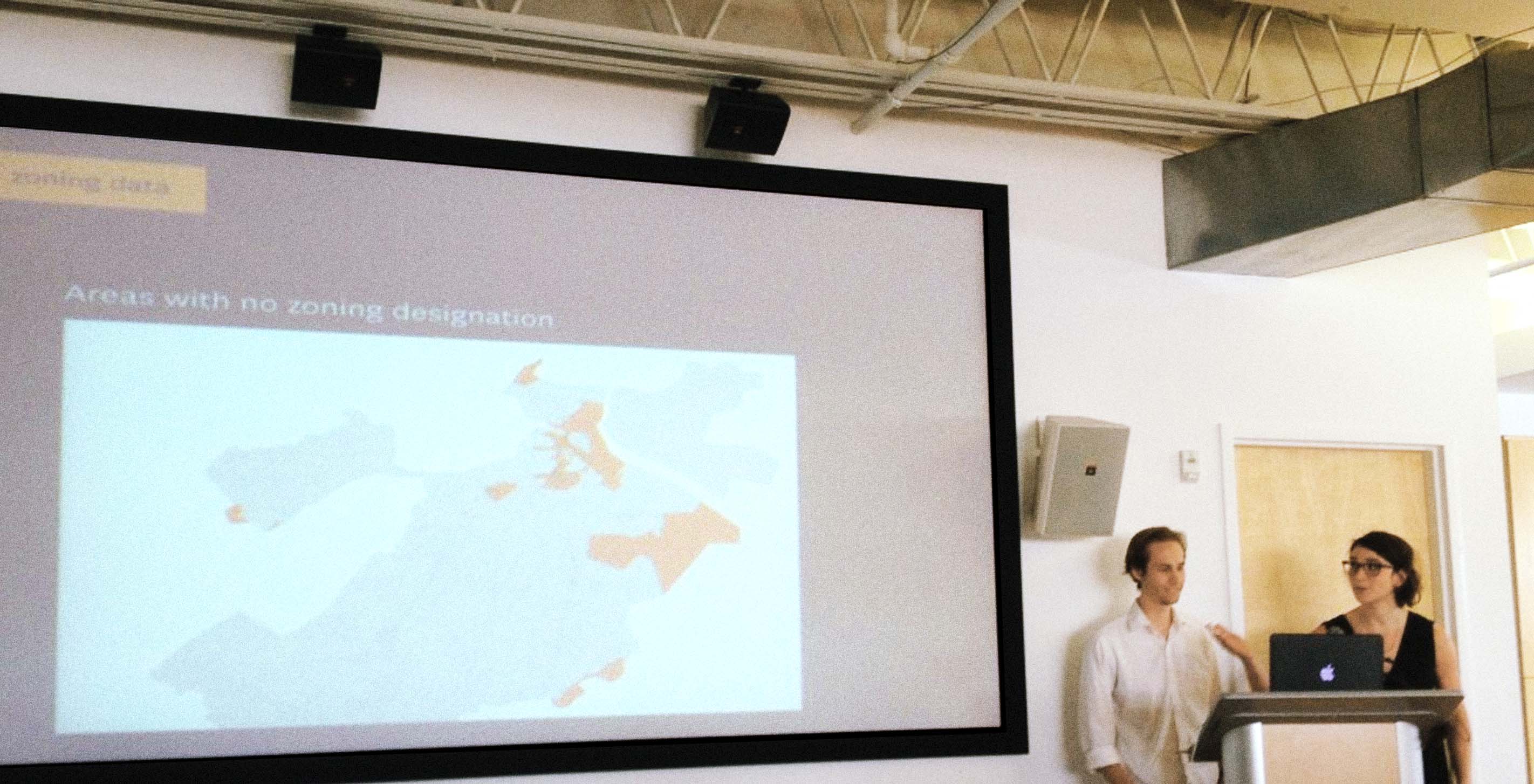
Fathom received a Knight Prototype grant which provided us the opportunity to embark on a collaborative project with the City of Boston. Last week, we traveled to Pittsburgh to present our Urban Agriculture project at Knight Demo Day.
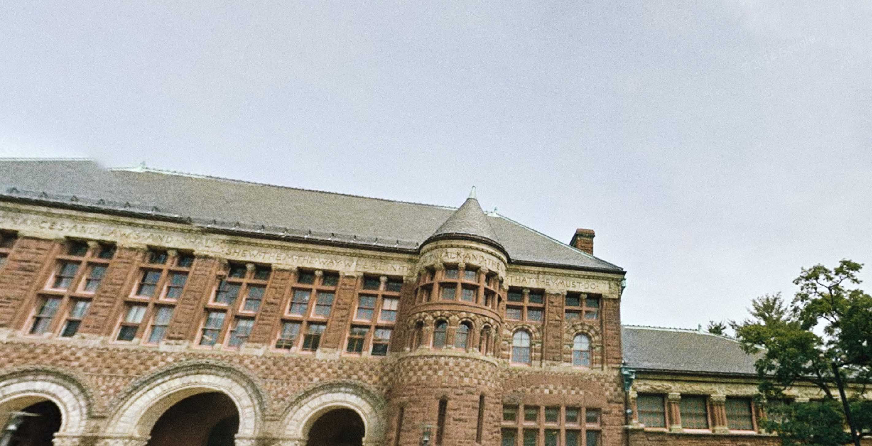
Today Mark and I took another trip to Harvard to speak at Beautiful Data, a two week summer institute hosted by metaLAB at Harvard University. The institute is supported by the Getty Foundation and is a workshop to help curators and historians tell stories with open art collections.
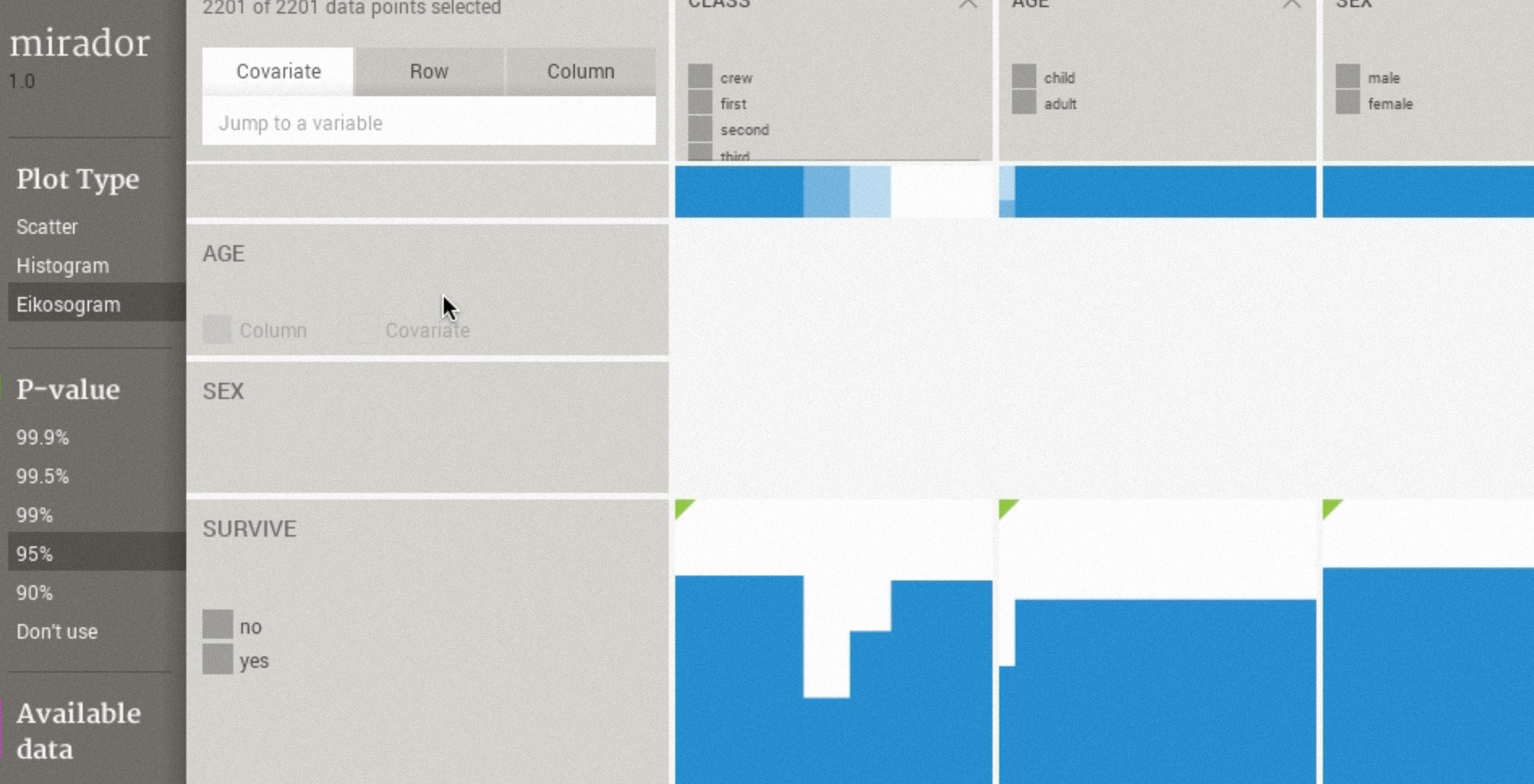
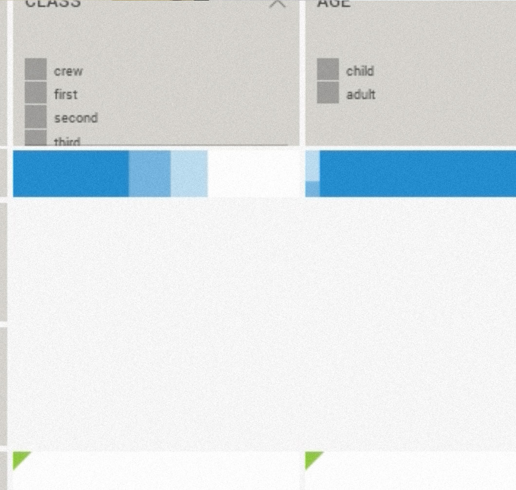
When Andrés isn’t contemplating the future of Processing or writing about OpenGL shaders, he has been leading the development of Mirador, a tool that provides an overview of large datasets, by visualizing their underlying dependency structures and identifying groups of explanatory variables.
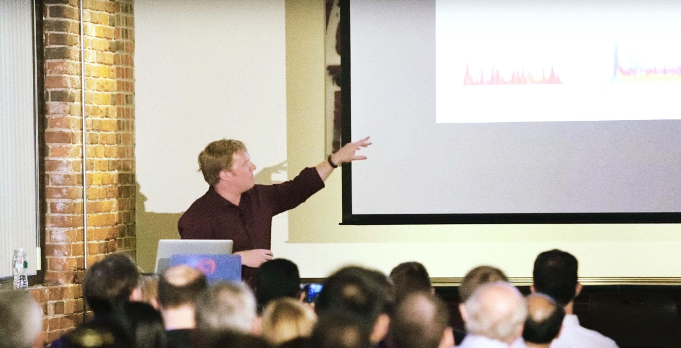
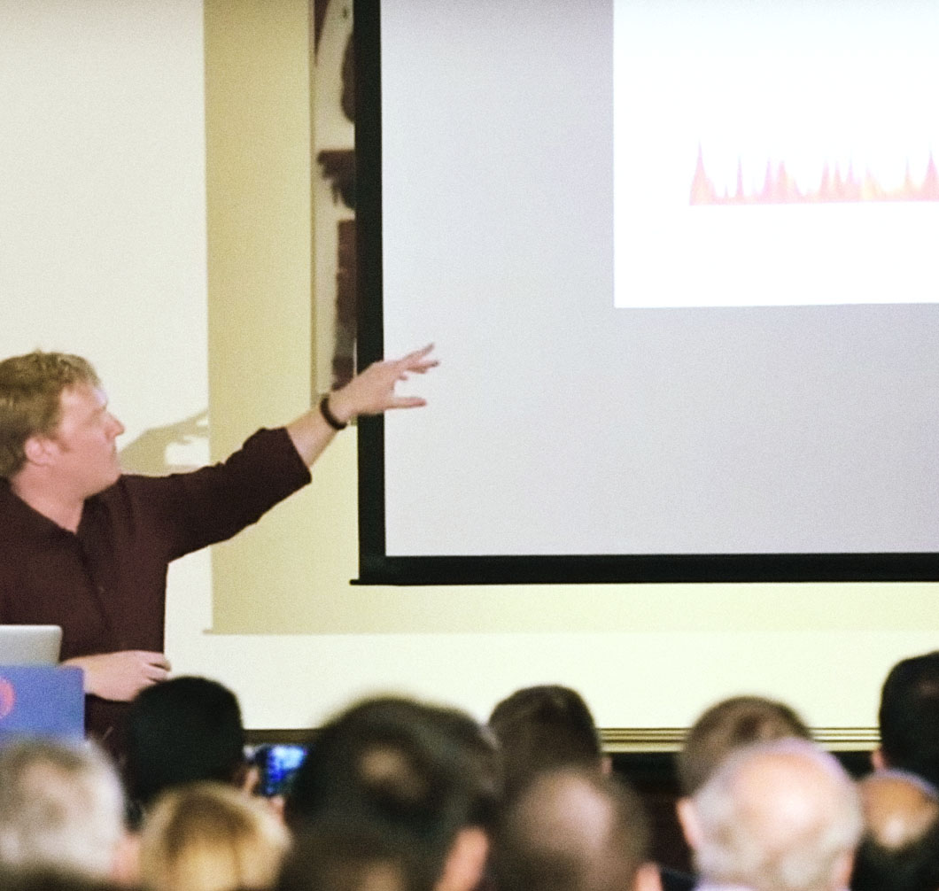
Last week Ben spoke at the Thomson Reuters Knowledge Worker Innovation Series. Hosted by Mona Vernon, Vice President of the Data Innovation Lab at Thomson Reuters, the series is intended to bring together innovators and entrepreneurs who are interested in understanding how knowledge work is evolving.
With two visitors and a weeklong culinary tour* of Beacon Hill, we've had a busy few weeks here at Fathom.
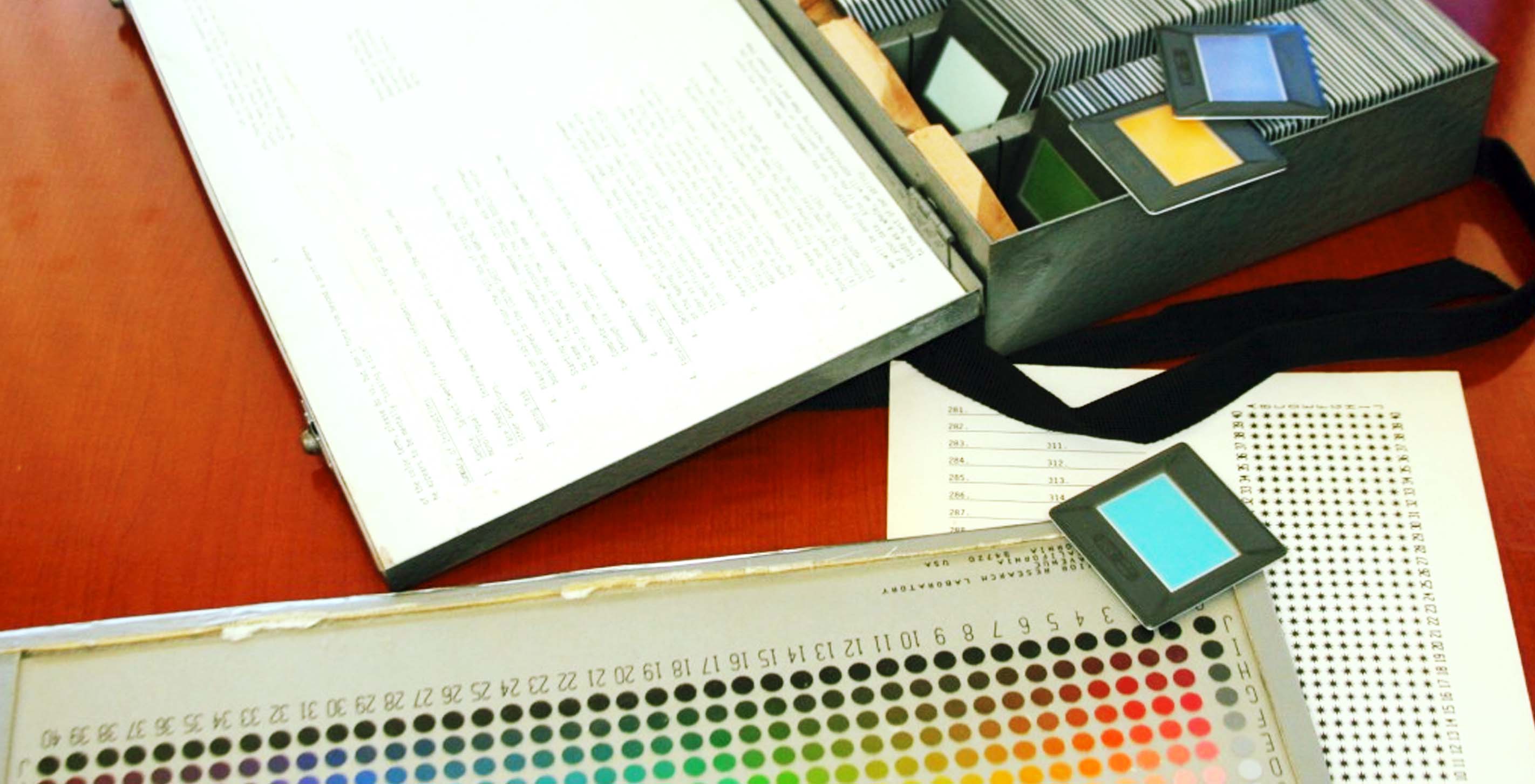
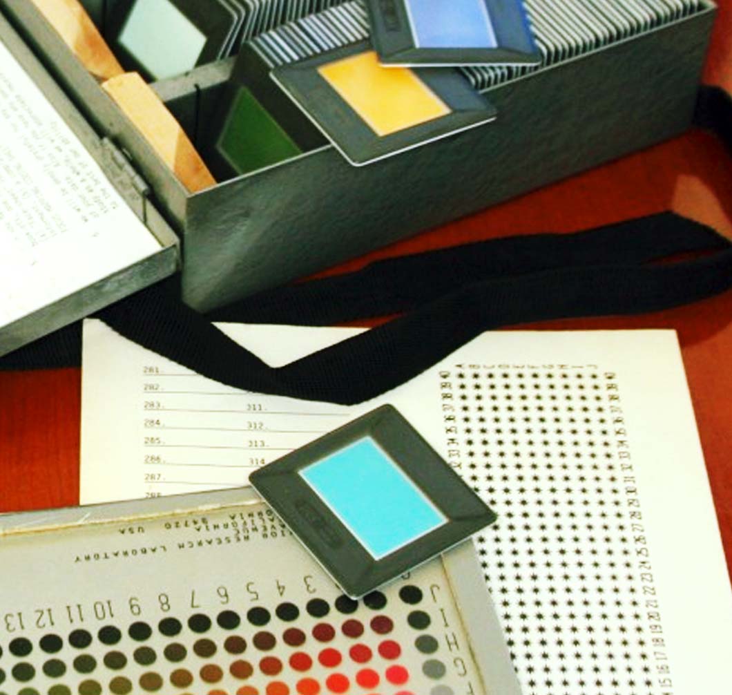
Sina Najafi, editor-in-chief of Cabinet, contacted us about including our project Colorful Language to serve as a visual explanation of the World Color Survey data, the topic of an essay in the new issue. Cabinet is a quarterly non-profit publication about art and culture based in Brooklyn, NY.
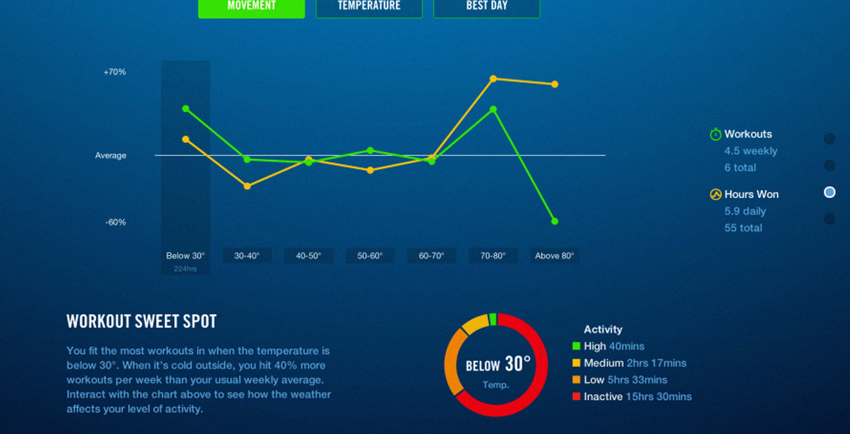
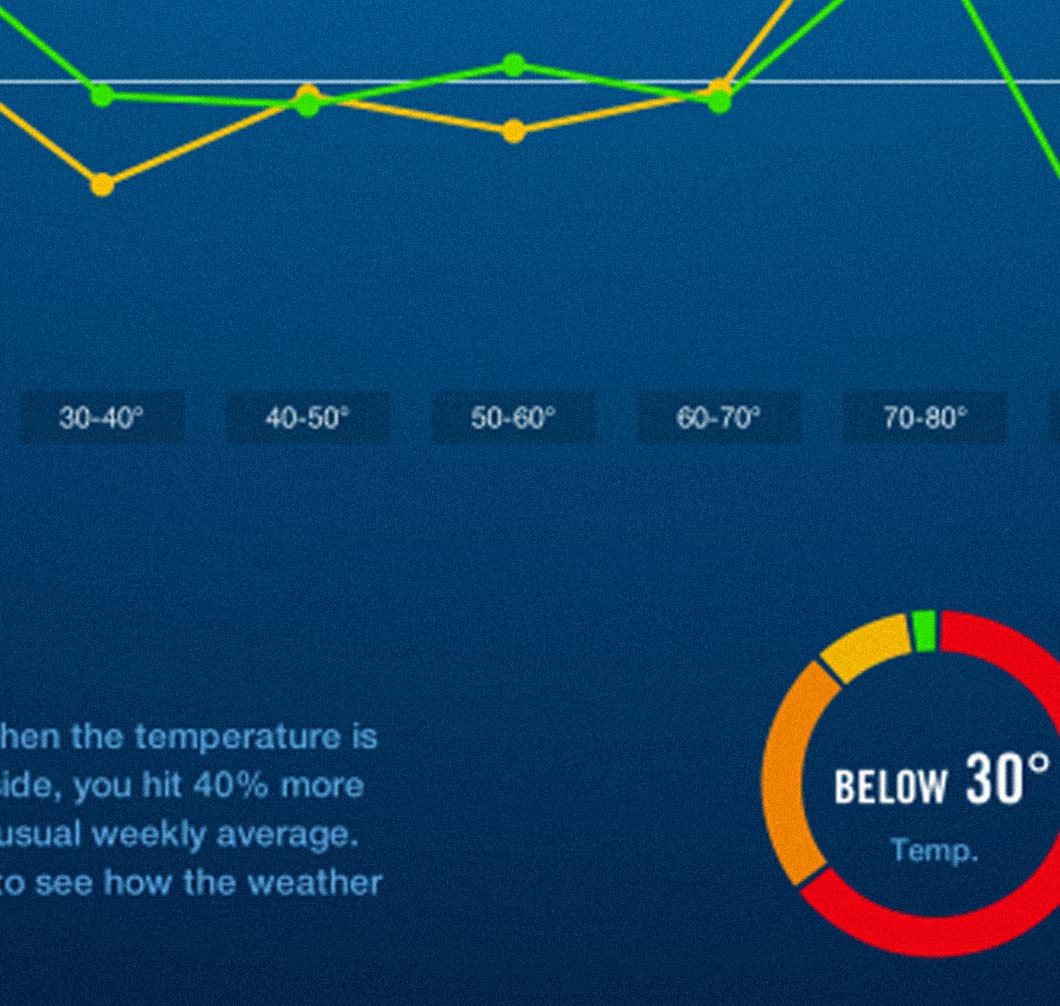
We're excited about our recent release of NikeFuel Weather Activity, a website that connects billions of 2013 Nike+ FuelBand activity data points with localized weather data. In continuation of our study of movement patterns from the 2013 year in NikeFuel, we overlaid 2013 weather data on a map of the U.S. to see how temperature, rain, and snow impact physical activity. We'd like to take this opportunity to reflect on some of the processes that went into the design and development of the site.


In partnership with Nike, we’ve created NikeFuel Weather Activity, a website that connects 2013 Nike+ FuelBand activity with localized weather data, allowing users to see how daily temperature, rain, and snow affect personal, statewide, and national movement patterns in the U.S. The site features an interactive map that illustrates how states and regions react differently to changes in the weather. You can see, for instance, that what’s considered warm in the Midwest is still too cold for the South to get moving, or that the Rocky Mountain states are the only region to turn up their intensity in extreme heat. In addition, the site provides Nike+ FuelBand users with personalized stats and interactive graphics, so individuals can see how temperature, rain, and snow affect their minute-to-minute and daily activity patterns.
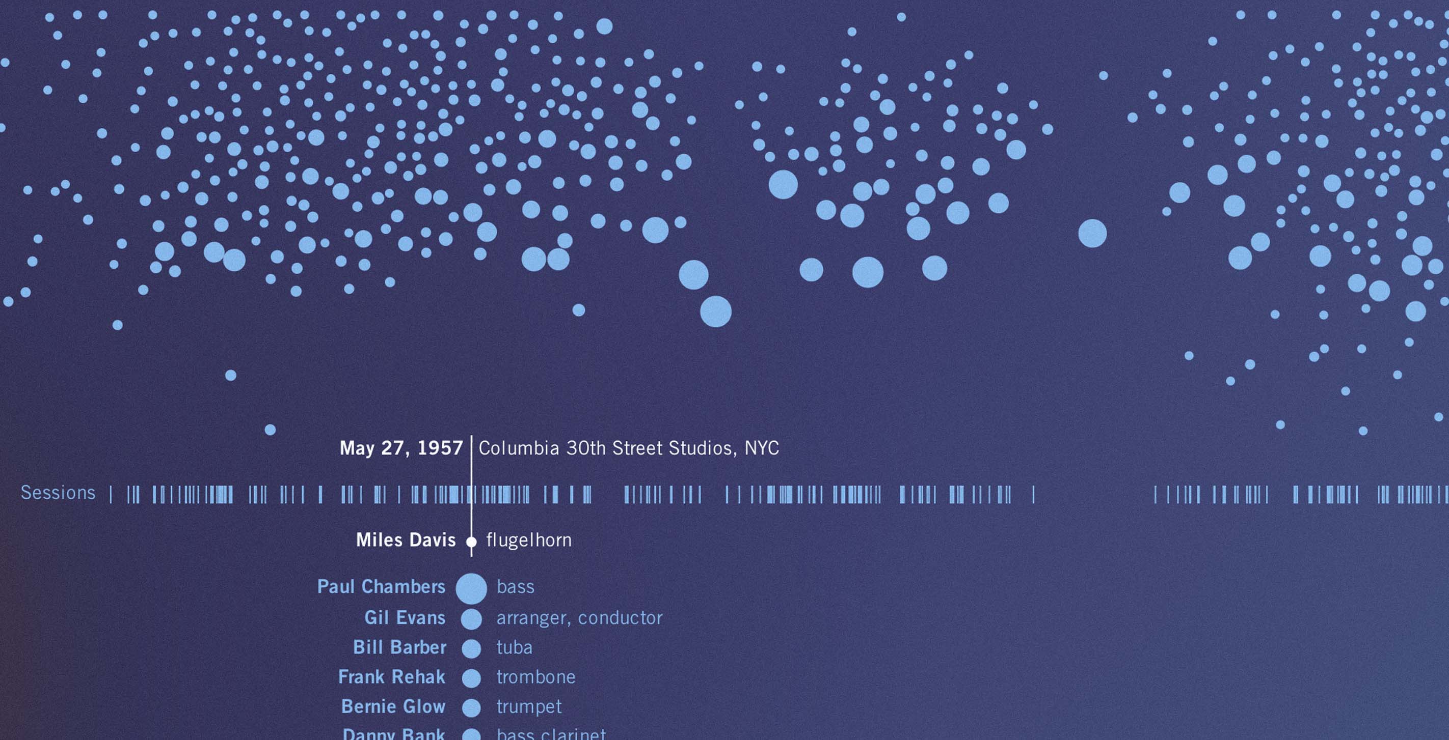
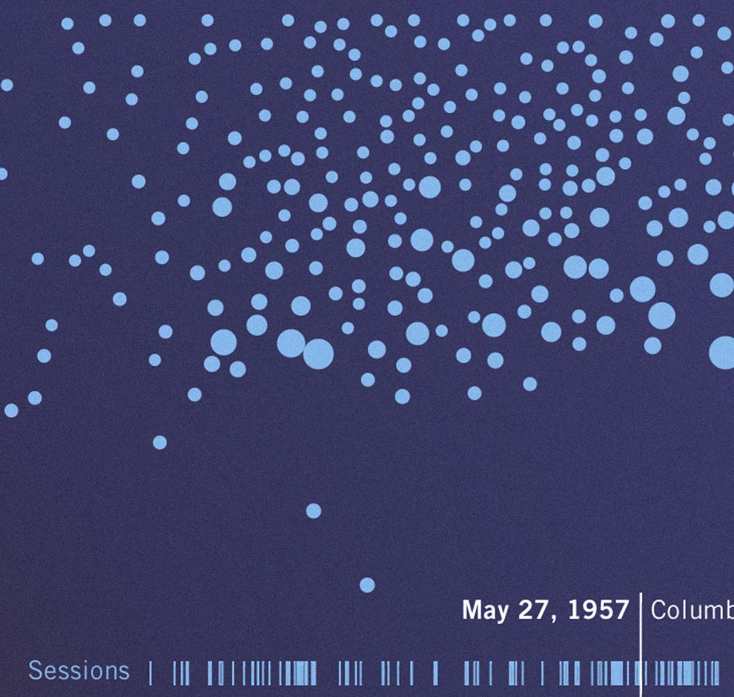
Exactly 69 years ago today, on April 24, 1945, a young trumpet player named Miles Dewey Davis got the chance of a lifetime. He had recently left his native East St. Louis for New York City, and at only seventeen years old, he was playing alongside the legendary Charlie Parker. On this day, he was heading into the recording studio for the first time. Perhaps he wasn't quite up to the task: in his first recordings, Miles' playing comes across as tentative, especially when compared to Parker's confident saxophone. But Miles soon found his voice, and over the next forty five years, his vision pushed him into uncharted territory and repeatedly redefined the scope of jazz.
Mark and I just finished a talk at Harvard's School of Engineering and Applied Science CS 171 - Visualization course with Professor Hanspeter Pfister and Alexander Lex (Head TF). We got to share some recent projects we’ve worked on — some more in-depth than others — in order to convey our understanding of "Audience, Context, and Tools with Storytelling and Data Visualization." We fielded some interesting questions at the end. The talk should be online soon.