In the last post, I went into some detail about the difficulties that arise when representing pairwise associations in a dataset that contains a mixture of numerical and categorical variables. This is often the case for health and disease data, where researchers are interested in finding relationships between demographic parameters (age, gender, income, etc.), prevalence of specific illnesses (expressed as the percentage of population affected by it), various quantitative lab measurements (such as hormone levels, blood cell counts), and genetic markers (for example Single-Nucleotide Polymorphisms or SNPs). I described a visual representation of pairwise associations called eikosograms, which are very effective at depicting statistical dependency between two variables. However, as our datasets could contain up to several thousands of variables (as is the case with NHANES), the number of pairwise plots would be in the order of millions. For an exhaustive examination of pairwise relationships, eikosograms are best suited for smaller datasets comprised of a few variables.

At the same time, most of these plots are of little interest since only a small fraction of them are likely to represent related pairs of variables. Our visualization tools need some kind of numerical index or score of statistical dependency, which can be evaluated automatically by the computer to show the user those with the highest significance. These plots should reveal (if our score of dependency is good) the most interesting associations in addition to exposing new ones. The user can then focus her attention on the highest ranking associations, and use visual representations such as scatter plots or eikosograms to determine their nature, and whether or not they are worth looking further into with more specialized statistical software like R, Stata, or SUDAAN.
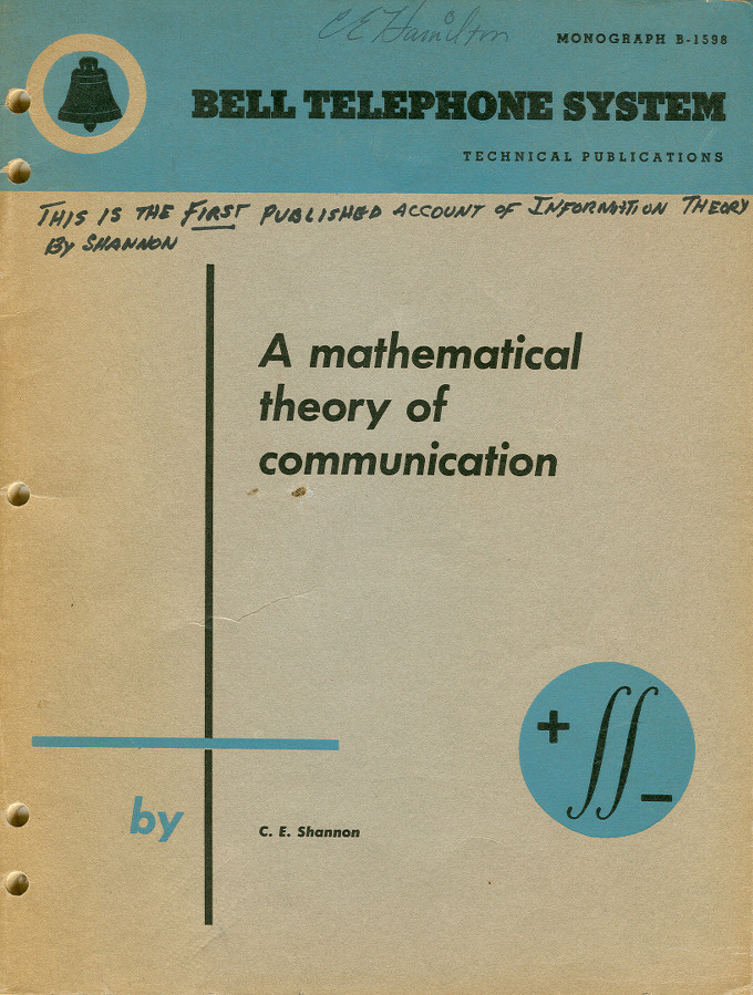
The mutual information quantity I mentioned earlier seemed like a good starting point for creating a general index, or score of statistical dependency. In order to see why, we need to go step by step and first look at a fundamental concept from information theory called the Shannon entropy. This concept was introduced by American mathematician Claude E. Shannon in a paper from 1948 entitled, "A Mathematical Theory of Communication." This paper was the starting point of the entire field of Information Theory and had major repercussions in understanding the limits of digital data transmission and compression.
There are many online materials on information theory and Shannon entropy, starting with the obligatory Wikipedia article. However, these references can get very mathematical and abstract fairly quickly. What I would like to do here is to write down my own "self-conversation" that developed while I read about and tried to understand Shannon entropy and mutual information better, with some interactive plots at the end to help visualize a few fundamental relationships in information theory.
One thing I found striking about the Shannon entropy is that one can describe it with very intuitive words, and these words actually do help make sense of the definitions and relationship without having to rely too heavily on mathematical notation. The simplest “textual” definition of Shannon entropy I found was: the amount of information we gain when making some measurement," or alternatively, the "amount of surprise we should feel upon reading the result of the measurement" (as suggested by Andrew Fraser and Harry Swinney in a physics paper on strange attractors from 1986).
The Shannon entropy makes the intuitive concepts of "information" and (perhaps less seriously but more effectively) "surprise" precise and measurable. Concretely, if a measurement x has a probability p(x) of actually occurring, Shannon defined -log p(x) as the amount of information we gain from observing x, where log is the natural (base e) logarithm function. We could use a logarithm in any other base, but that simply represents a change in the unit of measure. The logarithm function matches our intuition well: if an outcome x has probability p(x) = 1 of occurring - which means it always happens - we won't gain any information (or feel any surprise) from observing it, and accordingly to this intuition, log 1 = 0. Conversely, an outcome x with a low chance of occurring, say one in a thousand times or p(x) = 1/1000, will surprise us if we see it happening, consistent with the logarithm formula
-log 1/1000 = log 1000 = 6.9
If the outcome is even less likely, for example once every million or p(x) = 1/1000000, then its observation would surprise us even more:
-log 1/1000000 = log 1000000 = 13.81
Because of the logarithm function, the information increases two-fold when the probability decreases 1000x.
If we held a survey to record the gender of randomly selected individuals, we would have p(female) = p(male) = 1/2, and the amount of information (or surprise) is
-log 1/2 = log 2 = 0.69
Using logarithm in base 2, we would gain exactly 1 bit of information by knowing the gender of a randomly selected person, since ln 2 = 1. From Shannon's original 1948 paper:
The logarithmic measure is more convenient for various reasons: 1. It is practically more useful. Parameters of engineering importance such as time, bandwidth, number of relays, etc., tend to vary linearly with the logarithm of the number of possibilities [...] 2. It is nearer to our intuitive feeling as to the proper measure [...] One feels, for example, that two punched cards should have twice the capacity of one for information storage, and two identical channels twice the capacity of one for transmitting information. 3. It is mathematically more suitable. Many of the limiting operations are simple in terms of the logarithm but would require clumsy restatement in terms of the number of possibilities.
But we still don't have the Shannon entropy. From the individual -log p(x) contributions for each possible outcome x=a, b, ...– for example, in the case of X = gender then a = female, b = male– the total Shannon entropy is the expected information we would gain from making a measure on the variable X, meaning that each log p(x) term is weighted by the probability p(x):
You can drag the edge of the circles to change the magnitudes of the probabilities, and this can help us get a sense of the amount of information can we obtain from a variable X.
In the equation above, we have only two possible generic outcomes a and b, and by changing the magnitudes of p(a) and p(b), we can see how H(X) changes accordingly. As it turns out, the maximum value of H(X) happens when each event is equally likely. A very unlikely event, however, makes a large -log p(x) contribution that's weighted down by the low probability p(x). So in the average, it is better to have uniform distribution over the outcomes in order to maximize the information content.
This definition can be applied to a measurement where we observe two variables X and Y at once. This case is similar to the previous, however we are now looking at joint probabilities p(x, y):
Now we have four probabilities, p(a, c), p(a, d), p(b, c), p(b, d). Like the previous equation, we can manipulate their values by dragging the circles.We are finally getting closer to the mutual information! If we think about the meanings of H(X), H(Y), and H(X, Y), we have, respectively, the average information we gain from measuring X and Y alone, and the average information of measuring X and Y together. Since we should always gain more information from measuring two different variables than from measuring only one, then regardless of the case:
And what do we obtain if we subtract H(Y) from H(X, Y)? In H(X, Y) we have the joint information from observing X and Y together, so by subtracting H(Y) we we would have removed the information that is due solely to Y. This is called the conditional entropy of X given Y. The conditional entropy of Y given X is defined similarly:
If the variables X and Y are unrelated to each other, we could expect the conditional entropies equal the entropies we first defined (typically called marginal entropies):
But these two equalities are equivalent to having the joint entropy H(X, Y) equating to the sum of the two separate marginal entropies:
If the variables are related we cannot split the joint entropy in this way. If we continue with the survey example, and we measure X = age and Y = education level –which are clearly related– observing an individual of age over 20 will result in less "surprise" to additionally learn that the person has college education. If we measure X and Y separately, some of the information in H(X) + H(Y) would be counted twice, so H(X, Y) < H(X) + H(Y). It sounds reasonable then to define the difference between H(X, Y) and H(X) + H(Y) as the information that is "shared" between X and Y, this is, the mutual information of X and Y:
If X and Y are unrelated, there is no shared information between X and Y (meaning that knowing one doesn't help to predict the other) and I(X, Y) = 0.We could use the mutual information I(X, Y) as our measure of statistical dependency: starting at 0 when X and Y are independent, and increasing as the level of dependency between them grows. However, it misses a nice property: normalization. In principle, the mutual information can be as large as H(X, Y), since it represents the part of the joint entropy that is common to both X and Y. From our interactive equations, we can find combinations of probabilities that result in H(X, Y) larger than 1. It can be much larger than 1 if we have variables X and Y with many possible outcomes. Hence, the following calculation gives a number between 0 and 1 that we can take as our similarity score for X and Y:
How can we make all these relationships a bit easier to visualize? We already discussed the eikosogram plot where statistical independency is visually encoded by the horizontal pattern indicating the conditional probabilities are independent of x, this is p(y|x) = p(x). Below we have an interactive eikosogram (which is linked to all the plots and equations we've had so far):
By increasing the step in the eikosogram plot, we can make the dependency between X and Y more pronounced. Alternatively, we can make the variables independent. And how do all the entropies and mutual information quantities change as we do that? The next graph shows the overlap between H(X) and H(Y) becoming larger or smaller depending on our probability selections:
As with the previous post, I'm using this space in the Fathom blog to explore better ways of illustrating or visualizing concepts in statistics and math by combining interactivity and "traditional" text. A good example of this approach is the visual explanation of conditional probability by Victor Powell. Another important reference for the idea of making mathematical arguments more interactive and visual –using the web as the publishing and sharing platform– is the IPython notebook, which combines text, math, plots and calculations in a single webpage, like in this notebook about simulations of economic marketplaces.
For the interactive snippets in this post, I used p5.js, an experimental version of Processing designed for use with JavaScript. The last plot showing the relationship between all the information theory quantities is based on figure 2 from this article by Rethnakaran Pulikkoonattu.
We’d love to hear what you’re working on, what you’re curious about, and what messy data problems we can help you solve. Drop us a line at hello@fathom.info, or you can subscribe to our newsletter for updates.