Notebook
Here's where we post periodic updates on what we've been up to at Fathom. Reflections on the interesting stories that emerge from our client work, side projects, after-hours rabbitholes, and other miscellaneous threads of inquiry.
You can also follow these posts as a feed in your feed reader.
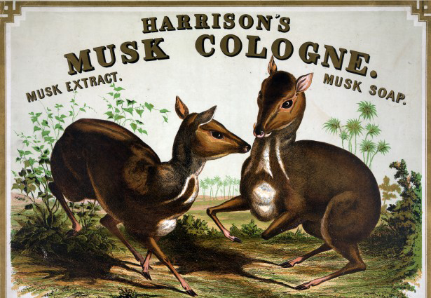
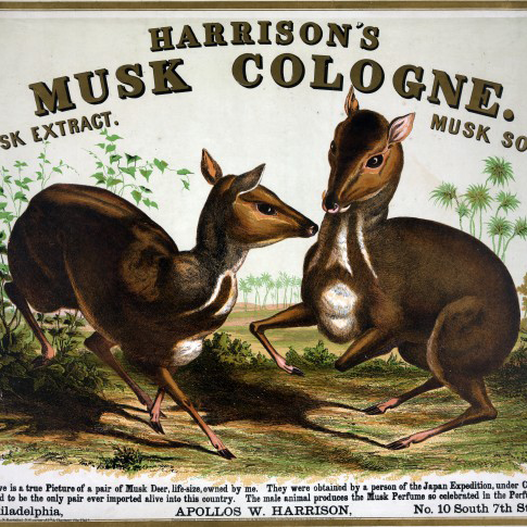
A transcription of the first episode of our Especially Big Data podcast.
We recently had the pleasure of working with Lukas – an architecture student at Princeton. While hanging out with us this summer, Lukas continued his work exploring the idea of “One Minute Architectures.”

This is a transcription of an episode from our Especially Big Data podcast for those of you who prefer words on a page instead of words in your ears. Enjoy!
This summer I researched and analyzed data, learned how to code in p5.js, and participated in the iterative workflow of Fathom. Additionally, I took a trip to the aquarium on my second day of work, practiced building Ikea furniture for the new office, and (unsuccessfully) tried to convince everyone that crumpets are delicious.
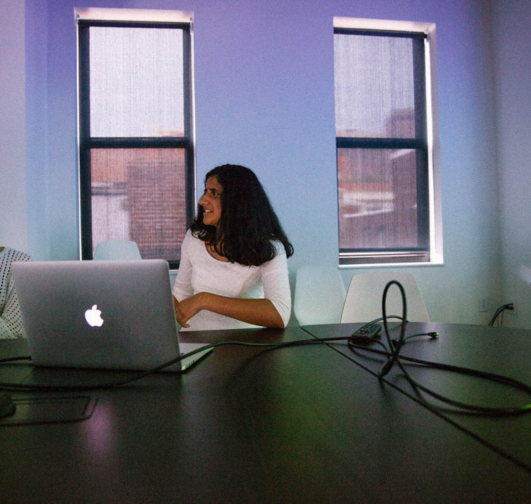
Welcome Parima! It’s not often we have high school interns, but Parima was an exception. She learned about us through Girls Who Code after a visit last summer. Over the past two weeks she has been on turbo learning a lot about visualization, information design, and web programming. She even made a pull request fixing a bug in the No Ceilings dataset. It was a pleasure having her. Read more about Parima in her own words.

Alas, we've released another episode of our podcast, Especially Big Data. The episode, Let's Hear it for the Girls, dives into the many factors contributing to the dearth of women in tech-- most of which are not captured in numbers.
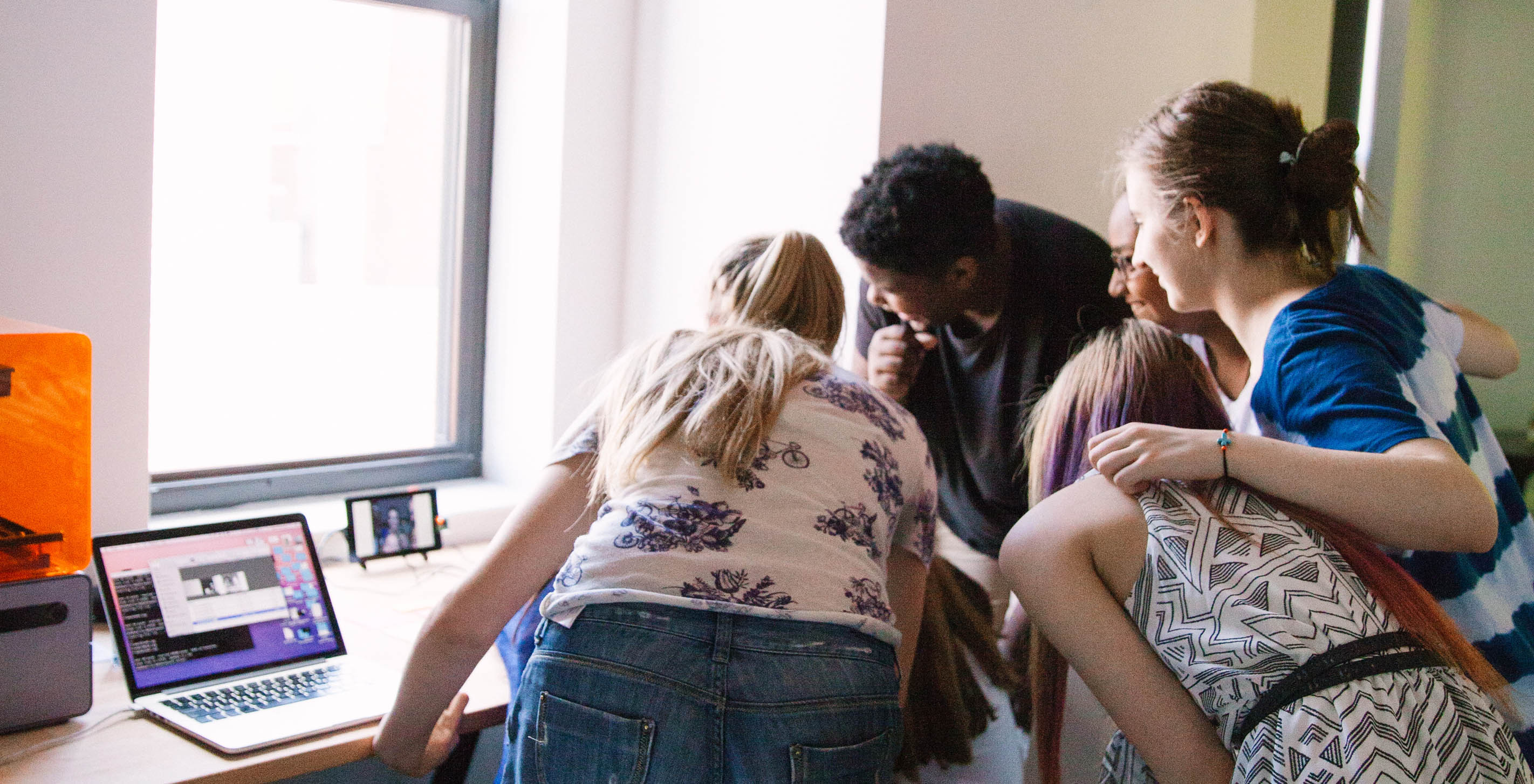
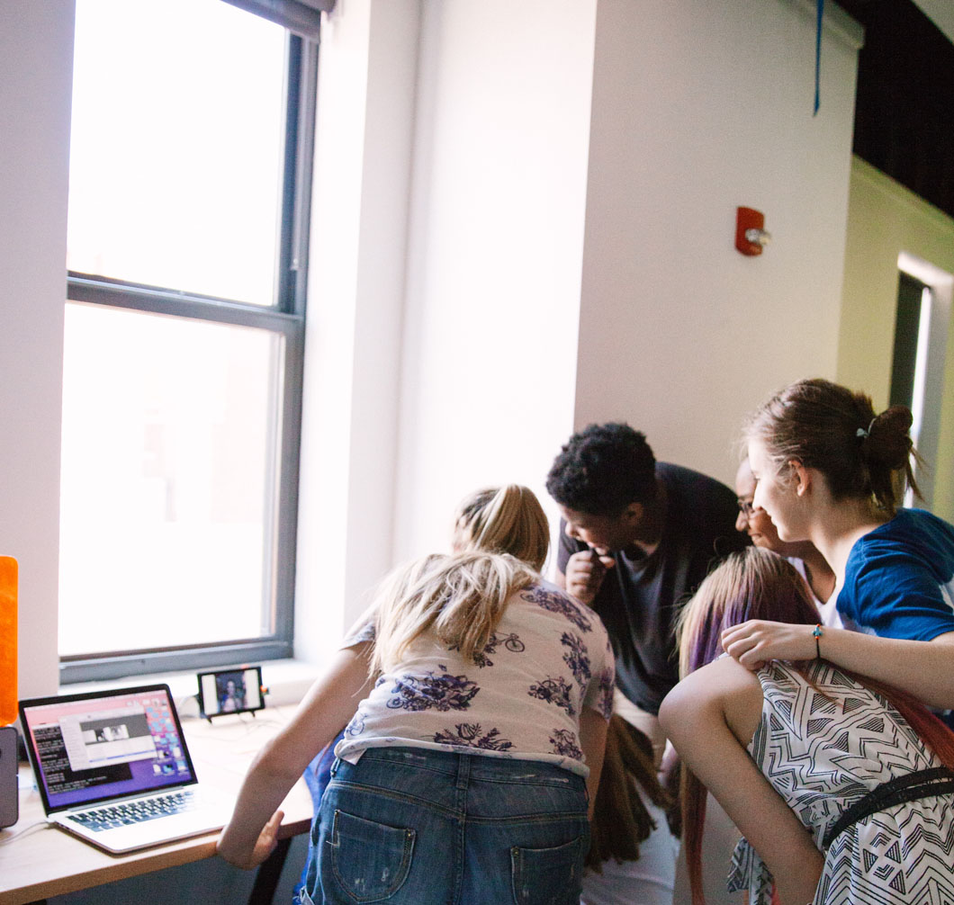
This year, Fathom celebrated Pi Approximation Day one of the best ways we know how-- by sharing our love of coding and technology with a visiting Girls Who Code group!
Last week we launched a project with ProPublica that investigated the hundreds of innocent people in Houston, Texas, who have been wrongfully convicted for drug crimes since 2003. You can gain some background on the piece, "Busted," in Elaine's recent blog post. Like most of our projects, though, much of the story lives in the details.
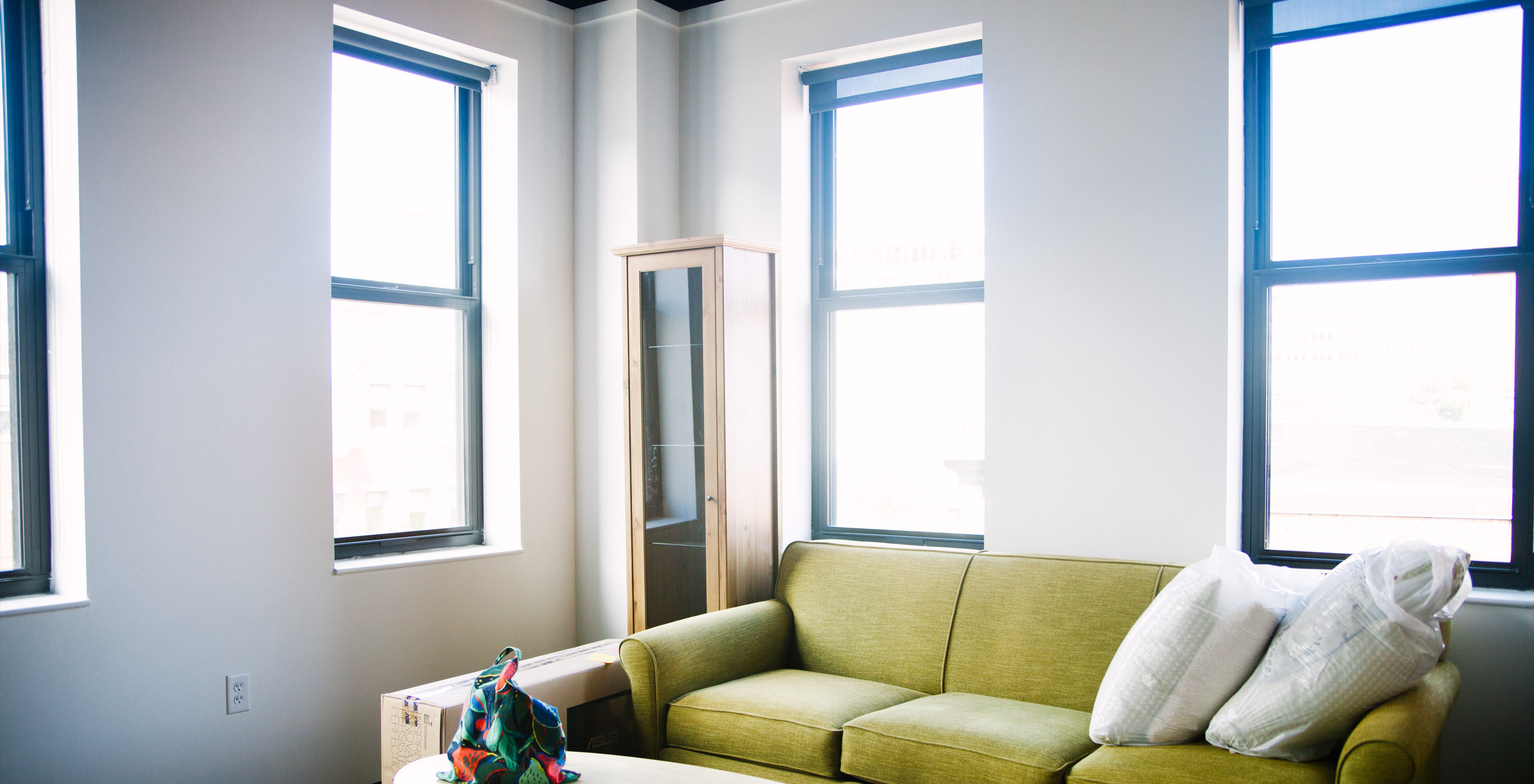
Fathom got started on one floor with just two people and two desks. Eventually our team grew and added a second floor, which became our official conference room. As we continued to grow in numbers, we also continued to explore other interests, often peripherally related to design, development, and analysis. Six years passed, and we realized we were using our conference room simultaneously as a classroom, workshop space, poster shop, 3D printing studio, kitchen, and living room. We knew it was time for a move.
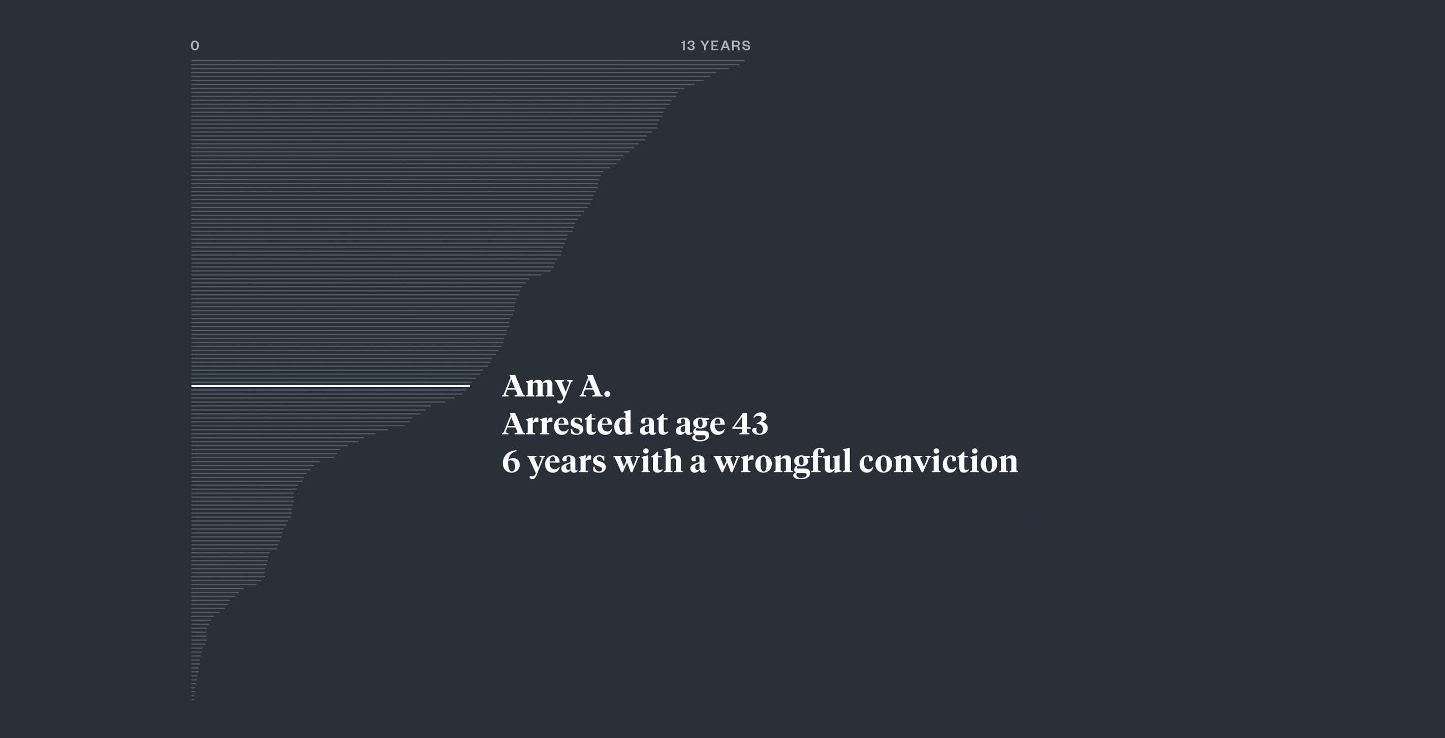
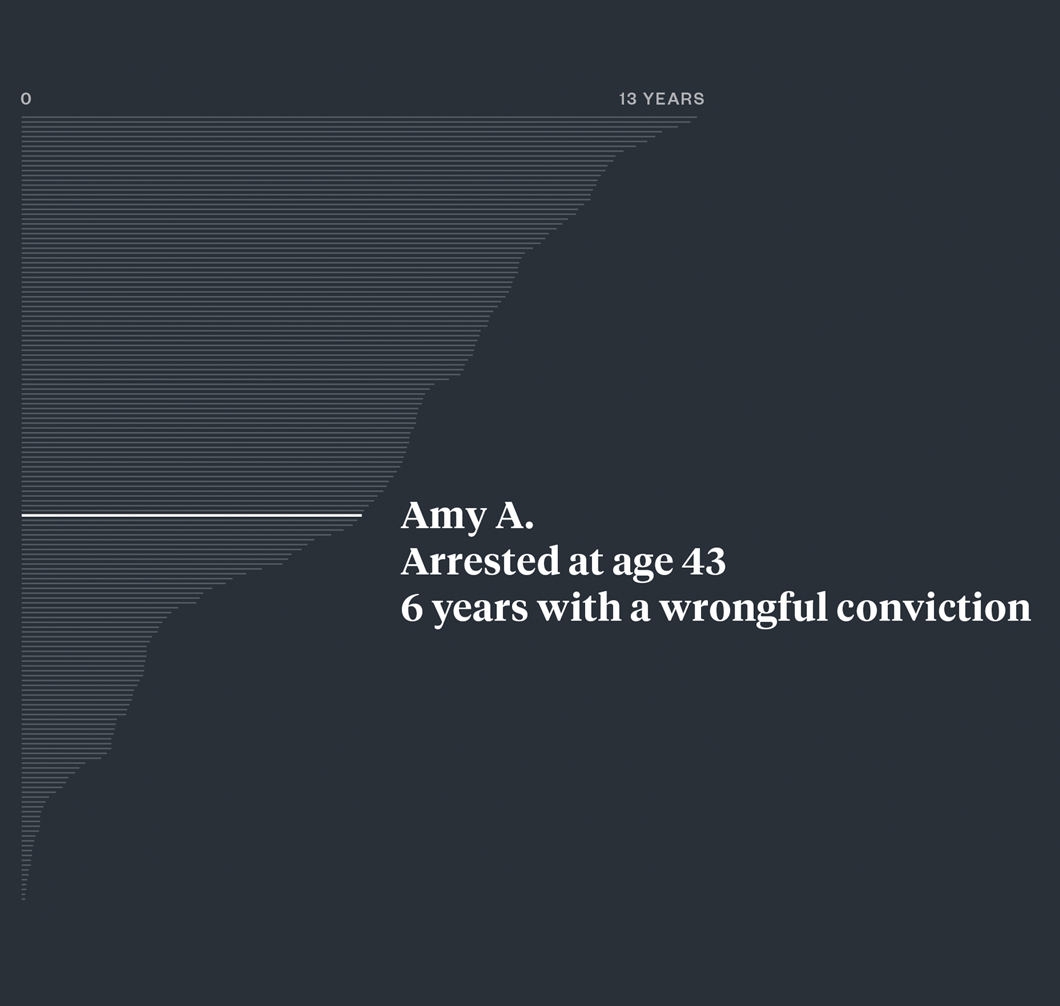
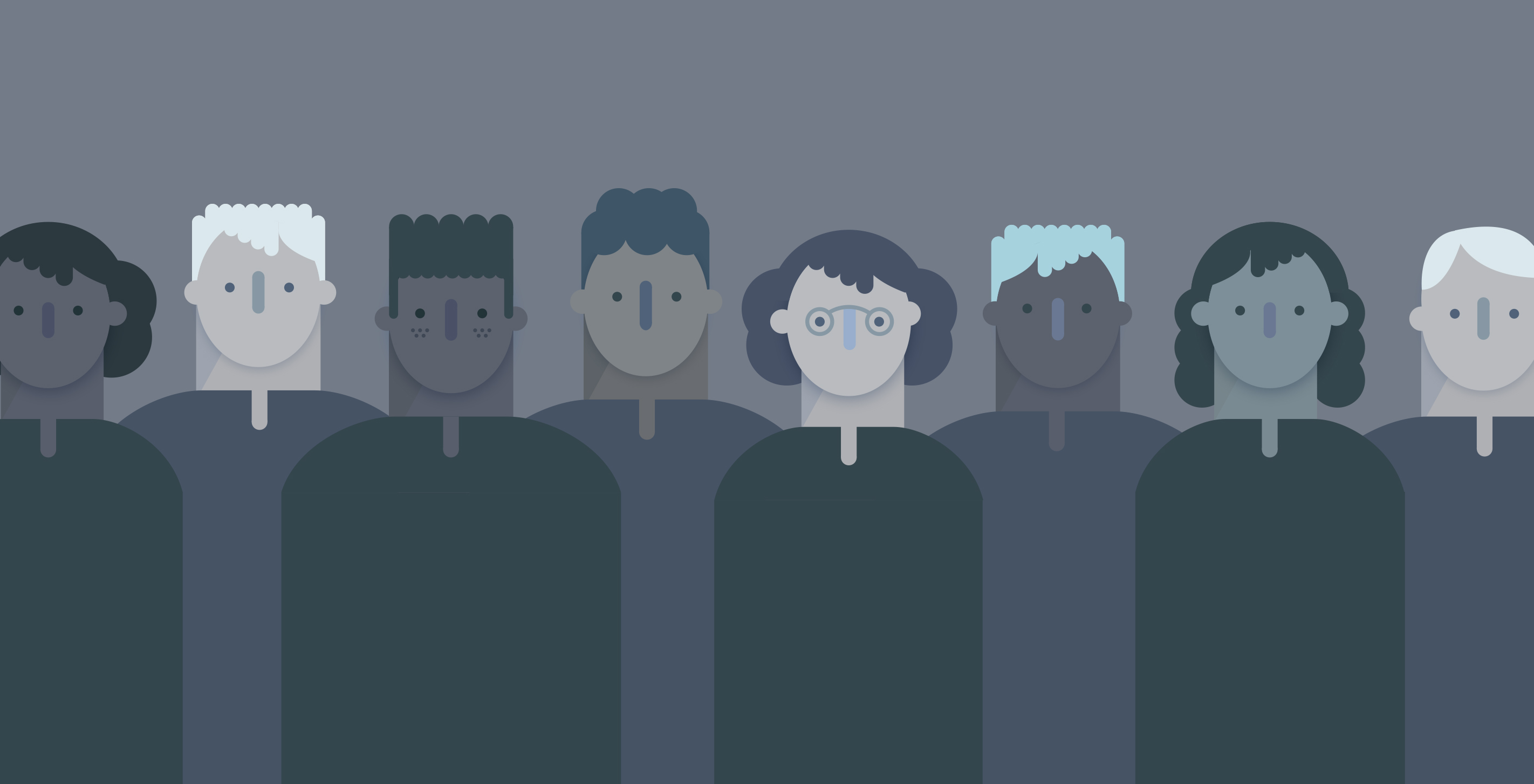
Since 2003, more than 300 innocent people have been wrongfully convicted for drug crimes in Houston, Texas. We partnered with ProPublica on their recent article, "Busted," that delves into the story of one innocent woman, Amy Albritton, who was arrested in 2010 at a traffic stop. She was pressured to plead guilty for drug possession, and to this day lives with a felony conviction for a crime she did not commit. Amy is just one individual representing the outcome of the systemic failures of the U.S. criminal justice system.