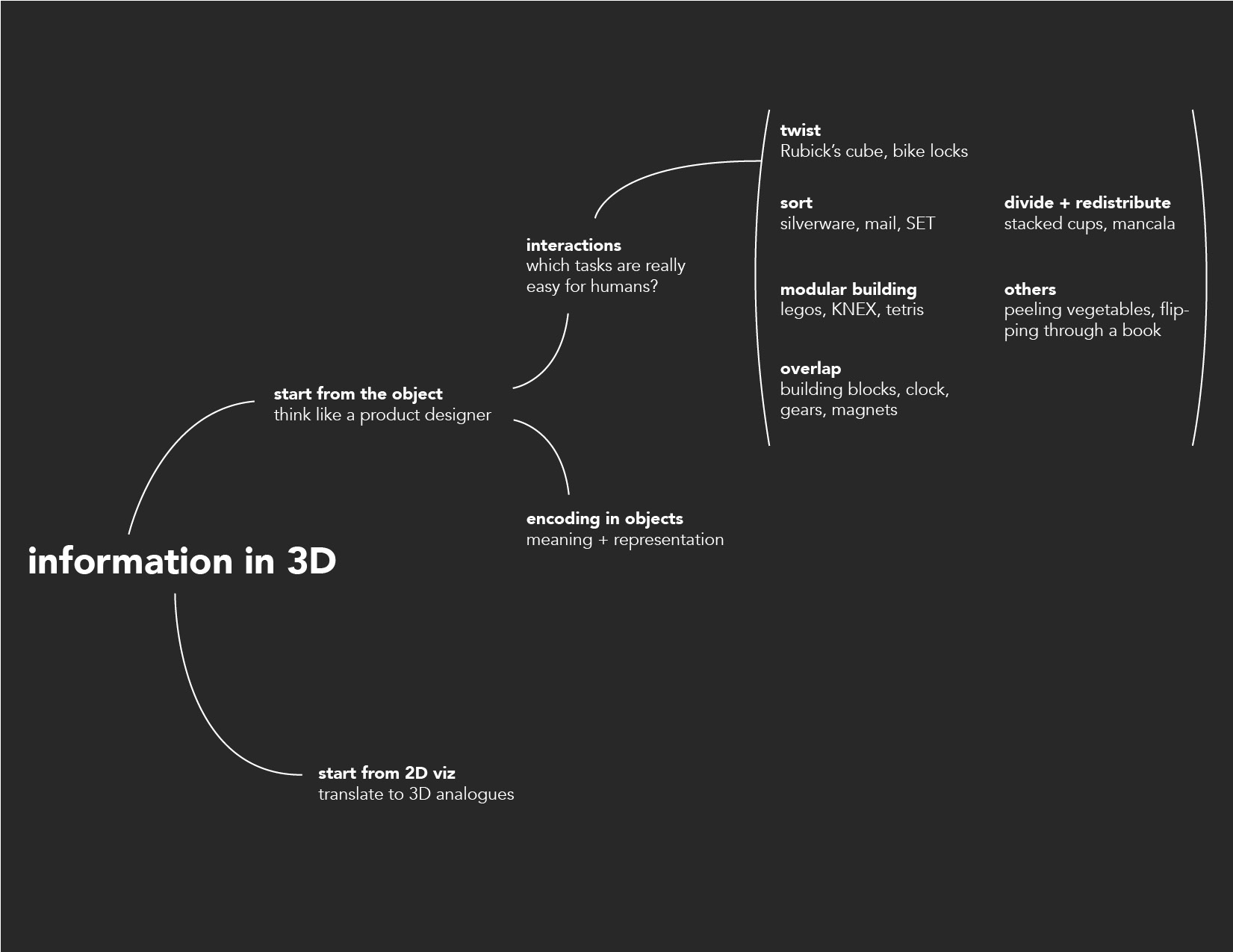
To encode meaning into material itself, I considered what makes us want to pick up and touch certain objects, as well as the subtle features that cue our immediate understanding of an object - what it's for, who uses it, how old it is. In terms of interactions, I analyzed tasks that are very efficient for humans in the 3D world: quickly sorting and distributing many small objects, using peripheral vision, rotating and seeing multiple views of an object, and focusing on a small detail while keeping the bigger picture visible in the background.
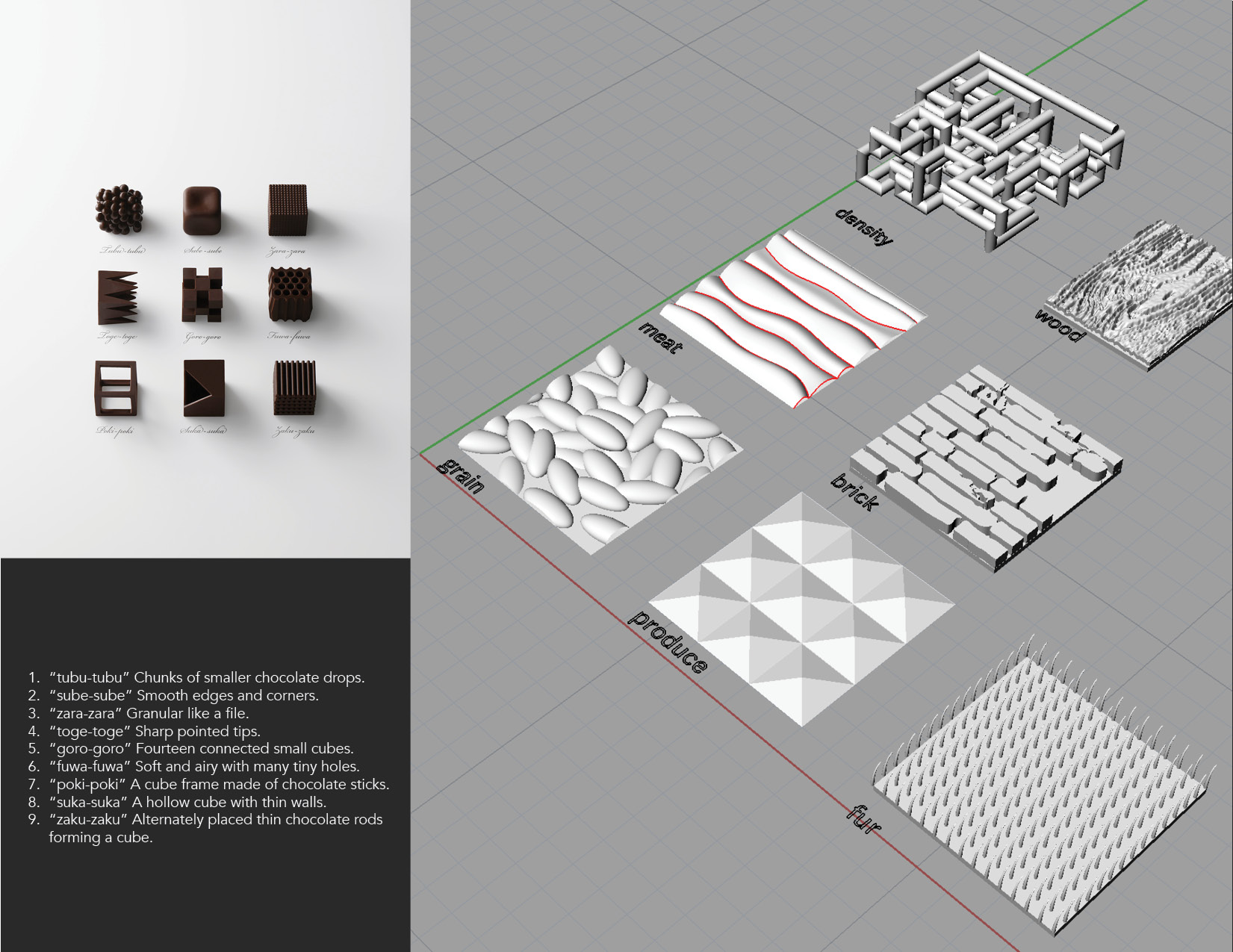
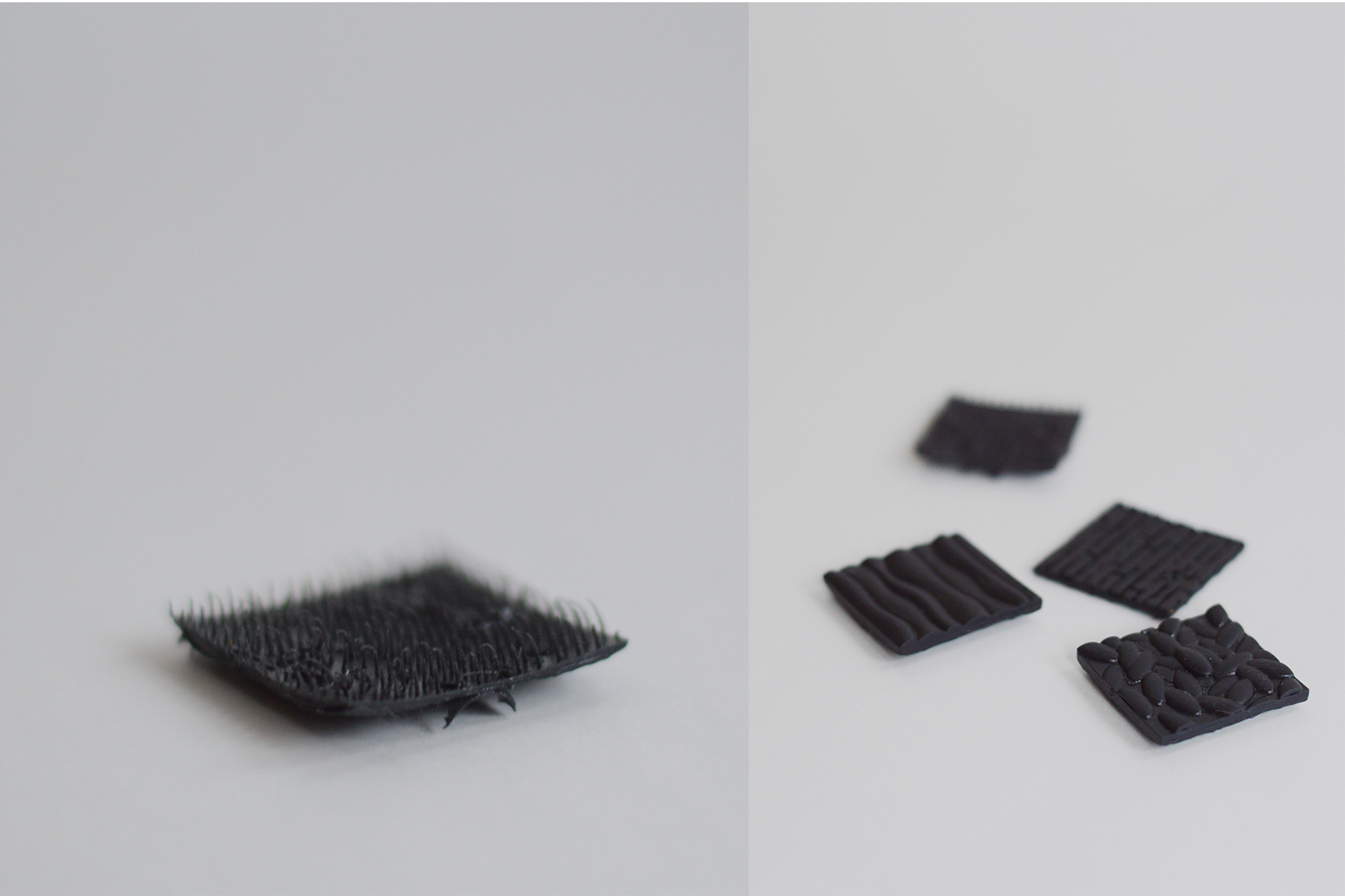
Most of my experiments employed texture as a way to show what an object represents. If the texture is legible and successfully references familiar objects, there is no need for a key - one piece would clearly represent grain, another meat - though both made of 3D printed plastic. My inspiration for the food-related textures came from a series of chocolates designed by Nendo, a Japan-based studio, which led me to a massive list of Japanese words with no English equivalent, all used to describe the textures of different foods.
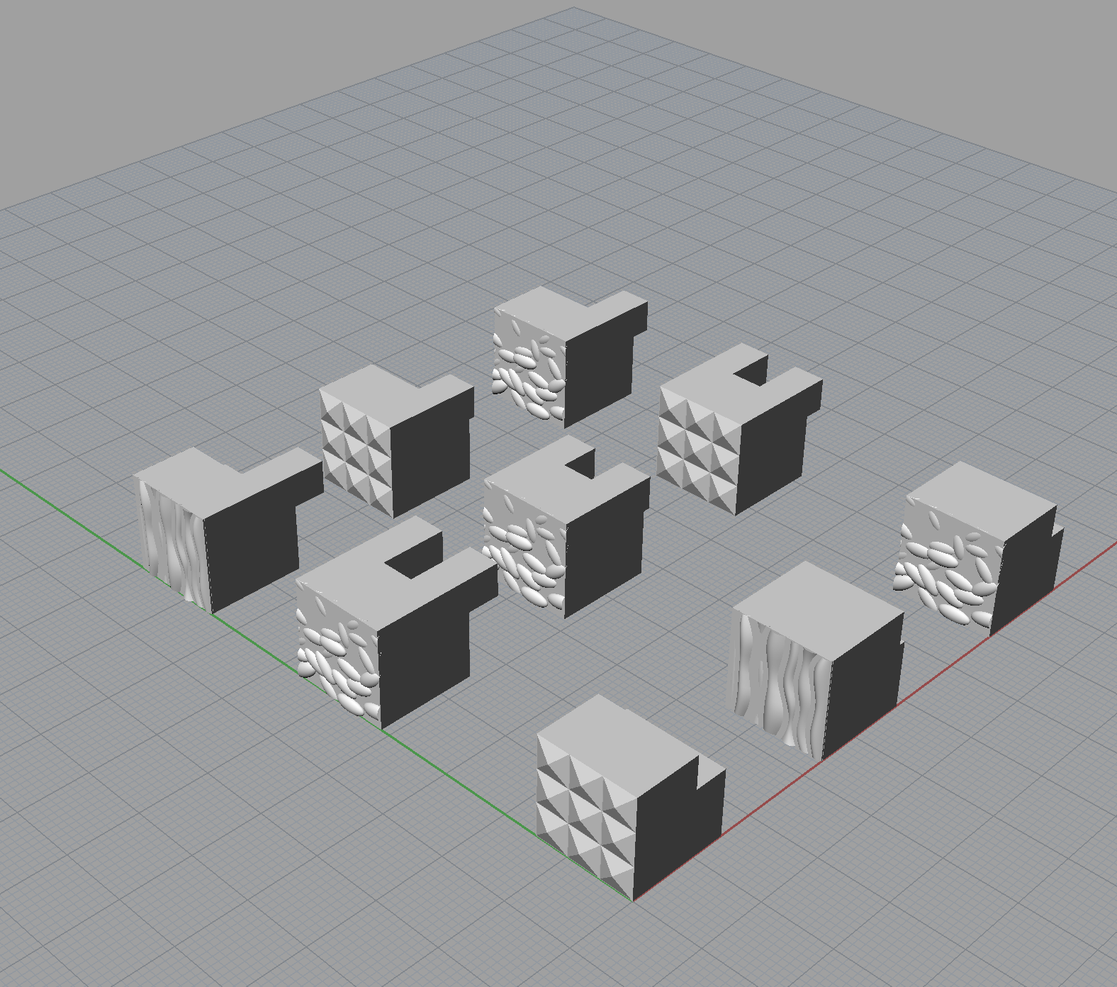
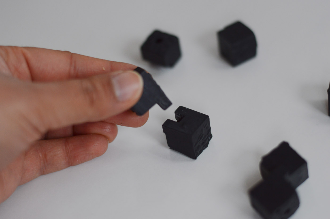
One example of an efficient human task that really stuck with me was the motion of quickly sorting silverware into compartments. Thinking along the lines of categorization, I remembered the card game SET from my childhood, and set out to design a 3D version. In this design, I also allowed for a hierarchy of information: certain characteristics and trends are discernible at a glance, while more subtle details reveal themselves through a closer look at a subset of pieces.
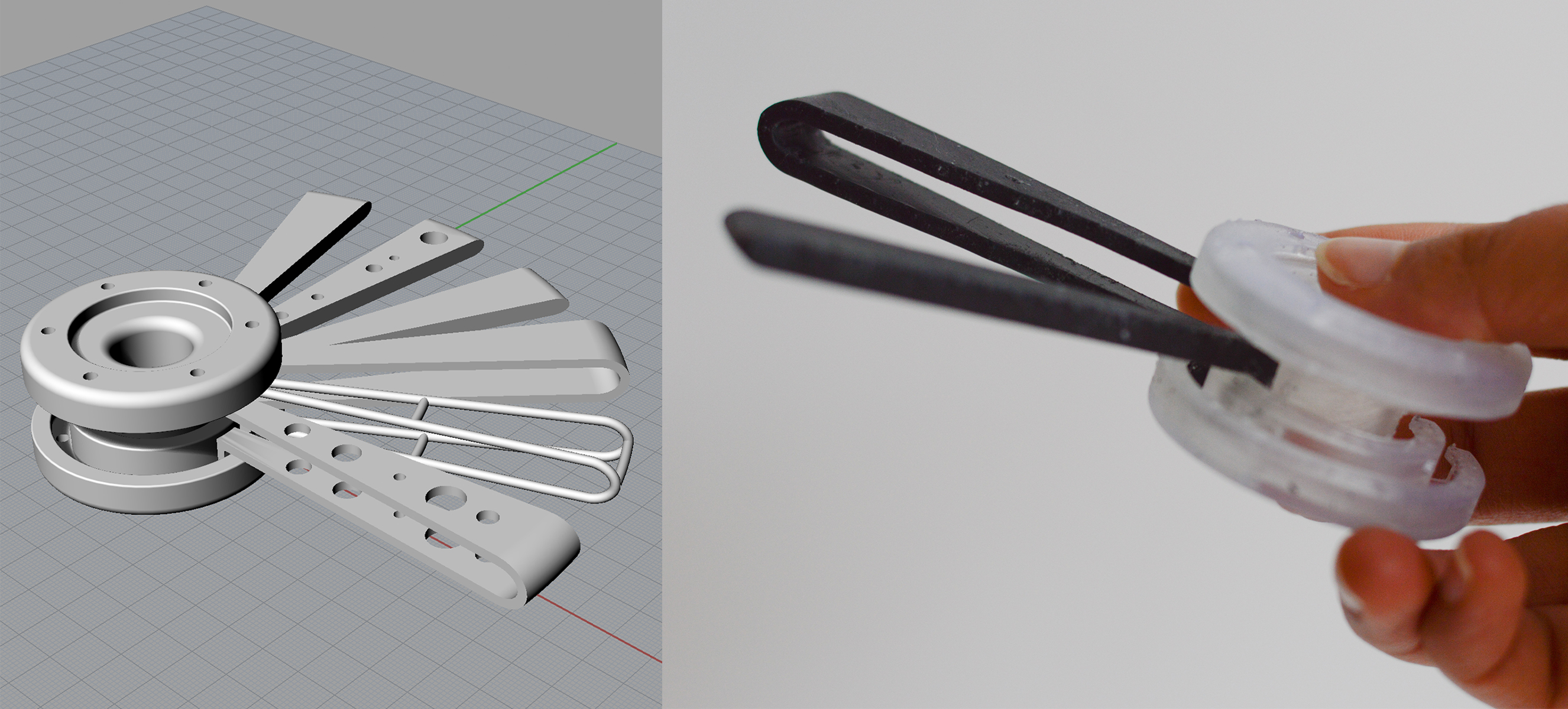
In a more spontaneous experiment, I tested what kind of objects people are compelled to pick up and play with in order to understand them, designing a sort of handheld clock with multiple hands that nest within each other. No one (myself included) could quite figure out what it should be, though maybe that is partly what made it compelling. I also discovered some of the limitations of SLA printing, which is the method of 3D printing that uses a UV laser to harden a vat of liquid resin one layer at a time. For starters, the laser has difficulty printing articulating parts that require a certain clearance between them, as the parts tend to fuse together during the printing process. It is also challenging to clean support material out of inner channels.
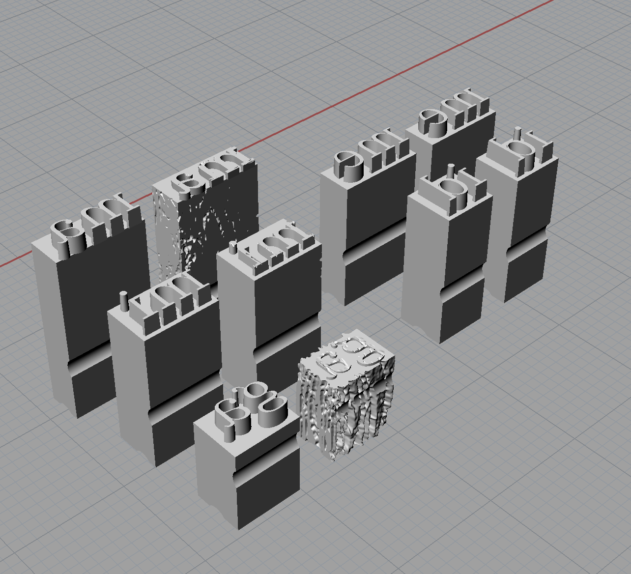
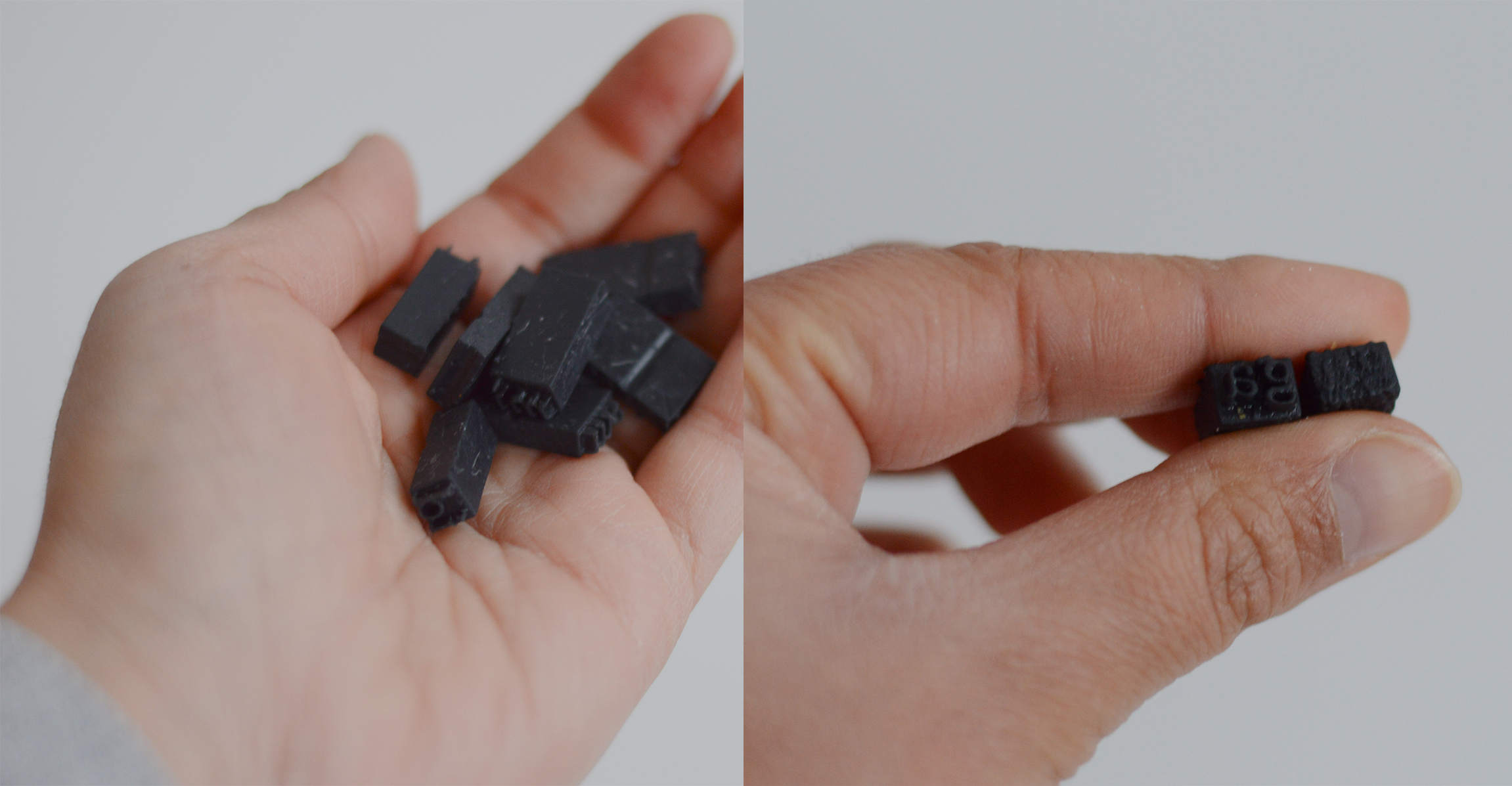
My final series of explorations were based on data from a national public libraries survey, containing indicators on library use and spending from 1992-2013. I chose to really push the idea that objects can tell stories, with the example of sea glass in mind. Sea glass experts can tell how old a piece of glass is, what kind of bottle it came from, and where it was made - all from subtle cues like texture, color, thinness, purity, and knowledge of trade routes.
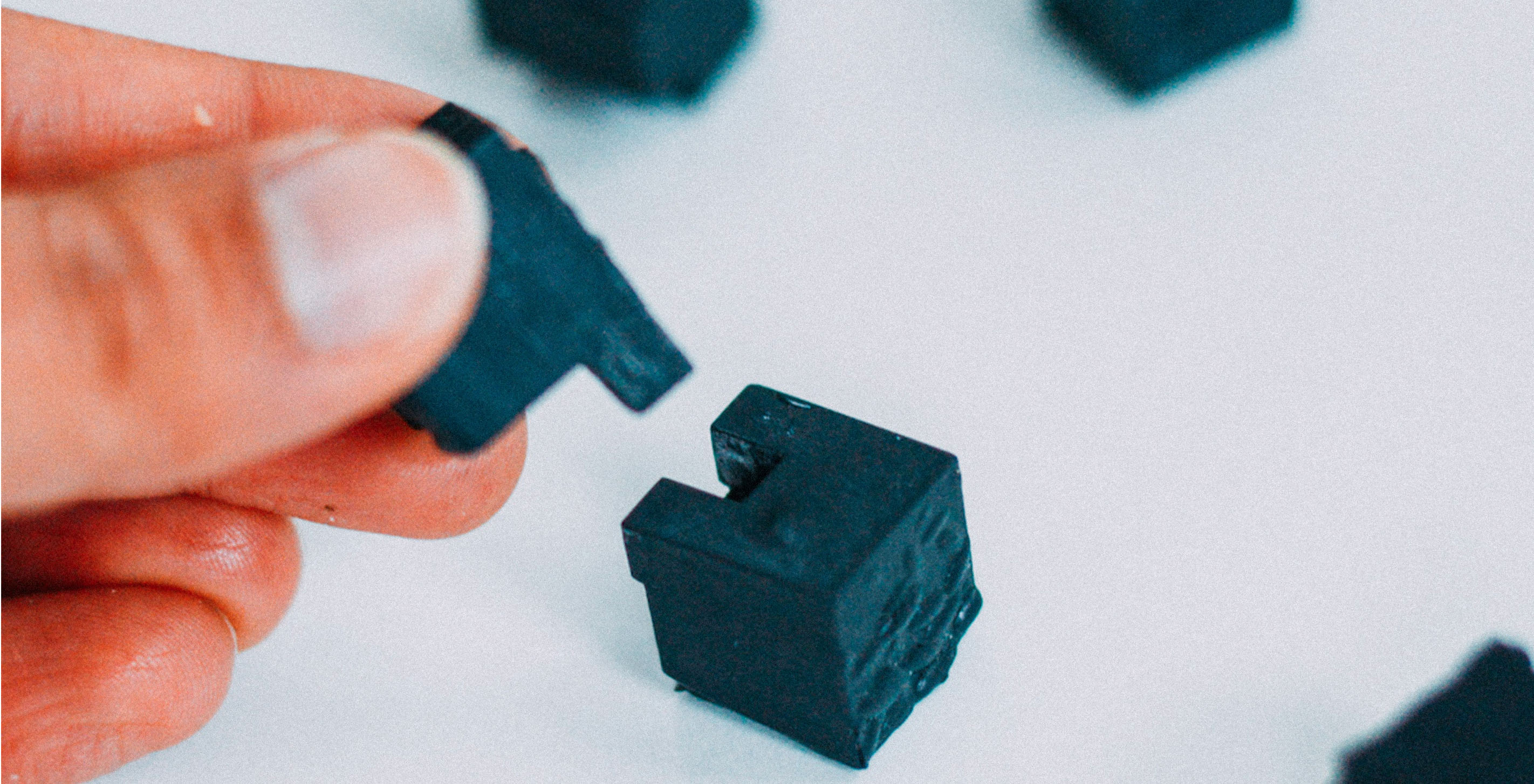
I let the content of the data itself inform my design: referencing the metal type used in letterpress printing, with each piece of type representing a state in 2003 (left) and 2013 (right). The height of each piece reflects how much money each state's libraries spent on printed material per capita (as of 2013), and the amount of wear of each piece on the right indicates how much spending on printed material was cut in the last decade.
Tackling such an open-ended prompt, I feel I only scratched the surface of 3D printed information design, and further exploration is definitely in order. Some other ideas thrown around the studio were to make metal casts from 3D printed parts, design for different abilities (e.g. blindness), use mechanical properties like friction to sort how easily different parts slide across a table, and create a big data analogue to the silverware in a drawer: one million forks in a centrifuge.
We’d love to hear what you’re working on, what you’re curious about, and what messy data problems we can help you solve. Drop us a line at hello@fathom.info, or you can subscribe to our newsletter for updates.