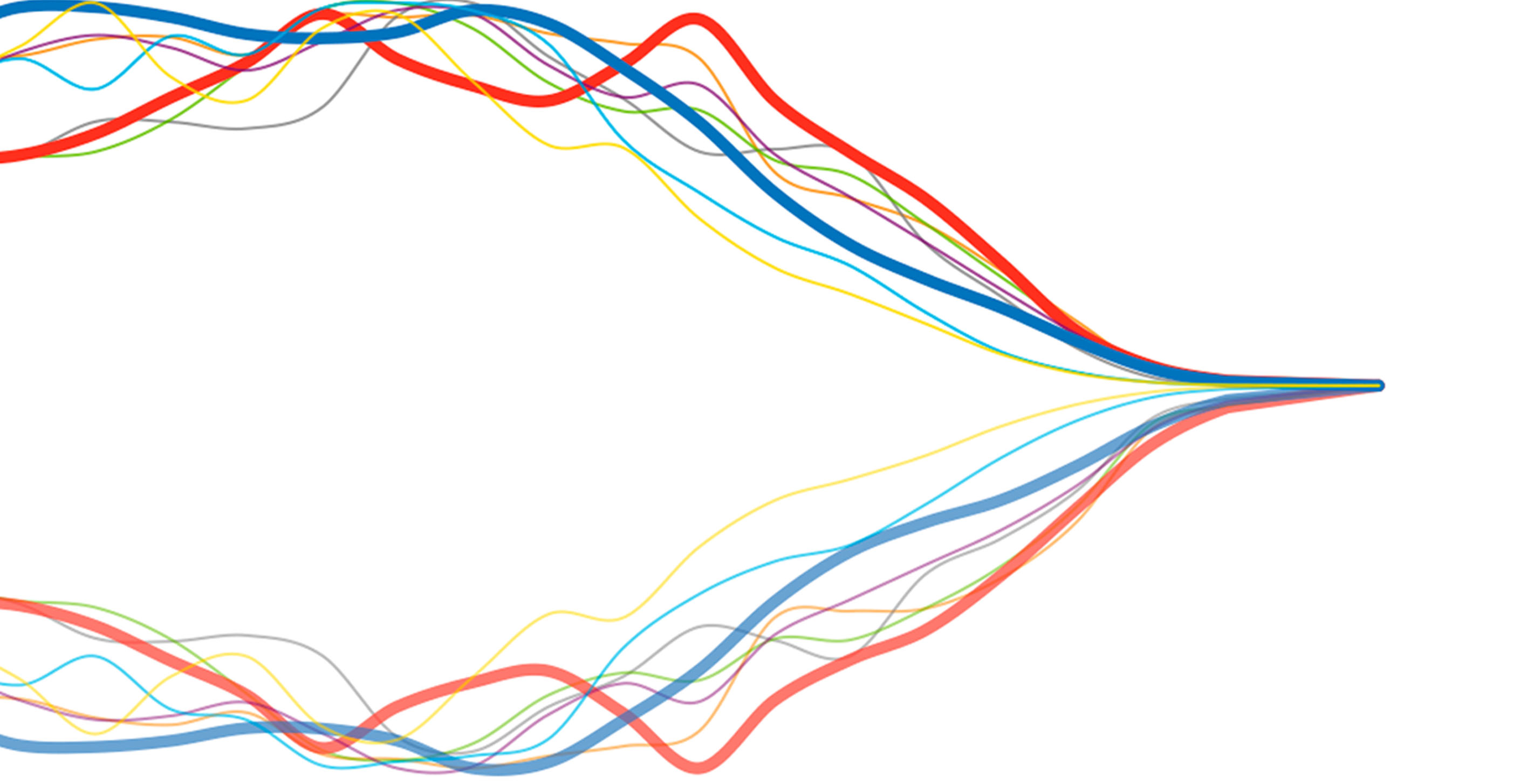
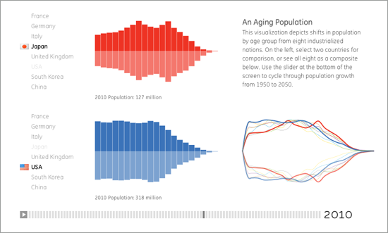
In addition to showing comparisons between pairs of countries, we also wanted a means to show the entire set of countries, to see how the ups and downs coincided with one another. The vertical scale is not population count, because overall population totals vary widely between the countries—instead we're looking at the portion of people within each age range. We found this interesting because the spikes actually coincide less than you might expect from only looking at individual countries on the left.
More of our GE visualization work (along with projects from GOOD, Pentagram, and others) can be found at healthymagination.com.
We’d love to hear what you’re working on, what you’re curious about, and what messy data problems we can help you solve. Drop us a line at hello@fathom.info, or you can subscribe to our newsletter for updates.