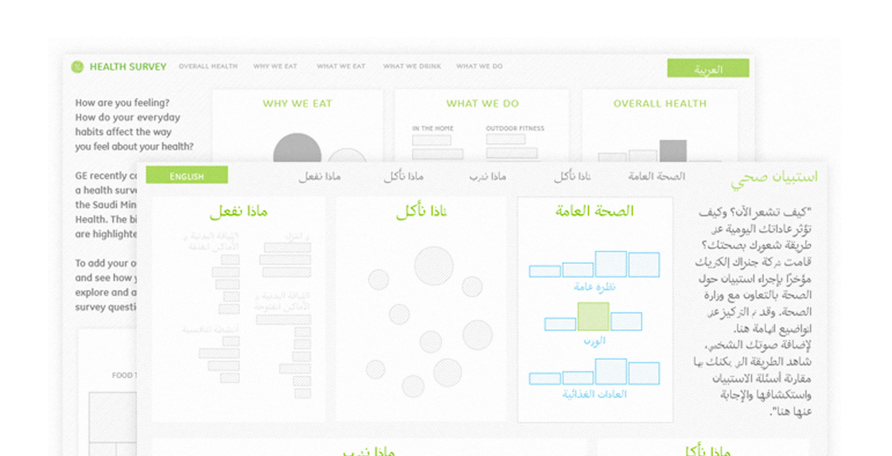

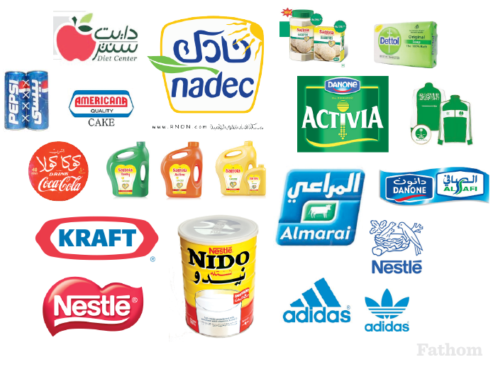
We were particularly excited to work on this project, not only because we have developed a bit of a crush on health data, but because it was our first opportunity to do a piece in both Arabic and English. Part of the Saudi Health Survey included data on influential health products in the Middle East, so some of our initial research focused on brand imagery, which we used to inform our color and typography choices throughout the project.
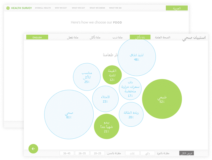
As we progressed, a fascinating challenge emerged: not only did we have to design for characters that read right-to-left, but our entire concept of visual hierarchy had to be flipped along with it. Our realizations ranged from the obvious (page designs anchored to the upper right!) to the not-so-obvious (qualitative options in order from poor/fair/good become good/fair/poor). View this in action by clicking on the green button in the upper right (English), or the upper left (Arabic) to toggle both the language and the orientation of the interface.
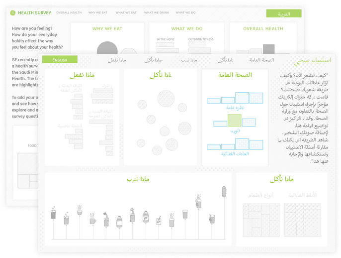
More than in previous projects, we also relied on iconography that was general enough to translate across two languages.
It should also be noted that this project would not have been possible without our counterpart team of designers, translators, and developers in Saudi Arabia who were invaluable resources in making sure our visualizations translated to other cultures and other languages.
We’d love to hear what you’re working on, what you’re curious about, and what messy data problems we can help you solve. Drop us a line at hello@fathom.info, or you can subscribe to our newsletter for updates.