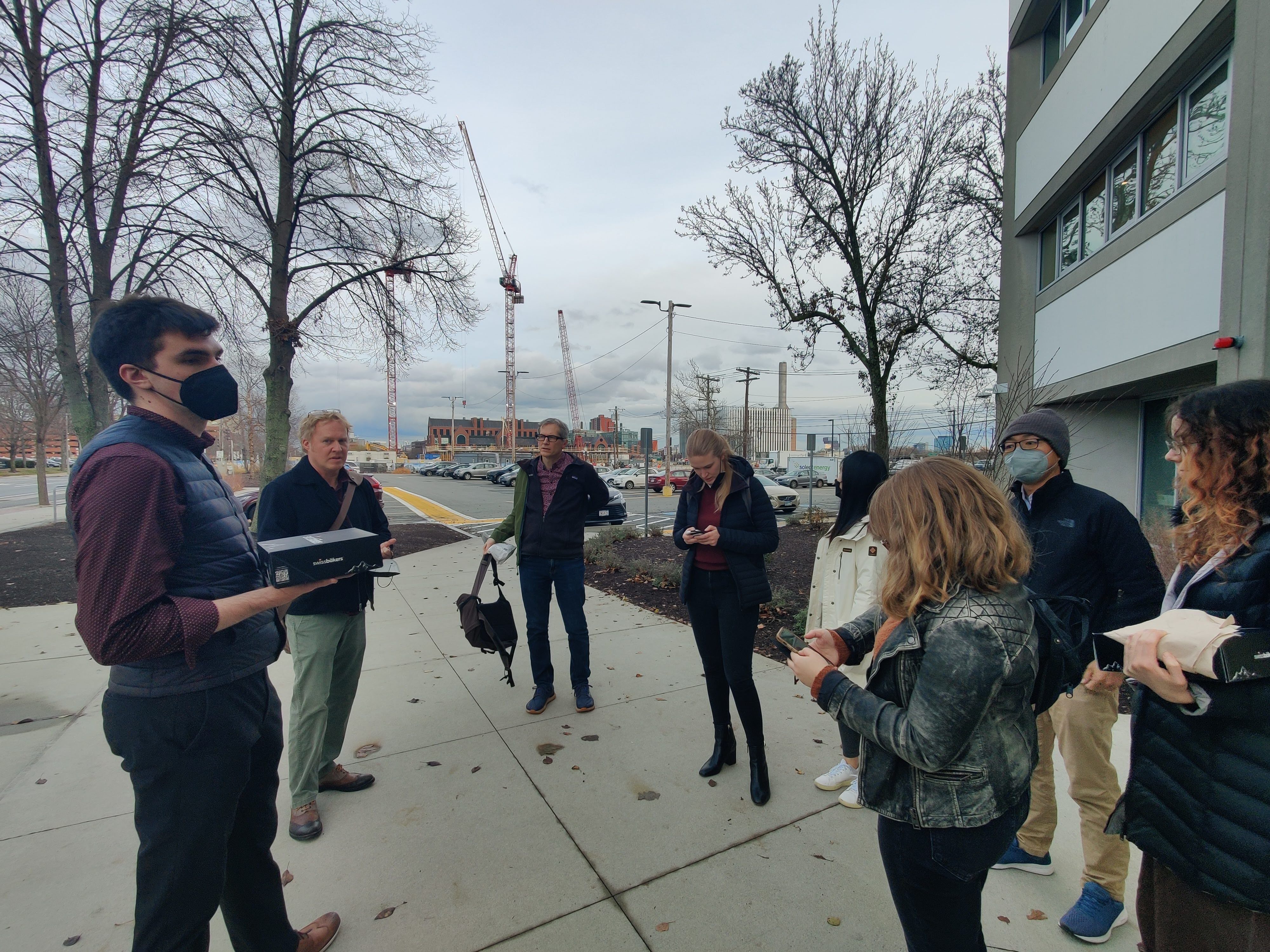
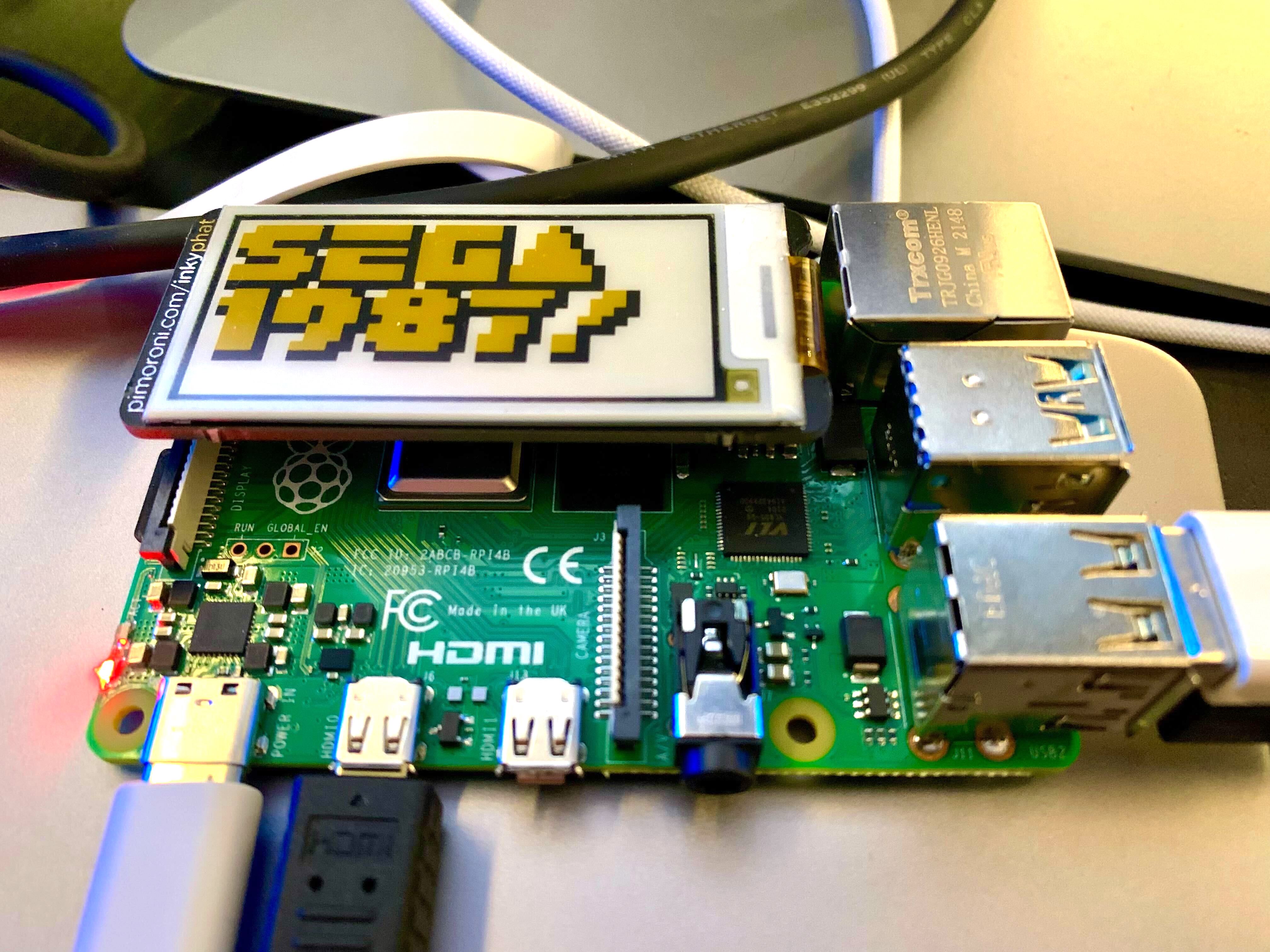
With our out of towners all in the office last week, we enjoyed celebrating together, hacking away at some Raspberry Pi hardware, and managing to avoid any and all attempts to wrangle a group photo.
As evidenced by our chronically active Slack, we’re a pretty social bunch. From problem solving how to squash tricky bugs to chatting about free diving and knitting patterns, making ample time to connect with each other is a big part of what makes our team work. Having everyone together (in the same time zone!) was a great reminder of how essential collaboration and frequent communication are to both our process and the team we’ve built over the last few years.
Amidst the fun and games, we devoted a large portion of our time this year to our ongoing collaboration with the Sabeti Lab at the Broad Institute - developing tools and platforms for tracking and understanding pathogens in an effort to be better prepared for future outbreaks.
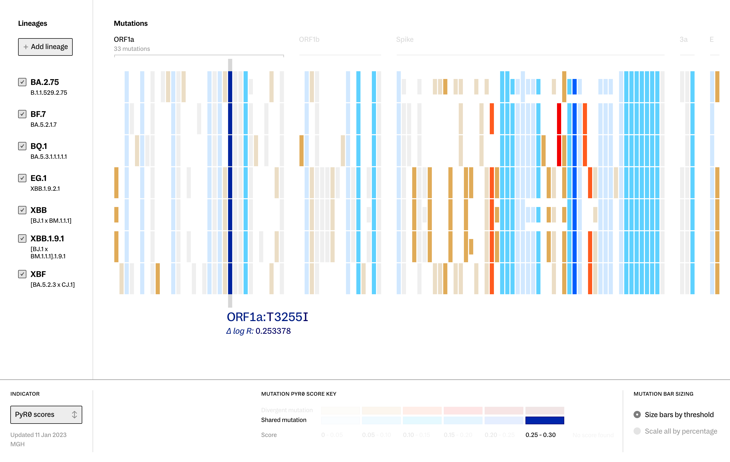
Our suite of Banyan tools saw a number of updates this year. In the spring, we launched Lineage Portraits - a tool designed to quickly view the differences and similarities in mutations between SARS-CoV-2 lineages, with scoring methods applied to highlight the potential impact of those mutations on the evolution and spread of the virus.
In the months since Fathom was announced as a partner within the CDC’s Pathogen Genomics Centers of Excellence network in late 2022, we have been diligently working within our regional center to help facilitate the advancement of outbreak response protocols and surveillance capabilities in the face of new and existing infectious diseases. We are eager to continue our work with this dynamic group of public health departments, academic institutions, wet labs, epidemiologists, and outbreak surveillance teams over the next few years and begin to see our tools in the real world.
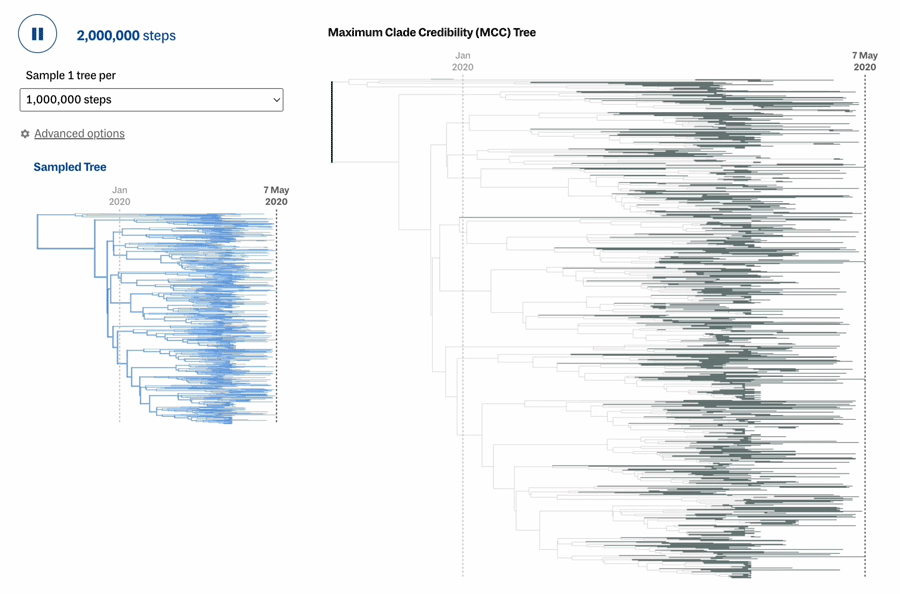
We also spent a considerable amount of time working on a soon-to-be-released Bayesian phylogenetic inference tool designed to aid researchers in quickly examining and understanding their sequencing data. Stay tuned to hear more soon!
We reconnected with the Operation Outbreak team to deliver two new phases of development on their outbreak simulation application.
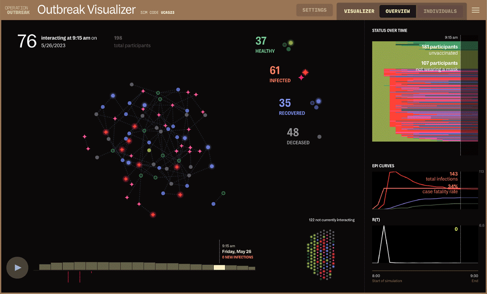
Throughout the spring and summer, we worked with our partners at Operation Outbreak to expand the capabilities of the OO platform, developing three distinct applications within the software to enhance the overall experience and opportunity for immersive learning within simulations.
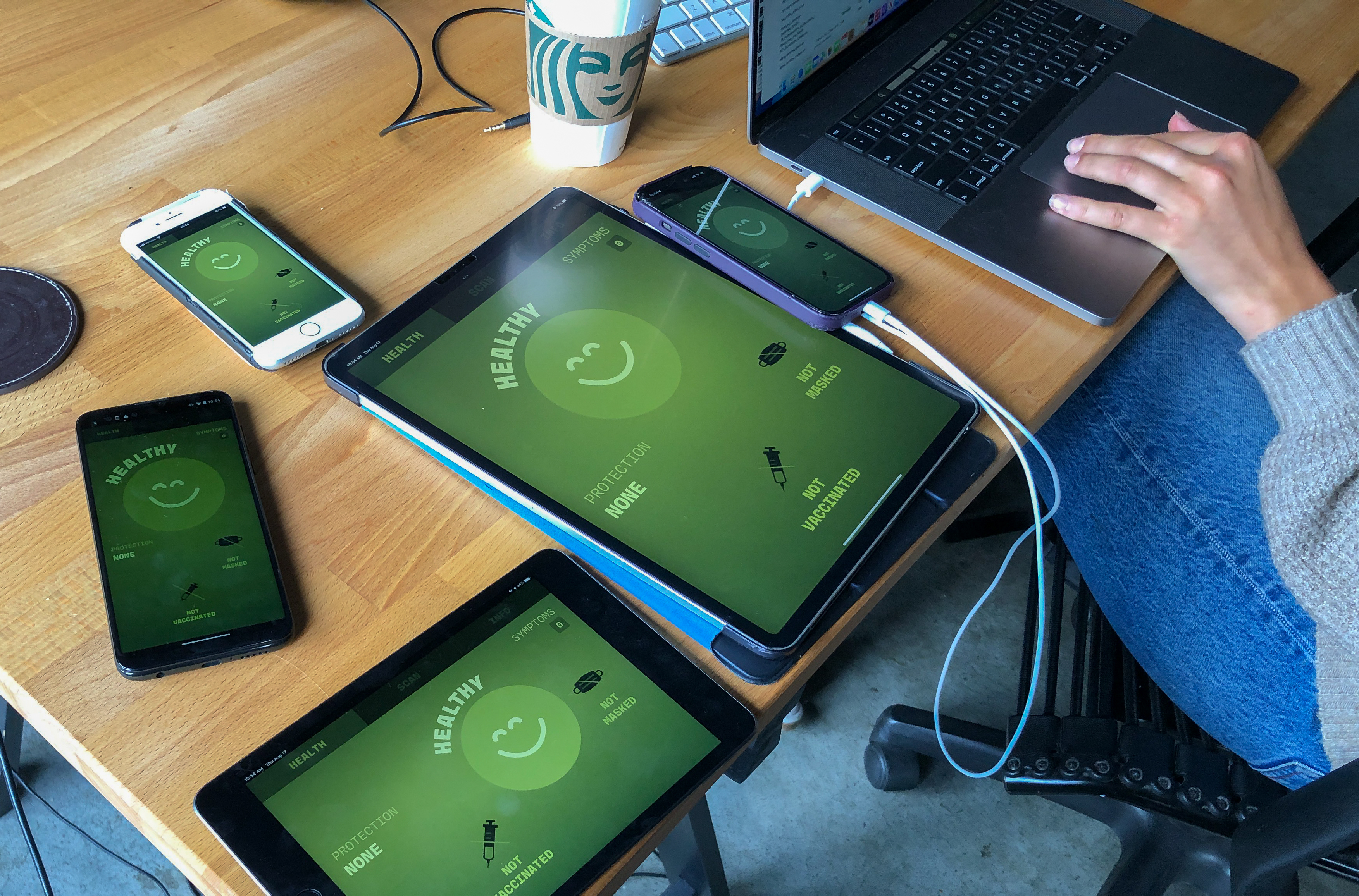
OO Creator allows teachers and students to create, run, and visualize infectious disease simulations without expert knowledge or technical know-how.
OO Lookout is modeled after our real-life outbreak response tool, and provides students with the opportunity to role-play as essential workers and government officials - working through the operations and challenges of attempting to quell a pandemic.
OO Visualizer acts as an interactive timeline of the transmissions that occurred throughout the simulation - presenting a bird’s eye view of what actually happened over the course of the activity.
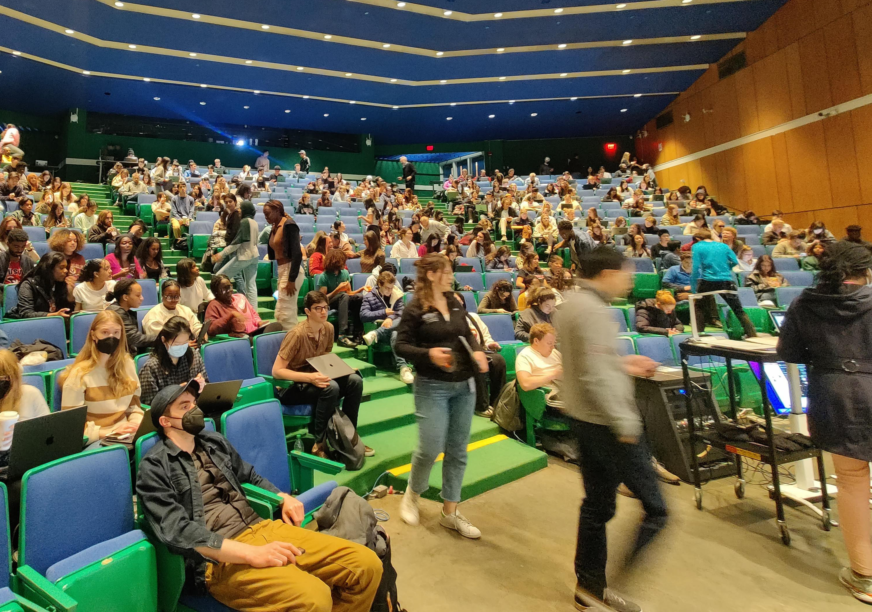
Of course, it’s always exciting to see our creations in action! In the spring, we were invited to join our close collaborator Dr. Pardis Sabeti and her Harvard class in a live simulation. Designed to be flexible enough to adapt to a variety of classroom and group environments, it was certainly rewarding (and entertaining) to watch the stakes of a regular class change in real time when “life saving” vaccine QR codes were suddenly on the line.
With SARS-CoV-2 very much still a reality of day-to-day life, future outbreaks are never too far off the horizon. As we continue to build on our body of work with the Sabeti Lab, we are determined to use what we learned from this pandemic to prevent the next.
But we weren’t entirely consumed by thoughts of plagues and pathogens this year…
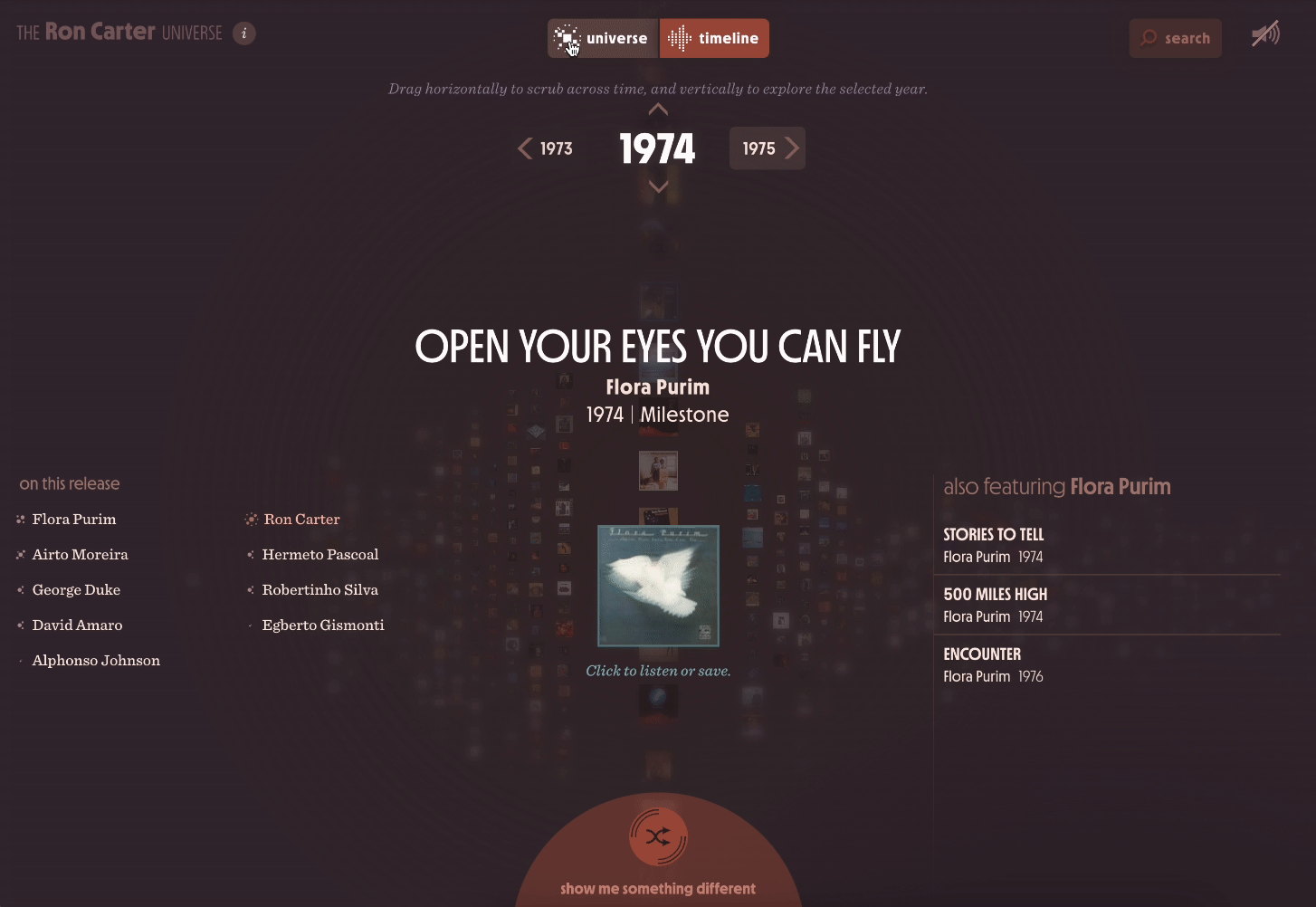
Fueled by Mark’s love of jazz, this fall we completed the Ron Carter Universe - an immersive discography celebrating the far ranging and expansive career of one of the most legendary jazz bassists of all time. Libby even got to see the Maestro perform live in New York City, and wrote a beautiful three part blog series elaborating on her experience throughout this project.
We also continued our partnership with Tufts University’s Silklab - an innovative team investigating the unique properties that make silk such a versatile and sustainable material.
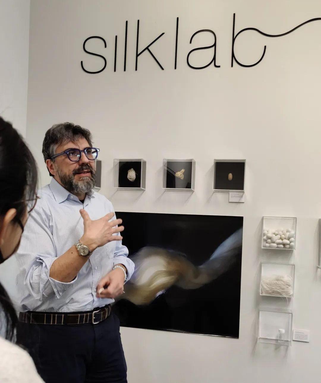
We’re particularly inspired by silk’s ability to perform as a color-changing responsive material and we even got to visit the lab to check out a few of their ongoing experiments in person!
New faces and fond farewells.
In February, Ellory became the newest member of the Fathom team - joining the crew as a producer! She’s pretty great, but she’s also authoring this piece and feels uncomfortable spending too much time waxing poetic about herself in third person. Odds are you can find her hyping up Somerville’s annual Fluff Festival, or bracing herself against the elements on the office patio while insisting it isn’t too cold out to type.
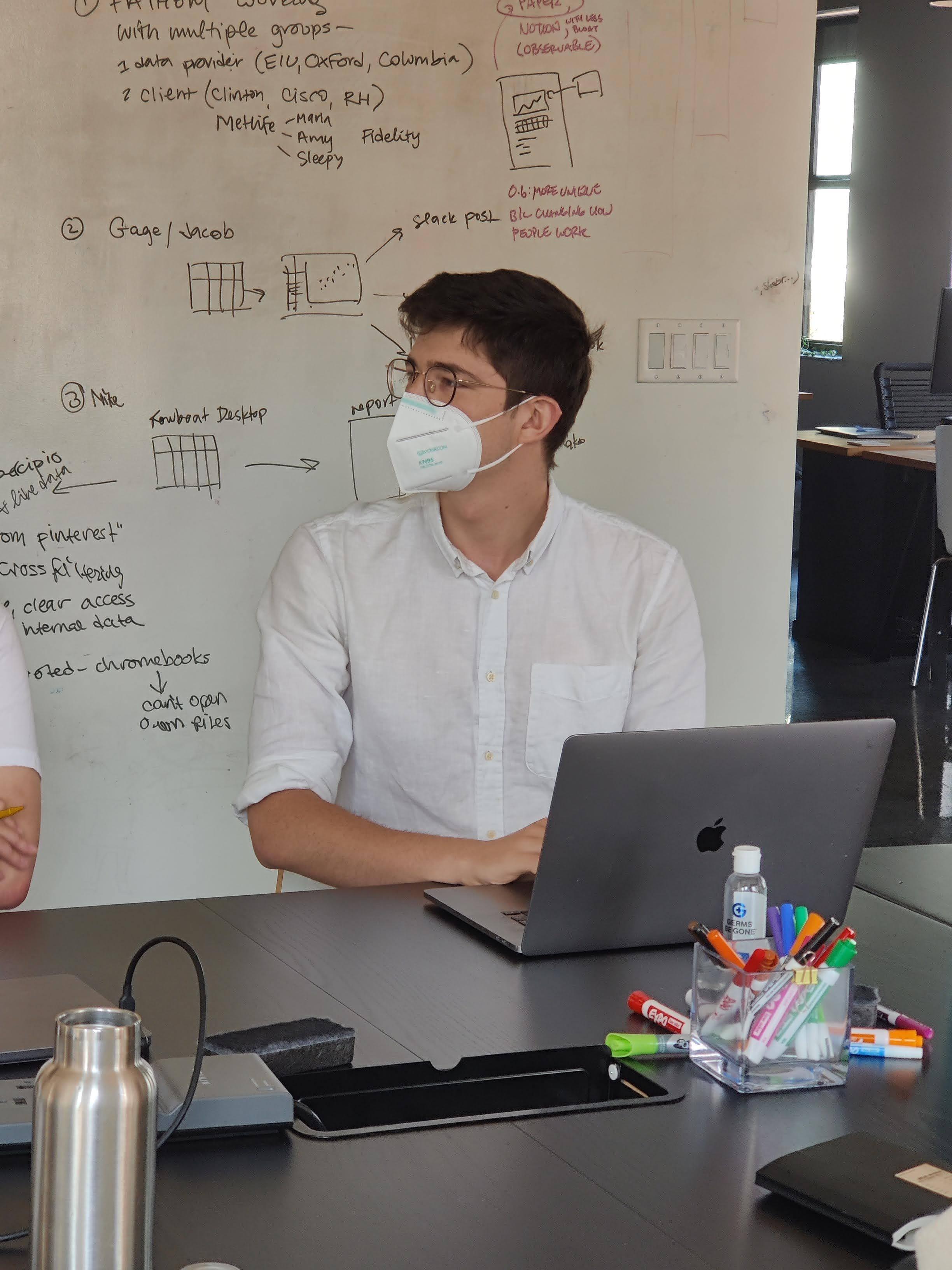
We were also excited to have rising Harvard University seniors Livie and Ivan join us in the studio this summer!
Livie spent her months with us as a full-time intern - working closely with our developers and designers to get some hands-on experience participating in our design and development process. Her concentration in statistics was especially handy when dealing with a tricky codebase during the second phase of our Operation Outbreak work.
As part of his ongoing work with our friends over at the Sabeti Lab, Ivan spent some time with us thinking through the visual design elements of an upcoming tool he’s building for the epidemiological modeling of infectious diseases.
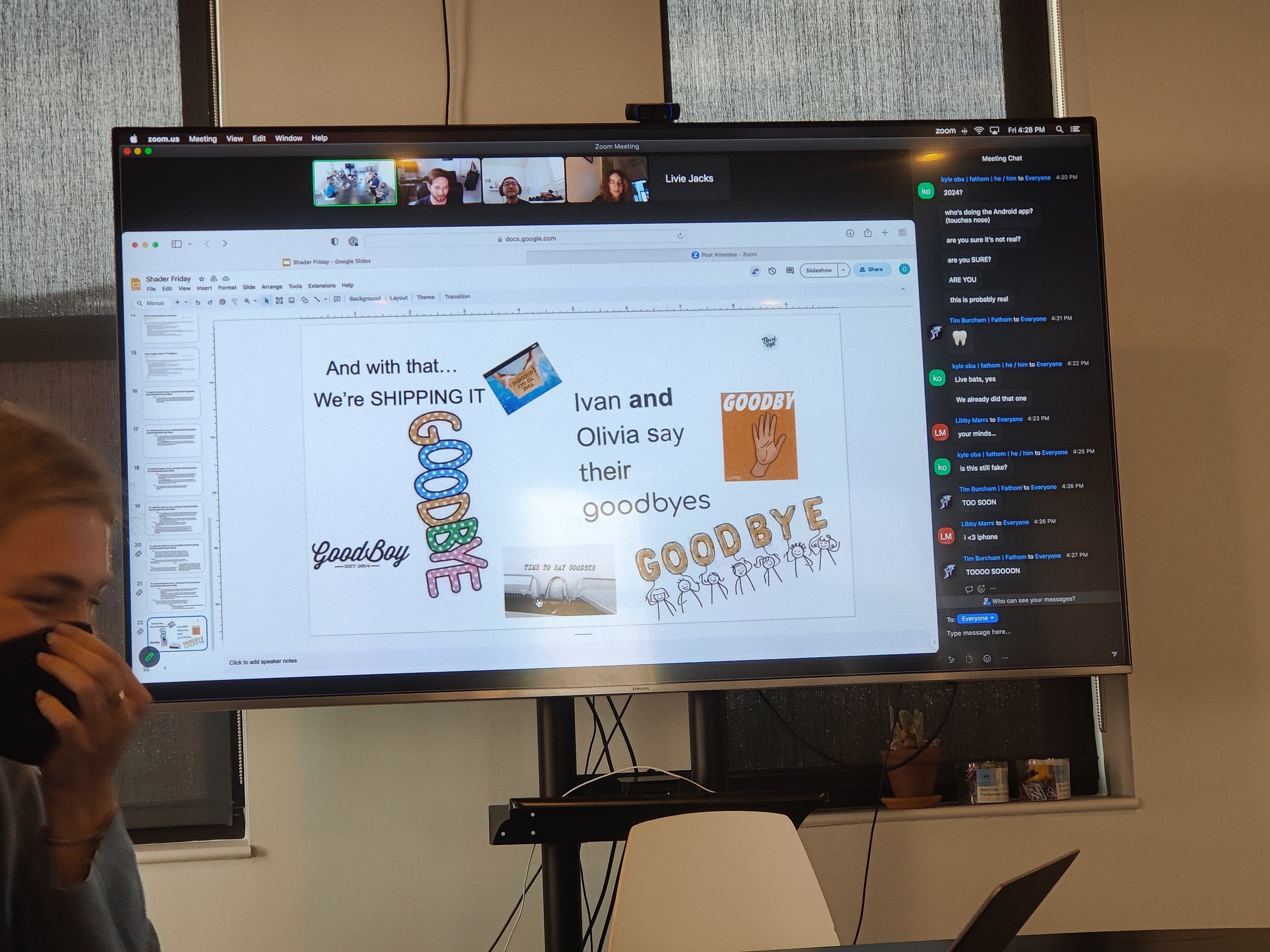
Despite how busy we kept them, Livie and Ivan made sure to find time to tease us on their way out in the form of a presentation that lovingly (we hope) mocked all of the Fathom idiosyncrasies, lunch gossip, and project highlights they observed - and participated in - over the summer.
With tears in our eyes and cocktails in hand, this November we wished Tim all the best as he set off for his next great adventure. Joining the Fathom team in 2020, Tim never ceased to amaze us all with his thoughtful contributions, unique humor, and insightful feedback. We will miss him dearly, but look forward to keeping tabs on what he’s up to in the years to come. We truly had the Tim(e) of our lives.
As always, teaching has remained central to our office culture and approach to what we do.
Ben was frequently over in Kendall Square this spring teaching his Information Design and Visualization class at MIT - featuring a handful of guest lectures from Paul, Mark, and Olivia. Speaking of Mark and Olivia - the dynamic duo took center stage once again at Harvard’s CS171 class, discussing Fathom’s approach to working with complex datasets and providing students with the opportunity to ask questions about what it’s like to work in the field.
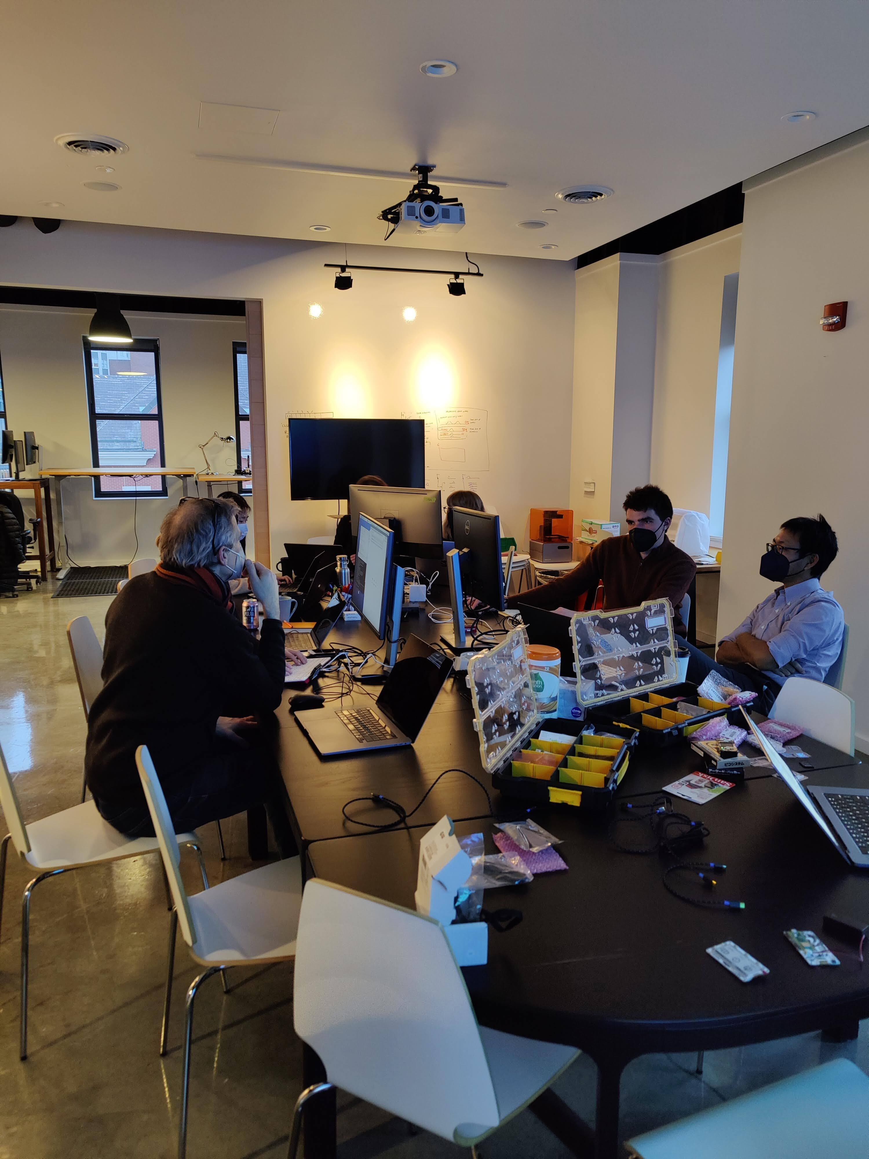
As mentioned above, the full team spent a delightful afternoon teamed up in pairs to hack away at some Raspberry Pi hardware last week. From a digital cootie catcher, to a handheld color weaving game, to a Sega inspired custom typeface, to a single line stubbornly persisting in the wrong color, we all made progress in our own ways. More importantly, we all had a great time. Even Mark. Especially Mark.
During the summer Ben also put together a mini Info Design class for the Fathom crew - taking us on a speed run through his clock and weather app units in a single day. For some, this “bootcamp” was an opportunity to get creative designing something outside the realm of our day-to-day work. For one specific individual who had not coded a single thing in eight years, seeing a static sketch on paper spring to life on screen was a particularly invigorating and fulfilling experience.
No matter what form it takes, our hunger to learn and to teach is a driving force behind everything we do as a studio. We’re always on the lookout for more opportunities to engage with a wide range of students, teachers, and curious individuals - if you’re interested in connecting with our team, drop us a note at hello@fathom.info.
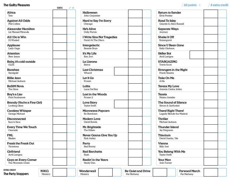
We all got to know each other a little better through a close examination of our favorite guilty pleasure songs. Some things you can’t unlearn about your coworkers.
Who is willing to Rickroll the whole office? Livie.
Who should never be handed the aux cord? Mark.
Who has an irrational distaste for Steely Dan? Ben.
This summer we uncovered the answers to these pressing questions (and more) through our now-annual “Guilty Pleasure Songs” guessing game. As is our fashion, what began as a Mandatory Fun Activity morphed into a philosophical examination of the term “guilty pleasure” and the ways in which we all interpret “guilt” differently. Despite the stress of selecting our songs and some questionable guessing strategies (looking at you Tim) we left the experience battle weary, but more closely bonded than ever.
We also spent some time this year unpacking how we can better educate ourselves on designing inclusive tools - in particular what it means for our work to be accessible across a broad spectrum of visual ability.
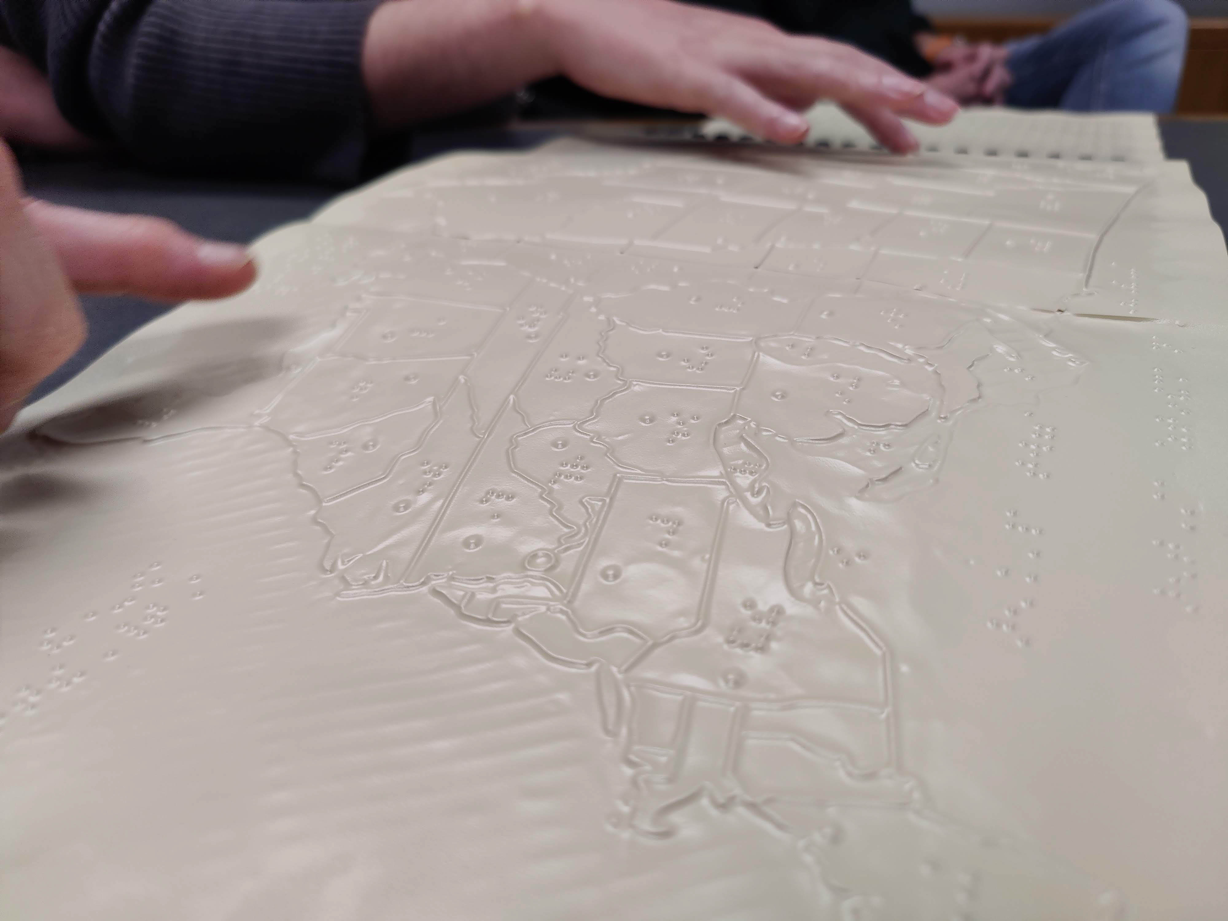
We took a trip to the National Braille Press, where we got a look into how braille printing is produced and learned about the challenges that visually impaired people face on a daily basis; from poor urban planning to a lack of investment in braille literacy, many obstacles prevent visually impaired communities from having equal access to education and work opportunities.
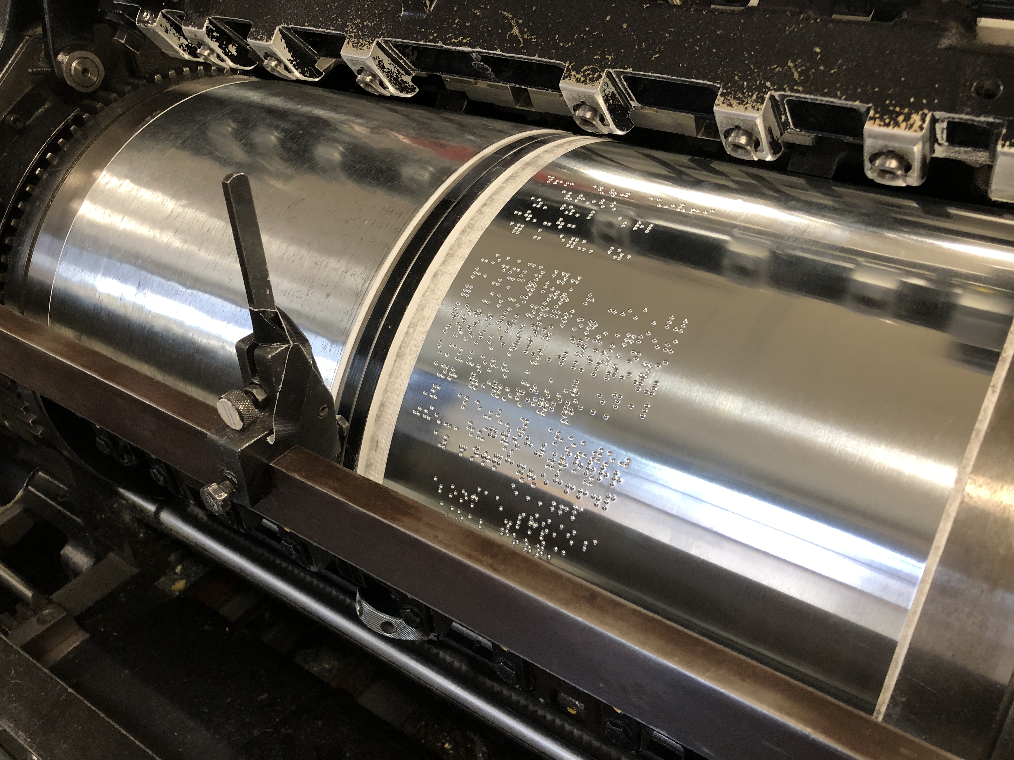
It was an enlightening experience, one that reminded us that our primarily visual data tools are simply inaccessible to a significant group of users. After our visit, we have reinvested efforts into examining and prioritizing the accessibility of our work, from improving the technical markup of webpages for screen reader use to reinforcing visual hierarchy and contrast for easier comprehension. We continue to be inspired by the world of inclusive design and accessibility and hope to explore how to understand and design for different or wider audiences in the near future.
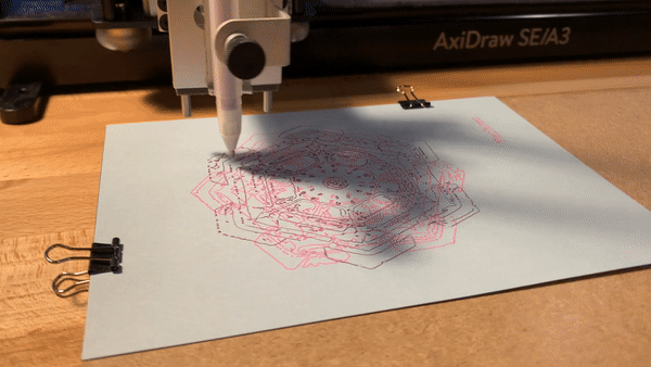
“In this inexhaustible storehouse of crystal treasures, what a delight is in store for all future lovers of snowflakes, and of the beautiful in nature.”
-Wilson “Snowflake” Bentley
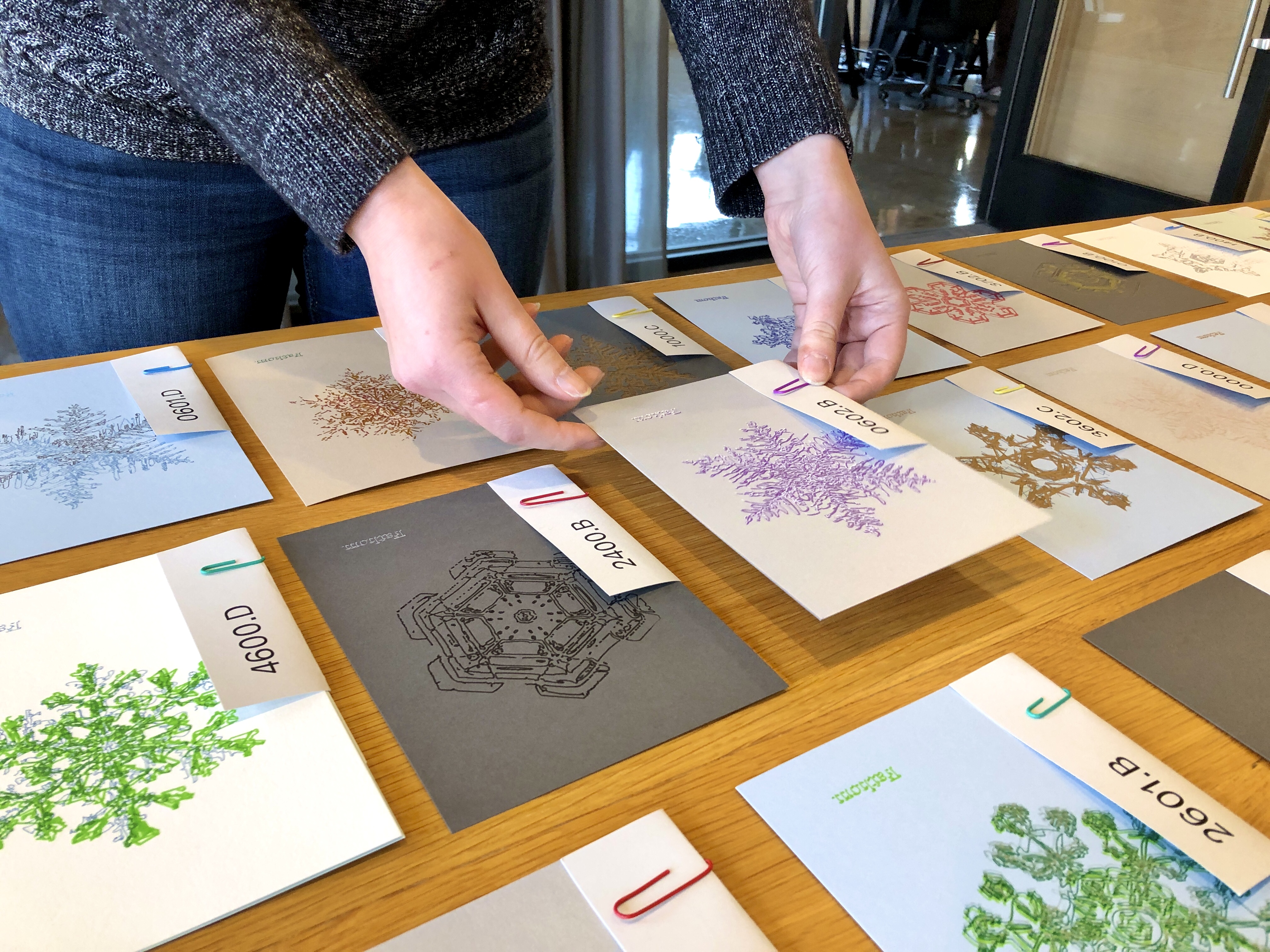
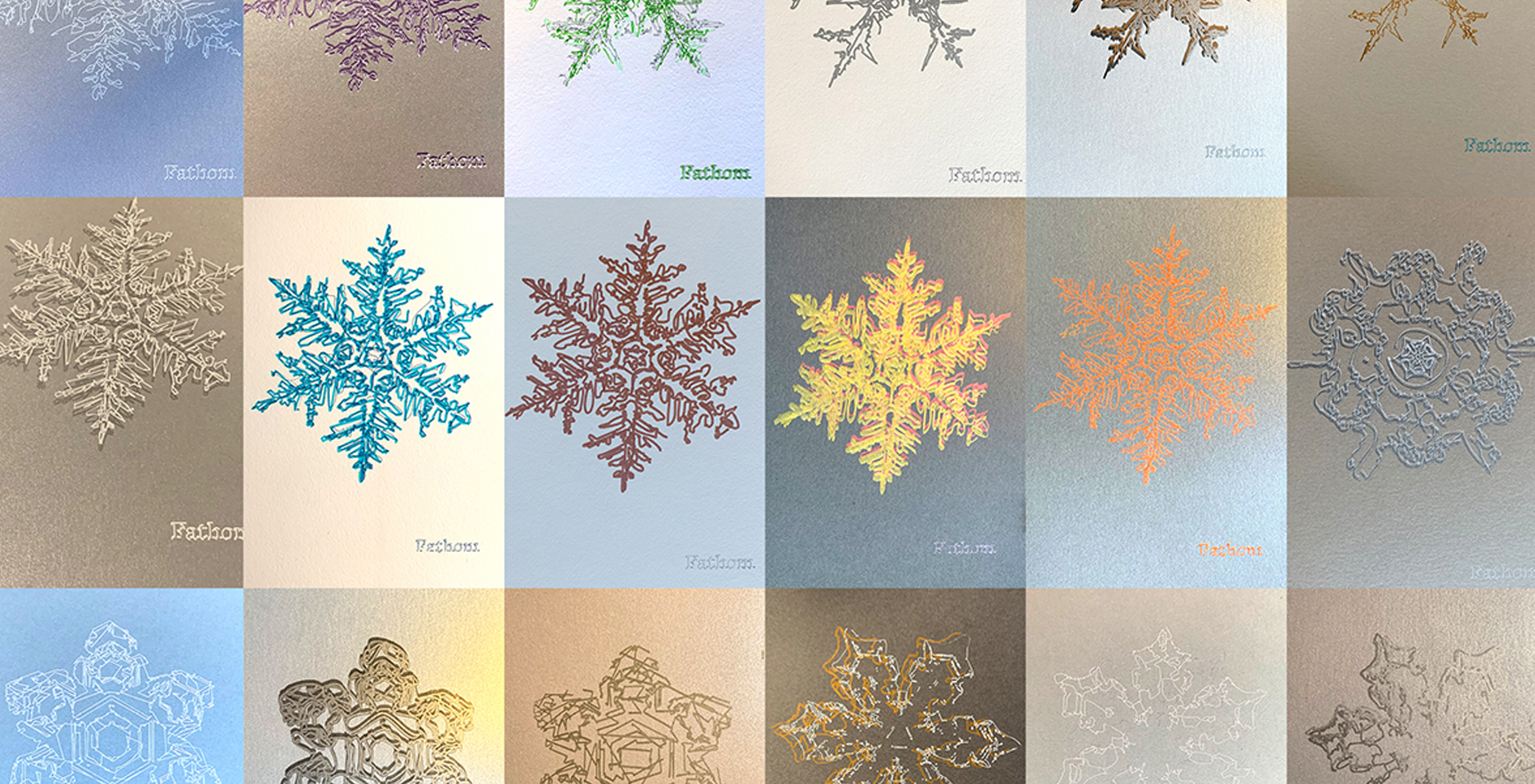
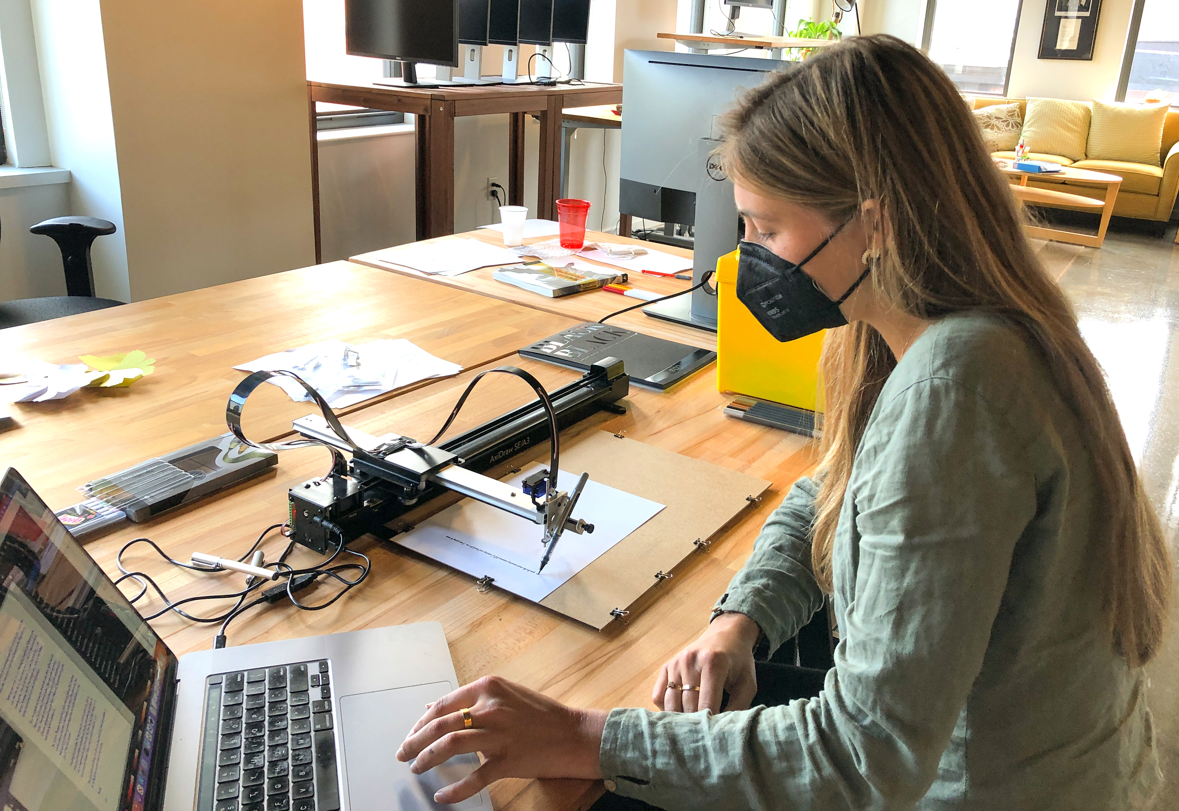
Of course, we couldn’t wrap up the year without creating a holiday gift for our friends and families. Inspired by Vermont farmer Wilson Bentley’s trailblazing work in photomicrography, we set out to transform his extensive collection of individual snow crystal images into unique holiday cards. With Paul at the wheel, we busted out our AxiDraw to generate a flurry of snowy cards for our loved ones.
Cheers to 2023!
As busy as we’ve been with our client work, we also spent a good chunk of time cooking up something exciting behind the scenes that we look forward to sharing in early 2024. We encourage you to subscribe to our newsletter to be among the first to hear our big announcement in the new year!
As we look forward to partnerships new and old in the coming year, we’re also seeking to expand our team of designers, developers, and data enthusiasts. We’ve recently updated our careers page and encourage anyone whose background and interests align with our work to reach out to us.
Wishing everyone a peaceful, restful, and joyous holiday season!
-Ellory and the Fathom Team
We’d love to hear what you’re working on, what you’re curious about, and what messy data problems we can help you solve. Drop us a line at hello@fathom.info, or you can subscribe to our newsletter for updates.