

Myriscope: a visual digest of scientific articles
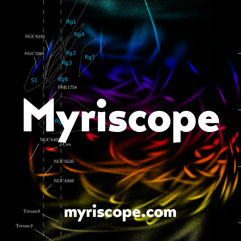
Over the past year we’ve taken various approaches to mapping and making sense of large archives. Most recently, with the guidance of our resident astrophysicist, Fernando, we designed and built an easy way to skim research articles and get an intuitive sense of their content.

Myriscope collects figures and abstracts from arXiv and bioRxiv into a single feed to provide an overview of the latest literature. Prioritizing key components (abstracts, figures, etc.) helps users browse through the articles to quickly stay up to date.


Understanding the Mueller Report through word associations
From an illustrated poster to the intertwining timelines of Porfiry, we’ve spent a lot of time trying to sort out for ourselves all the pieces in the Trump/Russia investigation. With the report itself finally in-hand, we built ConText to understand how individuals and groups are referred to in the report.
The platforms allows users to select an individual, get an impression of why they are relevant through the words associated with them, and read the references in context.
“Design is the best means we have for making information useful — not just presenting it visually, but giving people ways to work and think with it.”
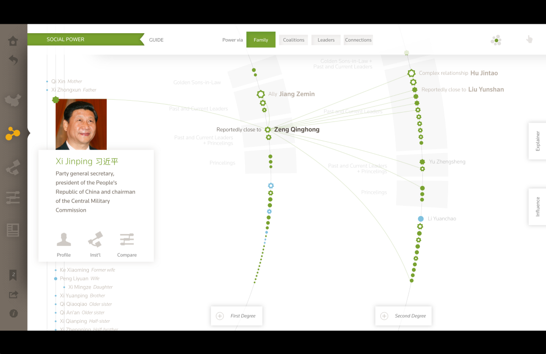
In a recent post, Ben wrote about the “four Cs” of design and data: Communicate, Consider, Condense, and Conceive. To illustrate these, he covers a range of old and new Fathom projects.


Around the studio
- We’re mid-way through our collaboration with the Mayo Clinic’s Innovation and Design team to reimagine medical records, and are taking a trip out there to gather feedback from providers and other stakeholders.
- We briefly lost Olivia to our newest studio attraction: the knitting machine. With a background in both engineering and design, Olivia created Processing sketches to create palettes from images and generate knitting patterns. Learn more about her experiments here.

We’d love to hear what you’re working on, what you’re curious about, and what messy data problems we can help you solve. Drop us a line at hello@fathom.info, or you can subscribe to our newsletter for updates.