
Growth x 200, a partnership with State Street
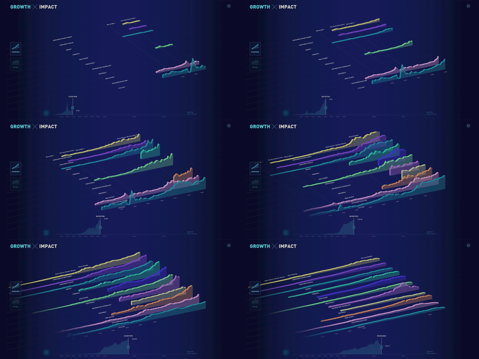
This week, we’re launching the web version of the visualization we built for State Street. Originally designed as a touchscreen installation for a conference, the piece focuses on four facets of growth in the financial system over the past 200 years: data, connectivity, complexity, and scope.
Shortly after the conference, the State Street team asked us to build a web version of the piece so that it could be shared more widely — for both internal and external audiences. We rebuilt the piece for the web and reworked parts of the design to translate it to laptop screens and to handle mouse or trackpad interactions. Explore the visualization or read more about our process.
Untangling the Facebook ads purchased by Russia
Over the past year, we’ve been digging into different ways to analyze, understand, and represent large document sets. Usually we look at large archives (millions of documents) or long documents (hundreds of pages). Last month, we decided to look at a different kind of document set — the Facebook ads released by the House Intelligence Committee. This document set includes 3,000 ads purchased by the Russian government between 2015 and 2017.
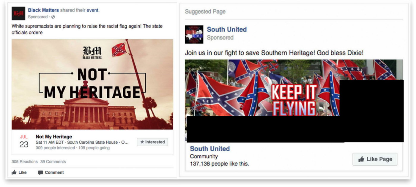
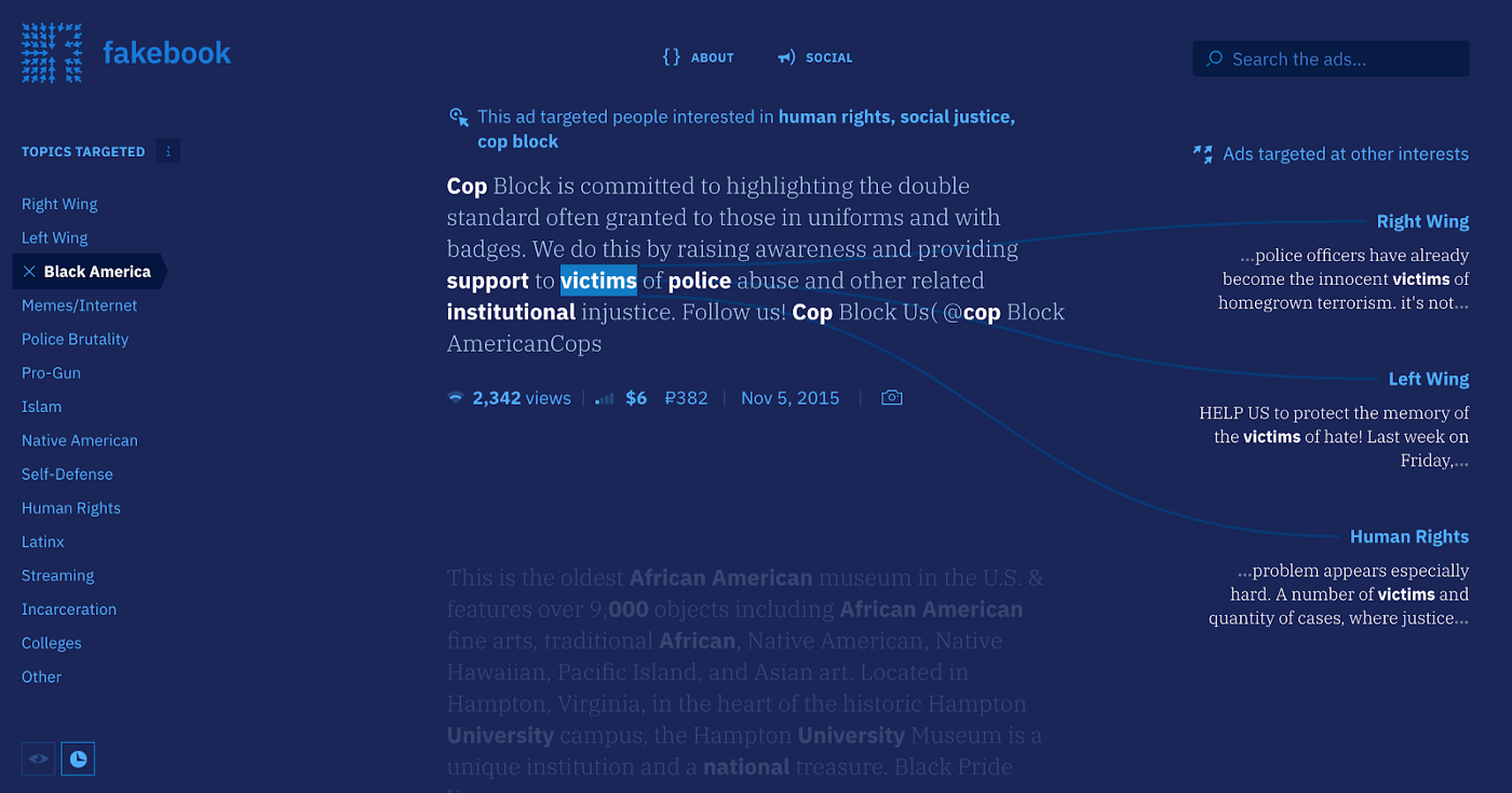
Using entity extraction, we analyzed how the ads stoke tensions by targeting polarizing messages at both sides of controversial issues. After many design iterations, we settled on a piece that shows the original text and compares how the same words are used in ads targeted at different demographics. Explore Fakebook or read more about how we built the tool.
Sketches from an upcoming project
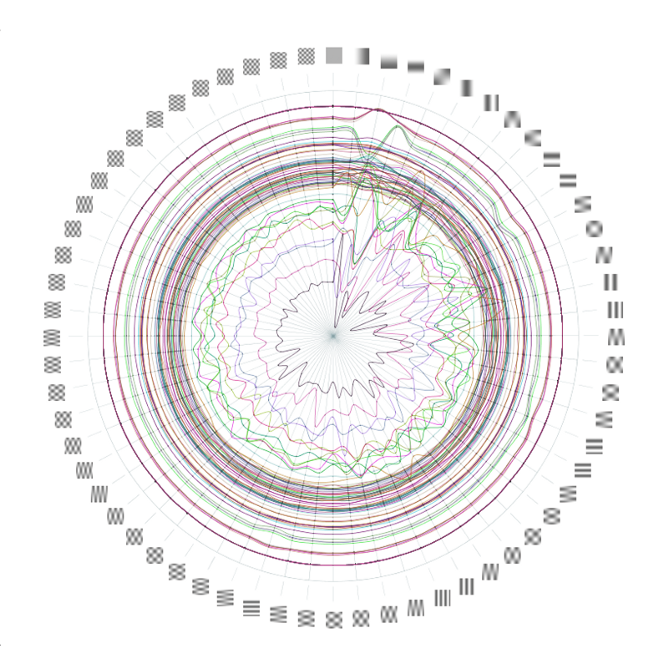
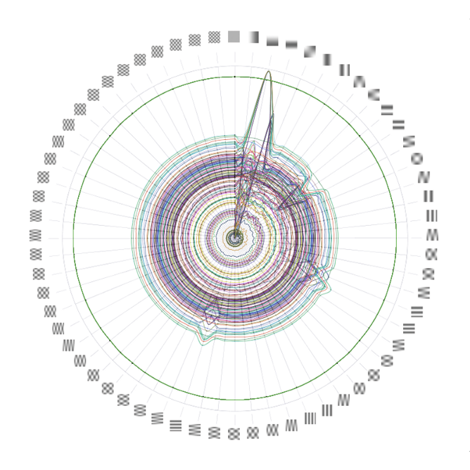
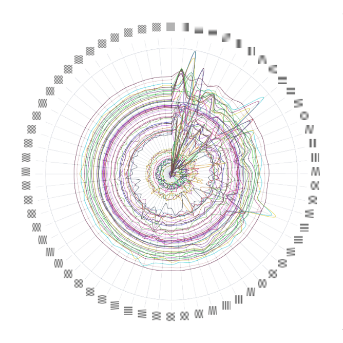
A few images from some research we’ve been doing on how image data is stored and encoded for an upcoming project. Here we’re breaking down individual frequencies in an image based on how they’ll be stored in a file. We’ll be sharing more about the project in the coming months.


What we’re reading
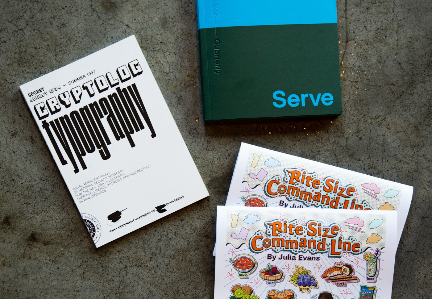
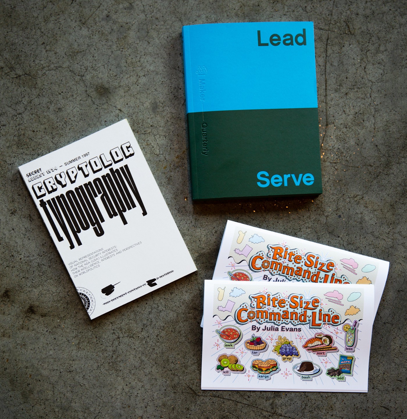
This month, we’re enjoying Julia Evan’s latest or read more about Bite Size Command Line zine, typographical illustrations from declassified NSA publications in or read more about Cryptolog Typography, and issue No. 14 of or read more about Mohawk Maker Quarterly, Lead & Serve.
We’d love to hear what you’re working on, what you’re curious about, and what messy data problems we can help you solve. Drop us a line at hello@fathom.info, or you can subscribe to our newsletter for updates.