
Recently, we collaborated with ProPublica to visualize the campaign donations and taxpayer dollars spent at Trump properties since 2015. ProPublica, along with the Washington-based transparency group, Property of the People, have been researching and collecting data on this spending. Looking for a way to visualize their findings, Scott Klein, a deputy managing editor at ProPublica, reached out to us to build a piece that would serve as a regularly updated repository where users could explore and download the information.

Since Watergate, U.S. presidents have avoided conflicts of interest between personal profits and public responsibilities. Jimmy Carter put his Georgia peanut farm into a blind trust. Ronald Reagan and George W. Bush also put their assets into blind trusts. Barack Obama moved his investments to Treasury bonds and broadly held mutual funds. Donald Trump, on the other hand, put his businesses into a trust run by his children, which means he can withdraw assets whenever he wants.
Once Trump announced his candidacy, his campaign started spending millions at his properties. When he became the presumptive nominee, the Republican National Committee and other campaigns began flocking to his properties to host events. Since his inauguration, government agencies have followed suit, spending taxpayer dollars at Trump hotels, golf clubs, and restaurants.
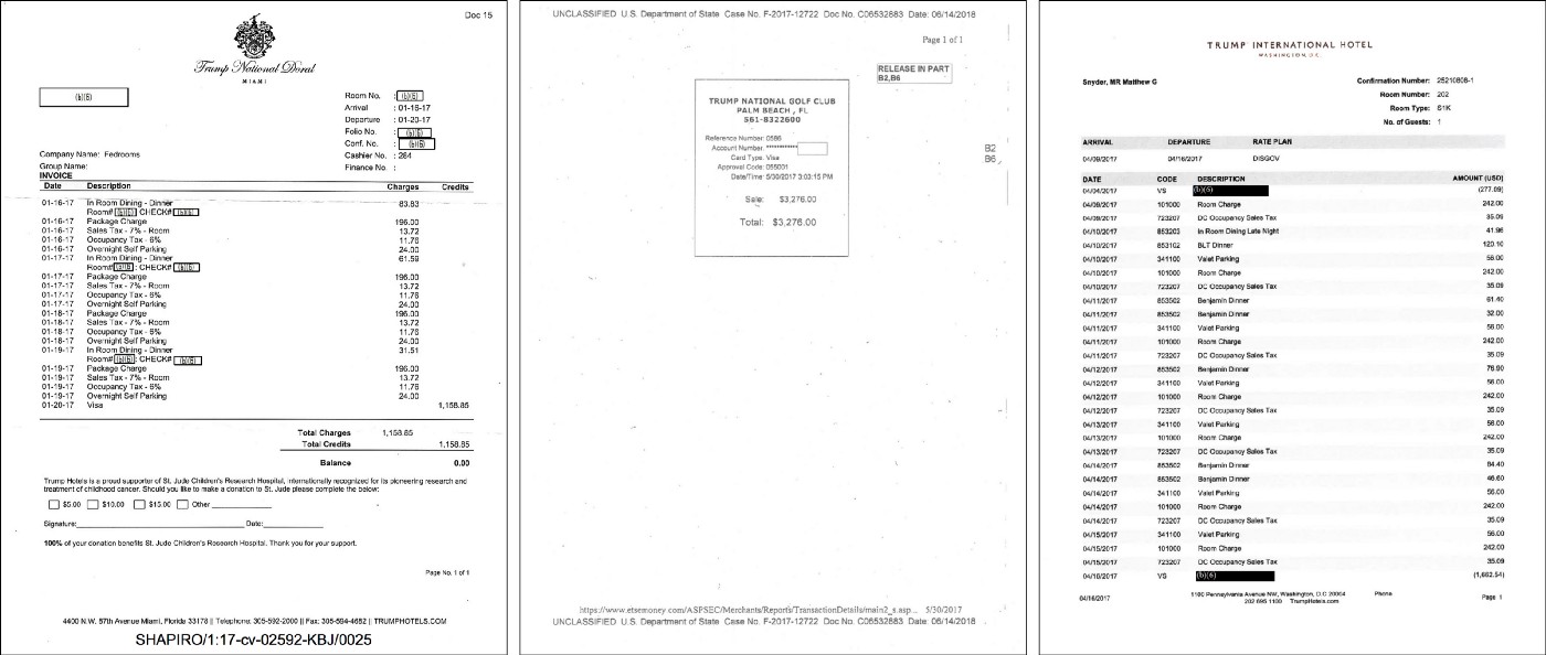
So far, the available data totals $16.1 million. Of this, the campaign data and state government data is publicly available. To obtain the federal spending receipts, Property of the People has submitted Freedom of Information Act requests to more than a dozen agencies and is currently suing four. That said, the federal spending data remains incomplete as many agencies fight the disclosure of this information.
One could argue that the spending needs to go somewhere, but the current situation also provides an unfair advantage to Trump properties over other local businesses. Each transaction represents a conscious choice of an agency or an individual to spend money at a Trump property rather than elsewhere in the economy. This data does not include secret service or coast guard protection details. Nor does this piece cover spending by other governments wishing to curry favor with the administration, the subject of a lawsuit that cites the Emoluments clause of the Constitution.
A large part of information design is placing numbers in context. In comparison to what? is a central question, especially in the early stages of a project. But it’s difficult with this piece; the data is in a comparison against zero. $0 has been spent this way since Nixon.
Moreover, we wanted to de-emphasize the dollar value more than we normally would in such a piece. We wanted to avoid users becoming distracted thinking “is that a lot of money?” rather than the core issue—that the office of the President was being used for direct personal gain. And because the numbers themselves might seem small compared to the kind of amounts we’re used to reading about for campaign spending or government budgets.
Our framing came from a point made on an early call: hardly a day goes by without this spending at Trump properties. The frequency is remarkable, and seems to be normalizing the behavior in Washington. With all this in mind, we put frequency at the core of the visualization.
To accurately show frequency, we needed to decide what constituted a “transaction.” Some campaigns and agencies log a receipt for each person, while others submit one per group. To avoid this inconsistency and obtain the number of days on which spending occurred at Trump properties, we decided to merge the total values from receipts with the same agency and day.
Even accounting for this, there are still days with multiple transactions. For example, on March 2, 2017, the Department of State spent $14,930.29 at the Trump Hotel in Vancouver and the Department of Defense spent $992.04 at the Trump Hotel in Las Vegas.
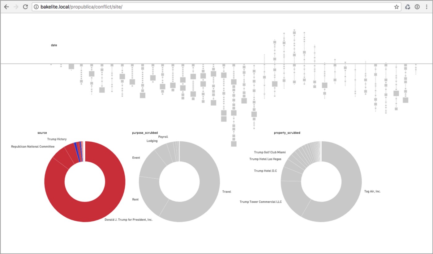
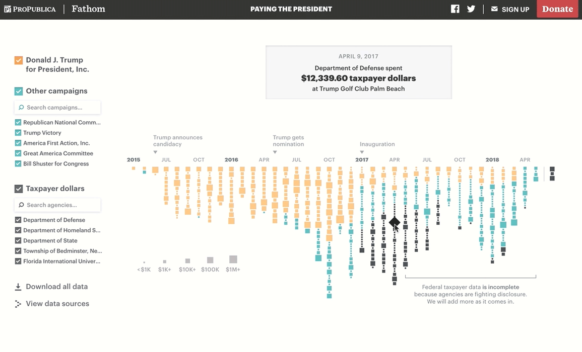
In depicting a timeline from April 2015 to May 2018, our goal was to show how this spending is an ongoing aberration. We chose to represent each transaction with a square colored by the spender (Trump campaign, other campaign, or government agency). These transactions are stacked vertically by spender and date, with each column representing the total spending for that month.
The transaction amounts vary widely, so the boxes are shown with a logarithmic scale. This allows each transaction — whether it was $1,000 or $1,000,000 — to reveal the frequency of spending, without being overpowered or dwarfing the surrounding ones, because they’re no less important. The size still varies, however, so that it’s easy to distinguish between, or locate, smaller and larger amounts paid.
In the final visualization, users can explore the details of each transaction: the spender, property, and dollar value. When moving the mouse over each square, it rotates to draw more attention to itself because other methods of showing the current selection (an outline, a color change, size shifts) were too subtle or introduced too much distortion.
Users can also filter the transactions and search for specific agencies and campaigns. For those interested in exploring the raw data, it’s available via the “Download all data” link which directs to the ProPublica datastore. We also built a table view for each spender, which shows the un-merged receipt data along with the purpose of the visit (restaurant, hotel, etc). There, users can sort, filter, and download a CSV with data of interest.
We will continue to update the piece as more information becomes available. In the meantime, explore the visualization on desktop and mobile, or read ProPublica’s story.
We’d love to hear what you’re working on, what you’re curious about, and what messy data problems we can help you solve. Drop us a line at hello@fathom.info, or you can subscribe to our newsletter for updates.