In its final incarnation before being integrated into MIT's D-Minor curriculum as a required course, the Fall 2016 section was taught as a graduate workshop. Just like last semester, we had a diverse group of students from the Media Lab, Computer Science Department, SA+P, and the Sloan School of Management, and we divided the semester into four main projects, each of which covered a different aspect of the subject material:
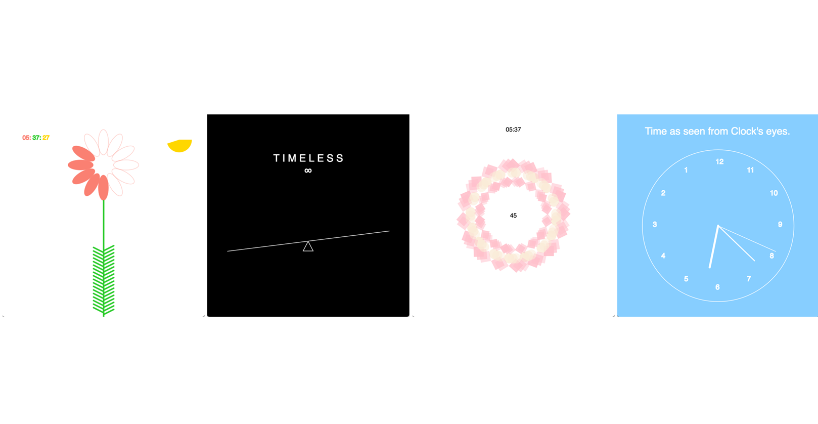
- introduction to design and p5.js with clock faces
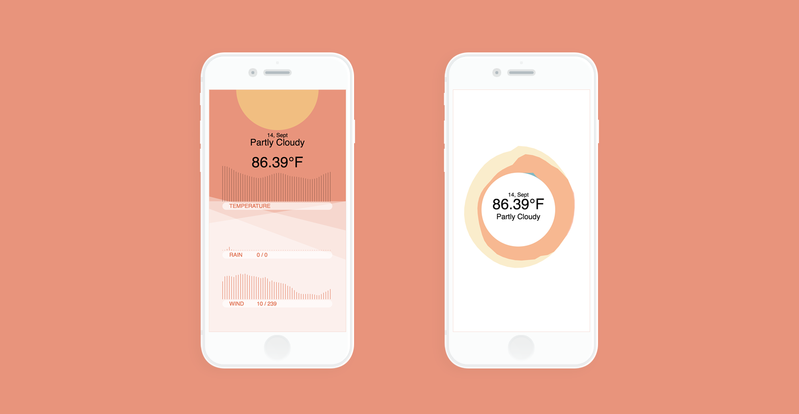
- context of use with a weather application for mobile
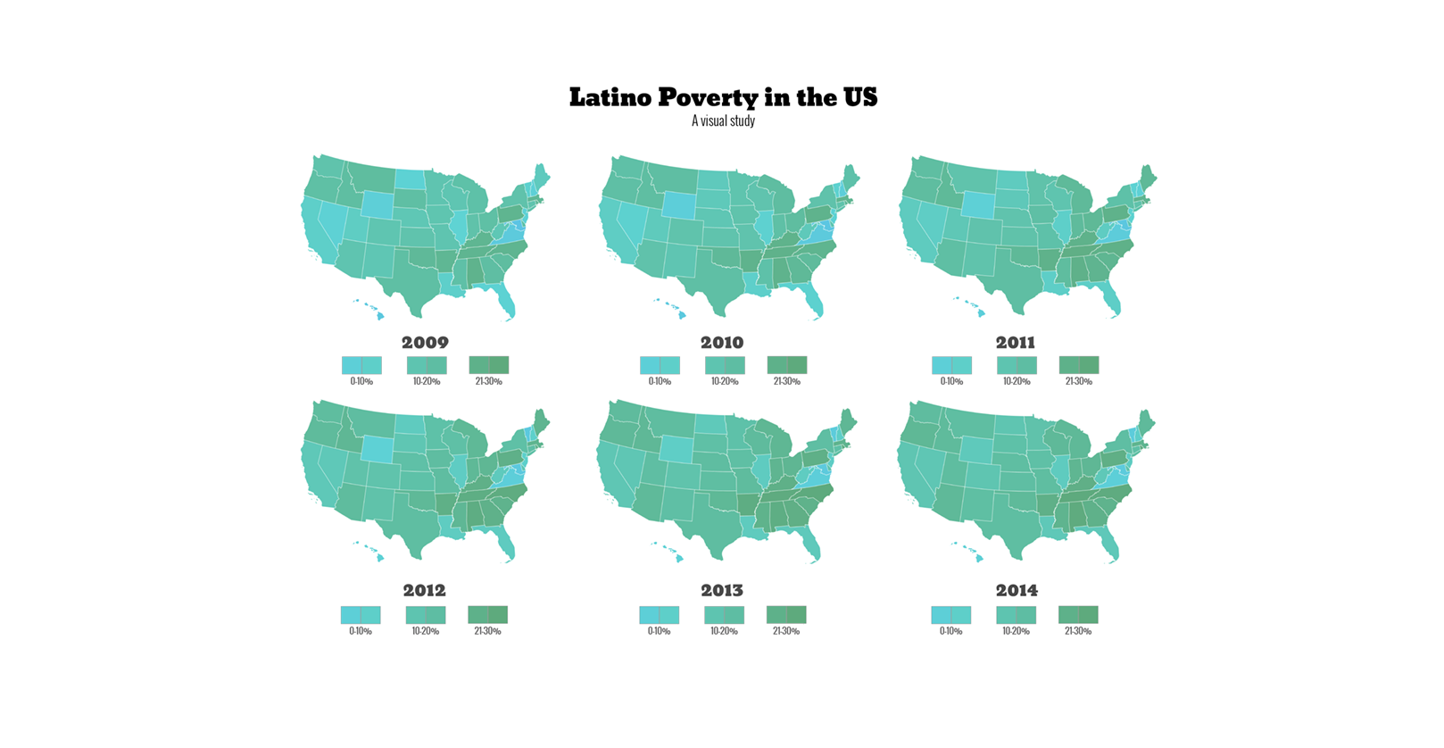
- finding a story within census data
- tying everything together with a “choose your own adventure” final project
These assignments run the gamut from very directed at the beginning of the semester to very open-ended at the end of the semester. The census and final projects consistently reveal that some students thrive in the open-ended environment, while others struggle to find direction and manage their time. However, regardless of their learning style, all students deserve the support they need to learn effectively, so this Fall we began exploring different ways of guiding the students through the course and projects. Although the final deliverable for each of the assignments was largely the same as last semester, we directed the students in a different way. This provided them with a bit more support, and gave us the opportunity to focus on the didactic qualities of process and iteration. To demonstrate, here's the evolution of one student's final project, from conception to completion over the course of six weeks.
During the first week, Xinhui Li, along with the other students in the class, settled on a project idea and story. This semester, we asked the students to identify four candidate datasets that they would like to use, one for each of the following categories:
- Personal: some type of personal data that you’ve collected
- Research/class: information design questions around your research, other classes, or thesis
- Explanation: a complex idea that’s data-centric, and make sense of it
- Curiosity: finding a data set that you think is interesting, and telling us a story about it or providing people with a way to explore it
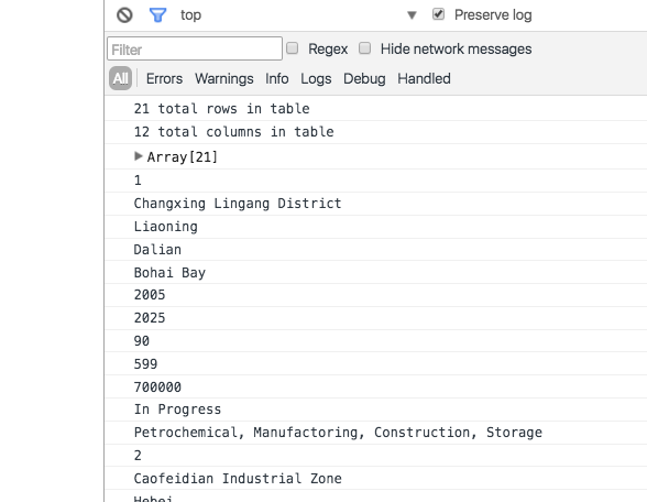
Once students had decided on an idea, they were given a week to collect and parse data. Data parsing is a challenging, but extremely important, aspect of information design, and we again wanted students to focus on this crucial stage of their project without being distracted or overwhelmed by the other stages. Xinhui's first p5.js sketch didn't actually draw on the canvas at all. Rather, it printed to the console to demonstrate that her program could load and internally represent the data she wanted to use.
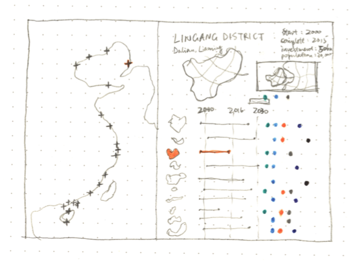
The next two weeks were spent creating an initial visual representation of the data. At this point, we asked students to provide paper sketches alongside their code, to encourage them to occasionally step away from the computer and consider the overall design and ultimate goal of their final project. After Xinhui sketched out her visual ideas on paper, she had a template she could follow to guide the layout of her first p5.js sketch that used the canvas.
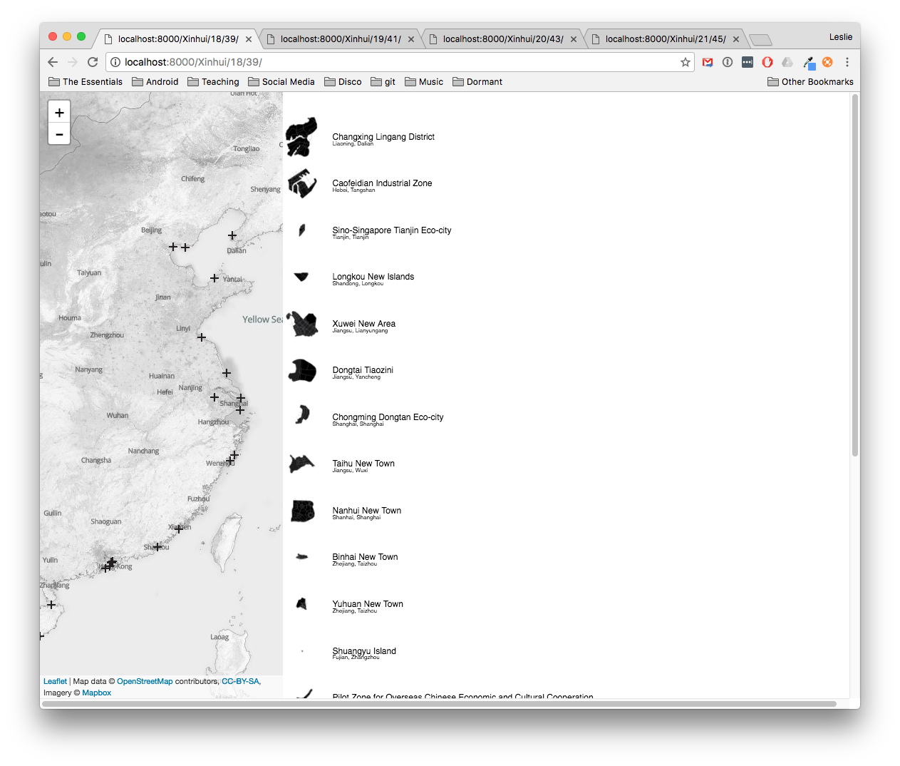
The initial representation demonstrated Xinhui's ability to incorporate the map, data, and icons that she had gathered for her project, but there were a lot more refinements that could be made in the two weeks before the assignment was due. At this point, we began to shift our focus toward design and interactivity, helping students refine and iterate on their initial representations.
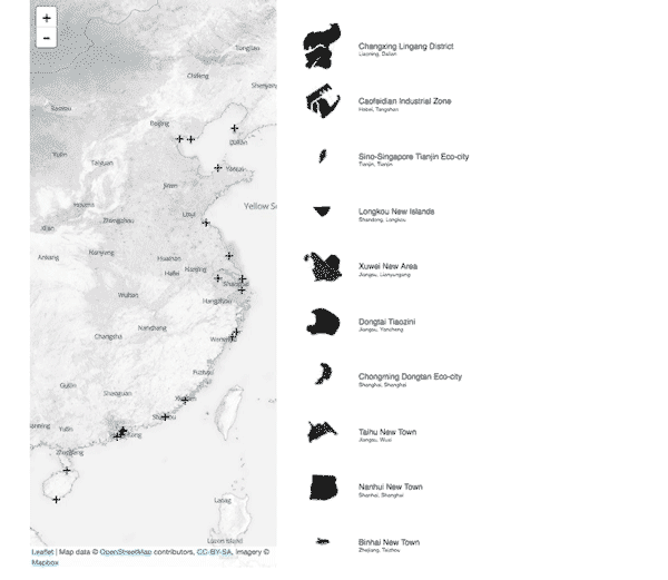
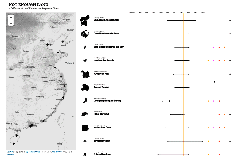
Xinhui's second design iteration implemented the timeline that she had drawn in her paper sketches, added a title to give the piece some context, and changed the scroll behavior so that the map always remains visible in the browser window.
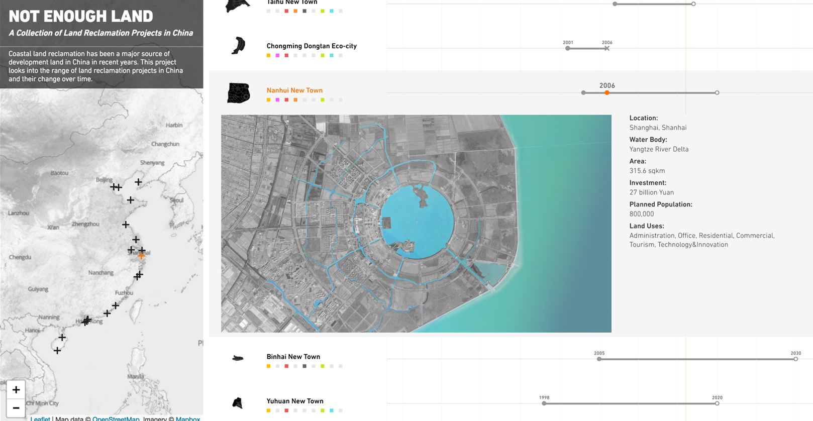
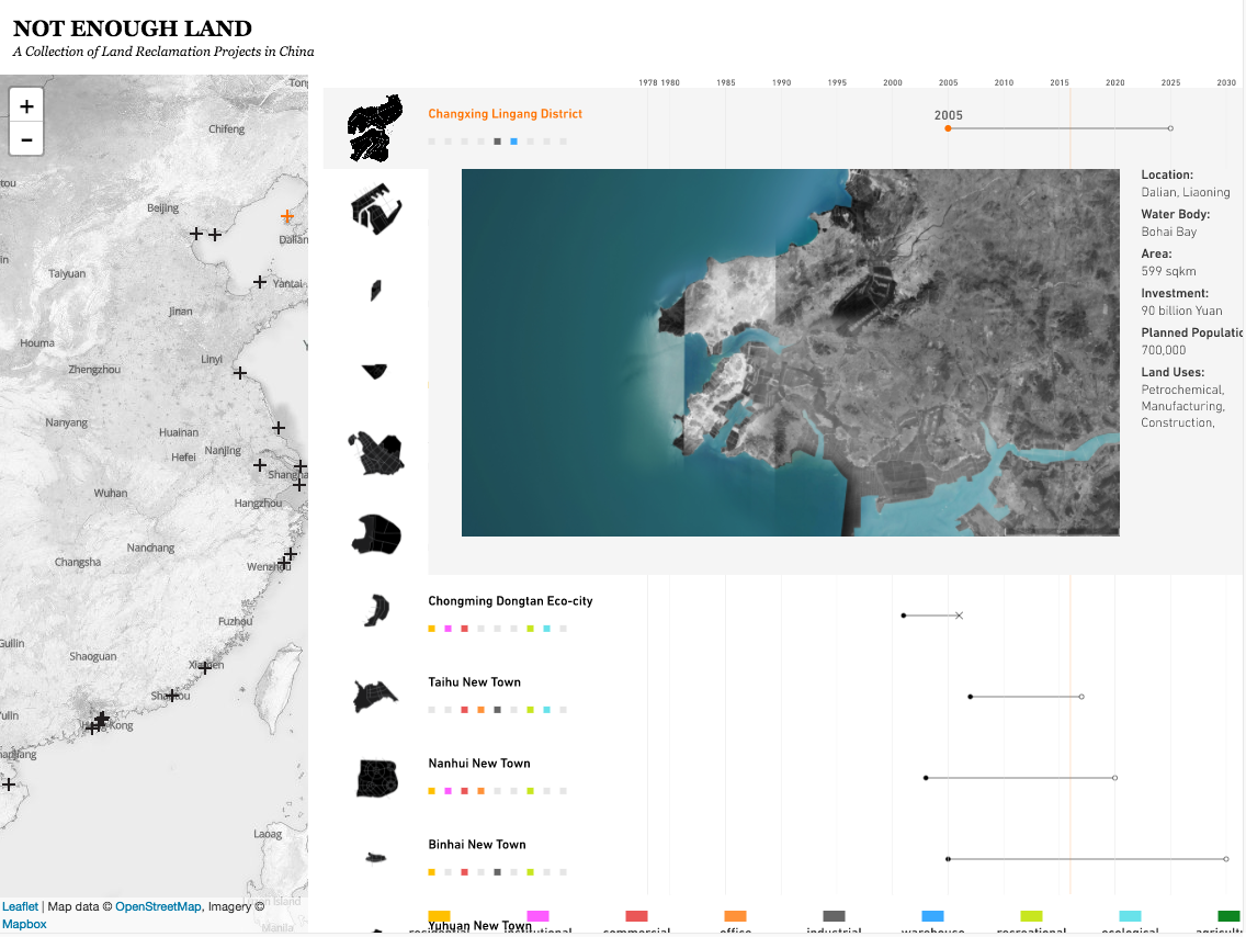
For her third iteration, she implemented more of the functionality from her paper sketches, adding satellite images and detailed information about each item in the list. Demonstrating her understanding of hierarchy in information design, she designed the list items to be expandable and collapsable, so that the user only sees detailed information when it's relevant. She also included a legend that reveals at a glance the intended uses of the various land reclamation sites.
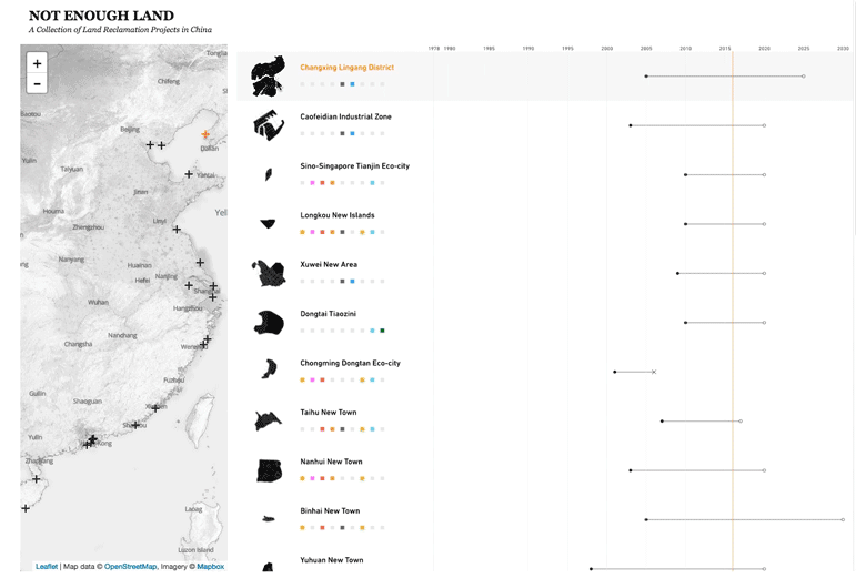
Between the third and fourth iterations, Xinhui implemented animated transitions to further refine the user experience, redesigned her legend so that it makes better use of the space she has available, added a description of her project beneath the title, and made the list sortable so that users can browse the data more easily.
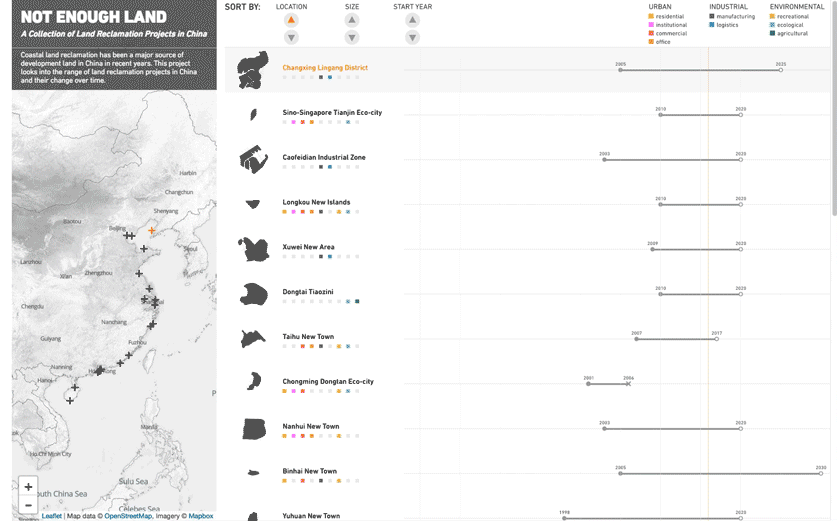
You can see Xinhui's final project here, and a gallery of student projects here.
We’d love to hear what you’re working on, what you’re curious about, and what messy data problems we can help you solve. Drop us a line at hello@fathom.info, or you can subscribe to our newsletter for updates.