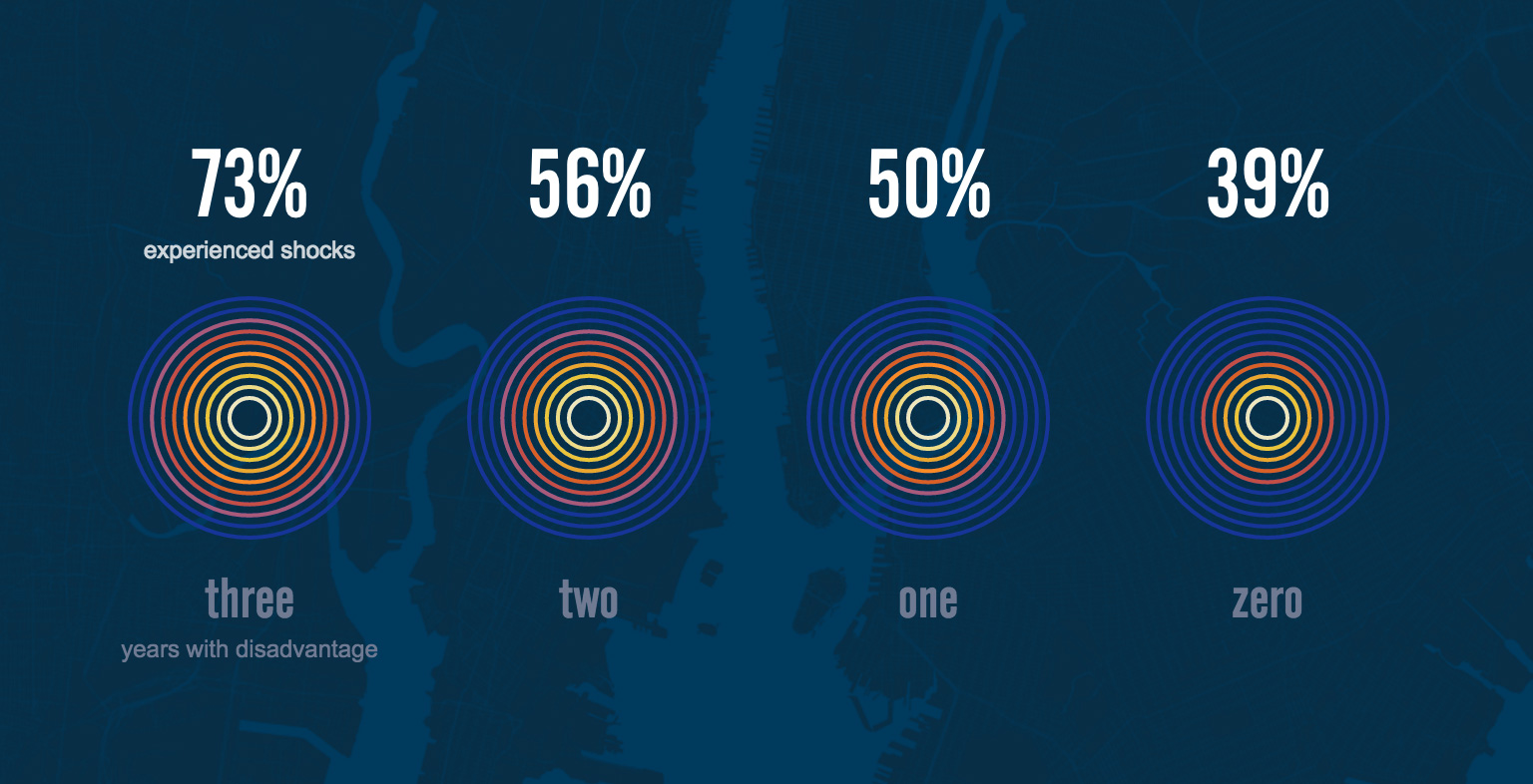
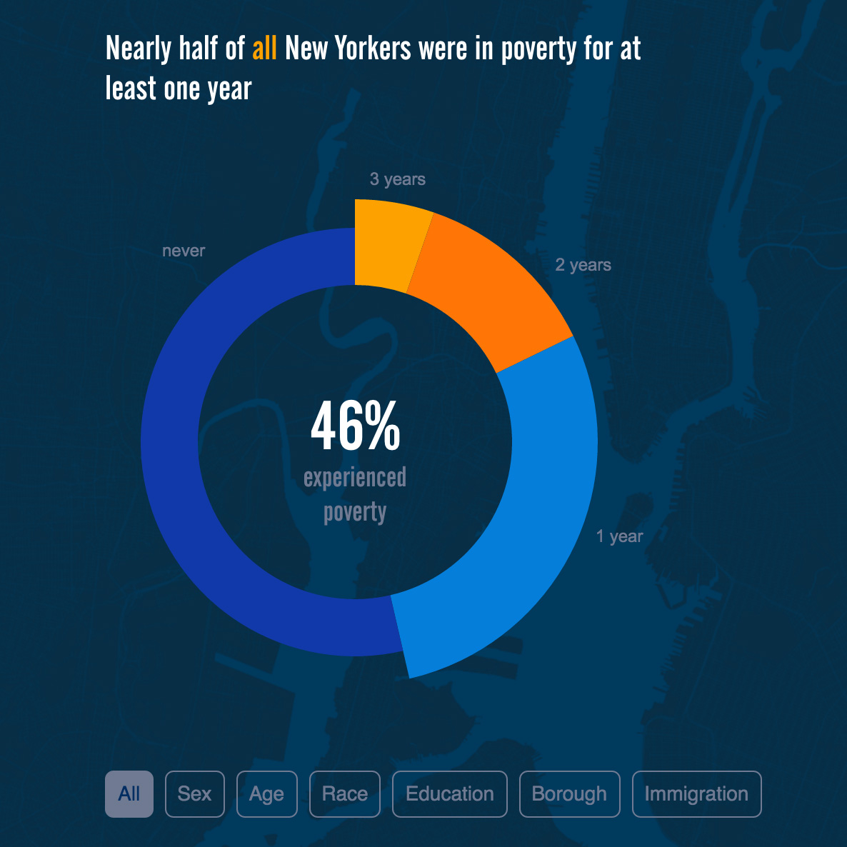
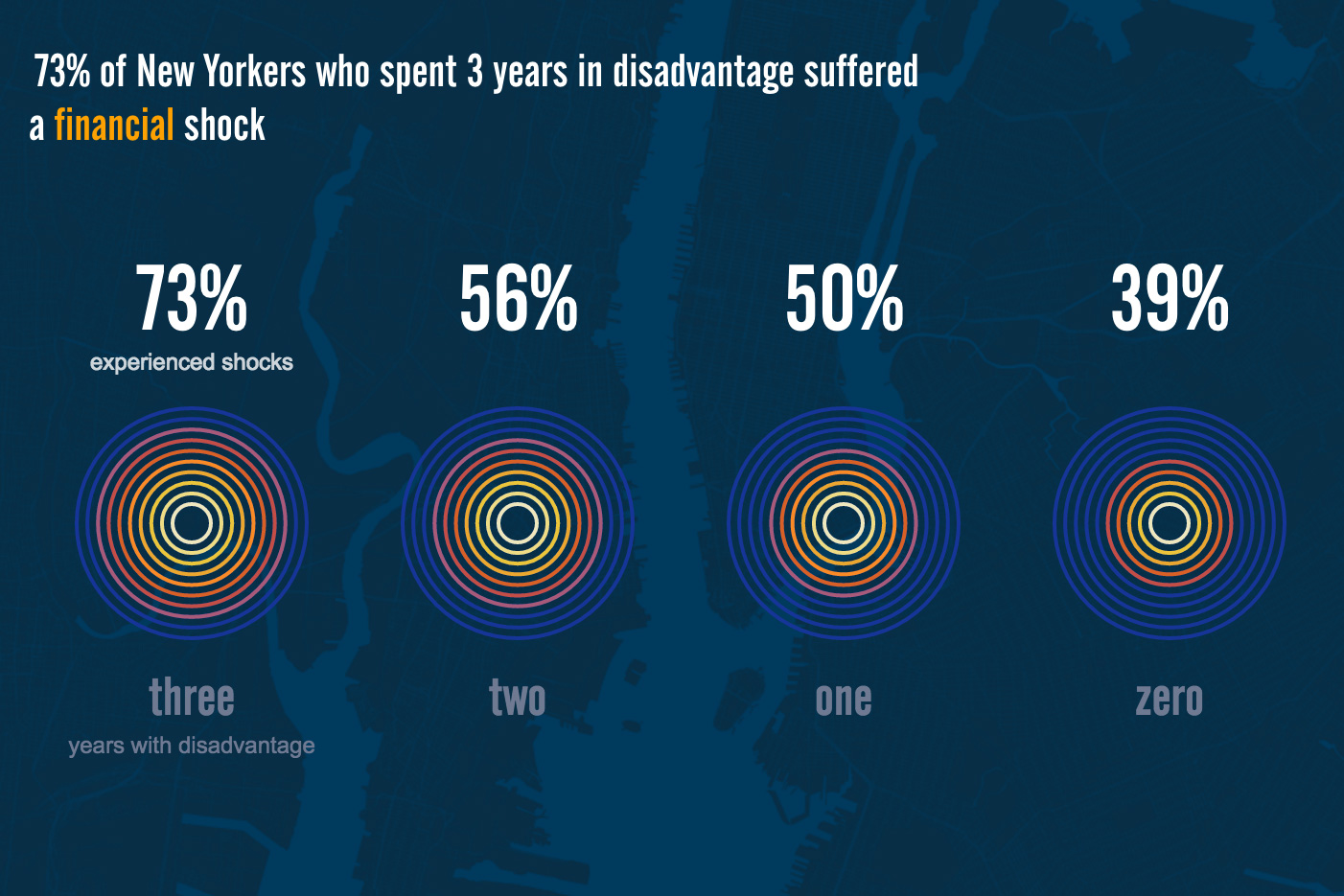
Building off the longitudinal data from the previous report, the latest edition depicts the total count of those who experience hardship over three years. A single year's data might suggest that only a small percentage of New Yorkers are facing poverty, but looking over three years shows how almost half the city's population experienced poverty at some point during that time.
This report also takes a look at the different types of “shocks” people are facing—such as losing a job, going through a divorce, or getting arrested—and how that affects the length of time individuals experience hardship.
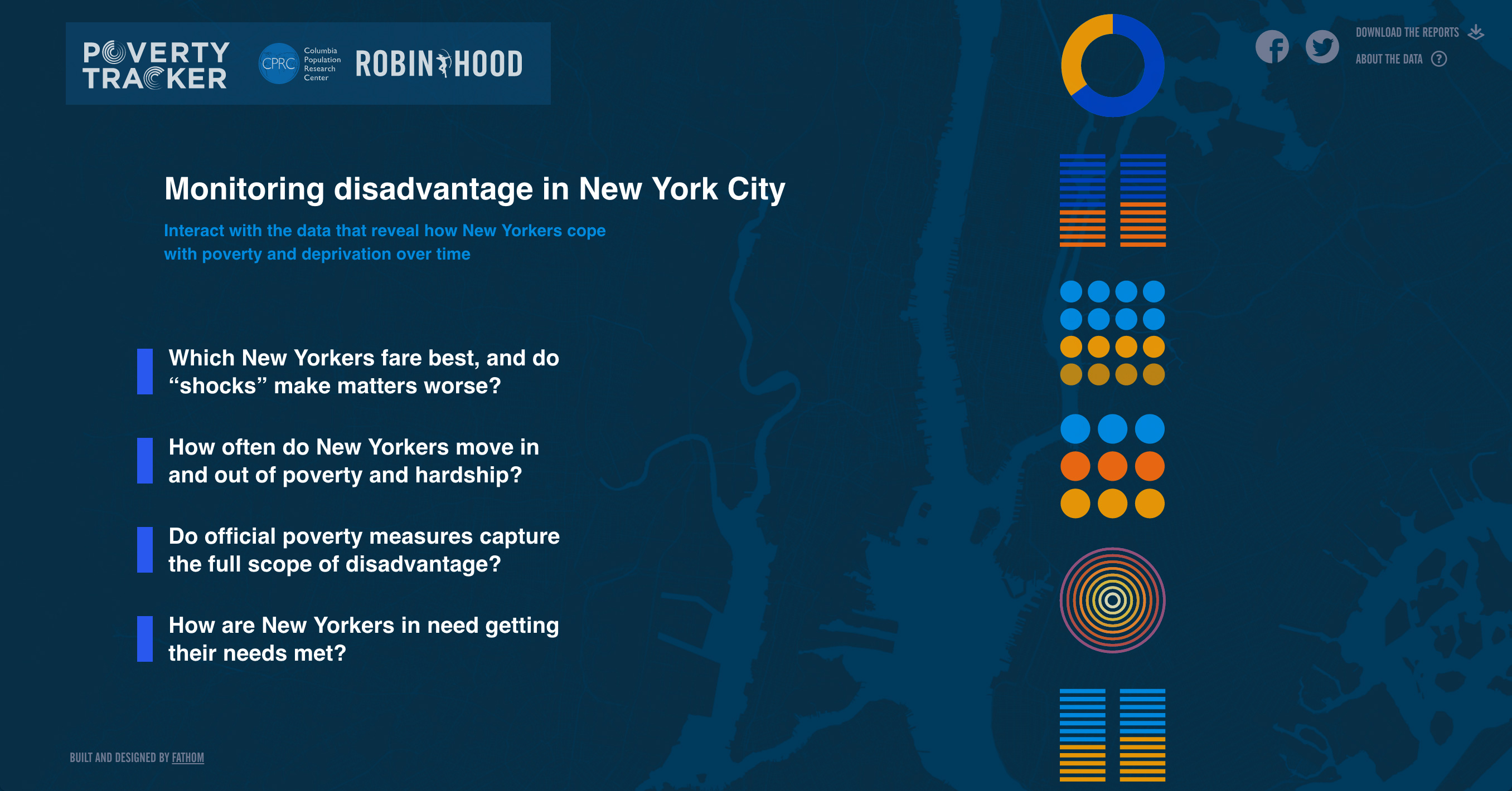
It’s been a privilege to build on this project with the Robin Hood Foundation and Columbia’s Population Research Center as more data is collected and new reports are added. Since its launch in 2014, the Poverty Tracker site has grown from one report to four, and with that, into an accessible resource that paints a striking picture of poverty in New York City.
You can check out the full site at povertytracker.robinhood.org
We’d love to hear what you’re working on, what you’re curious about, and what messy data problems we can help you solve. Drop us a line at hello@fathom.info, or you can subscribe to our newsletter for updates.