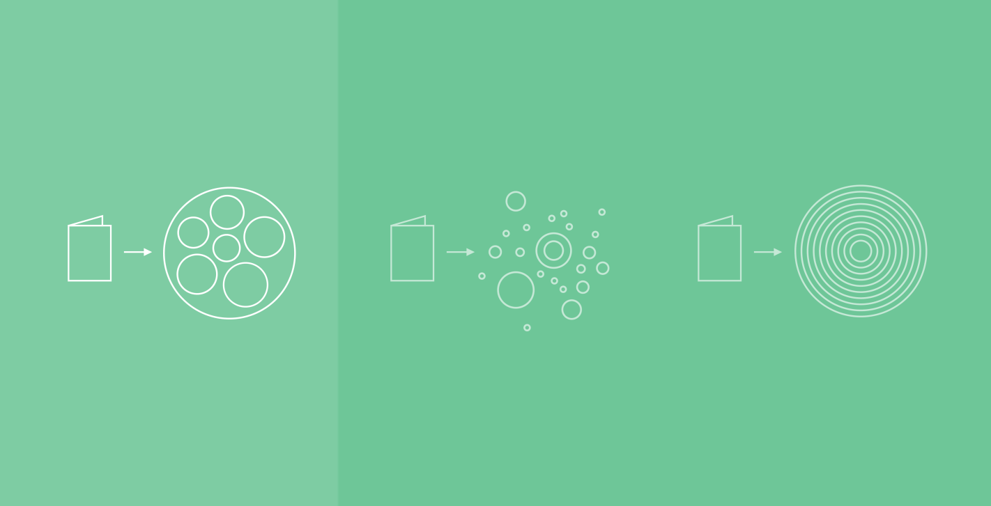
Even as they move away from printed reports and into PDF documents shared online or by email, the same questions remain: How do I reach a broader audience? How do I make the data as understandable and transparent as possible? How do we make sure this information is widely shared? No matter how important the information in a report, even a motivated reader will be challenged to find the time to dig into a few dozen pages, given the number of things already competing for their attention. In these projects, we make complex reports more accessible by creating simple interactive diagrams. They first draw attention to the most important aspects of the data for the quickest possible read, but also provide additional controls so that interested users can delve into the report.
In a series of reports monitoring poverty and well-being in New York City, we translated survey data from Columbia University into multiple interactive visualizations for the Robin Hood Foundation. Normally, only a smaller expert audience already familiar with this kind of report would have seen this information. But with the visualization on their site, Robin Hood has been able to expand its audience, engaging more people with vital information on how poverty manifests in New York.
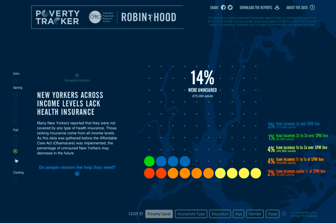
With this project, as we do with every project, we're thinking about not just the data, but also key audiences and the context in which they'll be using the data or interacting with the report. Will they be on a tablet during their morning subway commute? Sitting at their desk later in the day? Glancing at their phone in an elevator between meetings? Given the importance of Robin Hood's subject matter, how do we share that with the general public? How do we clearly reach previous—and potential—donors? Can the piece help explain the poverty situation to legislators or motivate their constituents? Ultimately, we want to empower the user by making the data more accessible and understandable.
Our process always begins by looking at the data. Through initial sketches or tools, we depict the available data and reveal interesting stories contained within. From there, we work with our clients to align what we see with what matches their understanding of the data, based on their deeper knowledge of the information or subject matter. Frequently, this initial work will reveal new patterns that our client wasn't aware of, and we'll work with them to identify a point of interest to be pursued, an anomaly in the data that requires fixing, or simply an unnecessary distraction.
Next we begin to develop the overall narrative and visual structure of the piece. It all comes together as we build the final interactive piece, which makes its way through several rounds of software development, design iterations, and refining with our clients, the domain experts. By designing directly with code, we can refine the interactions and the animations as we go, and work out the kinks in ideas that initially looked promising, but weren't supported in the final analysis or design of the piece.
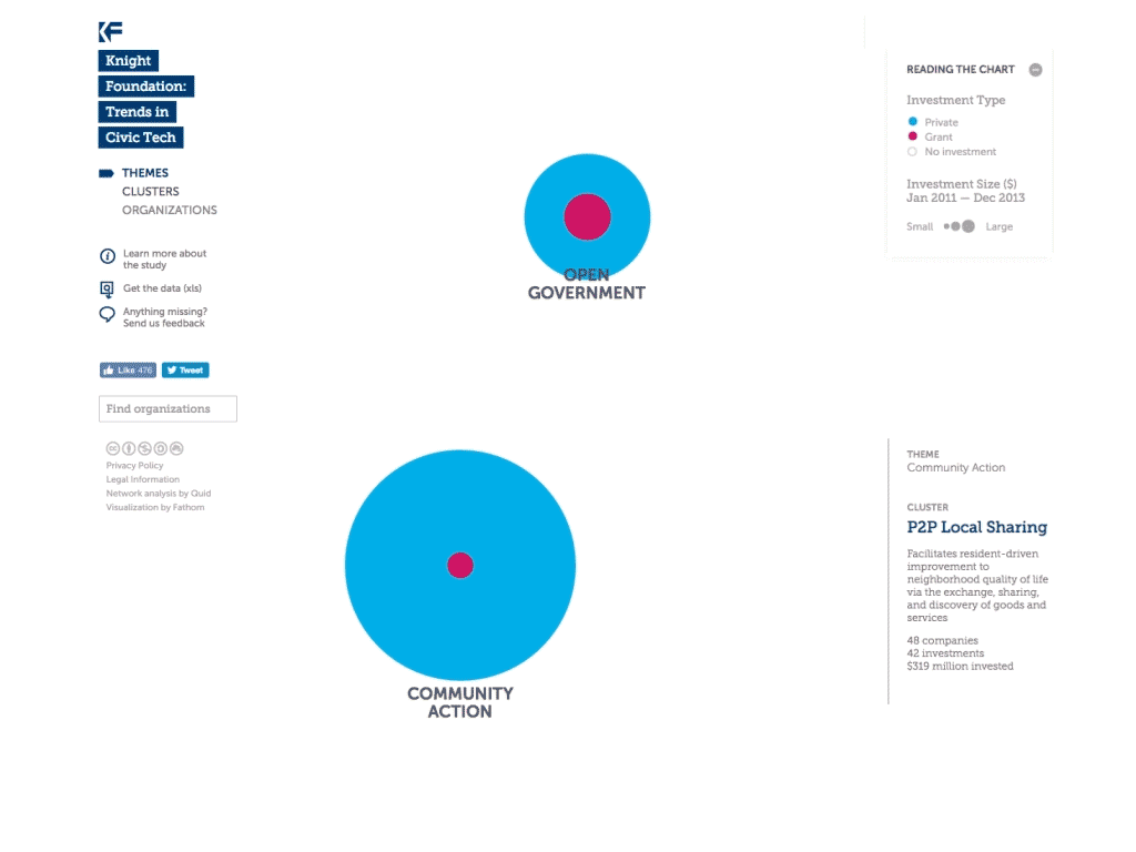
A second example of our process is a project commissioned by the Knight Foundation. In conjunction with research they conducted on the evolving civic tech landscape, we created an interactive visualization that allows users to explore over $695 million of investments across 241 organizations. The resulting piece on their site turned their traditional SlideShare approach into something engaging and exploratory. We were pleased to hear a year later that the project has continued to have exceptionally high levels of engagement in terms of number of visitors and time spent on the site.
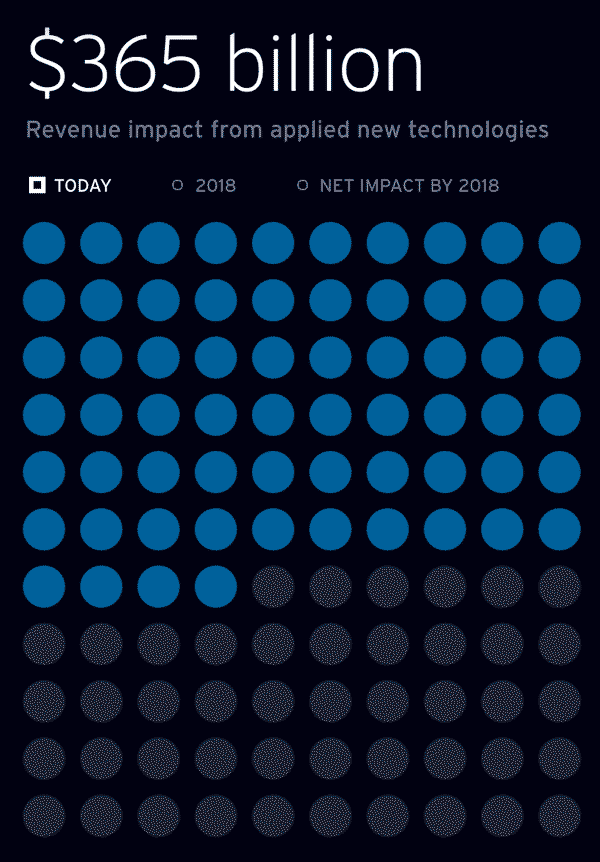
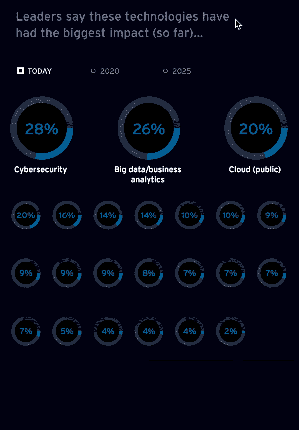
More recently, Cognizant's Center for the Future of Work conducted a study of digital impact on business, and asked us to create an interactive tool that executives, journalists, and others could mine for information relevant to them. Traditionally, this type of material is released as a white paper, so we were challenged to present that research in a different, compelling, and understandable format for a broader audience. For Cognizant, we focused a lot of attention on how to create a smooth experience for a business leader accustomed to reading traditional reports. When a reader feels confident that they clearly understand the data, they might be encouraged to share what they're learning and continue to spread the information.
With all pieces that complement a report, the emphasis is on showing more than telling — interactive graphics with brief accompanying text rather than long paragraphs and static charts. How do you visually demonstrate your argument, rather than constructing it from paragraphs of text alone? The best interactive graphics may even replace the white paper or traditional report, but that's not always (or even usually) the point: more often, we hope to guide the viewer from initial engagement with the data to greater involvement.
Check out all three projects here:
The Knight Foundation: Civic Tech
We’d love to hear what you’re working on, what you’re curious about, and what messy data problems we can help you solve. Drop us a line at hello@fathom.info, or you can subscribe to our newsletter for updates.