
ProPublica
I spent my first month at Fathom diving into the world of wrongful convictions. I was so amazed, and shocked, when I read the draft of the ProPublica article, Busted. It was an engaging piece to read, but even more exciting to look at the data that supported the article. I found it incredible that all these variables existed—plea date, lab date, lab result—yet at each step a system failure still occurred.
Once I got used to the legal lingo, one of the most interesting parts was deciding which variables to use. Even while narrowing the scope to temporal variables there were numerous: filing to plea, filing to lab, filing to dismissal, plea to lab, plea to dismissal, plea to now, lab to dismissal, lab to now, etc.
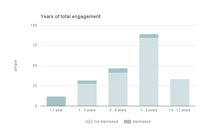
Trying to organize and understand these variables in a way that made sense was challenging. It helped to identify the points in the article that were complicated. For example, the sequencing of events was crucial to the story, yet utterly confusing because at each stop the proper order was reshuffled.
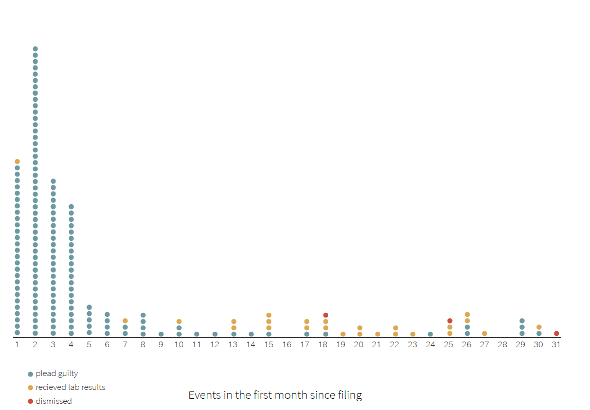
In the short span of the ProPublica piece I got to experience and participate in the Fathom workflow. The article provided the background and research for the piece, but the data was everything—it revealed the complexities and supported the widespread nature of the narrative. The data was where the team started before jumping into portraying the narratives of time, demographics, and sequencing. Through the ProPublica immersion, I came to fully understand the importance of iteration, because it happened at every step: data cleaning, variable calculation, analysis, development, design, and text editing until we reached the final.
Women’s Equality Day
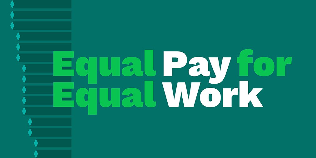
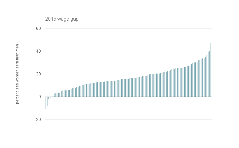
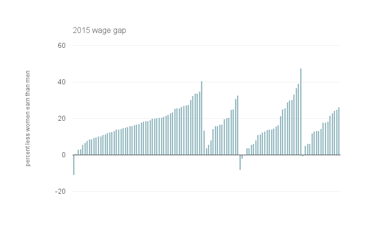
I also worked with Olivia and Paul on a piece for Women's Equality Day—August 26—not every day as we would like. Using national data on job earnings, we analyzed the idea of equal pay for equal work. People often throw around the phrase “women make 81 cents on the dollar” or “78 cents on the dollar,” but we wanted to nuance that figure in order to show what women really earn at the same jobs as men.
The data is very granular; job titles get as specific as “extruding, forming, pressing, and compacting machine setters, operators, and tenders.” However, despite the detailed 550+ occupations each year in the original data, only about 100-115 have annual reported data for both men and women. Even with this decreased data pool, we had some interesting findings. In 2015 alone, women in only 5 of the 119 jobs made more or equal to their male counterparts. Additionally, it’s right to question the generalization that women make 81 percent of what men make for the same job. In 2015, women made anywhere between 56 and 111 percent of what their male counterparts made.
In 2015, the 5 jobs where women made more than their male counterparts were:
- bookkeeping, accounting, and auditing clerks
- police and sheriff patrol officers
- office clerks, general
- data entry keyers
- wholesale and retail buyers, except farm products
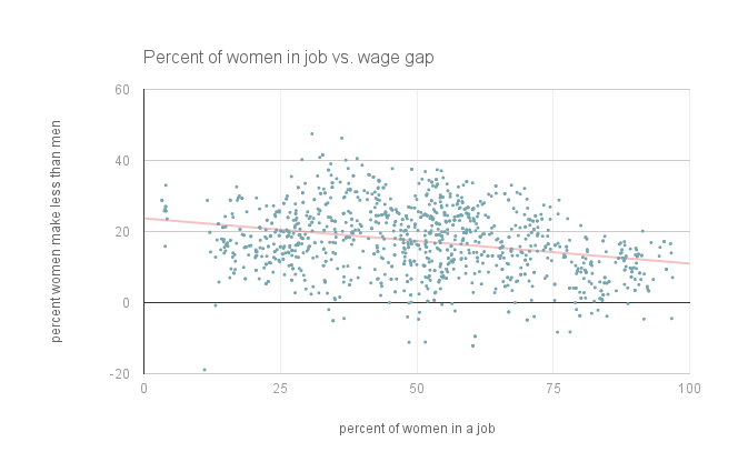
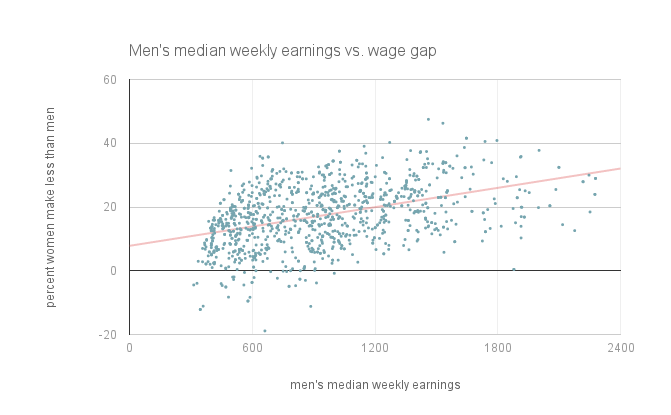
Some additional trends I spent time exploring were the relationship between the percent of women in a job and the wage gap, and the male salary and the wage gap. Neither of these have an absolute, linear correlation, but both have significant relationships. There is a negative relationship between the percent of women in an occupation and the wage gap, meaning that jobs with a larger percent of women may have a smaller pay gap. On the contrary, there is a positive relationship between the male weekly earnings and the pay gap, suggesting that positions with higher pay for men have a greater gap. Neither of these relationships show causation however they do reveal correlation of a few the many factors regarding gender inequality in the workplace.
Sea Level Rise
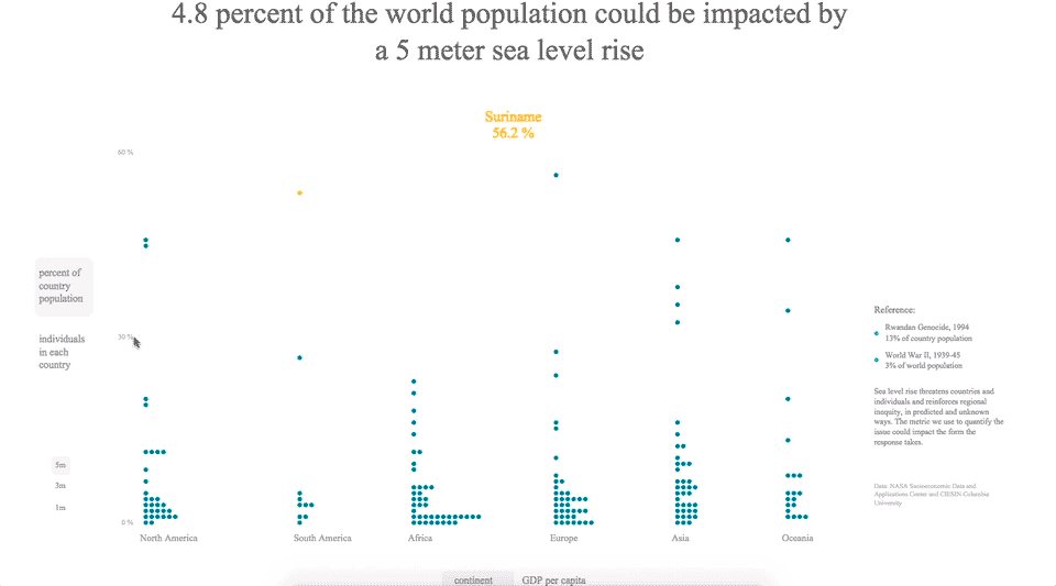
The final project I worked on this summer was independent research on sea level rise. I first became interested in this topic within the field of international law with the idea that there are not existing structures to handle climate refugees and disappearance of parts of, or complete, nations.
I started my research by scoping the existing data, and settling on data from the NASA Socioeconomic Data and Applications Center (SEDAC) at the Center for International Earth Science Information Network at Columbia University. This source provided country-level data for the variable “percent of country population living under a certain elevation.” I used this variable as a prediction for the people who would be impacted by sea level rise even though not everyone would be equally affected due to the uneven nature of sea level rise and different mitigation capabilities. I selected this variable for 1 meter, 3 meters and 5 meters given the incremental and unknown aspects of sea level rise.
Once I started looking into the relationships between countries and regions given the percentages, one of the first calculations I made was the conversion from the percent of the country population to the raw number of people. This started to shape the direction of my research because the countries with the highest percent of the population affected were not those with the most people impacted.
I think the metric we use to quantify the effects of sea level rise can alter the perceived danger, and change the narrative regarding the mitigation and adaptation response. Focusing on the percentage of the country population values the nation, culture, community, language, history, and heritage. On the other hand, quantifying the population that would be impacted recognizes the individuals, families, and lives affected. Both are important, and I will carry this question of how the metric changes the response into future research.
Another aspect that interested me from the data was which regions or countries would be the most impacted. In conjunction with this I wanted to incorporate the variable of development, which impacts a country or region’s ability to mitigate or adapt to the impacts of sea level rise. In my final visualization I decided to use GDP per capita as this indicator.
Only after I’d identified these themes from the data did I start the design process. With the goal of a communication, jumping off piece for future studies, I went through many iterations of how to portray the ideas I extracted from the data: metric of quantification, comparisons across countries and regions, regional trends of impact and development.
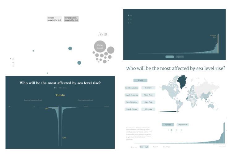
I cycled through many versions and considerations: how to show the difference between the country’s percent and raw population, how to ground this idea in geography, how to incorporate geography and regional trends by abstracting away from a traditional map, how to preserve comparisons across countries and across regions, and more.
The final design I landed on was something that (I hope):
- grounds the viewer in some sort of geographic reality
- shows the relationship and differences between the percent of the population impacted and the number of individuals impacted
- provides an alternate view of the same information that incorporates the regional trends in GDP per capita
- shows the different sea levels: 1, 3 or 5 meters
This piece is still a work in progress, but it combines the research, data analysis, design, and coding that I have worked on for the past few months.
This summer has been an amazing, enlightening experience working with the Fathom team to study, create, and ponder representations about complex topics in our world.
We’d love to hear what you’re working on, what you’re curious about, and what messy data problems we can help you solve. Drop us a line at hello@fathom.info, or you can subscribe to our newsletter for updates.