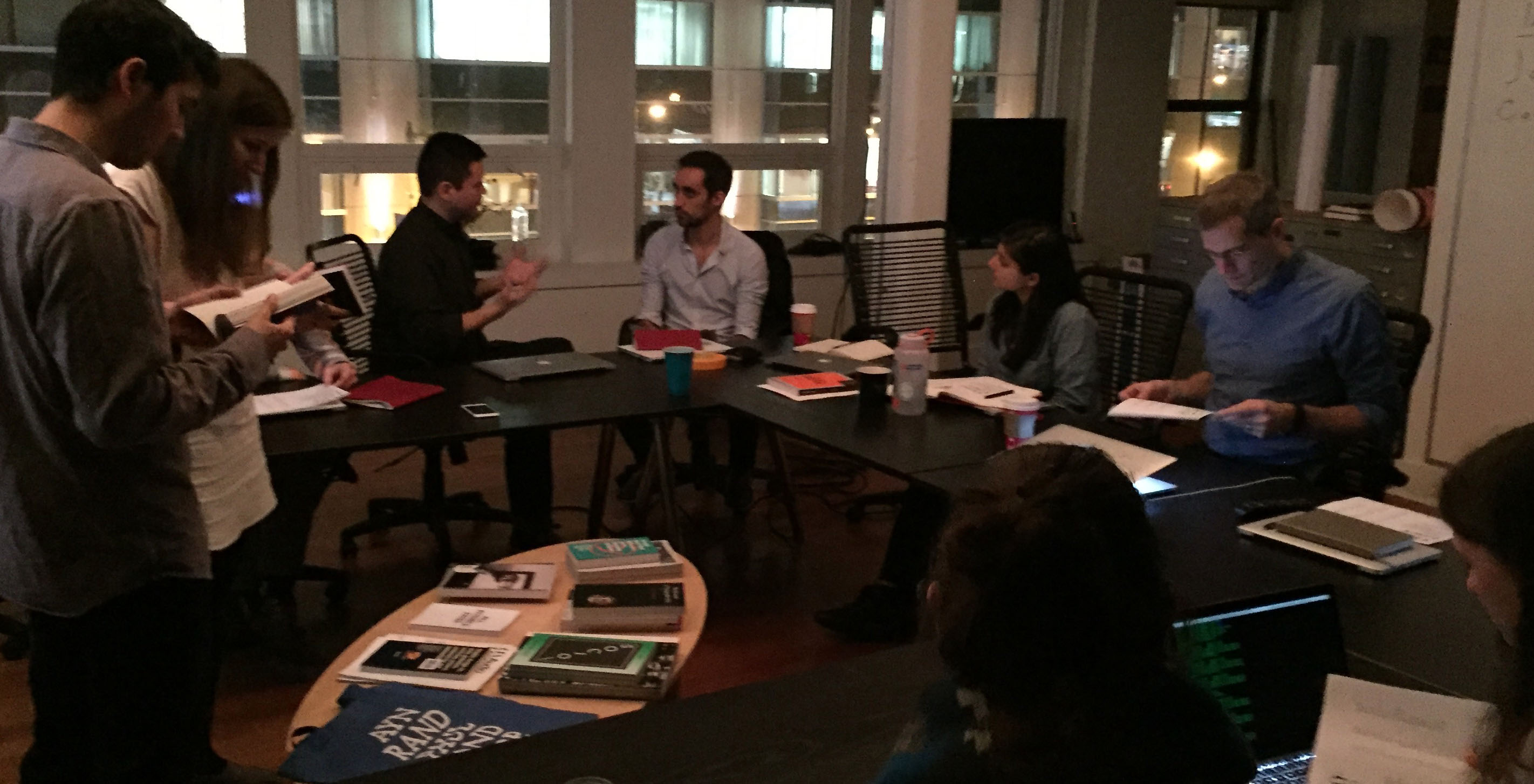

Typography has become part of the public consciousness like never before. An ever-increasing variety of people, aside from graphic designers, are discussing Kerning, rags, and favorite (or most hated) typefaces. This dispersion of design across a variety of audiences resonates strongly with Fathom, as we intentionally pursue projects that cross creative domains.
Recently, several Fathomistas with strong coding backgrounds requested an internal design workshop to share knowledge and skills, specifically about typography. One particularly vocal proponent, Jose, is a recovering architect studying at the Harvard Graduate School of Design. So, with a nod toward this interdisciplinarity and our own recent explorations in 3D space, the "Architecture of Typography" workshop was born.
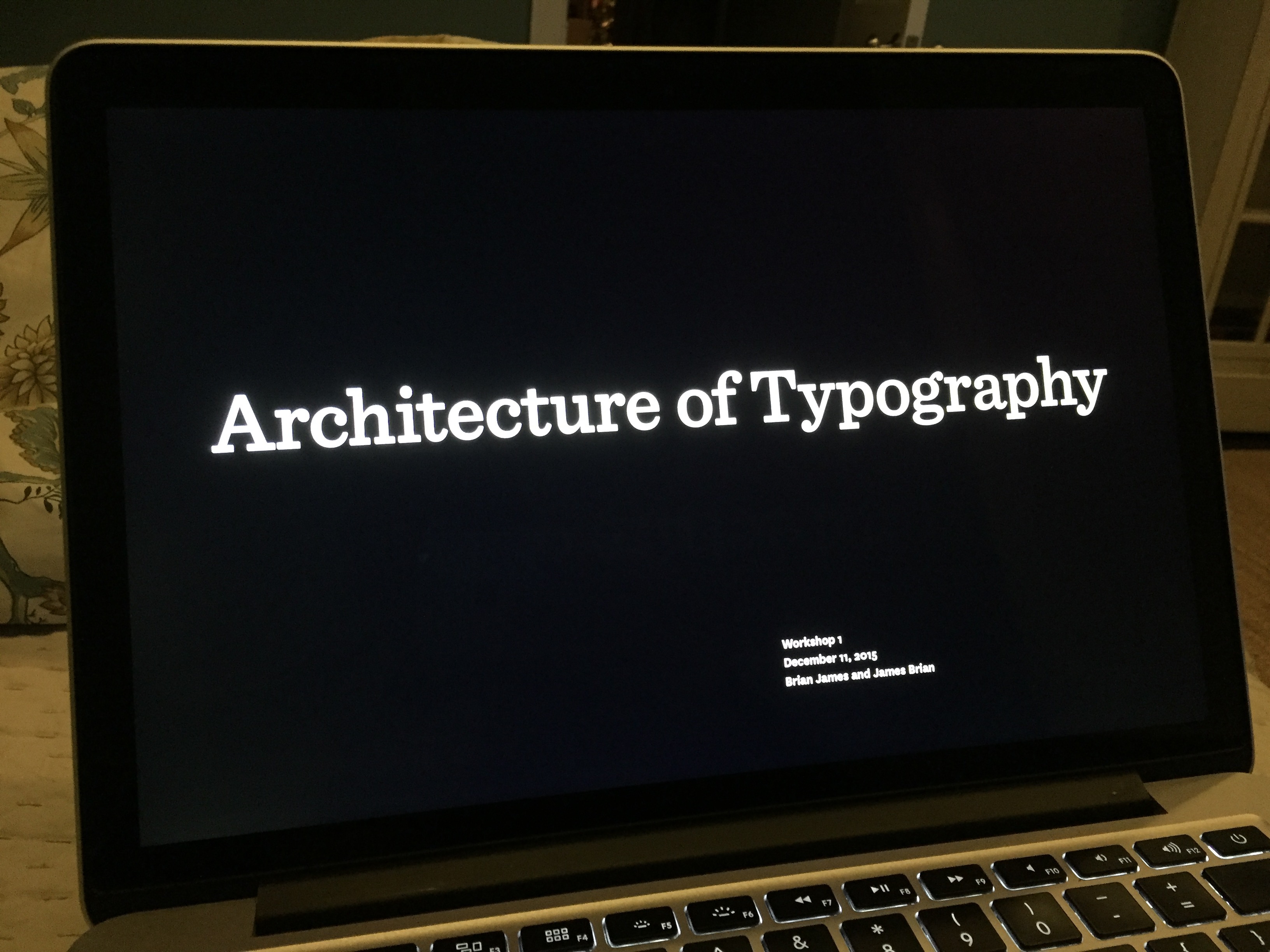
James and I, former classmates, offered to relive our design school glory days and lead the workshop. Studio interest was split between applied typography and design theory, so we divided it into two segments. The challenge was to avoid overwhelming our audience with too much content, while providing a good balance of technical–formal advice and a basic context in which to discuss type. Fortunately this was just the introductory session!

James kicked things off with the essentials: the anatomy of type, and how to look at and describe a letterform. There are of course many rules and theories that can be applied to typography, but everything starts with seeing type in terms of its shape and structure. After a quick pop quiz, James covered specific tips for common tasks, like choosing an appropriate typeface, and the basics of a strong layout. Followed, of course, by pinning work to the wall for a large group crit .
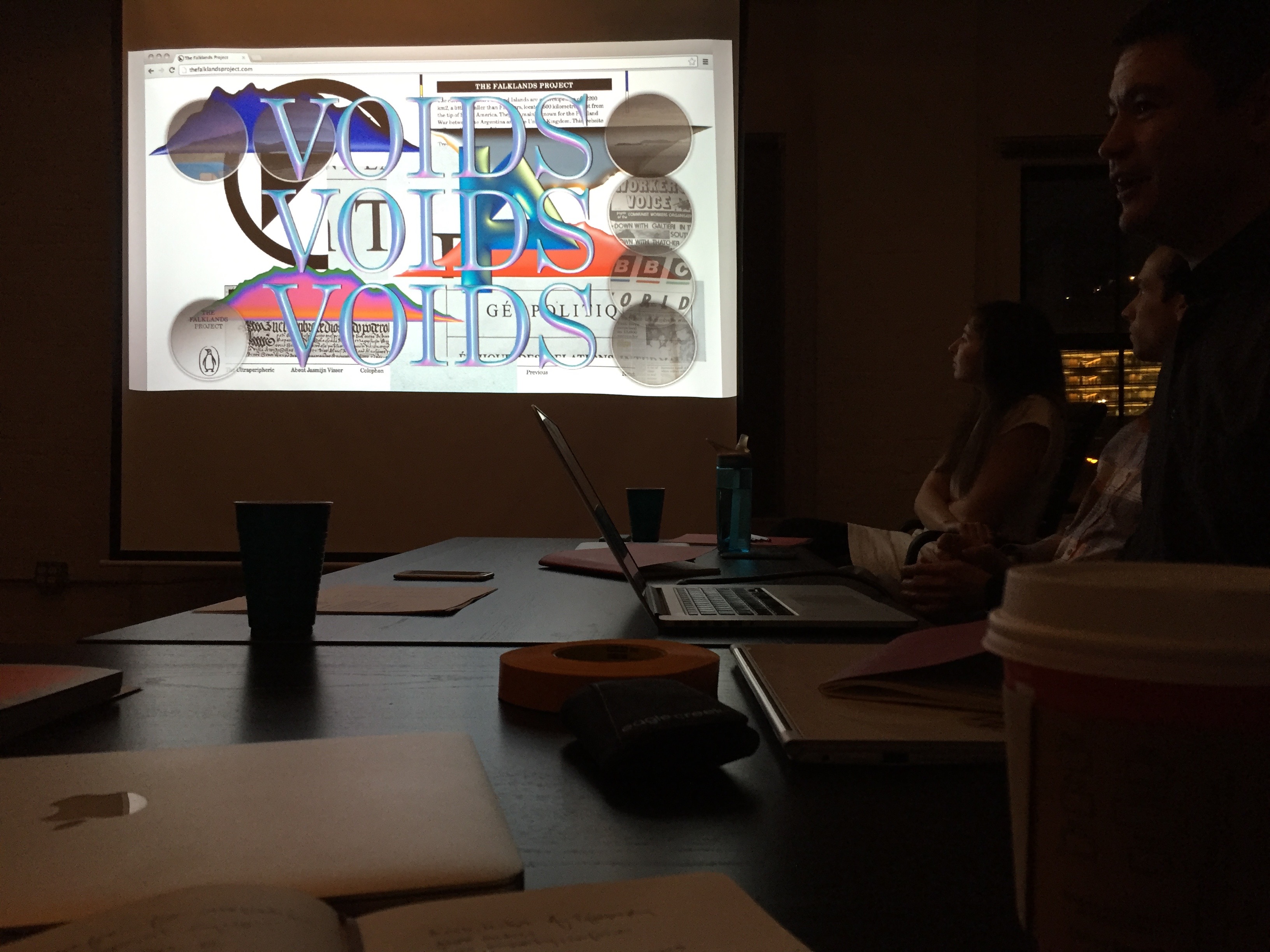
I picked up from there and led a brief historical overview of digital typography. It is already a cliché to say that computerized media tools have revolutionized design. But by discussing concrete examples of typographic evolution across recent decades, we hoped to find some threads toward understanding the current design climate, including many independently published “critical design” works. Plus, it was a chance to show off a few old issues of Émigré from the collection!
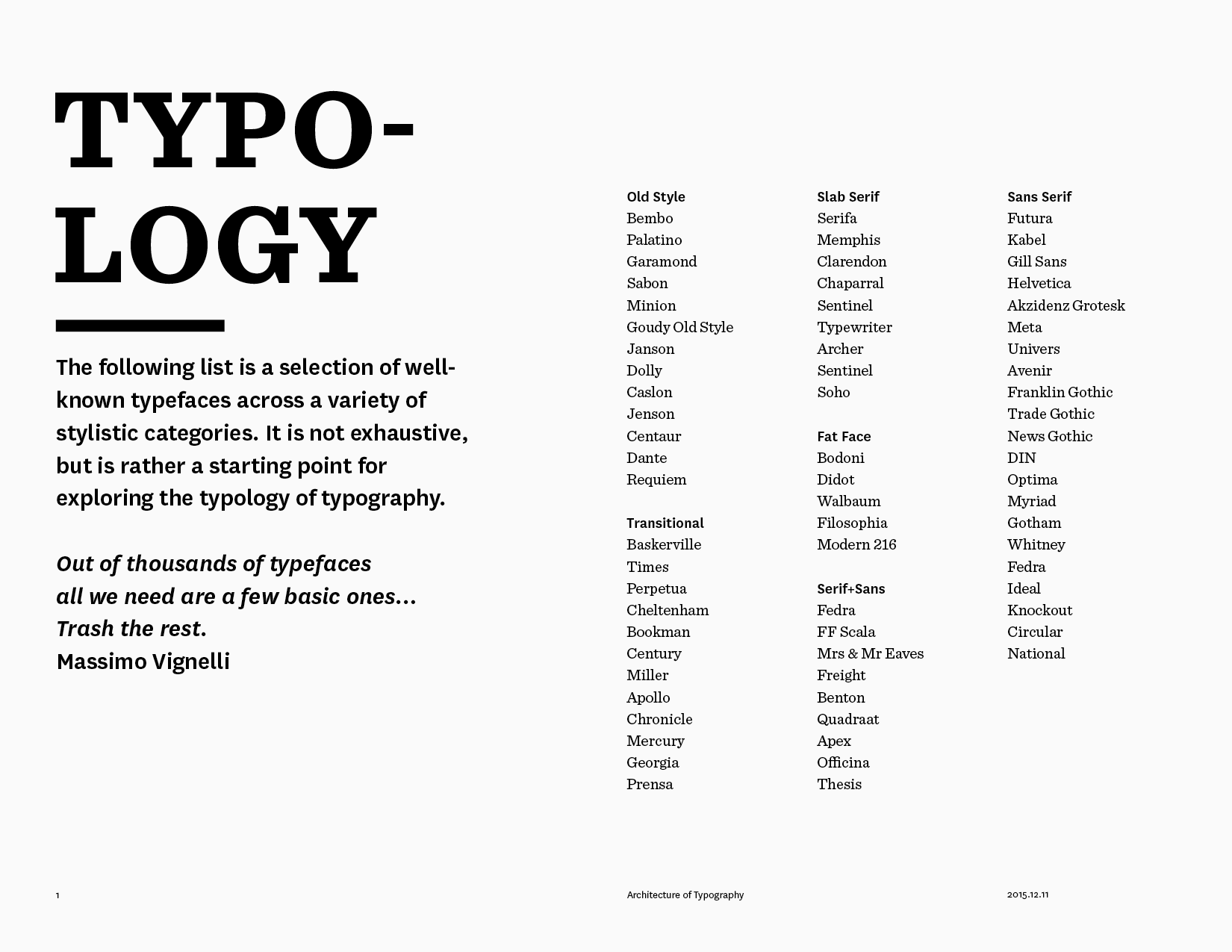
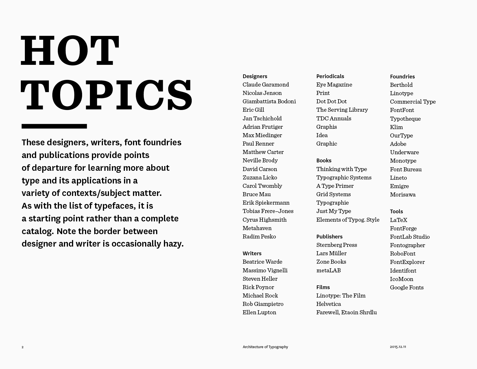
It was a whirlwind session. To be honest, we could have dedicated a semester’s worth of classes to exploring the issues raised in this one-evening event. But this introduction was an important part of our response to the current design landscape. Fathom’s hybrid approach to making, which cross-pollinates research, computation, and design throughout the creative process, is all the more relevant as audiences from various backgrounds become increasingly familiar with design and technological concepts.
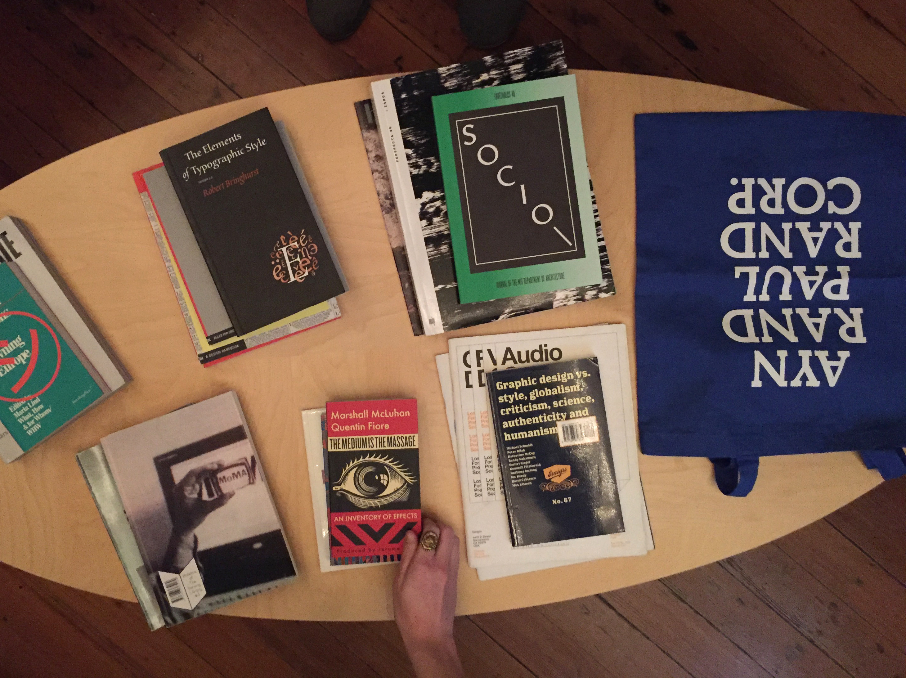
We hope to make this the first of a continuing workshop series, so stay tuned for more reports!
We’d love to hear what you’re working on, what you’re curious about, and what messy data problems we can help you solve. Drop us a line at hello@fathom.info, or you can subscribe to our newsletter for updates.