The Sabeti Lab | Sentinel
Viral Genomic Tools
With the support of the Sabeti Lab, we have built a suite of viral genomic tools to explore different research questions against the full global dataset of COVID-19 sequences.
Capabilities
- Large-scale data visualization optimization for the web
- Front-end design and development
- Rapid prototyping
- Building expert level tools for scientists
Challenges
- How can we enable virology researchers to work with
the entire global COVID-19 sequencing dataset when asking questions? - How can we bring visualization upstream in the reasearch pipeline?
Achievements
- Created a suite of tools that allow researchers to dive more deeply into specific questions
- Built and maintained a robust pipeline and API to support all of our COVID-19 research and tools
One of our key goals when building tools is to bring visualization further upstream in the research process. For example, how can it be part of the way researchers explore and understand their data—and make better use of data that is continually changing and being updated—instead of just "final" outputs for a report or presentation?
After building the initial Banyan tool for exploring the entire dataset, we worked with researchers to identify key areas of interest that required further, more refined tools. Each of these applications addresses a smaller set of questions with a more tailored interface, but is still backed by the full global dataset.
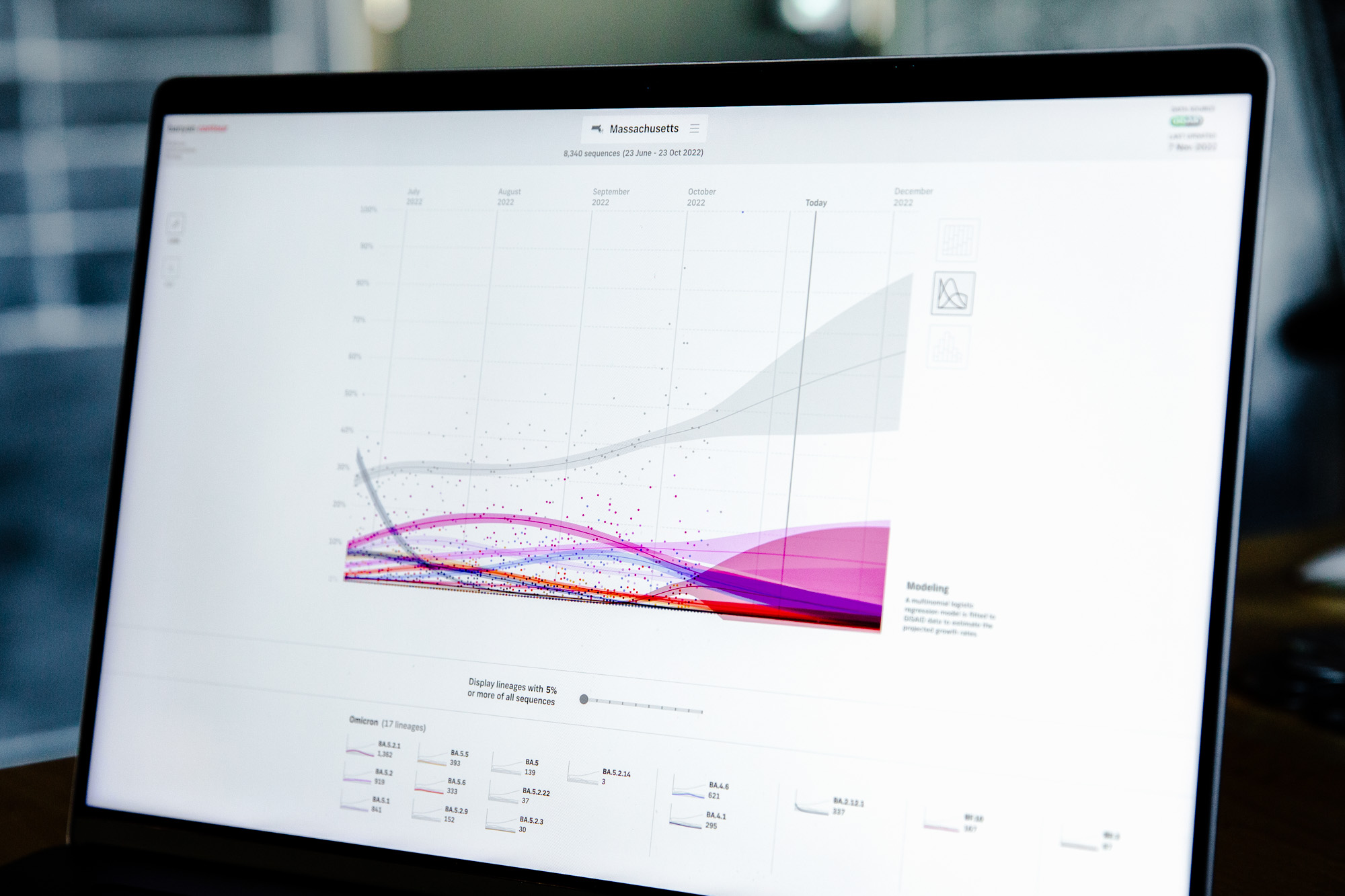
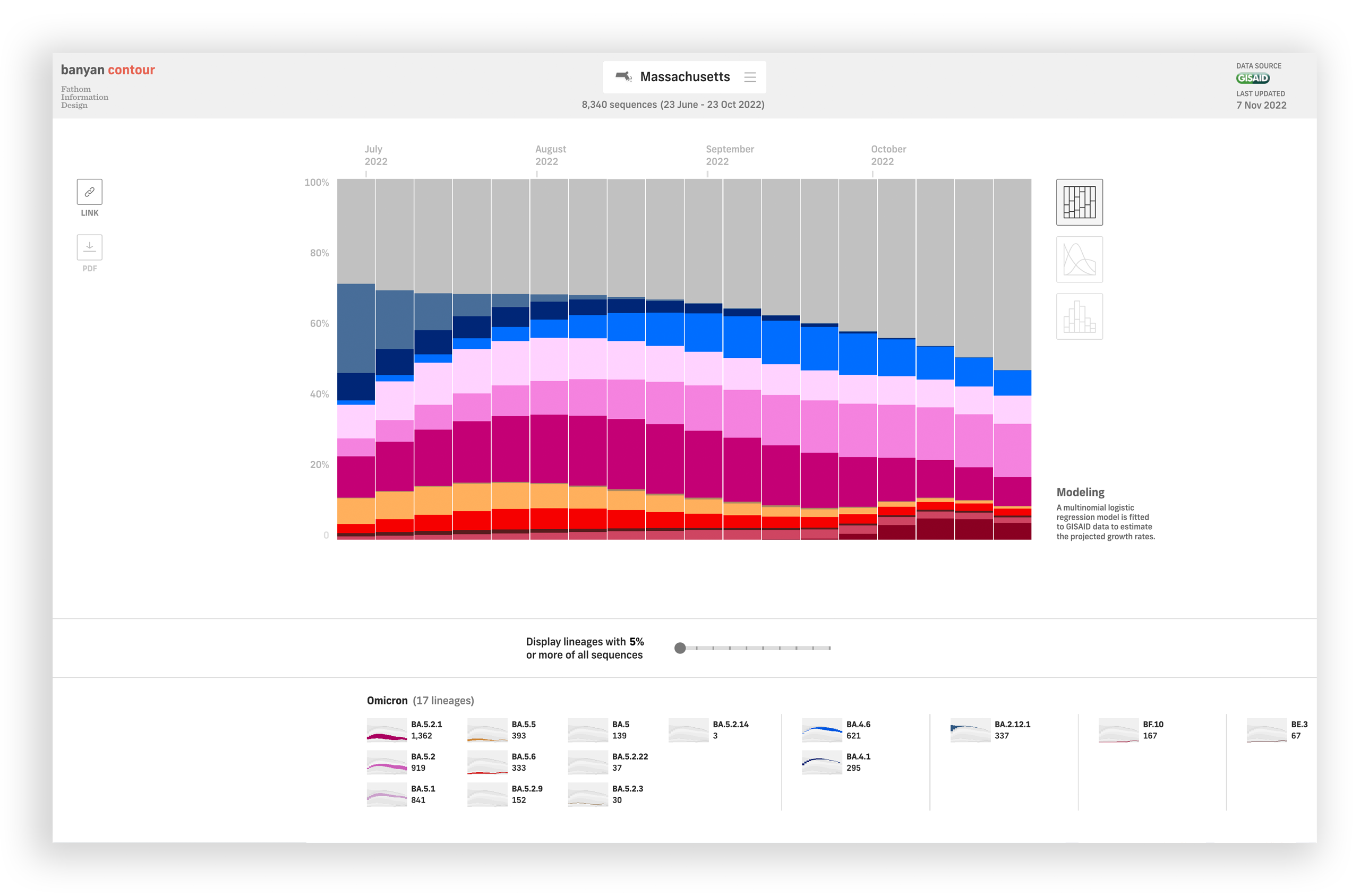
Contour
With Contour, we designed three views to help users understand a recent snapshot of the current situation. As testing efforts decline and no longer accurately represent what is going on, we track current and projected trends with the help of modeled data. Users can choose to focus on percentage distributions of lineages, trend projections, and raw case counts within a four month timeframe. Users can also browse among 217 countries and U.S. states to look at the presence and fluctuations of different lineages in different parts of the world.
Crosscut
In some situations, a historical overview brings more clarity and perspective. Whether it is two weeks or since the beginning of the pandemic, Crosscut gives users the option to customize a date range that suits their needs.
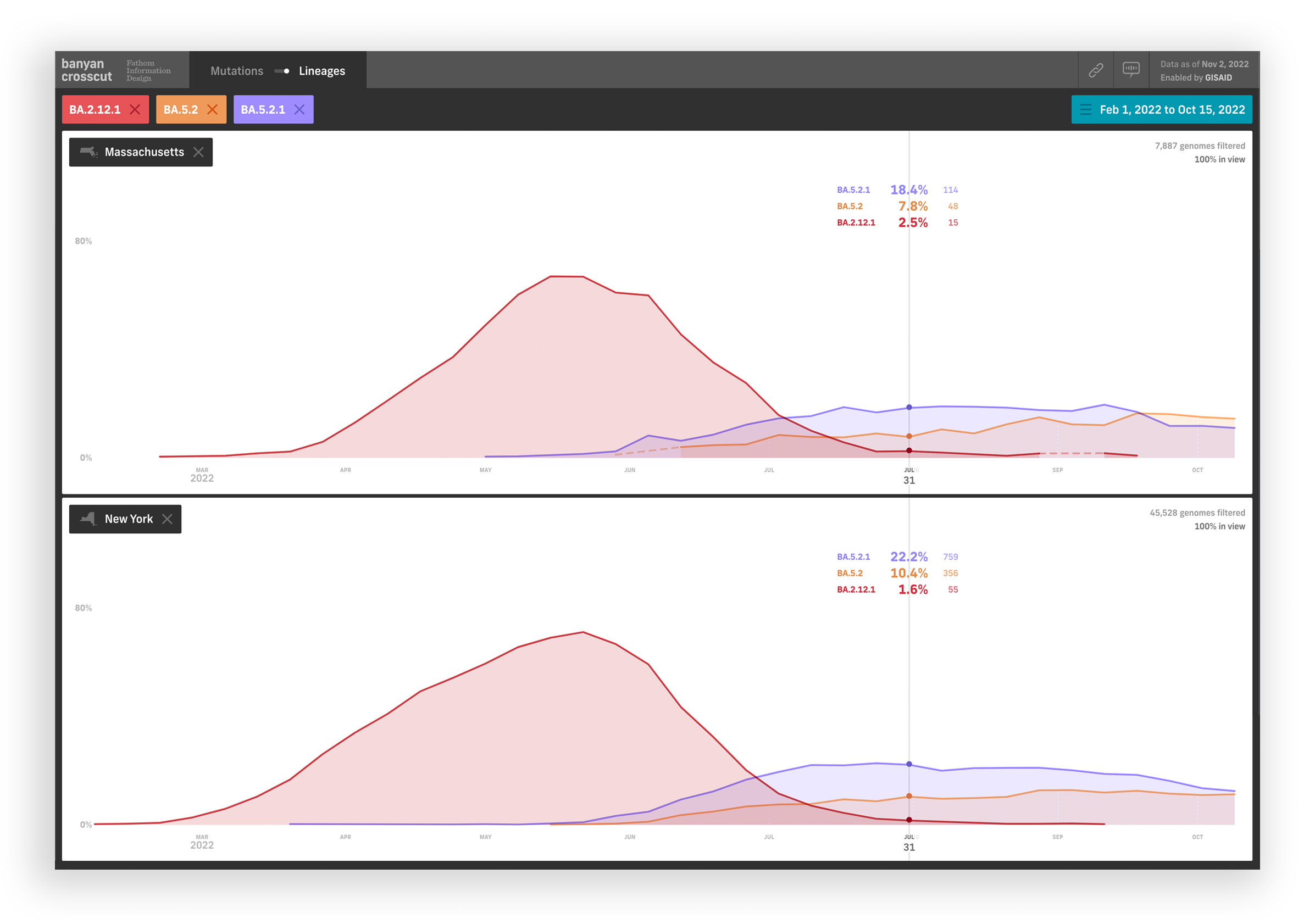
Users can toggle between mutation and lineage views, and filter by countries or states to look at how COVID-19 has changed at a global or national scale. The split screen interface lets users load up to two countries or states and slide across a synchronized timeline to easily compare trends and overlaps. This is particularly useful for understanding the emergence of mutations in lineages — did mutations appear around the same time? In what order did mutations appear after another?
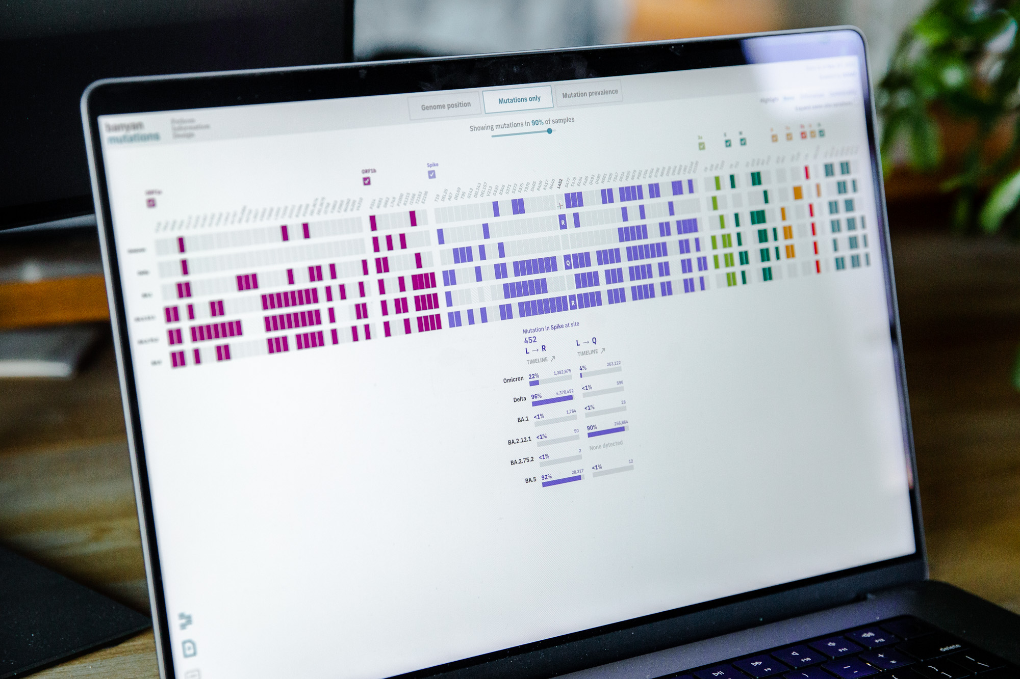
Mutations
For deeper variant analysis, users can use Mutations to select specific lineages and look at where in the genome mutations have occurred and their prevalence. Users can also upload their own sequences and compare mutations between their sample and the consensus of different lineages.
Working with researchers, we identified three key ways that mutations are often viewed – plotted along the genome by actual position, in a grid format to compress space, and coloring the grid by mutation prevalence. We wanted to create a tool that would allow researchers to seamlessly switch between these different views to support discussions.
We also explored a radial version to support viewing on smaller screens. The compact radial interface gives the ability to fit many more mutations on screen. This was particularly useful for the omicron variant that has many more mutations compared to its counterparts.