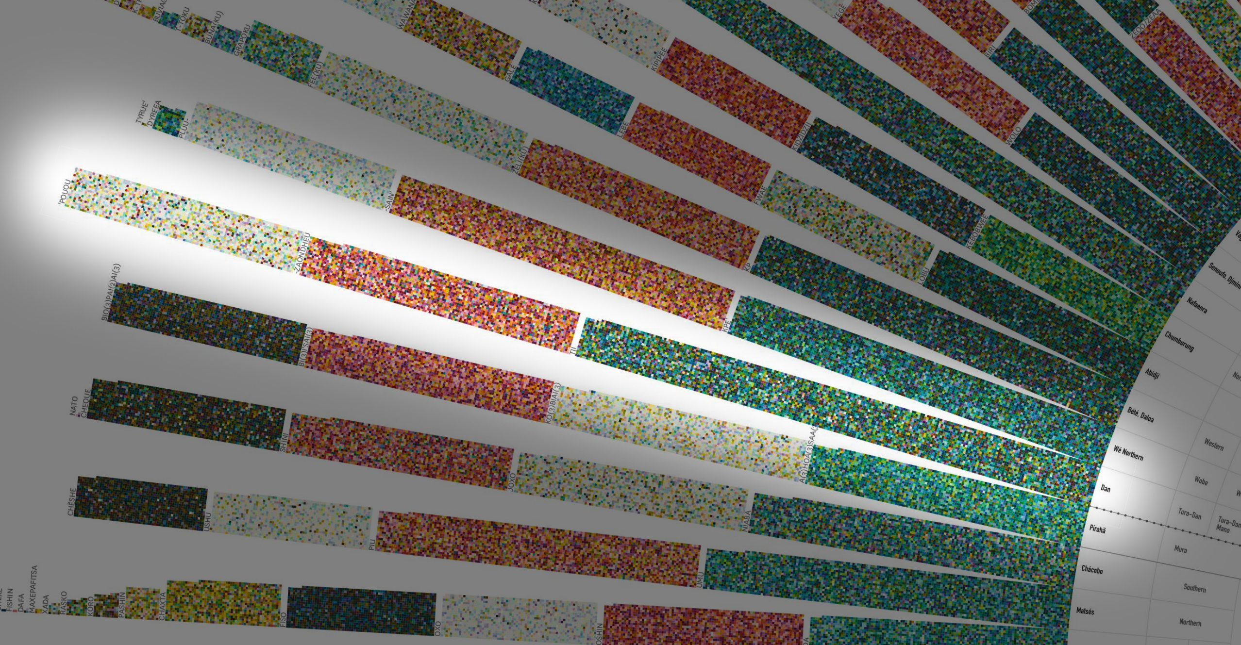
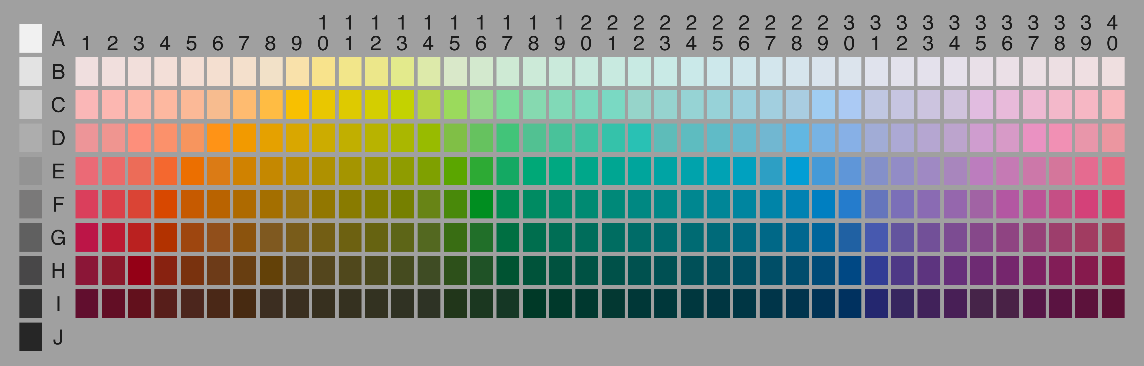
The World Color Survey (WCS) was an anthropological study conducted in the 1970s that used color to study the effect that culture may have on language. Field workers surveyed 2,696 native speakers, representing 110 unwritten languages, by asking them to name each carefully chosen set of color chips (many of which are difficult to categorize into our basic colors in English).
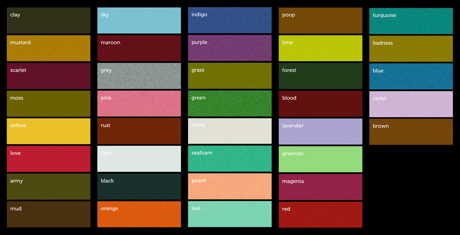
Terrence and I took the 330-question survey and found the results compelling. We expected that some colors would be closer in comparison to others, but didn't expect to have different words for the same colors.
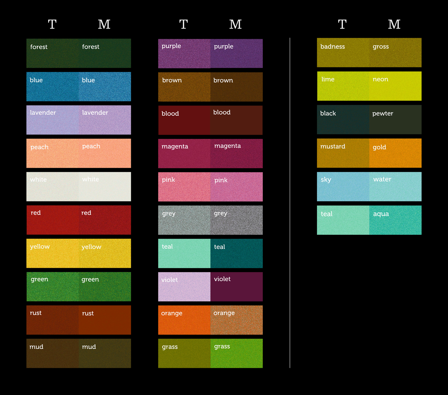
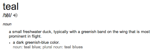
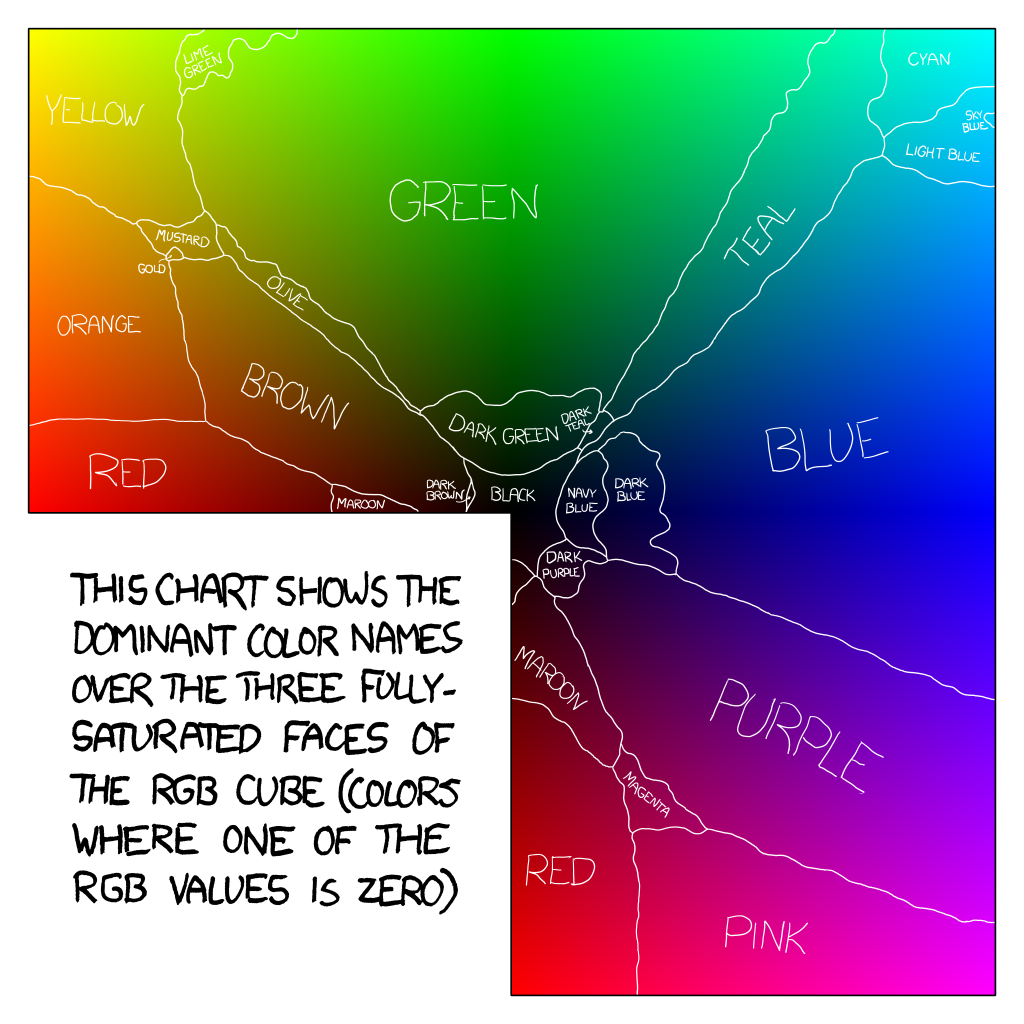
For the most part, my colors are consistently darker than his, possibly because I didn't name a single color "black". The two of us have very different ideas of what teal and violet are. After some investigation, my "teal" is closer to the dictionary definition of teal, but violet is more loosely defined as anything between purple and blue on the color wheel. No one here supports color brainwashing though — teal is whatever you want it to be!
We both made up our own names for the unappealing range of greenish yellows ("badness" and "gross"), and when it comes to light blues Terrence uses the the sky as a reference while I reference the water. This may be because I was a competitive swimmer for ten years so I've always felt some innate connection to water.
Building the app
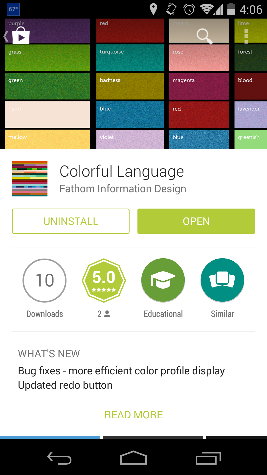
When I arrived at Fathom, Ben and Terrence approached me with an idea to take the WCS one step further. They wanted to create an app that would make it easy for anyone to take the World Color Survey. The main difference from the WCS is that our app focuses on how people name colors differently within the English language. For example, what I call teal is different from Terrence's definition of teal.
I built the app in Processing for Android, along with some Android and Java libraries, as it seemed like the easiest route given my previous experience with Java. It was convenient to be able to pull from any of the libraries and implement the same thing at least two different ways, but at times it was tricky to figure out which of those ways was best.
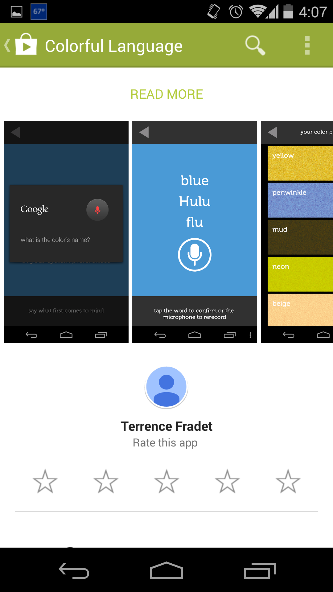
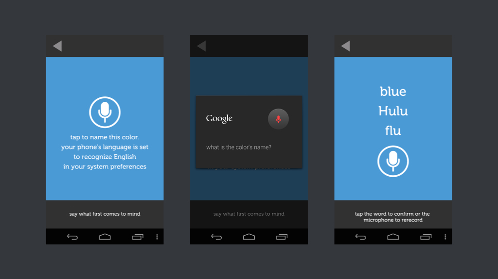
We chose to implement the survey using Android's built-in speech recognition. Speaking your responses makes the survey easier to complete, and it doesn't limit users to those who know how to spell. It is also closer to how the original WCS was administered, verbally and in person. Besides, it's fun to make people think you're crazy when you're on the train enthusiastically shouting colors into your phone.
"Blue."
"Aquamarine!"
"MAUVE!!"
I found a handy example for using Android's speech API, and then I was off! When you speak a color into the speech recognizer, the app suggests up to three possible words it thinks you said. The WCS looked for single word responses, so I coded the speech recognizer to return up to three possible words and then omit compound words or capitalized duplicates (the speech recognizer counts "blue" and "Blue" as different words). The app then displays the top three remaining results so one can be confirmed.
Aside from the obvious motivation to name 330 colors in the survey as a way to help us better understand human perception and culture, we considered ways to encourage users to complete the entire survey we created a live updating "color profile" that grows as you name more colors and acts as a UI element.
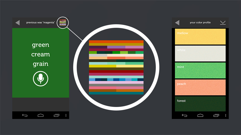
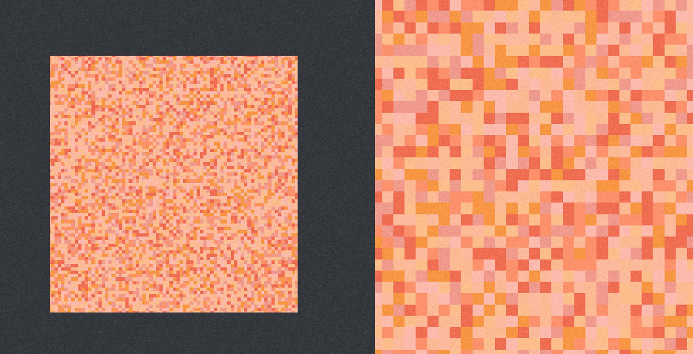
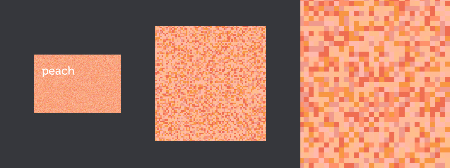
Each block of color in the detailed color profile is a pixel-by-pixel composite of each of the colors that were given the same name. From far away you can see what your average "peach" looks like, while close up you can see each of the different colors you've named "peach".
To create the color profile I had to regenerate and render a mini data visualization every time the user names a new color, essentially on every page. I very quickly learned the importance of efficient for-loops, especially when rendering such heavy images. To further improve efficiency, the app only downloads a user's color profile from the server when it is first launched. Once the app is running, it stores and updates that information locally as the user continues to name subsequent colors, and only sends updates to the server to keep it in sync.
We have more hypothesis we'd like to test so please, if you have an Android, download the app here and read our other posts about the color kit and the color "grue".
We’d love to hear what you’re working on, what you’re curious about, and what messy data problems we can help you solve. Drop us a line at hello@fathom.info, or you can subscribe to our newsletter for updates.