First, let's talk about the data
The data was culled from 6600 weather stations courtesy of the National Oceanic and Atmospheric Administration (NOAA). We used the Global Summary of the Day (GSOD) data, but every station had incomplete data, so we had to continuously adjust to the mosaic of stations to derive an accurate picture of temperature.
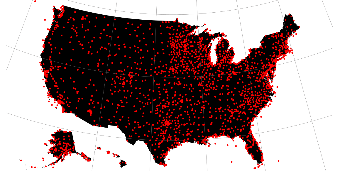
Starting with a list of US zip codes, we mapped out latitude and longitude using data available from ESRI. We used that to connect each anonymized FuelBand user’s zip code to the nearest weather station that contained daily weather data.
For the personal section of the site, we used more granular data sets provided by the National Climatic Data Center (NCDE), which contained hourly temperature information. Instead of using the daily NikeFuel numbers that made up the map, we broke down personal NikeFuel into fifteen-minute intervals à la YearInNikeFuel.com. With the lookup logic for zip codes already in place, we had already completed the code needed to link individuals to the nearest NCDC weather station.
Now, let's talk about the design
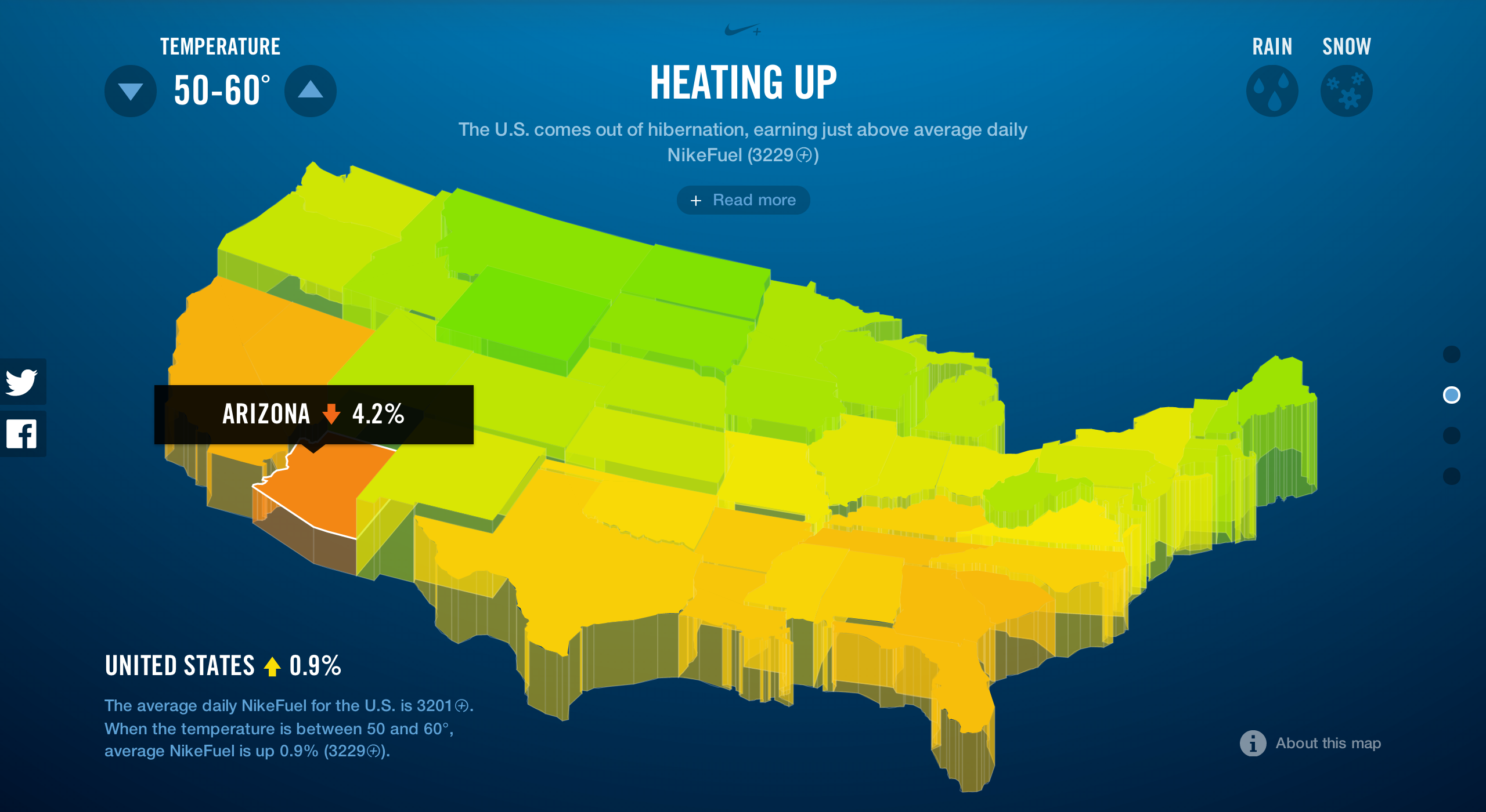
We presented the 3D map to Nike a while back, and they used it in some internal presentations. The original map was created in Processing, and output to movie files were made to work in a Keynote presentation. However, in order to make the map interactive in the browser — we wanted the state blocks to move up and down depending on the percent difference of an individual states' NikeFuel at a selected weather, and enacted a state outline and caption to appear over the individual states upon mouse over or tap — we had to recode from scratch.
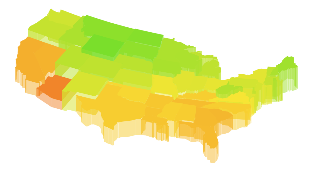
In deciding whether to use canvas or SVG to render the map, we figured that SVG would give us complex shape detection without additional code. But in order to create the 3d effect, we still had to build an SVG parser in JavaScript so that we could take apart the state shapes and create the sides. We got the concept to work, but it was far too slow: every frame rebuilt over 6,000 distinct shapes. The way to cut that count was to simplify the shapes, so we built a customized SVG shape simplifier and got the count down to around twelve hundred shapes. This seemed to be a good balance between speed and detail. After a bit of tweaking to get the states to stack properly, the rest was just a whole mess of JavaScript to get it to behave.
We kept all the additional UI elements as minimal as possible so that the map could be the hero element on the screen. It took many iterations before we were able to balance the amount of interactive elements and the amount of text on the screen. Images below show some of the more awkward attempts.
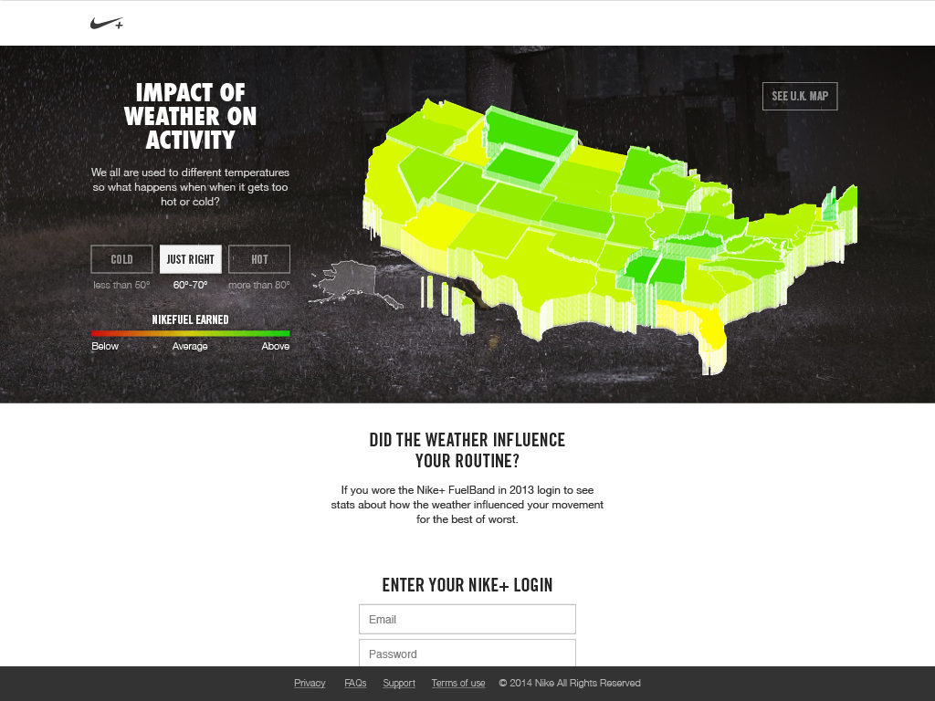
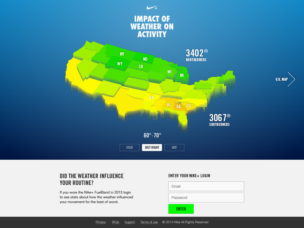
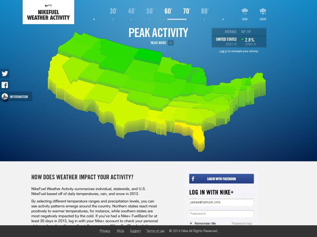
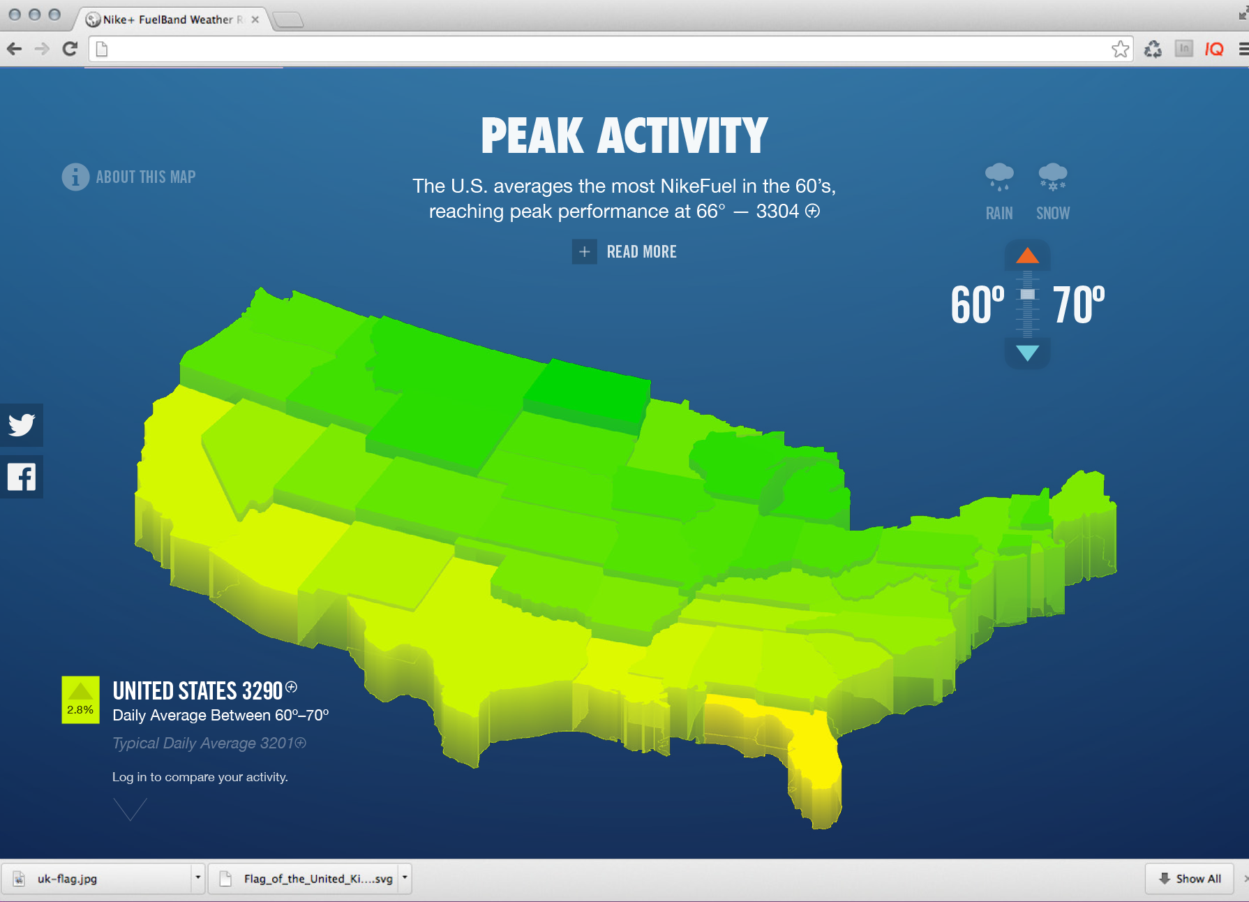
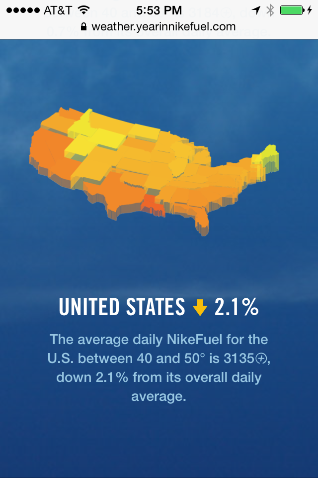
When we could see the clear divide between the northern and southern states at colder temperature ranges, we knew the 3D representation was an effective way to display regional stories and patterns. The individual states rising and falling based on average NikeFuel creates a sense individual state pride (or pity), as well as regional competition to see which states outperform one another under different weather conditions.
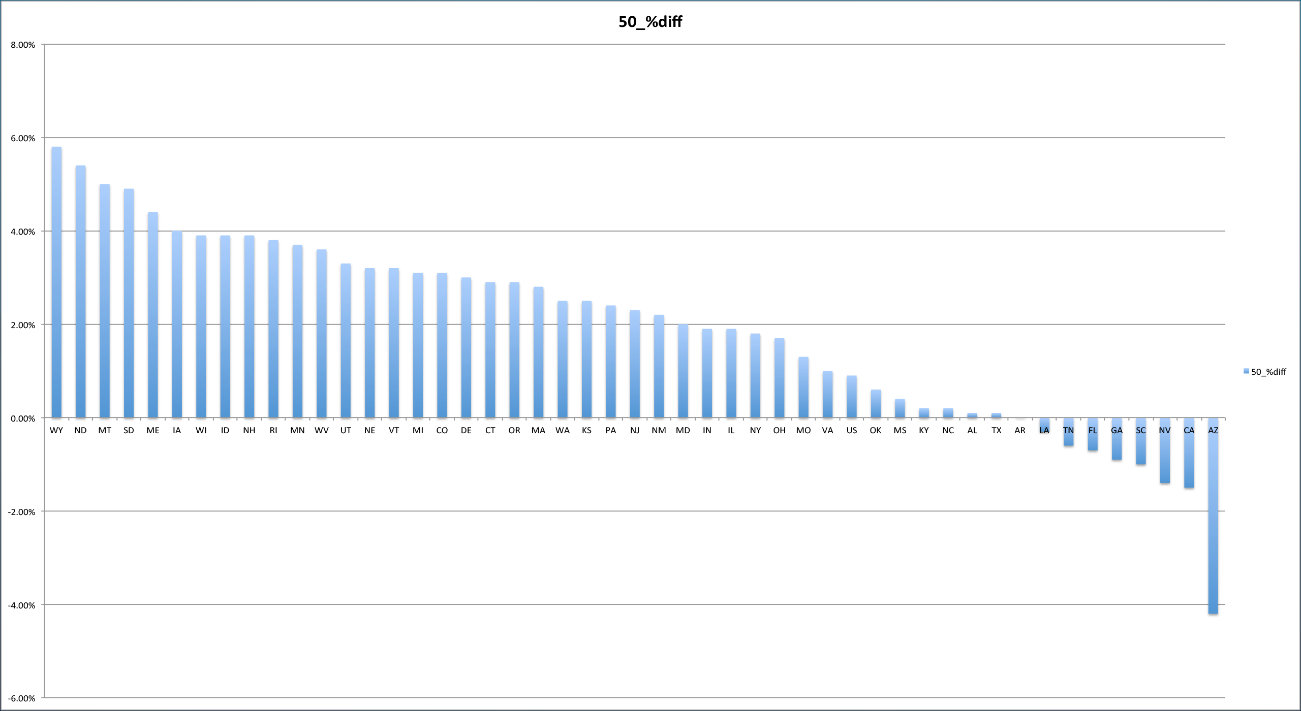
Our initial analysis looked at all the different temperature ranges as simple bar charts but, it would have been extremely inefficient to represent the data in this manner (never mind boring), because they would have essentially depicted lists of state rankings at every temperature range. The map distinguishes state and regional movement trends at every weather scenario, highlighting performance both within and between each region of the country.
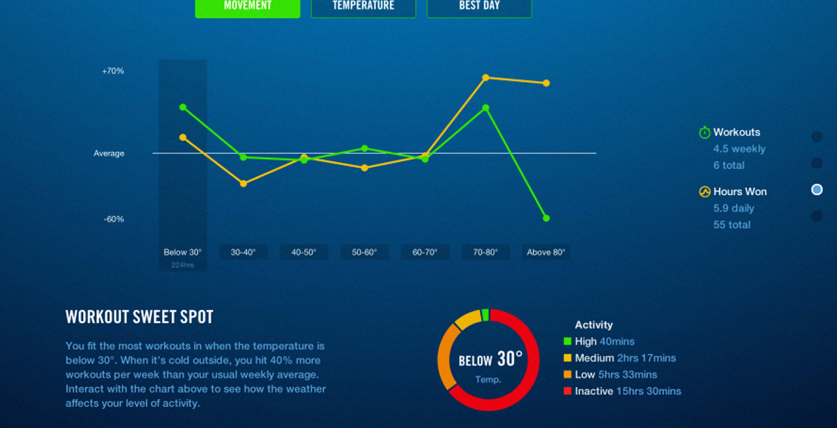
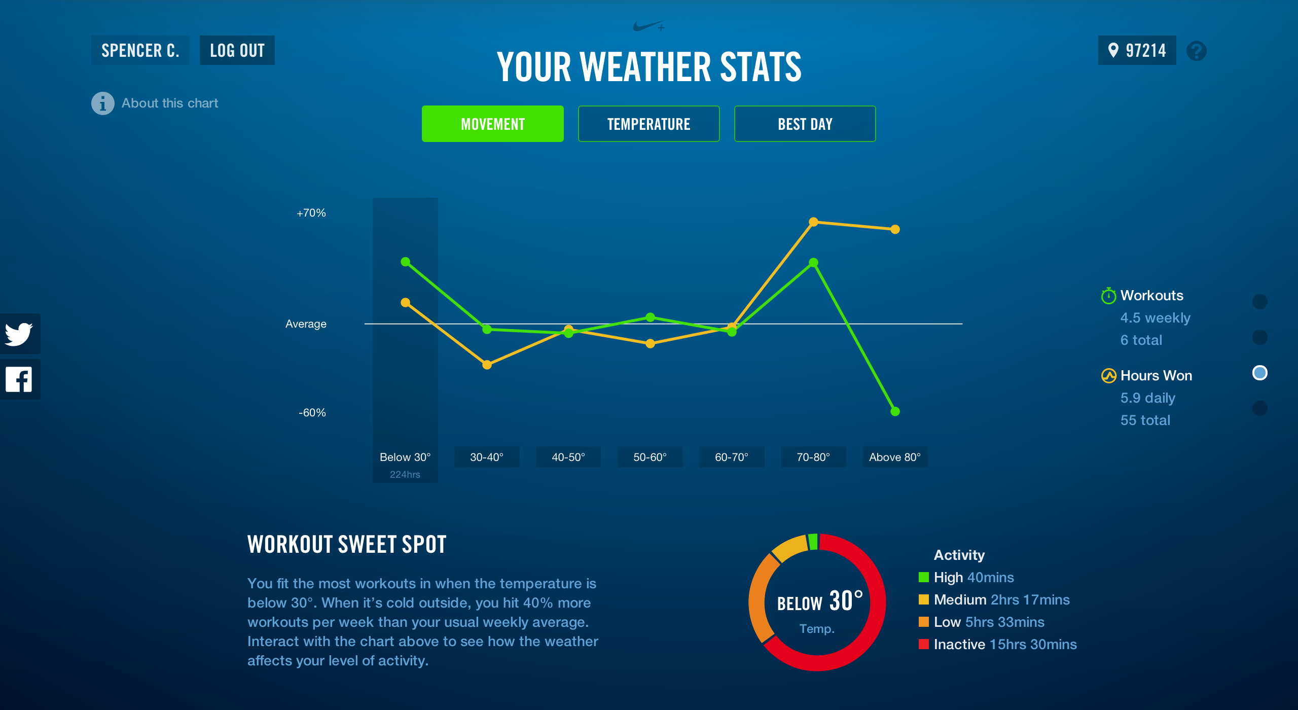
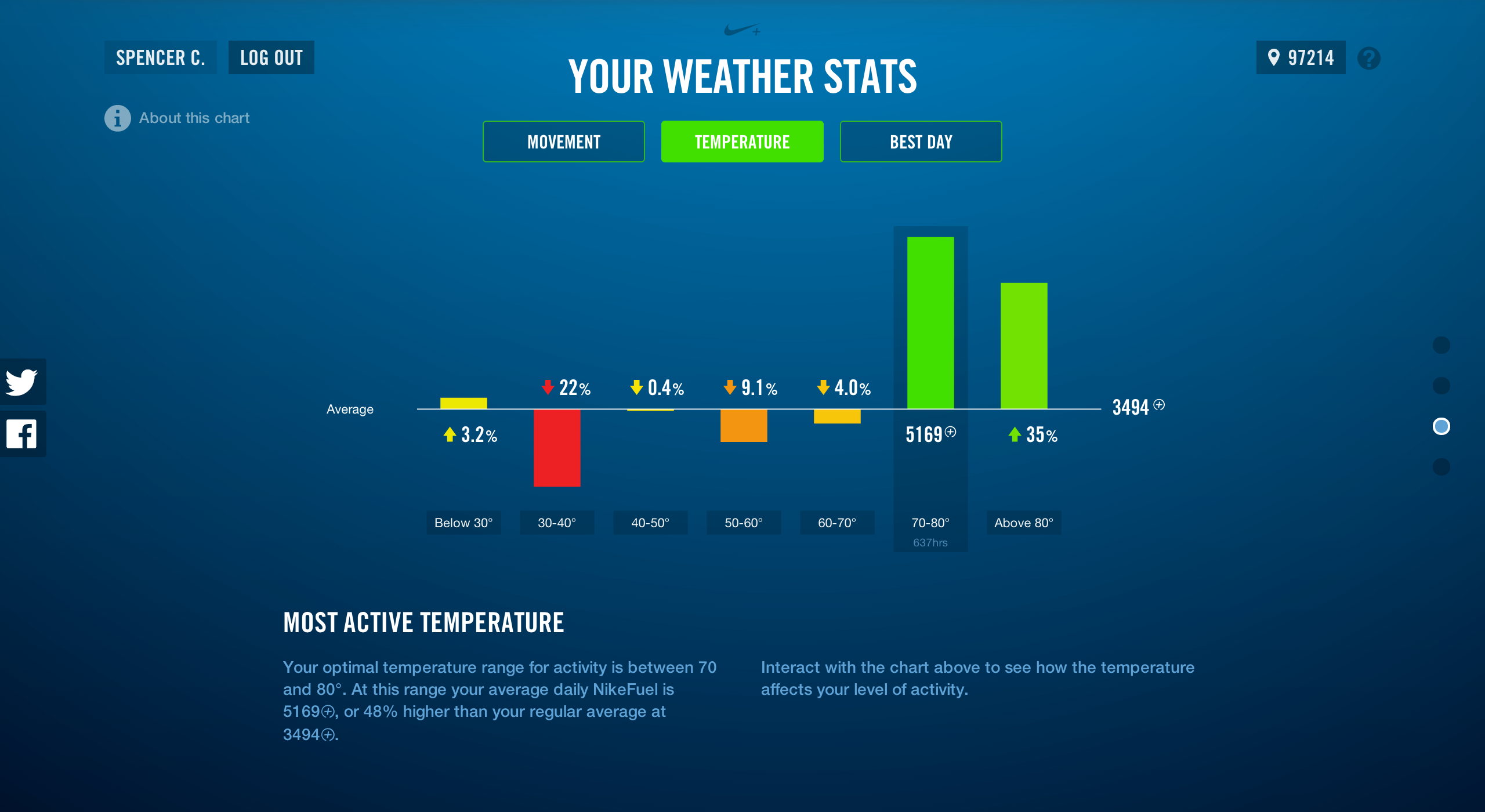
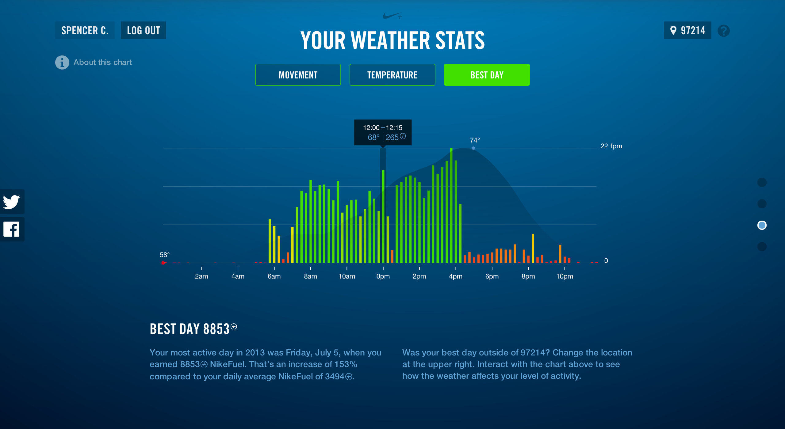
The personal data section also had its share of design iterations. For those of you with Nike+ accounts, you can log in to the section of the site "What weather moves you?" to see personalized information about how the weather impacts your daily intensity levels and frequency of workouts. We initially intended the personal section to be quite simple; just showing your personal best for activity and the percent difference based on your daily average NikeFuel. It seemed a bit too basic and was greatly overshadowed by the sophistication of the interactive map. We then over corrected a bit and started to look at an individuals' entire year of data compared to the temperature, intensity of activity and individual state comparison in one view. This seemed like a dashboard of too much information that most consumers did not want to see all at once.
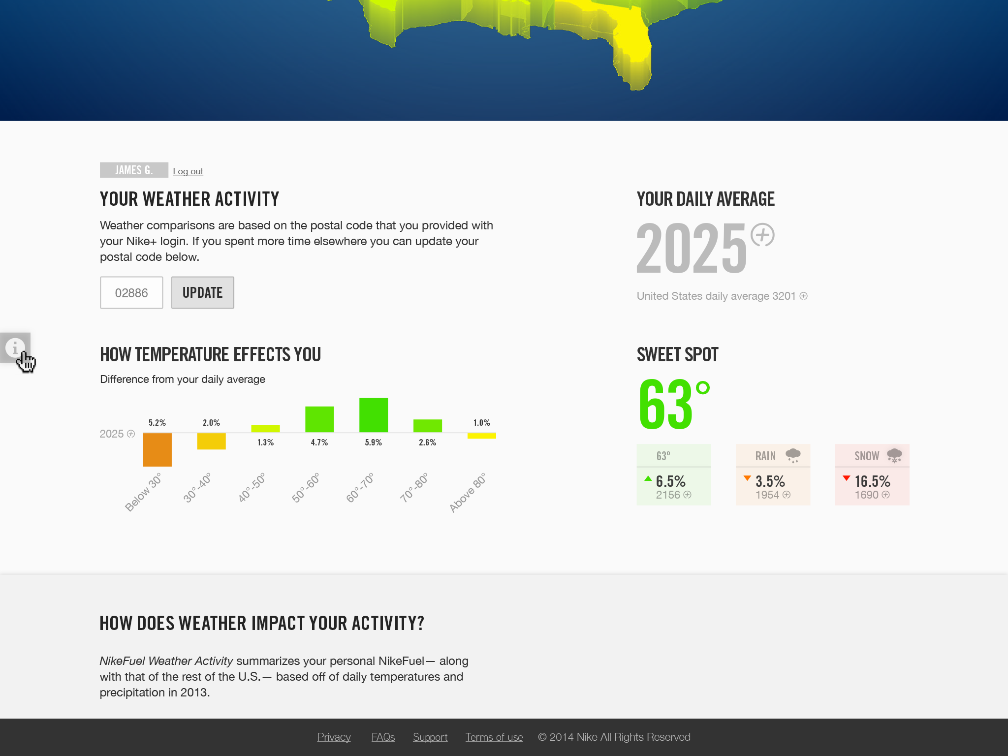
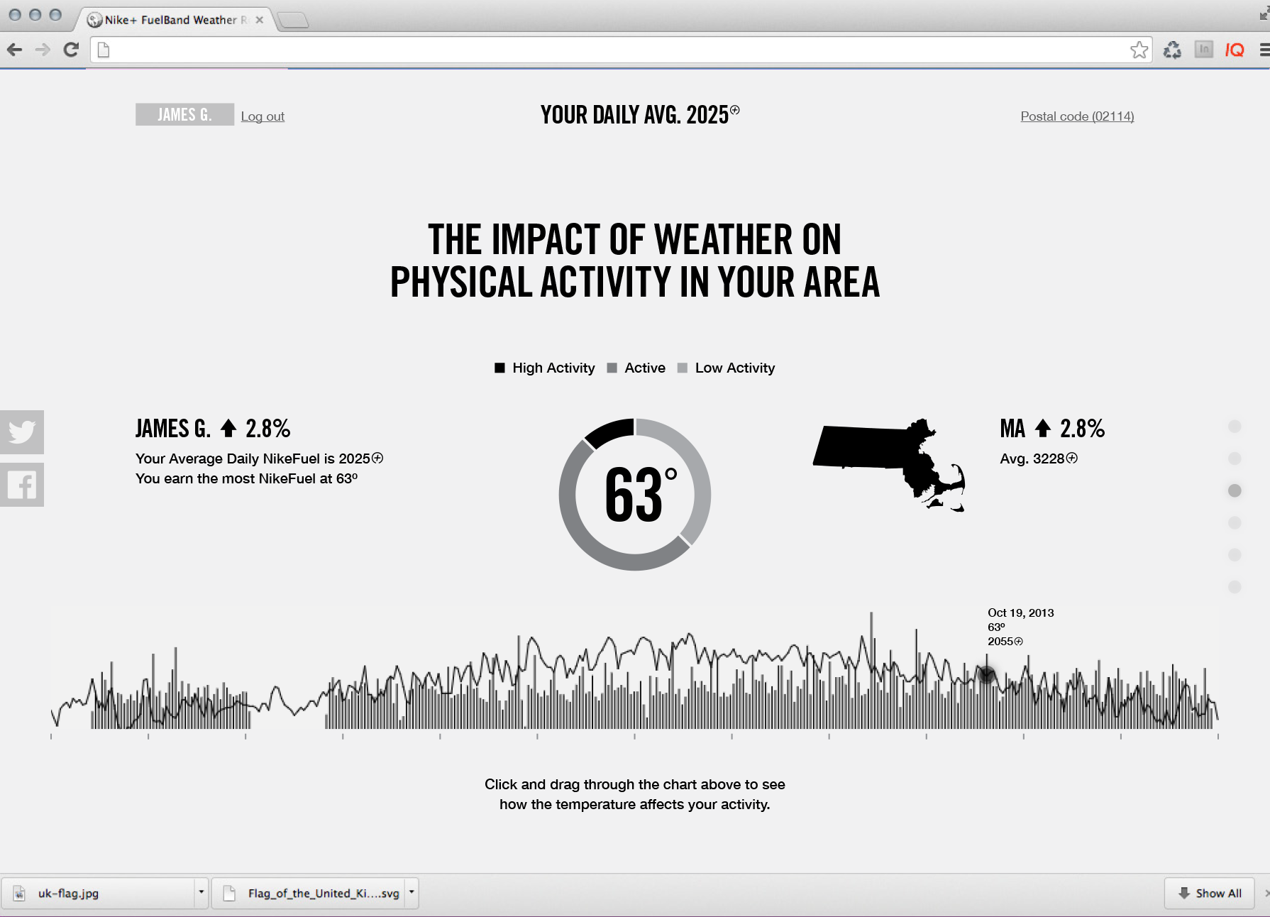
We were able to balance the robustness and simplicity of the map and apply it to the personal data by breaking it out into three screens (Movement, Temperature, and Best Day). This display helps people navigate and interact with each sub story, enabling the individual to see themselves in the data.
Finally, lets talk about responsiveness and context
Balancing an interactive data visualization that works on a desktop computer and scales down to the size of your phone is no easy endeavor. We fought with this task for a while until we realized we were fighting the wrong battle. Trying to make this site work on a small screen would never work, even after setting all sorts of breakpoints in the CSS and limiting the functionality and content. It's not the right contextual experience for a small screen like your iPhone or fabulous phablet.
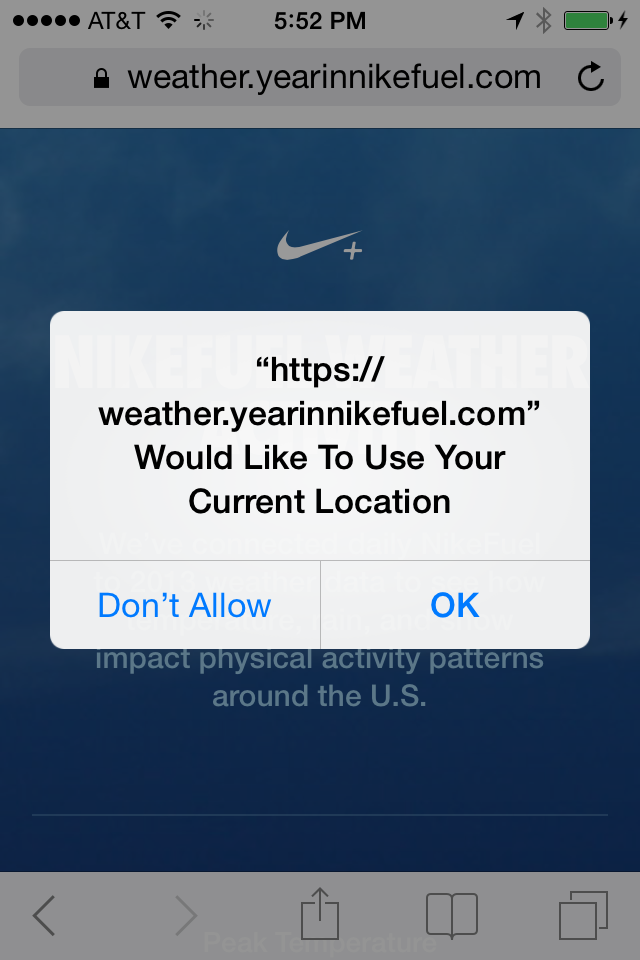
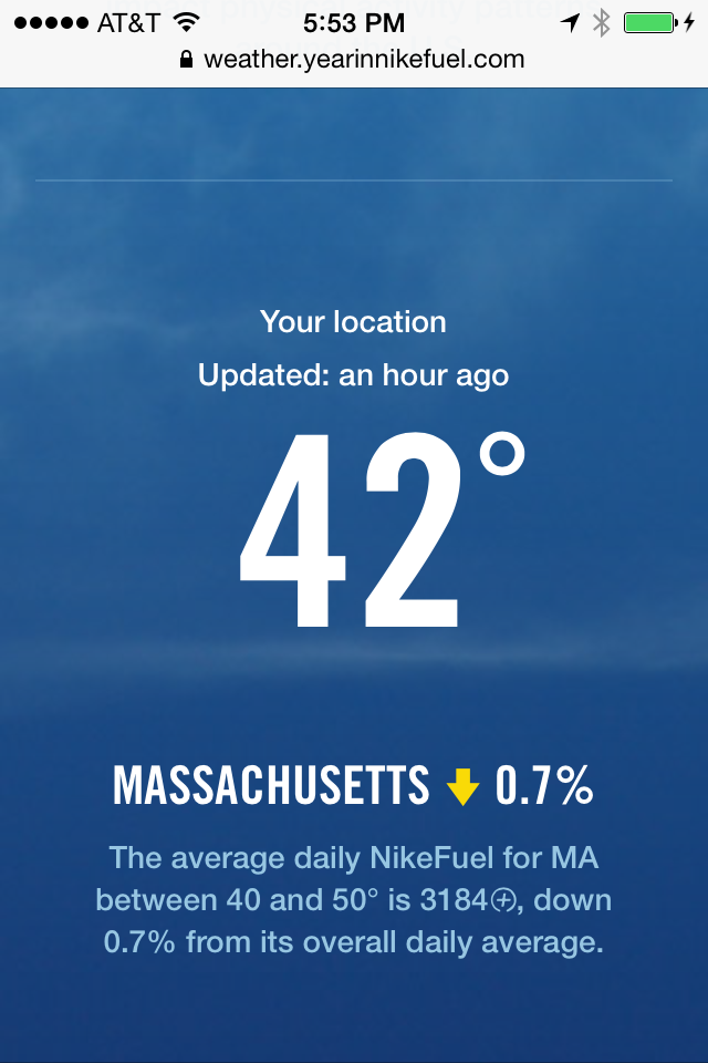
We thought about some key messages we wanted to convey to our audience while on the go. What's the weather like in my area and how does it impact activity? How does weather impact activity across the country? How do these things compare? We developed a discrete site that uses your current location to identify the weather and statewide NikeFuel activity. You can then see the overall map of the U.S. to see how trends appear while comparing them to your current local weather conditions.
To continue the conversation about the weather check out NikeFuel Weather Activity.
We’d love to hear what you’re working on, what you’re curious about, and what messy data problems we can help you solve. Drop us a line at hello@fathom.info, or you can subscribe to our newsletter for updates.