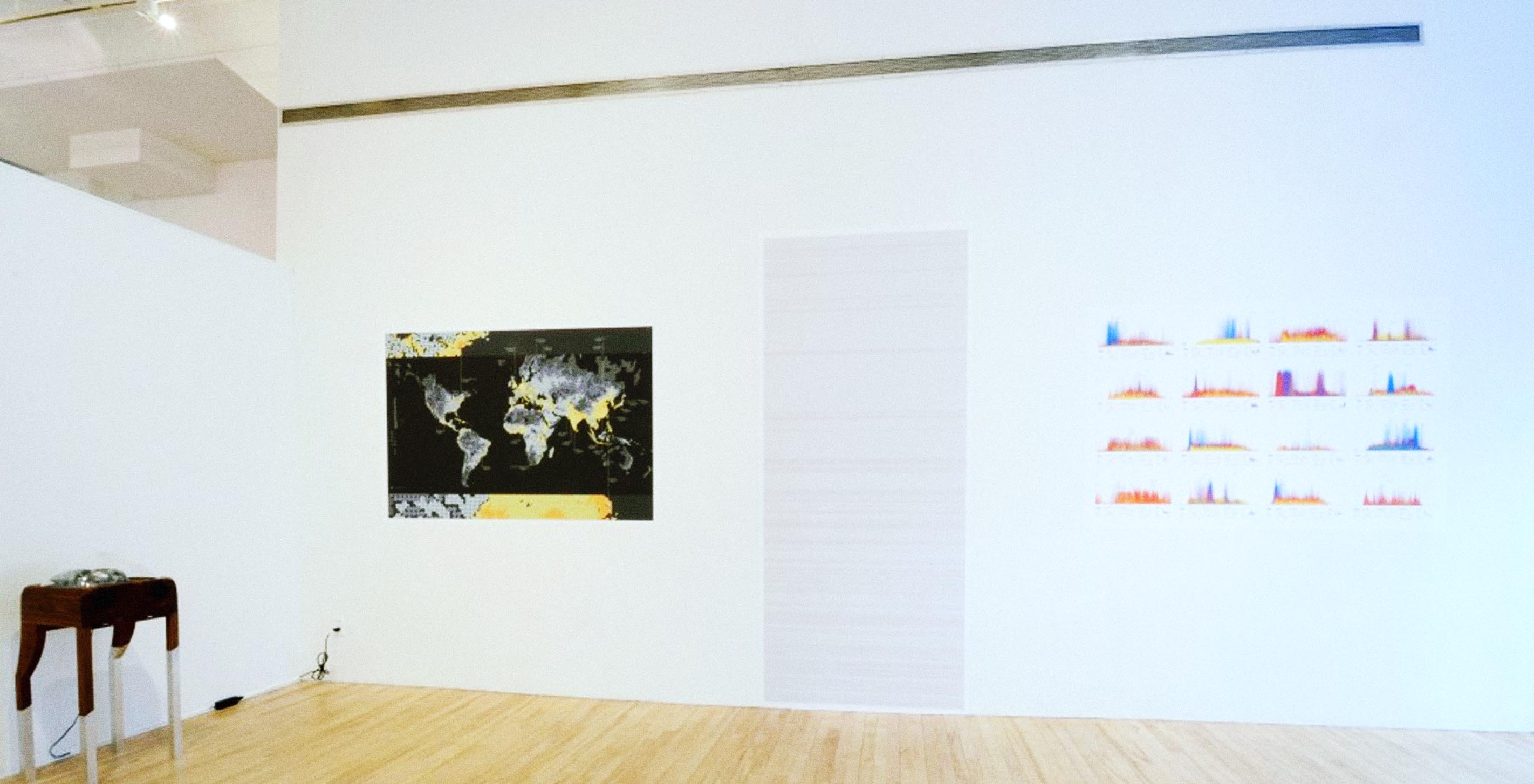

When Leah first came to Ben in search of a few contributions, we were (coincidentally) pretty deep in exploring human movement patterns through Nike+ FuelBand data. We contributed a collection of 2013 Year in NikeFuel posters, which visualize physical activity patterns for individuals over the course of a year, in addition to sharing the Dencity map. The map illustrates the world’s most densely populated places by representing people with circles of varying sizes and hues. Ben also contributed his Chromosome 21 piece, which captures 13 million letters—just a quarter of the 50 million letters—of genetic code from chromosome 21.
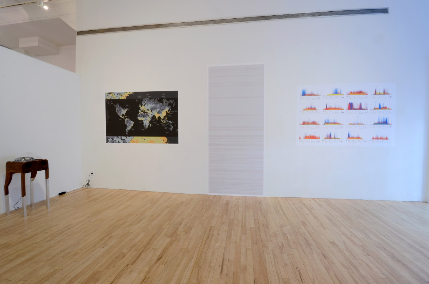
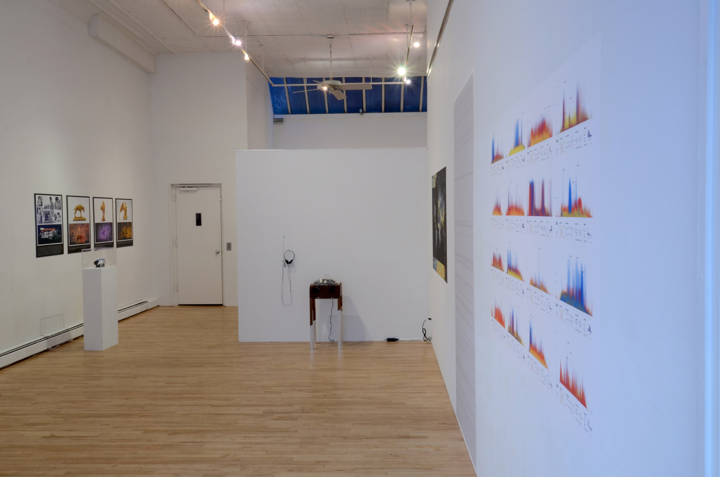
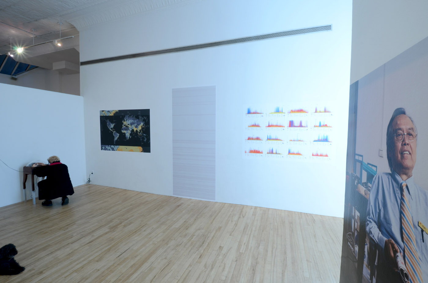
For more information on the exhibit and other nearby galleries, check out the latest review from The New York Times. They've conveniently outlined the locations of a perfect Saturday afternoon, if you ask us.
The exhibit features exciting work from Cait and Casey Reas among other friends. Take a peek if you can, and if your moral code so advises.
We’d love to hear what you’re working on, what you’re curious about, and what messy data problems we can help you solve. Drop us a line at hello@fathom.info, or you can subscribe to our newsletter for updates.