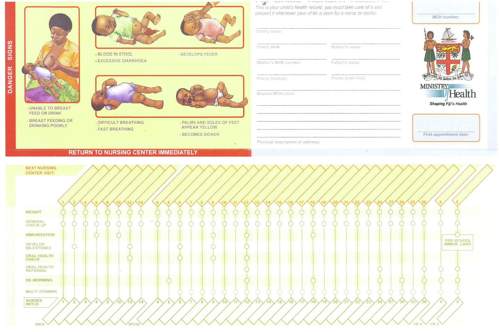
The weight-for-age chart, for example, was not a required component of the contest. We were drawn to it for its ability to engage parents in the immunization process, making them more likely to both participate in — and complete — a vaccination program for their child. Attrition is a big problem in developing nations. In one study only 39% of the children surveyed completed their immunization, if they started at all. We saw the weight-for-age chart as a key way to convert parents into participants in the medical process. A parent who contributes to the vaccination record is a parent who takes care of the card, knows when their child’s next appointment is, and brings the card with them. They also have it readily available should a national health surveyor pay them a visit.
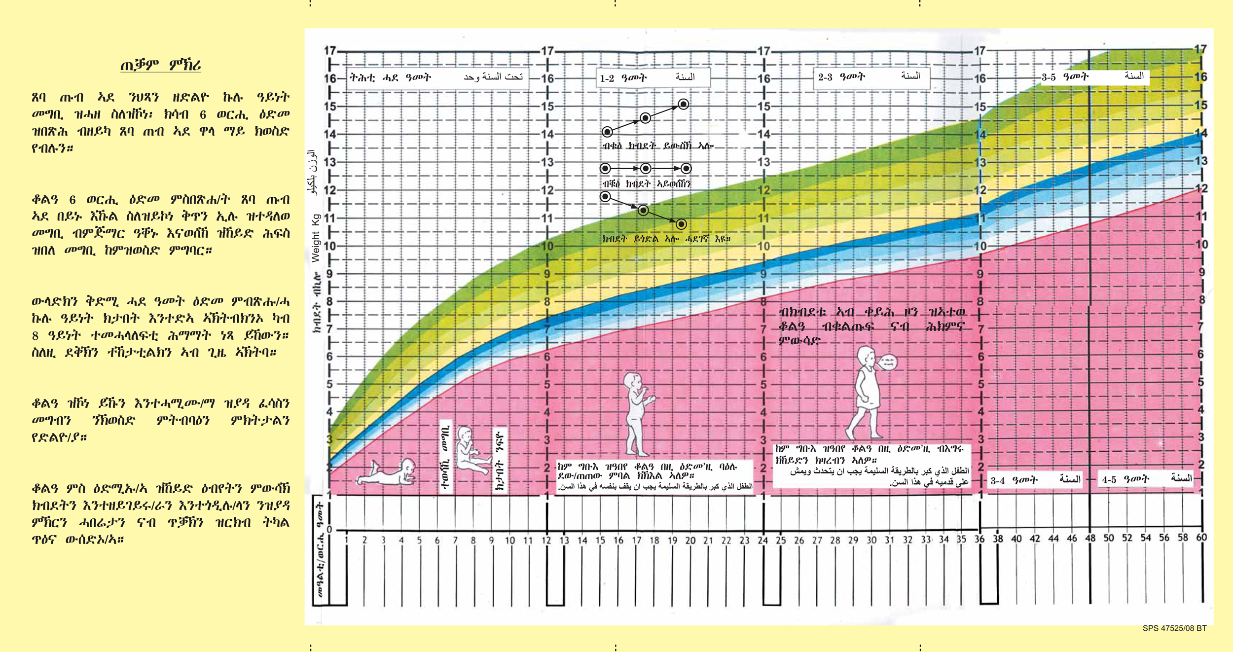
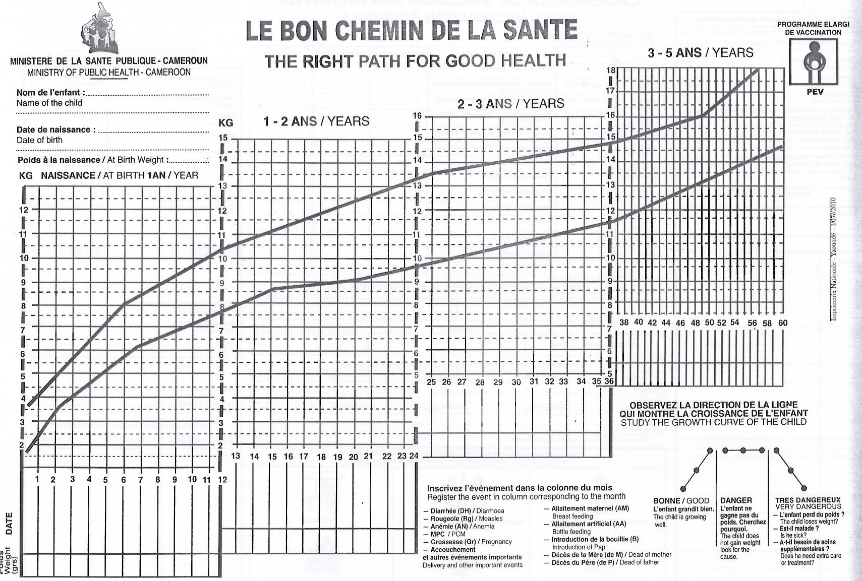
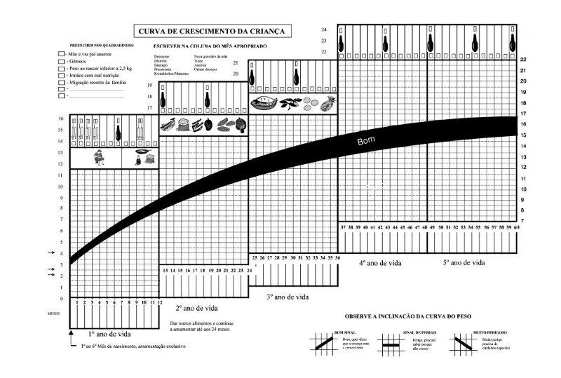
We started by examining existing records, which are often dense, confusing, and assume a level of literacy that some populations just don't have. Plotting single dots on top of a full color document can also make future scanning and digitization efforts less accurate.
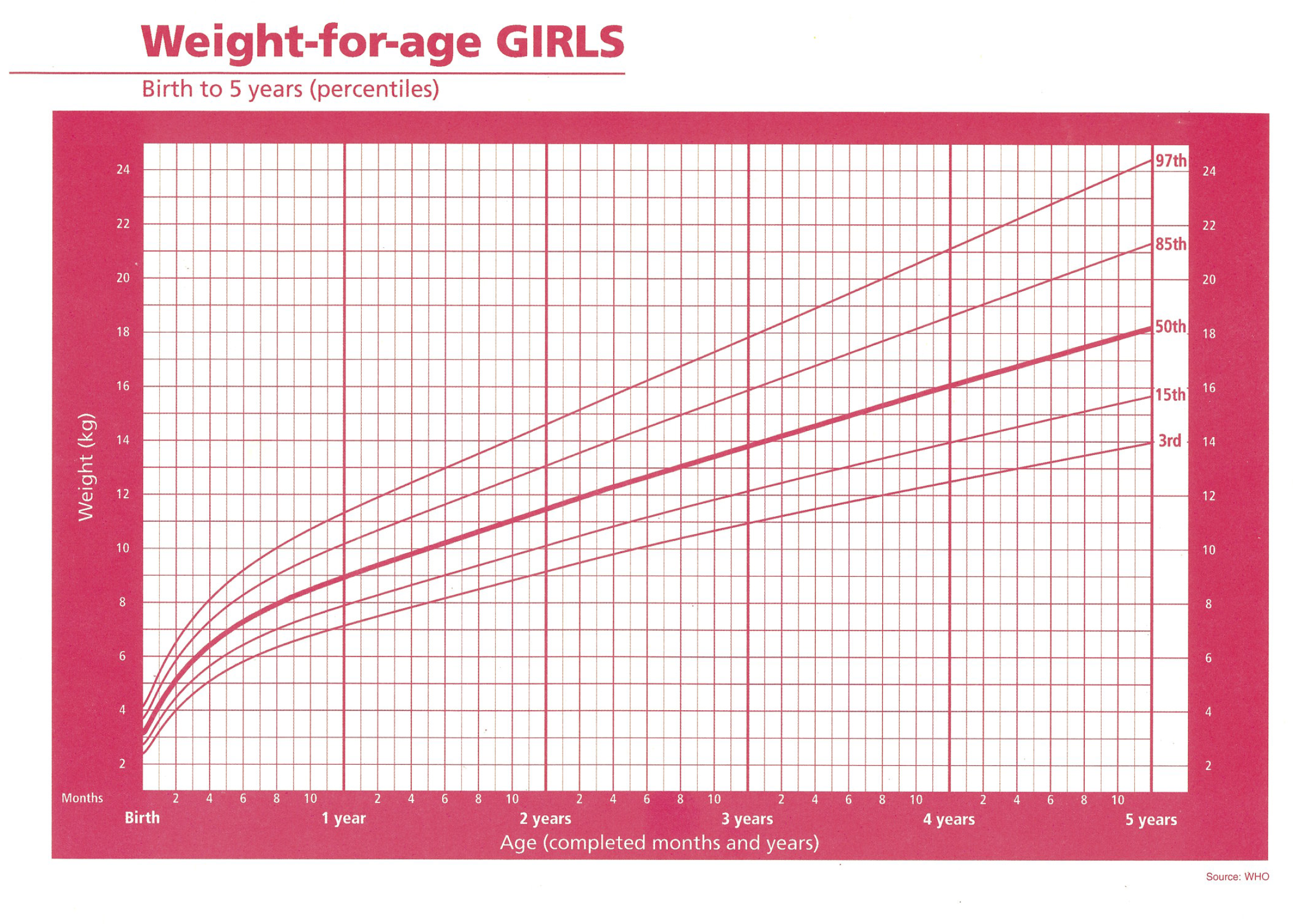
While the visual design might vary widely, these records are built on top of a rigorous dataset provided by the World Health Organization. The dataset contains daily median weight for boys and girls from birth to five years, accurate to four decimal points, as well as four z-scores above and below median.
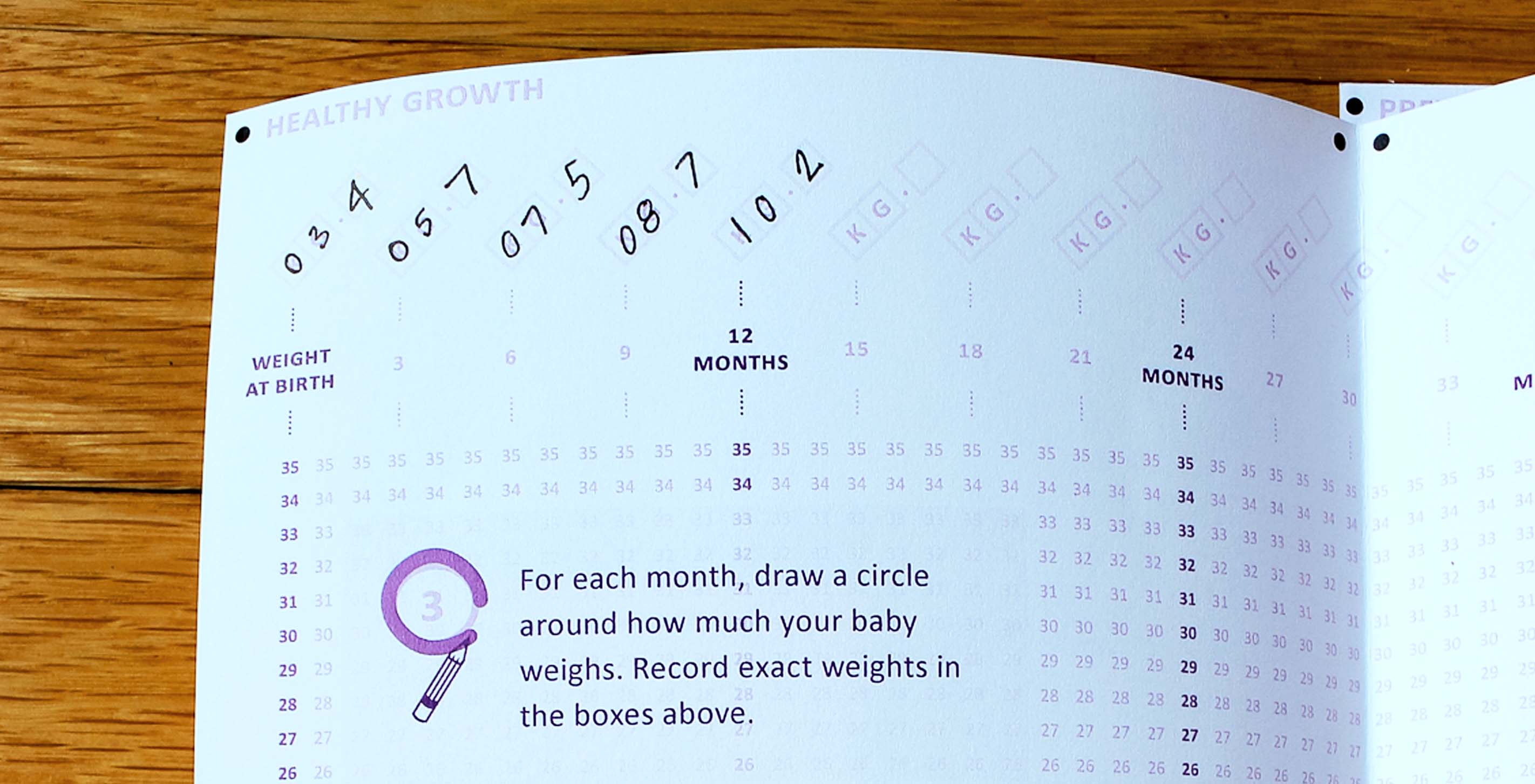
The chart above demonstrates an instance where the needs of the parent may be different from those of a doctor or a policymaker. From a medical or research perspective, data gathered at this level of detail is essential. To a parent, however, the difference between a child weighing 15 kilograms and 15.1 kilograms is negligible. Their question is more fundamental: “Is my child healthy?”
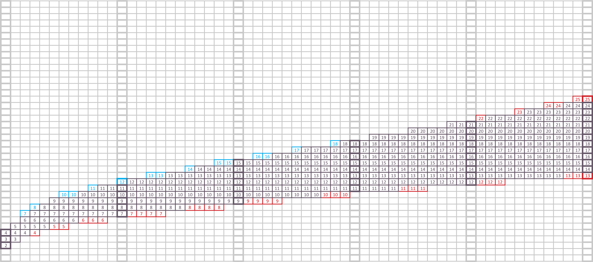
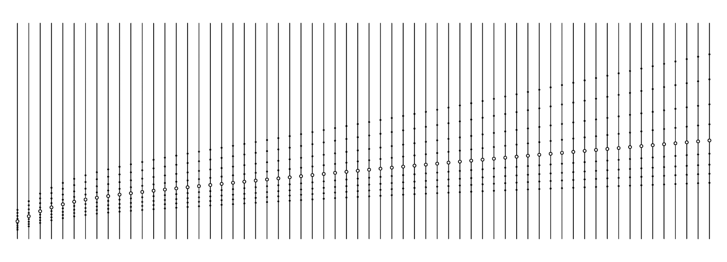
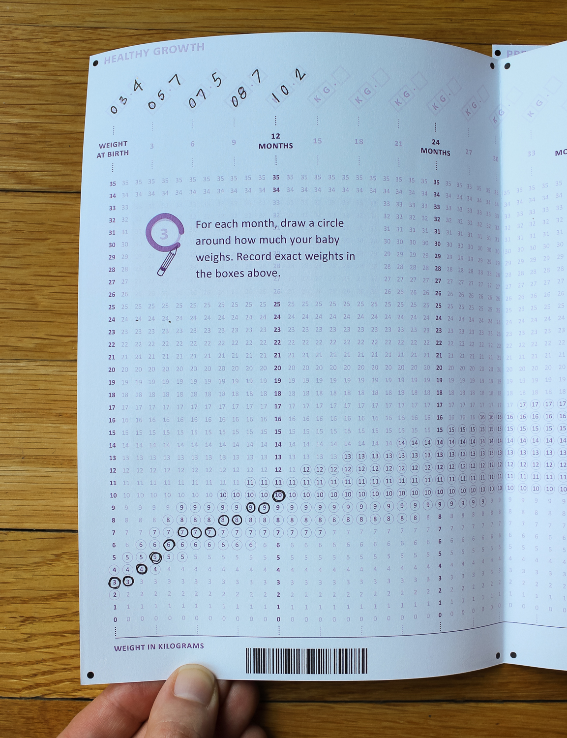
We made a conscious choice to simplify the standard weight-for-age chart, enabling parents to use it as a tool to answer that one basic question. Our challenge lay in deciding what range to highlight, and how to calculate it. Since falling exactly inside or outside a certain range isn't an absolute indication of health, and just getting close to the edge should be cause for alarm, we used an average of male and female values at two z-scores above and below the median to define "normal" — a range that statistically captures about 95% of the population. This allowed us to create a chart that worked for both genders, saving valuable real estate and cutting large-scale production costs. We also decided to use a single knockout color that can be filtered out easily by optical character recognition (OCR) software.
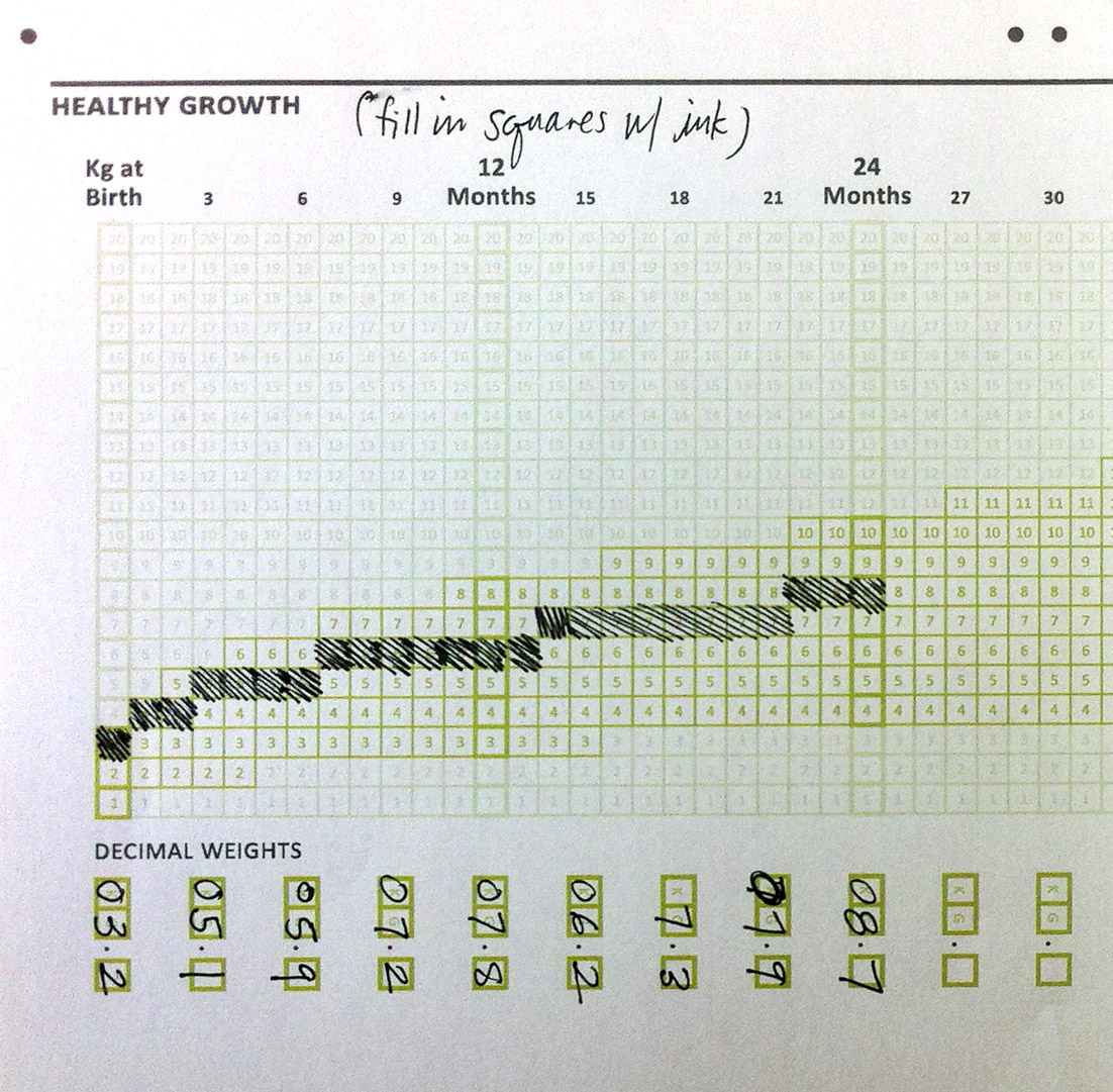
Asking parents to fill in an exact square for each month proved to be tedious and error prone. We ultimately shifted to values designed to be circled, with structured inputs for more exact decimal weights only at key milestones. Circles only appear around the values in the "normal" range, highlighting when a parent should be concerned.
For more information check out the documentation of our final contest entry, as well as the original Records for Life brief.
All weight-for-age data was sourced from the World Health Organization, and handled according to their published standards.
We’d love to hear what you’re working on, what you’re curious about, and what messy data problems we can help you solve. Drop us a line at hello@fathom.info, or you can subscribe to our newsletter for updates.