Once design conventions are established, they're hard to avoid. For example, the vast majority of mobile weather apps seem to be cut from the same cloth of UI design, as a quick image search demonstrates [click to enlarge]:
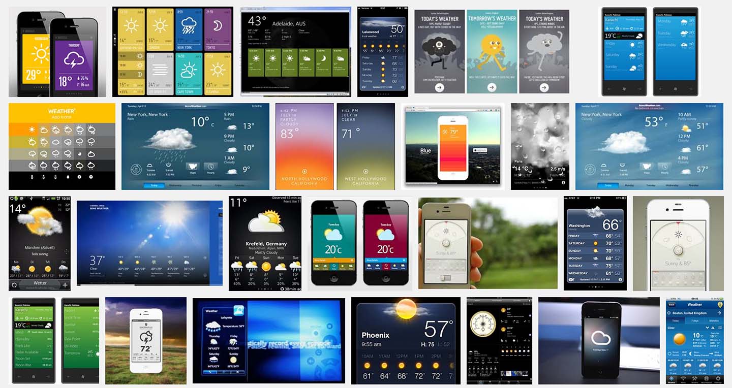
The canonical weather widget displays the current local weather conditions alongside a multi-day forecast. There is typically an image or icon representing the overall weather for each day (e.g., a cloud shooting lightning bolts might tell you that thunderstorms are coming). Temperature is often the only numerical information provided.
There are good reasons why this formula is so seductive for designers, since it hits a sweet spot of overall simplicity and high visual impact on the small screen of a mobile device. But is simplicity always the best choice? In the case of weather, a little more complexity can be very useful. If Tuesday's forecast is simply a rainy cloud icon, there's no way to know what time the rain might start, which could mean the difference between staying dry and getting soaked on the way to work.
Of course, it's also tempting to go overboard with complexity. Exhibit A: The heavyweight champion of weather widgets, the National Weather Service's hourly weather graph, displaying the forecasted values for twelve different climatic attributes* plotted hour-by-hour:
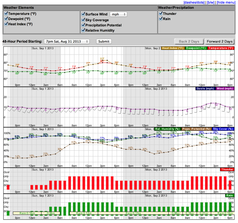
While this industrial-strength hash of grids, lines, and bars isn't the easiest to read—and certainly isn't ideal for smartphone viewing—there's something nerdily fascinating about its valiant effort to visualize so many things. And for weather geeks with the dedication to stare at it long enough, interesting patterns and relationships start to emerge: daily periodicity in most of the variables, the inverse relationship between temperature and humidity, humidity modulating the difference between temperature and dew point, etc.
And so, as my first mission at Fathom this summer, I threw my own hat into the ring** to bring you a weather app that merges the user-friendliness of the classic weather widget with the geek-friendliness of the Daily Weather Graph. It's useful. It's educational. It's called The Weather. (The imaginative name speaks to my bright future as a branding consultant.)
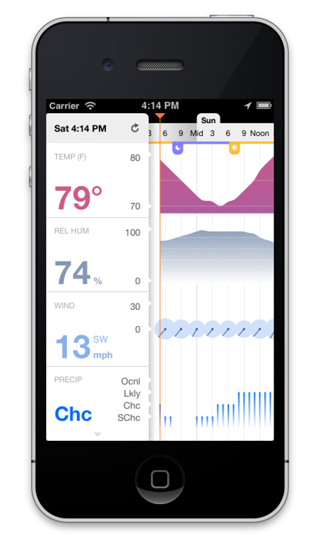
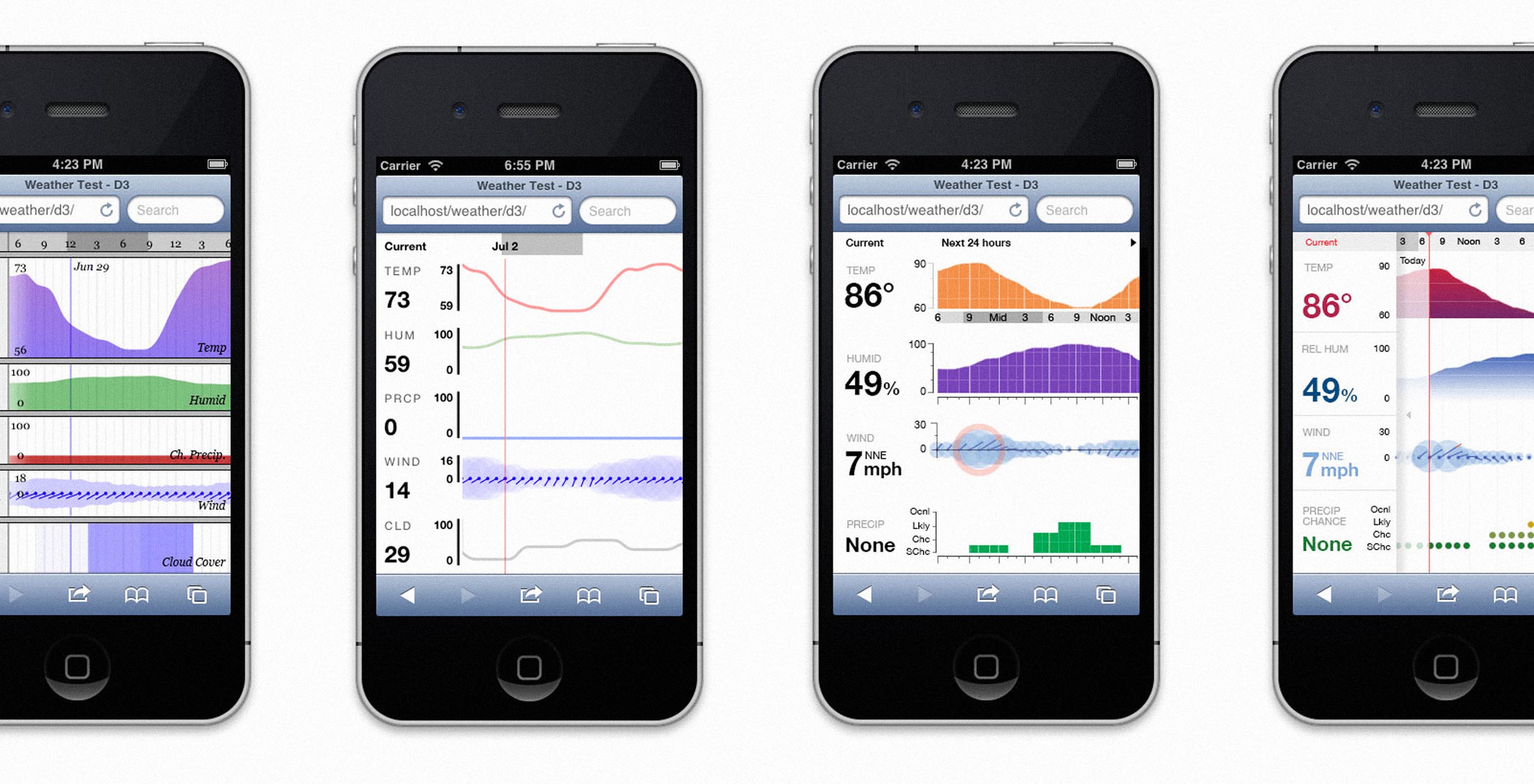
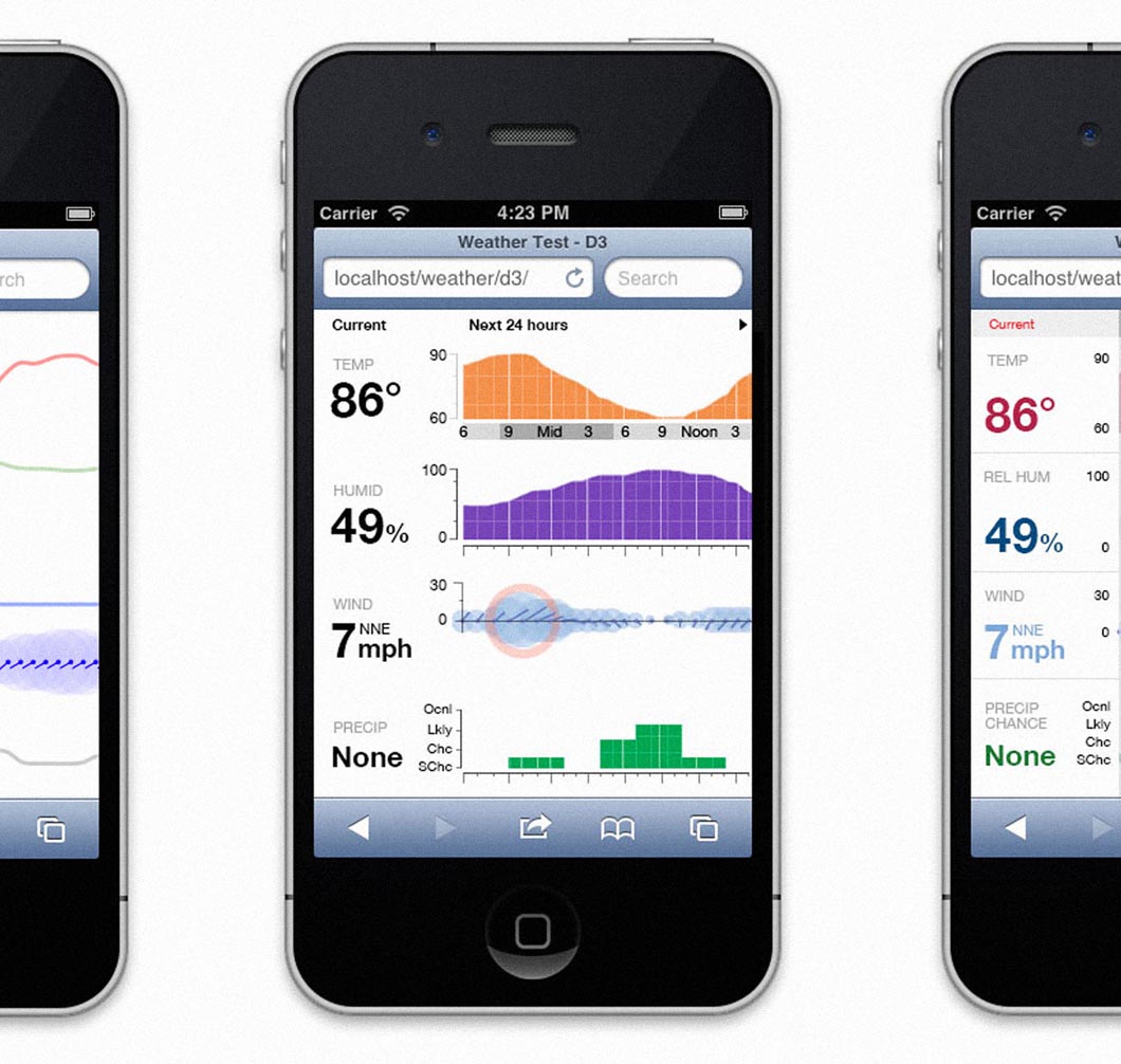
To use the app, navigate your iPhone or iPod touch (sorry, Android users) over to http://www.fathom.info/weather/ and add the page to your home screen as a web clip. The app's sidebar displays the current weather conditions in your location, and you can swipe your finger on the graph at the right to page through the weather forecast for the next few days. Swiping upwards on the sidebar reveals a link to the more comprehensive NOAA mobile forecast. Click the top of the sidebar with the "refresh" symbol to reload the data.
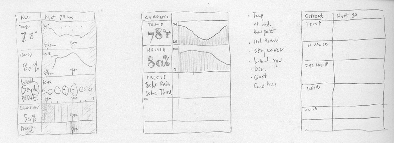
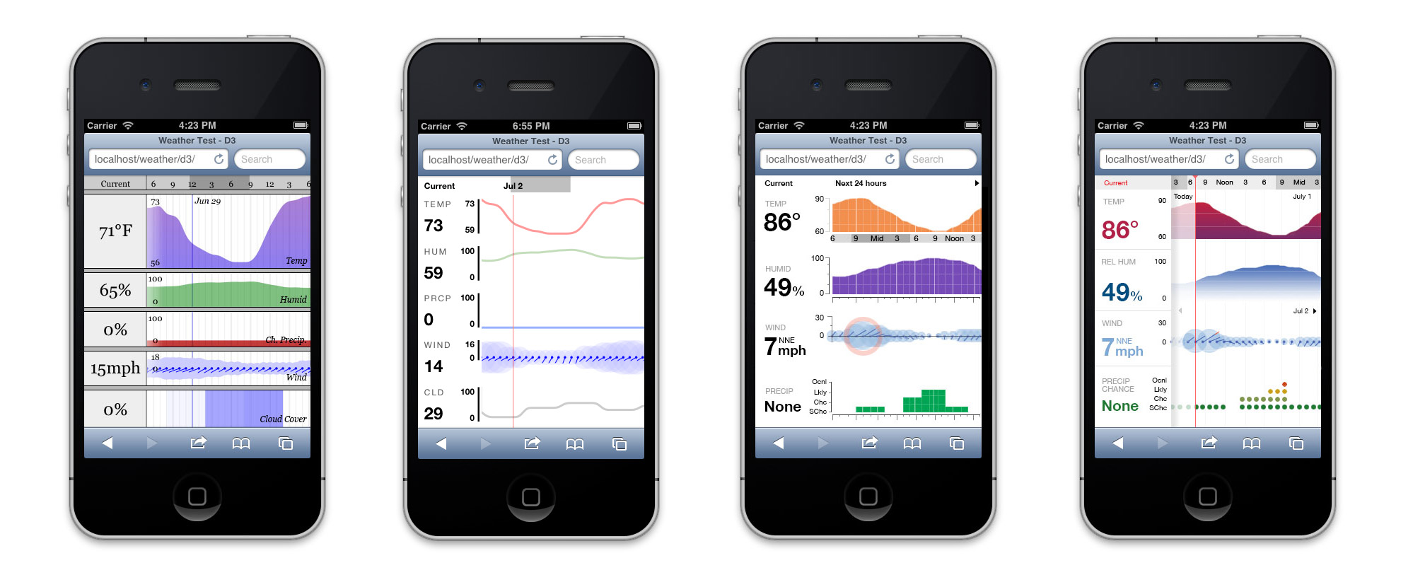
Since I did both the design and development for The Weather, I went back and forth between sketching and coding as my ideas gradually converged on the final version. The first step was writing a Python script to fetch and parse the data,*** after which I sketched out the split-screen, multi-row layout for the app which remained essentially the same through to the final version:
Going back to the keyboard, I used Processing.js to build out a working mockup of one of my sketches. While rough, it served as a foundation on which to begin experimenting with the look and feel of the app:
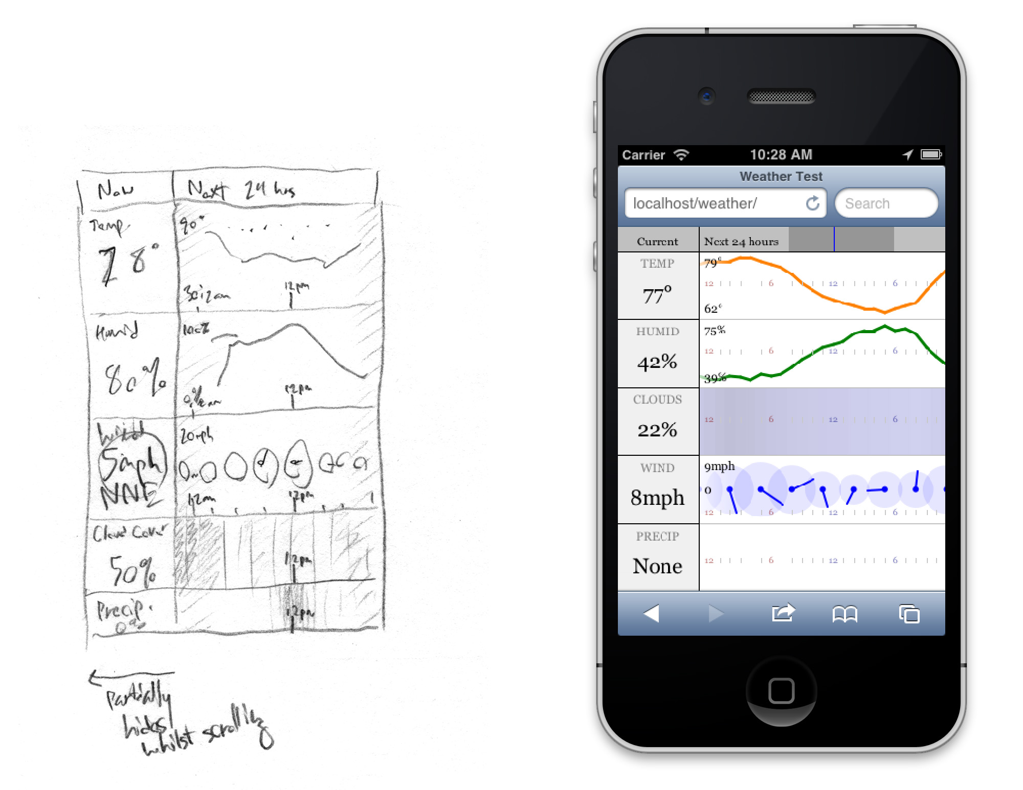
I initially chose Processing.js because of my familiarity with its progenitor Processing, but it quickly became clear that it wasn't the best choice for The Weather. Processing.js is CPU-hungry (not great for mobile devices, and wasteful if the display is mostly static), and it doesn't handle typography, gradients, time-coded data, or animated transitions very elegantly, all of which were important elements of my design. Therefore, I decided to re-implement my mockup using D3, a javascript SVG-drawing library which has very nice built-in support for all sorts of useful interactive dataviz things.
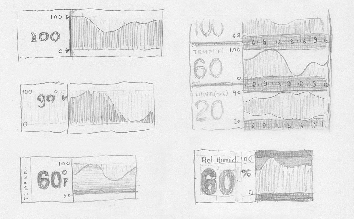
The D3 version immediately gave me much more control over the design, and I could begin making more confident choices about the layout and interaction. After narrowing the variables down to temperature, humidity, wind speed/direction, and precipitation chance, I refined the vertical scales for the plots:
As I tested these out in code, different overall aesthetic possibilities for the app began to emerge, with varying degrees of app-iness (Apple-iness?):
This introduced the related problems of where to start the plot, how to page through it, and how to visually link the numbers on the sidebar to the starting point on the graph. The initial concept was to show only 24 hours of data on the plot at once, always starting from the same time of day (3 AM, for example). A vertical marker would indicate the current conditions:
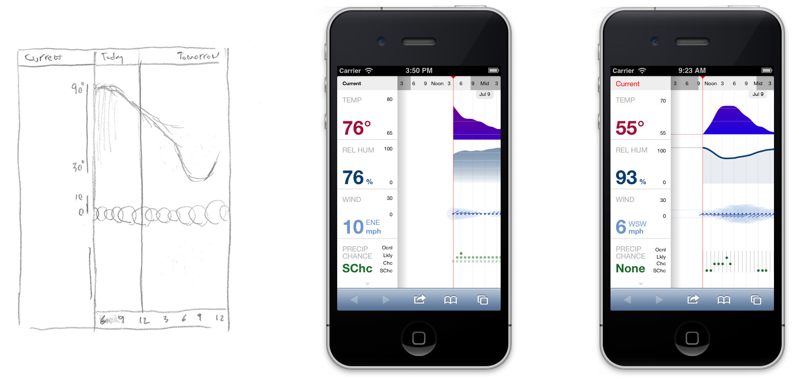
One issue with this design is that very little of the plot is shown when the current time is close to midnight, and then there's all that wasted empty space. The obvious choice would be to fill the space with past data, although this proved to be technically infeasible. Thus I settled on simply starting the graph at the current time and having it snap to the beginning of each day as the user pages through it. Of course, when the user is examining the forecast for another day, the current conditions aren't important, so the sidebar can partially hide and leave just the vertical axes showing:
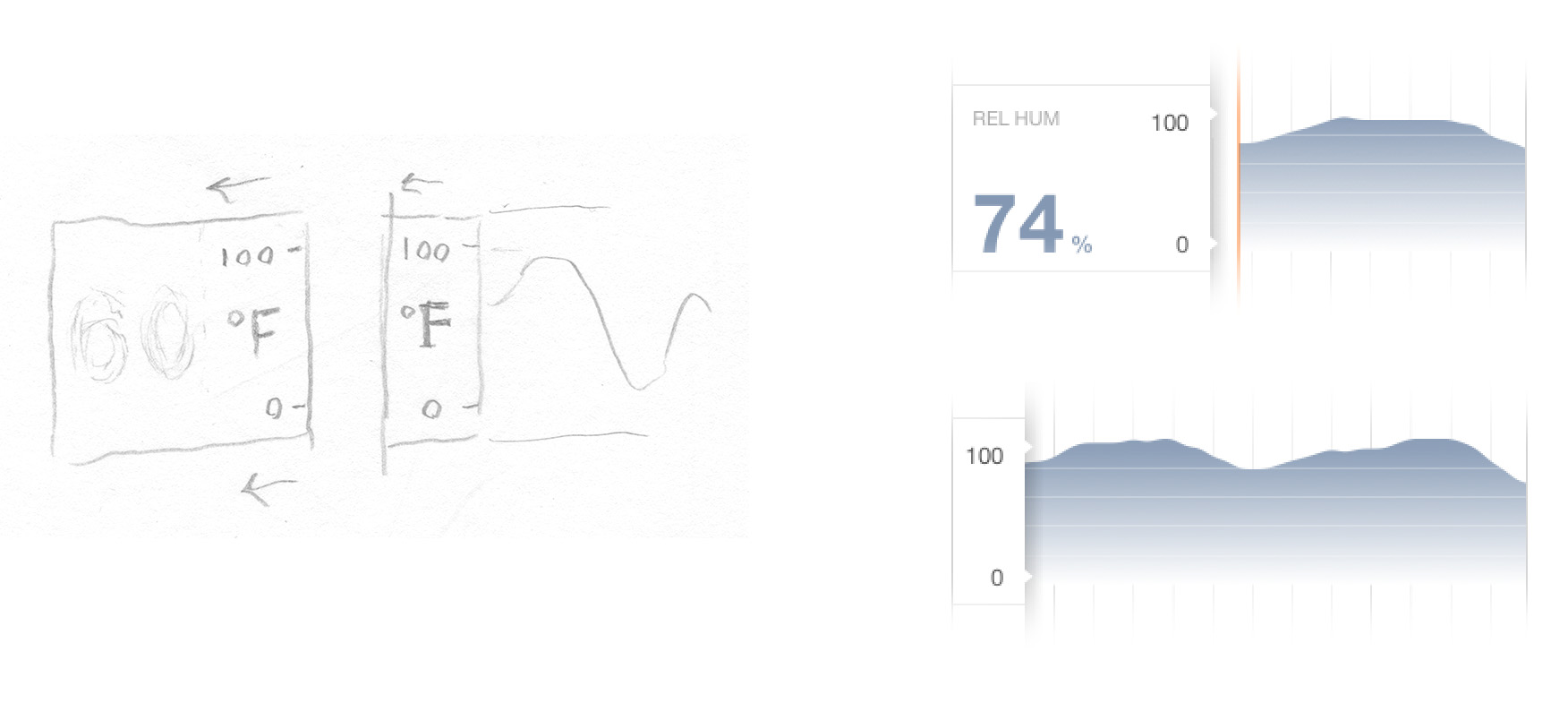
To maximize screen space during the scrolling, I also considered doing away with the axes altogether and using value callouts at the local minima and maxima of the curves. However, this felt too cluttered, so I reinstated the moving-sidebar design.
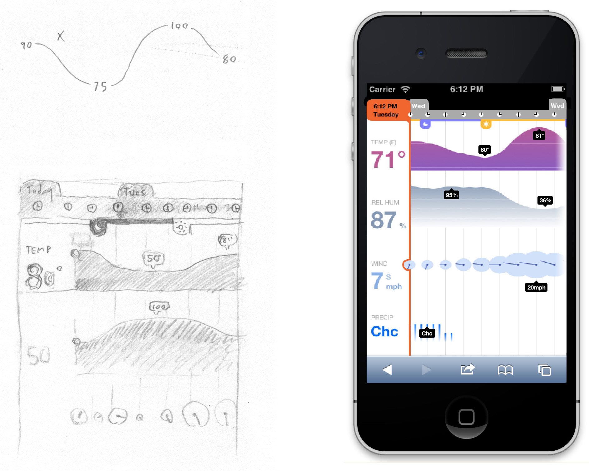
The time scale at the top of the screen and the precipitation chance plot underwent many changes throughout the process. The time bar was a little tricky simply because it has to do a lot of work in a small space. The examples below, culled from the cutting room floor, show a few of my attempts to integrate time, day, and sunrise/sunset markers (yes, those are the orange and blue tabs with the sun and moon icons). I still kind of like the clocks as an idea in general, although they weren't the best choice here:
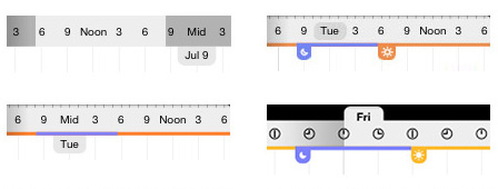
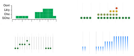
I also went through a number of different iterations for the precipitation-chance plot before the aptly atmospheric bar chart at lower right emerged as the winner:
Looking back on my experience with The Weather, it's interesting to see which design clichés I avoided, which ones I embraced, and which ones I attempted to avoid but ended up returning to for the sake of usability. Design is always a process of compromise. And it is also a process of progressive interrelation: The more a design is refined, the more its components become locked into each other, requiring the whole design to change in response to small revisions of its parts. The asymptotically time-intensive and circuitous process of refining my app was a good illustration of this principle.
When all is said and done, I think The Weather hits the balance of simplicity and complexity I was aiming for. It's an app that I would use, if I owned a phone that was remotely smart (mine doesn't even have a camera, but its battery lasts a week).
I'm still accepting suggestions for better names, but in the meantime, enjoy The Weather.
—
* Temperature, heat index, dew point, relative humidity, cloud cover, precipitation potential, wind speed, wind direction, wind gusts, chance of thunderstorms, chance of rain, and amount of rain.
** Joining several other estimable apps, among them WeatherPro, WeatherTron, Partly Cloudy, and Today, all of which have taken a crack at reworking the standard weather widget with some infoviz principles.
*** The National Weather Service provides a handy free API for getting forecasts for any location in the U.S. as an XML file.