In 1916, the British writer and English professor Sir Arthur Thomas Quiller-Couch (pen name Q) coined the term "murder your darlings" in a lecture at Cambridge University, UK.
"Style, for example, is not—can never be—extraneous Ornament.... Whenever you feel an impulse to perpetrate a piece of exceptionally fine writing, obey it—wholeheartedly—and delete it before sending your manuscript to press. Murder your darlings."
If something is a darling because it makes the creator feel clever and impressive—it has to go. That's what the audience should feel and it goes as much for design as it does for writing. But sometimes a piece is a darling because it has something special that can be useful in a different context. That's why we don't actually murder our darlings. We keep them in the basement.
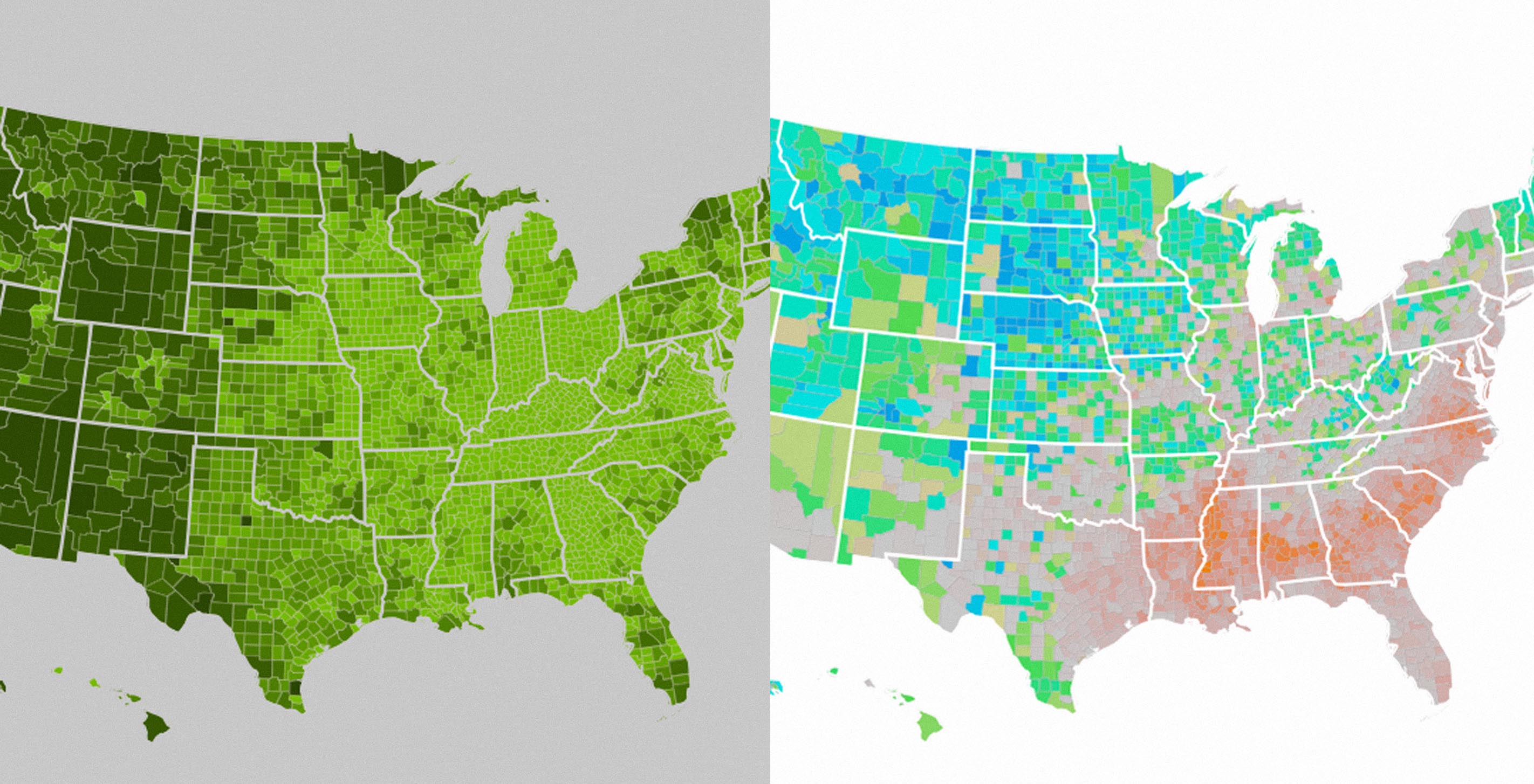
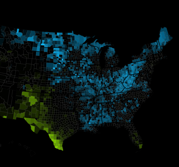
In what we hope is the start of a tradition, we'd like to share some of our Kill Darlings from recent projects. Things we liked, but didn't quite make it out the door in the final version. For Stats of the Union, we wanted to share our process of arriving at the final color palette—a task that left dozens of designs on the cutting room floor.
Our challenge was to arrive at a color palette that showed off geographic trends in the data. We were seeking to minimize flattening in the final piece. While it might be easy to distinguish between "high" and "low" on a map, we wanted the subtle gradations between "slightly high" and "really high" to also be apparent.
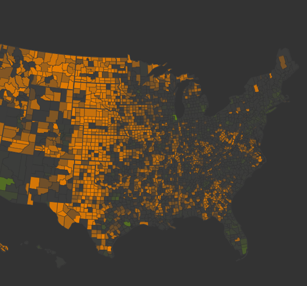
We started with spectrums of a single hue, but ultimately decided they didn't have enough contrast to show the highs and lows in the data properly. We moved to the split color spectrum that exists in the final piece. It became immediately apparent that interpolating through HSB color space was a bad idea. As was this brief black and white episode.
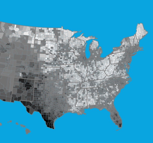
Other color pairings worked more successfully together, but were not balanced, such as this green and purple option. Other combinations had unavoidable connotations already attributed to them.
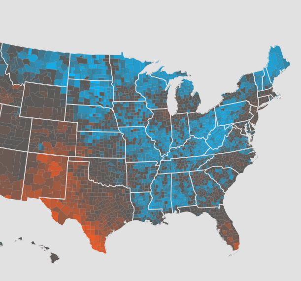
Finally we settled on blue and green for their ability to sit next to one another without one of them stealing the show. Shifting the background to a true black seemed heavy-handed on a monitor, but in testing on the iPad itself the colors practically glowed.
We’d love to hear what you’re working on, what you’re curious about, and what messy data problems we can help you solve. Drop us a line at hello@fathom.info, or you can subscribe to our newsletter for updates.