From our first meeting with Irene Jay Liu where she laid out the plans for Connected China, we knew this would be an expansive data set. What she proposed would have both breadth and depth, and we were excited about working with Thomson Reuters' team of journalists as they filled it out. The stories that they wanted to demonstrate with the data — the primacy of the Communist Party, the standardized path of the rise to power, the influence of accumulated social capital — would all require unique representations. We were eager for the challenge, but first we needed to familiarize ourselves with the data. At this point, we were working with data in draft format that wouldn't see final approval for a few months.
One of the first challenges was how to portray guanxi (关系), the influence of social networks. The typical way to represent this would be in a graph where people are clustered according to the closeness of their relationship. However, most social graphs do not typically include an explicit measure of how tightly linked two people are. That affinity is calculated by an algorithm that traverses the relationships in the network, often looking at the links they have in common to infer how close they are. While affinity can make for an interesting presentation, we felt that the hand-curated data for the networks of China's top leaders would support something more customized, and that there were more interesting stories to tell.
As part of their research, the journalists at Reuters qualified each connection with a specific relationship type, such as Mentor, Ally, Colleague, or Mishu (秘书). The nature and variety of these relationships provided a much better measure of affinity than an algorithmic model would provide. That prompted us to drop the idea of a graph based on clustering and look for different organizing principles for our network layout.
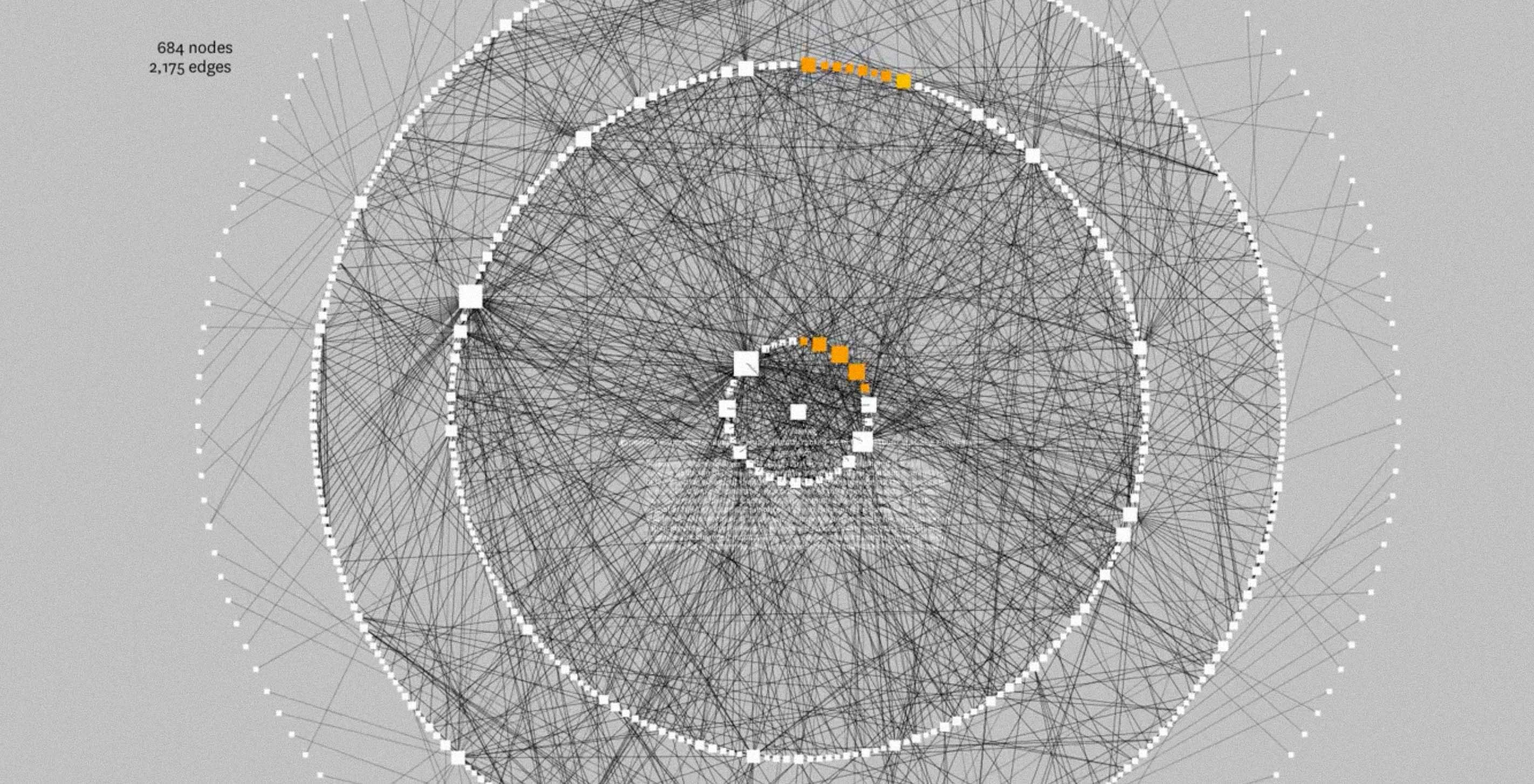
When we started looking at China's top leaders, it quickly became clear that we wanted to feature degrees of separation. Most party officials are either one or two degrees away from a former top leader. These retired leaders, known as kingmakers, continue to exert tremendous influence through their protégés. So our first exploration of the social relationships in the Connected China database was a simple tool that allowed us to center the network on a person, then choose how many degrees of separation to show:
This sketch confirmed that only a few degrees were needed to convey the interwoven connections of Chinese top leaders. For example, each of the current members of the Politburo Standing Committee has at least one kingmaker among their first-degree connections. Whenever working with a network such as this, an early goal is to find ways to simplify it based on how it will be used, rather than showing a visually complex — but mostly useless — hairball of connections.
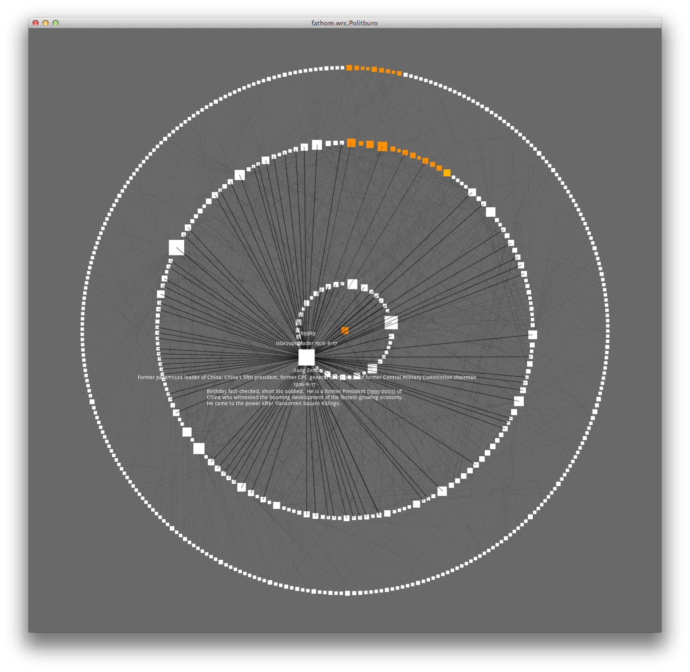
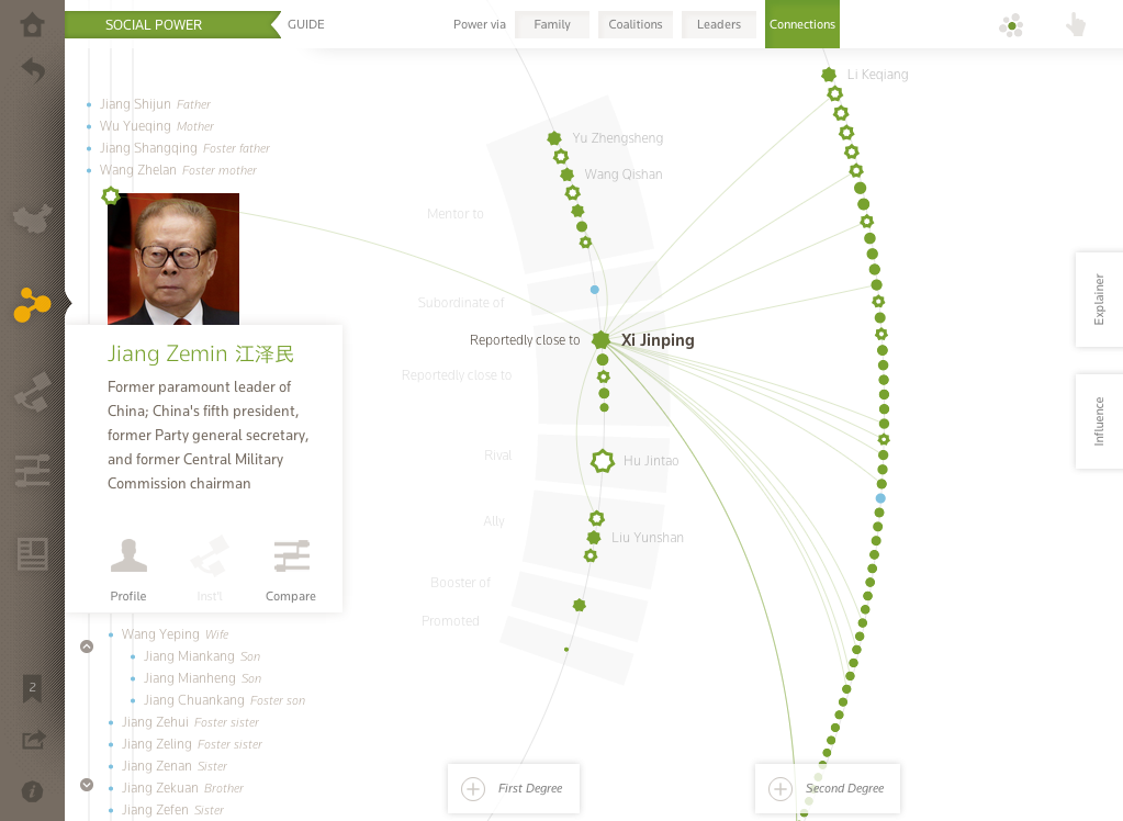
We settled on two degrees in our next iteration, and our next step was to highlight the detail behind the relationship types. In addition to using those types for grouping people within the first and second degree, we wanted to emphasize the influence of family connections. The offspring of early communist leaders are known as princelings (太子党), and many of them have benefited from the prominence of their parents by landing leadership roles in government and business. We highlighted this in two ways. First, we placed the family members to the left of the person at the center of the network (called the "ego"). Second, we put anyone with a relationship to an ego's family member in the first degree, right alongside the people with direct relationships to the ego (although we kept them a different color).
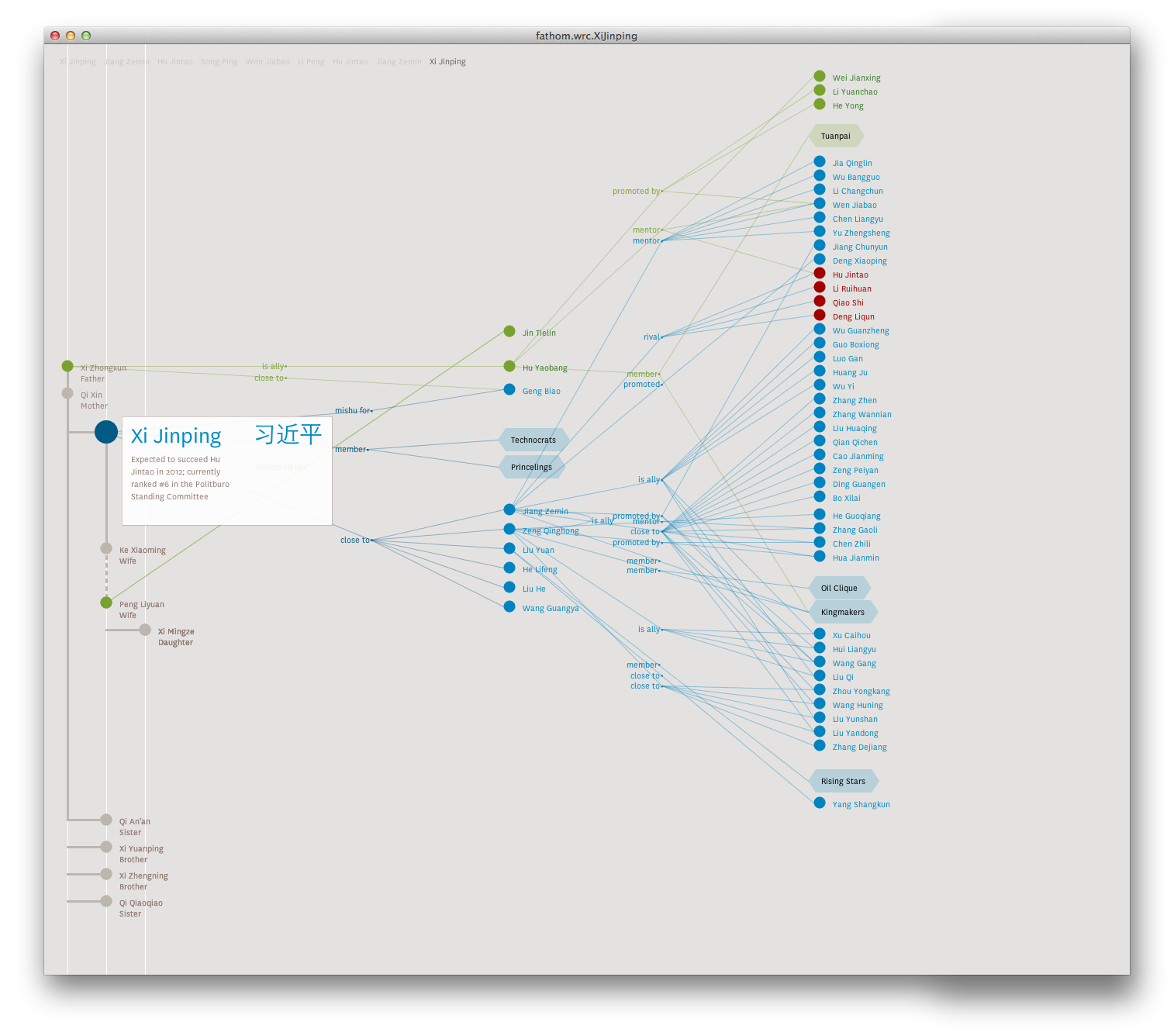
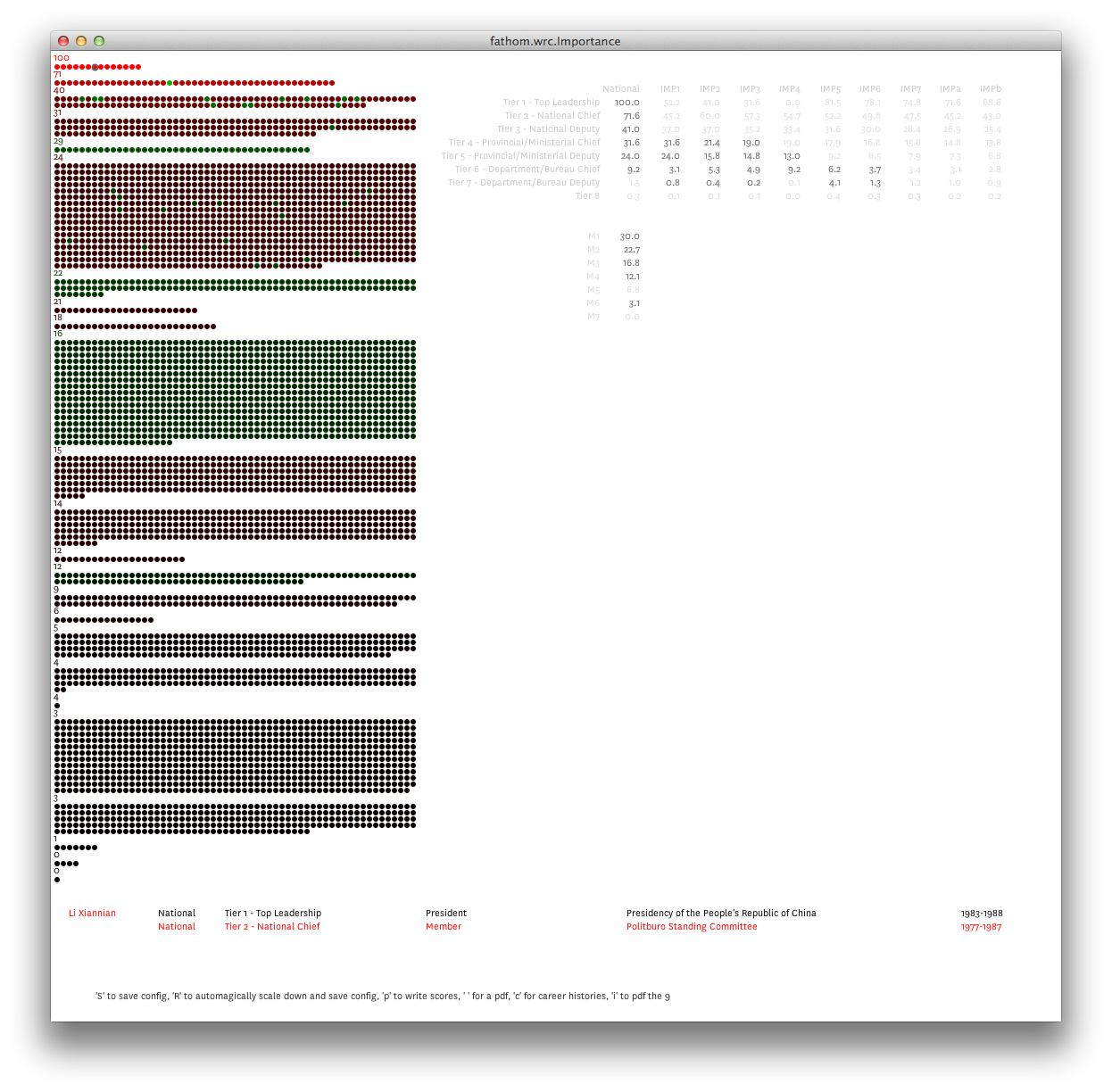
Despite some clutter remaining, by this point we knew we had worked out the organizing principles for the network layout. There remained one more item that we wanted to show, and that was a measure of each person's overall importance in Chinese politics. Among all the relationships a person is likely to have, some will be more important than others. Rather than relying on the number of connections to determine importance, this was another case where the Reuters data offered us the opportunity to do something more meaningful. In Chinese political culture, everything from the civil service to geographic regions are stratified by administrative levels, and importance is tied to this rank. In our representations of social networks, we decided to size each person according to their importance in China's national political arena. But first we had to come up with a way of quantifying it.
Our goal was a single scale with which you could compare any two people in the database to see who was more important — and which would also provide a rough magnitude of the difference. Working with the Reuters reporting team, we identified which data would inform our model, and then assembled the tools that would combine these inputs into a single number for each person in the database. But this was the sort of problem where a strictly algorithmic solution was unlikely to yield the results we were after. To calibrate our model, we needed a combination of good judgment and domain expertise, someone to sit down with us, iterate through the results, and tell us where it was right and where it needed correcting. Irene was the obvious choice, but given her hectic travel schedule between New York, Boston, and Hong Kong, her hours onsite would be limited. With that in mind, we built a tool to make the trial and error as efficient as possible, allowing us to weight the different inputs and instantly see how different people compared to one another.
The resulting importance scores are used in Connected China whenever we size an icon for an individual. Below is an example showing the prominence of China's outgoing President Hu Jintao and new President Xi Jinping, in the first degree of former president Jiang Zemin.
In many ways, Connected China embodies our ideal project. We started with a rich data set, thoroughly researched by a team of experts, and from there we assembled a tool that was tuned to bring out the unique traits of the data. We were also challenged to find systematic ways of organizing information that is not strictly quantitative. This extra layer brings clarity and guidance to the fantastic research conducted by the Reuters journalists. Perhaps Irene describes the result best in the introductory post on the Connected China blog:
By quantifying and categorizing these complex relationships, we ... allow new ways of communicating and interpreting this acquired knowledge.We hope you find the end result enlightening, informative, and entertaining.
We’d love to hear what you’re working on, what you’re curious about, and what messy data problems we can help you solve. Drop us a line at hello@fathom.info, or you can subscribe to our newsletter for updates.