Earlier this year we were tasked with communicating the research findings coming out of the Beacon Community Program — seventeen communities situated throughout the United States, each serving as a test site for innovative technology and infrastructure programs that aim to improve the quality, scalability, and cost-effectiveness of healthcare in the United States.
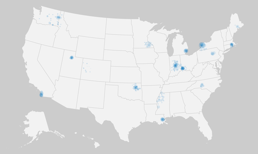
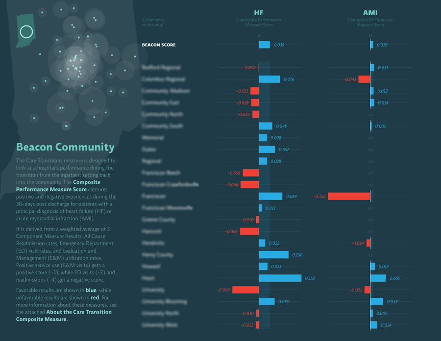
In an early mapping exercise, each hospital in a Beacon community was marked with a small dot of consistent size, while larger concentric dots were sized according to the bed size of the facility. Some of the regional complexities that health policymakers are faced with start to become apparent as we zoom in farther:
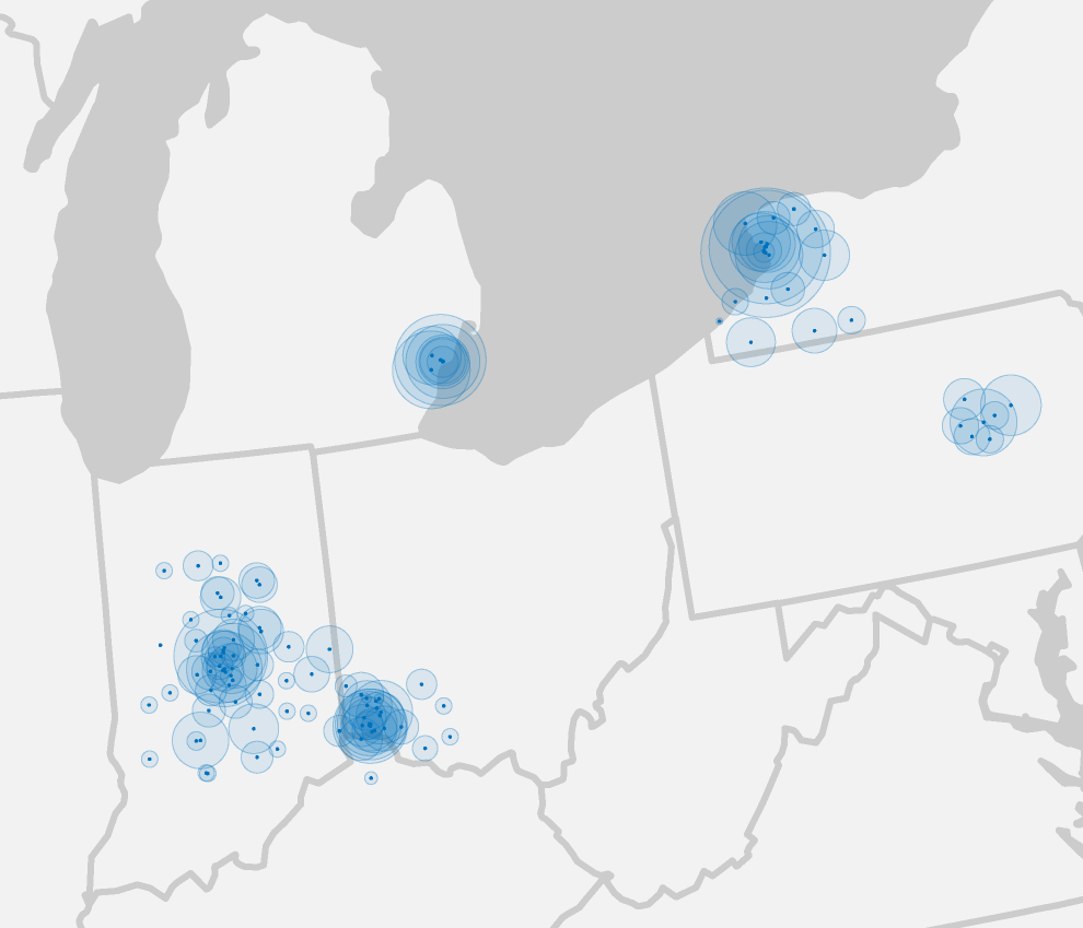
Even in neighboring states, one network might have a few large, busy hospitals in one small geographic region, or dozens of smaller regional hospitals that span large areas. The 17 communities in the study were chosen to be representative samples of geographic location, population density, at-risk populations, and demonstrated commitment to pilot new technologies such as electronic health records. One metric the Beacons are using to track the impact of these programs is readmission rates.
A little background on readmissions: In an ideal world, if you are brought to an emergency room (ED, for Emergency Department), you are treated for a condition and released. Any further care you receive would hopefully come from further downstream (Evaluation & Management, or E&M), in an outpatient facility or a primary physician's office. In reality, however, patients often return again and again to the ED, indicating that something has broken down in the system.
Reducing readmission rates in general is a good indicator of improved care. A secondary sign of improvement is when the balance of readmissions can be shifted away from the ED and into E&M facilities. The Beacon program worked with researchers to establish a weighted composite score (per hospital, per admitting condition), that could be used over time to indicate improvement in readmissions.
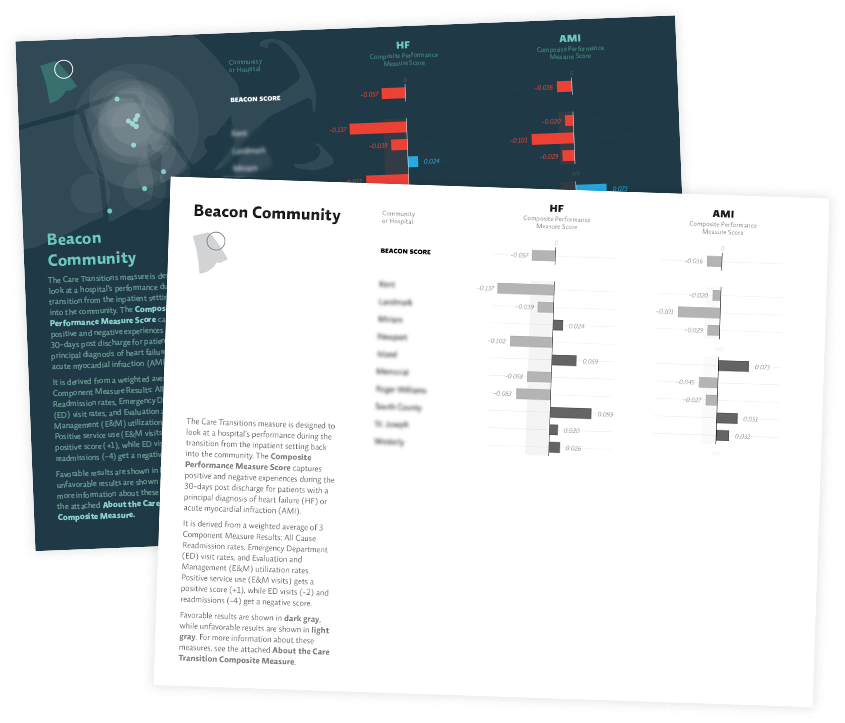
Our initial dataset started with two common conditions—heart failure (HF) and heart attack (AMI, or acute myocardial infarction). It contained composite scores as well as readmission rates for Emergency Departments and Evaluation & Management facilities:
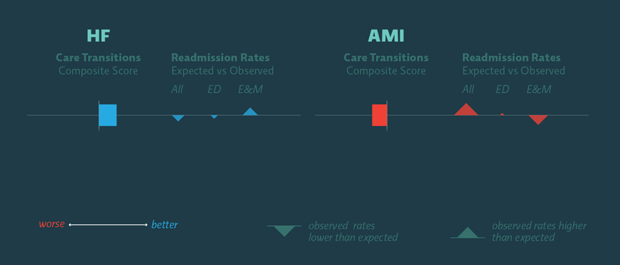
In the single hospital shown above, heart failure (HF) readmissions went down overall in the study period. ED rates went down and E&M rates went up, indicating that the balance of care shifted downstream to where it is more efficient and cost-effective. All of these were steps in the right direction, so they're shown in blue and their weighted composite score is positive. In the area of heart attack (AMI), however, readmissions increased significantly, and the balance of readmissions tipped further towards the ED. These are all steps in the wrong direction, which is reflected in their negative score.
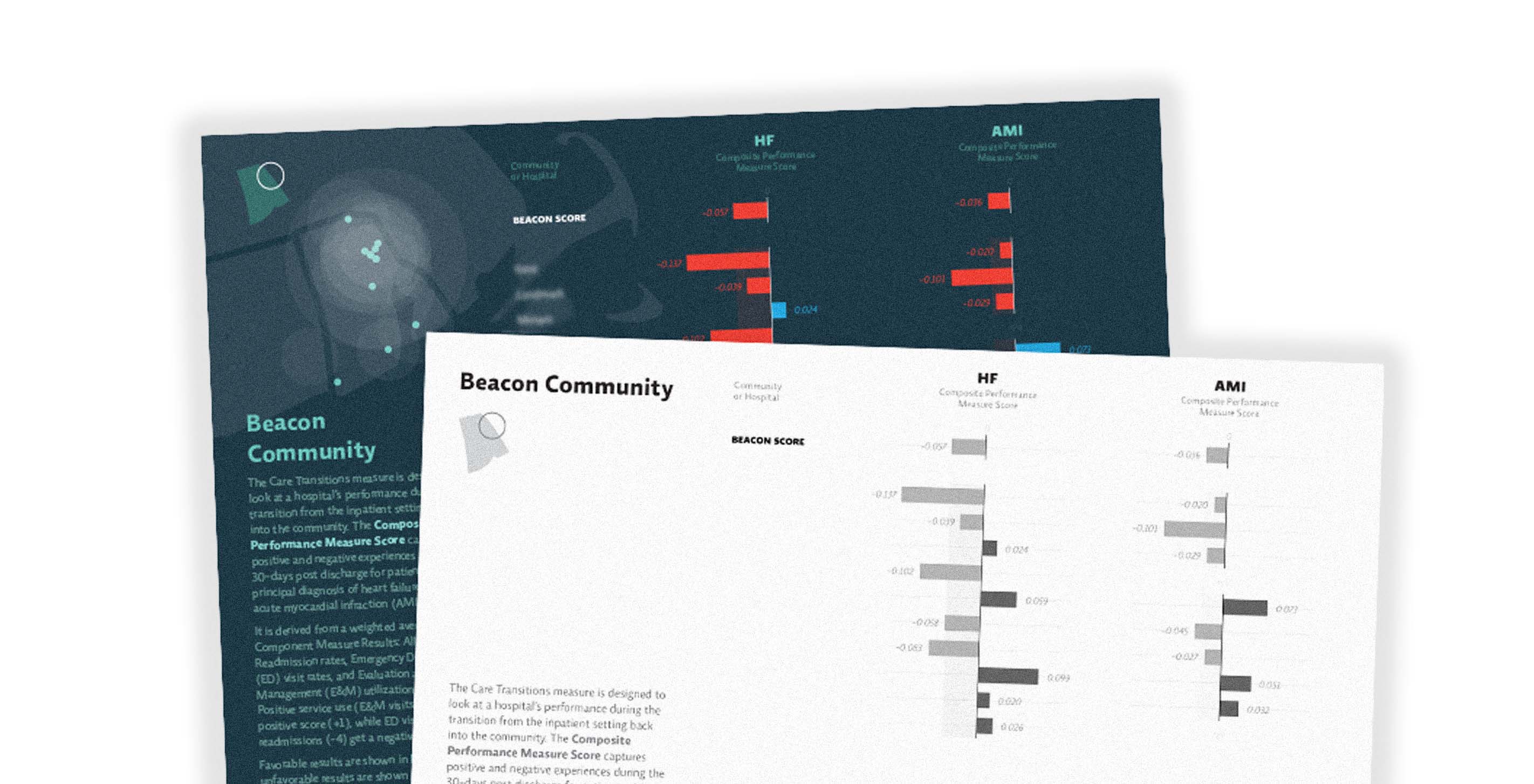
Trying to communicate that a lower number was good in some metrics but not in others proved to be a barrier for our primary audience. The complex weighting mechanism used to derive the composite score led to additional confusion. The trees were getting in the way of the forest — so at the client's request, we simplified the final piece to show only the composite score:
Our task was to build a simple system that could ingest these scoring metrics and produce two sets of summaries for each Beacon Community — one designed to be projected during presentations, and one more appropriate for easy printing and copying in black and white.
The most interesting part of this project — at least to someone (ahem) who geeks out a little on production methods — was the process used to make it.
In general we use a lot of technologies in day-to-day work: Processing, various applications from Adobe Creative Suite, HTML5/JavaScript prototypes, Python, full on C++ or Java, etc. Each has its strengths and weaknesses. Processing is great for generating quick iterations and complex imagery, but not great for setting blocks of text. HTML5/Canvas prototypes are quick and flexible, but leave you without high-resolution images that can be reused in other modes such as print. Adobe Illustrator is great for quickly manipulating the formal aspects of rough vector output (usually from Processing), but doesn't lend itself to multi-page documents. Adobe InDesign is better for managing all the moving parts of a document, but it's not the tool you'd want to use to create visualizations themselves.
Which is how we ended up using a smorgasbord of tools for one relatively straightforward booklet. At the core was an InDesign file with multiple layers — the base layer contained hospital maps (generated with Processing and tweaked with Illustrator), the middle consisted of a multi-page PDF (with transparent background) with the charts generated by Processing code, and the topmost layer featured text laid out on a traditional document grid. Taking advantage of InDesign's ability to autoflow and update linked files, we were able to iterate on the maps, the data, and the copy independently of one another.
Keep up with Beacon news here!
We’d love to hear what you’re working on, what you’re curious about, and what messy data problems we can help you solve. Drop us a line at hello@fathom.info, or you can subscribe to our newsletter for updates.