Last September, we launched Rowboat, our tool for getting a quick and meaningful first look at your data. Since then, we’ve been busy smoothing out edges and building out more features that bring Rowboat closer to being our dream tool.
What’s new?
As we bring Rowboat into classes and workshops, we’ve been able to get a concrete sense of where people get stuck in trying to use the tool. To help smooth out the user experience, we’ve clarified some of the flows in the interface.
Want to explore data from two columns together? We’ve taken out the confusing guesswork in linking columns — now, start your exploration by choosing the representation you have in mind, then selecting the corresponding column.
Expanded charts now have a more streamlined control panel, so you can easily change the data being represented in a chart.
Now for the fun part. We’ve introduced a handful of exciting new charts that can help answer more questions through visual representations.
Stacked Bars
If you want to see categories in one column subdivided by categories from another column, try Stacked Bars.
In this OKCupid dataset from the 2010s, users reported both their horoscope sign and whether they thought horoscopes were “fun to think about”, or said “it doesn’t matter”, or perhaps “it matters a lot”. The chart shows the widest difference between Scorpios and Virgos, in terms of how much each group tended to pay attention to horoscopes.


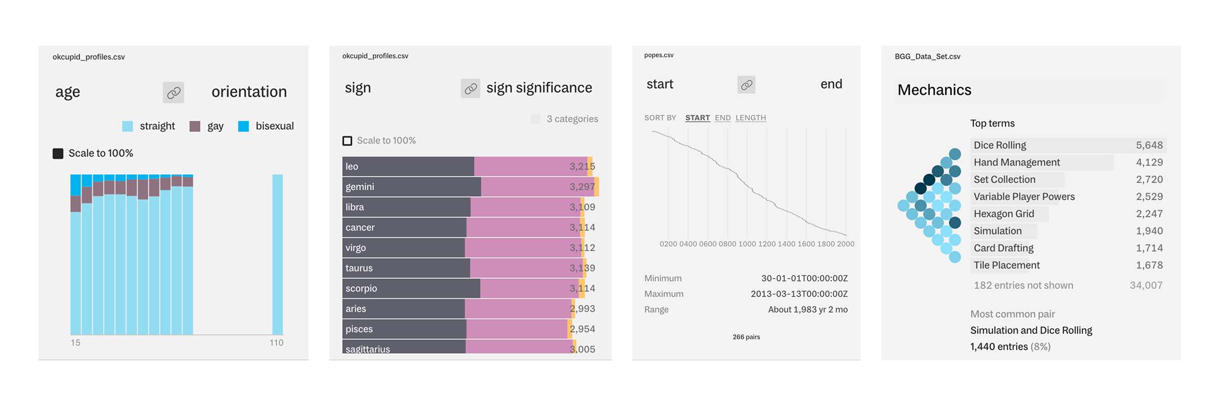
Stacked Histogram
If you’re looking for a similar breakdown, but one of your columns is numeric, use Stacked Histogram instead.
From the same OKCupid dataset, we see that a larger percentage of people reported their orientation as bisexual in younger age brackets than in older age brackets.
.png)
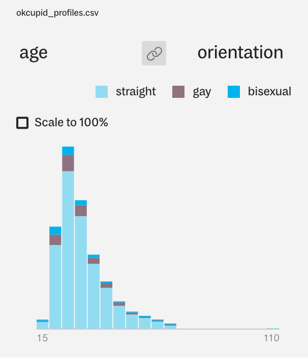
Ranges
If your data contains start and end values or minimum and maximum values, you can use the Ranges linked header to look at the lengths between two values.
The chart below shows the length of each past papacy, from the first papacy, beginning in 30 AD, to Benedict XVI, whose papacy ended in 2013 AD. (We should note that the dataset is outdated, as of a few months ago.)
In the expanded view of this chart (zoomed in to 1700 onwards), we can also label the lines by the Pope’s name. The title of shortest papacy goes to John Paul I, in 1978, while that of the longest papacy goes to Pius IX, in the mid-1800s.

Sorted Values
If you’re looking for a visual representation of a sorted table, try the Sorted Values header or panel.
Below is a list of Pixar films, sorted in descending order by box office results in the US and Canada. We can also compare those values to the box office results for the films in regions outside the US and Canada, as well as how their results worldwide. Coco stands out, in particular, as a film that performed very well outside the US and Canada.

Text Analysis
For data with more free text entries, Rowboat offers a text analysis header, which will take text entries in a column and show the most common words and word pairs from those entries, as well as distributions for word count and character count.
To take it even further, you can export a CSV of more common words and word pairs for continued analysis.

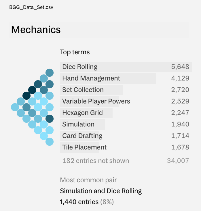
Set Analysis
Some data columns contain lists or arrays of individual entries, like this Mechanics column in a board games dataset.
To get insight into this data, you can use the Set Analysis header, which will use a configurable format to break up list entries into individual terms. Here, you can see the most common mechanics, as well as an interactive correlation matrix for which mechanics often appear together.
Header snapshots
As fast as Rowboat is in helping you see quick insights in your data, we want to make it just as fast and easy to share those insights with other people, by dropping a small image in Slack or over email.
Now, a click of a button gets you a shareable snapshot of the header visual, so you don’t have to fuss around with getting a messy screenshot on your own.
Bug fixes
New features aside, we’ve also been putting in plenty of time on bug fixes and improvements in reliability and performance. For a more detailed list of Rowboat updates, you can check out our new release notes site, where we’ll be posting the details for each release.
What’s next?
The past month has been a whirlwind of wrapping up class and flying away to exciting places to give lectures and workshops on Rowboat. As always, we come away from these opportunities with a wealth of feedback to chew on and inspiration for what to dive into next. Look out for more updates from us on those events!
In the meantime, check out Rowboat if you haven’t had a chance yet! We always love hearing from you — send us a note at hello@rowboat.xyz if you have any questions or feedback.
We’d love to hear what you’re working on, what you’re curious about, and what messy data problems we can help you solve. Drop us a line at hello@fathom.info, or you can subscribe to our newsletter for updates.