While browsing data repositories recently, Ellory came across a census of squirrels in Central Park, and it became our new favorite shiny toy. Do yourself a favor and go check out the delightful census website, browse the map, and, wherever in the world you are, join the cause!
What’s in this wondrous dataset of squirrels? We could set up a notebook or write some code to dig out the analysis… or we can use Rowboat! Rowboat is a tool that we designed to be useful to ourselves, and hopefully to others who also spend much of their time swimming through a sea of data. (We wrote an introduction about it, if you missed it.)
After downloading the file, I can go to Rowboat and drop it right in.
In less than a second, I now have a visual look into the lives of these squirrels.
I get some basic stats about the file across the bottom. The file is about 747 KB. There are 31 columns (or, fields of data collected about the squirrels), and there are 3,023 rows (or, sightings recorded).
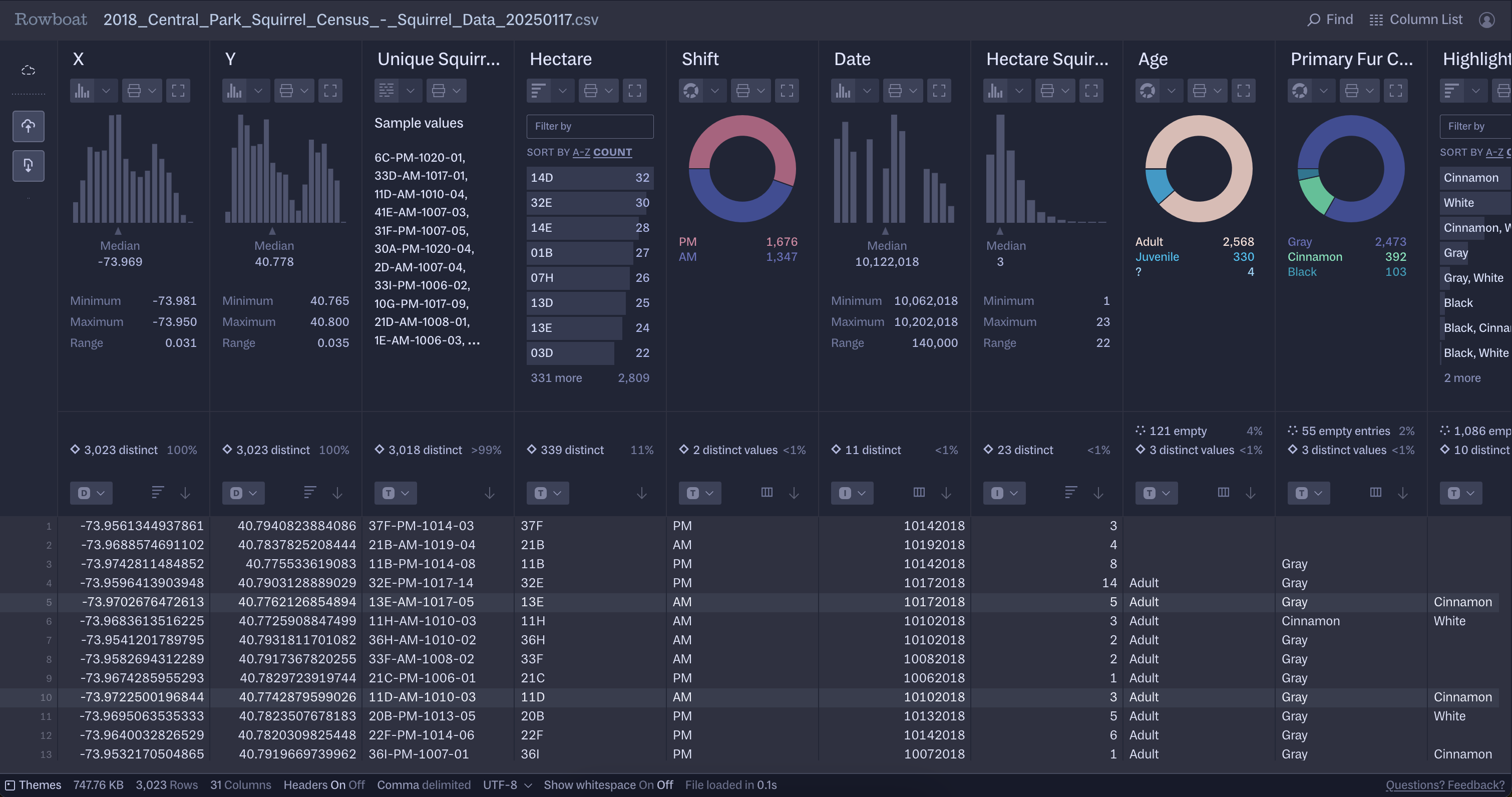
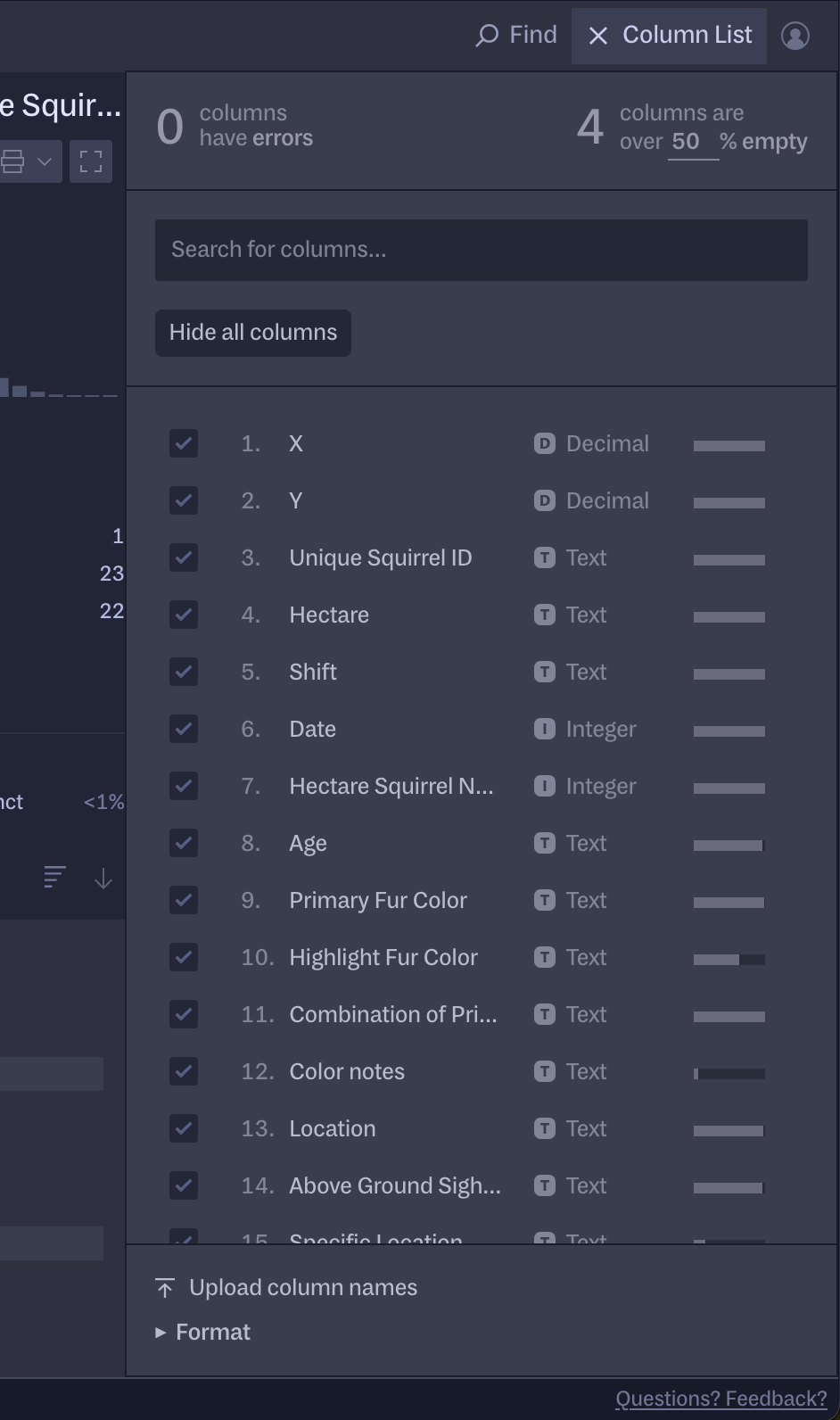
I can get a quick glance at what the rest of the columns are by scrolling horizontally, or by opening up the Column List:
As I scroll through, I start to gather ideas about what’s in this dataset. From the “Shift” column, I can see that there are slightly more sightings in the afternoon than in the morning. In “Age”, I can see that there are mostly adult squirrels, some juvenile squirrels, and a handful of indeterminate age (denoted by a question mark). The most common primary fur color was gray, then cinnamon, with the remaining fraction being black.
With some of the basics in mind, I’m also starting to think about what questions I want to ask about this data.
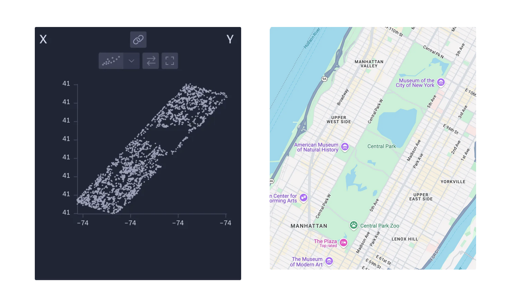
The first two columns are an “X” and a “Y” column. I know those are going to be coordinates, so, naturally, I want to know what kind of picture they make, when mapped together.
Rowboat makes this easy: with three clicks, you can link two columns to see a visual representation of the relationship between them. Maps are a great use case for this.
Rowboat makes some informed guesses at what charts should be shown, based on clues like the type of data in the column, the general shape of the data, and the name of the column. Rowboat doesn’t currently have enough clues here to know to show this data on a geographic map. Even still, it’s a delightful surprise to see the clear resemblance in a simple scatterplot:
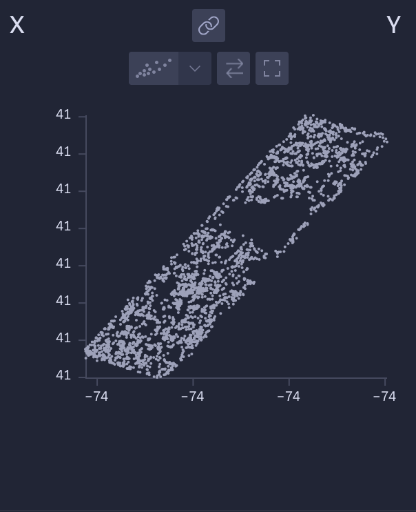
Turns out that there aren’t any squirrels swimming in the reservoir.
Now that we can picture this dataset in a space, could we get a sense of time, too?
A few more columns down, we have a date column. Unfortunately, since it’s in a date format that isn’t one of the most common, Rowboat hasn’t recognized it and has fallen back to showing a histogram of numbers, which isn’t as helpful to us. To fix this, we can manually change the type from Integer to Time and set the format (using a strptime date notation as described in our resources). That’ll get us the stats in the right formatting. Now, we can see that the data spans a total range of 14 days, or 2 weeks.
Now, we can open up the X/Y scatterplot and play it over time, to get a fun timelapse of squirrels spotted each day:
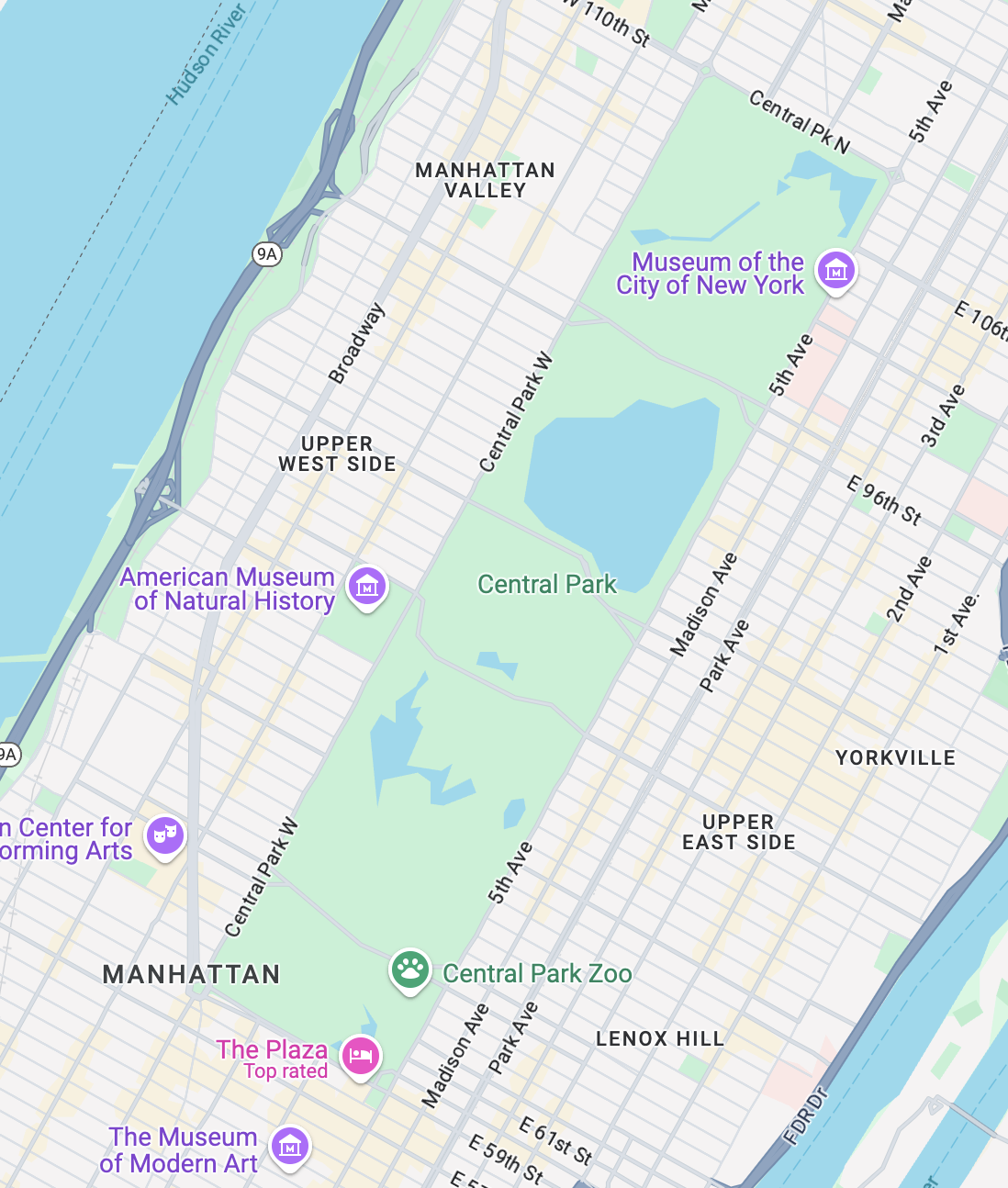
This scatterplot map can also help us visually understand coded fields in the data such as “Hectare”, which contains codes consisting of a number and a letter. If we open up the scatterplot and add “Hectare” as a label to the tooltip, we can discover the hectare codes correspond to relative locations in the park. Moving from west to east, locations correspond to letters A through I. Moving south to north, locations correspond to numbers 1 through 42.
There are lots of ways to continue slicing the data. Here is a range of activities that squirrels can be seen doing, from running, chasing, and climbing, to eating and foraging. Could we see how squirrels behave differently depending on their location on the ground or above ground?
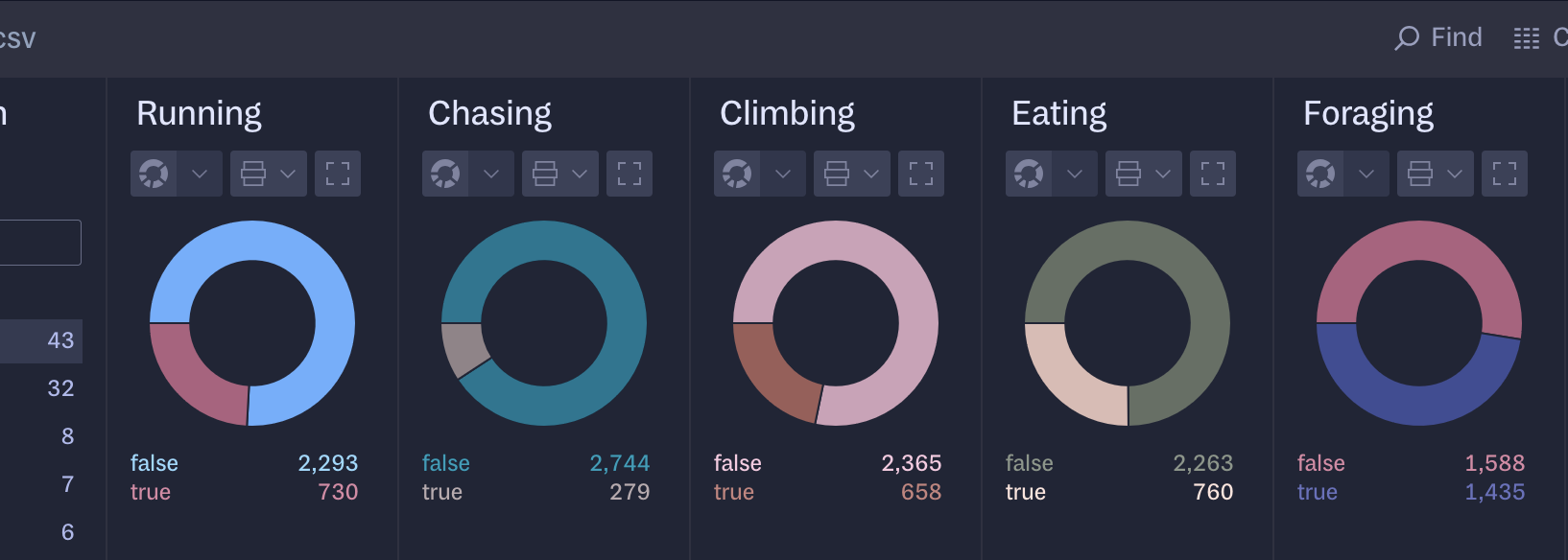
The interactivity of Rowboat means that, whenever you see something visually interesting, you should be able to dive into them as quickly and effortlessly as possible. To answer our question, we can click to add filters from the “Location” column, and compare the results for either “Ground Plane” or “Above Ground”.
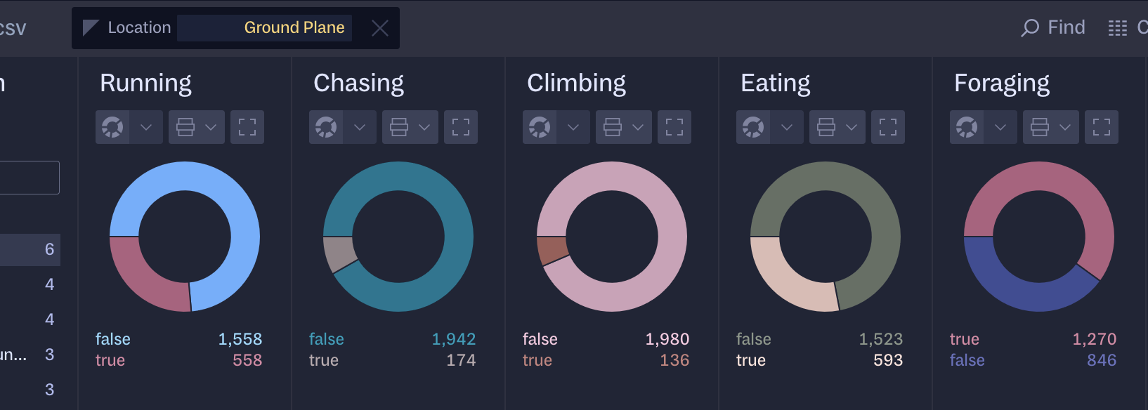
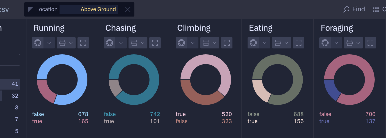
Looks like squirrels are more likely to be climbing above ground and more likely to be eating and foraging on the ground.
But there’s a lot that these squirrels are doing that can’t be as easily quantified, and that’s why there’s one final column to dig into. The “Other Interactions” column consists of free text that squirrel sighters have written in, to fill in any important information we absolutely have to know about the aforementioned squirrel. By default, Rowboat is showing this as a list of the most frequent entries, so we can see that running from dogs is a very common squirrel activity.
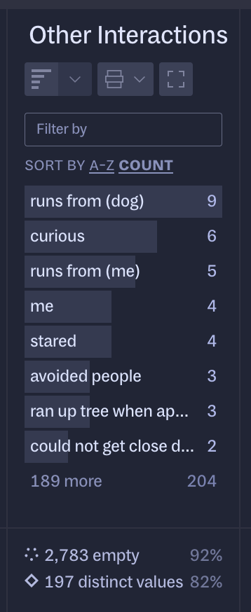
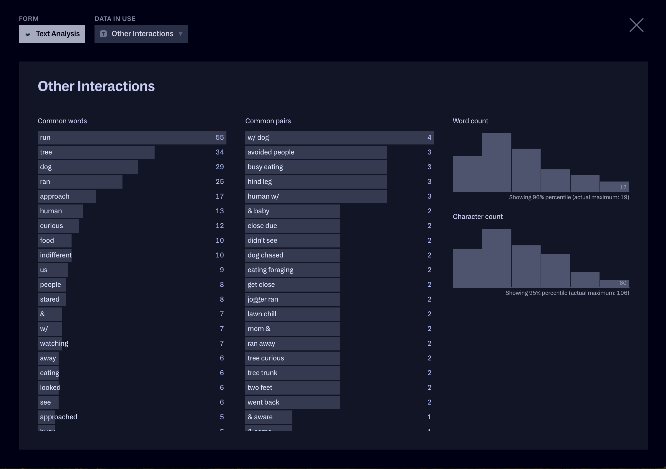
We can dig into this more by changing the chart type from Bars to Text Analysis, which will give us a wealth of granular information about the most common words and pairs of words in the corpus of text here, along with distributions of word counts and character counts.
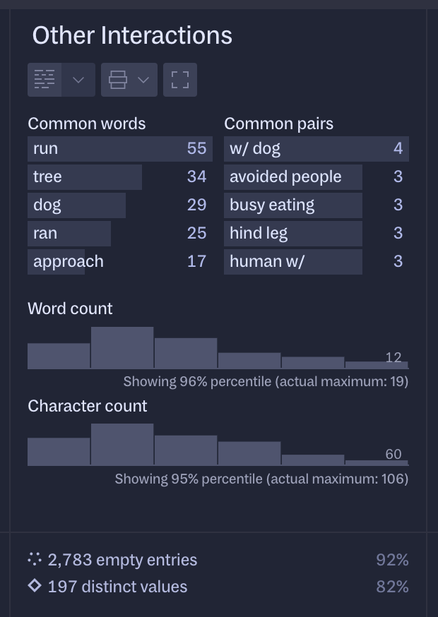
As with most other charts, we can expand it to see it in the bigger panel and really understand what the squirrels are chasing, or are being chased by, or approaching, or being approached by, et cetera.
Now it’s your turn: go ahead and continue exploring squirrels with this file in Rowboat, or drop in your own files and see what you can find!
We’re always developing new features for Rowboat, so we would love to hear from you. Let us know what would make it even better for you at sos@rowboat.xyz.
We’d love to hear what you’re working on, what you’re curious about, and what messy data problems we can help you solve. Drop us a line at hello@fathom.info, or you can subscribe to our newsletter for updates.