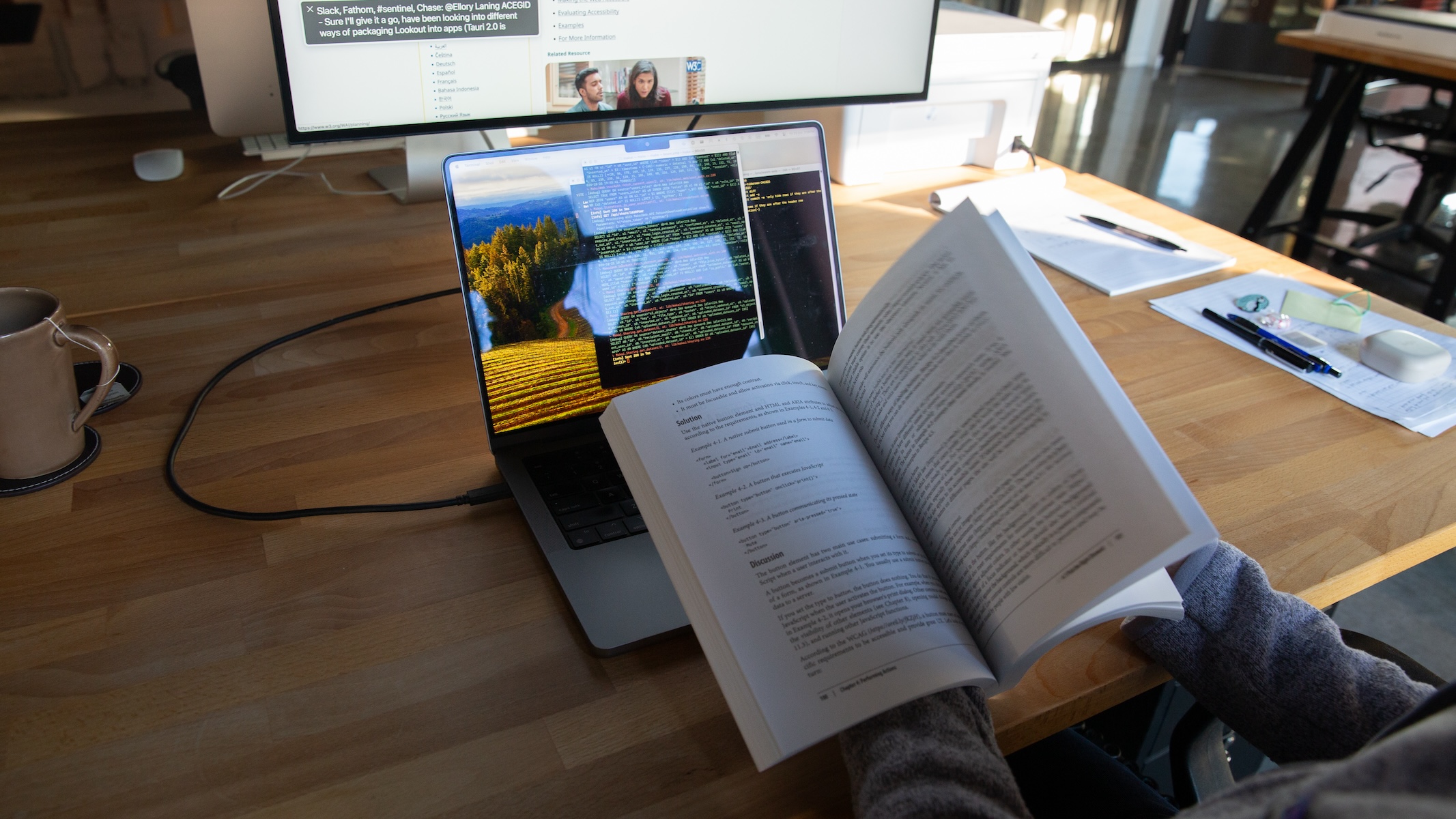

Over the past few years, accessibility has become a particular interest of mine. I’m learning about how it’s so much more than just a technical best practice or a set of guidelines to meet. It’s a practice of keeping an open and curious mind for how people live, what barriers they encounter, what assistive technologies and aids they use, what accommodations can look like, and what happens when we do or don’t design and build with these considerations in mind.
The work of accessibility ties in beautifully with the work of information design. We can chase technical implementations forever, but in many cases, it’s often helpful to revisit the problem we’re addressing and the story we’re trying to tell.
One of my goals at Fathom, as well as in other areas of my life, is to prioritize accessibility — to help our projects meet those technical guidelines, for one, but also to encourage more conversation about how we’re thinking about technology and about the people we want to reach.
In my experience, accessibility is rarely taught in schools or in general-purpose resources. As an able-bodied person, I’ve had the privilege to not have to think much about these questions, at least until I started to take an active interest in accessibility. To remedy this, I’ve been learning as much as I can from articles, discussions, and conference talks from accessibility practitioners and disabled designers, developers, and users.
One of the main tasks in this process has been identifying where we fall short, especially in more complex web apps. Some questions that I’ve been practicing are:
- Could someone not using a mouse still be able to do everything on the page with just the Tab key and the arrow keys?
- Could someone using a screen reader be able to understand the structure of the page through a list of headings and landmarks, and click on buttons and manipulate controls? (I have learned a bit of the screen reader functionality on my computer to understand its particular language of navigation, but I’m definitely not fluent yet.)
- Could someone with colorblindness or low vision, or someone in adverse lighting conditions, be able to read all the text and differentiate between color-coded categories? (The afternoon glare on my monitor is great for helping me identify some of these issues.)
The process often involves having to challenge our assumptions. We can make a certain layout problem pixel-perfect by assuming that the font size or element size we set is constant, but that falls apart once someone uses zoom on the page, or has text zoom set on their browser. Many other solutions, too, that might seem obvious or straightforward to me quickly fall apart when I consider people and their circumstances more broadly. One resource I’ve found especially useful for thinking about this is the Web Accessibility Initiative, where pages such as “Accessibility: It’s About People” and “Stories of Web Users” help me understand the diversity of people using the web.
We always have to balance these considerations with constraints on our time and resources. Still, it’s been an incredibly rewarding and interesting part of work and life to be able to think about these questions and to do our best to address them.
It’s work that’s complicated, invisible, and never finished — but always worth doing.
We’d love to hear what you’re working on, what you’re curious about, and what messy data problems we can help you solve. Drop us a line at hello@fathom.info, or you can subscribe to our newsletter for updates.