So, how does Maestro himself figure into our visual representation of his musical legacy? This question required a careful consideration of his role in the sonic landscape. Compared to his beloved collaborator, Miles Davis, his presence takes a different shape. Though similarly influential figures in the world of early jazz, together shaping its evolution into the present-day, Carter’s presence takes a subtler, more dispersed form in the soundscape, where Davis often sat in the foreground. A prolific band-leader such as Miles naturally emerges as a central figure in jazz history, in a fairly literal way. But Carter is central more in the sense of a ‘sphere whose center is everywhere and whose circumference is nowhere,’ to quote a 12th-century text describing God, which Ron Carter kind of is, in the sense that he’s omnipresent (just kidding, not quite). While Miles Davis’ appearances were pretty concentrated in the musical contexts where he often took the lead, Carter’s presence feels more rhizomatic, a quality that begets a more nonlinear visual translation than a straightforward timeline. He’s the thread connecting a vast network of artists, weaving many otherwise-unrelated musical communities together across time and genre into an expansive, colorful textile of sound.
Though Carter headlined, composed, or even played solo on plenty of releases, many of his collaborative contributions are more structural than directorial. His position in the background is precisely what makes his bass line able to anchor a great variety of sounds to a complimentary backbone that’s as solid as it is dynamic. While this means that Carter’s sound is less audibly prominent, it also took him across a more diverse, delightfully sprawling landscape. It can take a discerning ear to detect how those deep chords inform the direction of the soundscape, but by making it possible to freely navigate his universe, we can draw meaningful connections that might not otherwise be easy to notice.
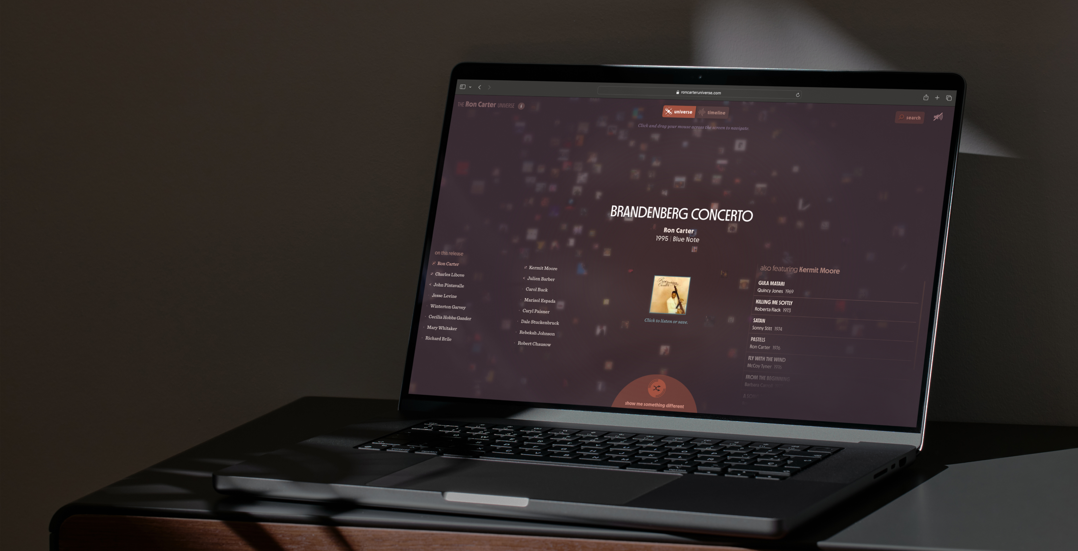
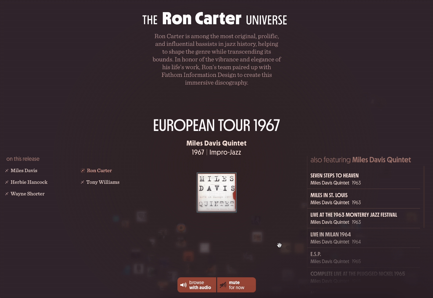
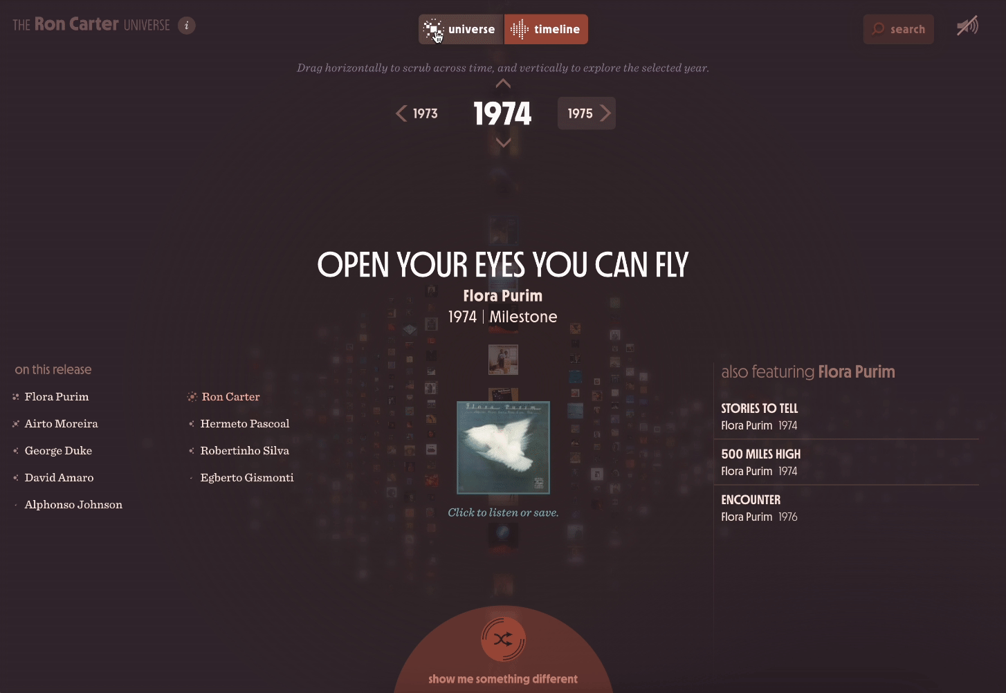
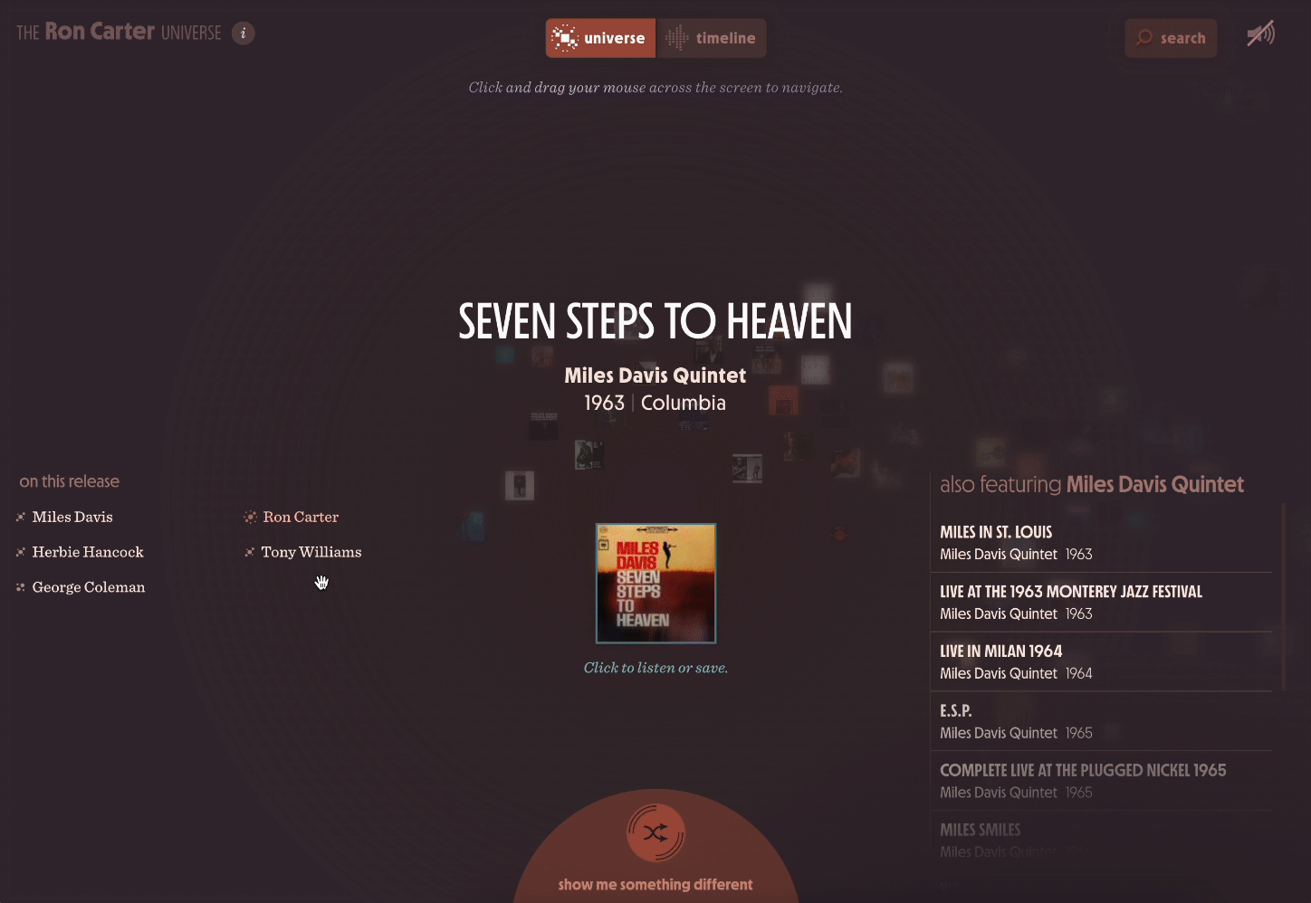
We wanted to avoid delineating these connections too explicitly. They’re most satisfying when stumbled upon, in a browsing experience where time or genre aren’t exactly constraints, but merely part of a more ambiguous, complex logic that evades visualization. For this reason, we gave our mobile-first app its unconventional but simple default interaction, keeping buttons and labeling minimal. A drag of a finger takes you across a map of releases loosely clustered by personnel, and you’re free to wander, listen, and collect sounds unhindered by unnecessary gridded order. But as focused as we were on designing a novel, experimental interface inviting access into rabbitholes within Maestro’s discography from as many vantage points as possible, we also wanted our app to function as a research tool, the way a good poster can. This means keeping certain design conventions within reach, and anticipating the contexts in which they’re most useful. So, if desired, you can easily switch to a timeline mode when browsing audio snippets, or search within a more straightforward list of releases and collaborators.
Although our primary focus was to design an experience suited to smartphones, we adapted it to desktop-sized browsers too — with some tweaks. We kept the experience similarly organic for larger screens, but made use of some of the extra real estate to accommodate more information density. To facilitate its use as a tool for someone doing heavy-duty research on the web, we also boosted the UI for querying and analyzing the entire index.
I’m not sure whether you’re reading this on your smartphone or an IMAX screen, but I am certain that you’d rather check out the final product yourself than listen to me go on about device-responsive design. Whether for research or leisure, we hope our Ron Carter Universe finds its way to even a fraction of its (conscious or not) audience, and beckons them to delight and learn, through ambient wandering and serendipitous discovery, half as much as we did while building it.
We’d love to hear what you’re working on, what you’re curious about, and what messy data problems we can help you solve. Drop us a line at hello@fathom.info, or you can subscribe to our newsletter for updates.