Shannon was tasked with investigating more of the conceptual and design aspects, while I’ve been looking into what we can extract from publicly available historical data — the “pathogen climate”, if you will.
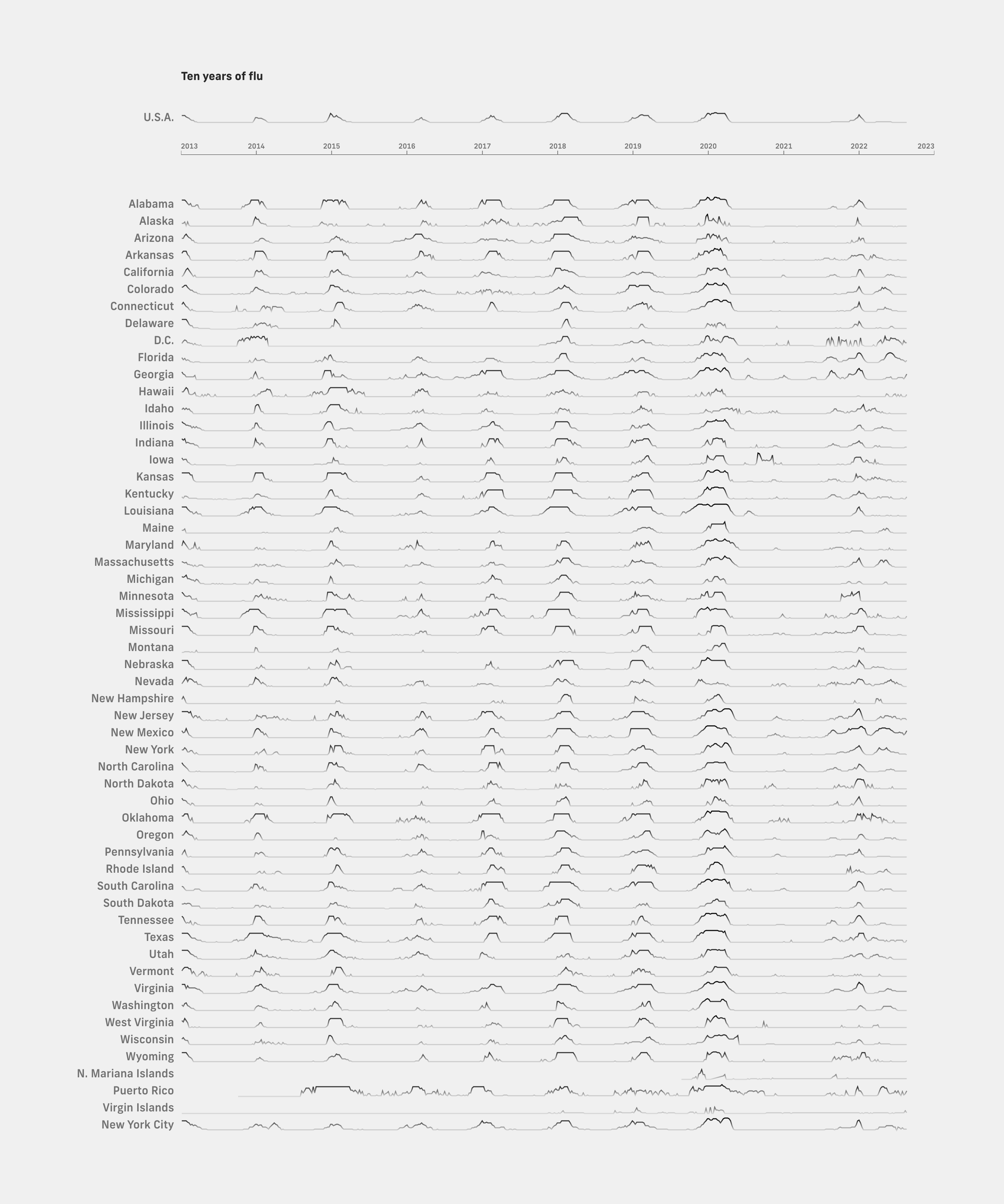
One of the most immediate ways I could understand “pathogen weather”, aside from the now-ever-present COVID, was flu. As a layperson, I know that there exists a “flu season”, which is when I should get vaccinated and be on the lookout for a cough or a sniffle. To find out how well my intuition aligned with the data, I created a visualization of ten years of flu seasons, building on an earlier Fathom sketch. For each U.S. state or territory, a long line chart represents the level of flu activity over time, from 2013 to late 2022. On each line chart, peaks appear at regular intervals, which matches what I had imagined about a “flu season”. However, there’s a conspicuous gap where we would typically expect a flu season between late 2020 and early 2021. We could infer that the preventative measures that were implemented to mitigate COVID during that time had also helped curb the incoming flu season. In fact, the CDC typically classifies each flu season with a severity level (low, moderate, or high)—but the burden estimate for the 2020–2021 season was not calculated “due to the uncharacteristically low level of influenza activity that season”.
Flu data was easy to find, but hunting for a motherlode of disease data was more involved. We wanted data where the fidelity was high enough in multiple aspects. The data needed to:
- contain multiple diseases,
- disaggregate into state level (or better) geographies, and
- provide a continual time series across multiple years.
What I eventually found was the behemoth of Project Tycho, a data set that includes “all weekly surveillance reports of nationally notifiable diseases for all U.S. cities and states published since 1888”.
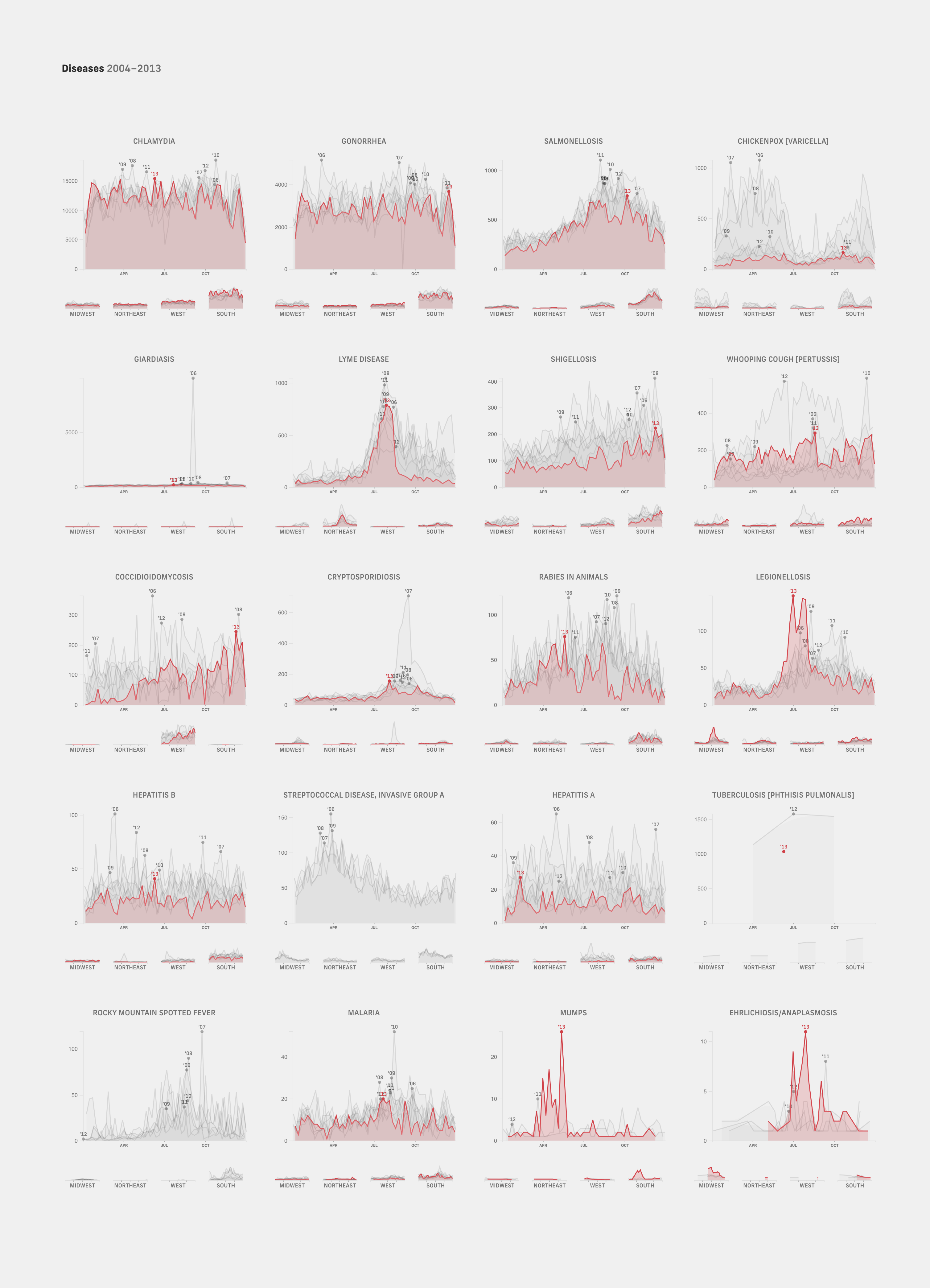
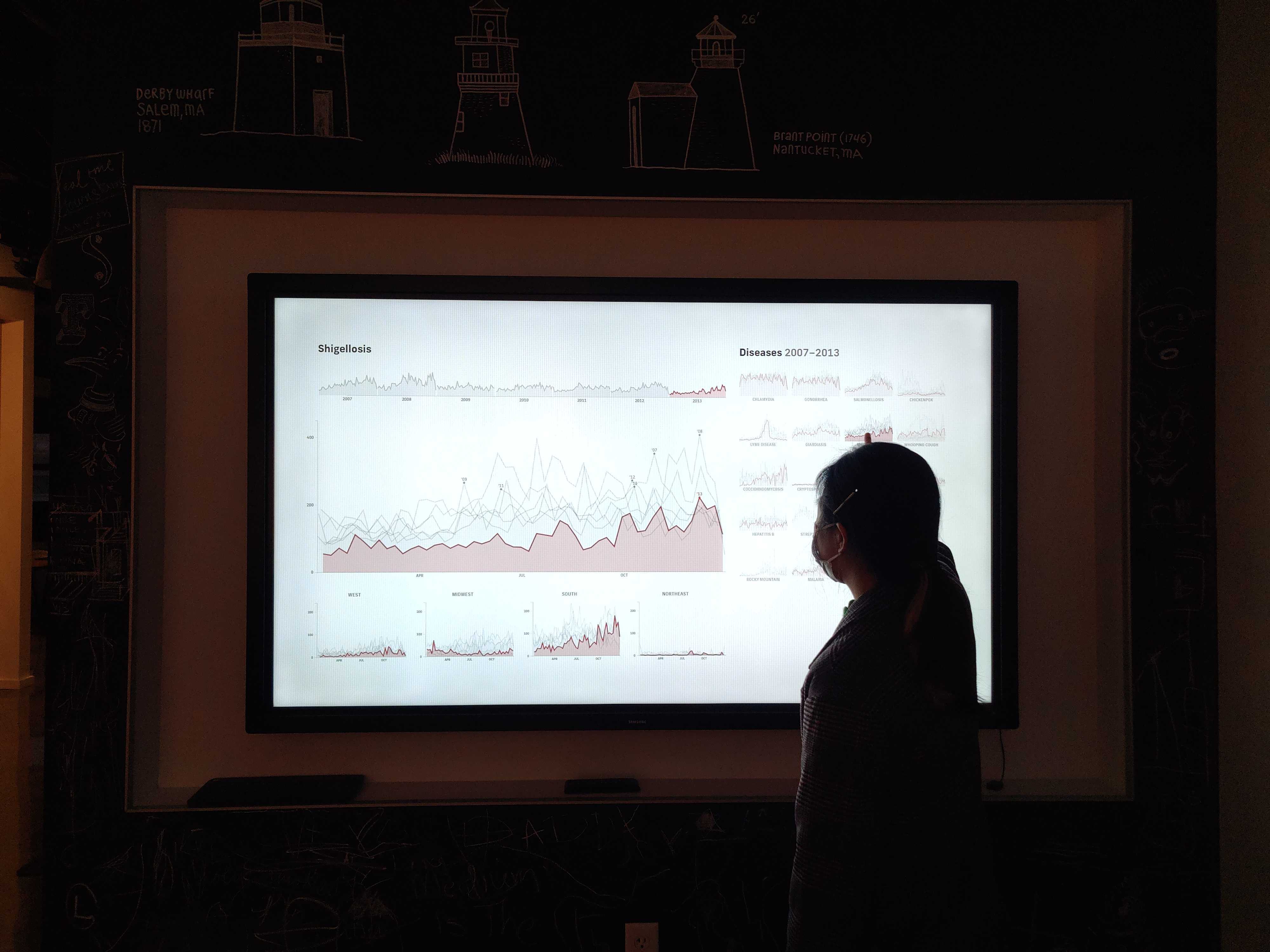
Using the same format as the flu charts, I laid out the data for diseases with recent data (21 in total), with each line chart representing a different disease instead of individual states.
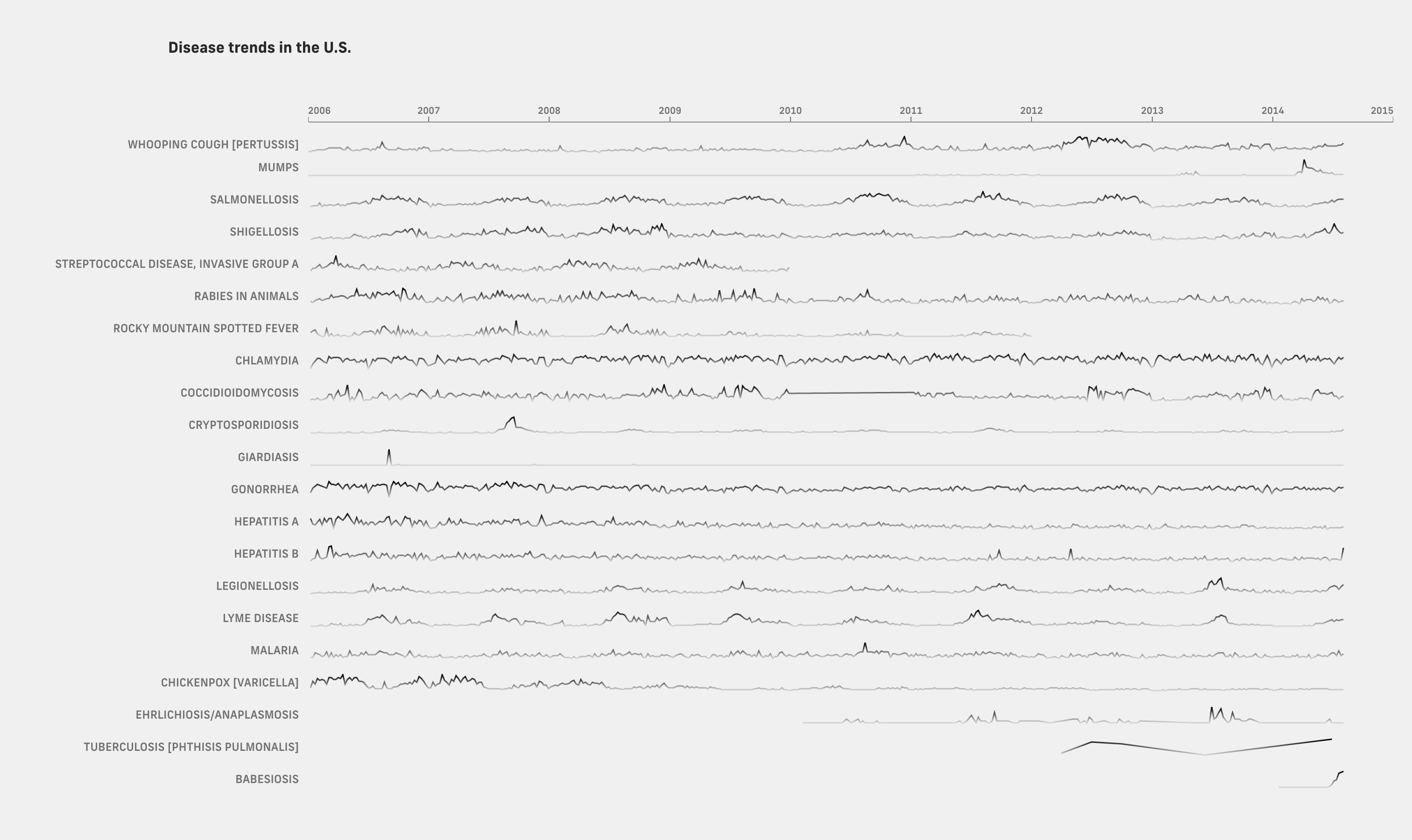
The first thing that jumped out was that the data was a lot noisier than the flu graphic. The flu graphic had been highly readable because I knew at a glance that the pattern would be seasonal peaks around the same time each year, which made it easy to scan across states and years. In contrast, this graphic had much more more visual variety in peaks and troughs. Each line chart demanded to be read individually and often required the reader to jump back up to the year labels to find context for different trends.
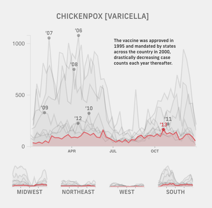
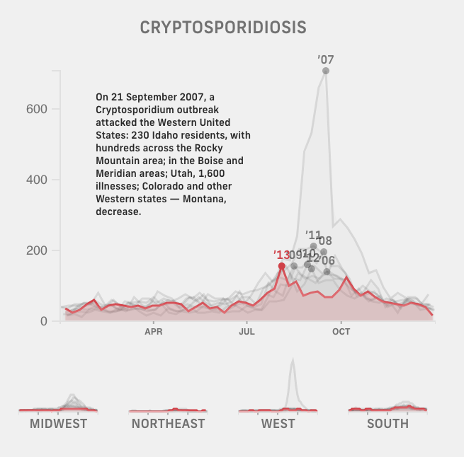
That being said, it was clear that there was a lot to dig into. Why were there isolated peaks for mumps (2014), cryptosporidiosis (2007), and giardiasis (2006)? Why was there no more data for streptococcal disease after 2009? Tuberculosis had seemed to me a historical disease—why had cases occurred in recent years and how many were there? Chickenpox had petered off steadily and was almost eradicated after 2008—how did the U.S. chickenpox vaccine program align with that timeline? These charts also sparked new questions about geography—would the charts for more climate-dependent diseases such as Lyme disease and malaria look different across the U.S.? As someone who had previously lived in California, what different kinds of pathogens should I be aware of in Massachusetts? To try to answer some of these questions, we moved on to explore other formats.
Thinking about what made the flu graphic compelling to us, we latched on to the theme of seasonality. Not every disease is seasonal—for example, sexually transmitted diseases such as chlamydia and gonorrhea have noisy line charts that maintain a generally consistent level throughout the years. For those that are, though, how could we gain an understanding of “Lyme disease season” or “malaria season”, or find periodic patterns in diseases that aren’t already on our day-to-day, year-to-year radar?
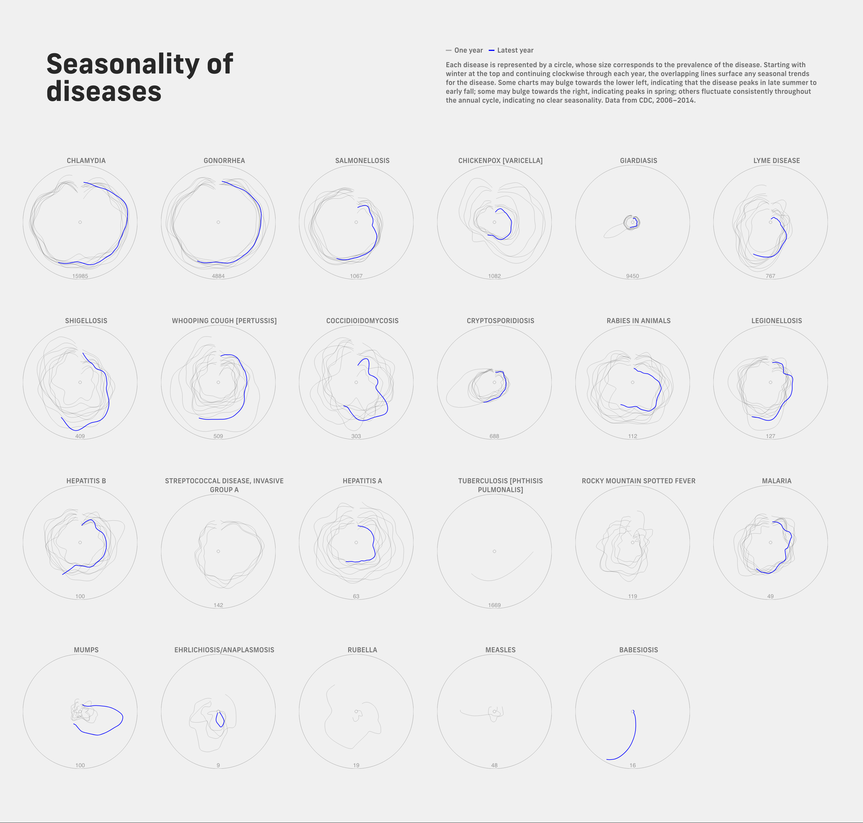
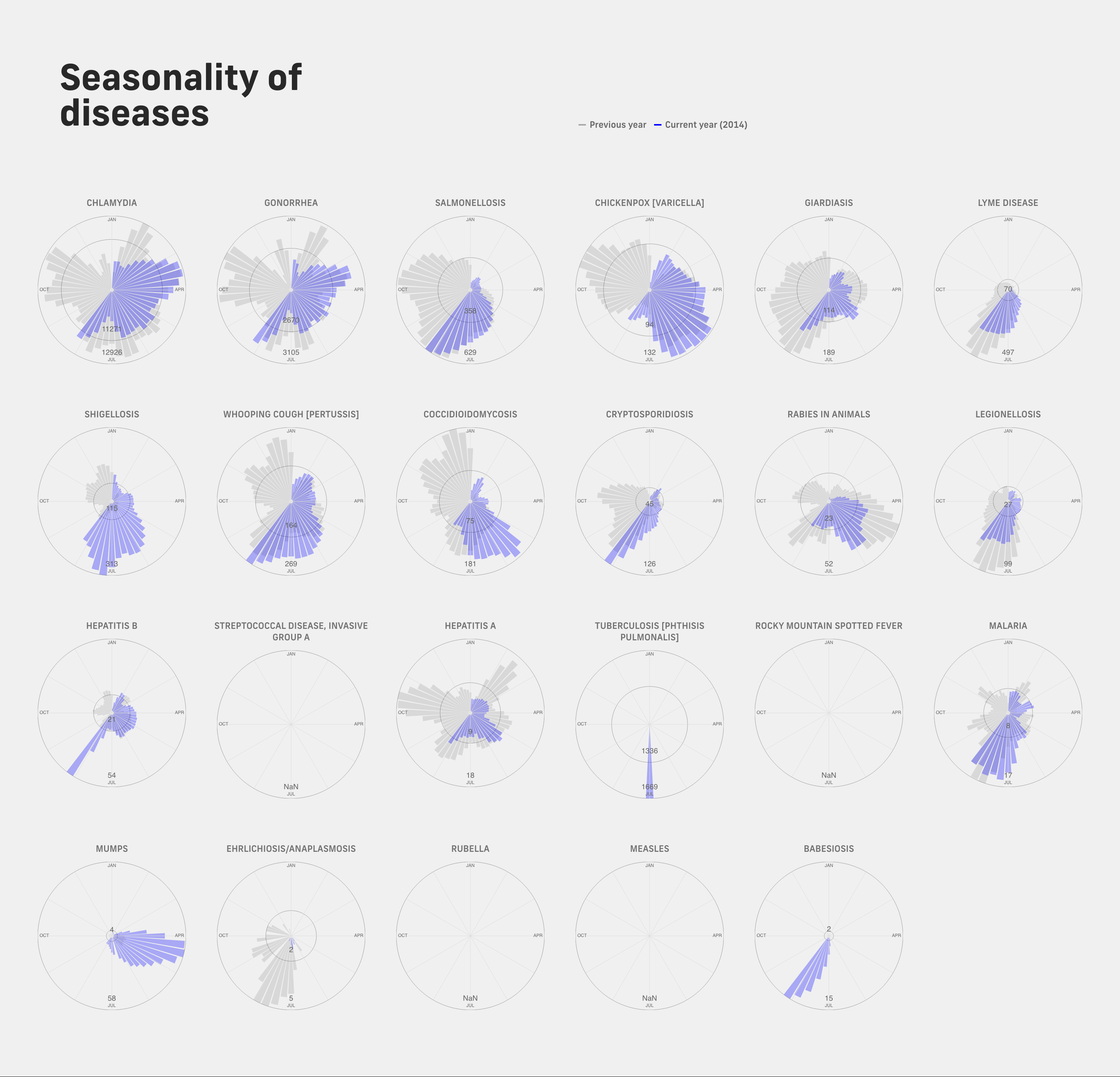
Following the theme of periods and cycles, I made a brief foray into circular charts. My plan was the following: each disease chart would be a disc of overlapping circular squiggles that started at the top, representing January, and continued clockwise, in time, around the circle, with its distance from the center representing the level of disease activity at that point in time. If you had trouble following that, so did we, unfortunately. The chart for Lyme disease showed a blob that bulged towards the bottom, representing summer, but it wasn’t immediately clear that this meant something—it just looked off-center. We also tried radial column charts in an attempt at providing more structure, but the problem remained that the visual metaphor of a circle as a year of four seasons was confusing. Our high hopes of so perfectly echoing the periodic patterns in the data with a circular visual image were dashed even through multiple iterations, as the charts continued to be too convoluted and difficult to read.
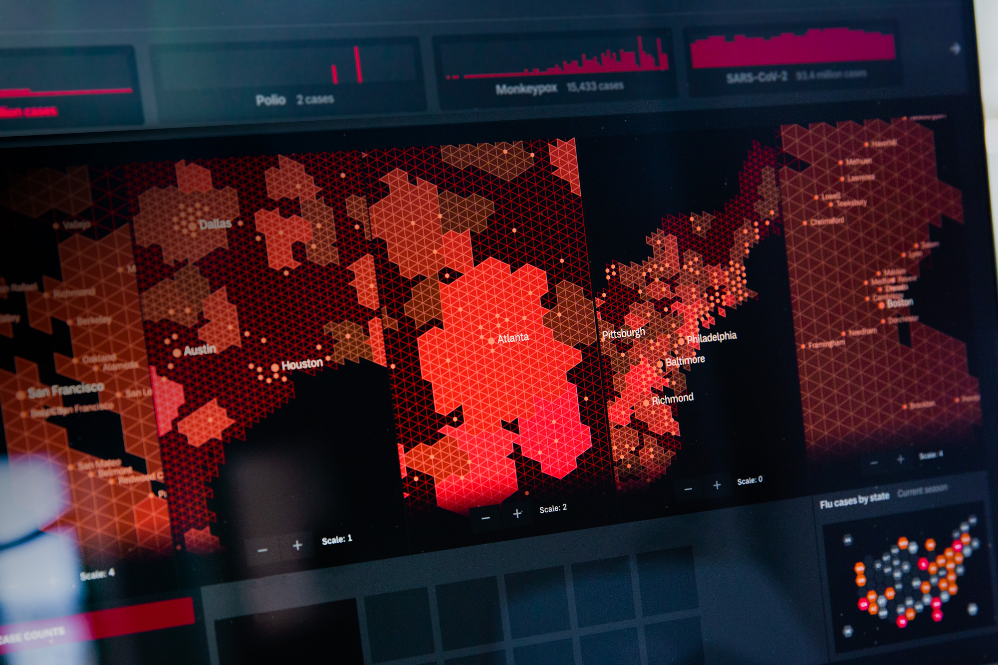
In another thread, I also explored overlaying or integrating charts with geographical maps to get at the sense of geography that some diseases require. We had been curious about leaning into the idea of a classic weather page map à la USA Today, with which we could imagine portraying diseases moving like fronts or outbreaks occurring like spots of rain. In particular, we were interested in representing geography in a way where geopolitical boundaries are displayed for the reader’s convenience, but do not constrain or obscure the details and patterns in the data. Unfortunately, I wasn’t able to figure out a representation that nicely displayed trends over time by state; even with tile grid maps, it was too clunky. This is where the pipe dream of a consistently high-fidelity dataset seems to be so useful—we can visualize patterns by areas as small as a county or zip code, so that we can find nuance where population density and demographics vary widely.
Those two threads investigating seasonality and geography clarified two points for me. First, the boring (or in other words, conventional and readable) representation was the right way to go and could still be altered to emphasize seasonal patterns. Second, there was a middle ground to be found between “no geography” and “detailed geography”—I could group states by the four main regions of the U.S., for example.
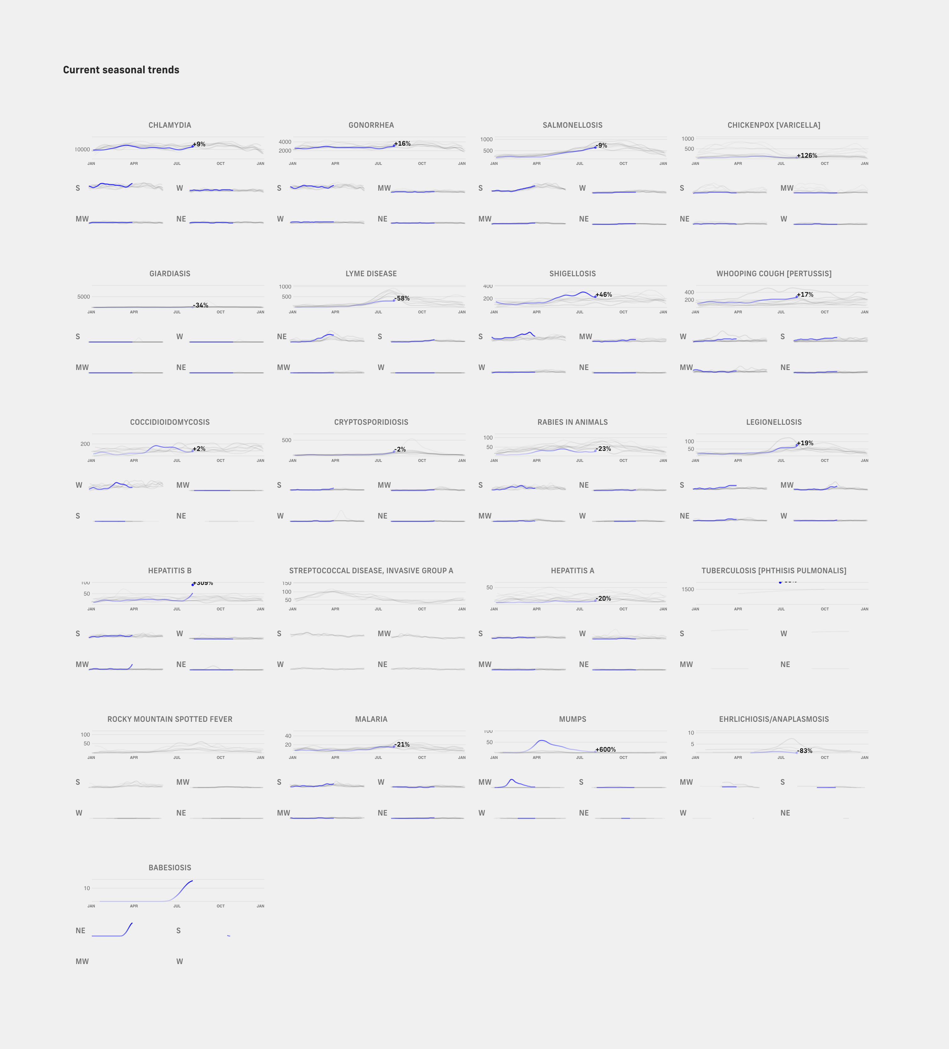
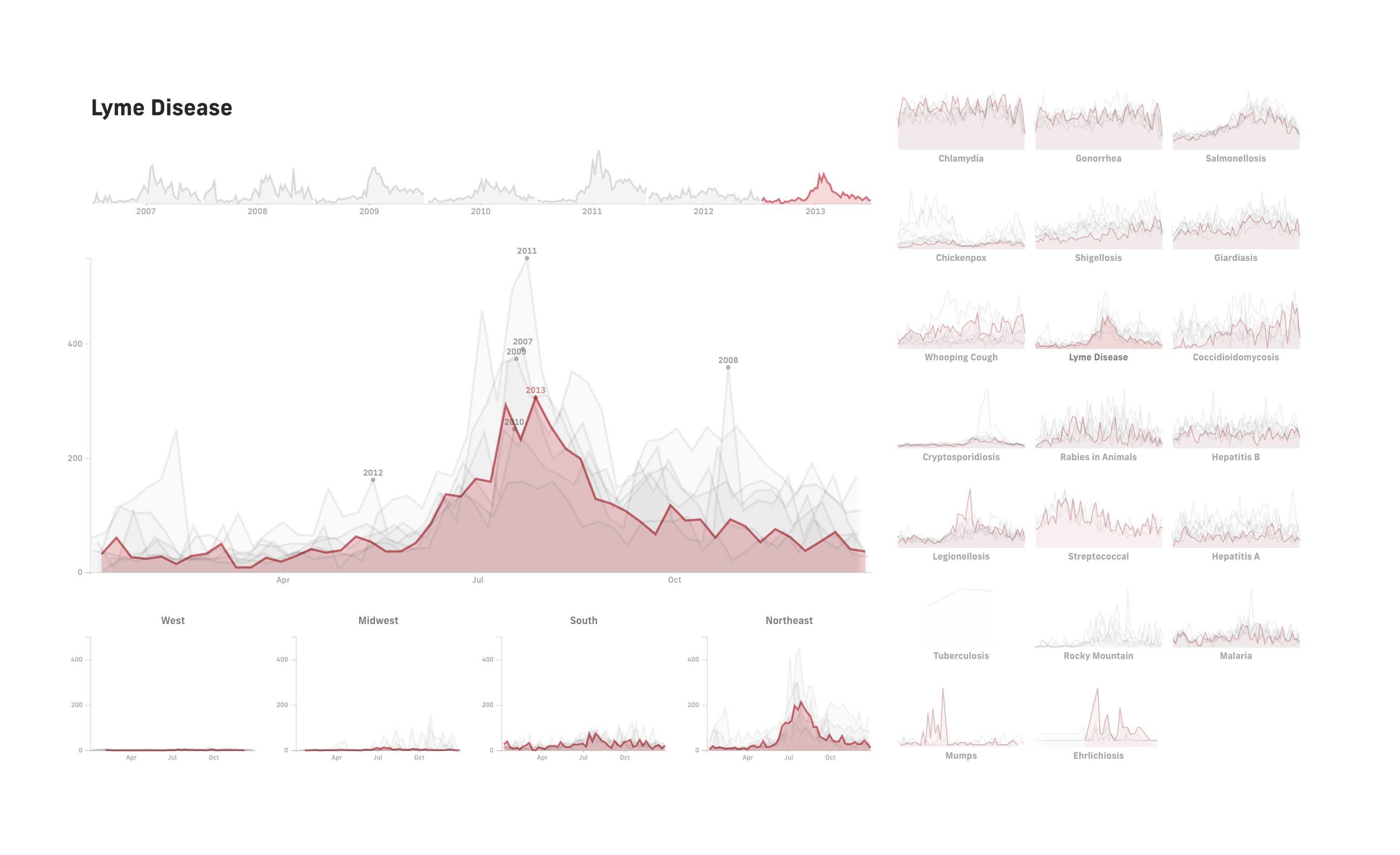
To bring out seasonal patterns, I adapted the line chart idea by breaking the data up into years and overlaying each year segment on top of each other, with grey lines representing previous years and the blue line representing the current year. Then, instead of trying to manage fifty-plus individual states and territories, I aggregated them into the four regions of the mainland. As with the original line charts, this seemed a promising direction from the way that the design helped me notice interesting patterns that hadn’t emerged before. Looking at the regional charts, I noticed that certain diseases were more prevalent in specific regions—salmonellosis in the south, Lyme in the northeast, coccidioidomycosis in the west, and mumps in the midwest, for example.
After a couple of wrong turns, I was excited to land on something promising, and the sentiment was shared by the rest of the team. Moving the design along, I tweaked the layout to create a better visual balance and to give focus to more important elements.
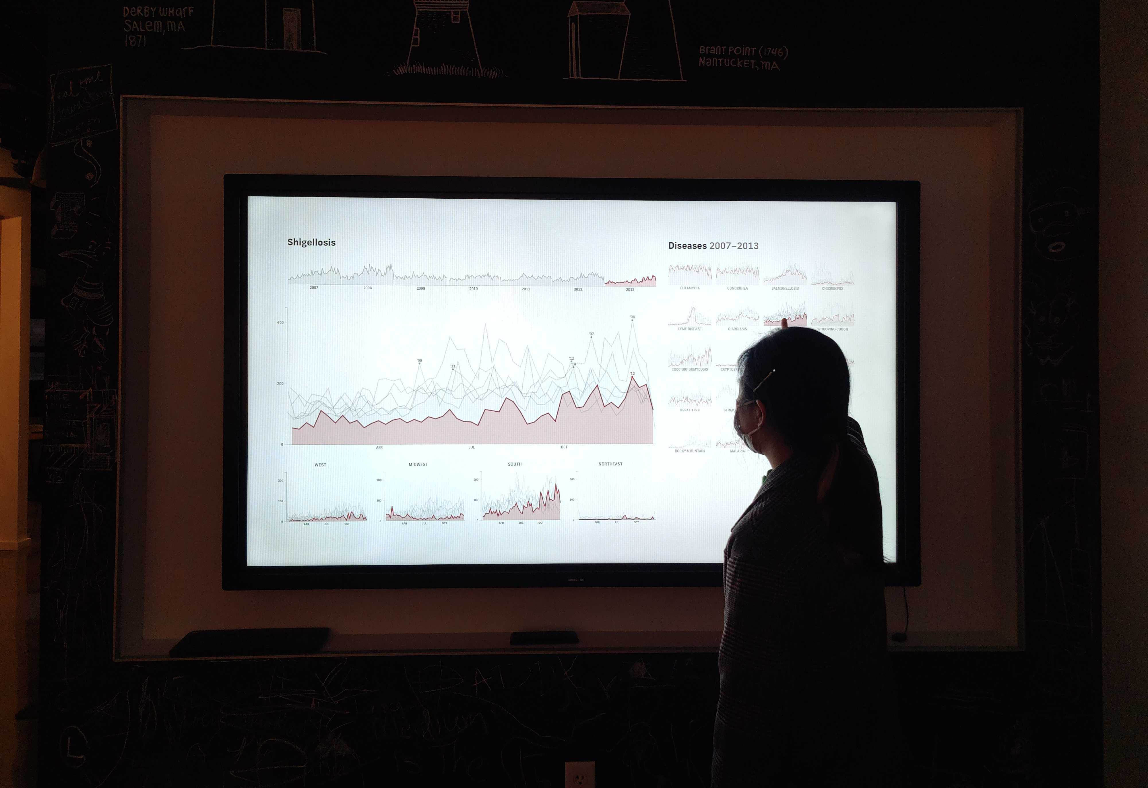
At this point, we felt that we had gained enough of an understanding of what was in the data to help inform our ongoing work with the Sabeti Lab and prepare us for working directly with the CDC in the coming months, which put us at a good stopping point to wrap up the project. Just for fun, though, we also wanted to polish up an interactive installation version that could be used on the large touchscreen in the office. In this version, there was more space available for the charts to take up, and even for the historical timeline to be reintroduced. This design allowed a visitor to tap around different diseases and tap or slide through different years, changing what year was currently highlighted across diseases.
What remained for me after this project were questions about disease stories. Many of the questions that had been raised in the initial sketches—why had tracking dropped off or picked up again for certain diseases? what was the story behind particular outbreaks?—couldn’t be answered easily without more journalistic research. I had explored this a little during sketching, with short info boxes attached to each chart to point out interesting stories about that particular disease. This direction deviates from the original prompt of a daily disease map, but it would be fascinating to pick up another time and design a layout that tells a story through data about the relationship that we have with disease throughout time and geography.
As we were wrapping up this project, other members of the team were also finishing a proof-of-concept disease “multimapper.” The project explored how we were thinking about our upcoming work with the CDC: the need to look at multiple diseases, in multiple geographies, at multiple scales simultaneously. The work was started with publicly available data, in anticipation of the more detailed data we’ll be using in the future. Between these two projects, we were happy with the questions and ideas we were able to explore around disease tracking. (We were also very much ready to stop staring at this data and thinking about how much disease is around us every day.)
We’d love to hear what you’re working on, what you’re curious about, and what messy data problems we can help you solve. Drop us a line at hello@fathom.info, or you can subscribe to our newsletter for updates.