To share the installations online, we created a pair of videos (seen above and below) that capture how the interactive pieces work and what they depict.
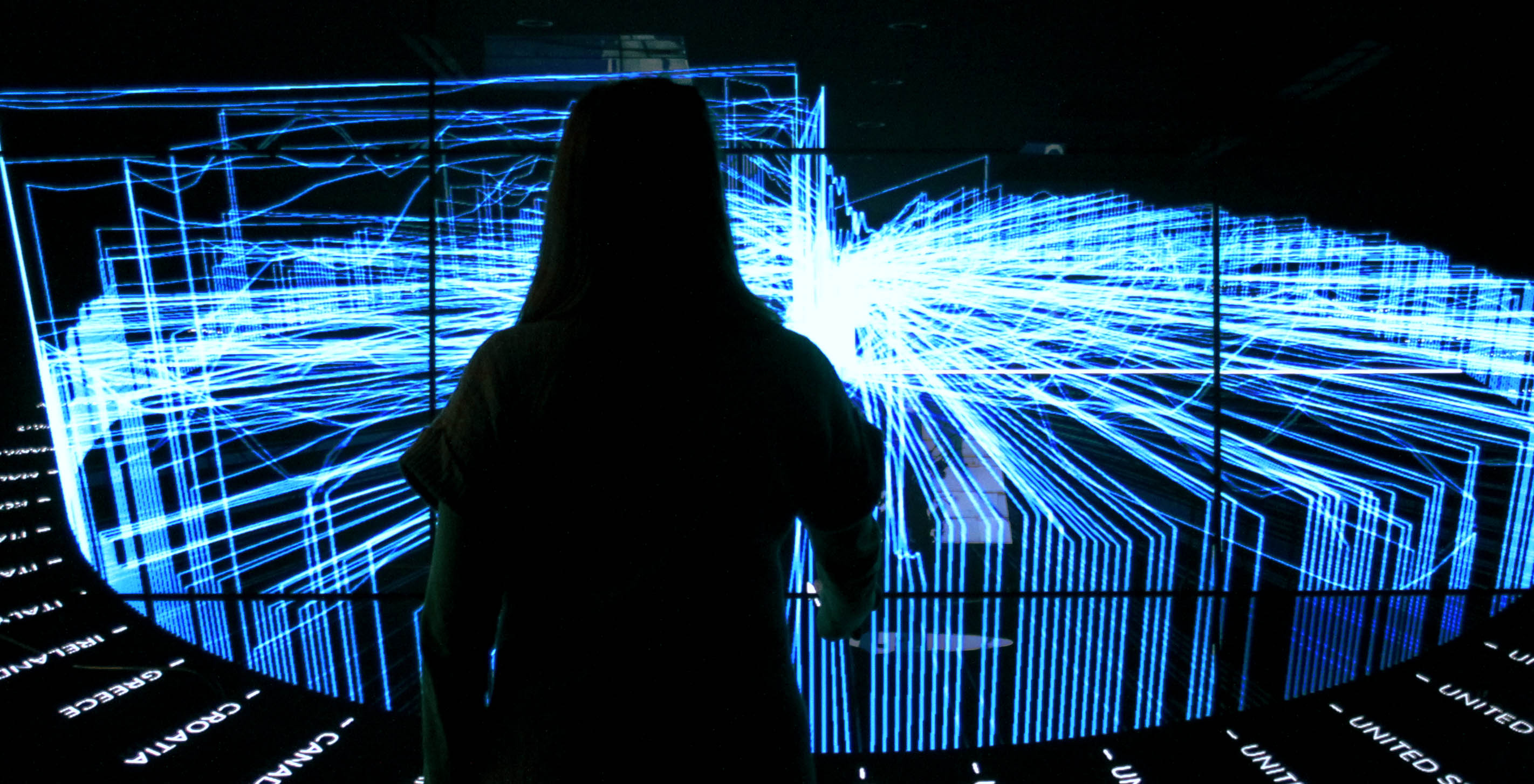
For the "Powering" piece, we worked with data about the location and power output from 713 GE gas turbines during fifteen days.
For "Curing," we tracked 125,530 CT and MR scans conducted using GE equipment during a 24-hour period. Aesthetically, the pieces had to work from a distance in the physical space of a lobby, which called for some different design decisions than an online tool would require. Still, we wanted it to be clear that the pieces are informed by real data, generated by machines at work in the real world. Real data has structure, and this structure informs the design.
The difference between generative art and a visualization based on real data is that with the latter, the viewer can visually decode the piece. Order, shape, size, direction, and color all have meaning. The dots originating from the globe in the “Curing” piece, for instance, represent the locations where the scans took place.
In the "Powering" data set, we discovered that turbines located in the same area work together for efficiency and sustainability. Globally, there’s no intentional, overarching structure to how the turbines fire up. Yet patterns emerge when turbines sharing time zones turn on and off at the same time. You can see these correlations in the final piece: the illuminated lines rolling towards the center at the same time indicate turbines turning on in unison. This wouldn’t happen with artificially generated data.
We chose each design element to best highlight what the data represented. The designs either evoke thoughts of the actual events and actions that the data signifies (turbines turning on, electricity being generated) or show a story of time and scale that is otherwise difficult to grasp (what do 135,000 scans really look like? What do they look like when spread across five continents?).
The designs also allow for different perspectives in a single interface. The globe in "Curing" shows the geo-location of the scans; simultaneously the timelines indicate the number of scans occurring each minute. The wheel in "Powering" shows the correlation of turbines turning on at the same time that it shows each turbine's location and power output. This ensures that no data point is presented without context that lets an audience put it in perspective.
Even if these visualizations are small stories, just short glimpses into a larger story of activity across the world, they still reward the audience for taking an interest and a closer look. They make accessible actual numbers and output that would otherwise be buried in a spreadsheet.
The pieces are now being displayed on a large touch screen wall in the GE lobby. They were also on display during the World Economic Forum Annual Meeting in Davos.
We turned to our friends for the soundtracks: for Powering, Gloobic produced From there to, and Oslo electric by Eric Gunther is the backdrop for Curing.
We’d love to hear what you’re working on, what you’re curious about, and what messy data problems we can help you solve. Drop us a line at hello@fathom.info, or you can subscribe to our newsletter for updates.