
Chris and Ben made some color palettes... and then we just looked at the pictures instead of out the window.
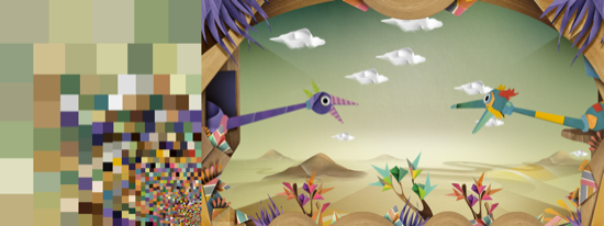
These are birds from Emily Gobeille's and Theo Watson's interactive Puppet Parade. Theo and Emily used to work in our office all the time, but now they live in New York. We miss them.
Hey Theo and Emily, what’s the story about these colors?
The color is very important with this project. The environment had to be inviting and neutral, because the colors and textures of the creatures change based on the foods they eat. What's the name of this bird?
Pointy. Pointy is very happy but also very hungry.
What does Pointy like to eat?
The creatures eat the food made by the children and if they want to erase their color they eat the clouds.
And what do they like to do?
They like to be controlled by frantic arms and they are always hungry for a meal (being a giant puppet burns a lot of calories).
Why are they so colorful?
In this world 'you are what you eat'.
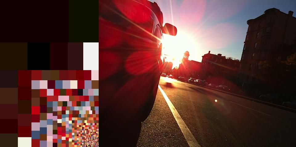
This is a photo that James Grady shot last fall. When James doesn't go to RISD, he is a designer for us. This is what he wrote about the colors in his photo:
In the late fall, the crisp air and bright blue sky make for the most amazing sunsets. I love the way the solar flares bounce off the camera lens and create a beautiful prism of color that ranges from hot pink too cool blue, while all the other colors fade to graphic silhouettes.
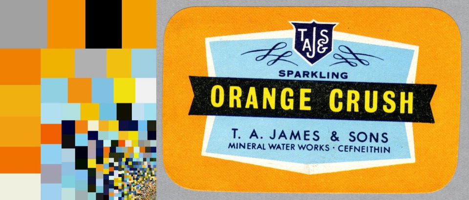
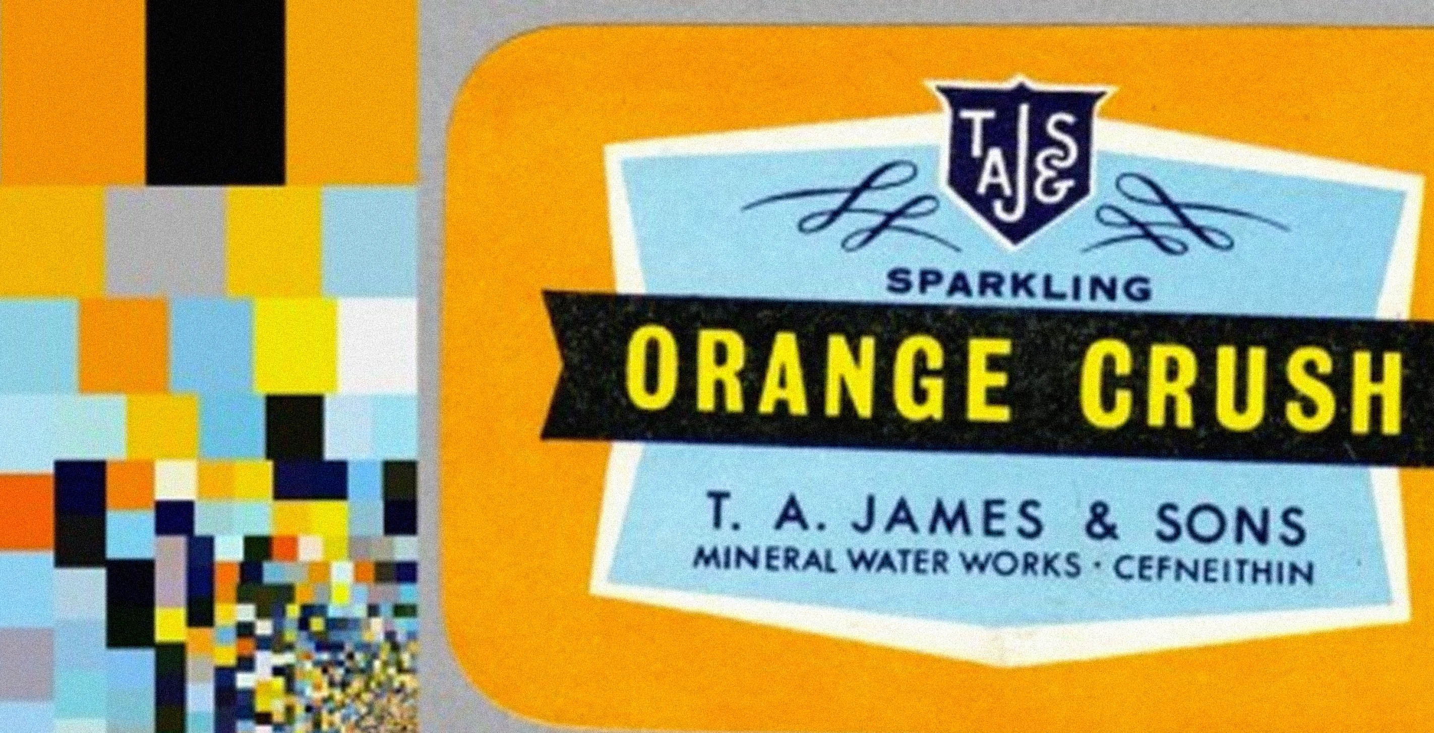
When we asked Katy which colors she likes today, she sent a vintage label for Orange Crush soda from across the room:
I bought a batch on eBay with about a hundred old soda labels from all over the world. They were really beautiful, and had great names, like Howdy and Cheer Up!. The backgrounds were screen prints or lithographs made for glass bottles, which allowed for spot colors and an intensity you just don’t see on modern labels. Incidentally, Fathom is housed in the Puffers building here in Boston, which takes its name from a local beverage entrepreneur who patented carbonation and bottling technology in the late 1800s.
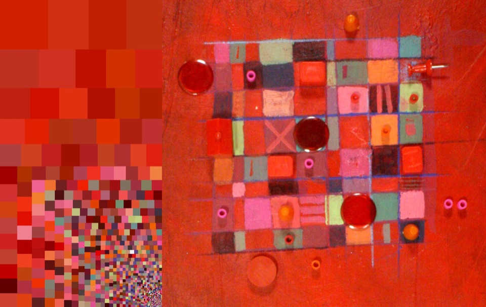
Beatriz Ramos, artist and founder of New York/Caracas production company Dancing Diablo, channeled her roots in this painting for a stopmotion animation piece.
I come from the Caribbean, where the sea is turquoise, the mountains roll in lustrous greens and the sky is an intense blue. The sunlight is so bright that any colors you use for your house or your art work, have to be high in chroma in order not to look faded. You get used to rich, vivid colors.
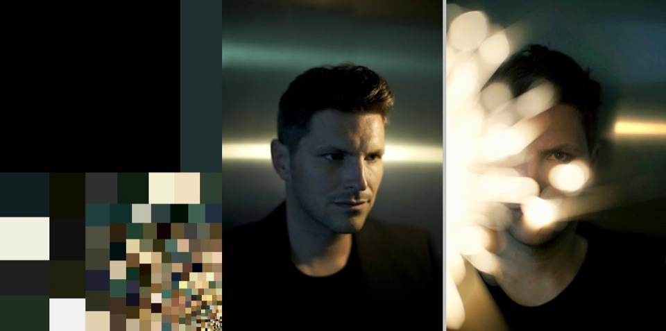
New York photographer Anna Schori makes everyone look chilly like they were in Sweden or something.
Portrait of Ed Vallance, musician.
I like cold metallic blues and greens. The more underwater the picture feels, the more I can strip skin tones from warmth, and the more satisfying I find the result. During the winter months in Sweden, where I grew up, you get more dusk and dawn then actual daylight. The light that the snow reflects back then is a beautiful cold blue.
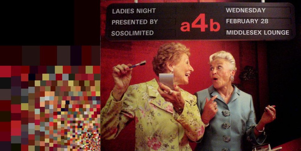
Sosolimited sent us a flyer they made for one of their shows at Middlesex.
This was a giant poster that we picked up from a CVS going-out-of-business sale. The original picture said something about "you go girl". We think the colors are supposed to inspire youthful confidence, but the kind of confidence that is improved if you buy make-up.
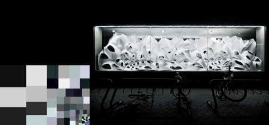
But not everyone likes color. Skylar Tibbits from MIT Department of Architecture, finally put his foot down:
The spectrum from black to white is filled with nearly limitless variations and there is little to no need for any other colors in ones life. Even if there was a need for color (which there clearly is not), the average human life has roughly 2,208,816,000 seconds, which is just not enough time to comprehend the complexities of black-to-white, let alone the infinite spectrum and depressing qualities of the remaining colors.If black is the absence of all color and white is the presence of the complete spectrum, then one might ask 'what more do you need in your life than all or nothing?' Who wants to be stuck on the fence?
Living proof of the purity of black lies in an architects outfit - I ask, 'have you ever seen an architect dressed in color?'
Which made us feel a bit like this guy:
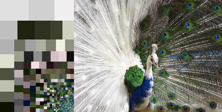
But we kept being happy about colors. Here are some other palettes we like:
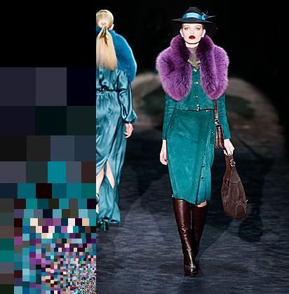
Gucci's fall collection
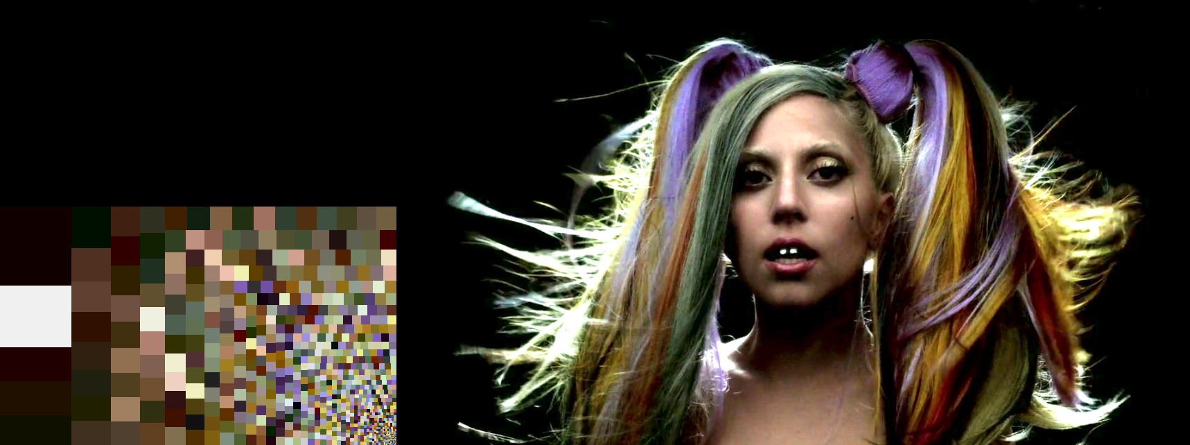
Lady Gaga for Thierry Mugler
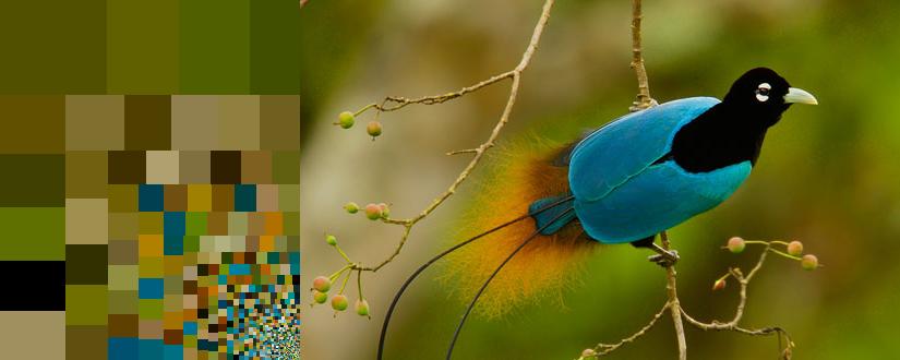
Male Bird of Paradise
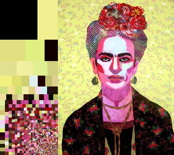
Frida Kahlo by Frida Kahlo
Cube installation by Robert Filliou
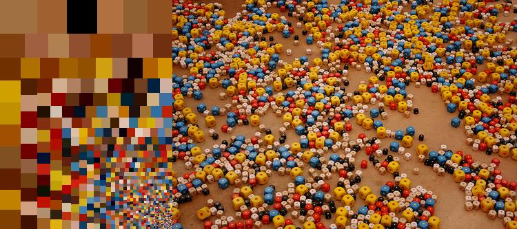
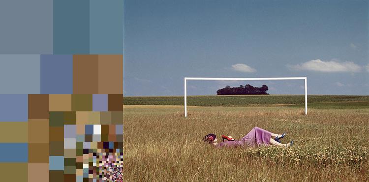
Photo by Guy Bourdin
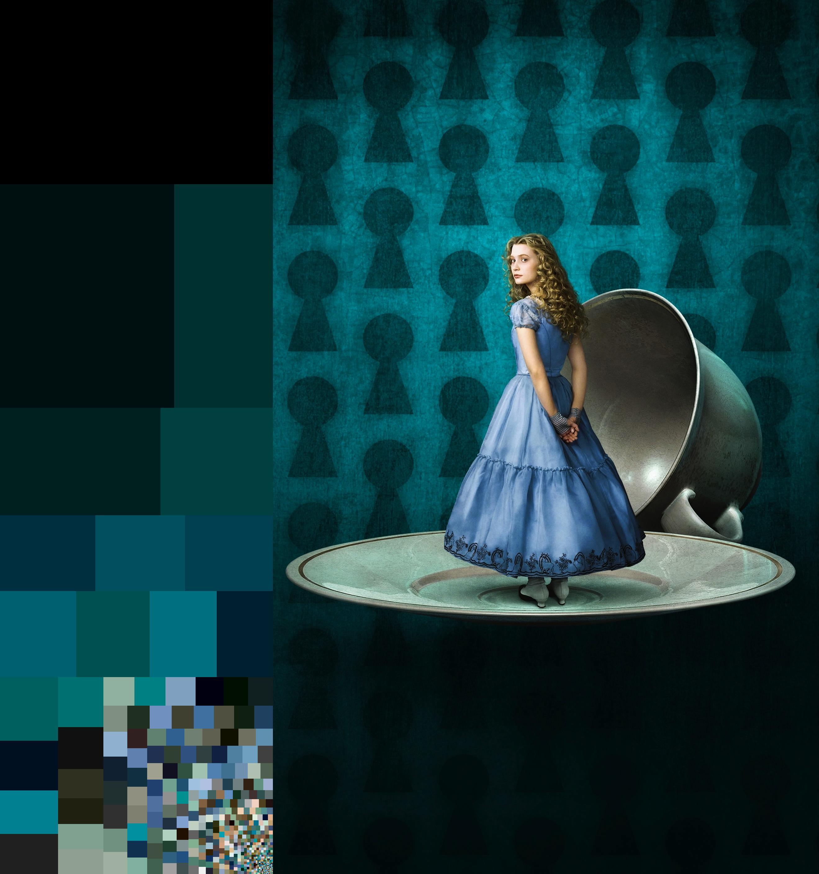
Tim Burton's Alice in Wonderland
We’d love to hear what you’re working on, what you’re curious about, and what messy data problems we can help you solve. Drop us a line at hello@fathom.info, or you can subscribe to our newsletter for updates.
