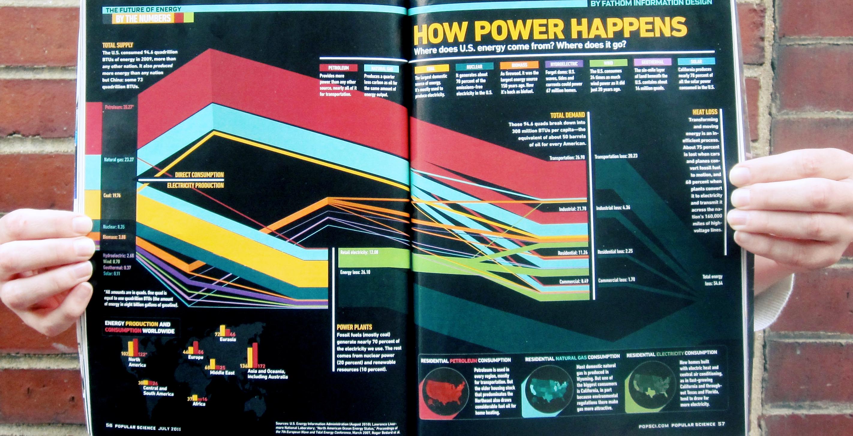
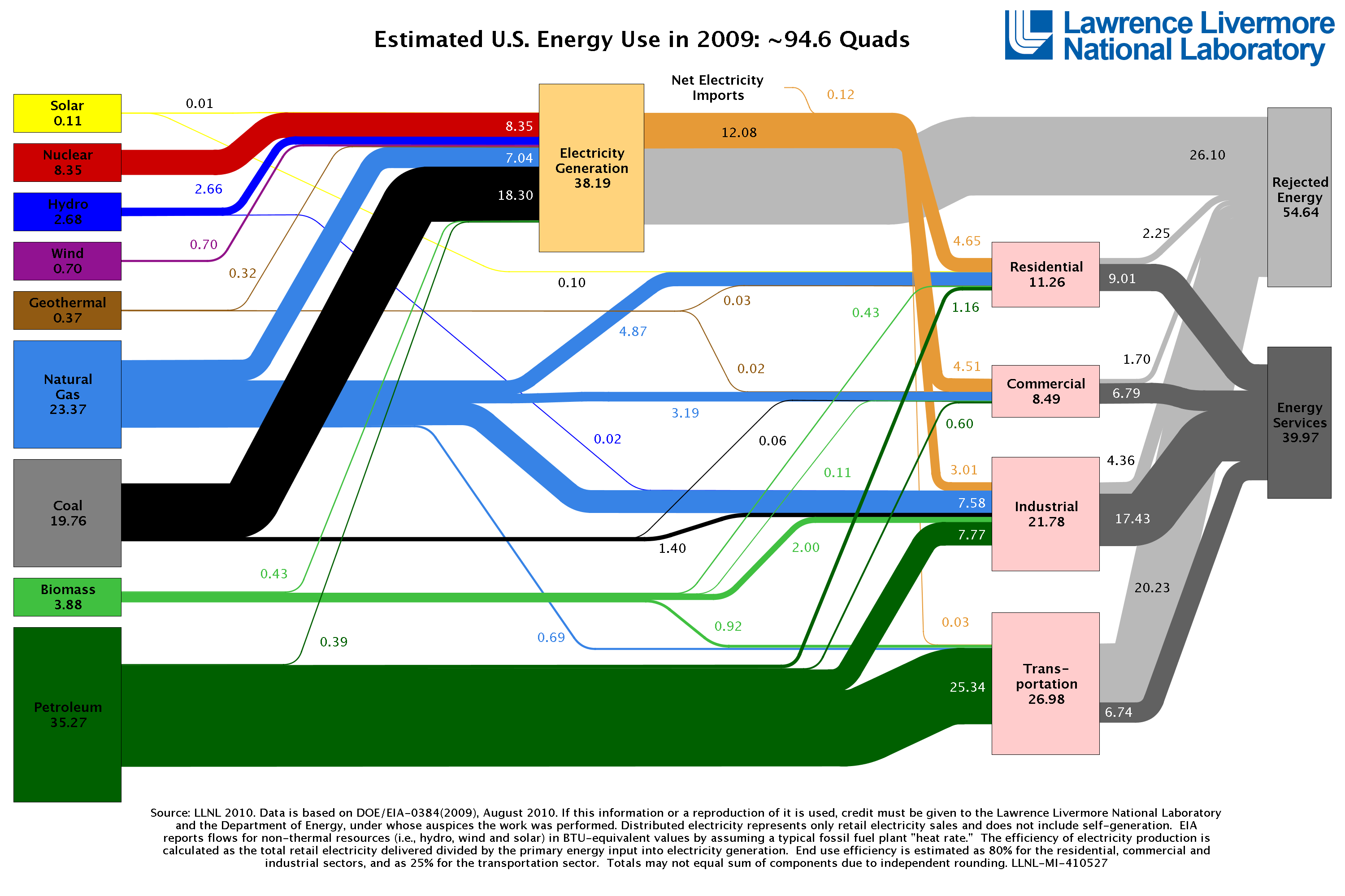
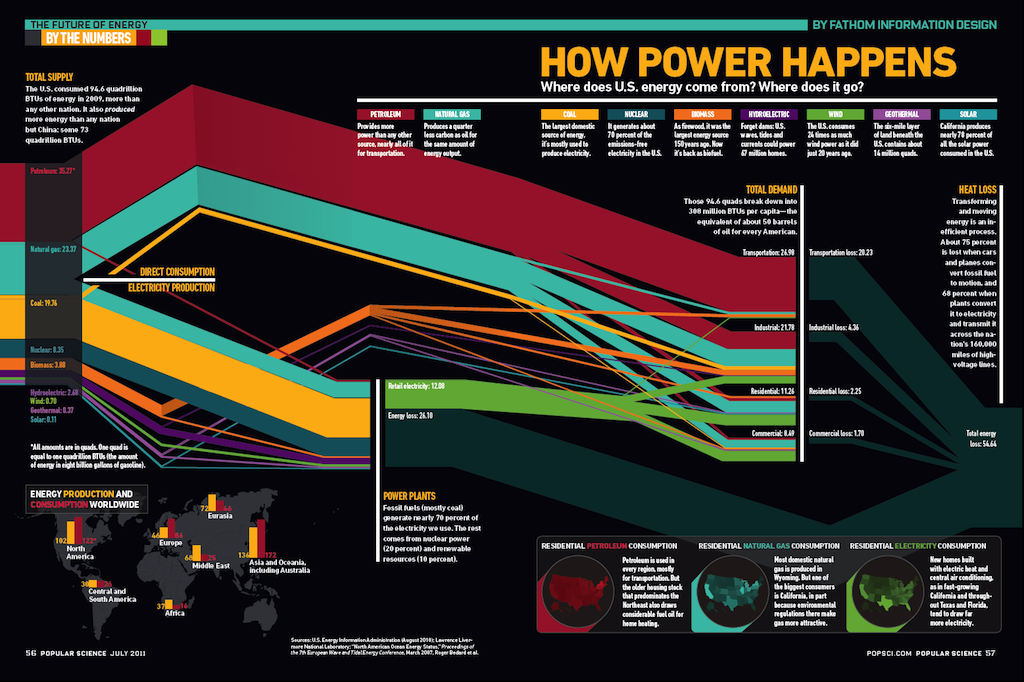
In the original chart, LLNL outlines their estimates on energy resources and American consumption. There are many stories to tell with this data. All versions of this chart that we found online immediately shows how transportation is the biggest energy gobbler, at almost 36 percent of all energy used, and mainly from the most problematic resource: oil.
But another story that's subdued in other versions is how more than 50 percent of all energy goes to waste in the United States. In the original chart, this is referred to as "rejected energy" and again — most of it happens in the category of transportation. In our version, Katy made "energy loss" a larger portion of the final chart and added color and brightness to these graphs. How much of petroleum and other energy resources are lost as waste heat in the process of conversion or to inefficiencies in the infrastructure, was the point we wanted to make most poignant.
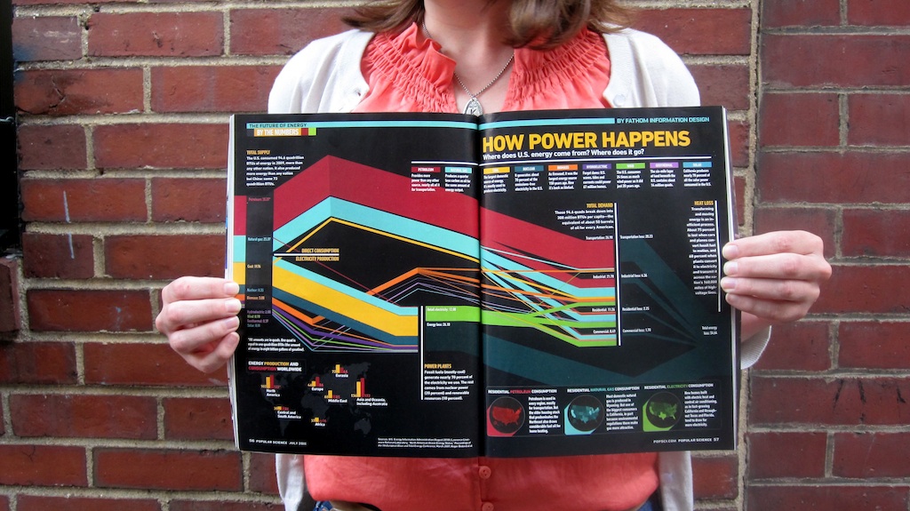
The illustration ran in the Future Energy issue of PopSci in July of 2011.
Katy with the July issue of PopSci.
Previous post.
We’d love to hear what you’re working on, what you’re curious about, and what messy data problems we can help you solve. Drop us a line at hello@fathom.info, or you can subscribe to our newsletter for updates.