

Experiencing a crowd moves fast from fun party to the black hole of Calcutta. On the larger scale of seven billion, it’s just hard to grasp. What is this unprecedented state like? How does being more change what we do? Where are all these people going? Last year, National Geographic asked designers to sketch narratives around “population density” and show how the world population relates the United States.
Not being chosen, we kept working on the project since we wanted to see what the world map could look like if drawn with numbers of population density instead of nation borders and topography.
If a map with country borders says something about war, politics, secured resources, and national identities, a map of people tells about popularity and access to the stuff of survival. There’s something interesting about how some people now identify with the regions where they have lived, rather than the nations where they were born.
Mark Monmonier said that any map is “but one of an indefinitely large number of maps that might be produced from the same data”. Since we wanted Dencity to be a poster — looking good on the wall and also show a more specific situation than a standard geographic map — we decided to turn a few things on their head.
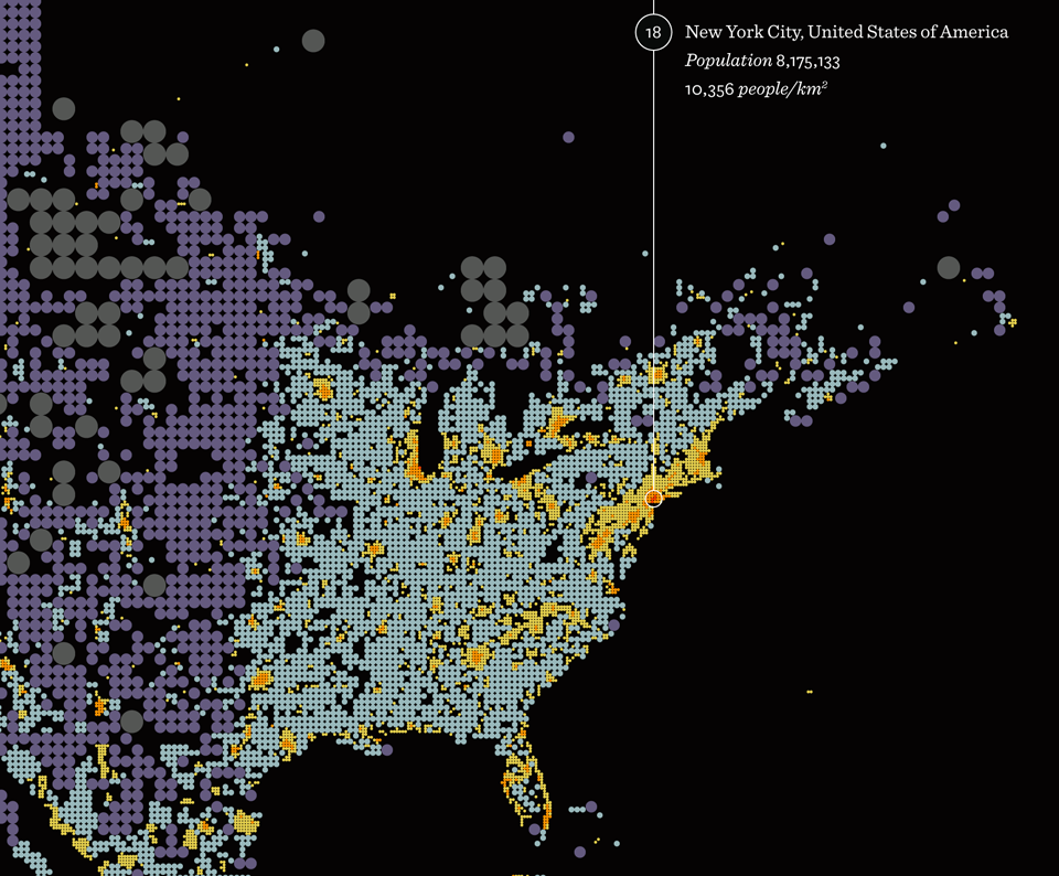
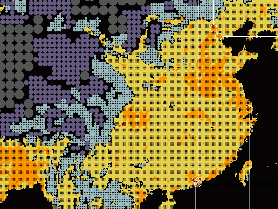
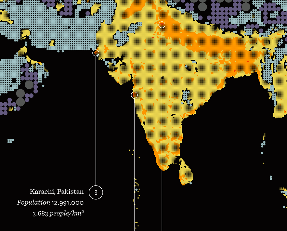
When generating the first sketches based on the density data, we flipped the usual scale of resolution: dense meant smaller circle and sparse larger. By also creating different level of detail in the same map, which is contrary to the fixed level of standard heat map representation, we wanted to draw the eye to specific regions — show the action in densely populated areas (small circles of the reddest red, orange, and yellow) and give an immediate idea of where the sparser regions were (large circles in gray, blue, and purple).
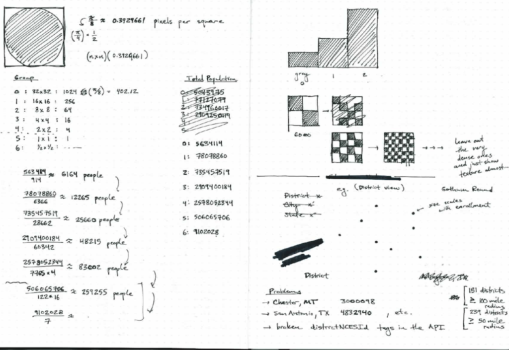
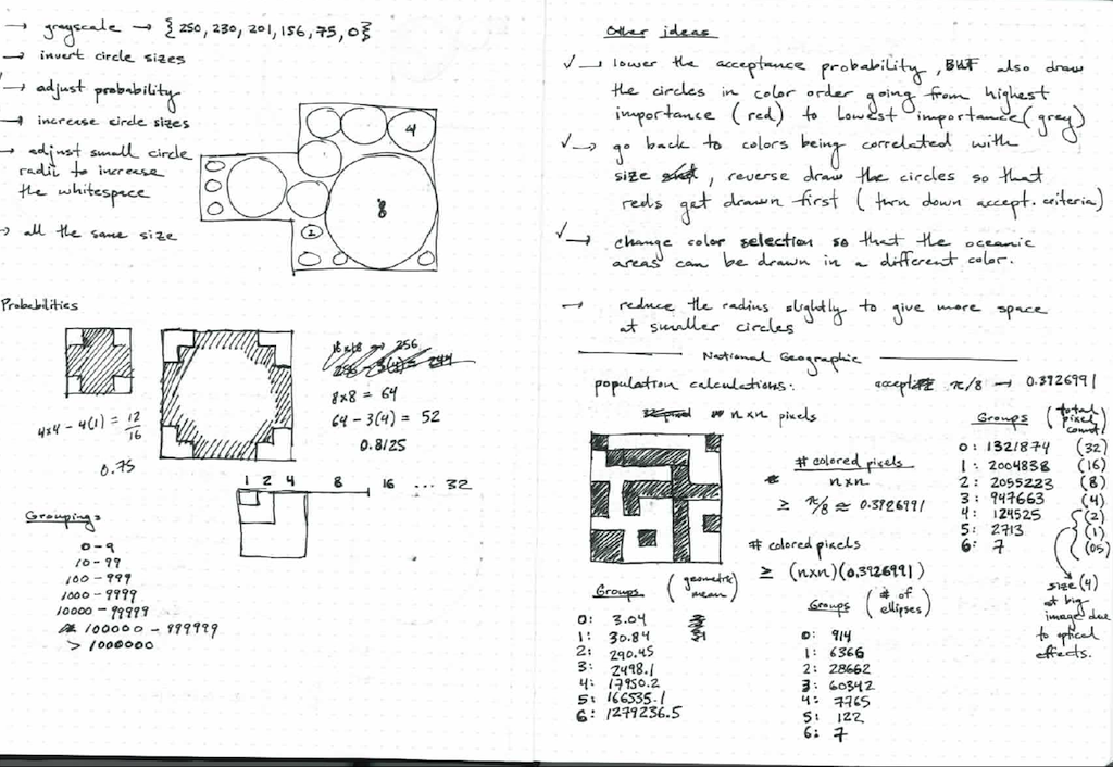
These early sketches consisted of a square grid with finer and finer subdivision, in which inscribed circles were placed.
Last year’s summer intern, Lynn Kiang (now Lynn Wen), laid the foundation for the graphic design and this summer our designer James Grady finished it up.
Some things that struck us about the poster were that people like hot better than cold (excepting deserts). It’s hard to live on a mountain. There’s a big hole in the middle of Australia and if the world was a party, the kitchen, bar, back room, and porch would be found in Indonesia, on the stretch between Calcutta and Bombay, in Shanghai with neighbors, and around the Nile.
The map also inspired some questions that we may look at later. How has population density changed over time? How does it correlate with changing nation borders? Why and how do we move around and cluster? And what other variables than people change the shape and size of countries? We'll see how it goes.
For now, the Dencity poster is available here. As of 2022, we no longer sell our posters online, but office visitors may get a special goodie bag…
We’d love to hear what you’re working on, what you’re curious about, and what messy data problems we can help you solve. Drop us a line at hello@fathom.info, or you can subscribe to our newsletter for updates.