As we look forward to our the next semester of our MIT class, we are particularly interested in providing more informative examples to make p5.js more accessible to individuals without prior development experience. In this article, we’ll clarify the utility of one p5.js function students commonly struggled with, the map() function, and provide some examples of how it can be used to visualize weather data.
What is the map function?
The map() function, inherited from the original Processing software, is a tool that lets you re-map a number from one range to another. Put more simply, we can think of the map() function as a tool for mathematical conversion. When visualizing weather data, there are several reasons we might need to convert a number. Perhaps we want to convert a temperature from Celsius to Fahrenheit. Or maybe we want to take precipitation data and calculate positions for each data point on a chart. We might need to convert a number to a percentage, or vice versa. The following examples show how the map() function can help facilitate these conversions.
Converting from Fahrenheit to Celsius
Temperature data often needs to be converted from Fahrenheit to Celsius, or vice-versa. Instead of using the common mathematical functions for these, we can use the map() function to take a number, measured in degrees, and convert it.
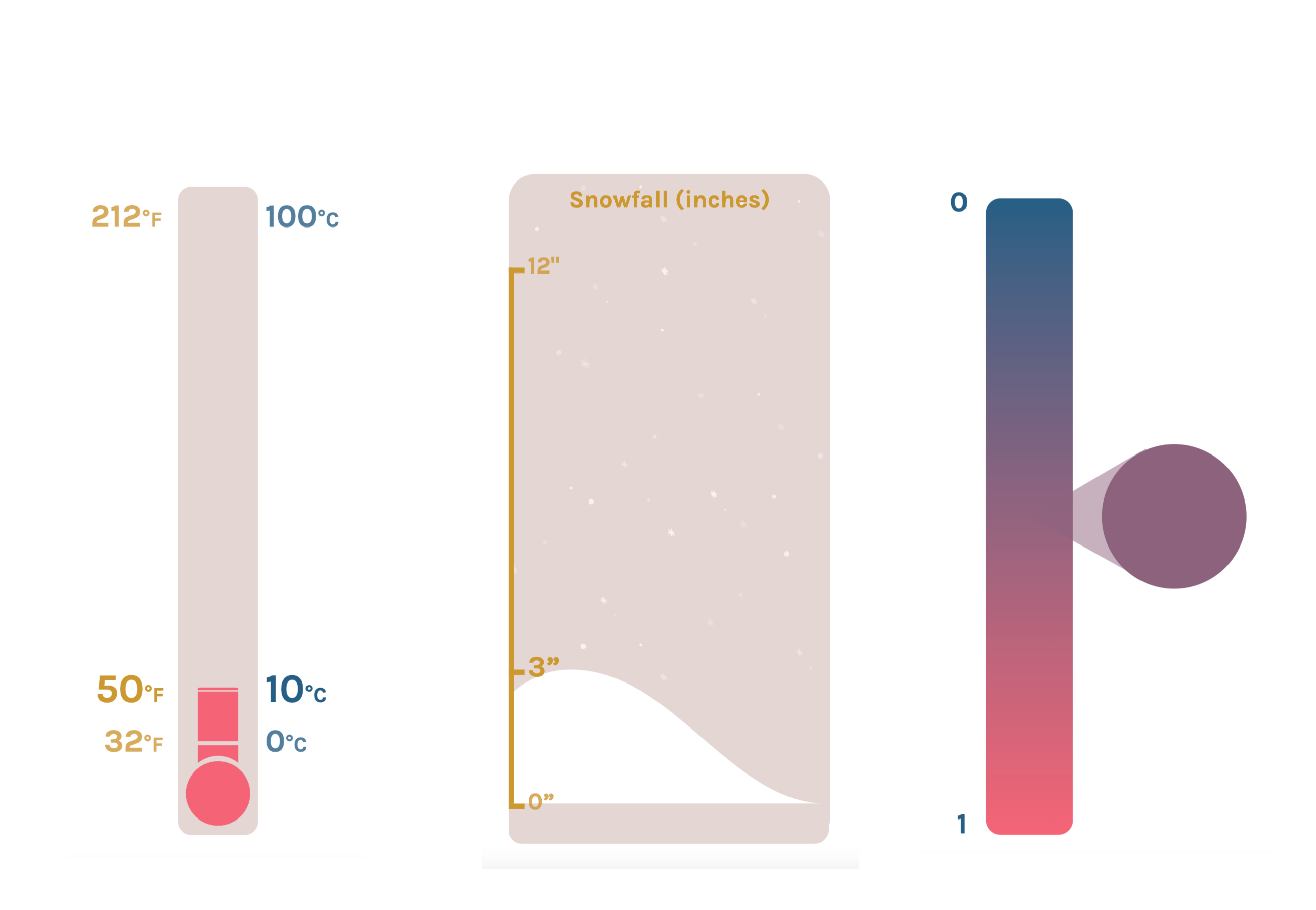
What are we mapping?
In this example, we want to take a temperature, measured in Fahrenheit, and convert it to the equivalent temperature measured in Celsius.
The following information is provided to the map() function:
- an observed temperature
- a range of temperatures measured in Fahrenheit
- an equivalent range of temperatures measured in Celsius
Use the example below to convert a temperature from Fahrenheit to Celsius or vice-versa.
See the Pen p5.js map example - temperature by Erin Thomas (@erinctho) on CodePen.
Measuring snowfall in a graph
Charts or graphs are a widely used tool for showing weather information. To display a chart in a p5.js sketch, one must manage several variables: the height of the chart, how far it is from the top-left corner of the canvas, and how far each of the data points lies from the bottom of the chart. We can use the map() function to help us manage some of this complexity.
What are we mapping?
In this example, we want to take a data point, the recorded snowfall measured in inches, and convert it to a location, measured in pixels, on our p5.js canvas.
The following information is provided to the map() function:
- Recorded snowfall, in inches.
- The lowest and highest amount of snowfall we want to display on our chart
- The area on the screen where we want to place the chart
Try adjusting the position of the chart in the example below.
See the Pen p5.js map example - bar chart by Erin Thomas (@erinctho) on CodePen.
Blending between colors
Color is an easy way to convey information and works particularly well for weather data. We see color used extensively when showing precipitation, change in temperature, and change in the global climate.
In our example, we want to show temperature data using color. We will show cooler temperatures as a shade of blue and warmer temperatures as a shade of red, moving evenly between the two colors as the temperature increases or decreases. To do this we can use the function lerpColor(), a p5.js function inherited from Processing that allows us to transition smoothly between these two colors. The lerpColor() function takes three arguments: your starting color, your ending color, and a value between 0 and 1 which represents how much we want to blend from your starting color to your ending color.
What are we mapping?
We want to take a numerical value representing a change in temperature and use our map() function to normalize it, converting it to a range of 0 to 1. The lerpColor() function will then take this value and use it to blend between the colors blue and red.
The following information is provided to the map() function:
- A data point representing temperature change
- The lowest and highest changes in temperature we wish to use
- The 0 to 1 range we wish to convert our temperature to
- An optional argument called the ‘constraint’. When set to true, this ensures that the resulting value of our map() function never falls outside of the range 0 to 1.
See the Pen p5.js map example - color tween by Erin Thomas (@erinctho) on CodePen.
The map() function is a valuable tool that can be used to manipulate your data in a multitude of ways. If you wish to learn more, check out this video from Coding Train and create your own sketches with the p5.js web editor.
We’d love to hear what you’re working on, what you’re curious about, and what messy data problems we can help you solve. Drop us a line at hello@fathom.info, or you can subscribe to our newsletter for updates.